
Figures & data
Figure 1. Identification of HRGs in AS. (A) The correlation heatmap of HRGs. Significant positive correlations are indicated by red circles, while significant negative correlations are marked by green circles. The size of the circle and the numeric value within correspond to the strength of the correlation coefficient, with statistical significance annotated by asterisks (*p < 0.05, **p < 0.01, ***p < 0.001, ****p < 0.0001). (B) Friends analysis of HRGs. To demonstrate the differential expression of HRGs between the HC and AS groups, we utilized a heatmap (C) and box plots (D). (**p < 0.01, ***p < 0.001).
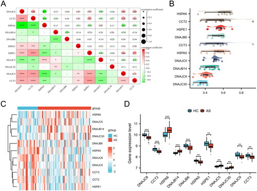
Figure 2. Enrichment analysis of HRGs. (A) GO term enrichment for BP, CC, and MF categories. Enrichment significance is represented as -Log10(P.adj), where P.adj denotes the adjusted p-value for multiple testing corrections. (B) KEGG pathway enrichment analysis. The size of each bubble indicates the count of genes associated with the pathway, while the color corresponds to the p-value. The x-axis, labeled as GeneRatio, represents the ratio of the number of differentially expressed genes involved in a given pathway to the total number of genes that make up that pathway.
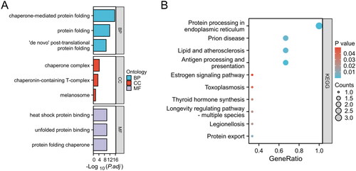
Figure 3. Evaluation of predictive biomarkers and model performance for AS risk assessment. (A) Nomogram for predicting the probability of disease risk based on the expression levels of four biomarkers: CCT2, HSPA6, DNAJB14, and DNAJC5. (B) ROC curve for the predictive model. (C) ROC curves for individual biomarkers CCT2, HSPA6, DNAJB14, and DNAJC5.
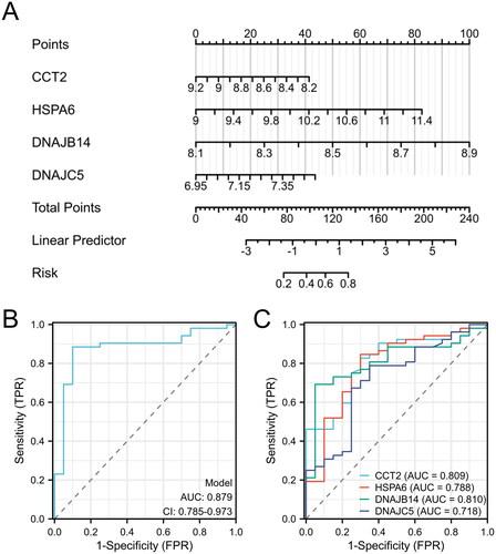
Table 1. The results of logistic regression analysis.
Figure 4. Differential expression of candidate genes between HC and AS. Boxplot representation of gene expression levels for CCT2, HSPA6, DNAJB14, and DNAJC5 in GSE73754 dataset (A) and clinical samples (B), comparing HC and AS (**p < 0.01, ***p < 0.001).
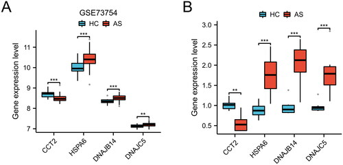
Figure 5. Clustering analysis and differential gene expression profiling of AS samples. (A) Heatmap with hierarchical clustering based on gene expression data of HRGs, illustrating two distinct clusters (Cluster 1 and Cluster 2) of AS samples. (B) Volcano plot depicting the differential expression between Cluster 1 and Cluster 2. (C) Heatmap of the top 50 differentially expressed genes between the two clusters, arranged by hierarchical clustering.
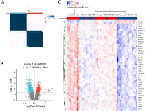
Figure 6. Functional and pathway enrichment analysis of differentially expressed genes in different clusters of AS. (A) GO term enrichment for BP, CC, and MF categories. (B) KEGG pathway enrichment analysis. (C) GSEA results visualized as enrichment plots for selected pathways.
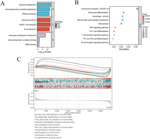
Figure 7. The immunological landscape of HSP-related clusters. (A) The distribution of immune cell subpopulations between Cluster 1 and Cluster 2 groups is presented in the heat map. (B) The levels of immune cell subpopulations between Cluster 1 and Cluster 2 groups are displayed in the box plot. *p < 0.05, **p < 0.01, ***p < 0.001.
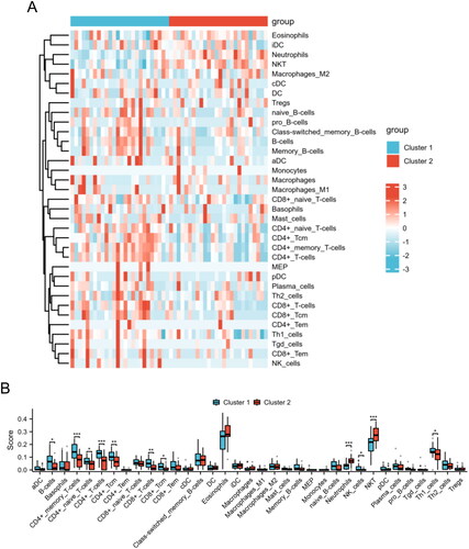
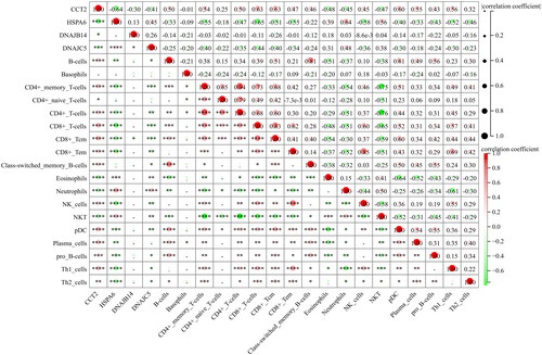
Figure 8. The correlations between key genes and immunological characteristics in AS. Red circles indicate positive correlation, while green circles indicate negative correlation. The intensity of the color and the size of the circle correspond to the strength of the correlation, with a color gradient from light to dark representing increasing correlation strength from low to high. *p < 0.05, **p < 0.01, ***p < 0.001, ****p < 0.0001.
Data availability statement
All data used in the present study were available from the GEO database (https://www.ncbi.nlm.nih.gov/geo/). The accession number is as follows: GSE73754).