
Figures & data
Table 1. Baseline characteristics of the 40 children.
Figure 1. Score scatter plot of PCA model for group asthma vs. control. The x- (PC1) and y- (PC2) axes indicate the first and second principal components, respectively. The circle represents the 95% confidence interval.
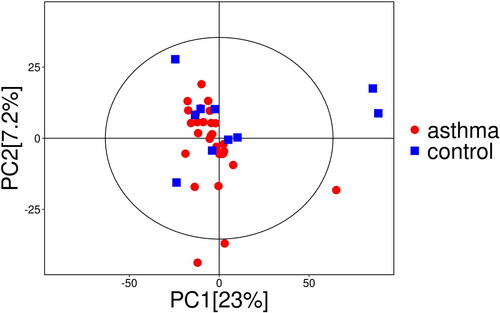
Figure 2. Score scatter plot and permutation plot test of OPLS-DA model for group asthma vs. control. (a) Score scatter plot of OPLS-DA model for group asthma vs. control. The x- (t[1]P) and y- (t[1]O) axes indicate predictive and orthogonal directions, respectively. The circle represents the 95% confidence interval. (b) Permutation plot test of OPLS-DA model for group asthma vs. control. R2 and Q2 indicate interpretability and predictability, respectively.
![Figure 2. Score scatter plot and permutation plot test of OPLS-DA model for group asthma vs. control. (a) Score scatter plot of OPLS-DA model for group asthma vs. control. The x- (t[1]P) and y- (t[1]O) axes indicate predictive and orthogonal directions, respectively. The circle represents the 95% confidence interval. (b) Permutation plot test of OPLS-DA model for group asthma vs. control. R2 and Q2 indicate interpretability and predictability, respectively.](/cms/asset/a0f440dd-bdff-4411-bd48-1850b556c460/ijas_a_2338865_f0002_c.jpg)
Figure 3. Volcano plot for group asthma vs. control. The x-axis indicates the change in multiples of each substance in the group (taking the logarithm base 2), and the y-axis represents the p value of the Student’s t-test (taking the negative logarithm base 10). Significantly up-regulated metabolites are shown in red, significantly down-regulated metabolites are shown in blue, and non-significantly differentiated metabolites are shown in gray.
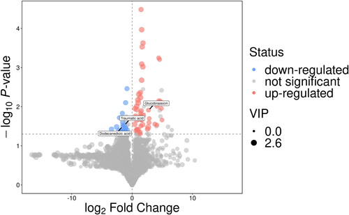
Figure 4. Heatmap of correlation analysis for group asthma vs. control. The x- and y-axes represent the differential metabolites in this group of contrasts, with red indicating a positive correlation and blue indicating a negative correlation.
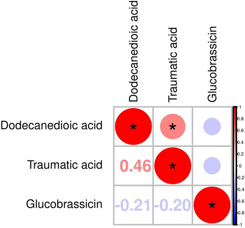
Figure 5. ROC analysis for distinguishing asthma patients from healthy controls. (a) ROC analysis of dodecanedioic acid (AUC = 0.75). (b) ROC analysis of glucobrassicin (AUC = 0.74). (c) ROC analysis of traumatic acid (AUC = 0.74).
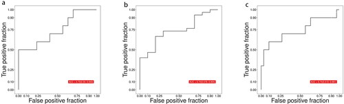
Table 2. Identification of differentially abundant metabolites in urine between asthmatic and healthy subjects.
Figure 6. Metabolic pathways. Blue represents down-regulated significantly differentiated metabolites.
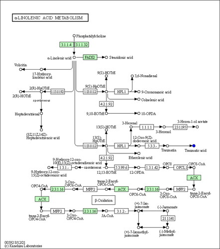
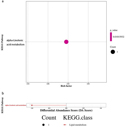
Figure 7. KEGG enrichment and differential abundance score for group asthma vs. control. (a) KEGG Enrichment for group asthma vs. control. The x-axis represents the Rich Factor, and the y-axis represents the KEGG metabolic pathway name. The color indicates the size of the p value, and the smaller the p value, the redder the color. (b) Differential Abundance Score for group asthma vs. control. The x-axis represents the DA Score and the y-axis represents the KEGG metabolic pathway name. The DA Score reflects the overall change of all metabolites in the metabolic pathway, and the score −1 indicates a downward trend in the expression of all annotated differential metabolites in the pathway.
Supplemental Material
Download MS Word (53.7 KB)Data availability statement
Data available on request due to restrictions, e.g., privacy or ethical.