442
Views
1
CrossRef citations to date
0
Altmetric
Letters to the Editor

In response to ‘Behind EUD’

&
Pages 610-614 | Received 06 Nov 2008, Published online: 08 Jul 2009

Figures & data

Figure 1.  Upper panel: In the left graphs, the two step-wise dose distributions that are tested are shown. In both cases the mean dose is kept constant at the value of 80 Gy while the relative standard deviation varies from 0 to 100% by changing the dose to the different fractions of the target. is related to the minimum dose for parallel structured organs (such as tumors) at large dose variations. behaves similarly but the curves of and differ from each other in their absolute values. All these different dose distributions are characterized by the same mean value implying that is not an appropriate unit to describe a dose distribution. The curve of EUD follows closely that of apart from the region of low doses. Finally, the gEUD follows closely the curve of Dmin deviating significantly from the curve of , which is the one that is derived directly from the response probability of the tissue. Lower panel: By using the two types of step-wise dose distributions shown in the upper panel and selecting distributions of small, medium and large dose inhomogeneities in the target, the response probabilities of the target and the corresponding values of the , EUD, Deff and gEUD were calculated. It is apparent that the Deff and gEUD concepts are not as accurate as the and EUD in medium and large dose inhomogeneities.
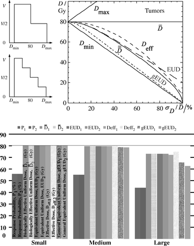
Figure 1.  Upper panel: In the left graphs, the two step-wise dose distributions that are tested are shown. In both cases the mean dose is kept constant at the value of 80 Gy while the relative standard deviation varies from 0 to 100% by changing the dose to the different fractions of the target. is related to the minimum dose for parallel structured organs (such as tumors) at large dose variations. behaves similarly but the curves of and differ from each other in their absolute values. All these different dose distributions are characterized by the same mean value implying that is not an appropriate unit to describe a dose distribution. The curve of EUD follows closely that of apart from the region of low doses. Finally, the gEUD follows closely the curve of Dmin deviating significantly from the curve of , which is the one that is derived directly from the response probability of the tissue. Lower panel: By using the two types of step-wise dose distributions shown in the upper panel and selecting distributions of small, medium and large dose inhomogeneities in the target, the response probabilities of the target and the corresponding values of the , EUD, Deff and gEUD were calculated. It is apparent that the Deff and gEUD concepts are not as accurate as the and EUD in medium and large dose inhomogeneities.

Table I.  Comparison of , EUD, Deff and gEUD for different dose distributions and dose ihnomogeneities.

Figure 2.  Left diagram: In this diagram, a radiobiological treatment plan comparison is performed regarding the clinical effectiveness of three different radiation modalities illustrating also the confidence intervals of the dose-response curves. It is apparent that the use of the concept on the dose axis provides the appropriate dose prescription basis for making such comparisons practical and clinical useful. Right diagram: The dose-response curve derived using a radiobiological model for a certain tissue is shown. On the same diagram, the dose-response points of each patient have been drawn. Those points were calculated using the individual dose distribution delivered to each patient and the model parameters. P denotes probability and the is the unit of the dose axis. The patients with response are indicated by crosses while the patients without response by open circles. The histograms represent the observed response rates at the corresponding dose intervals.
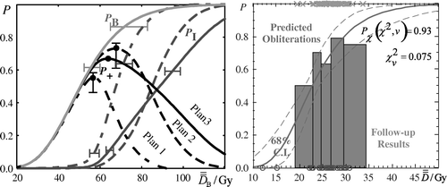
Figure 2.  Left diagram: In this diagram, a radiobiological treatment plan comparison is performed regarding the clinical effectiveness of three different radiation modalities illustrating also the confidence intervals of the dose-response curves. It is apparent that the use of the concept on the dose axis provides the appropriate dose prescription basis for making such comparisons practical and clinical useful. Right diagram: The dose-response curve derived using a radiobiological model for a certain tissue is shown. On the same diagram, the dose-response points of each patient have been drawn. Those points were calculated using the individual dose distribution delivered to each patient and the model parameters. P denotes probability and the is the unit of the dose axis. The patients with response are indicated by crosses while the patients without response by open circles. The histograms represent the observed response rates at the corresponding dose intervals.

Reprints and Corporate Permissions

Please note: Selecting permissions does not provide access to the full text of the article, please see our help page How do I view content?

To request a reprint or corporate permissions for this article, please click on the relevant link below:

Academic Permissions

Please note: Selecting permissions does not provide access to the full text of the article, please see our help page How do I view content?

Obtain permissions instantly via Rightslink by clicking on the button below:

If you are unable to obtain permissions via Rightslink, please complete and submit this Permissions form. For more information, please visit our Permissions help page.