Figures & data
Figure 1. Typical Baseline Imaging. Top Row: Baseline T2 (A), DWI b300 (B) and DWI b600 (C). Images obtained with exhale breath-hold through same axial region of the tumour. Bottom Row: Typical ROI selection in tumour, peri-tumour and irradiated liver on ADC map (D), gadolinium enhanced T1 (E), contrast enhanced planning CT with (F) dose map. Gross tumour volume and planning target volume shown on T1 MRI and CT in blue and pink contours respectively.
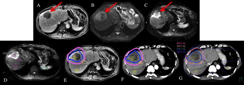
Figure 2. Plots demonstrating population mean ADC values for irradiated and non-irradiated ROIs at baseline, week one, week two and follow-up.
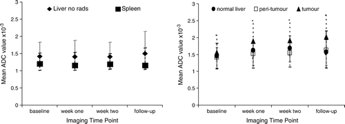
Figure 3. Population mean ADC values for normal liver receiving nominal (<8Gy) and moderate (>8Gy) doses of radiotherapy.
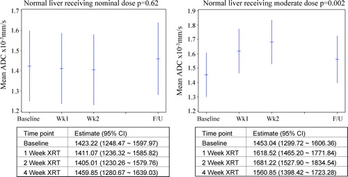
Figure 4. Population mean ADC values for irradiated tumour and peri-tumour ROIs.
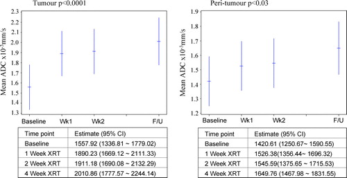
Figure 5. Change in mean ADC values from baseline to each subsequent imaging session, relative to delivered dose to tumour region at the time of imaging. Responders (R) shown in solid black, patients with stable disease (S) shown in solid grey, and patients with progressive disease (P), shown as open shapes.
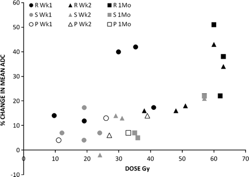
Table I. Percent change in mean ADC for patients at all time points for tumour and peri-tumour.
Table II. Correlation and significance of delivered tumour dose and change in mean ADC (all patients).
Figure 6. Dose versus baseline tumour volume (left). Mean ADC at baseline (solid) and in follow-up (open square) versus baseline tumour volume (right).
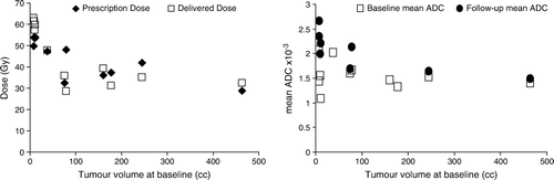
Table III. Correlation between tumour volume at baseline with mean change in ADC.
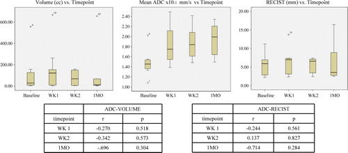
Figure 7. Box plots demonstrating population changes in ADC, tumour volume and RECIST measurements (as measured on T2 images) over time.