
Figures & data
Figure 1. Enrollment and outcomes of the cohorts. PD: peritoneal dialysis; HD: hemodialysis. (A) Training cohort. (B) Validation cohort.
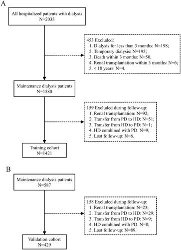
Table 1. Baseline characteristic of the training and validation set.
Figure 2. Identification of predictive factors using the LASSO-Cox regression. (A) LASSO model coefficient trendlines of the 33 variables (shown in ) for all-cause mortality. (B) Tuning parameter λ selection threefold cross-validation error curve. Vertical lines were drawn at the optimal values given by the minimum criteria and 1es criteria. The parameter λ = 0.02 was selected under the 1es criteria, 13 variables of them with non-zero coefficient were selected. LASSO: least absolute shrinkage and selection operator; es: standard error.
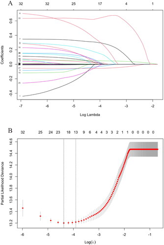
Figure 3. Forest plot with hazard ratio (HR) for the optimal prognostic variables of the final multivariable model in the training set. HR above one indicates that a variable is positively associated with the event probability and negatively with survival time. A horizontal line parallel to the X-axis has a logarithmic scale that represents a more precise CI (95% CI).
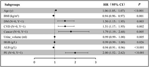
Figure 4. Predictive nomogram for the probability of 1-, 3-, and 5-year all-cause mortality among maintenance dialysis patients. *p < .05; **p < .01; ***p < .001.
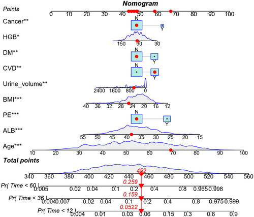
Figure 5. The time–AUC curve analyses between the training set (A) and the validation set (B).
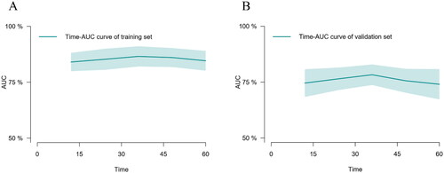
Figure 6. Calibration plot of nomogram predicted probability of 1-year (A), 3-year (B), and 5-year (C) all-cause mortality in training set, and 1-year (a), 3-year (b), and 5-year (c) in validation set. The dashed line represents an ideal evaluation, whereas the red line represents the performance of the nomogram.
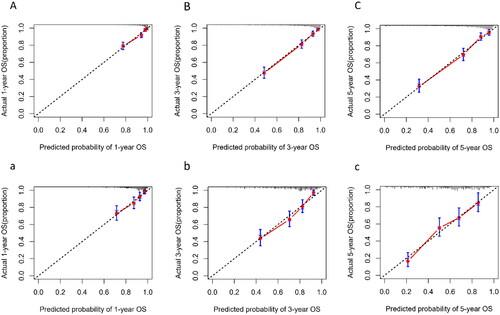
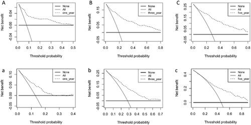
Figure 7. Decision curve evaluates the clinical benefit of the nomogram prediction model for 1-year (A), 3-year (B), and 5-year (C) in training set, and 1-year (a), 3-year (b), and 5-year (c) in validation set. The dashed line represents the nomogram. The black horizontal line represents the net benefit when no patients were considered to exhibit death, while the gray real line represents the net benefit when all patients were considered to exhibit death.
Data availability statement
The data underlying this article will be shared on reasonable request to the first author and corresponding author.