
Figures & data
Table 1. Coding example in theme: It affects all aspects of living.
Table 2. Participant characteristics.
Figure 1. Five main themes of SHS after ABI.
A graph presenting the five main themes in five separate boxes, encircling a box in the middle named Sensory Hypersensitivity. Graph with four boxes encircling a fifth box with the text: Sensory Hypersensitivity. The four boxes include the following captions in clockwise order: 1. A mismatch between resources and demands; 2. Altered experience of ordinary stimuli; 3. It affects all aspects of daily living; 4. Avoid, approach, accept. A sixth box is presented underneath this circle, named: 5. It’s highly heterogeneous.
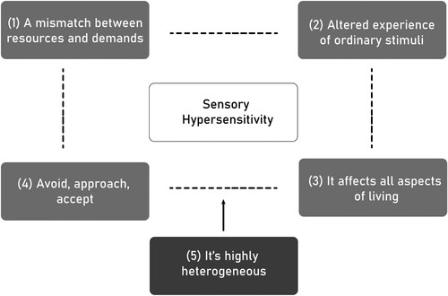
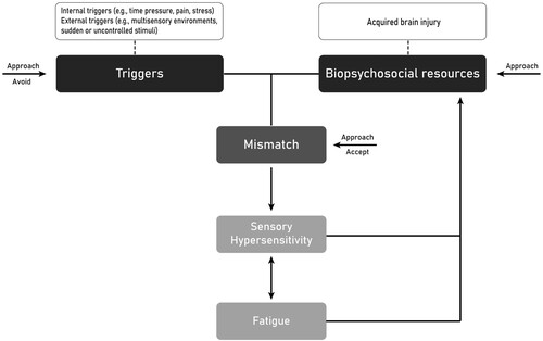
Figure 2. Proposed model that describes the triggers and maintenance of SHS symptoms after ABI.
Note. The boxes containing triggers and acquired brain injury could be replaced by individualized factors such as other triggers, or circumstances that impact an individual’s biopsychosocial resources.
A graph presenting the proposed model by using boxes with captions and arrows to connect them. There are two main boxes at the top of the image named triggers (left) and biopsychosocial resources (right). Above them, there are two boxes attached with a dashed line including internal and external triggers (left) and acquired brain injury (right), which serve as examples of input for triggers and biopsychosocial resources. Triggers and biopsychosocial resources are connected with a solid line that also connects to another box underneath them named: mismatch. From mismatch there is an arrow down towards a box named sensory hypersensitivity. Under sensory hypersensitivity, there is a bi-directional arrow connecting to a box titled fatigue. Both sensory hypersensitivity and fatigue have an arrow feeding back to the top into biopsychosocial resources. Furthermore, there are little arrows describing the level at which certain coping strategies act to decrease sensory hypersensitivity. There is one arrow towards triggers for approach and avoid. There is one arrow towards biopsychosocial resources for approach. And lastly, an arrow for approach and accept pointing towards mismatch.
Supplemental material