Figures & data
Table 1. A selection of software for Bayesian and maximum likelihood phylogenetic inference. The second column lists the most recent released version at the time of writing and the specified features apply to this version. The listed properties are the method of tree inference (BI or ML), whether the program supports data partitioning, the implemented models of sequence evolution, and the options to deal with rate variation across sites. The last two columns specify whether the program can be run in parallel (i.e. can make use of multiple processors to speed up analyses and/or do more thorough tree searches) and the availability of the program (web means that analyses can be run remotely on a web server). Note that in addition to the DNA based models listed here, most programs implement additional models for analysis of amino-acid, binary and n-state discrete data types.
Fig. 1. Model parameters often differ among markers in a multi-marker dataset. This graph illustrates differences between model parameters for a red algal multi-marker dataset. Base frequencies show lower AT content in 28S than rbcL, while the ratio between transitions and transversions, and the shape parameter of the Γ distribution (α) also differ between markers.
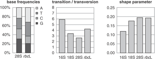
Fig. 2. Model parameters usually differ quite strongly among codon positions of protein-coding genes. These graphs show differences between model parameters for a green algal dataset comprising atpB and rbcL sequences. The base frequencies graph shows marked differences in base composition among codon positions (cp1, cp2, cp3), with a strong AT bias at third codon positions. The fourth column represents the global frequencies, which are not representative for first and third codon positions.
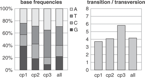
Fig. 3. Manual selection of models using the Akaike Information Criterion. The scheme illustrates the four steps that need to be taken to calculate the AIC score of a set of user-specified combinations of partitions and models. The combination receiving the lowest AIC score can be used in further analyses. The table shows the fit of various partitioning strategies and models to a dataset of two plastid genes (rbcL and atpB) for representatives of the Viridiplantae. The AIC scores are represented with colour codes, red indicating high scores (poor fit to the data) and green indicating low scores (good fit), Whereas partitioning into genes does not improve model fit, partitioning into codon positions yields a significant increase. Adding among-site rate variation to the models (+Γ4) also yields considerable increase in model fit. The lowest score, however, is that obtained with a simplified version of the GY94 codon substitution model, illustrating that models with extra biochemical realism better fit the data than standard and partitioned nucleotide models.
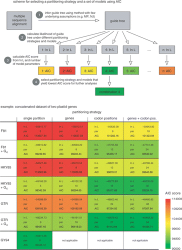
Table 2. Selection of software that performs model selection in a more or less automated way.
Fig. 4. Visual methods for detecting saturation in molecular phylogenetic datasets. The three graphs on the left show how plotting uncorrected versus corrected pairwise genetic distances allow assessment of the degree of substitutional saturation in a dataset. The dashed line indicates the expected correlation in the absence of saturation (i.e. uncorrected distances equal corrected distances). The datasets in the three plots were generated by simulating markers evolving at different rates along the same tree, facilitating comparison between the three panels. The top panel represents the slowest marker and does not deviate far from the dashed line. The centre plot shows the results for a marker evolving at an intermediate rate. The bottom panel shows the strongest deviation from the dashed line, indicating strong saturation in this fast marker. Note the different scales along the x-axis. The top right panel illustrates how the slope of the linear regression through the saturation curve can be used as a measure of the amount of saturation in a dataset. The data in this plot are for the slow and intermediate markers from the previous graphs. The triangles in the lower right of the figure illustrate likelihood mapping. The left panel shows the parts of the graph indicating tree-like signal (corners, indicated with +), conflicting signal (along the sides) or the lack of signal (in the centre). The centre panel shows the application of this technique to a red algal rbcL dataset of 20-taxa (Hommersand et al., Citation2006). A great majority of points are located in the corners, indicating that the quartets in this dataset are tree-like. When only third codon positions are considered (right panel), a substantially larger amount of the quartets were unresolved, indicating moderate saturation at third codon positions.
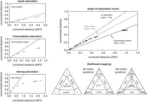
Fig. 5. Graph showing distribution of substitution rates at first (cp1), second (cp2) and third (cp3) codon positions in a green algal dataset composed of the plastid rbcL and atpB genes. Whereas first and second positions evolve slowly, third codon positions show a broad rate distribution.
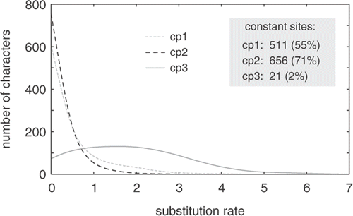
Fig. 6. Consensus networks are useful to visualize conflict between two or more trees in a single graph.
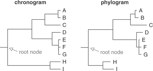
Fig. 7. Comparison of a chronogram and a phylogram. In a chronogram, branch lengths are proportional to time and root-to-tip path lengths are equal. In a phylogram inferred from sequence data, branch lengths are proportional to the number of substitutions along the branches and root-to-tip path lengths are usually unequal.