
Figures & data
Figure 1. The case distribution of amyloidoses in which proteomic data has been reported in the literature. Point size refers to the number of amyloidosis cases typed via LC-MS/MS in the respective organ sample. In three cases, the samples were derived from more than one organ type: *heart and digestive tract; **lung and skin; ***heart, subcutaneous fat aspirate (SFA), and colon/rectum. The nomenclature of the amyloid fibril is according to Benson et al. (Citation2020).
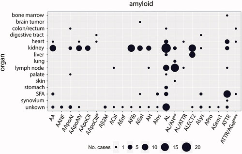
Figure 2. A heatmap examining protein occurrence in amyloid samples analyzed with LC-MS/MS. Proteins are categorized according to their fibril formation ability into either amyloid proteome-category 1 (APC1), which contains only fibril-forming proteins in the patient; APC2: potentially fibril-forming proteins found in other types of amyloidosis.; APC3: regular amyloid components, where most are likely involved in amyloidosis pathogenesis; APC4: normal tissue constituents, that might play a role in amyloid formation. Protein names were taken from the UniProt entry name, and only human proteins are listed. Apo-CII and Apo-CIII fibril proteins are not shown as less than 10 samples were reported. Each heatmap cell is colored based on the ratio comparing the number of positive samples to the total number of samples tested per protein (left) for the corresponding organ (bottom) and amyloid type (top). White cells correspond to missing values. Proteins are arranged according to the protein with the highest ratio for all amyloid types and organs analyzed. A simple right annotation shows the median spectral number for each category per protein. The bar graph illustrates the absolute number of positive and negative samples analyzed per protein. *AANF; **AApoCII; ***median value for number of spectra categories between the >21 and 11–20 groups. H: heart; K: kidney; SFA: subcutaneous fat aspirate; X: unknown; CR: colon/rectum; P: palate; D: digestive tract; B: brain tumor; LN: lymph node; ST: stomach; S: skin; LI: liver; LU: lung; BM: bone marrow; SY: synovium (see colour version of this figure at https://www.tandfonline.com/ibmg).
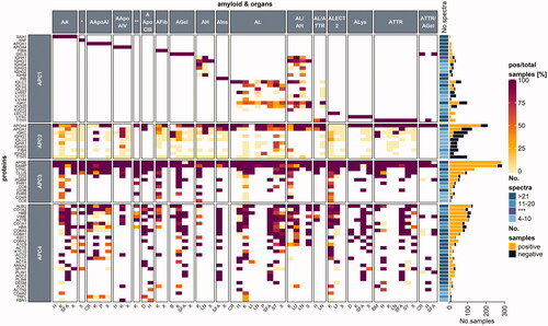
Figure 3. STRING protein network analysis. Putative protein interactions are indicated using differently colored lines: curated database entries (pink), experimentally determined interactions (light blue), correlated gene expression (black), protein homology (light purple), and textmining (green). Only highest confidence interactions (0.900) are depicted (see colour version of this figure at https://www.tandfonline.com/ibmg).
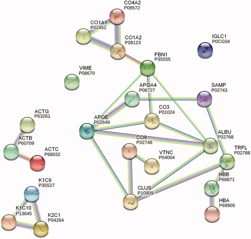
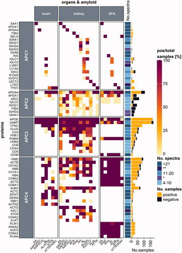
Figure 4. Protein distribution among heart and kidney tissues and SFA samples. Proteins are categorized according to their occurrence in one, two or three of the respective tissue types. Protein names refer to the UniProt entry name, and only human proteins are listed. Each heatmap cell is colored based on the ratio comparing the number of positive samples to the total number of samples tested per protein (left) for the corresponding amyloid type (bottom) and organ (top) type. White cells correspond to missing values. Proteins are arranged according to the protein with the highest ratio for all amyloid types and organs analyzed. A simple right annotation shows the median spectral number for each category per protein. The bar graph refers to the absolute number of positive and negative samples analyzed per protein. *median value for the number of spectra categories between the 11–20 and 4–10 groups (see colour version of this figure at https://www.tandfonline.com/ibmg).