
Figures & data
Figure 1. TTR structures revealing small molecule and protein binding sites. (A) Crystal structure of tetrameric TTR bound to the small molecule kinetic stabiliser tafamidis (PDB ID: 3TCT). Each of the four monomers in the tetramer is coloured differently. The small molecule binding sites, occupied by tafamidis, are indicated with orange arrows. (B) Crystal structure of tetrameric TTR bound to Retinol Binding Protein in purple (PDB ID: 1RLB).
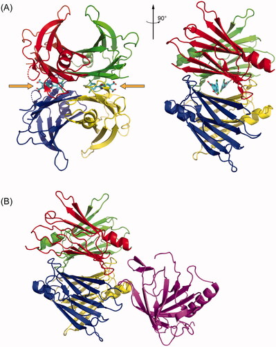
Figure 2. Box plots of the plasma concentrations of native, total, and non-native TTR at baseline stratified by response classification—Non-Responders (NR), Partial Responders (PR), and Responders (R)—and patient sex. (A) Concentrations of native TTR measured by the A2-UPLC method. (B) Concentrations of total TTR measured by the SDS-PAGE/IB method. (C) Concentrations of non-native TTR, calculated as the difference between the total TTR and native TTR for patients for whom both measurements are available. (D) Ratio of plasma native to total TTR concentration. In all box plots, the upper and lower fences represent the maximum and minimum values of the data; the top and bottom of the boxes represent the 1st and 3rd quartiles; and the white lines represent the median. The white diamonds are drawn with their centre at the data mean and their upper and lower points span the 95% confidence interval for the mean. Blue hatch marks represent individual data points.
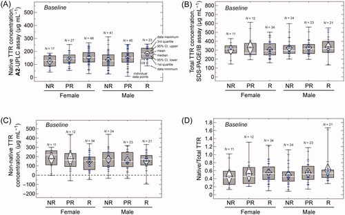
Figure 3. Plasma concentrations, and changes in concentration, of native TTR at 12 and 24 months of tafamidis treatment measured by the A2-UPLC method and stratified by response classification—Non-Responders (NR), Partial Responders (PR), and Responders (R)—and patient sex. (A) Plasma concentrations of native TTR at 12 months. (B) Changes in plasma concentrations of native TTR from baseline to 12 months. (C) Plasma concentrations of native TTR at 24 months. (D) Changes in plasma concentrations of native TTR from baseline to 24 months. (E) Changes in plasma concentrations of native TTR from 12 months to 24 months. (F) A plot of the measured (y-axis) vs. expected (x-axis) plasma native TTR concentrations. Expected concentrations were calculated using the best fit of EquationEquation (1)(1)
(1) , for which r2 = 0.27. The dashed line has a slope of 1 and goes through the origin, for reference. Small, light blue circles represent individual measurements. Larger, dark blue circles represent the averages for each of the 18 sub-groups—2 patient sexes (male, female) × 3 response categories (Non-Responder, Partial Responder, Responder) × 3 sample times (baseline, 12-month, 24-month). That these averages fall very close to the dashed line indicates that, despite the variability in the experimental data, EquationEquation (1)
(1)
(1) represents a good model for the native TTR plasma concentrations. Box plot features are as in .
![Figure 3. Plasma concentrations, and changes in concentration, of native TTR at 12 and 24 months of tafamidis treatment measured by the A2-UPLC method and stratified by response classification—Non-Responders (NR), Partial Responders (PR), and Responders (R)—and patient sex. (A) Plasma concentrations of native TTR at 12 months. (B) Changes in plasma concentrations of native TTR from baseline to 12 months. (C) Plasma concentrations of native TTR at 24 months. (D) Changes in plasma concentrations of native TTR from baseline to 24 months. (E) Changes in plasma concentrations of native TTR from 12 months to 24 months. (F) A plot of the measured (y-axis) vs. expected (x-axis) plasma native TTR concentrations. Expected concentrations were calculated using the best fit of EquationEquation (1)(1) [TTR]nat=c0+cM×M+cP×P+cR×R+c12×T12+c24×T24(1) , for which r2 = 0.27. The dashed line has a slope of 1 and goes through the origin, for reference. Small, light blue circles represent individual measurements. Larger, dark blue circles represent the averages for each of the 18 sub-groups—2 patient sexes (male, female) × 3 response categories (Non-Responder, Partial Responder, Responder) × 3 sample times (baseline, 12-month, 24-month). That these averages fall very close to the dashed line indicates that, despite the variability in the experimental data, EquationEquation (1)(1) [TTR]nat=c0+cM×M+cP×P+cR×R+c12×T12+c24×T24(1) represents a good model for the native TTR plasma concentrations. Box plot features are as in Figure 2.](/cms/asset/548c894e-0719-4857-9653-ddafbbfe3f2e/iamy_a_2126308_f0003_c.jpg)
Figure 4. Plasma concentrations, and changes in concentration, of total and non-native TTR at 24 months of tafamidis treatment measured by the SDS-PAGE/IB method or calculated as the difference between total and native TTR concentrations and stratified by response category—Non-Responders (NR), Partial Responders (PR), and Responders (R)—and patient sex. (A) Plasma concentrations of total TTR at 24 months. (B) Changes in plasma concentrations of total TTR from baseline to 24 months. (C) A plot of the measured (y-axis) vs. expected (x-axis) plasma total TTR concentrations. Expected concentrations were calculated using the best fit of EquationEquation (2)(2)
(2) , for which r2 = 0.03. The dashed line has a slope of 1 and goes through the origin, for reference. Small, light blue circles represent individual measurements. Larger, dark blue circles represent the averages for each of the 18 sub-groups. (D) Plasma concentrations of non-native TTR. (E) Changes in plasma concentrations of non-native TTR from baseline to 24 months. (F) Ratio of native to total TTR plasma concentration after 24 months of tafamidis treatment. Box plot features are as in .
![Figure 4. Plasma concentrations, and changes in concentration, of total and non-native TTR at 24 months of tafamidis treatment measured by the SDS-PAGE/IB method or calculated as the difference between total and native TTR concentrations and stratified by response category—Non-Responders (NR), Partial Responders (PR), and Responders (R)—and patient sex. (A) Plasma concentrations of total TTR at 24 months. (B) Changes in plasma concentrations of total TTR from baseline to 24 months. (C) A plot of the measured (y-axis) vs. expected (x-axis) plasma total TTR concentrations. Expected concentrations were calculated using the best fit of EquationEquation (2)(2) [TTR]tot=γ0+γM×M+γP×P+γR×R+γ24×T24(2) , for which r2 = 0.03. The dashed line has a slope of 1 and goes through the origin, for reference. Small, light blue circles represent individual measurements. Larger, dark blue circles represent the averages for each of the 18 sub-groups. (D) Plasma concentrations of non-native TTR. (E) Changes in plasma concentrations of non-native TTR from baseline to 24 months. (F) Ratio of native to total TTR plasma concentration after 24 months of tafamidis treatment. Box plot features are as in Figure 2.](/cms/asset/8fc22acd-692c-4b91-bde3-2b8a81d0123f/iamy_a_2126308_f0004_c.jpg)
Table 1. Genetic, clinical, and demographic features of the study population.a
Figure 5. Tafamidis plasma concentrations stratified by response classification and patient sex and the effect of tafamidis on TTR stability. (A) Box plot of tafamidis plasma concentrations 12 months after initiation of therapy. (B) Box plot of tafamidis plasma concentrations 24 months after initiation of therapy. (C) A plot of funbound – where funbound is the ratio of TTR subunit exchange rate in each patient after 12 or 24 months of tafamidis treatment (kex) to that at baseline (kdiss)—vs. plasma tafamidis concentration at the 12- or 24-month time point (N = 388). The solid curve represents the best fit of a model for tafamidis binding to TTR in patient plasma in the presence of albumin, which competes with TTR for tafamidis binding. This curve was calculated using Kd1 = 25.8 ± 1.4 nM, the best-fit value of the dissociation constant for a single tafamidis molecule binding to TTR; Kd,Alb = 1.8 µM, the previously determined dissociation constant for tafamidis binding to albumin [Citation7]; and the overall post-treatment mean plasma concentrations of native TTR (223 µg mL−1, or 4.05 μM tetramer) and albumin (45 g L−1, or 680 μM) across all patients at the 12- and 24-month time points. (D) Calculated values of funbound (= 1 – fbound) for TTR in the plasma of tafamidis-treated ATTRV30M-PN patients based on the best fit value of Kd1, the known value of Kd,Alb, and the measured tafamidis, native TTR, and albumin concentrations in each patient’s plasma. Small, light blue and orange circles represent the values for individual patients at the 12- and 24-month time points, respectively. Larger, darker blue and orange circles represent the mean values for the patient subgroups at the 12- and 24-month time points, respectively. Error bars represent the standard error of the mean. Box plot features are as in .
![Figure 5. Tafamidis plasma concentrations stratified by response classification and patient sex and the effect of tafamidis on TTR stability. (A) Box plot of tafamidis plasma concentrations 12 months after initiation of therapy. (B) Box plot of tafamidis plasma concentrations 24 months after initiation of therapy. (C) A plot of funbound – where funbound is the ratio of TTR subunit exchange rate in each patient after 12 or 24 months of tafamidis treatment (kex) to that at baseline (kdiss)—vs. plasma tafamidis concentration at the 12- or 24-month time point (N = 388). The solid curve represents the best fit of a model for tafamidis binding to TTR in patient plasma in the presence of albumin, which competes with TTR for tafamidis binding. This curve was calculated using Kd1 = 25.8 ± 1.4 nM, the best-fit value of the dissociation constant for a single tafamidis molecule binding to TTR; Kd,Alb = 1.8 µM, the previously determined dissociation constant for tafamidis binding to albumin [Citation7]; and the overall post-treatment mean plasma concentrations of native TTR (223 µg mL−1, or 4.05 μM tetramer) and albumin (45 g L−1, or 680 μM) across all patients at the 12- and 24-month time points. (D) Calculated values of funbound (= 1 – fbound) for TTR in the plasma of tafamidis-treated ATTRV30M-PN patients based on the best fit value of Kd1, the known value of Kd,Alb, and the measured tafamidis, native TTR, and albumin concentrations in each patient’s plasma. Small, light blue and orange circles represent the values for individual patients at the 12- and 24-month time points, respectively. Larger, darker blue and orange circles represent the mean values for the patient subgroups at the 12- and 24-month time points, respectively. Error bars represent the standard error of the mean. Box plot features are as in Figure 2.](/cms/asset/08a8a303-9ce4-4fa3-ae51-d04b426cf334/iamy_a_2126308_f0005_c.jpg)