Figures & data
Figure 1. Flowchart of study participants.
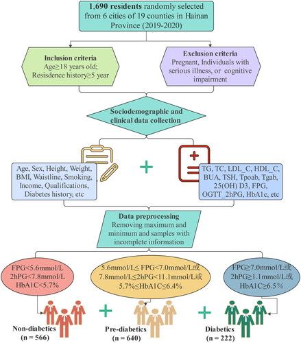
Table 1. The sociodemographic and clinical characteristics of participants.
Figure 2. Feature selection based on LASSO model. (A–B) The ten time cross validation for tuning parameter selection in the LASSO model. The binomial deviance curve was plotted versus log (λ), where λ is the tuning parameter. (C–D) Plots for LASSO regression coefficients over different values of the penalty parameter. LASSO: least absolute shrinkage and selection operator.
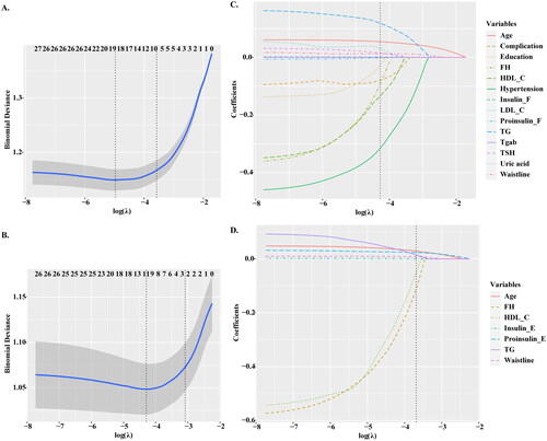
Figure 3. Comparison of AUROC between LASSO model and other prediction algorithms. (A) AUROC for prediabetes models. (B) AUROC for diabetes models. AUROC: area under the receiver operating characteristic; AUC: area under the curve; LASSO: least absolute shrinkage and selection operator; RF: Random Forest; SVM: Support Vector Machine; LR: logistic regression; LDA: Latent Dirichlet allocation; NB: Naive Bayes.
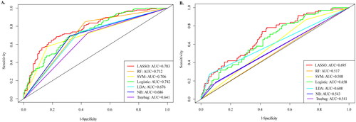
Table 2. Comparison of effects for each model.
Figure 4. Nomogram model for predicting prediabetes and diabetes. (A) Nomogram for predicting the risk of nondiabetes to prediabetes. (B) Nomogram for predicting the risk of prediabetes to diabetes. The value of each of variable was given a score on the point scale axis. A total score could be easily calculated by adding each single score and, by projecting the total score to the lower total point scale, we were able to estimate the probability of prediabetes and diabetes, respectively.
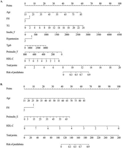
Table 3. Multivariate logistic regression in the prediabetics and diabetics model for optimal prediction factors selection.
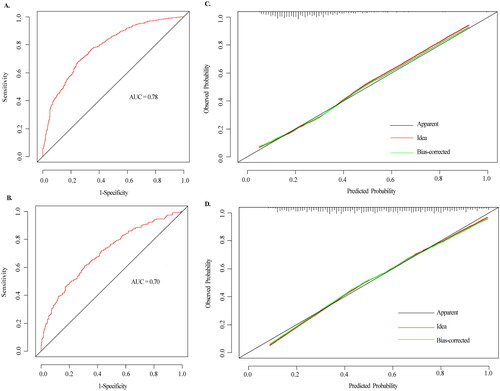
Figure 5. The ROC curves and calibration curves of the nomogram. (A–B) The ROC curves of the nomogram model of prediabetes and diabetes, respectively. The x-axis represents 1-specifcity, and the y-axis represents sensitivity. The part below the green line is the area under the ROC curve of the model. (C–D) Calibration curves of the nomogram. The x-axis represents the predicted probability of prediabetes and diabetes, respectively. The y-axis represents the actual diagnosed of prediabetes and diabetes, respectively. The red dashed line represents the perfect prediction with the same predicted probability as the actual probability. The black dashed line represents the performance of the nomogram and the green solid line represents the performance of the model after calibration. The closer the calibration curve of the model is to the yellow dashed line, the better the model prediction is represented.