
Figures & data
Table 2. Overview of project stages and resources.
Figure 1. Responses to the survey questions on self-rated topical and methodological knowledge. The top bar represents the teams' answers about their knowledge regarding religion and well-being and the bottom bar represents the teams' answers about their knowledge regarding methodology and statistics. For each item, the number to the left of the data bar (in brown/orange) indicates the percentage of teams that reported little to no knowledge. The number in the center of the data bar (in grey) indicates the percentage of teams that were neutral. The number to the right of the data bar (in green/blue) indicates the percentage of teams that reported (some) expertize.
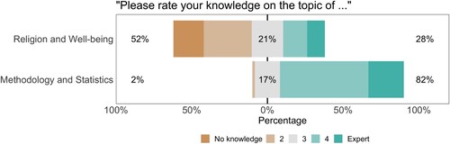
Table 1. Career stages and domains of expertize featured in the 120 analysis teams.
Table 3. Analytic approaches taken by the analysis teams.
Figure 2. Beta coefficients for the effect of religiosity on self-reported well-being (research question 1) with 95% confidence or credible intervals. Green/blue points indicate effect sizes of teams that subjectively concluded that there is good evidence for a positive relation between individual religiosity and self-reported well-being, grey points indicate effect sizes of teams that subjectively concluded that the evidence is ambiguous, and brown/orange points indicate effect sizes of teams that subjectively concluded that there is good evidence against a positive relation between individual religiosity and self-reported well-being. The betas are ordered from smallest to largest.
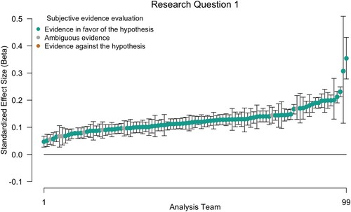
Figure 3. Responses to the survey questions about the likelihood of hypothesis 1. The left side of the figure shows the change in beliefs for each analysis team. Fifty percent of the teams considered the hypothesis somewhat more likely after having analyzed the data than prior to seeing the data, 18% considered the hypothesis less likely after having analyzed the data, and 32% did not change their beliefs. Likelihood was measured on a 7-point Likert scale ranging from “very unlikely” to “very likely.” Points are jittered to enhance visibility. The right side of the figure shows the distribution of the Likert response options before and after having conducted the analyzes. The number at the top of the data bar (in green/blue) indicates the percentage of teams that considered the hypothesis (very) likely, the number in the center of the data bar (in grey) indicates the percentage of teams that were neutral, and the number at the bottom of the data bar (in brown/orange) indicates the percentage of teams that considered the hypothesis (very) unlikely.
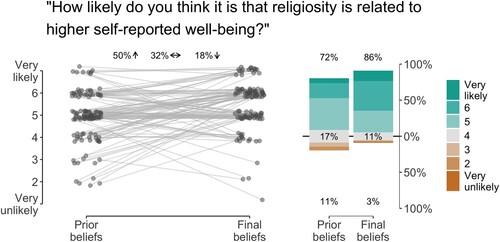
Figure 4. Beta coefficients for the effect of cultural norms of the relation between religiosity and self-reported well-being (research question 2) with 95% confidence or credible intervals. Green/blue points indicate effect sizes of teams that subjectively concluded that there is good evidence for the hypothesis that the relation between individual religiosity and self-reported well-being depends on the perceived cultural norms of religion, grey points indicate effect sizes of teams that subjectively concluded that the evidence is ambiguous, and brown/orange points indicate effect sizes of teams that subjectively concluded that there is good evidence against the hypothesis that the relation between individual religiosity and self-reported well-being depends on the perceived cultural norms of religion. The betas are ordered from smallest to largest.
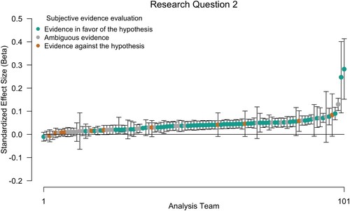
Figure 5. Responses to the survey questions about the likelihood of hypothesis 2. The left side of the figure shows the change in beliefs for each analysis team. Twenty-seven percent of the teams considered the hypothesis somewhat more likely after having analyzed the data than prior to seeing the data, 45% considered the hypothesis less likely having analyzed the data, and 28% did not change their beliefs. Likelihood was measured on a 7-point Likert scale ranging from “very unlikely” to “very likely.” Points are jittered to enhance visibility. The right side of the figure shows the distribution of the Likert response options before and after having conducted the analyzes. The number at the top of the data bar indicates the percentage of teams that considered the hypothesis (very) likely, the number in the center of the data bar (in grey) indicates the percentage of teams that were neutral, and the number at the bottom of the data bar (in brown/orange) indicates the percentage of teams that considered the hypothesis (very) unlikely.
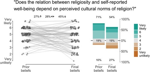
Figure 6. Responses to the survey questions about the suitability of the dataset for answering the research questions (top) and the teams' confidence in their analytic approach (bottom). For question 1, the top bar represents the teams' answers with respect to research question 1 and the bottom bar represents the teams' answers for research question 2. For each item, the number to the left of the data bar (in brown/orange) indicates the percentage of teams that considered the data (very) unsuitable/were not (at all) confident in their approach. The number in the center of the data bar (in grey) indicates the percentage of teams that were neutral. The number to the right of the data bar (in green/blue) indicates the percentage of teams that considered the data (very) suitable/were (very) confident in their approach.
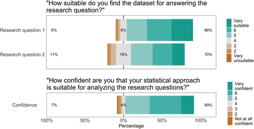
Figure 7. Items included as dependent variables for research question 1 (on the left) and research question 2 (on the right). Note that the averages for the well-being subscales (“Mean Psychological,” “Mean Social,” “Mean Physical”), as well as the overall average (“Mean Overall”) were provided by the MARP team.
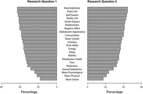
Figure 8. Items included as independent variables for research question 1 (on the left) and research question 2 (on the right). Variables indicated as “external” refer to variables that are based on data not provided by the MARP team.
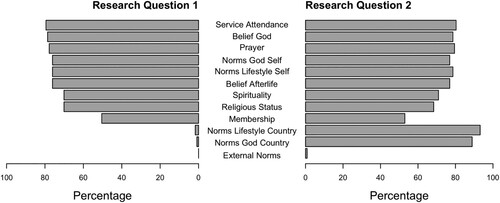
Figure 9. Items included as covariates for research question 1 (on the left) and research question 2 (on the right). Variables indicated as “external” refer to covariates that are based on data not provided by the MARP team.
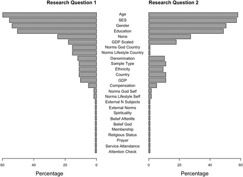
Figure 10. Responses to the survey questions about effort (top), frustration (middle), and workload (bottom). For each question, the top bar represents the teams' answers about stage 1 (planning) and the bottom bar represents the teams' answers about stage 2 (executing). For each item, the number to the left of the data bar (in brown/orange) indicates the percentage of teams that considered effort/frustration/workload (very) low. The number in the center of the data bar (in grey) indicates the percentage of teams that were neutral. The number to the right of the data bar (in green/blue) indicates the percentage of teams that considered effort/frustration/workload (very) high.
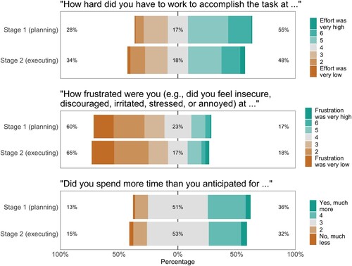
Figure 11. Reported effect sizes (beta coefficients) and subjective beliefs about the likelihood of the hypothesis. A. shows the relation between effect size and prior beliefs for research question 1, B. shows the relation between effect size and final beliefs for research question 1, C. shows the relation between effect size and prior beliefs for research question 2, and D. shows the relation between effect size and final beliefs for research question 2. Points are jittered on the x-axis to enhance visibility. The dashed line represents an effect size of 0. The data are separated by subjective evaluation of the evidence; green/blue points reflect the conclusion that there is good evidence for the hypothesis, grey points reflect the conclusion that the evidence is ambiguous, and brown/orange points indicate the conclusion that there is good evidence against the hypothesis. Histograms at the top represent the distribution of subjective beliefs and the density plots on the right represent the distribution of reported effect sizes.
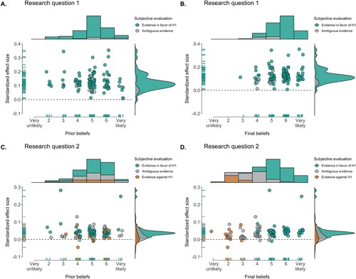
Figure 12. Reported effect sizes (beta coefficients) and self-reported team expertize. A. shows the relation between effect size for research question 1 and methodological knowledge, B. shows the relation between effect size for research question 1 and theoretical knowledge, C. shows the relation between effect size and for research question 2 and methodological knowledge, and D. shows the relation between effect size for research question 2 and theoretical knowledge. Points are jittered on the x-axis to enhance visibility. The dashed line represents an effect size of 0. The data are separated by subjective evaluation of the evidence; green/blue points reflect the conclusion that there is good evidence for the hypothesis, grey points reflect the conclusion that the evidence is ambiguous, and brown/orange points indicate the conclusion that there is good evidence against the hypothesis. Histograms at the top represent the distribution of reported expertize and the density plots on the right represent the distribution of reported effect sizes.
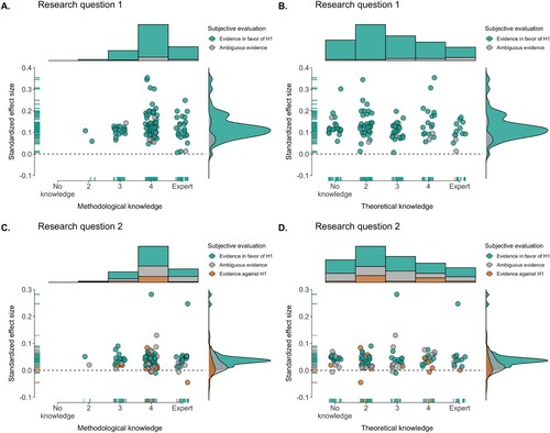
Table A1. Descriptive statistics of the cross-cultural data.
Table A2. Religious denomination in the cross-cultural data.
Table A3. Items included as dependent variables for research question 1 by each team.
Table A3. Continued.
Table A4. Items included as dependent variables for research question 2 by each team.
Table A4. Continued.
Table A5. Items included as independent variables for research question 1 by each team.
Table A5. Continued.
Table A6. Items included as independent variables for research question 2 by each team.
Table A6. Continued.
Table A7. Covariates included for research question 1 by each team.
Table A7. Continued.
Table A8. Covariates included for research question 2 by each team.
Table A8. Continued.