
Figures & data
Table 1. Surveys and dates of individual waves (fieldwork dates).
Table 2. Detailed information for countries by: survey, number of waves in the survey and years, total and average sample size in the survey, total number of waves in the survey, total and average sample for all surveys.
Table 3. Structure of the DIM-R dataset by total number of respondents by survey and wave.
Table 4. Analytical sample sizes used for DIM-R harmonization by surveys.
Table 5. Coding scheme for the implied probability of weekly church attendance, by study and years.
Table 6. Coding scheme for the implied probability of weekly prayer, by study and years.
Table 7. Distribution of the integrated denominational affiliation variable in the survey waves.
Table 8. Countries and surveys (ESS, ISSP, EVS/WVS) and numbers of Christian respondents.
Table 9. Countries and surveys (ISSP, EVS/WVS) and numbers of Christian respondents.
Figure 1. Visualization (Bates et al., Citation2015) of implied self-declared religiosity (IMP_SDR). 1A (top) frequency shows how IMP_SDR decreases by cohort. 1B (bottom left) boxplots present the frequency distribution for the 3 surveys, with medians and means (red hollow circles). 1C (bottom right) histogram shows the distribution of the aggregated variable.
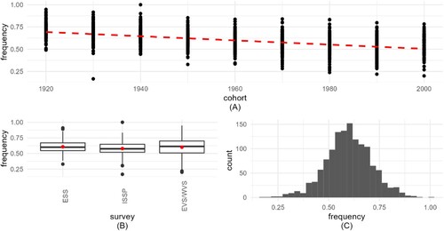
Figure 2. Visualization of implied probability of weekly prayer (IMP_WPR). 2A (top) frequency shows how IMP_WPR decreases by cohort. 2B (bottom left) boxplots present the frequency distribution for the 3 surveys, with medians and means (red circles). 2C (bottom right) histogram shows the distribution of the aggregated variable.
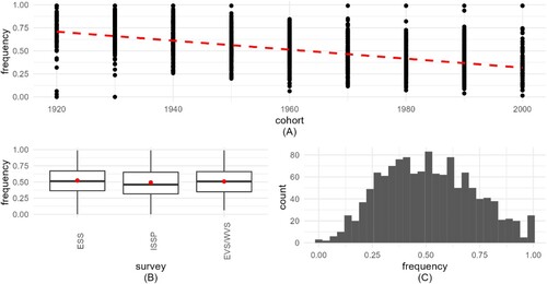
Figure 3. Visualization of implied probability of weekly service attendance (IMP_ATT). 3A (top) frequency shows how IMP_WPR decreases by cohort. 3B (bottom left) boxplots present the frequency distribution for the 3 surveys, with medians and means (red circles). 3C (bottom right) histogram shows the distribution of the aggregated variable.
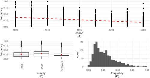
Table 10. Descriptive statistics for IMP_SDR, IMP_WPR, IMP_ATT.
Table 11. Summary of model 1 for the three aggregate variables (ML estimation method).
Table 12. Summary of best-fit model 3 for variables IMP_SRD and IMP_WPR and model 2 for variable IMP_ATT (ML estimation method).
Figure 4. Visualization of implied self-declared religiosity (IMP_SDR). 4A (top) frequency shows how IMP_SDR decreases by cohort. 4B (bottom left) boxplots present the frequency distribution for the 2 surveys, with medians and means (red circles). 4C (bottom right) histogram shows the distribution of the aggregated variable.
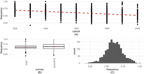
Figure 5. Visualization of implied probability of weekly prayer (IMP_WPR). 5A (top) frequency shows how IMP_WPR decreases by cohort. 5B (bottom left) boxplots present the frequency distribution for the 2 surveys, with medians and means (red circles). 5C (bottom right) histogram shows the distribution of the aggregated variable.
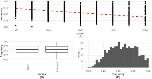
Figure 6. Visualization of implied probability of weekly service attendance (IMP_ATT). 6A (top) frequency shows how IMP_ATT decreases by cohort. 6B (bottom left) boxplots present the frequency distribution for the 2 surveys, with medians and means (red circles). 6C (bottom right) histogram shows the distribution of the aggregated variable.
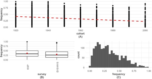
Table 13. Descriptive statistics for dependent variables (IMP_SDR, IMP_WPR, IMP_ATT).
Table 14. Summary of model 1 for the three dependent variables (ML estimation method).
Table 15. Summary of best-fit model 3 for the three dependent variables (ML estimation method).
Figure 7. Visualization for analysis 1 of the random effect sizes (x-axis) of the three dependent variables explained by the three/two random-effect variables: survey (left column), WaveYear (middle column), and country (right column). The top row shows results for self-declared religiosity, the middle row for the probability of weekly prayer, and the bottom row for the probability of weekly service attendance.
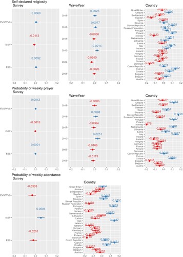
Figure 8. Visualization for analysis 2 of the random effect sizes (x-axis) of the three dependent variables explained by the three random-effect variables: survey (left column), WaveYear (middle column), and country (right column). The top row shows results for self-declared religiosity, the middle row the probability of weekly prayer, and the bottom row for the probability of weekly service attendance.
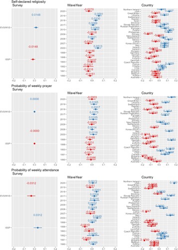
Figure 9. Prediction plots of the three variables for model 3 (IMP_SDR and IMP_WPR) and model 2 (IMP_ATT). This figure illustrates the prediction plots for three key variables obtained from two distinct models. Model 3 focuses on predicting IMP_SDR and IMP_WPR, while Model 2 is dedicated to forecasting IMP_ATT. Each line represents the model's prediction over a specified time period, and the corresponding shaded regions indicate the associated confidence intervals. The x-axis denotes the cohorts, while the y-axis represents the predicted values. The comparison between the predicted values and actual observations offers insights into the model's accuracy and reliability in forecasting both IMP_SDR, IMP_WPR, and IMP_ATT.
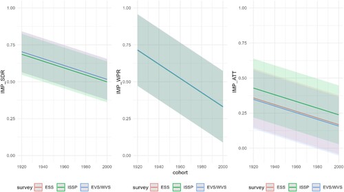
Table 16. Summary of 3 dependent variables with REML estimation for model three and two.
Figure 10. Prediction plots of the three variables for model 3. This figure illustrates the prediction plots for three key variables obtained from two distinct models. Model 3 focuses on predicting IMP_SDR, IMP_WPR, and IMP_ATT. Each line represents the model's prediction over a specified time period, and the corresponding shaded regions indicate the associated confidence intervals. The x-axis denotes the cohorts, while the y-axis represents the predicted values. The comparison between the predicted values and actual observations offers insights into the model's accuracy and reliability in forecasting both IMP_SDR, IMP_WPR, and IMP_ATT.
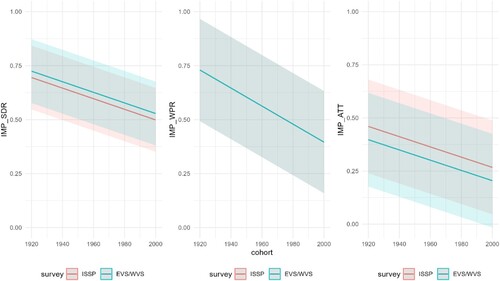
Figure 11. Diagnostic charts for the third model with the dependent variable IMP_SDR. The PPC chart can show the actual observations compared to the data generated by the model. This allows you to assess whether the distributions of the generated data are consistent with the actual data. The Linearity chart shows whether the residuals are evenly distributed along the x-axis. If the residuals are random and show no pattern to the predicted values, this suggests that the model captures the linearity of the relationship between the variables well. The Homogeneity of Variance chart helps assess whether the variances of the residuals are equal for different levels of predicted values. The Normality of Residuals chart shows whether the residuals of the model have a normal distribution. The trend line should be close to a straight line. Separate Random Effects Normality charts for the country, survey and WaveYear categories allow you to assess whether the random effects for different levels of these variables have a normal distribution. The Influential Observations chart identifies observations that can significantly affect model parameter estimates.
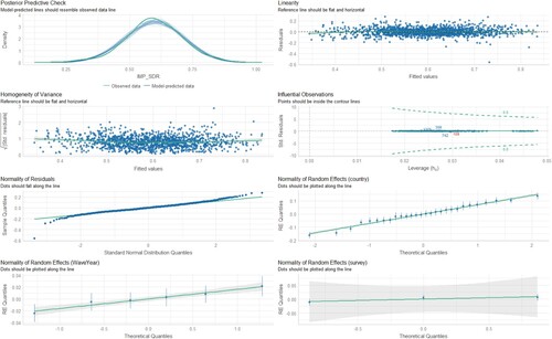
Figure 12. Diagnostic charts for the third model with the dependent variable IMP_WPR. The PPC chart can show the actual observations compared to the data generated by the model. This allows you to assess whether the distributions of the generated data are consistent with the actual data. The Linearity chart shows whether the residuals are evenly distributed along the x-axis. If the residuals are random and show no pattern to the predicted values, this suggests that the model captures the linearity of the relationship between the variables well. The Homogeneity of Variance chart helps assess whether the variances of the residuals are equal for different levels of predicted values. The Normality of Residuals chart shows whether the residuals of the model have a normal distribution. The trend line should be close to a straight line. Separate Random Effects Normality charts for the country, survey and WaveYear categories allow you to assess whether the random effects for different levels of these variables have a normal distribution. The Influential Observations chart identifies observations that can significantly affect model parameter estimates.
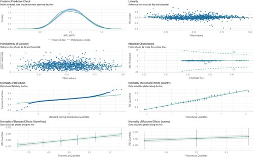
Figure 13. Diagnostic charts for the second model with the dependent variable IMP_ATT. The PPC chart can show the actual observations compared to the data generated by the model. This allows you to assess whether the distributions of the generated data are consistent with the actual data. The Linearity chart shows whether the residuals are evenly distributed along the x-axis. If the residuals are random and show no pattern to the predicted values, this suggests that the model captures the linearity of the relationship between the variables well. The Homogeneity of Variance chart helps assess whether the variances of the residuals are equal for different levels of predicted values. The Normality of Residuals chart shows whether the residuals of the model have a normal distribution. The trend line should be close to a straight line. Separate Random Effects Normality charts for the country, survey and WaveYear categories allow you to assess whether the random effects for different levels of these variables have a normal distribution. The Influential Observations chart identifies observations that can significantly affect model parameter estimates.
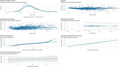
Figure 14. Diagnostic charts for the third model with the dependent variable IMP_SDR. The PPC chart can show the actual observations compared to the data generated by the model. This allows you to assess whether the distributions of the generated data are consistent with the actual data. The Linearity chart shows whether the residuals are evenly distributed along the x-axis. If the residuals are random and show no pattern to the predicted values, this suggests that the model captures the linearity of the relationship between the variables well. The Homogeneity of Variance chart helps assess whether the variances of the residuals are equal for different levels of predicted values. The Normality of Residuals chart shows whether the residuals of the model have a normal distribution. The trend line should be close to a straight line. Separate Random Effects Normality charts for the country, survey and WaveYear categories allow you to assess whether the random effects for different levels of these variables have a normal distribution. The Influential Observations chart identifies observations that can significantly affect model parameter estimates.
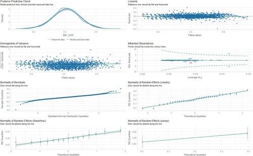
Figure 15. Diagnostic charts for the third model with the dependent variable IMP_WPR. The PPC chart can show the actual observations compared to the data generated by the model. This allows you to assess whether the distributions of the generated data are consistent with the actual data. The Linearity chart shows whether the residuals are evenly distributed along the x-axis. If the residuals are random and show no pattern to the predicted values, this suggests that the model captures the linearity of the relationship between the variables well. The Homogeneity of Variance chart helps assess whether the variances of the residuals are equal for different levels of predicted values. The Normality of Residuals chart shows whether the residuals of the model have a normal distribution. The trend line should be close to a straight line. Separate Random Effects Normality charts for the country, survey and WaveYear categories allow you to assess whether the random effects for different levels of these variables have a normal distribution. The Influential Observations chart identifies observations that can significantly affect model parameter estimates.
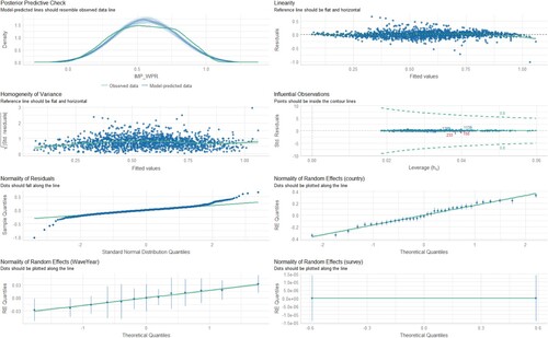
Figure 16. Diagnostic charts for the third model with the dependent variable IMP. The PPC chart can show the actual observations compared to the data generated by the model. This allows you to assess whether the distributions of the generated data are consistent with the actual data. The Linearity chart shows whether the residuals are evenly distributed along the x-axis. If the residuals are random and show no pattern to the predicted values, this suggests that the model captures the linearity of the relationship between the variables well. The Homogeneity of Variance chart helps assess whether the variances of the residuals are equal for different levels of predicted values. The Normality of Residuals chart shows whether the residuals of the model have a normal distribution. The trend line should be close to a straight line. Separate Random Effects Normality charts for the country, survey and WaveYear categories allow you to assess whether the random effects for different levels of these variables have a normal distribution. The Influential Observations chart identifies observations that can significantly affect model parameter estimates.
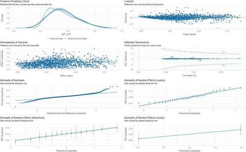
Table 17. Variance partition coefficient.
Table 18. Summary of 3 dependent variables with REML estimation for model three.
Table 19. Variance partition coefficient.
Table 20. Summary of the three models for the dependent variable IMP_SDR.
Table 21. Summary of the three models for the dependent variable IMP_WPR.
Table 22. Summary of the three models for the dependent variable IMP_ATT.
Table 23. Summary of the three models for the dependent variable IMP_SDR
Table 24. Summary of the three models for the dependent variable IMP_WPR.
Table 25. Summary of the three models for the dependent variable IMP_ATT.