
Figures & data
Figure 1. Histograms of real count data. Left panel is the number of views on YouTube of videos about scoliosis (Staunton et al., Citation2015). Right panel is the number of days on which participants sought help from a health professional over 30 days (Anwar et al., Citation2017).
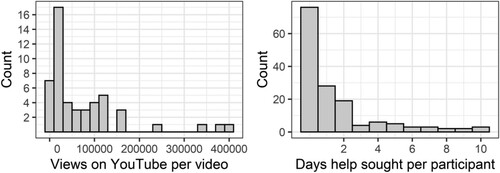
Figure 2. Left panel shows the shape of the Poisson distribution (number of events on the x-axis; probability of observing that number of events on the y-axis) for various values of λ. Right panel shows the shape of the negative binomial distribution for various values of μ and θ.
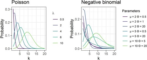
Figure 3. Hypothetical data with a clear bi-modal distribution, with the first peak at zero.
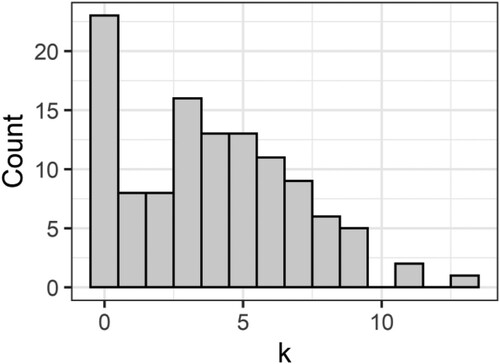
Figure 4. Scoliosis-specific score against number of YouTube views controlling for age. Original data in black, data simulated with a Poisson model in red. Upper and lower ellipses highlight original data points outside the simulated range. Note that Figures from the sim.plot function automatically ‘jitter’ data points a little bit so that points that might otherwise be on top of each other are slightly offset.
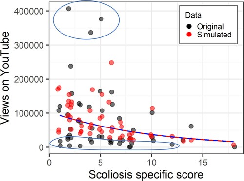
Figure 5. Two example rootograms from the countreg package. The left shows a model fit with a Poisson, and the right, a hurdle negative binomial model. Purple arrows on the left highlight a substantial underprediction of zeros in the Poisson, and then a ‘run’ of over-predictions at one through five. In contrast, the hurdle negative binomial accurately predicts the right number of zeros, and there are only a number of minor deviations (purple arrows), but they are not consecutive.
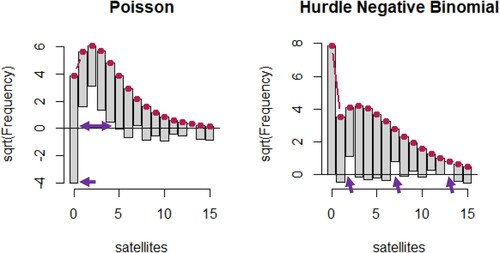
Table 1. Availability of different analyses for count data in different software packages.
Figure 6. Scoliosis-specific score against number of YouTube views controlling for age. Original data in black, data simulated with a linear model in red. Ellipses highlight where the simulated data does not overlap with the original data.
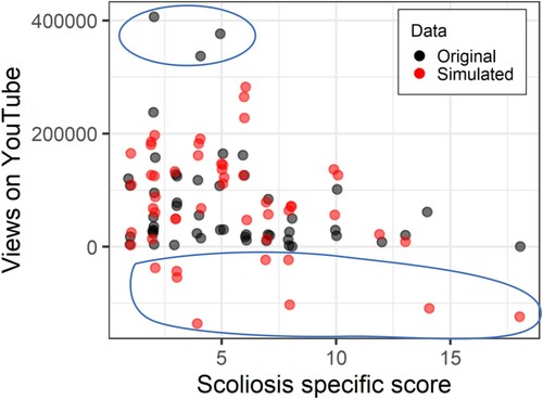
Figure 7. Scoliosis-specific score against number of YouTube views controlling for age. Original data in black, data simulated with a Poisson model in red.
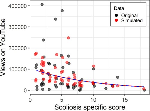
Figure 8. Fit curve for quasi-Poisson (estimated fit in red, 95% CI in blue).
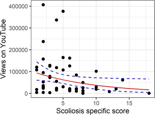
Figure 9. Scoliosis-specific score against number of YouTube views controlling for age. Original data in black, data simulated with a negative binomial model in red. The top-left panel has the random seed set to 45. The subsequent three panels are re-running the same function immediately afterwards, and demonstrates the importance of running multiple simulations.
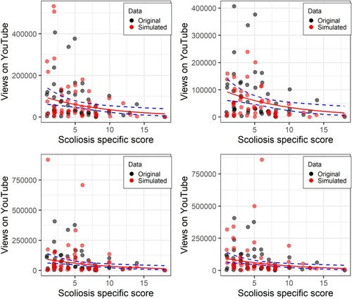
Table 2. Regression coefficients and model fit for different distribution models.
Figure 10. Number of days on which participants reported symptoms as a predictor of days on which participants visited a healthcare professional. Original data in black, Data simulated from a linear model in red.
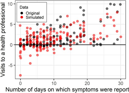
Figure 11. Simulated versus original data with Poisson fit on a scatterplot (left) and rootogram (right). Circle size is used to illustrate the number of overplotted points.
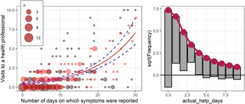
Figure 12. Simulated versus original data with negative binomial fit on a scatterplot (left) and rootogram (right).
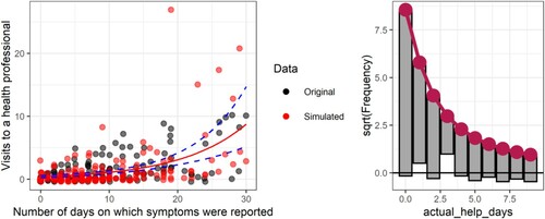
Figure 13. Rootograms for various count models for the number of days on which a health professional was visited.
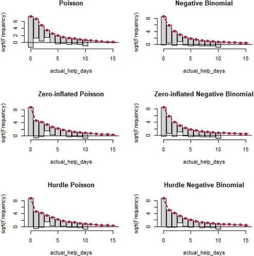
Table 3. Regression coefficients and model fit for different distribution models.