
Figures & data
Figure 1. Study flow diagram. GEO: gene expression omnibus; DEG: differentially expressed gene; DEARGs: anoikid-related DEGs; GO: gene ontology; KEGG: Kyoto Encyclopaedia of Genes and Genomes; GSEA: gene set enrichment analysis; GSVA: gene set variation analysis; WGCNA: weighted gene co-expression network analysis; ROC: receiver operating characteristic.
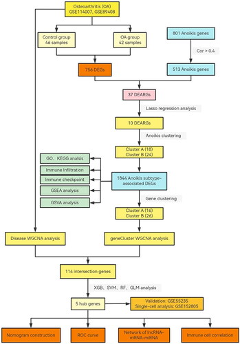
Figure 2. Landscape of anoikis in osteoarthritis. (A) Volcano plot showing the differential expression of OA between normal and OA samples. (B) Venn diagram showing the intersected genes of OS DEGs, anoikis genes. (C) Heatmap showing that the expression of 37 anoikis-related DEGs. (D) Circus plot of chromosome distributions of the 37 DEARGs. (E) Correlation analysis among 37 differentially expressed anoikis-related genes in OA patients. *p < .05, **p < .01, ***p < .001.
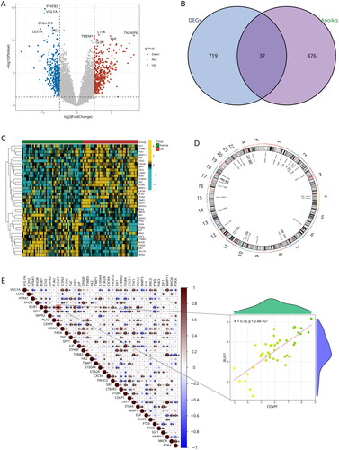
Figure 3. Identification of two distinct anoikis modification subtypes across OA samples. (A, B) Ten genes were identified by lasso regression analysis. (C) Consensus matrix heatmap defining two subtypes (k = 2) and their correlation area. (D) Consensus clustering model with cumulative distribution function (CDF) for k = 2–9. k means cluster count. (E) Relative change in the area under the CDF curve for k = 2–9. (F) The consensus cluster of items (in column) at k = 2–9 (in row). (G) Principal component analysis (PCA) showing a remarkable difference in transcriptomes between the two subtypes of OA.
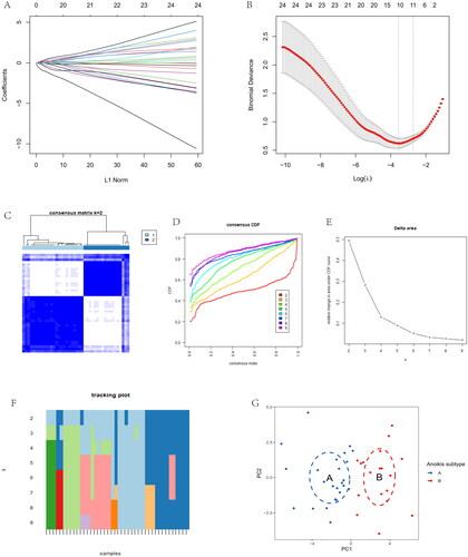
Figure 4. Immune signature and pathways of two distinct anoikis subtypes. (A) Volcano plots of DEGs via anoikis subtypes. (B) Heatmap visualizing the infiltrated immune cells in Cluster A and Cluster B groups. (C) The barplot was used to show the proportion of 22 immune cells in different OA samples. (D) Gene-set variation analysis (GSVA) of biological pathways enrichment between two anoikis subtypes.
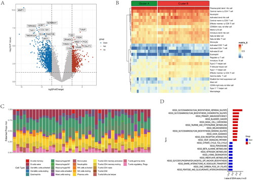
Figure 5. GO and KEGG functional enrichment analysis in anoikis subtypes. (A) Gene ontology (GO) analysis for the DEGs between anoikis subgroups, including biological process, cellular component, and molecular function, respectively. (B) Circle plots for the GO analysis. (C) KEGG enrichment analysis barplot of DEGs between two anoikis subtypes. (D) Bubble of KEGG. (E) Differential expression of immune checkpoint genes between anoikis-related subtype. (F) Multiple pathways and functions were found to be enriched in cluster A group. (G) GSEA analysis in cluster B group. *p < .05, ** p < .01, *** p < .001.
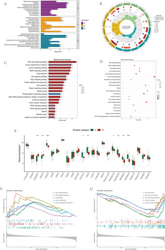
Figure 6. Immune cell infiltrations and immune-related pathways in the immune landscape. (A) Comparison of immune cell infiltration levels in anoikis subtypes. (B) Correlation plot showing significant correlations between the 28 immune cells. (C) Correlation plot showing significant correlations between the genes and immune cell infiltrations. (D) Comparison of immune-related pathways in anoikis subtypes. (E) Correlation plot showing significant correlations between the genes and immune-related pathways. *p < .05, **p < .01, ***p < .001.
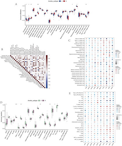
Figure 7. Identification of two distinct gene cluster across OS samples. (A) Unsupervised consensus clustering matrix and optimal clusters. (B) Item-consensus plot showing the relationship between each cluster. (C) Relative change in the area under the CDF curve for k = 2–9. (D) The consensus cluster of items (in column) at k = 2–9 (in row). (E) The heatmap of immune cell infiltrations based on gene cluster.
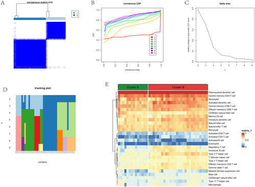
Figure 8. Comparison of immune microenvironment between two gene clusters. (A) Proportion of 22 immune cell types in two gene subgroups. (B) Gene-set variation analysis (GSVA) of biological pathways enrichment between two gene clusters. (C) Alluvial diagram showing the changes of anoikis subtypes and anoikis gene subgroups of OA. (D) Comparison of immune cell infiltration levels in two gene clusters. (E) Comparison of immune-related pathways in two gene clusters. (F) Correlation plot showing significant correlations between the genes and immune cell infiltration. (G) Correlation plot showing significant correlations between the genes and immune-related pathways. *p < .05, **p < .01, ***p < .001.
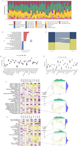
Figure 9. Expression of sample groups, anoikis subtypes, gene subgroups based on 37 anoikis-related DEGs. (A) The two sample groups exhibit distinct expression profiles of the 37 DEARGs. (B) Comparison of 37 DEARGs expression levels between the two anoikis subtypes. (C) Comparison of 37 anoikis-related DEGs expressions between the two gene subgroups. *p < .05, **p < .01, ***p < .001.
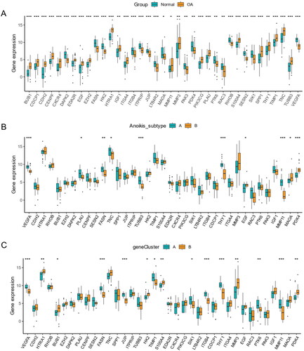
Figure 10. Identification of anoikis-related hub genes in OA. (A) Heatmap of the correlation between module eigengenes and disease groups. (B) Heatmap of the correlation between module eigengenes and OA gene subgroups. (C) 114 genes were identified by intersecting between disease WGCNA and gene clusters WGCNA analysis. (D) The boxplots of residual among XGB, RF, SVM, GLM model. (E) The ROC curve evaluated the diagnostic effect of RF, SVM, XGB, GLM model. (F) Future Importance created for the GLM, RF, SVM, XGB model.
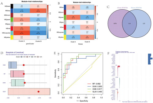
Figure 11. Nomogram and The ROC curve of five hub genes construction and validation by GSE55235 dataset. (A) The nomogram of genes was visible for diagnosing OA. (B) Calibration curve to evaluate nomogram model. (C) The DCA curve suggests that decision-making based on the nomogram may benefit in OA patients because the red lines are consistently maintained above the gray and black lines of 0 to 1. (D) The ROC curve exhibition of four genes (CDH2, SHCBP1, SCG, C10orf10, PFKF). (E) The entire ROC curve of five hub genes. (F) The expression of five hub gens in train dataset. (G) The heatmap showing that the expression of five genes. (H) The boxplot showing that the expression of five hub genes were validated in GSE55235 dataset. (I) The heatmap showing that the expression of five hub genes in validation dataset.
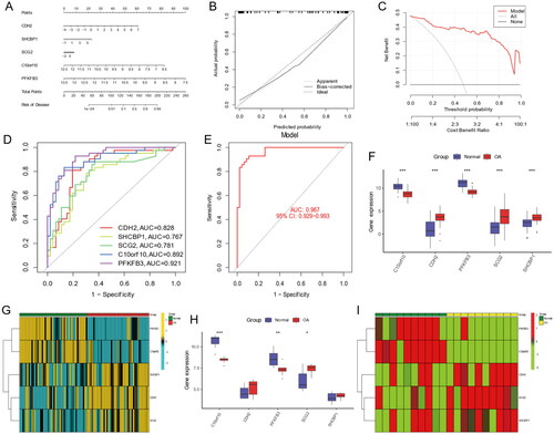
Figure 12. Construction of lncRNA-mRNA-miRNA network in OA. Red nodes indicate hub genes, green nodes stand for miRNAs, blue nodes show lncRNAs.
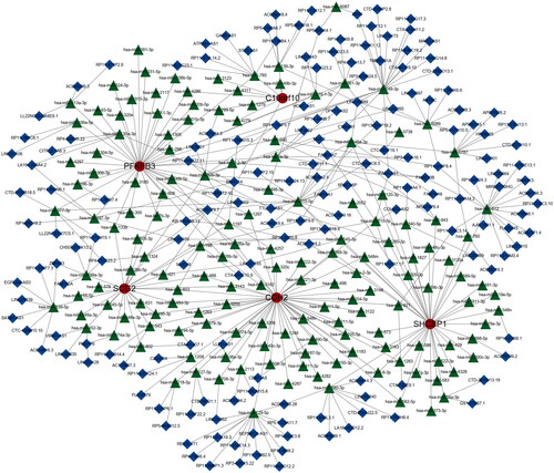
Figure 13. Correlation between four candidate genes and 28 kinds of immune cells. (A–E) Correlation between five genes (C10orf10, CDH2, PFKFB3, SCG2, SHCBP1) and infiltration immune cells. The dot size was used to represent the correlation intensity between genes and immune cells. The greener colour, the p value was higher, and the more yellow colour, the p value was lower.
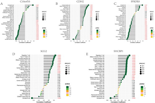
Figure 14. Analysis of single-cell RNA sequencing data from 25,852 cells of six OA cartilage. (A) The gene counts per cell (nFeature_RNA), number of unique molecular identifers (UMIs) per cell (nCount_RNA), and percentage of mitochondrial genes per cell (percent. mt) of the single-cell RNA-seq data. (B) The correlation for nCount_RNA between percent. Mt and nFeature_RNA. (C) The variance plot showed 30,738 genes in all cells, red dots represent the top 2000 highly variable genes. (D) Twenty-four identified chondrocyte marker genes were used to show in different clusters. (E) Cells were divided into 14 separate clusters. (F) Cells were clustered into seven types via tSNE dimensionality reduction algorithm, each colour represented the annotated phenotype of each cluster. (G–H) Feature and violin plots showing the distribution of five ARG hub genes in various cell types.
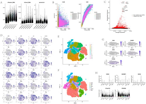
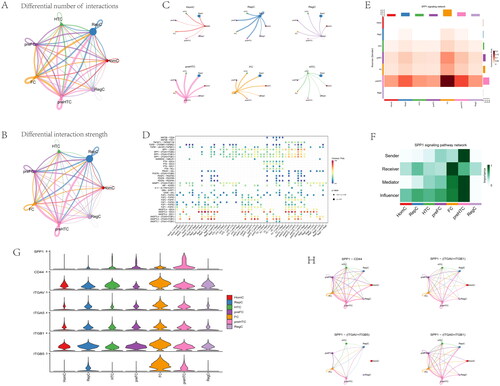
Figure 15. Inferences of cell–cell communication by CellChat revealing the global signalling changes. (A–B) Circular plots of the cellular interaction number and interaction strength between each chondrocyte subtype. (C) Cross-talk analysis between each cluster’s cell type in OA cartilage. (D) Expression of genes associated with each cluster’s cell type. (E) Relative strength of seven cell subtypes in clusters from OA cartilage (F) The role importance of different clusters in the SPP1 signalling pathway. (G) The expression level of genes associated with SPP1 signalling pathway. (H) The circle plots show the obvious changes in cell communication mediated by SPP1 signalling pathways.
Data availability statement
The GSE114007, GSE89408, GSE55235, and GSE152805 datasets were publicly available and obtained from Gene Expression Omnibus (GEO, https://www.ncbi.nlm.nih.gov/geo/).