Figures & data
Figure 1 Screen capture views of the three components of the digital COPD support service. Views of the patient application (A), the clinician dashboard (B), and the support website (C) are shown. Synthetic data shown is for illustrative purposes only.
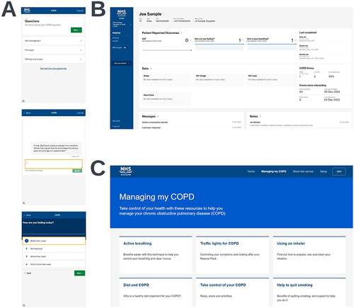
Figure 2 Participant flow diagram for the RECEIVER cohort (A) and cohort identification flow diagram for the location and time-period matched control cohort (B).
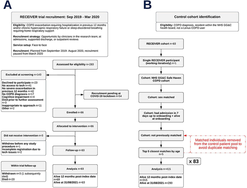
Table 1 Baseline Characteristics of the RECEIVER Trial Participants and the Location and Time-Period Matched Control Cohort
Figure 3 Utilization of the patient application as determined by completion of daily CAT entries. The percentage of participants completing at least one CAT entry per week is shown for the cohort overall (A) and the cohort stratified by SIMD quintile (SIMD quintile 1 vs SIMD quintiles 2–5) (B). The mean number of entries completed per participant per week is also shown (C).
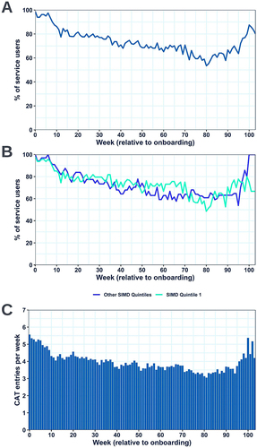
Figure 4 Heatmap visualization showing the seven-day rolling average CAT entry completion of each RECEIVER participant over the first year of follow-up, with the cohort stratified into quartiles based on this metric. Dark green areas represent periods of very high completion (6–7 daily CAT entries completed in the previous seven-days), whilst red areas represent periods of no recent completion (0 CAT entries completed in the previous seven-days). Continuous blue areas are shown where a participant has died.
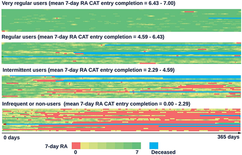
Table 2 Table Comparing Survival to Event Metrics Between the RECEIVER Cohort and the Matched Control Cohort
Figure 5 Survival plot visualizations with accompanying percentage at risk tables comparing survival to first COPD or respiratory-related admission or death (A), survival to first COPD or respiratory-related admission (B), and survival (C) from study index date between the RECEIVER cohort and the matched control cohort.
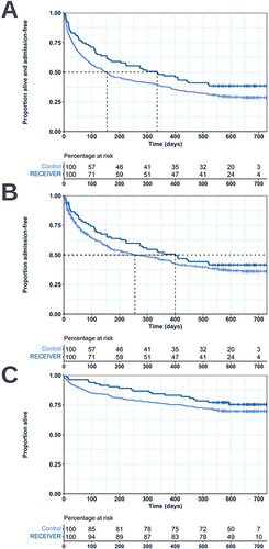
Table 3 Table Compiling Admissions Data for the RECEIVER and Control Cohorts
Figure 6 Violin boxplots comparing the number of COPD or respiratory-related admissions (A) and occupied bed days (B) had in the 12-month windows pre- and post-index date in the RECEIVER and control cohorts. Data shown is for individuals alive 12-months post-index date. Violin-box plots are selected to ensure complete data provision. For their interpretation: standard boxplots illustrate the variation of values (median and IQR), the relative frequency of individual data points is illustrated by the width of the violin plot at each point on the y-axis, and mean values are shown by red dots.
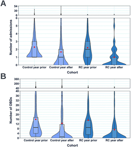
Figure 7 Annotated violin boxplots showing the change in the distribution of EQ-VAS (A) and CAT scores (B) reported by the RECEIVER participants across 26-week windows relative to onboarding. Violin-box plots are selected to ensure complete data provision. For their interpretation: standard boxplots illustrate the variation of values (median and IQR), the relative frequency of individual data points is illustrated by the width of the violin plot at each point on the y-axis, and mean values are shown by red dots.
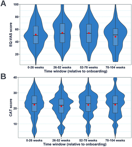
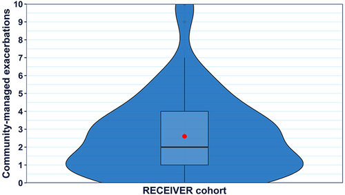
Figure 8 Violin boxplot showing the distribution of participant-reported community-managed exacerbation counts within the RECEIVER cohort during the first year of follow-up. A violin-box plot is selected to ensure complete data provision. For interpretation: a standard boxplot illustrates the variation of values (median and IQR), the relative frequency of individual data points is illustrated by the width of the violin plot at each point on the y-axis, and the mean value is shown by a red dot.