
Figures & data
Table 1 Inclusion and Exclusion Criteria
Figure 1 Flow chart for article selection.
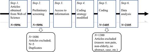
Figure 2 Number of articles published and the mode fitting curve from 2000 to 2019.
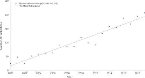
Table 2 Top 20 Articles with the Highest Total Citation Scores
Table 3 Top 20 Articles with the Highest Relative Citation Scores
Table 4 Top 20 Journals with the Highest Number of Published Articles
Figure 3 Percentage of papers published by single and multiple authors.
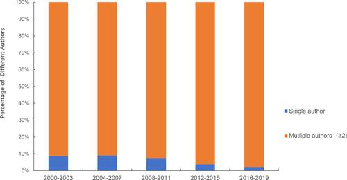
Figure 4 World map of total country outputs.
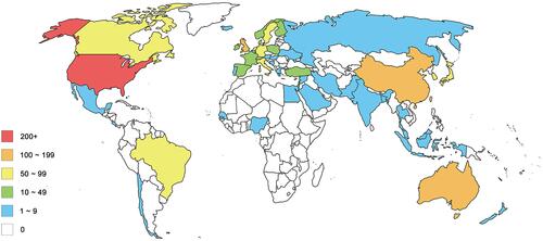
Table 5 Top 68 Keywords with the Strongest Citation Bursts in Publications on Pain in the Elderly
Table 6 Top 10 Subject Categories of Articles on Pain in the Elderly with the Strongest Citation Bursts in Web of Science
Figure 5 Co-citation map (timeline view) of references from publications on pain in the elderly. The size of the nodes reflects the number of publications or frequency; the larger the node, the higher the number of publications or frequency. The different colors within the nodes represent different times, the connection lines between the nodes reflect the relationship between the co-operation or co-citation, and the color of the line reflects the years when the co-operation or co-citation first appeared. Nodes with a larger centrality are more likely to become the key nodes in the network and are represented by purple on the node ring in the knowledge network map.
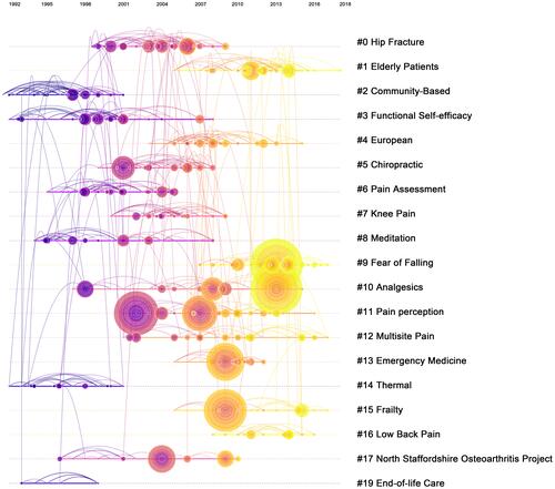
Figure 6 (A) Average percentage of each article type published from 2000 to 2019; (B) average percentage of topics discussed in articles published from 2000 to 2019.
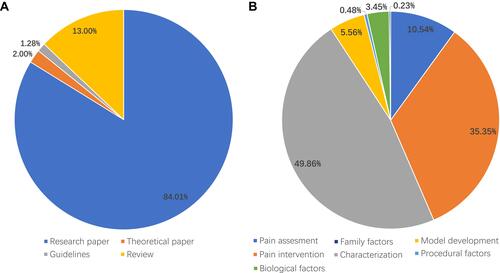
Figure 7 Trends of the percentage of subject type.
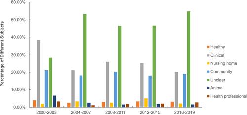
Figure 8 Percentage of community sample-based research studies amongst all research articles in each country (ie, in each country, the proportion of research studies in which subjects come from the community to the total number of studies in the country).
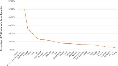
Figure 9 (A) Trends in the percentage of pain characteristics reported every 4 years; (B) average percentage of experimental designs reported every 4 years.
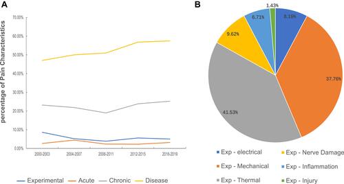
Table 7 Bradford’s Law of Scattering for Journals That Published Articles on Elderly Pain Research from 2000 to 2019