Figures & data
Box 1 Query Formulation
Figure 1 Flowchart for literature selection.
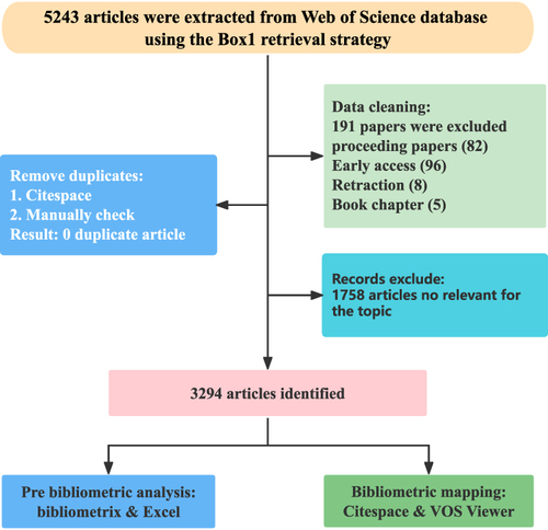
Figure 2 (A) The trend of publication outputs and (B) mean citations per year in the past 10 years.
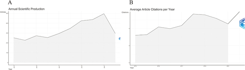
Table 1 The Top 10 Countries/Regions and Organizations Contributed to Publications About Migraine Treatment
Figure 3 (A) Geographical distribution of global articles of migraine treatment. The darker the national color block on the map, the more migraine treatment-related articles are published. (B) The collaboration of countries. Each country is represented by a color block, and larger blocks indicate a higher number of publications. The line between the blocks represents the cooperation between countries. (C) Citation relationships between countries. The United States, Italy and China are the major contributors to migraine treatment.
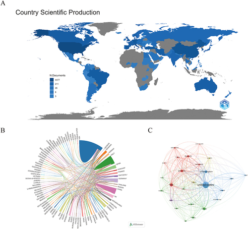
Table 2 The Top 10 Productive Journals Related to Migraine Treatment
Figure 4 (A) Articles dynamics of the top 5 journals. The number of articles published in the 5 journals in the figure is increasing year by year. (B) Co-Citation relationships between journals. As the largest node in the graph, Cephalalgia has the most co-citations and TLS.
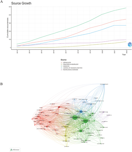
Figure 5 Dual-map overlay of journals produced by CiteSpace. The color bar on the left side of the figure represents the field of the citing journals, the color bar on the right side speaks for the domain of the cited journals, and the connecting line between them represents the citation relationship.
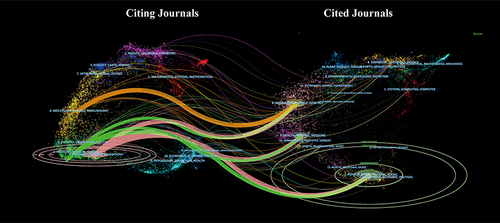
Table 3 The Top 10 High-Yield Authors Based on Total Citations
Figure 6 (A) Co-authorship relationships between authors. Top3 TLS was: Lipton, Richard B. (TLS=360), Dodick, David W. (TLS=260), and Buse, Dawn C. (TLS=179). (B) Co-Citation relationships between authors. (C) The top 10 authors of centrality in (B).
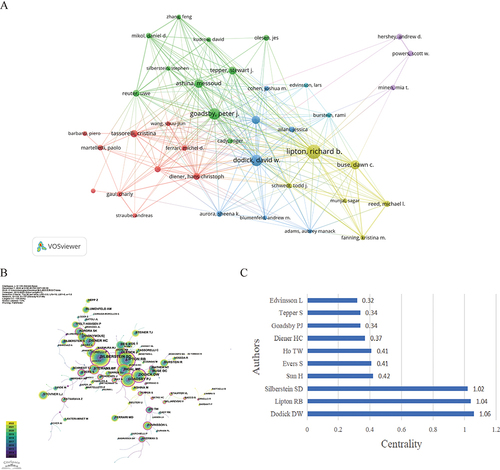
Figure 7 Cluster diagrams of references. The figure shows 10 color blocks representing 10 clusters, each composed of articles on the same topic.
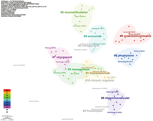
Figure 8 Timeline view of co-citation reference. The timeline from left to right represents the time evolution from 2012–2021. Nodes composed of different colors represent citations. The greater the node is, the larger the citations’ quantity is. The color of the node corresponds to the cited time for the time band. The timeline view visually shows the rise and fall of each area.
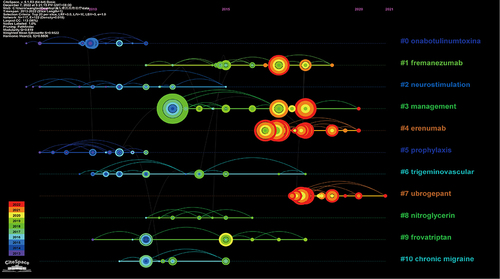
Figure 9 (A) Co-occurrence map of keywords on migraine treatment research generated by the VOS viewer. (B) Overlay map of co-occurrence keywords. The yellower node in the figure represents the latest time of appearance. That is, the future hotspots we are looking for.
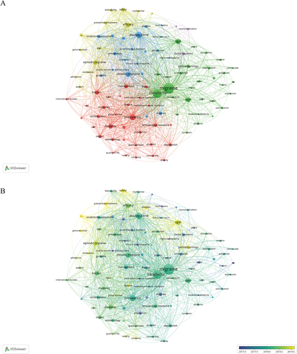
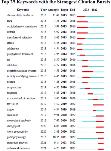
Figure 10 Top 25 keywords with the strongest citation bursts. Year: the first occurrence of the keyword; strength: the larger the value, the stronger the emergence of the keyword; begin: the start time of the keyword burst; end: the end time of the keyword burst. The blue line represents the time interval and the red line represents the time of the keyword burst.