Figures & data
Figure 1. The superior and inferior zones of the femoral neck after Birmingham hip resurfacing.
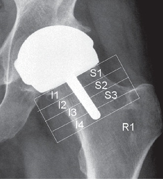
Figure 2. Graph showing percentage change in bone density in the whole of the femoral neck over time, represented as boxplots with mean, inter-quartile range (boxes), and range of values excluding outliers.
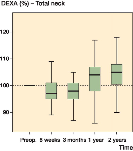
Figure 3. Graph showing percentage change in bone density in the inferior femoral neck over time, represented as box plots with mean, inter-quartile range (boxes), and range of values excluding outliers.
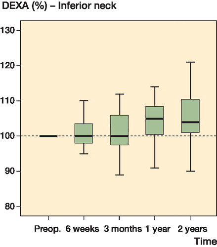
Figure 4. Graph showing percentage change in bone density in the superior femoral neck over time, represented as box plots with mean, inter-quartile range (boxes), and range of values excluding outliers.
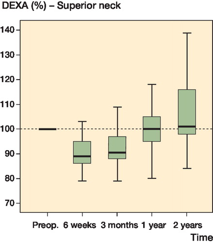
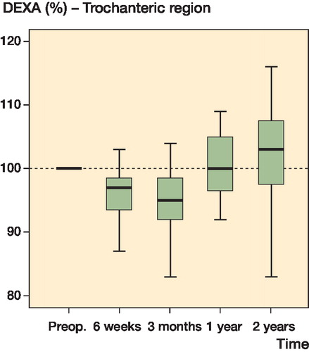
Figure 5. Graph showing percentage change in bone density in the femur lateral to the inter-trochanteric line (R1) over time, represented as box plots with mean, inter-quartile range (boxes), and range of values excluding outliers.