Figures & data
Table 1. Basic characteristics of the study population, showing absolute numbers (%) for proportions and mean (SD) for continuous variables. The number of patients with missing observations is presented as percentages of the total for that particular group
Figure 1. A. An illustration of the difference in impact of Charnley class depending on sex. The results were adjusted to the median age and pain VAS: 69 years and 65 mm. The most frequent EQ-5D index value preoperatively was 0.87. The red area indicates values below the preoperative index value. The dashed line indicates the predictions from a linear regression model while the solid lines depict quantile regression predictions at the different quantiles. B. The same as in panel A but with EQ VAS as outcome. This was adjusted to the most frequent EQ VAS value preoperatively: 50 mm.
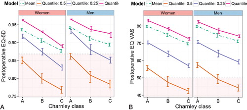
Figure 2. Average change before and after surgery, by EQ-5D dimension (mobility, self-care, activities, pain/discomfort, and anxiety/depression), each stratified by Charnley class. Each dimension may take on 3 different ordered values; thus, the change ranges from –2 to 2 and this average is shown on the y-axis. The confidence interval bars indicate 95% certainty of each average. The maximum influence of the Charnley classes was on the mobility and pain/discomfort dimensions.
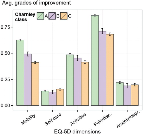
Figure 3. The crossover between Charnley classes from before to after surgery. The patients before surgery are represented on the left while those after surgery are represented on the right. Pink corresponds to the proportion of women in each group while blue corresponds to the proportion of men. The size of the arrow is proportional to the percentage of patients leaving that specific class and the color of the gradient corresponds to the sex proportion for each transition according to the color bar.
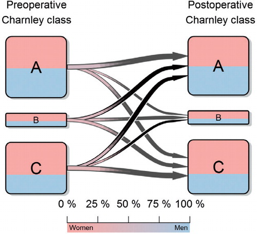
Table 2. The changes between the preoperative and the postoperative Charnley class according to sex
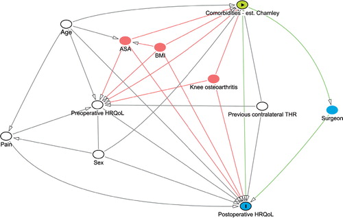
Figure 4. Our directed acyclic graph (DAG) for this study as generated by dagitty.net. The green node indicates the exposure of interest, the green lines the exposures effect pathways, and the blue node with the “I” indicates the outcome of interest. The blue node without “I” is an intermediate to the effect pathway. White nodes are confounders that are adjusted for in the models, while red nodes indicate nodes that should be adjusted for but that are not available.