Figures & data
Figure 1. View of a typical OCT dataset consisting of 300 slices with corresponding single OCT slice (top) and matched histopathology slide (bottom). The site of the osteochondral defect is marked in red and the location of the OCT slide is marked with a green frame. Landmark properties such as small fissures (white arrow) and the transitional zone between cartilage and subchondral zone (green arrows) are identified in both modalities.
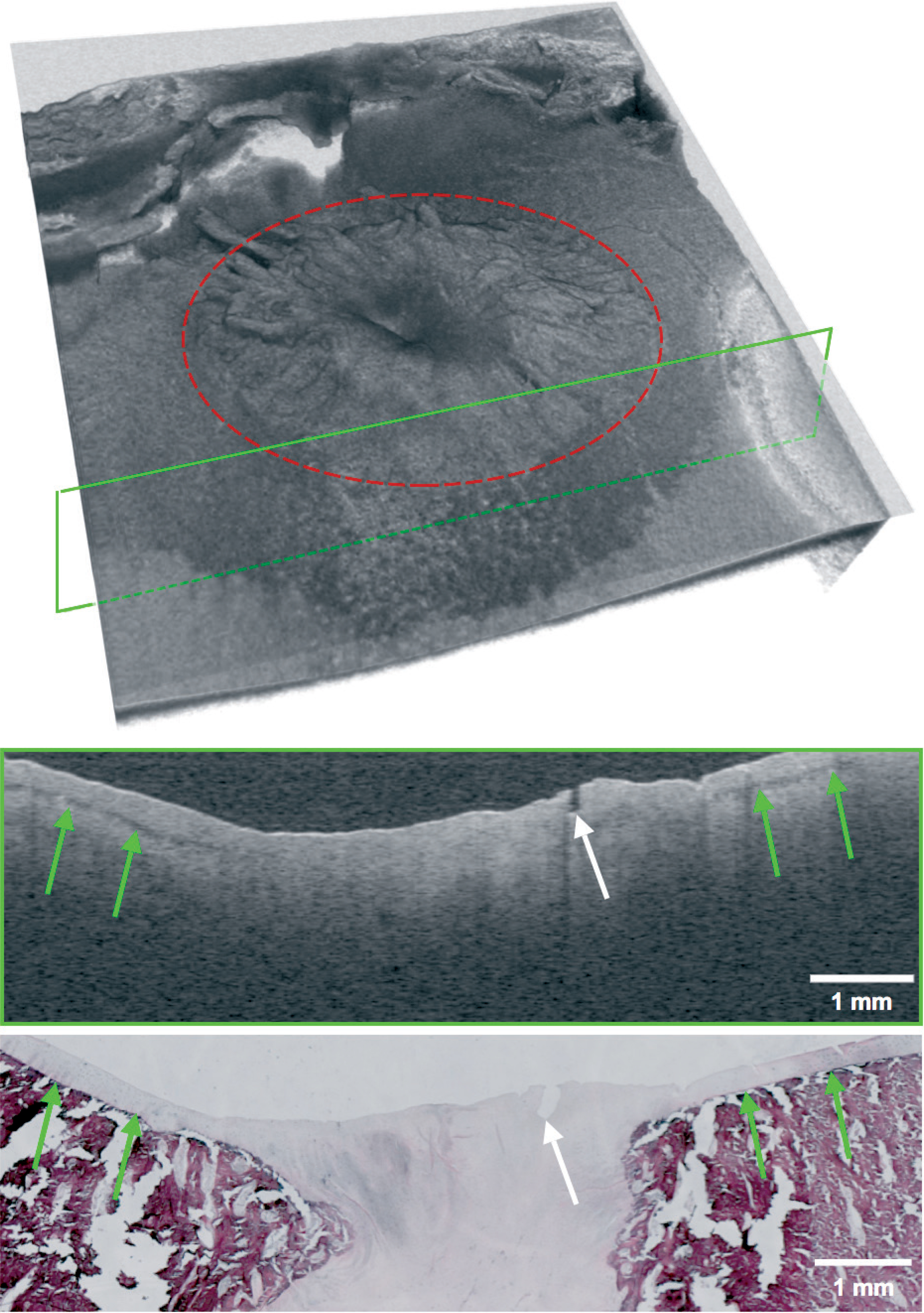
Figure 2. A. Good match between histopathology and OCT with auxiliary lines created by the analysis software. The pink line represents edge detection. The top and bottom boundaries of the cartilage layer with extrapolation through the osteochondral defect are shown with the blue and green lines, respectively. The vertical red lines mark the location of healthy cartilage and the (start of the) osteochondral defect. Thickness is defined as the average distance between the blue and green line in healthy tissue regions. Area is computed from the area bounded by the pink line and green line in the defect region. Roughness is defined as the root-mean-square distance between the pink line and the blue line in the defect region. B. Fair match between OCT and histopathology, producing noticeable differences in the parameters repair tissue area and surface roughness. Definitions of the parameters are explained above and in the text.
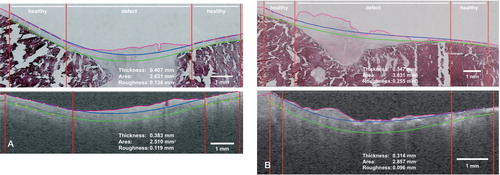
Figure 3. Graphical comparison between OCT and histopathology (x-y plot). The figure depicts measurements of the quantitative parameters cartilage thickness, repair tissue area, and surface roughness, with fitted linear regression lines. Measurements from a good match between OCT and histopathology (Figure 2A) and a fair match (Figure 2B) are shown in green and red, respectively.
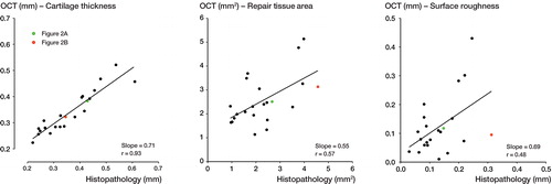
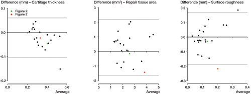
Figure 4. Bland-Altman plots showing the differences between the 2 methods of measurement. The dashed lines represent the 95% limits of agreement. The good match from Figure 2A is shown in green and the fair match from Figure 2B is shown in red.