Figures & data
Figure 1. Algorithm used for the selection of the study population. The shaded boxes indicate the patient groups analyzed.
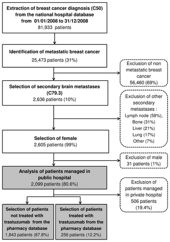
Table 1. Characteristics of the study population.
Figure 2. Distribution of treatment use during the 1-year follow-up period for the whole population (n = 2,099). This figure presents the distribution of treatment use by 3-month period. For instance, at 3 months of follow-up, 38% of patients had received general medical care, 37% palliative care, 36% chemotherapy and 28% radiotherapy and surgery. The total exceeds 100% since patients may have received one or more types of treatments over the period. Expensive innovative drugs are included in the category chemotherapy.
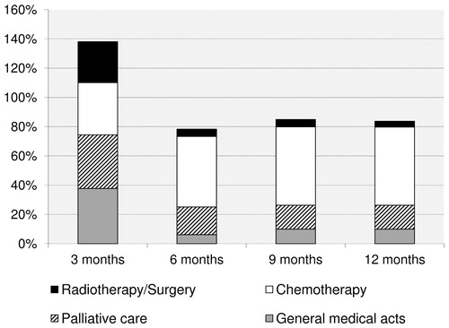
Figure 3. Box and whisker plot of the distribution of healthcare costs (n = 2,099). The cost shown on the graph is the median cost per treatment category. From top to bottom of the graph: the largest observation (♦), the upper quartile, the median (–), the lower quartile and the smallest observation (▪).
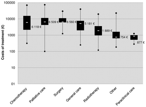
Table 2. Healthcare costs over 1 year of follow-up.
Table 3. Multivariate regression analyses performed on the mean cost of treatment.