
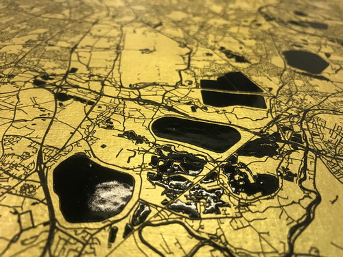
We begin this new Volume with a tale of two cities. Or, more precisely, with a reflection on the two most recent winners of the British Cartographic Society Award that offer a new perspective of Paris (the 3D wooden cartefact by David Kidd; see Issue 56.1) and of London (Streets of Gold, an aureate portrait of the city by Warren Vick and Ewan David Eason; see front cover and ). The success of these entries is worth exploring, since they were both designed primarily to be desirable objects rather than useful conveyors of geographical information. This would appear to reflect a shift towards a greater appreciation of the artistic elements of cartography in the world of professional (or formal) map-making, at least in the United Kingdom. To a wider world saturated by the utilitarian sterility of web map servers, this perhaps implies that novelty and aesthetic appeal are valued above all else within the cartographic community, where beauty has tended to be seen as a virtue rather than as a means to an end. Both winners exploit the materiality of mapping, whether the strength of their appeal lies respectively in their tactile or visual aesthetic, and both possess an allure that invites all to stop and gaze.
Figure 1. Detail from Streets of Gold (2019) UV (ultraviolet) varnish on 24-carat gold leaf (113 × 113 cm) by Warren Vick and Ewan David Eason. Reproduced courtesy of the artists.
If we are to regard the Society’s most prestigious award as a bellwether for current attitudes towards cartography, the achievement of these two recent examples suggests that maps do not need to present a commendable design solution to be considered worthy. They should, perhaps above all, provide an imaginative and convincing presentation of geographical data that fuses innovation with aesthetic appeal. Case (Citation2012, 21) urges cartographers to address what it means to make a beautiful map in order to learn to look at maps as expressions of something people want and need. With greater accessibility to an abundance of datasets than ever before, the goal of the aspirant cartographer is therefore not to optimize what data already exists, but to offer a fresh way of seeing these data.
This widening of professional ideals embraces the rising tide of art in map-making, placing more value on originality and less on the capacity of maps to communicate geographical knowledge efficiently. The point is perhaps demonstrated most clearly by the two recent winners’ treatment of typography: essentially, by their abandonment of lettering, that most fundamental interpretive element of a map. Yet, these are not merely stummenkarten designed for teaching geography; the deliberate absence of labels amplifies the pure form of their subject. A trend towards a greater purity of form and away from conventional design can be traced in BCS Award winners over the last few years (arguably, the last piece of ‘traditional’ cartography to win was the Historical Map of York, in 2014). It has seen the implementation of a visual aesthetic that conveys the complexity, intricacy and unauthoredness of raw data, e.g. in the work of Cheshire and Uberti (Citation2014, Citation2016 – winning in 2015 and 2017) and of Field (Citation2016) – winning in 2016). The presence of user-centred design is more subtle in these curiosity-driven mappings than their sense of scientific rhetoric, which allows their data to speak with more conviction.
The most recent winners of 2018 and 2019, however, represent a point of departure, since their makers are not primarily concerned with the communication of geographical information, but with its form and effect. If the aim of such competitions is to recognize and inspire excellence in cartographic design (Kent, Citation2015), we will run into problems if fellow map-makers are seeking insights into the identification and celebration of best practice, even if that concept of excellence is inherently subjective (Demaj and Field, Citation2012). As Norman (Citation2005: 74) suggests, the design challenge is ‘to discover real needs that even the people who need them cannot yet articulate’. The recent winners, however, bring into question whether cartographers should consider themselves primarily as designers who aim to meet the needs of users, or as artists who aim to change the way we see or feel about a subject. Robbins (Citation2018) argues that ‘design thinking’ places the consumer at the very heart of the innovation process and can often lead to more incremental, rather than radical, ideas. But, if creativity in cartography is simply made to serve the user as consumer, the search for optimum solutions appears to become a search for opulent statements.
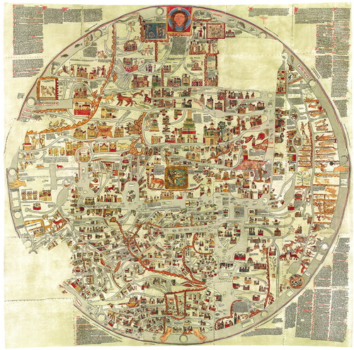
When access to geographical knowledge and the ability to make maps are taken as given, it no longer seems necessary to cling to the ideal of cartography as a process for designing maps to be immutable statements of fact. Indeed, the aim of post-modern, perhaps post-cartographic, mappings echoes the traits of the pre-modern era, when cartographers ‘had neither the geographical knowledge nor the cartographic skill to make accurate maps, [and] fancy and artistry had free rein’ (Rees, Citation1980: 62). If art is the original keynote of cartography (Jervis, Citation1938: 127), the arc of mapping appears to have modulated through the dominant realm of science to reach its home key. It is no coincidence that Streets of Gold belongs to a series of artworks by Eason entitled Mappa Mundi, where world cities from Accra to Zurich are given the golden treatment. Their playful approach appeals to the post-scientific imagination in their disc-like mimicry of the mappae mundi of the pre-scientific era (). Similarly, the freedom to create maps without fulfilling the requirements of a client or without meeting the specific needs of users allows a re-engagement with the human and personal elements of mapping: inspiration from stories, fantasies and myths enjoy renewed appeal. Even the world – and hopes – of Dick Whittington, which inspired the creation of Streets of Gold, become desirable.
Figure 2. The Ebstorf mappa mundi (c.1300) (digital composite derived from colour reproduction of the original 30 parchment sections, c.360 × 360 cm). Reproduced courtesy of Leuphana University Lüneburg.
The process of mapping is, however, always broader and more versatile than we can readily imagine. Maps have a unique capacity to challenge and to change the way we see and as abstract forms, they are symbols of something greater than themselves. They can elegantly support or supplant the goal of communicating geographic information with that of making an artistic or political statement. If the aim of art is to transfer emotion (Tolstoy, Citation1995), perhaps Streets of Gold carries especial resonance because it evokes the deeper, more emotive message of placing confidence in London to illuminate the post-Brexit economy, echoing Dick Whittington’s hope (and perhaps its realization). As told by Vera Southgate (Citation1966: 12) in the Ladybird edition of the story: ‘When Dick had got over his first wonderment, he began to look for the streets that were paved with gold. Nowhere could he find them’. Like all maps that offer immersion into a utopian ideal, Streets of Gold hides unpleasant realities; in this case, those of a highly polarized city whose socio-economic inequalities are quite literally glossed over with gold leaf.
To work, maps engage our imagination as well as our senses. Hence, moving the professional ideals of map-making further along the trajectory from design towards art also raises important issues surrounding the rhetorical power of maps. Communication must be instant and it must be exact (Munari, Citation2008: 55), yet the visual language of mapping is inherently persuasive, whether its aim is to communicate an emotion or mood, or to communicate a measurable reality as objectively as possible. Maps, and, by extension, 3D visualizations that resemble maps or satellite imagery, tend be judged aesthetically as pictures, but they also convey an impression of veracity that exceeds that of other graphics. They are too easy to trust, whatever the intentions of their creator.
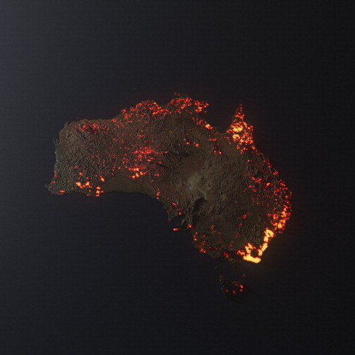
The blurring of the boundary between news and entertainment – particularly by social media – illustrates the hazards of this effect. The current environmental tragedy of the Australian bushfires has yielded some dramatic examples. These include the artwork of Anthony Hearsey, whose spectacular portrait of Australia based on a compilation of cumulative data derived from one month of NASA imagery successfully engaged the imagination, if not the critical faculties, of many struggling to grasp the severity of the disaster (). A combination of visual power and the penetrating influence of celebrity ensured the image's viral dissemination, assisted by erroneous captions describing it as a snapshot from space. Hearsey (Citation2020) even issued a statement attempting to rectify the problem: ‘This is a 3D visualisation of the fires in Australia. NOT A PHOTO. Think of this a graph’. Antidotes are not always effective against viruses, and the pervasiveness of this image owes more to its simplicity in communicating a complex problem than did many of the maps designed to portray the situation more faithfully (see Rannard, Citation2020).
Figure 3. Australia is Burning / A 3D Visualization (2019) (available at https://anthonyhearsey.com/australia-is-burning-a-3d-visualisation) by Anthony Hearsey. Reproduced courtesy of the artist.
Awards, especially those won by competition, carry significance because they define ideals at a particular time and place. It is therefore important to question the values that underpin these ideals to ensure that they reflect and advance those of the wider community. Clearly, mapping encompasses a broad range of approaches and techniques that support both artistic and scientific routes to understanding. The British Cartographic Society may have reached a milestone by rewarding new insights gained by artistic expression, but whether this championing of the role of art over design marks a way forward is yet to be seen. Certainly, the absence of lettering exhibited in the two most recent winners of the BCS Award suggests that the cartographic aesthetic can be elevated without the ‘voice’ usually present through typography. Perhaps this step resembles the change in musical aesthetics that took place in Germany at the turn of the nineteenth century, which, over the span of little more than a decade, saw the sudden shift of instrumental music from the lowest to the highest musical forms, and indeed of all the arts (Bonds, Citation1997: 387). Perhaps it resembles the non-representational turn of visual art after the introduction of the photograph later that century (Kent, Citation2017). Certainly, cartographers are increasingly drawing upon artistic expression in asserting the relevance of their way of seeing. However, if maps are going to be judged as pure works of art, they cannot also serve as the best examples of design.
Notes on the cover
The cover incorporates an image of Streets of Gold by Warren Vick and Ewan David Eason. Winner of the 2019 BCS Award and the Ordnance Survey Award, the map also won two awards at the 2019 Esri User Conference: a Cartography Special Interest Group (CartoSIG) Excellence Award and the Most Innovative Map Award. Warren and David describe their work and what inspired them to create it:
Streets of Gold is a 1.13 m square map of Greater London created on a base of 24-carat gold leaf. It is the result of a collaboration between Europa Technologies and London-based artist, Ewan David Eason. It is based on Ewan’s celebrated Mappa Mundi series, but with Esri software and Ordnance Survey Open Data being used for the first time. Management of the artwork as GIS layers made innovative new methods possible, such as the precise application of UV varnish over the water features. The work was inspired by the story of Dick Whittington, who leaves home with his cat to seek his fortune in London, where he believes the streets are ‘paved with gold’.
Disclosure statement
No potential conflict of interest was reported by the author(s).
Notes on the contributor
 Alexander J. Kent is Reader in Cartography and Geographic Information Science at Canterbury Christ Church University in the UK, where he lectures on map design, GIS, remote sensing and on European and political geography. His research explores the relationship between maps and society, particularly the intercultural aspects of topographic map design and the aesthetics of cartography.
References
- Bonds, M.E. (1997) “Idealism and the aesthetics of instrumental music at the turn of the nineteenth century” Journal of the American Musicological Society 50 (2,3) pp.387–420. doi: 10.2307/831839
- Case, N. (2012) “Function and beauty (In Defence of Useless maps)” Cartographic Perspectives 73 17–22. doi: 10.14714/CP73.588
- Cheshire, J., and O. Uberti (2014) London: The Information Capital: 100 Maps and Graphics That Will Change how you View the City London: Particular Books.
- Cheshire, J., and O. Uberti (2016) Where the Animals Go: Tracking Wildlife with Technology in 50 Maps and Graphics London: Particular Books.
- Demaj, D., and K. Field (2012) “Reasserting design Relevance in cartography: Some examples” The Cartographic Journal 49 (1) pp.77–93. DOI:10.1179/0008704112Z.00000000012.
- Field, K. (2016) “Pitch Perfect” Available at: http://s3.amazonaws.com/webapps.esri.com/mwl-maps/PitchPerfect.html (Accessed: 21st February 2020).
- Hearsey, A. (2020) ‘Australia is Burning / A 3D Visualisation’ Available at: https://anthonyhearsey.com/australia-is-burning-a-3d-visualisation (Accessed: 15th February 2020).
- Jervis, W.W. (1938) The World in Maps: A Study in Map Evolution 2nd ed London: George Philip.
- Kent, A.J. (2015) “Some Reflections on Judging Maps” The Cartographic Journal 52 (4) pp.303–304. DOI:10.1080/00087041.2015.1115220.
- Kent, A.J. (2017) “The President's Address to the British Cartographic Society 2017” The Cartographic Journal 54 (4) pp.370–374. DOI:10.1080/00087041.2017.1430115.
- Munari, B. (2008) Design as Art (trans. Patrick Creagh) London: Penguin Books.
- Norman, D.A. (2005) Emotional Design: Why we Love (or Hate) Everyday Things New York: Basic Books.
- Rannard, G. (2020) “Australia fires: Misleading Maps and Pictures Go Viral” Available at: https://www.bbc.co.uk/news/blogs-trending-51020564 (Accessed: 15th February 2020).
- Robbins, P. (2018) “From design thinking to Art thinking with an Open innovation perspective – A case Study of How Art thinking Rescued a Cultural Institution in Dublin” Journal of Open Innovation: Technology, Market, and Complexity 4 (4) pp.57–74. DOI:10.3390/joitmc4040057.
- Rees, R. (1980) “Historical Links Between Cartography and Art” Geographical Review 70 (1) pp.60–78. doi: 10.2307/214368
- Southgate, V. (1966) Dick Whittington and his Cat Loughborough: Ladybird Books.
- Tolstoy, L. (1995) What is Art? (Translated by Richard Pevear and Larissa Volokhonsky) London: Penguin Books.