
Abstract
The aim of the research was to investigate the usability and legibility of 3D printed typeface characters in smaller sizes. In the experimental investigation two software programs for letter modelling, three typefaces, three type sizes, two weight options, and two printing materials were tested. The samples were analysed visually and with image analysis. The legibility tests were conducted in laboratory conditions and testing chamber. The participants were asked to read pangrams and answer close-ended questions. The reading speed and understanding of the text were measured and analysed. It was found that the success of printing parts of letters, as well as their recognition and visual evaluation, is most often influenced by two analysed factors, i.e. weight option and type size, in all three typefaces. We established that the type size is statistically significant, and that the typographic tonal density is influenced by the typeface and the material used.
Practitioner summary: The research presents the investigation of usability and legibility of 3D printed typefaces at smaller sizes. Five variables were analysed visually and with image analysis. Typographic tonal density, reading speed, and text comprehension were evaluated. The findings demonstrated that weight option, type size, and material influence the reading speed and text comprehension.
Five different parameters were investigated regarding usability of 3D printed typeface.
Legibility of different typefaces, weight options, and type sizes were tested.
Typographic tonal density was evaluated with image analysis.
Print quality of different materials using an FDM technology printer was evaluated.
HIGHLIGHTS
1. Introduction
The product designing includes a combination of art, science, and technology to create new products and accessories that people handle and manage in their daily lives. In the workflow from a concept to the final product, a creative team uses product experience design approaches, including target users, defining usage goals, ideation, prototyping, multi-stage testing. When designing a physical product, digital (3D modelling and visualisation) and physical (3D printing) prototypes are key to testing the appropriateness of product features and characteristics that are used to discover potential deficiencies of the product and opportunities to improve usability and utility in the early stages of product development (Ball, Wang, and Luximon Citation2019; Kermavnar, Shannon, and O’Sullivan Citation2021). Useful products and accessories that we handle and manage in our daily lives often include a typeface in addition to symbols, signs, and other graphic elements conveying a message. The presence of a typeface improves the understanding of a product and its use, and increases its use accessibility. The presence of a typeface in product design is also important when personalising the product, e.g. names, personal data. 3D printed typefaces are suitable for lettering phone cases, office tiles, business cards, tags, dashboards, room lettering, office signs, key chains, etc. (Miller Citation1996). Desktop 3D printers make personalised products accessible at a faster rate and the production is more flexible.
In the research, we answered the question of accuracy of 3D printing at smaller sizes in terms of typeface, type size, and weight option for selected printing parameters, i.e. software and material (Tambrallimath et al. Citation2019; Zhang, Fan, and Liu Citation2020; Kakanuru and Pochiraju Citation2020; Hazal Tümer and Erbil Citation2021), and their interactions.
A review of applicability shows that 3D printing of a typeface is mainly suitable for larger prints, e.g. the word ‘Discovery’ designed for the Metropolitan Works Creative Centre (Abbink and Andersen Citation2010). Jon Fidler (Mings Citation2012) designed and produced 26 3D project letters called Arkitypo. Each of the letters was designed in a unique way, pointing to the history of the letter and the typeface it was drawn from. The English designer Daisy Hill designed and printed a 3D hollow (outline) typeface consisting of 30 mm cube characters (Hill Citation2013). A design and research company from Amsterdam, Freedom of Creation, offers people to design their own word or phrase with a typeface in the shape of a wavy band on the company’s website, which can then be 3D printed (Flood Citation2020). There is also 3D printed typography based on a material that imitates wood and a Vornoi pattern in a smaller size (type size 3 mm) (Boonoobong Citation2013). A 3D typeface was designed by the A2/SW/HK studio and printed as the lead letter-like print (Zhou Citation2017). The history of 3D printed typography was written by a Chinese designer Hongtau Zhou with a complex Text Scape system that combines typography and sculpture (To the Letter Citation2015; Zhou Citation2017). There is also a 3D printed book cover designed by Riverhead Publishing for the novel ‘On Such a Full Sea’ (To the Letter Citation2015).
In contrast, scientific research on 3D printing and typography is scarcer. Taekyeom (Citation2017) presented a method of 3D type design, including the materials and technique for ceramics and 3D printing. In the research, it was shown that the typographic experience is strongly influenced by the material and manufacturing technology used for production and that the use of the typeface in 3D space enables a new paradigm of user experience. Grimaud (Citation2017) presented an innovation and method in the field of automation of 3D typeface design for manufacturing. 3D typefaces were characterised with multiple character relations so that the character relations made connections to defined characters of the 3D typeface. The results of the process were customised as durable 3D representations based on the 3D typeface. Bugdayci, Grunert, and Keller (Citation2014) presented a study on the printability of a 3D typeface based on Grunert’s text plate (Grunert Citation2014), depending on slicing tools on multiple printers. The study resulted in recommendations for the use of different slicing tools, of 3D printers and in the evaluation approaches for the printed objects after using different slicing techniques.
Legibility means how easily the reader can translate typographic symbols into meaning (Reynolds Citation1988; Sheedy et al. Citation2005; Galle and Kroes Citation2014; Špakov et al. Citation2017). To enable the reading, the text must have three properties, i.e. (a) visibility of a clear image of appropriate size, (b) recognisability or perceptibility of letters and words, and (c) text comprehension (Reynolds Citation1988; Možina, Podlesek, and Bračko Citation2019).
The reading speed and comprehension of a text are considered in the legibility test. The reading speed is measured with the time it takes for a reader to read a given amount of text, whereas text comprehension is checked by looking for errors or single words after reading the text (Bix et al. Citation2003; Tai, Sheedy, and Hayes Citation2007; Beier Citation2012; Sharmin, Špakov, and Räihä Citation2012; Spichtig et al. Citation2017). The reading speed is, more than memory and comprehension, influenced by typographic features (Tarasov, Sergeeva, and Filimonova Citation2015), i.e. parts of letters, distinctive letter strokes, serif shapes, x-height, ascender, counter size, stroke thickness, typeface style, and type size (Reynolds Citation1988; Gaultney Citation2001; Možina Citation2003; Tracy Citation2003; Tarasov, Sergeeva, and Filimonova Citation2015). A precise type size [measured in points (pt); 1 point = 4.233 mm] depends on the x-height of a typeface. X-height is the distance between the baseline and the midline of an alphabet and is normally the height of unextended lowercase letters (e.g. a, c, m, r, u, x). Ascender is the distance between the midline and cap line or ascender line (e.g. upper parts of letters b, d, h, k are in ascender). A small stroke added to the beginning or end of the main stroke of a letter is called serif. Serifs differ at different typeface styles according to the shape and size of letters. Contrast depends on the difference between thick and thin strokes of a given letter (Bringhurst Citation2002; Možina Citation2003; Legge and Bigelow Citation2011). Legibility is also affected by the typographic tonal density (TTD) as it refers to the relative blackness or shades of grey of type on a background or page. It can be expressed as the relative amount of colour or ink per square centimetre or inch (in %) (Keyes Citation1993). The changes in various type features can create variations in TTD (Možina Citation2003; Grunert Citation2014; Možina, Podlesek, and Bračko Citation2019). Typefaces with larger counters trap a larger amount of white space in the enclosed spaces of letters. The cumulative effect decreases TTD. A thicker stroke width creates more colour or ink per area (Bringhurst Citation2002; Možina Citation2003; Legge and Bigelow Citation2011; Možina, Podlesek, and Bračko Citation2019). Contrast also has a major influence on legibility (White Citation1996).
Due to the topicality of 3D printing for home use, we decided to focus our research on optimising typography for printing and print quality with a personal, affordable, low-cost desktop 3D printer, i.e. a fused deposition modelling (FDM) technology, as one of the fastest-growing additive manufacturing technologies used in printing (Wickramasinghe, Do, and Tran Citation2020; Cano-Vicent et al. Citation2021). Recent systematic research established that the FDM technology is the most commonly used 3D printing technology for testing the ergonomics of medical products, assistive and wearable technology, hand tools, and test equipment (Kermavnar, Shannon, and O’Sullivan Citation2021). A review revealed that no systematic research has been conducted on desktop 3D printers to analyse the influence of significant typeface parameters on 3D printed typography.
The aim of the research was to analyse the usability and legibility of small-sized 3D printed typography produced on an FDM technology printer and to make recommendations for selecting appropriate typeface, preparing the typeface, and optimising the 3D printing model. This technology and desktop printer were chosen for their affordability and ease of use as a framework for prototyping typeface usability on flat 3D printed products before the actual implementation. They are most suitable for lab testing and personal use, smaller printing plants and businesses, and for rapid trial printing of unique products, including typeface.
The research included five influencing parameters (variables, factors), i.e. three widely used typefaces, three type sizes, two options in typeface weight (regular and bold), two different material types, and two software programs for 3D typeface design. The study included both visual and image analysis of 3D printed product images. We analysed the differences in TTD between digital letters in 3D software and digital images capturing the upper surfaces of 3D printed typeface, reading speed, and text comprehension as a function of five independent variables. Using multivariate analysis of variance (ANOVA), we statistically processed the results and determined which parameters (factors) are statistically significant and which factor is the most significant. The results of the study provide new insights into the 3D creation of type models, the usability of 3D printers, and their adaptation to the 3D printing of letters.
2. Materials and methods
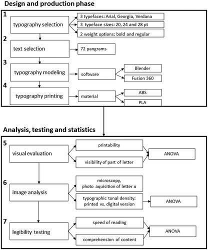
For 3D printing, we chose three widely used typefaces that differ according to their type style, x-height, and character spacing, i.e. Arial, Georgia, and Verdana. They are used to write different texts, and we wanted to establish how these typefaces turn out in 3D printing. All three typefaces were rendered in two weight options, i.e. regular and bold. In line with the use of an FDM technology printer, three type sizes of the typefaces were determined in the preliminary research (Culjkar Citation2017), i.e. 20, 24, and 28 pt. The typeface and base were printed in one colour to optimise printing costs, as is also common in 3D prototyping processes. For the tested texts, 72 different pangrams (holoalphabetic sentences) were used, i.e. sentences where each letter of a given alphabet occurs at least once, from the collection Sto pangramov (100 Pangrams) (Sto pangramov–sto črkovnih vrst Citation2006). shows the experimental plan.
Figure 1. Experimental plan.
Pangram tiles were modelled in two software programs (Blender and Fusion 360) and printed after the pre-production (STL, Cura), using a Wanhao Duplicator i3 V2.1 3D printer, i.e. open source, affordable, and easy to use desktop 3D printer for home use, small business and production of unique products.
Two programs for 3D model creation were selected to analyse the possible influence of software selection on the outcome of 3D printed typeface (Bugdayci, Grunert, and Keller Citation2014). The selected programs were Blender, an open-source 3D modelling software with a good preparation module for 3D printing, and Fusion 360, a cloud-based software platform for 3D modelling, computer-aided design (CAD), computer-aided manufacturing (CAM), computer-aided engineering (CAE), and printed circuit board (PCB) for professional product design and manufacturing. The cost of using the programs is lower than the cost of purchasing and using a 3D printer; hence, it is valuable to know whether the software ability to prepare 3D models has a potential impact on the quality and legibility of the 3D printed typeface.
We chose two materials for printing, i.e. acrylonitrile butadiene styrene (ABS) and polylactic acid (PLA). The combination of the FDM printing prototyping technology with the PLA material is most commonly used in the practice of product design, while the ABS material is still widely used, mainly due to its low cost and good mechanical properties (Kermavnar, Shannon, and O’Sullivan Citation2021). In total, we created 72 different 3D printed tiles with pangrams, which were analysed as shown in the experimental plan (cf. ), including the visual analysis of letter parts, image analysis of a representative letter, calculation of the typographic tonal density (TTD) and legibility testing, and ANOVA (analysis of variance). The analysis of the impact of changes in printing parameters was not the focus of our research. presents the print settings which proved to be optimal for printing with the selected material when preparing for 3D printing (Culjkar Citation2017).
Table 1. Print setup for ABS and PLA printing materials.
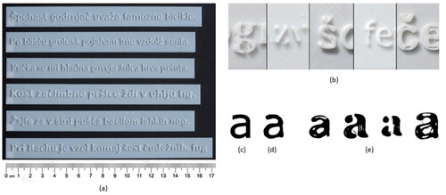
show 3D printed boards with pangrams of size 24 pt, modelled in Fusion 360 and printed with PLA, typographical errors observed during visual analysis, and the examples of the letter a after the image processing, i.e. digital version of letter a, digital images capturing the upper surfaces of 3D printed letters and four letters with a visible impact of the printing process.
Figure 2. (a) 3D printed boards of size 24 pt, modelled in Fusion 360 and printed with PLA material, (b) printing errors observed during visual analysis; (c–e) examples of letter a after image processing: (c) digital version of letter, (d) digital image capturing the upper surface of 3D printed letter, and (e) four letters with visible interfering elements within letter image considered during further analysis.
2.1. Visual analysis
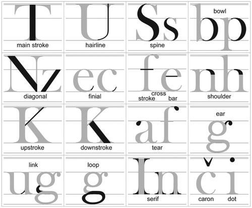
In the visual analysis, we evaluated the print quality of letter parts (cf. ), i.e. main stroke, spine, bowl, diagonal, finial, cross bar, cross stroke, shoulder, upstroke, downstroke, dot, and caron (cf. ). At the typeface with different stroke width (i.e. Georgia), we also focussed on hairline (i.e. thin stroke), tear, ear, link, loop, and serif (cf. ). The visual analysis included the assessment of the (i) quality of printed letter parts (i.e. whether the part was printed or not), (ii) visibility of the counter, and (iii) visibility of the deformation that occurred during the printing.
Figure 3. Parts of letters.
We scored both detection values using a three-point intensity (size) scale from 1 to 3, where 1 is small, 2 is medium, and 3 is large. We obtained a visual score for all influencing parameters (material, software, typeface, weight options, and type size) and their combinations, which was then statistically analysed with multivariate analysis of variance (ANOVA) with a statistical significance of 95%. The experimental design diagram for the visual analysis is shown in .
Table 2. Experimental design diagram for visual analysis.
2.2. Typographic tonal density
We chose the letter a for the image analysis as it enabled the analysis of the print quality of all letter parts. We used a Nikon SMZ800 microscope and a Nikon D600 camera to photograph the best printed letter a on each of the 72 3D printed plates (magnification range 1–8, magnification ratio 8:1 (16× magnification), illumination from above, 1/25, ISO whiteness = 200). The image data were captured using digiCamControl. The images were then processed in ImageJ, showing the extraction of image elements which represent letter parts that were created by moving the print nozzle to a different location (cf. ) or other printing anomalies caused by the printing process that were within the boundaries of the lettering (cf. ). The same procedure was used to repeat the processing and thresholding method on the digital version of letters, created using both Blender and Fusion 360 software (cf. ).
The differences in the typographic tonal density (TTD) of digital letters in 3D software (Blender, Fusion 360) and digital images capturing the upper surfaces of 3D printed letters were measured with an image analysis (ImageJ). This software gives the opportunity to measure, analyse and provide output values, e.g. area, number of particles, circularity, and percentage of coverage (National Institutes of Health Citation2021).
2.3. Average reading time and text comprehension of pangrams
The reading time measurements and text comprehension tests were conducted in a laboratory, i.e. a quiet room with walls painted in neutral matte grey, according to the ISO 3664 standard (ISO 3664 Citation2009), using 3D printed typefaces of type sizes 24 and 28 pt. We used a GretagMacbeth Judge light II chamber (D65 lighting conditions). The reading stand was placed in the chamber at an angle of 60°, on which a background in grey colour 7011 was placed according to the scale of the RAL standard (Ralcolor Citation2019). The participants read the pangrams from the distance of 40 cm.
The participants (N = 96, 75 females and 23 males) were students who volunteered to participate in the study, aged between 20 and 29 years, with normal or correct-to-normal vision. The study was divided into two parts. In the first part, 48 participants read pangrams printed in 24 pt type size. In the second part, another 48 participants read pangrams printed in 28 pt type size. The pangrams were presented to different participants in random order to prevent the effect of display sequence. The reading speed and text comprehension were taken into consideration. The length of pangrams was different; therefore, the time required to read 27 characters was calculated. To test reading comprehension, the proportion of correct answers (24 questions) to multiple-choice questions (two-answer alternatives, i.e. yes or no) was examined.
Moreover, legibility (correct answers and reading time) and TTD were analysed using ANOVA with the statistical significance of 95%. shows the diagram of the experimental design for the testing of legibility and TTD.
Table 3. Experimental design diagram for testing legibility and TTD.
3. Results and discussion
3.1. Visual analysis
Visual analysis as a qualitative method used to determine the usability of a 3D printed typeface provided insight into the key parts of each letter, type size, and weight option as a function of technical parameters and printing variables.
The ANOVA results of the visual analysis and statistical significance of how different factors influence the visual perception of 3D printed text are presented in , with mean values and 95% of Least Significant Difference (LSD) intervals. In , only statistically significant influences on dependent variables are presented—statistically insignificant influences are excluded. The factors and dependent variables are presented in .
Figure 4. Influence of (a) software for letter modelling on bowl at typeface Arial, (b) weight option on bowl at typeface Arial, and (c) type size on bowl at typeface Arial.
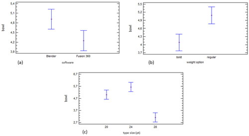
Figure 5. Influence of (a) used material on diagonal at typeface Georgia, (b) weight option on diagonal at typeface Georgia, and (c) type size on diagonal at typeface Georgia.
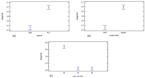
Figure 6. Influence of (a) software for letter modelling on stem at typeface Verdana, and (b) weight option on stem at typeface Verdana.
We first considered the trends of statistically significant effects of the factors on the letter parts in the visual analysis results for all typefaces together and then examined the statistical results for an individual typeface. Most often, the print quality of letter parts, their recognition, and visual analysis were influenced by weight option (cf. ) and type size (cf. ) at all three typefaces. The influence of interaction between these two factors also significantly influenced the typographic elements. There was no clear trend among the typefaces, showing that the same factors have a statistically significant influence on the same parts of letters. Only at the dependent variable bowl, the influence of the factors weight option and type size was presented in all three typefaces. Otherwise, the part of the letter that was affected by most factors and their interactions was upstroke in the typeface Arial (three factors and four interactions), ear in the typeface Georgia (four factors and five interactions), and cross stroke in the typeface Verdana (three factors and three interactions).
Some letter parts, i.e. bowl, upstroke, ear, and cross stroke, were of lower quality when printed. These parts of the letters are rounder, smaller, and thinner; therefore, their preparation and printing are more challenging (Bugdayci, Grunert, and Keller Citation2014).
The least statistically significant effects of the factors on the letter parts were found in the Arial typeface. The dependent variable bowl was influenced by three factors, i.e. software, weight option, and type size (cf. ). The factor type size was statistically the most important factor (cf. ). shows that the maximum type size (28 pt) had the best assessments, while the type sizes 20 and 24 pt were statistically equally significant. The factor weight option was by two times less important than the factor type size. The bold weight option of the typeface was better rated (cf. ). The factor software, however, was the least important factor, while the Fusion 360 software was better rated than the Blender software. The dependent variables diagonal and caron were statistically significantly influenced by the factor type size. The dependent variable shoulder was statistically significantly influenced by the factors weight option and type size. The weight option factor was by 1.5 times more important. The dependent variable upstroke was statistically significantly influenced by three factors, i.e. material, weight option, and type size. The most important factor was weight option. It was by 10 times more important than the factor type size and by almost 22 times more important than the factor material.
In the Georgia typeface, we found that the factors weight option and type size significantly affected parts of the letter, i.e. main stroke, hairline, and spine, where weight option was a statistically more significant factor. The parts of the letter that were statistically most significantly influenced by the factor type size were bowl, shoulder, link, upstroke, and serif.
The dependent variable diagonal in the Georgia typeface was significantly influenced by the factors material, weight option, and type size (cf. ). Statistically, type size was the most important factor, while material and weight option had the same effect on diagonal. The type sizes 24 and 28 pt had a statistically equally significant effect on diagonal (cf. ). A better assessments for diagonal were seen in the bold weight option (cf. ) and for the ABS material (cf. ). Only the factor type size was statistically significant for the dependent variable cross bar. The dependent variable tear was statistically significantly influenced by three factors, i.e. material, weight option, and type size. All four factors had a statistically significant effect on the dependent variable ear. Material had the greatest impact, followed by software (half the impact), weight option, and type size, which had about the same effect on ear.
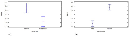
We found that in the Verdana typeface, two factors were statistically significant, i.e. the used software and weight option (cf. ). The factor weight option was statistically by four times more important than the factor software. It is evident from that the letters modelled with the software Fusion 360 gave better ratings for the dependent variable main stroke. The same software offered a better assessment in the main stroke printed in the bold weight option (cf. ).
The dependent variables spine and bowl were statistically significantly influenced by the factors weight option and type size. The weight option factor was statistically three times more significant at spine and by two times at bowl.
The dependent variable diagonal was statistically significantly influenced by the factor type size. The dependent variable cross stroke was statistically significantly influenced by the factors material, weight option, and type size. Shoulder was statistically significantly influenced by the factor weight option. The dependent variable downstroke was statistically significantly influenced by the factors material and type size, where the type size factor was statistically by four times more significant than the factor material. The dependent variables finial, cross bar, upstroke, dot, and caron were not statistically significantly influenced by any of the analysed factors.
The results of the visual analysis showed that the factors representing the technological parameters, e.g. material, and the program for preparing the letters for printing, have a less significant influence (and are statistically insignificant) on the printing quality of letter parts, their recognition, and visual analysis. On the other hand, there are statistically important factors for usability, i.e. typographic parameters, such as weight option and type size, which consequently require greater attention in the design of 3D printed typography to obtain satisfactory usability.
3.2. Typographic tonal density
The typographic tonal density (TTD) of digital letters in 3D software and digital images capturing the upper surfaces of 3D printed letters as a dependent variable was analysed as influence indicators of selected factors and levels of technological parameters of preparation and production of 3D printed letters (software programs Blender and Fusion 360, materials ABS and PLA) and typeface properties (typeface, weight option, type size).
In , the differences between digital letters in 3D software and digital images capturing the upper surfaces of 3D printed letters are represented in the form of TTD. Since the TTD of the digital typeface was higher in all cases, the values were negative.
Figure 7. Differences in TTD between digital letters in 3D software and digital images capturing the upper surfaces of 3D printed letters represented.
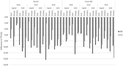
The results present that the bold weight option of the typefaces (with the exception of Arial of 20 pt and Georgia of 28 pt) leads to a greater deviation of TTD than the regular weight option due to the increase in type size. On average, regarding the TTD deviation, the typeface closest to a digital letter is in the regular weight option of the Verdana typeface with the average difference of 4.9% (stdev = 2.36), while in the bold weight option of the Arial typeface with the difference of 7.9% (stdev = 2.87).
The average values show that Arial (6.93%, stdev = 3.22) and Verdana (6.82%, stdev = 3.20) are printed with a smaller difference in TTD compared to the Georgia typeface, the TTD of which is closest to the original, i.e. the digital version only at 20 pt (9.35%). Otherwise, the Georgia typeface deviates on average from the digital version by 9.56% (stdev = 1.90%).
Regarding the difference in TTD between the printed and digital letter, the PLA material proved to be more appropriate, and between the two software programs for letter modelling, the Fusion 360 software was more appropriate if compared to the digital letter, where the difference in TTD was by 0.5% lower (mean of −7.51, stdev = 3.38) than when using the Blender software (mean of −8.03, stdev = 3.34). The results also showed that the use of the PLA material is more appropriate for all type sizes and weight options, since, on average and independently of other variables, the difference in TTD at a digital letter is by 2.85% lower than in the case of the ABS material. The average TTD for the PLA material is 6.34% (stdev = 2.94) and for the ABS material, 9.20% (stdev = 2.53).
3.3. Average reading time and text comprehension of pangrams
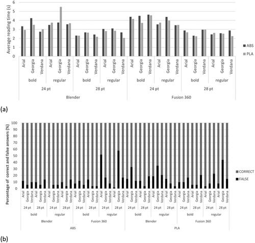
In , the results of (a) the average reading time of pangrams and the results of (b) text comprehension are presented.
Figure 8. (a) Average reading time and (b) results of text comprehension of pangrams depending on various variables.
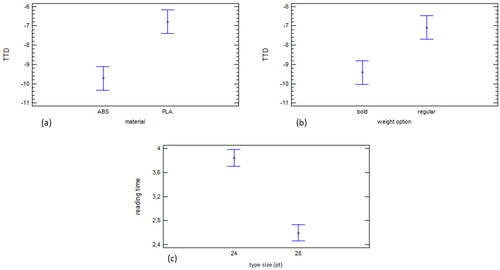
shows the ANOVA results for the statistically significant influence of the used (a) material and (b) weight option on TTD and the influence of (c) type size on reading time.
Figure 9. Influence of used (a) material on TTD, (b) weight option on TTD, and (c) type size on reading time.
shows that the average reading time of all three typefaces and two weight options is shorter when the type size 28 pt (compared to 24 pt) is used. The reading time of the pangrams in 28 pt decreased on average by 1.24 s compared to the pangrams in the 24 pt type size. The speed of reading the bold weight option is independently of other variables on average by only 0.1 s shorter than the speed of reading the regular weight option. On average, the choice of the Verdana typeface (aver. = 3.01 s, stdev = 0.85 s) is more suitable for the regular weight option, and the Arial typeface (aver. = 3.13 s, stdev = 0.89 s) for the bold weight option.
In general, the average reading time of the Verdana typeface is the shortest (aver. = 3.1 s, stdev = 0.23 s), regardless of the choice of software for letter modelling, printing material, weight option and type size. Moreover, in terms of both type sizes and weight options, Verdana was on average read the fastest due to its typeface characteristics. It has a moderate counter size and the highest x-height among the used typefaces.
The analysis in dependence of type size shows that with the size of 24 pt and both weight options, the Georgia typeface was on average read the slowest (both versions took more than 4 s). At the size of 28 pt and for the bold weight option, the Verdana typeface gave the fastest reading time result (aver. = 2.64 s, stdev = 0.39 s), while for the regular weight option, the fastest reading time result was achieved for the Georgia typeface (aver. = 2.76 s, stdev = 0.27 s). The Georgia typeface with 28 pt and the bold weight option resulted in the fastest reading time result (aver. = 2.46 s, stdev = 0.23). The Georgia typeface is the only one among the tested typefaces with differences in stroke width and serifs.
The text comprehension results (cf. ) confirm the results of the reading speed and show that for the regular weight option and 24 pt type size, the Verdana typeface is the most legible typeface, resulting in 85.5% of correct answers. Almost the same percentage of correct answers was achieved with the results of text comprehension in the bold weight option of 24 pt with the typefaces Verdana and Arial (88.8%). This suggests that when poor typographic design, e.g. type size too small, obstructed the reading, the texts were remembered better than the texts the legibility of which was not hindered (Diemand-Yauman, Oppenheimer, and Vaughan Citation2011; Price, McElroy, and Martin Citation2015; Možina et al. Citation2020). The Verdana typeface was generally read the fastest with the regular weight option and 28 pt type size and two types of materials and software programs.
After testing the Georgia typeface, we confirmed that this typeface is among other typefaces read and understood the best with the bold weight option and 28 pt type size. The use of this typeface also shows the maximum distribution of results between the regular and bold weight option due to the recognisability of letters. Regarding the typeface with differences in stroke width, the bold weight option is more suitable for 3D printing, esp. in smaller type sizes.
In general, it can be said that the speed of reading 3D printed letters is significantly slower than when reading a text printed on paper or on-screen. When testing legibility at very small type sizes (Možina, Podlesek, and Bračko Citation2019), i.e. 6 and 8 pt, printed on paper, the reading of 27 characters took from 1.35 to 1.57 s. In another study (Možina et al. Citation2020), participants read usual type sizes of 8, 10, and 12 pt for printed matter. They read from Japanese knotweed paper. The prints were of poor contrast, since this paper grade is dark brown, and the reading of 27 characters took 1.42 s. The legibility of larger type sizes (16, 17, 19, 20, 21, 24, 26, and 32 pt) was tested on-screen (Franken, Podlesek, and Možina Citation2015). For 27 characters in sizes 24, 26, and 32 pt, the reading time for the Verdana typeface was from 1.38 to 1.32 s and from 1.43 to 1.44 s for the Georgia typeface. The main reason in the significantly slower reading can be found in the poor contrast of the 3D printed image of the letter and the background, as the pangrams were printed entirely in one colour.
ANOVA showed that the TTD results (cf. ) were statistically significantly influenced by two factors, i.e. material and weight option, with the statistical significance of 95%. Material is statistically more significant, i.e. by about 1.5 times.
For the PLA material, the percentage intervals are the same as for the ABS material (cf. ). When analysing the effect of TTD on weight option, we found that the bold weight option had lower values than the regular weight option (cf. ).
The statistical analysis showed that only the type size factor had a statistically significant influence on the reading time results. We found that the reading time decreases with increasing type size (cf. ).
We need to say that the research results should not be generalised to other 3D printing technologies or to other FDM technology printers. To verify the general applicability of the results, it would be necessary to test the 3D printed products with typography with different types of FDM printers and compare the results. What the present research and result analysis provide is a possible framework for the usefulness of the 3D printed typography for the purpose of reading and understanding a text, and thus the impact on the experience of using smaller sizes 3D printed letters on products. The results systematically demonstrate the importance of both technological (material, software) and typographic (type size, weight option, typeface) variables for the visual quality of 3D printed typography (using visual analysis), and consequently for the quality of the 3D printed prototype of letters in terms of their type size, weight option, and typeface, which are important ergonomic factors in the design of a 3D printed product with typographic elements.
4. Conclusions
The research presents the influence of significant typeface parameters, and the impact of print material and software for letter modelling on 3D printed typography as systematic and statistically evaluated results for the use of desktop 3D printers. Due to the lack of research in the field of 3D printed typography, the research results, which follow below, are valuable as recommendations and guidance even if other input parameters are used in the analysis and printing:
The results revealed that the speed of reading 3D printed letters is by almost two times slower than when reading a text printed on paper or on-screen (Franken, Podlesek, and Možina Citation2015; Možina, Podlesek, and Bračko Citation2019; Možina et al. Citation2020). The main reason for the significantly slower reading can be found in the poor contrast of the 3D printed image of the letter and the background, as the pangrams were printed entirely in one colour.
The results of the visual analysis of the representative letter show that the print quality of letter parts and their recognition, respectively, was most often influenced by two factors and their interaction, i.e. weight option and type size for all three analysed typefaces.
The statistical analysis of the factors influencing typographic tonal density showed that, with the statistical significance of 95%, only print material and weight option are statistically significant. Between these two factors, material is more statistically significant, and the material PLA and regular weight option have a greater impact on typographic tonal density than the material ABS and bold weight option.
According to the statistical analysis, the results of the reading time of a particular typeface are, as expected, strongly dependent on type size.
When analysing the reading time, it was established that the Verdana typeface is generally the optimal typeface.
The recommendations based on the results of this research are useful for the design and manufacture of 3D printed products that incorporate elements of typography. The findings can be used as direct guidelines for research with the FDM technology, and the materials ABS and PLA. If using other printing technologies, there is a possibility of using the presented framework to analyse the influence of typographic parameters on the quality of 3D printed typography (visual features and TTD) and its applicability in terms of legibility and understanding of a text. Nevertheless, further research, e.g. analysis of different technologies, analysing the effects of changes in 3D printing parameter settings (which was not addressed in our study), exploring materials that are increasingly being used in the 3D production due to their environmental and sustainable aspects (biocomposite materials), investigating other typefaces of different colour than the background used in 3D printed products, could lead to ampler findings.
Ethical approval
Our research was a non-interventional study: Verbal informed consent to participate in this research was provided by the participants. According to Slovenian legislation, participants in the study were between 20 and 29 years of age and thus of legal age. Before the research, participants were told the purpose of the research, i.e. how the research would proceed, what their task would be, approximately how long the research would last, and in what room it would take place. This included reading pangrams in a standardised environment and answering 24 closed questions. All subjects who participated in the research agreed to participate before the research, for which they were not paid or otherwise rewarded.
Disclosure statement
No potential conflict of interest was reported by the author(s).
Additional information
Funding
References
- Abbink, J., and E.C.M. Andersen. 2010. 3D Typography. New York, NY: Mark Batty.
- Ball, R., H. Wang, and Y. Luximon. 2019. “Scan and Print: A Digital Design Method for Wearable Products.” Ergonomics in Design 27 (4): 26–34. doi:10.1177/1064804619852428.
- Beier, S. 2012. Reading Letters: Designing for Legibility, 10–11. Amsterdam: BIS.
- Bix, L., H. Lockhart, S. Selke, F. Cardoso, and M. Olejnik. 2003. “Is x-Height a Better Indicator of Legibility than Type Size for Drug Labels?” Packaging Technology and Science 16: 199–207. doi:10.1002/pts.625.
- Boonoobong. 2013. 3D Printed Typography with Generative Voronoi Pattern. Accessed April 15, 2021. http://3dprinted.tumblr.com/post/49352227399/3d-printed-typography-with-generative-voronoi-pattern/
- Bringhurst, R. 2002. The Elements of Typographic Style, Vol. 45, 121–136. Point Roberts, WA: Hartley & Marks.
- Bugdayci, H., J. Grunert, and F. Keller. 2014. Analysis of Slicing-Tools for Fused Deposition Modeling 3D-Printers and Comparison of Different Printers, 39–41. Stuttgart: Institut für Rechnergestützte Ingenieur Systeme, Universität Stuttgart.
- Cano-Vicent, A., M.M. Tambuwala, S. Sk. Hassan, D. Barh, A.A.A. Aljabali, M. Birkett, A. Arjunan, and A. Serrano-Aroca. 2021. “Fused Deposition Modelling: Current Status, Methodology, Applications and Future Prospects.” Additive Manufacturing 47: 102378. doi:10.1016/j.addma.2021.102378.
- Culjkar, P. 2017. “Čitljivost 3D Tiskane Tipografije Pri Manjših Velikostih.” Diploma Thesis. Univerza v Ljubljani, Naravoslovnotehniška fakulteta.
- Diemand-Yauman, C., D.M. Oppenheimer, and E.B. Vaughan. 2011. “Fortune Favors the Bold (and the Italicized): Effect of Disfluency on Educational Outcomes.” Cognition 118: 111–115. doi:10.1016/j.cognition.201009.012.
- Flood, K. 2020. Gorgeous Custom 3D-Printed Text. Accessed November 20, 2020. http://thecreatorsproject.vice.com/blog/gorgeous-custom-3d-printed-text/
- Franken, G., A. Podlesek, and K. Možina. 2015. “Eye-Tracking Study of Reading Speed from LCD Displays: Influence of Type Style and Type Size.” Journal of Eye Movement Research 8: 1–8. doi:10.16910/jemr.8.1.3.
- Galle, P., and P. Kroes. 2014. “Science and Design: Identical Twins?” Design Studies 35: 201–231. doi:10.1016/j.destud.2013.12.002.
- Gaultney, V. 2001. Balancing Typeface Legibility and Economy: Practical Techniques for the Type Designer, Research Essay, 1–9. Reading: University of Reading.
- Grimaud, J.J. 2017. 3d Fonts for Automation of Design for Manufacturing, EP3113011A2. Accessed September 25, 2020. https://patents.google.com/patent/EP3113011A2/
- Grunert, J. 2014. Text Test. Accessed March 25, 2021. http://www.thingiverse.com/thing:383163
- Hazal Tümer, E., and H.Y. Erbil. 2021. “Extrusion-Based 3D Printing Applications on PLA Composites: A Review.” Coatings 11: 390. doi:10.3390/coatings11040390.
- Hill, D. 2013. 3D Printed Typeface, Adobe Systems. Accessed March 19, 2021. hhtp://www.behance.net/gallery/3D-Printed-Typeface/3794707/
- ISO 3664. 2009. Graphic Technology and Photography – Viewing Conditions. Gèneve: International Organization for Standardization.
- Kakanuru, P., and K. Pochiraju. 2020. “Moisture Ingress and Degradation of Additively Manufactured PLA, ABS and PLA/Sic Composite Parts.” Additive Manufacturing 36: 101529. doi:10.1016/j.addma.2020.101529.
- Kermavnar, T., A. Shannon, and L.W. O’Sullivan. 2021. “The Application of Additive Manufacturing/3D Printing in Ergonomic Aspects of Product Design: A Systematic Review.” Applied Ergonomics 97: 103528. doi:10.1016/j.apergo.2021.103528.
- Keyes, E. 1993. “Typography, Color, and Information Structure.” Technical Communication 4: 638–654.
- Legge, G.E., and C.A. Bigelow. 2011. “Does Print Size Matter for Reading? A Review of Findings from Vision Science and Typography.” Journal of Vision 11: 1–22. doi:10.1167/11.5.8.
- Miller, J.A. 1996. Dimensional Typography: Case Studies on the Shape of Letters in Virtual Environments. New York, NY: Kiosk, Princeton Architectural Press.
- Mings, J. 2012. Arkitypo: The 3d Printed Alphabet Project (and How It Was Made). Accessed January 27, 2021. https://www.solidsmack.com/fabrication/arkitypo-the-3d-printed-alphabet-project-and-how-it-was-made/
- Možina, K. 2003. Knjižna Tipografija, 111–119, 130–133, 216–223. Ljubljana: Filozofska fakulteta, Naravoslovnotehniška fakulteta.
- Možina, K., S. Bračko, D. Kovačević, B. Blaznik, and K. Možina. 2020. “Legibility of Prints on Paper Made from Japanese Knotweed.” BioResources 15: 3999–4015. doi:10.15376/biores.15.2.3999-4015.
- Možina, K., A. Podlesek, and S. Bračko. 2019. “Preserving Typographical Cultural Heritage Using Contemporary Digital Technology.” Journal of Cultural Heritage 36: 166–173. doi:10.1016/j.culher.2018.07.010.
- National Institutes of Health. 2021. Research Services Branch. Accessed March 13, 2021. http://rsb.info.nih.gov/ij/
- Price, J., K. McElroy, and N.J. Martin. 2015. “The Role of Font Size and Font Style in Younger and Older Adults’ Predicted and Actual Recall Performance.” Aging Neuropsychology, and Cognition 23: 366–388. doi:10.1080/13825585.2015.1102194.
- Ralcolor. 2019. Accessed April 5, 2021. http://www.ralcolor.com/
- Reynolds, L. 1988. “Legibility of Type.” Baseline, International Typographics Journal 10: 26–29.
- Sharmin, S., O. Špakov, and K.J. Räihä. 2012. “The Effect of Different Text Presentation Formats on Eye Movement Metrics in Readin.” Journal of Eye Movement Research 5: 1–9. doi:10.16910/jemr.5.3.3.
- Sheedy, J.E., M.V. Subbaram, A.B. Zimmerman, and J.R. Hayes. 2005. “Text Legibility and the Letter Superiority Effect.” Human Factors 47 (4): 797–815. doi:10.1518/001872005775570998.
- Špakov, O., H. Siirtola, H. Istance, and K.J. Räihä. 2017. “Visualizing the Reading Activity of People Learning to Read.” Journal of Eye Movement Research 10: 1–12. doi:10.16910/jemr.10.5.5.
- Spichtig, A.N., J.P. Pascoe, J.D. Ferrara, and C. Vorstius. 2017. “A Comparison of Eye Movement Measures across Reading Efficiency Quartile Groups in Elementary, Middle, and High School Students in the U.S.” Journal of Eye Movement Research 10: 1–17. doi:10.16910/jemr.10.4.5.
- Sto pangramov–sto črkovnih vrst. 2006. Vzorčnik Črkovnih Vrst, Nastalih Na Tipografskih Delavnicah Tipo Brda v Letih 1997–2006. Ljubljana: Društvo Tipo Brda.
- Taekyeom, L. 2017. “New Typographic Experience in the Post-Digital Age with 3D Printing and Ceramics.” In Advances in Affective and Pleasurable Design, Proceedings of the AHFE 2017, International Conference on Applied Human Factors and Ergonomics, July 17–21, edited by W.J. Chunh and C.S. Shin, 161–170. Los Angeles, CA: Springer.
- Tai, Y., J. Sheedy, and J. Hayes. 2007. “Effect of Letter Spacing on Legibility, Eye Movements, and Reading Speed.” Journal of Vision 7 (2): 1–10.
- Tambrallimath, V., R. Keshavamurthy, D. Saravanabavan, P.G. Koppad, and G.S.P. Kumar. 2019. “Thermal Behavior of PC-ABS Based Graphene Filled Polymer Nanocomposite Synthesized by FDM Process.” Composites Communications 15: 129–134. doi:10.1016/j.coco.2019.07.009.
- Tarasov, D.A., A.P. Sergeeva, and V. Filimonova. 2015. “Legibility of Textbooks: A Literature Review.” Procedia – Social and Behavioral Sciences 174: 1300–1308. doi:10.1016/j.sbspro.2015.01.751.
- To the Letter. 2015. 3D Printed Typography Designs. accessed April 15, 2021. http://www.leolane.com/blog/to-the-letter-5-3d-printed-typography-designs/
- Tracy, W. 2003. Letters of Credit: A View of Type Design, 13–21, 30–32. Boston, MA: David R. Godine.
- White, J.V. 1996. Color for Impact, 27–30. Berkeley, CA: Strathmoor Press.
- Wickramasinghe, S., T. Do, and P. Tran. 2020. “FDM-Based 3D Printing of Polymer and Associated Composite: A Review on Mechanical Properties, Defects and Treatments.” Polymers 12: 1529. doi:10.3390/polym12071529.
- Zhang, X., W. Fan, and T. Liu. 2020. “Fused Deposition Modeling 3D Printing Polyamide-Based Composites and Its Applications.” Composites Communications 21: 100413. doi:10.1016/j.coco.2020.100413.
- Zhou, H. 2017. Textscape: Hongtao Zhou. Accessed September 11, 2020. http://hongtaozhou.com/section/408972_Textscape.html/