
ABSTRACT
This editorial explores knowledge visualization, a field of study that investigates the power of visual formats to represent knowledge, as a strategy to enhance knowledge mobilization of results from ICT4D research. We highlight the fact that there are evidence-based guidelines for creating and crafting visualizations in academic writing. We also provide some visualization examples that highlight general knowledge visualization criteria such as anchor and extend, familiarity, clarity and consistency, include text, prudent simplicity and aesthetics. Although visualization is not the central theme of any of the papers in this issue, the papers offer a variety of visualization techniques as appropriate to the knowledge domain.
1. Introduction
The year 2020 will be remembered for the global health pandemic caused by the COVID-19 virus, the social justice ‘pandemic’ that erupted after the murder of George Floyd, and also the locust ‘plague’ that has affected countries of West and East Africa and Asia. Globally interdisciplinary research teams are investigating these disasters to find solutions and discover what lessons humankind can and should learn. The data, information and knowledge captured by the lessons learned process ought to be mobilized to support sensemaking and reflection across all sectors of society, including government, industry and the general public. Knowledge mobilization employing ICTs have an important role to play in ‘not wasting a crisis,’ i.e. harnessing the emotion, energy, knowledge and innovation resulting from these kinds of disasters to engender positive post-recovery growth. Knowledge Mobilization (hereafter referred to as KM) emerged in response to the need for strategies in forging stronger connections between research, policy and practice across sectors, disciplines and countries (Crilly et al., Citation2010; Levin, Citation2011).
This editorial explores knowledge visualization (KV), a field of study that investigates the power of visual formats to represent knowledge, as one strategy to enhance knowledge dissemination, in terms of improving effectiveness and efficiency when applying that in the domain of information and communication technologies for development, in short ICT4D. We provide an overview of what KV is and consider why it adds value in the ICT4D research domain. We conclude by providing some examples of how it has, and could, be applied to enhance this field. The papers in this issue represent diversity in terms of the geographical, methodological and application contexts of the research but all the authors use visualization to some degree in representing their findings. Therefore, the editorial reflects on the visualizations used towards creating an awareness of how visualizations can be used to support knowledge mobilization.
2. Perspectives on visualization
Cave or rock paintings dating back to prehistoric times and ancient objets d'art bear witness to humankind’s innate ability to create visualizations to support generational knowledge transfer in pre-literate eras. Christianson (Citation2012), proposed a list of 100 diagrams that changed the world, starting with the Chauvet Cave drawing (30 000 BC), moving on towards the Aztec calendar (1479), the Periodic Table (1869), and the World Wide Web (1989), to name a few, and ending with the design of the iPod in 2001. These diagrams represent innovations in the fields of art, astronomy, cartography, chemistry, mathematics, engineering, history and communications but were, more often than not, created by drawing on a combination of disciplines. Scientific visualizations, as provided by graphical objects, have characteristics that make them a powerful communication mechanism (Card, Citation1999). Images are pre-attentive, i.e. processed before the conscious mind starts to pay attention, and are thus processed before text and need less effort to comprehend than textual descriptions (Burkhard, Citation2004). When consuming a visualization, the viewer will move through the stages of perception, interpretation and comprehension with each stage depending on the previous stage, the visualization itself and the viewer’s pre-existing knowledge and experience (Kirk, Citation2016).
Using mainly text and numbers, without complementary visualizations, is unlikely to meet the requirements of our modern knowledge-driven society (Meyer, Citation2010). Visual methods provide a powerful medium that grounds general communicative frameworks (Gavrilova et al., Citation2017). Any study of KV can benefit from considering its relationship to the more established fields of data and information visualization. From a data processing perspective, visualization is considered a method of computing which transforms the symbolic into the geometric, in some cases also changing the dimensionality of the data (Hansen & Johnson, Citation2011). The data is represented visually through combinations of marks and attributes where the marks are the points, lines and areas and the attributes include appearance properties such as size, color and position thereof. Skillful combinations of these marks and attributes facilitate appropriate representations of the entities and relationships, patterns, trends, clusters, and outliers within the data. We acknowledge the existence of diverse streams of thought on differentiating between data, information and knowledge and indeed in the visualizations thereof, but propose the following as a point of departure:
Data visualization is the use of a visual representation of data which adds meaning to such data, supporting the transitioning of such data to information (Chen et al., Citation2009), alternatively the representation and presentation of data to facilitate understanding (Kirk, Citation2016).
Information visualization is the use of a computer-supported, interactive, visual representation of abstract non-physically based data with the aim to amplify cognition (Card, Citation1999).
Knowledge Visualization (KV), an essential part of knowledge mobilization, is a field of research that focuses on the creation and transfer of knowledge, specifically the use of visual representations to support and facilitate the communication of knowledge between at least two persons (Burkhard, Citation2005; Meyer, Citation2010). We acknowledge that the concept of knowledge transfer is epistemologically contentious, and many prefer the term knowledge sharing. However, not wanting to change basic KV definitions, we continue using the term ‘knowledge transfer’ and suggest that this term could reflect the intention to share knowledge with the expectation that the recipient will utilize it for sensemaking.
For example, data could be visualized using bar charts to produce meaningful information. Information visualizations can then be constructed to engender pattern recognition which leads to knowledge production (Card, Citation1999). Knowledge visualizations can then help to convey such new knowledge to other people. Notably, data, information and knowledge visualizations have a shared purpose in the amplification of understanding, but we argue that knowledge visualizations are specifically focused on knowledge sharing and effective communication between persons.
depicts the Data-Information-Knowledge-Wisdom hierarchy based on a diagram by Renaud and van Biljon (Citation2017). There is general agreement on the idea that knowledge production starts with the analysis of raw (primary) data to add the meaning required to produce information as output. Then the information is analysed to produce knowledge, which is visualized to ease sharing it with other people.
Figure 1. Data, information, knowledge, wisdom hierarchy (Renaud & van Biljon, Citation2017).
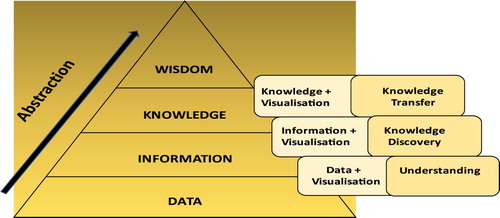
However, the lines between data, information and knowledge visualizations have become blurred. Information and data visualizations are often viewed similarly (Kirk, Citation2016). Both domains involve computer engineering and applications and both domains previously scrutinized the algorithmic concepts underlying the domains and applied visualization techniques to biomedical research (Kim et al., Citation2016). The line between information and knowledge visualizations is also hard to pin down but we suggest two dimensions for differentiating. The first and most obvious difference lies in the inputs used to produce the visualization with a one-to-one mapping from the input type to the visualization name (), e.g. ‘data’ is used to produce ‘data visualizations.’
The second difference lies in the purpose of the visualization as that informs decisions on the way the visualization is crafted. The interested reader can consult Burkhard (Citation2004, Citation2005), Kirk (Citation2016), Kim et al., (Citation2016) and Meyer (Citation2010) for more fine-grained details on these distinctions.
Data visualization and information visualization theories are mature but knowledge visualization is still considered a relatively new subject (Gavrilova et al., Citation2017; Meyer, Citation2010). The St. Gallen School made a significant contribution to the study of visualization aspects, including the classification of visualization methods, descriptions of the use of visualization in business, development of a theory of boundary objects, as well as a detailed description of pertinent experimental research (Gavrilova et al., Citation2017). Information visualization is an interdisciplinary research field drawing on the subject domains of information retrieval, hypertext and the world Wide Web, digital libraries and human computer interaction (Chen, Citation2004). Knowledge visualization research has been published in the fields of Knowledge Management and Business Management, but many other fields can benefit from research into visualizations designed to enhance knowledge transfer and facilitate knowledge sharing in the domain.
Academic writing is mostly constrained to the two-dimensional, static space, but some conferences have started inviting academics to provide video previews of their papers, and Elsevier has started asking for graphical abstracts of accepted papers. Furthermore, illustrated information booklets, posters and the interactive visualizations on community websites and digital platforms can provide a significant spur to knowledge mobilization across interest groups, disciplines, education and literacy levels. Having noted the diverse origins of KV, we now focus on the relevance of KV in the Information and Communication Technology for Development research (ICT4D) research domain.
3. Why is knowledge visualization important in ICT4D research?
The study of ICTs for development and the on-going innovations support active participation by all sectors of society (Bailey & Osei-Bryson, Citation2018). The term ICT4D can refer to various concepts; Bon (Citation2019) identified the following three streams: (i) policy and the subsequent efforts by the international community and national governments to make the advantages of modern ICTs available to the unconnected, underserved and resource-constrained communities or regions of the world; (ii) the academic disciplines or sub-disciplines that study the effects and impact of ICTs on developing societies and contexts; (iii) to the practice of designing, building and engineering ICT systems and applications in programs and projects in a development context by multi-disciplinary teams including professionals in ICT, science and engineering. Each stream involves stakeholders collaborating on different levels. According to the typology of ICT4D research (Qureshi, Citation2015), the stakeholders include: Individuals, organizations, countries, regions and the world. This means that people in different capacities and from different backgrounds need to communicate to facilitate ICT4D progress within and between streams. KV has potential for easing communication between the researchers and the community and between researchers from different disciplines by providing mechanisms for communicating across language, and other demographic barriers. For example, consider a project manager wanting to present the notion of a new dam being built in a rural community might want to communicate the proposal to different stakeholder groups including politicians, engineers, environmental activists and the rural community members, all with different knowledge backgrounds. This is where different complementary visualizations with tailored levels of detail can be combined to optimize knowledge sharing as advocated by Burkhard (Citation2004).
Considering disciplinary divides, ICT4D research has a multi- inter- and trans-disciplinary nature (Walsham, Citation2017) with diverse stakeholders including funding organizations, industry, governments, NGO’s, researchers, practitioners and the user communities (Bon, Citation2019). Continuing with the example of the dam, this means engineers and geologists would collaborate in designing the physical structure to be appropriate for the geological foundations. Mostly that collaboration would involve disciplinary autonomy and thereby represent multi-disciplinary research, the latter not challenging the structure, functioning or best practices of the academic communities involved (Wickson et al., Citation2006). However, if the geological foundation presents specific challenges, the engineers and geologists may have to devise interdisciplinary methods, which means drawing on and possibly challenging their respective methods in a way that requires methodological transfer between disciplines (Van Biljon, Citation2011). Transdisciplinary work involves the application of a theory or a concept across disciplines, which means that the theory or concept becomes applicable in many fields (Tarafdar & Davison, Citation2018). This transcends separate disciplinary perspectives towards the epistemological goal of the production of new, in vivo knowledge of a phenomenon (Nicolescu, Citation2005). In this case, it could be the phenomenon of a community-informed design in water management which involves and transcends the fields of engineering, information systems, sociology etc.
KVs have a unique potential to facilitate the knowledge sharing beyond words and text and we argue that the ability to combine different types of information and knowledge visualizations to bridge disciplinary knowledge gaps makes KV particularly relevant in ICT4D. Furthermore, it is necessary to think about KV in terms of a suite of KV solutions for each project. This implies a greater awareness of which visualizations are available, which would be appropriate for different stakeholders and how these can be crafted and delivered. It means recognizing the full range of visualization tools for supporting knowledge presentation and sharing. These range from the use of formulas and static tables through two dimensional, static diagrams and moving beyond in terms of complexity and interactivity to collaborative processes, used to create visualizations and new knowledge dynamically (Meyer, Citation2010).
The most useful visualizations have been created when the authors recognize the interdependency of the intellectual and of the creative (Christianson, Citation2012) and optimally resolve the competing needs for abstraction and detail. For example, Henry Charles Beck, designer of the London Underground Tube map, introduced the novel idea of abandoning geography. He realized that abstraction allowed the development of a circuit diagram, which travellers found easier to understand. He further improved the usability by using optimal color coding and symbols to distinguish between ordinary and interchange stations. Abstraction is an intellectual mechanism which allows us to ignore irrelevant or lower-order constructs (Borning et al., Citation2020), but we need to be mindful of the trade-off between abstraction and detail and the possibility of unintended consequences if abstraction is over- or under-applied. The general visualization risks and pitfalls include the cognitive, emotional, and social risks that could be introduced by the designer’s choices or by the users’ interpretation of the visualization as influenced by their education, socialization and personal experiences (Bresciani & Eppler, Citation2015).
Besides, the general challenges related to visualization, as mentioned, there other are research specific challenges such as the lack of consistent agreement on data, information and knowledge divisions (Gavrilova et al., Citation2017) and lack of knowledge visualization competence (Meyer, Citation2010). The latter limits KV efforts to representations by software templates that enforce inadequate and even incorrect linear or hierarchical relationship structures. Examples of knowledge visualizations appearing in publications are on the rise, but we argue that mindful, evidence-based approaches to the creation and evaluation of those examples are needed to harness their true potential for knowledge mobilization. Therefore, we now present a few KV examples, highlight their potential impact and conclude this editorial with some suggestions for creating useful ICT4D-related knowledge visualizations.
4. Visualization examples
An overview of the most useful visualizations in ICT4D research would be an excellent topic of a future investigation. Here, we suffice with a selection of examples chosen to highlight specific aspects of knowledge visualization and how these were applied. These examples meet the general visualization design criteria of trustworthiness, accessibility and elegance (Kirk, Citation2016) where trustworthiness can be measured in terms of integrity, accuracy and legitimacy, accessibility in terms of usefulness and understandability and elegance in terms of aesthetics, balance and parsimony (Kirk, Citation2016). On a more operational level, the examples meet the KV criteria of anchor and extend, familiarity, clarity and consistency, include text, prudent simplicity and aesthetics (Renaud & Van Biljon, Citation2019). Using familiar terminology and notations, anchoring and extending the message is guided by a consideration of the target audience. Aesthetics is more subjective. Chen (Citation2004), when considering graphs comprising nodes and edges proposed the following graph drawing aesthetics: minimize the total number of bends in polyline edges, minimize the number of crossing in the display, maximize the minimum angles between edges, fix nodes and edges to a orthogonal grid and display a symmetrical view of the graph if possible. For diagrams the properties of being symmetrical, balanced, regular and complete apply (Gavrilova et al., Citation2019). Therefore, we conclude that the aesthetics is generally evaluated in terms of simplicity, balance and symmetry. Acknowledging that most of the basic criteria have been met, we now highlight selected properties of the following visualizations.
ICT4D research domain: Sein et al. (Citation2019, p. 3) identify three concepts that lie at the root of the definition of the area of ICT4D, namely ICT, D and the catchall term ‘4’ or ‘for,’ and present the ICT4D area visually as depicted in . Hermeneutically this distinction forms the basis for identifying three groups of theories as ‘parts’ that gives an understanding of the ‘whole,’ which is ICT4D. The diagram meets the criteria of simplicity and anchoring the message by using the familiar context of a Venn-diagram. The font size and intensity of the text labels signal the difference between the subsets. Besides identifying the significant components and their relationships an increased understanding of ICT4D is achieved by iterating between the independent meaning of the parts and the whole that they form (Sein et al., Citation2019). That diagram is useful when considering recurring questions in the domain, as the following applications demonstrate.
Figure 2. Visual representation of the ICT4D Domain based on (Sein et al., Citation2019, p. 3).
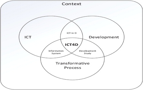
The question: ‘Are we making a better world with Information and Communication Technology for Development?’ was initially posed by Walsham (Citation2012) and later re-examined by other authors like Qureshi (Citation2015). The diagram in demonstrates that the question invites consideration of all three components (i.e. ICT, Development, and the Transformative Process) within the appropriate context. For example, a paper that deals only with development and the transformative process components may be making a better world but does not harness the power of ICTs. Notably, the issue is not that ICT should be part of the solution but rather that placing such research in the ICT4D domain is dubious.
Another recurring discourse relates to the use of the term ‘ICT4D’ where the term ‘development’ is multifaceted and often contentious (Walsham, Citation2017), it can also be ambiguous, especially in Computing where it could refer to software development, socio-economic development or human development. This is compounded by the different perspectives on what the ‘4D’ represents. Toyama (Citation2010) argues that the label ‘ICT4D,’ is problematic since ‘4’ implies application and suggests substituting that with ‘and’ for the less application-focused abbreviation ICTD. Brown and Grant (Citation2010) argue that the term ICTD refers to the studies done in developing countries and distinguishes those from the studies with a clear developmental focus, i.e. ICT4D studies. The diagram in suggests that the transformative process is not included in the intersection of the ICT and Development circles. Whether that applies to conferences, journals and research groups that associate with the term ICTD is beyond this discussion, but the visualization provides a way of distinguishing the research that focuses on application (technological) development as well as transformative development, i.e. ICT4D from those that focus on subsets thereof. Finally, one of the core themes in ICT4D research has been the elicitation of localized knowledge about the phenomenon being studied, framed by contextually-developed lenses (Davison & Martinsons, Citation2016). confirms the status of context by embedding all the other components in the context. Therefore, is considered a useful knowledge visualization with communicative power.
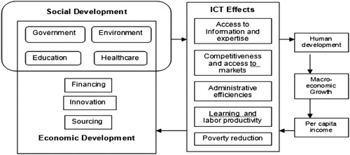
Unpacking the thorny concept of Development in relation to ICTs, depicts a model for IT Development (Qureshi, Citation2005, p. 506) whereby the relationship between the social and the economic components are made explicit. The ICT effects are unpacked and linked to the goals of Human development, Macro economic growth and Per capita income. Abstraction and making the boundaries and relationships clear, as done in offer opportunities for engagement. The communicative power is enhanced by providing both an overview in terms of the boundaries and intersections and details in terms of the components included in each sub-set. Therefore, this is proposed as an example of a useful knowledge visualization with communicative power.
Figure 3. Model of IT for development (Qureshi, Citation2005, p. 506).
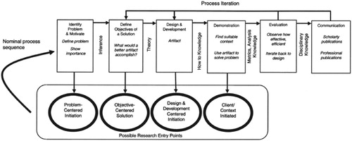
ICT4D research methodology: For some time, it has been accepted that IS research needs to demonstrate rigor, relevance and make an impact. With respect to relevance, ICT4D researchers will have to consider the people for whom the expected results are relevant. Further, to paraphrase one of the research guidelines presented in Hevner et al. (Citation2004). ‘The purpose of and results from each ICT4D research project should be presented effectively to academic, policymaker & other practitioner, and community & other end-user audiences.’ In keeping with their advice, they included a diagram depicting the basic components of DSR research which was later simplified as the three cycle DSR diagram (Hevner, Citation2007). Visual access to DSR was further strengthen by the DSR process, model as depicted in , which incorporates the notion of direction and different entry points. Without, casting any doubt on the merits of any of the papers mentioned, the example diagrams have abstracted and concretized the essential ideas including the components and the connections between those thus promoting a deeper understanding which led to adoption – as is evident from the many applications and adaptations of these seminal diagrams.
Figure 4. Process model (Peffers et al., Citation2014, p. 54).
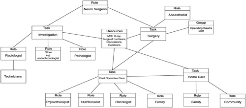
ICT4D stakeholder engagement: As noted, ICT4D stakeholders are a diverse group of individuals, with diverse and often unpredictable formal and informal knowledge. To describe the extent of a knowledge domain, ontologies are often used both for knowledge creation and codification (Gavrilova et al., Citation2015). Codification resonates with abstraction, an essential tool of the knowledge visualizer. We thus find it useful to consider an example of a formal representation and then contemplate how a similar structure ontology could be adapted to arrive at an informal representation. Mansingh et al. (Citation2009) present an ontology-driven methodology for extracting different knowledge items to represent them as knowledge maps. depicts a case study from the treatment of a brain tumor (Mansingh et al., Citation2009, p. 47), which shows how useful a knowledge structure map can be, in delineating roles and resources and depicting relationships. The diagram in is regular, complete and symmetrical, as far as is practical, thereby meeting the criteria of ‘good shape’ in terms of ontologies (Gavrilova et al., Citation2015).
Figure 5. Knowledge structure map – treatment of tumor (Mansingh et al., Citation2009, p. 47).
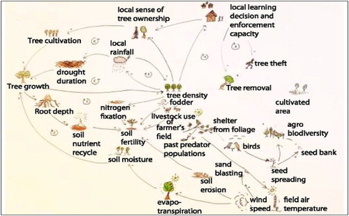
Moving beyond academic audiences, conceptual models can be useful in depicting complex systems with interrelated variables to diverse groups of stakeholders. For example, considering trees and the environment, the relations between biophysical (trees, soil, water, and atmosphere) and socio-political (institutions, social capital) modelled at the field-to-village level can be depicted as in (Bon, Citation2019). It could be argued that the images added to the diagram obscure rather than enhance the original model, but that is where the target audience should be considered. Notably, all the previous diagrams were black on a white background. Color can support the encoding of knowledge, but it has practical trade-offs like publication costs, cultural and personal preferences to contend with, and color blindness has to be borne in mind.
Figure 6. Conceptual model of the variety of interrelated variables that influence large scale regreening in a complex setting (Bon, Citation2019, p. 43) after a model by Sendzimir et al. (Citation2011).
The following additional examples are mentioned for supporting knowledge sharing:
Visualizations are often used in representing results. However, Hatakka et al. (Citation2020, p. 667) succinctly visualized the conceptualization of the theoretical premises for their study also showing the links between the facilitating conditions, actors and conversion factors.
Tables are recognized visualizations and important mechanisms for knowledge sharing as evident from the following examples which meet the criteria in terms of prudent simplicity, clarity and consistency:
o The typology for ICT4D research (Qureshi, Citation2015, p. 516) is an example of providing an overview with detail on demand. The mindful selection of the column headings and the content structuring provide a snap-shot overview of the different means by which ICTs for Development may be studied while the individual cells provide the detail. The abstraction and structuring allow effective knowledge sharing and supports extension by comparison between the different levels.
o The summary of ICT4D research history (Walsham, Citation2017, p. 3) is an example of a fine balance between abstraction and detail from a large amount of information. The table structure and the mindful selection of the column headings and the groupings under the rows further support knowledge transfer.
The Sustainable Development Goals as published by the United Nations have known limitations such as being weak on agency, with limited obligations to governments and none to business or consumers (Spangenberg, Citation2017). Despite these and other criticisms the SDG’s are an internationally recognized framework that help to focus international development efforts on many levels. The table structure, color and the combination of images and text create a powerful visualization that bridged communication boundaries to reach and connect researchers, practitioners and politicians globally.
Heeks (Citation2017, p. 38) presents the ICT4D value chain, visually. By including the adoption stages, the value chain is linked to the changing focus of ICT4D priorities over time. This mindful structuring allows for parallel knowledge transfer on different aspects such as the critical components and relationships while mapping those to the adoption stages. Notably, text is processed linearly but elements of visual images can be processed in parallel. The communicative superiority of this diagram over a textual description is clear, especially in depicting the information flow.
These examples suggest that for IS research the selected research process (e.g. behavioral science research methodology or design science research methodology) that is used in an ICT4D research project could benefit from a deliberately considered and integrated set of KM activities. We suggest that KV approaches should be considered for this. For success to be achieved here then it would critical for ICT4D researchers to be aware of KV strategies and consider KM activities as part of extended research methodologies for improving impact. The next section makes some recommendations in this regard.
5. How can knowledge visualization maximize it’s potential?
Considering academic writing, there are many guidelines to evaluate visualizations, but the challenge lies in prioritizing and selecting those that are most appropriate and helpful. A knowledge visualization method for ICT4D is beyond the scope of this discussion, but we hope the following steps will be useful in guiding the reader towards creating a knowledge visualization with maximal communicative power.
Answer the basic questions posed in , based on (Renaud & Van Biljon, Citation2019). In particular:
Why is the knowledge being visualized, i.e. what is the purpose (desired effect of externalizing the knowledge in a visual representations)?
For Whom is the knowledge is being visualized for, i.e. who is the audience?
What is relevant? Knowing the desired effect and the audience the visualizer must select the critical knowledge to be visualized.
How should the knowledge be visualized, i.e. what is the most efficient way to visualize the knowledge? More detail on selecting appropriate representations see types of knowledge visualizations Meyer (Citation2010) and visual knowledge codification techniques (Kudryavtsev & Gavrilova, Citation2017).
Figure 7. KV process based on Renaud and Van Biljon (Citation2019).
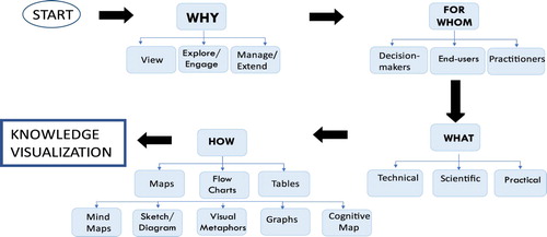
Notably, the components provided in are proposed as a point of departure when considering how to craft a visualization and should not be considered an exhaustive set of possibilities.
(2) Checklist, see for a checklist on visualization content and formatting items
(3) Evaluation: A pre-release evaluation with a member of the intended audience is critical.
Table 1. Knowledge visualization checklist.
If visualizations are to become an essential part of research presentation and evaluation, then more research is required to validate these suggestions and provide domain-appropriate guidelines. presents a point of departure in evaluating a visualization.
Clearly, not all kinds of knowledge can, or should, be visualized and visualizations should always be accompanied by a textual description. Besides the general and specific challenges related to visualization, there is the question of time and effort to consider. The papers in this issue were selected based on rigor and relevance, without any specific directive or incentive to include visualizations. Therefore, it is interesting to look at the ways in which visualization was used by these authors to summarize, synthesize and emphasize their results and findings.
6. Papers in this issue
The research in this issue attests to this increasingly interconnected world. It provides a platform and opportunities for information and communication technologies to support the sustainable attainment of economic, social and environmental development (Bailey & Osei-Bryson, Citation2019). Despite visualization not being the central theme, the papers in this issue offer some level of visualization as appropriate to their knowledge domain. The papers are summarized in increasing use of visualization, the intention is not to suggest that having more or more sophisticated visualizations is better, rather to demonstrate how different authors applied visualization to support knowledge generation and sharing in Information Technology and Development research.
Rothe in the first paper (‘Rethinking Positive and Negative Impacts of ‘ICT for Development’ Through the Holistic Lens of the Sustainable Development Goals’) argues that while the ICT4D field claims that ICTs can be used to improve peoples’ lives, ICTs also have negative effects. A framework is presented that makes explicit the complex interdependencies between different set of Sustainable Development Goals (SDGs), and ‘provides a point of reference for holistically conceptualizing ICTs’ negative impact through the lens of policy coherence.’ The paper’s visualizations include two figures, the first engages literature on the links between SDG and other goals providing a visualization of the interconnected goals. The visualization is effective in conveying the complexity and interconnectedness of the system. The second figure depicts the three dimensions of ICT4D impact in a way that would be cumbersome, if possible, to describe in text thereby supporting the conceptualization of the holistic development impact of an ICT4D project.
Bock, Haque and McMahon in the second paper (‘Displaced and Dismayed: How ICTs are helping refugees and migrants, and how we can do better’) argue that while ICT platforms may have the potential for improving the lives of displaced people, some have staying power while others don’t. An approach based on a partial application of grounded theory is used to analyze 47 ICT platforms. Results of this analysis include ‘a preliminary list of what leads to a successful ICT initiative for refugees and migrants’ and ‘list ethical considerations for all stakeholders.’ The paper’s visualization includes two tables, both highlighting the findings in relation to the ICTs for Refugees and Migrants (ICTRM) platforms. The first table depicts the complexity of functionality and degree of involvement of displaced people in designing the ICT4RM platforms. The second table summarizes the factors that lead to a successful ICT4RM deployment thereby effectively highlighting the main contribution.
Nemer and Stratton in the third paper (‘ICTD research in Latin America: Literature review, scholar feedback, and recommendations’) investigate the following questions in the context of Latin American countries: ‘(1) what are the alternatives to ICTD and English-language ICTD publication venues researchers utilize to disseminate their work and why they may do so, and (2) what methodological, theoretical, and contextual characteristics these researchers bring to their publications.’ Their results suggest a set of recommendations for better incorporating scholarship about Latin America in the ICTD field as well as improving global coverage of the ICTD community. The paper’s visualization includes several tables and one graph. The tables provide evidence such as the literature review’s data capturing metrics and the survey respondent profiles, helpfully including summaries where appropriate to demonstrate the rigor of the study. Tables are also used to present the core findings such as the common methods of data collection and analysis used, publications venues including the conferences and journals where ICTD research was published, this provides the reader with cognitive support in making sense of the different results. A graph is appropriately used to depict the publication count per year.
Kim in the fourth paper (‘Voices of youth in reconceptualizing and repositioning the role of mobile learning for sustainable development’) used a qualitative case study to explore ‘youth perception of opportunities for mobile learning (M-Learning) as a means to achieve Sustainable Development Goals (SDGs).’ The paper’s visualizations include a table summarizing information on the study’s participants, and two figures that depict mobile app promotion leaflets, showing how the youth presented their insights on M-learning. Both figures add value in terms of authenticity and the opportunity to compare the presentations from different groups.
Peña et al. in the fifth paper (‘An analysis of the key role of human and technological development in the smart specialization of smart European regions’) explores in the context of the EU, the relationships between the capacities of the citizens of a geographic region and the technological development in a region. The authors propose a new ‘Smart Human Index’ for measuring human development. The paper’s visualization including three tables and one figure is interesting as it depicts visualizations on different levels of sophistication. Tables one and two depict data on the human capital and ICT variables respectively. Table 3 depicts the statistical results from the models’ evaluation. Figure 1 shows a relationship graph depicting the links between technological development and human capital.
Adjei-Bamfo et al. in the sixth paper (‘An e-government framework for assessing readiness for public sector e-procurement in a lower-middle income country’) focus on the gap in the ICT4D literature on ‘how to assess readiness for adopting a full e-procurement system in the public sector of lower and lower-middle income countries (LMICs).’ Qualitative analysis of multiple public sector cases from Ghana is used to identify ‘the key readiness determinants for a full public sector e-procurement system.’ The paper’s visualization includes two tables and two figures. The first table summarized background information of interviewees while the second categorized some existing e-government systems for public service delivery in Ghana. The latter is effective in presenting a large amount of information in a clear, simple, well-structured format to ease access. The first figure, an E-government framework for public sector e-procurement readiness (based on literature) is effective in depicting the main components and their relationships in the context of e-procurement. The second, helpfully depicts a partial e-government procurement process constructed by the authors.
Owoseni and Twinomurinzi in the seventh paper (‘Evaluating mobile app usage by service sector micro and small enterprises in Nigeria: an abductive approach’) use an abductive approach to investigate the influence of mobile applications on the dynamic capabilities of service sector micro and small enterprises (MSEs) in Lagos, Nigeria. Their resultant model suggests that mobile app usage barely increases the absorptive capability of MSEs; rather, it strongly influences the ability to seize opportunities. The visualizations include two tables (for summarizing statistical data) and two figures. The figures comprise a Scree plot and a contextual model of mobile app usage by service sector MSEs in Lagos, Nigeria. The conceptual model uses shading and differing line types to depict the strength of the relationships effectively.
Tripathi and Kumar in the eight paper (‘Does information and communications technology affect economic growth? Empirical evidence from SAARC countries’) investigate the impact of ICT on economic growth for member countries of the South Asian Association for Regional Cooperation (SAARC). Their findings reveal a positive and statistically significant effect of ICT on economic growth. The visualizations include five tables and four figures. The tables present summarized data for easy reference and comparison. The figures include line graphs to present trends and conceptual models. The latter are effective in highlighting the possible association between telecommunication infrastructure and economic growth (from literature) and in depicting the relationship between ICT and GDP based on the findings.
Mukerji and Chauhan in the ninth paper (‘A Social Network Analysis of ICTD Conferences (2006–2017)’) take the position that ICT4D research is ‘an interdisciplinary area of research associated with engineering, application, and adoption of ICTs in developing regions and/or for development’, and so explore the issue of ‘the social dimension of ICTD as manifest in co-authorship ties in the papers published in conference proceedings.’ Results of this study include that ‘the social network subsequently displays a distinct core-periphery structure.’ The visualization solution contains nine tables summarizing the results and sixteen network diagrams. Visualization is fundamental to network analyses and therefore the network diagrams are an essential part of presenting the results. The diagrams provide an overview but also contain detail, they are aesthetically pleasing in having a balanced layout. Color coding has been used effectively to distinguish between nodes from different parts of the network also to highlight the intersections (as in Figure 16).
Watchaton and Krairit in the tenth paper (‘Exploring university perceptions of IS implementation and attributes of success: a case study of public universities in Thailand’) focus on the perceptions that different stakeholder groups associate with the successful implementation of organizational information systems in public universities. Their results indicate that administrators and system user have different perceptions of the attributes that define IS implementation success. The visualizations include five figures depicting results from descriptive and inferential analyses and a knowledge visualization whereby the authors propose a framework for identifying the effectiveness of IS implementation in universities.
Karkin and Janssen in the eleventh and final paper (‘Structural changes driven by e-Petitioning technology: Changing the relationship between the central government and local governments’) noted that there is a gap in the research literature on ‘how e-petitions technology might result in structural transformations in public administration’, and so explored ‘the effects of an e-petitioning system in the Turkish public administration from neo-institutional and transaction cost perspectives.’ The study’s revelations include: ‘In contrast to the expectation of reducing transaction costs due to ICTs use, the transaction costs increased. The changes have further strengthened the central government by transforming the current tutelary relationship into a more hierarchical structure.’ The visualizations include two tables and seven figures. The tables show how the impact of a governance mechanism was increasing year by year by comparing the number of applications made to the BIMER website over time. The figures include the depiction of a website, a bar chart and knowledge visualization diagrams created by the authors. The knowledge visualization diagrams are most effective in depicting the main components and information flows. This paper includes a diverse set of visualizations each making a unique contribution to knowledge sharing.
7. Conclusion
The papers in this issue successfully applied a variety of visualization techniques used in the field of information technology and development. These include tables for summarization, statistical graphs, network diagrams and conceptual models for synthesis. Knowledge visualization exhibits characteristics of an art but also a science as evident from the growing body of research presented here. We hope this editorial has created a greater awareness of the communicative power of knowledge visualizations, how visualizations can convey a layered understanding of the components, the relationships between those and an interest in engaging with the boundary conditions. Also, an awareness that a useful visualization involves appropriate abstraction and invites deeper and more meaningful engagement than a text-only representation. Furthermore, we highlight the fact that there are evidence-based guidelines for creating and crafting visualizations in academic writing. More research is needed to uncover the potential value of knowledge visualization in ICT4D. This will include research on the strategies and tools available to produce context-appropriate visualizations and generic criteria to assess the communicative power of the visualizations supporting multi-, inter- and transdisciplinary research and communication between the stakeholders. Furthermore, visualizations could add value in easing assessment in the paper reviewing and dissertation contexts. As before, not all types of knowledge are amenable to visualization, but if so, the decision to add a visualization boils down to the question – what is the risk of not using a visualization?
Acknowledgements
We specially thank Prof. Sajda Qureshi, Editor-in-Chief, Prof. Karen Renaud, Prof. Robert Davison and Prof. Maung Sein for their valuable comments on earlier versions of this Editorial.
Disclosure statement
No potential conflict of interest was reported by the authors.
Notes on contributors
Judy van Biljon is a Professor of Information Systems and holds the South African Research Chair’s Initiative, Chair in Information and Communication for Development hosted by the School of Computing at the University of South Africa (Unisa). She holds a Ph. D. in Computer Science from Unisa, an M. Sc. in Computer Science from the University of the Free State in Bloemfontein and an M. Ed. from the North-West University in Potchefstroom. Her disciplinary focus is on Human-Computer Interaction for Development. She has contributed to the body of academic knowledge by publishing on Human-Computer Interaction evaluation and interaction design for marginalized groups, technology adoption, and sustainability in digital learning for resource-constrained environments. As open-distance learning (ODL) practitioner and researcher, she has published on cohort supervision in ODL and knowledge visualization for supporting postgraduate supervision. As Chairperson of the International Development Informatics Association (IDIA) she is involved in capacity building initiatives through the IDIA biennial conference series and through the establishment of the Southern African Chapter of the International Network for Postgraduate Students in the area of ICT4D (IPID). Currently she is on the Editorial Board of Information Technology for Development and serves as a Senior Editor of the Electronic Journal of Information Systems in Developing Countries.
Kweku-Muata Osei-Bryson is Professor of Information Systems at Virginia Commonwealth University in Richmond, VA. He is also currently a Visiting Professor of Computing at the University of the West Indies at Mona, and has also been Visiting Professor of Information Systems at the Ghana Institute of Management & Public Administration. Previously he was Professor of Information Systems & Decision Sciences at Howard University in Washington, DC. He has also worked as an Information Systems practitioner in industry and government in the USA and Jamaica. He holds a Ph.D. in Applied Mathematics (Management Science & Information Systems) from the University of Maryland at College Park; a M.S. in Systems Engineering from Howard University; and a B.Sc. in Natural Sciences from the University of the West Indies at Mona. His research areas include: Analytics & Data Science, Knowledge Management, Expert & Decision Support Systems, ICT for Development, Cyber-Security, e-Commerce, and Multi-Criteria Decision Making. His research has been published in various leading research journals, and he is author or editor of 5 books. Currently he serves as a Senior Editor of Information Technology for Development, an Associate Editor of the European Journal of Information Systems, an Editor of the African Journal of Information Systems, a member of the Editorial Board of Computers & Operations Research, and a member of the International Advisory Board of the Journal of the Operational Research Society.
References
- Bailey, A., & Osei-Bryson, K. M. (2018). Information technology for development contextual reflections on innovations in an interconnected world : theoretical lenses and practical considerations in ICT4D. Information Technology for Development, 24(3), 423–428. https://doi.org/10.1080/02681102.2018.1499202
- Bailey, A., & Osei-Bryson, K. M. (2019). Information technology for development contextual reflections on innovations in an interconnected world : theoretical lenses and practical considerations in ICT4D – Part 2. Information Technology for Development, 25(1), 1–6. https://doi.org/10.1080/02681102.2019.1582153
- Bon, A. (2019). Intervention or collaboration? Rethinking information and communication technologies for development. In 6th International Symposium Perspectives on ICT4D: Tackling Global Challenges-Collaboratively (p. 232). Pangea. https://www.researchgate.net/publication/331585246
- Borning, A., Friedman, B., & Logler, N. (2020). The “invisible” materiality of information technology. Communications of the ACM, 63(6), 57–64. https://doi.org/10.1145/3360647
- Bresciani, S., & Eppler, M. J. (2015). The pitfalls of visual representations : A review and classification of common errors made while designing and interpreting visualizations. Sage Open, 1–14. https://doi.org/10.1177/2158244015611451
- Brown, A., & Grant, G. (2010). Highlighting the duality of the ICT and development research agenda. Information Technology for Development, 16(2), 96–111. https://doi.org/10.1080/02681101003687793
- Burkhard, R. A. (2004). Learning from architects : The difference between knowledge visualization and information visualization. In Proceedings of the Eighth International Conference on Information Visualisation (IV’04) (pp. 519–524). IEEE Computer Society. https://doi.org/10.1109/IV.2004.1320194.
- Burkhard, R. A. (2005). Towards a framework and a model for knowledge visualization: Synergies between information and knowledge visualization. In Lecture Notes in Computer Science (including subseries Lecture Notes in Artificial Intelligence and Lecture Notes in Bioinformatics) (pp. 238–255). https://doi.org/10.1007/11510154_13
- Card, S. K. (1999). Readings in Information visualization: Using vision to think. Morgan Kaufmann.
- Chen, C. (2004). Information visualization: Beyond the horizon. Springer Science & Business Media.
- Chen, M., Ebert, D., Hagen, H., Laramee, R. S., van Liere, R., Ma, K., Ribarsky, W., Scheuermann, G., & Silver, D. (2009). Data, information, and knowledge in visualization. IEEE Computer Graphics and Applications, 29(1), 12–19. https://doi.org/10.1109/MCG.2009.6
- Christianson, S. (2012). 100 diagrams that changed the world. Penguin.
- Crilly, T., Jashapara, A., & Ferlie, E. (2010). Knowledge mobilisation : A scoping review of the literature. Report for the national Institute for Health Research Service Delivery and Organisation programme – SDO project (08/1801/220) Research.
- Davison, R. M., & Martinsons, M. G. (2016). Context is King! Considering particularism in research design and reporting. Journal of Information Technology, 31(3), 241–249. https://doi.org/10.1057/jit.2015.19.
- Gavrilova, T., Alsufyev, A., & Grinberg, E. (2017). Knowledge visualization : Critique of the St. Gallen School and an analysis of contemporary trends 1. Business Informatics, 3(41), 7–19. https://doi.org/10.17323/1998-0663.2017.3.7.19
- Gavrilova, T., Kudryavtsev, D., & Grinberg, E. (2019). Aesthetic knowledge diagrams: Bridging understanding and communication. In D. Carlucc (Ed.), Knowledge management, arts, and humanities (pp. 97–117). Springer.
- Gavrilova, T., Leshcheva, I., & Strakhovich, E. (2015). Gestalt principles of creating learning business ontologies for knowledge codification. Knowledge Management Research & Practice, 13(4), 418–428. https://doi.org/10.1057/kmrp.2013.60
- Hansen, C. D., & Johnson, C. R. (2011). Visualization handbook. Elsevier.
- Hatakka, M., Thapa, D., & Sæbø, Ø. (2020). Understanding the role of ICT and study circles in enabling economic opportunities : Lessons learned from an educational project in Kenya. Information Systems, 30(October 2018), 664–698. https://doi.org/10.1111/isj.12277
- Heeks, R. (2017). Information and communication technology for development (ICT4D). Routledge. https://doi.org/10.4324/9781315652603
- Hevner, A. R. (2007). A three cycle view of design science research. Scandinavian Journal of Information Systems, 19(2), 87–92. https://aisel.aisnet.org/sjis/vol19/iss2/4.
- Hevner, A. R., March, S. T., Park, J., & Ram, S. (2004). Design science in information systems research. MIS Quarterly, 28(1), 75–105. https://doi.org/10.2307/249422
- Kim, M. C., Zhu, Y., & Chen, C. (2016). How are they different? A quantitative domain comparison of information visualization and data visualization (2000–2014). Scientometrics, 107(1), 123–165. https://doi.org/10.1007/s11192-015-1830-0.
- Kirk, A. (2016). Data visualisation: A handbook for data driven design. Sage.
- Kudryavtsev, D., & Gavrilova, T. (2017). From anarchy to system: A novel classification of visual knowledge codification techniques. Knowledge and Process Management, 24(1), 3–13. https://doi.org/10.1002/kpm.1509
- Levin, B. (2011). Mobilising research knowledge in education. London Review of Education, 9(1), 15–26. https://doi.org/10.1080/14748460.2011.550431
- Mansingh, G., Osei-Bryson, K., & Reichgel, H. (2009). Building ontology-based knowledge maps to assist knowledge process outsourcing decisions. Knowledge Management Research & Practice, 7(1), 37–51. doi: 10.1057/kmrp.2008.37
- Meyer, R. (2010). Knowledge visualization. Trends in Information Visualization, 23, 23–30. https://doi.org/10.1007/978-1-4471-4303-1
- Nicolescu, B. (2005). Towards transdisciplinary education. TD: The Journal for Transdisciplinary Research in Southern Africa, 1(1), 5–16. https://hdl.handle.net/10520/EJC111793.
- Peffers, K., Tuunanen, T., Rothenberger, M. A., & Chatterjee, S. (2014). A design science research methodology for information systems research a design science research methodology for information systems research. Journal of Management Information Systems, 24(3), 45–77. https://doi.org/10.2753/MIS0742-1222240302
- Qureshi, S. (2005). How does information technology effect development ? Integrating theory and practice into a process model. In Proceedings of the Eleventh Americas Conference on Information Systems, Omaha, NE, USA August 11th–14th (pp. 500–509). https://digitalcommons.unomaha.edu/isqafacproc/40
- Qureshi, S. (2015). Are we making a better world with information and communication technology for development (ICT4D) Research? Findings from the field and theory building. Information Technology for Development, 21(4), 511–522. https://doi.org/10.1080/02681102.2015.1080428
- Renaud, K., & van Biljon, J. (2017). Knowledge visualization, https://knowvizonline.com
- Renaud, K., & Van Biljon, J. (2019). A framework to maximise the communicative power of knowledge visualisations. In Conference ofthe South African Institute ofComputer Scientists and Information Technologists 2019 (SAICSIT’19). ACM Press. https://doi.org/10.1145/3351108.3351111
- Sein, M. K., Thapa, D., Hatakka, M., & Sæbø, Ø. (2019). A holistic perspective on the theoretical foundations for ICT4D research. Information Technology for Development, 25(1), 7–25. https://doi.org/10.1080/02681102.2018.1503589
- Sendzimir, J., Reij, C. P., & Magnuszewski, P. (2011). Rebuilding resilience in the Sahel: regreening in the Maradi and Zinder regions of Niger. Ecology and society, 16(3), 1. https://doi.org/10.5751/ES-04198-160301.
- Spangenberg, J. H. (2017). Hot air or comprehensive progress? A critical assessment of the SDGs: Hot air or comprehensive progress? A critical assessment of the SDGs. Sustainable Development, 25(4), 311–321. https://doi.org/10.1002/sd.1657
- Tarafdar, M., & Davison, R. M. (2018). Research in information systems: Intra-disciplinary and inter-disciplinary approaches. Journal of the Association for Information Systems, 19(6), 2. https://aisel.aisnet.org/jais/vol19/iss6/2.
- Toyama, K. (2010). Human – Computer interaction and global development. Foundations and Trends in Human–Computer Interaction, 4(1), 1–79. https://doi.org/10.1561/1100000021
- Van Biljon, J. (2011). A critical review on the reporting of surveys in transdisciplinary research: A case study in information Systems. TD: The Journal for Transdisciplinary Research in Southern Africa, 7(2), 337–350. https://hdl.handle.net/10520/EJC111931.
- Walsham, G. (2012). Are we making a better world with ICTs? Reflections on a future agenda for the IS field. Journal of Information Technology, 27(2), 87–93. https://doi.org/10.1057/jit.2012.4
- Walsham, G. (2017). ICT4D research: reflections on history and future agenda. Information Technology for Development, 0(0), 1–24. https://doi.org/10.1080/02681102.2016.1246406
- Wickson, F., Carew, A. L., & Russel, A. W. (2006). Transdisciplinary research: Characteristics, quandaries and quality. Futures, 38(9), 1046–1059. https://doi.org/10.1016/j.futures.2006.02.011.