Abstract
This article empirically analyses the state of inequality in South Africa. International comparisons show South Africa to be among the most unequal countries in the world. The levels of income inequality and earnings inequality are analysed with a range of measures and methods. The results quantify the extremely high level of inequality in South Africa. Earnings inequality appears to be falling in recent years, with relative losses in the upper-middle parts of the earnings distribution. Decomposing income inequality by factor source reveals the importance of earnings in accounting for overall income inequality. The article concludes by observing that, internationally, significant sustained decreases in inequality rarely come about without policies aimed at achieving that, and suggests that strong policy interventions would be needed to reduce inequality in South Africa to levels that are in the range typically found internationally.
1. Introduction
It is well known that South Africa is one of the most unequal societies in the world. South Africa's inequality is often compared with Brazil's, yet Brazil's has narrowed significantly in recent years (see for instance Ferreira et al., Citation2008; Barbosa-Filho, Citation2008). This study provides a detailed analysis of the levels of inequality in income, expenditure and earnings in South Africa, and of trends in earnings. It also investigates the relationship between income and earnings inequality, by quantifying the extent to which earnings inequality accounts for the level of income inequality.
Section 2 summarises the findings from the existing South African literature on level and trends in inequality. Section 3 locates inequality in South Africa in an international context. Section 4 analyses the current levels of income and expenditure inequality in South Africa using a range of inequality measures, various ways of portraying inequality, and alternative ways of scaling household to individual income. It also compares the level of inequality for different components of income. The level of earnings inequality is analysed using various measures in Section 5, and Section 6 looks at trends in earnings inequality. In Section 7, income inequality is decomposed by factor source in order to determine the contribution of earnings and the other components of income to income inequality. Section 8 concludes.
2. Summary of findings from the existing literature
There is a broad consensus in the literature that income and earnings inequality worsened after 1994, through to the early 2000s. This conclusion has been drawn in various studies, using several different datasets and alternative measures of inequality. Studies that have found an increase in inequality in South Africa include UNDP (Citation2003), Simkins Citation(2004), Leibbrandt et al. Citation(2004), Hoogeveen & Özler Citation(2005), Van der Berg et al. (Citation2005), Ardington et al. Citation(2006) and Pauw & Mncube Citation(2007).
summarises some of the results from the literature, showing the levels found for various measures of inequality. Note that these figures are not directly comparable across studies, given the different methods used by the authors (e.g. adjustments to the data).
Table 1: Summary of literature on inequality levels and trends
3. International comparisons of inequality
To contextualise inequality in South Africa by international standards, shows countries by their level of income per capita (in natural logs) and Gini coefficient. The observations are not from the same year for each country but those shown here are the most recently available. The observations for each country are not derived from uniform sources nor do they measure precisely the same concepts, given the different ways that countries measure and report distribution. The figure therefore depicts separate series for gross earnings, gross income, disposable income and consumption or expenditure, with observations not being directly comparable across these series. For instance, it can be seen that the coefficients for disposable income are typically below those for gross income, given that taxes tend to have an equalising effect.
Figure 1: International comparison of inequality by income per capita FootnoteNotes.
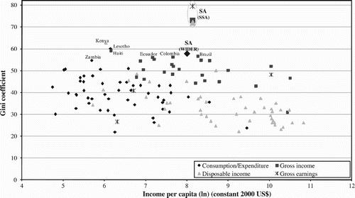
Despite the limitations of international comparisons of this sort, it is clear that South Africa has extremely high levels of inequality by international standards. Other countries with extremely high levels are either Latin American (Colombia, Paraguay, Brazil and Haiti) or African (Lesotho, Kenya and Zambia).
Kuznets Citation(1955) predicted an inverted-U relationship between income per capita and GDP. That is, inequality would be expected to rise in the early stages of industrialisation but to fall thereafter. There is, however, mixed evidence as to the validity of this today. For instance, Deininger and Squire Citation(1998) find no evidence to support the Kuznets hypothesis, whereas Galbraith and Garcilazo (Citation2004) find a downward-sloping relationship between income levels and inequality. Cross-country comparisons of inequality are generally fraught with problems of data comparability internationally. The data shown in point to a weak negative relationship between income per capita and the Gini coefficient internationally, with considerable variation around this. (In separate OLS regressions for each series shown here, income per capita generally explains no more than 30% of the variation in the Gini coefficient.)
4. Income and expenditure inequality
This section analyses the current levels of income and expenditure inequality in South Africa. The statistics are all derived from the various datasets of the 2005/6 Income and Expenditure Survey (IES) produced by Statistics South Africa (Stats SA, Citation2008a), accessed through the South African Data Archive (http://sada.nrf.ac.za/). All data were inflated or deflated to the month of March 2006, depending on the month in which a household was visited. The IES is a nationally representative survey in which the sampling unit is households. Household income or expenditure can be converted to a simple per capita measure by dividing household income or expenditure by the number of members of the household, yielding household per capita measures. This conversion method is set out more fully as equivalence scaling E 1 in Appendix B, and the data used in all figures are calculated on a household per capita basis in this way. to present various measures and dimensions of inequality and also use alternative methods of equivalence scaling that take into account not only the size but also the composition of households; these methods are set out fully in Appendix B. (Appendix A explains the Gini coefficient and other measures of inequality used in this article.)
We begin by comparing the degree of inequality of four different measures of income: income from work (salaries and wages), income from work and social grants, gross income (including income from work, social grants and other monetary income), and disposable income (gross income minus taxes). The Gini coefficient of each of these categories of income is shown in . This figure demonstrates the important equalising effect of social grants: once they are added to work income, the Gini falls from almost 0.8 to 0.73. Social grants are actually over-reported in the IES by about 10%, whereas work income is slightly under-reported (Stats SA, 2008b), and this probably leads to a very small overstating of the equalising effect of social grants. Even so, this effect is certainly significant. Social grants in South Africa include means-tested old-age pensions, a means-tested child support grant, a foster case grant and a disability grant (this last also covers severe chronic illnesses). Once other components of gross income are added in, the Gini falls slightly further to 0.72. Taxes also have an equalising effect, as would be expected given the progressivity of the overall tax structure, and thus the Gini of disposable income falls further to 0.71. Taxes are actually under-reported by about half in the IES (Stats SA, 2008b), and so the real Gini of disposable income is probably slightly lower than this.
Figure 2: Inequality of different income aggregates, 2006 FootnoteNotes.
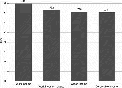
Notwithstanding the equalising effect of grants and of taxation, the Gini coefficient of all of these measures of income is extremely high. Internationally, Gini coefficients over 0.5 are considered high, and coefficients exceeding 0.7 are very rare.
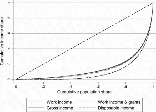
The inequality of different income categories is also shown in , which compares the Lorenz curves of income from work, income from work and social grants, gross income and disposable income. Each point on the Lorenz curve plots the proportion of the population against the proportion of cumulative income received by those people. The dashed diagonal line is the benchmark of a completely equal distribution.
Figure 3: Lorenz curves of different income aggregates, 2006 FootnoteNotes.
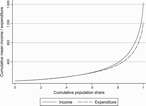
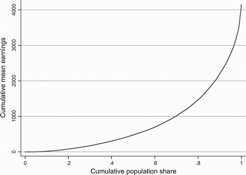
The contribution of the various sources of total income to inequality is analysed more rigorously in Section 7 below. In the rest of the empirical analysis the category of income used is gross income, henceforth referred to as income. compares the Lorenz curves of income and expenditure; expenditure is more equally distributed than income. shows the Generalised Lorenz curves of income and expenditure, which are the Lorenz curves scaled up at each point by the overall mean income or expenditure respectively. For example, the average income or expenditure of the poorest 40% of the population (read up from 0.4 on the x axis in ) is just over R80 per month. The average income across the whole population is R1634 per month, and the average expenditure comes in at R1230 per month (these can be seen from the highest points of the two curves, which indicate the average across the entire population).
Figure 4: Lorenz curves of income and expenditure, 2006 FootnoteNotes.
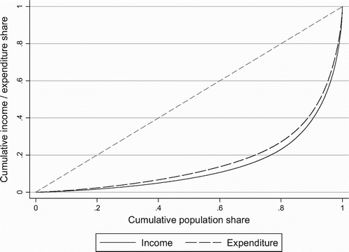
Figure 5: Generalised Lorenz curves of income and expenditure, 2006 FootnoteNotes.
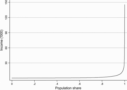
‘Pen's Parade’ (Pen, Citation1971), another way of representing income distribution, is shown in . It is based on the idea of a ‘parade of dwarfs and giants’. Here, a person's income is represented as their height, with distribution represented by a ‘parade’ of people walking past in order from shortest to tallest (i.e. poorest to richest), shown on the x axis of the proportion of the population from 0 to 1. The actual income (household per capita income) of a person at any point of the income distribution can be read directly off the y axis. Even knowing how unequally South Africa's income is distributed, the curvature of the plot is astonishing. It appears flat for most of the distribution and rises extremely steeply at the top end. Represented pictorially, this would mean that there would be barely visible midgets at one end and mile-high giants at the other.
Figure 6: Pen's Parade of income, 2006 FootnoteNotes.
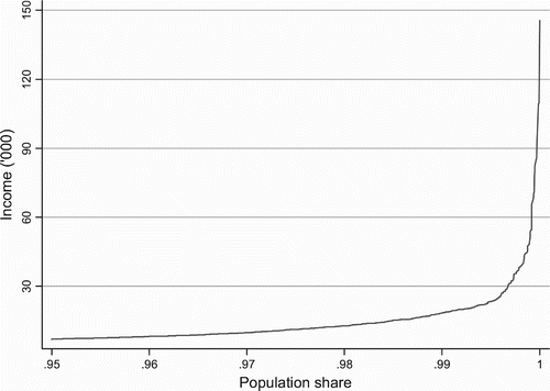
The extreme convexity of Pen's Parade of South African income distribution makes it difficult to observe the distributional pattern for all but the top end. We thus break the distribution up and show in the Pen Parade for the lower 95% and thereafter the same for the top 5% of the distribution. The convexity of the distribution is clear (although it is not as sharp when the top 5% is excluded). As we go up the distribution, income increases at an increasing rate. For instance, the ratio between the income of the 80th and 40th percentiles far exceeds the ratio between the income of the 40th and 20th percentiles. Even among the richest 5%, the distribution of income is extremely convex (see ). It should be borne in mind that incomes at the top end are almost certainly underestimated in IES, even more so than for the rest of the distribution. The response rate is typically lower among the wealthy, and furthermore there is a greater likelihood of incomes being under-reported. Indeed, the highest incomes reflected in the IES data are well below the high-end salaries that are routinely reported publicly. Even so, the presence of a small group of super-rich in South Africa is clearly evident, whose incomes depart radically from those of even the rest of the extremely wealthy.
Figure 7: Pen's Parade of income excluding top 5%, 2006 FootnoteNotes.
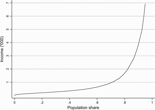
Figure 8: Pen's Parade of income of top 5%, 2006 FootnoteNotes.
Fourteen different measures of inequality are summarised in , using income and expenditure from the IES. For both income and expenditure a total including in-kind income or expenditure respectively is also shown. In-kind income or expenditure refers here to items not received or paid for in monetary form by the household.Footnote1 Three equivalence scales are used to convert household income into household per capita income. Equivalence scaling E1 is simple household per capita scaling, which divides household income by the number of members of the household. Scaling E2 takes account of the age profile of households and the different nutritional needs associated with this by converting children into adult equivalents and also takes account of economies of scale when converting household income into household per capita income. Scaling E3 is based on the McClements equivalence scale, which takes account of not only the number of children in relation to adults but also the ages of children, as well as economies of scale. These equivalence scales are fully explained in Appendix B.
Table 2: Inequality measures for income and expenditure (E1 scaling), 2006
The Gini coefficient of income (using simple per capita scaling, E1) is 0.72, while for expenditure it is 0.67. As would be expected, income inequality is consistently higher than expenditure inequality.
Total (i.e. including in-kind) income or expenditure inequality is generally higher than straight income or expenditure inequality respectively. This is surprising, since in-kind income or expenditure would be expected to be relatively progressively distributed and to have an equalising effect. This unexpected finding might be attributed to poor data quality.
Inequality appears quite significantly lower when household income or expenditure is scaled to a per capita level using the second or third equivalence scaling methods (i.e. instead of simply dividing household income or expenditure by the number of members of the household, as in E1 scaling above, a measure is constructed for each household based on the age or age group of each member). The reason why the use of these equivalence scales lowers the inequality measures is that poorer households generally have a higher proportion of children, and using an equivalence scale in which children count for less than an adult improves the relative position of these households when measuring overall inequality (see and ).
Table 3: Inequality measures for income and expenditure (E2 scaling), 2006
Table 4: Inequality measures for income and expenditure (E3 scaling), 2006
to show the distribution of income and expenditure in terms of percentile ratios: p90/p10 is the ratio between the income (or expenditure) of the person at the 90th percentile of the income distribution (i.e. at the bottom of the top decile) and that of the person at the 10th percentile (i.e. the top of the bottom decile), and similarly for the measures p90/p50, p10/p50, p75/p25, p75/p50 and p25/p50. These are shown for both income and expenditure, and with and without in-kind income or expenditure respectively.
Table 5: Percentile ratios for income and expenditure (E1 scaling), 2006
Table 6: Percentile ratios for income and expenditure (E2 scaling), 2006
Table 7: Percentile ratios for income and expenditure (E3 scaling), 2006
The person at the 90th percentile receives more than 27 times the income of the person at the 10th percentile and spends about 20 times as much (using simple per capita scaling). As with the other measures of inequality discussed above, the percentile ratios fall somewhat when equivalence scales other than simple household per capita scaling (E2 and E3 scaling) are used.
5. Earnings inequality
‘Earnings’ here refers to salaries and wages from work, while ‘income’ (as discussed in the previous sections) also includes income from capital, welfare grants and a range of other sources. Analysis of earnings inequality is based on the Labour Force Survey (LFS), using the 14 full datasets of the LFS from February 2001 to September 2007 (Stats SA, Citation2002–2008). (Although the LFS was pioneered in 2000, this study avoids the use of the 2000 datasets due to poor quality of the data and lack of comparability with subsequent rounds of the survey.) All static measures of inequality are derived from the September 2007 LFS. Appendix C sets out the various steps taken to clean the data and ensure comparability across time.Footnote2
and show the Lorenz and Generalised Lorenz curves for earnings among the employed. From the Generalised Lorenz curve it can be ascertained that the average earnings of, for example, the lower half of the employed are R478 per month and the average income across the employed is R4145 per month.
Figure 9: Lorenz curve of earnings, 2007 FootnoteNotes.
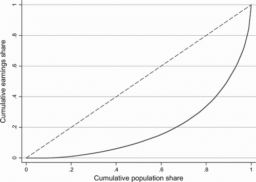
Figure 10: Generalised Lorenz curve of earnings, 2007 FootnoteNotes.
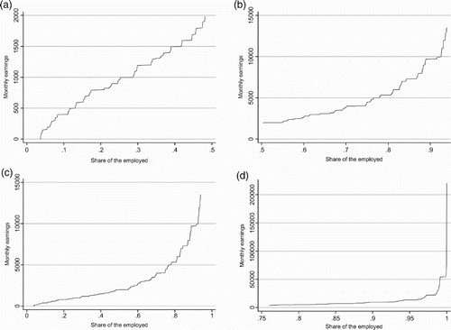
As with income and expenditure, Pen's Parade of earnings is shown in and , with the latter showing separate Pen's Parades for four segments of the distribution in order to illustrate the patterns more clearly. The extreme concavity of Pen's Parade of earnings, as can be seen in , indicates the degree of inequality in the earnings distribution. However, an interesting insight that emerges from is that in the lower half of the earnings distribution the level of earnings rises at a fairly steady rate, indicating a rather low degree of inequality among the lower half of earners. The distribution of earnings among the top half but excluding the highest 5%, as shown in , is also not very concave. However, it is at the very top of the earnings distribution that there is an extremely high degree of inequality. This can be clearly seen at the top end of the distribution of the top quartile as depicted in .
Figure 11: Pen's Parade of earnings, 2007 FootnoteNotes.
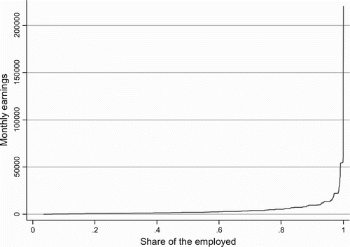
Figure 12: Pen's Parade of earnings for various segments of the distribution, 2007. (a) Lower half of earners. (b) Top half of earners excluding top 5%. (c) Lower 95% of earners. (d) Top 25% of earners FootnoteNotes.
summarises the current level of earnings inequality in South Africa, using several different measures of inequality. In addition to earnings inequality among the employed, the level of earnings inequality is also shown for the full labour force (which includes both the employed and unemployed as per the official definitions, aged between 15 and 65). Earnings inequality is evidently very high: for instance, the Gini coefficient of earnings among the employed is 0.61. (Note that this is not directly comparable with the Gini coefficients for income and expenditure, as earnings are measured on a per capita basis among the employed while income is measured on a household per capita basis.) While a key aspect of inequality in South Africa is the gap between the employed and the unemployed, the high degree of earnings dispersion among the employed is also important.
Table 8: Earnings inequality in South Africa, 2007
6. Trends in earnings inequality
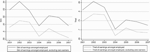
Having examined the current level of earnings inequality using various measures, we now analyse recent trends.Footnote3 shows the trends in earning inequality, measured with the Gini and Theil coefficients. There is an overall decline in earnings inequality since 2002, although there is a spike in 2005.
Figure 13: Earnings inequality among employed, 2001–2007 FootnoteNotes.
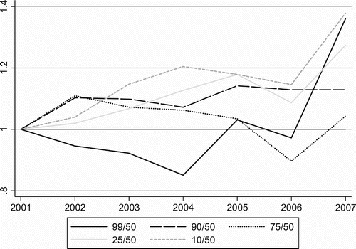
The trends in earnings inequality among the employed can also be examined in terms of the ratios between earnings at various percentiles of the earnings distribution. shows ratios between five such percentiles and median earnings. The line 99/50 shows the ratio between the earnings of the person at the 99th percentile (i.e. only 1% of the employed earn more than that person) and the median earner; similarly for the ratios 90/50, 75/50, and 25/50 and 10/50. The ratios are indexed to a base of 1 in 2001 so that the trends can be seen more clearly. shows the same trends but excluding those who are employed but earning nothing. (Appendix C discusses the issue of zero-earners among the employed in the LFS data.)
Figure 14: Selected percentile ratios of earnings, 2001–2007 FootnoteNotes.
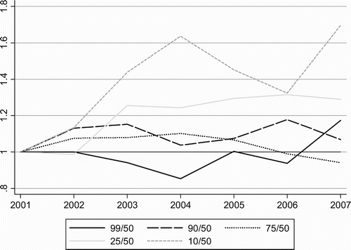
Figure 15: Selected percentile ratios of earnings, 2001–2007 (excluding zero-earners) FootnoteNotes.
Earnings at the 10th and 25th percentiles clearly rose relative to the median. The top percentiles, at 90 and 99, seem to have been making some gains relative to the median since about 2004. Overall, the upper-middle parts of the distribution (as represented by the median and 75th percentiles) appear to have fared worse than other points of the distribution.
also portrays distributional changes in earnings by showing, for each decile of the employed, the change in that decile's share of earnings as well as their change in real earnings. Note that the membership of each decile changes over time. The deciles with bars above the zero line increased their share of total earnings between 2001 and 2007, while the share of those with negative bars fell.
Figure 16: Change in earnings share by decile 2001–2007 FootnoteNotes.
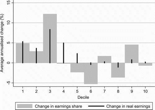
What is striking is that the highest relative gains accrued to the third decile, with the first, second and ninth deciles also making significant relative gains in share of earnings. In the upper-middle parts of the earnings distribution there seems to have been very little real earnings growth, or even negative growth.
The trends shown in percentile ratios and decile shares suggest that, to the extent that there has been some ‘redistribution’ towards the lowest earners, the relative losers have been not high income earners but middle and upper-middle earners. These trends challenge a common perception that those in the lower half of the earnings distribution have fared relatively badly in recent times. There have not been significant shifts in the occupational composition of the employed during this period (according to LFS data) that might explain these changes in earnings distribution. It is beyond the scope of this paper to determine the causes of these changes, but one possible explanation is the gradual erosion of the earnings premium accruing to whites, with the possible exception of those at the top. The upper-middle parts of the earnings distribution are where most whites are located. Although whites still earn significantly more than blacks (even for similar types of jobs), this racial wage premium in the labour market is likely to be declining as the effects of apartheid become gradually less pronounced. The trends may also be related to changes in the return to education, such as a decline in the returns to completed high school education.
7. Decomposing income inequality by factor source
Having examined the state of earnings and income inequality in South Africa, we now analyse the relationship between earnings and income inequality through a decomposition of income inequality by factor source. This analysis is based on the 2005/6 IES, normalised to March 2006, as discussed earlier.
Work income (that is earnings, including both wages/salaries and earnings from self-employment) is very important to households' economic status. As shows, about a quarter of households receive no income from work, and the overall income per capita in these households is far lower than that of households that do receive some work income. Considering that the category of households receiving no income from work also includes wealthy white households whose occupants are retired, the low relative income of households receiving no work income is even starker. Sixty-three per cent of households receiving no income from work are female-headed and in 92% of them the household head is African – both figures are much higher than for households that do receive some income from work.
Table 9: Comparison between households receiving any and no income from work, 2006
The importance of earnings inequality to total income inequality is analysed by breaking down income into earnings and its other components and quantifying the contribution of each to overall income inequality. What is counted as income includes earnings from work as well as other sources, such as income from capital and social grants. The way each of these income sources is distributed affects overall income inequality. In this part of the analysis we use the method of inequality decomposition by factor source to quantify how much each income source contributes to total income inequality. The technical details of this method are summarised in Appendix D.
For the decomposition analysis the various income sources are grouped into the major categories shown in . In this table, ‘income from work’ includes salaries, wages and self-employment; ‘income from capital’ includes royalties, interest, dividends, and letting of fixed property; ‘welfare grants’ include old age pensions, disability grants, family and other allowances, and worker compensation funds; ‘other income’ includes sources such as alimony, hobbies, stokvels, food and clothing donations, vehicle and property sales, gambling, lobola and tax refunds. The first column of this table shows how important each source is as a share of total income. About three quarters of all income comes from work (including salaries and wages and income from self-employment). The share of income from work in total monetary income is even higher (82%) if we exclude imputed rent, which is the next largest item and which is not really a source of monetary income. The decomposition of income inequality by factor sources is repeated using the other two methods of converting household into per capita income discussed earlier (see Appendix B for details). The results are shown in and .
Table 10: Decomposition of income inequality by source, using E1 equivalence scale, 2006
Table 11: Decomposition of income inequality by source, using E2 equivalence scale, 2006
Table 12: Decomposition of income inequality by source, using E3 equivalence scale, 2006
The contribution of each factor to overall income inequality is shown in the second column (in each of to ). This contribution depends on the share of the factor in total income, on how unequally the factor is distributed, and on the covariance between the distribution of that factor and of total income. This covariance can be thought of as how closely the distribution of the factor matches that of total income – do the same people get a lot of each, or do the people who get little income overall get a lot of that source? The contributions from all of the income sources sum to 100%. Were a factor to be equally distributed, it would have a zero contribution to total inequality.
The key finding is the importance of income from work as the major determinant of overall income inequality. Income from work accounts for between 77% and 79% of total income inequality (depending on the equivalence scaling used). Further, because of its particular distribution, income from work accounts for an even higher proportion of total income inequality than its share in total income.
The only income source that has an equalising effect on total income inequality is social grants. However, the mitigating effect of grants on total inequality is marginal at just –0.004%. Using the other two equivalence scales, the equalising effect of social grants on total income inequality comes out somewhat higher, but still well below 1%. With the McClements equivalence scale (E3), social grants have a contribution of –0.16% to total income inequality, while a similar result of –0.17% is obtained when using the E2 equivalence scale. The equalising effects of grants on inequality is lower than might be expected, especially given the results shown previously as to how much the Gini of income inequality falls once grants are included. The small magnitude of the negative contribution of grants to total income inequality is a result of the way income inequality is decomposed and the distribution of grant income. In the methodology for the decomposition of inequality by factor source, the covariance between the distribution of grants and the distribution of overall income inequality enters into the calculation of the contribution of grants to overall income inequality, as discussed earlier (see the methodology set out in Appendix D). In South Africa, grants are received even at upper-middle levels of the income distribution, and grant income is not very high among the very poorest. This explains why the equalising contribution of grants in total income inequality appears very low.
The positive signs of all other income sources indicate that they each have a disequalising effect on total income inequality. Income from capital contributes to total income inequality in significantly greater proportion than its share of total income, which is not surprising given the extreme concentration of capital ownership (among households) and the correlation between this ownership and other dimensions of income inequality. In fact, income from capital is by far the most unequally distributed of all the income sources. However, this contribution is quite small in absolute terms since income from capital is a very small component of total income.
Overall, the results from the decomposition of income inequality by factor source highlight the importance of income from work in total income inequality.
8. Conclusions
South Africa is clearly one of the most unequal countries in the world. This article presents a comprehensive analysis of inequality in earnings, expenditure and income in South Africa, using a range of measures, indicators of inequality, and so on. While it is already widely acknowledged that distribution in South Africa is highly unequal, these figures indicate the extent of this inequality. The analysis also allows for a comparison between different types of income, quantifies the equalising effect of social grants and of taxes, and illustrates the different results obtained depending on which method is used in converting household to per capita income.
Several interesting insights emerged from the analysis of trends in earnings distribution over time. Inequality in earnings peaked in the second half of 2002 and has since been on a downward trend. The major gains in relative terms appear to have been made in the lower 40% or so of the earnings distribution, but the relative losers have been in the upper-middle parts of the distribution.
The decomposition of income inequality by factor source underlined the importance of earnings inequality in accounting for about 77 to 79% of overall income inequality. This points to the significance of labour market dynamics in explaining the high level of income inequality in South Africa. Social spending certainly has a role to play in ameliorating inequality (and poverty), particularly in the short to medium term. However, labour market dynamics – in particular employment creation (or losses) and the distribution of earnings – are likely to be central to overall distributional changes in South Africa.
It is beyond the scope of this study to examine the causes of inequality in South Africa. However, the analysis presented here should prove useful in any future research on this topic, in terms of both the detailed data presented and the methodological aspects. Furthermore, the finding that earnings inequality is highly important in accounting for income inequality suggests that when analysing the determinants of overall income inequality it may be useful to focus on the determinants of earnings inequality in particular.
Internationally, it has been observed that – particularly over recent decades – increases in inequality tend to be much less reversible than decreases (Palma, Citation2007). For instance, in countries where a government that instituted conservative economic policies that worsened income distribution is followed by a government that switched to more ‘progressive’ policies, the distribution of income typically hardly comes down and certainly not down to the previous level. Even where the intention is genuinely to improve income distribution, this often turns out to be far more difficult than anticipated. This is not surprising, as the wealthy are generally far better able to protect their income than are the poor, as well as being better placed to reverse any ‘unfavourable’ changes in distribution that do occur. This asymmetry in distributional changes underlines the point that a significant improvement in income distribution is highly unlikely to materialise without strong policy interventions geared towards that goal.
Dramatic improvements in distribution thus rarely come about without active measures targeted specifically at lessening inequality. Moderate decreases in inequality may well come about as a by-product of other dynamics. However, the magnitude of the reduction in inequality that would be required to bring South Africa anywhere in line with international norms is unlikely to happen without the aid of policies dedicated to that end.
Acknowledgements
The authors gratefully acknowledge a grant from the Second Economy Project administered by Trade and Industry Policy Strategies (TIPS) that supported this research.
Notes
Source: UNU-WIDER (Citation2008), except for the top three points, labelled ‘SA (SSA)’, which are derived from Stats SA (2008b). Notes: The lower point for South Africa, marked ‘SA (WIDER)’, is for 2000 and is the most recent available in the UNU-WIDER dataset. The chart also includes the Gini coefficients reported by Stats SA (2008b) – the top three points labelled SA(SSA) – which are extreme outliers.
1In-kind consumption is identical to consumption for 68.5% of households, and in-kind income is identical to income for 62.5% of households. Some observations of the components of in-kind income are clearly unrealistic, and cast doubt on the accuracy of the entire category. A few obviously erroneous values were eliminated. However, these variables appear unreliable and any interpretation using them should be cautious.
Source: Derived from Stats SA (2008a). Note: Calculated on a household per capita basis.
Source: Stats SA (2008a). Note: Calculated on a household per capita basis.
Source: Stats SA (2008a). Note: Calculated on a household per capita basis.
Source: Stats SA (2008a). Note: Calculated on a household per capita basis.
Source: Stats SA (2008a). Note: Calculated on a household per capita basis, using simple per capita scaling.
Source: Stats SA (2008a). Note: Calculated on a household per capita basis, using simple per capita scaling.
Source: Stats SA (2008a). Note: Calculated on a household per capita basis, using simple per capita scaling.
2See Tregenna Citation(2011) for an analysis of earnings inequality in which values are imputed for non-responses on the earnings question in the LFS.
Source: Stats SA (Citation2008c).
Source: Stats SA (2008c).
Source: Stats SA (2008c).
Source: Stats SA (2008c).
3Trends can only be reliably analysed for earnings, not for total income, as inadequate comparability between the various IES rounds unfortunately makes it difficult to accurately assess trends in income or expenditure inequality with an acceptable degree of confidence.
Note: Annual averages calculated from Stats SA (2002–2008).
Note: Annual averages calculated from Stats SA (2002–2008).
Note: Annual averages calculated from Stats SA (2002–2008).
Source: Stats SA (Citation2002b, 2008c). Notes: Decile 1 is the 10% of the employed with the lowest earnings; decile 10 is the 10% of highest earners amongst the employed. The grey bars show the (average annualised) change in the earnings share of that decile between September 2001 and September 2007. The black lines show the (average annualised) change in the real earnings share of that decile between September 2001 and September 2007.
Related Research Data
References
- Ardington, C , Lam, D , Leibbrandt, M , and Welch, M , 2006. The sensitivity of estimates of post-apartheid changes in South African poverty and inequality to key data imputations , Economic Modelling 23 (2006), pp. 822–35.
- Barbosa-Filho, N H , 2008. An unusual economic arrangement: The Brazilian economy during the first Lula administration, 2003–2006 , International Journal of Politics, Culture and Society 19 (2008), pp. 193–215.
- Bhorat, H , Leibbrandt, M , and Woolard, I , 2000. Understanding contemporary household inequality in South Africa , Studies in Economics and Econometrics 24 (3) (2000), pp. 31–52.
- Deininger, K , and Squire, L , 1998. New ways of looking at old issues: Inequality and growth , Journal of Development Economics 57 (2) (1998), pp. 259–87.
- Galbraith, J K , and Garcilazo, E , 2004. Unemployment, inequality and the policy of Europe: 1984–2000 , Banco Nazionale del Lavoro Quarterly Review 228 (2004), pp. 3–28.
- Ferreira, H G , Leite, P G , and Litchfield, J A , 2008. The rise and fall of Brazilian inequality: 1981–2004 , Macroeconomic Dynamics 12 (S2) (2008), pp. 199–230.
- Hoogeveen, J G , and Özler, B , 2005. Not separate, not equal: Poverty and inequality in post-apartheid South Africa , (2005), Working Paper 379, William Davidson Institute, Ann Arbor.
- Jenkins, S P , 1995. Accounting for inequality trends: Decomposition analyses for the UK, 1971–86 , Economica 62 (1995), pp. 29–63.
- Kuznets, S , 1955. Economic growth and income inequality , American Economic Review 45 (1955), pp. 1–28.
- Lambert, P J , 2001. The Distribution and Redistribution of Income, 3rd edn . Manchester: Manchester University Press; 2001.
- Leibbrandt, M , Poswell, L , Naidoo, P , Welch, M , and Woolard, I , 2004. Measuring recent changes in South African inequality and poverty using 1996 and 2001 census data . 2004, Working Paper 84, CSSR (Centre for Social Science Research), University of Cape Town.
- Leite, P G , McKinley, T , and Osorio, R G , 2006. The post-apartheid evolution of earnings inequality in South Africa, 1995–2004 , (2006), Working Paper No. 32, October, International Poverty Centre, Brasilia.
- Palma, J G , 2007. Globalizing inequality: ‘Centrifugal’ and ‘centripetal’ forces at work . 2007, In Jomo, KS & Baudot, J (Eds), Flat World, Big Gaps: Economic Liberalization, Globalization, Poverty and Inequality. Zed Books, London.
- Pauw, K , and Mncube, L , 2007. The impact of growth and redistribution on poverty and inequality in South Africa , (2007), IPC Country Study 7, IPC (International Policy Centre)/UNDP (United Nations Development Programme), Brasilia.
- Pen, J , 1971. Income Distribution . London: Penguin; 1971.
- Shorrocks, A F , 1982. Inequality decomposition by factor components , Econometrica 50 (1) (1982), pp. 193–211.
- Simkins, C , 2004. What happened to the distribution of income in South Africa between 1995 and 2001? , (2004), Unpublished draft, SARPN (South African Regional Poverty Network), Pretoria.
- Stats SA (Statistics South Africa), 2002a. Earning and Spending in South Africa: Selected Findings and Comparisons from the Income and Expenditure Surveys of October 1995 and October 2000 . Pretoria: Stats SA; 2002a.
- Stats SA (Statistics South Africa), 2002b. Labour Force Survey, September 2001 Metadata . Pretoria: Stats SA; 2002b.
- Stats SA (Statistics South Africa), 2008a. Income and Expenditure of Households 2005/2006 . Pretoria: Stats SA; 2008a.
- Stats SA (Statistics South Africa), 2008b. Income and Expenditure of Households 2005/2006: Analysis of Results . Pretoria: Stats SA; 2008b.
- Stats SA (Statistics South Africa), 2008c. Labour Force Survey, September 2007 Metadata . Pretoria: Stats SA; 2008c.
- Stats SA (Statistics South Africa), 2002–2008. Labour Force Surveys – 14 Biannual Full Datasets from February 2001 to September 2007 . Pretoria: Stats SA; 2002–2008.
- Tregenna, F , 2011. Earnings inequality and unemployment in South Africa , International Review of Applied Economics 25 (5) (2011), pp. 585–98.
- UNDP (United Nations Development Programme), 2003. South Africa Human Development Report 2003: The Challenge of Sustainable Development . Oxford: Oxford University Press; 2003.
- UNU-WIDER (United Nations University World Institute for Development Economics Research), 2008. (2008), World Income Inequality Database V2.0c May 2008. www.wider.unu.edu/research/Database/en_GB/database/ Accessed 27 October 2011.
- Van der Berg, S, Burger, R, Burger, R, Louw, M & Yu, D, 2005. Trends in poverty and inequality since the political transition , (2005), Working Paper 1/2005, BER (Bureau for Economic Research) Department of Economics, Stellenbosch University.
- Whiteford, A , and Van Seventer, D , 2000. South Africa's changing income distribution in the 1990s , Studies in Economics and Econometrics 24 (3) (2000), pp. 7–30.
- Woolard, I , and Leibbrandt, M , 2006. Towards a Poverty Line for South Africa: A Background Note . SALDRU (Southern Africa Labour and Development Research Unit), University of Cape Town; 2006.
Appendix
This appendix explains the various measures on inequality used in the analysis. In all notation that follows,
is the income or expenditure of person or unit i,
is mean income or expenditure, and n is the population size.
Gini coefficient
The Gini is a commonly used measure of inequality. It lies between 0 (complete equality) and 1 (complete inequality). Graphically, the Gini coefficient is twice the area under the Lorenz curve. The Gini can be formally defined as
.
The Gini has an advantage of being easily understood, and the relatively high availability of national and international data in terms of the Gini allows for cross-country comparisons. However, it is not additively decomposable, as are the measures listed below.
Generalised Entropy measures
The Generalised Entropy (GE) group of measures includes GE[0], GECitation1, and GECitation2. Unlike the Gini, these measures do not have an intuitive meaning. An attractive feature of the GE measures is that they can be additively decomposed. The GE measures can be expressed generically as follows:
for
.
A specific measure in the GE group is the Theil (or Theil-T), a commonly used measure of inequality which can be specified as
.
gives the mean logarithmic deviation (sometimes referred to as Theil-L), specified as
. A third GE measure is GECitation2, which is half of the squared coefficient of deviation, calculated as
.
The lower the value of α in GE[α], the more sensitive is the measure to changes at the bottom end of the distribution, and vice versa. So, for instance, the mean logarithmic deviation will be particularly sensitive to changes in the income or expenditure of the poor, whereas the mean logarithmic deviation will be particularly sensitive to changes in the income or expenditure of the relatively wealthy.
Atkinson family
In the Atkinson family of inequality measures (
), the parameter
represents ‘aversion to inequality’. The higher
, the stronger the ‘aversion to inequality’ in that the index is increasingly sensitive to those with the lowest incomes. The scope for setting
makes the Atkinson measures flexible in expressing different value judgements concerning inequality aversion. The equally-distributed-equivalent income
is defined as
for
and
and
for
.The Atkinson index is thus defined as
,
where
is the equally-distributed-equivalent income, defined as
for
and
and
for
.
Percentile ratios
Inequality can also be measured in terms of the ratio between the shares of different percentiles (such as between the income of the person at the 90th and the person at the 50th percentile in the distribution). Although these are not formal measures of inequality like those discussed above, they can be useful in understanding the dynamics in different parts of the income distribution. They are generally not skewed by extreme outliers, as are some of the other measures. A limitation of percentile ratios is that that they do not impart any information about distribution at points of the distribution other than the two specific percentiles used in a given ratio.
Households have varying size and compositions. This means that some adjustment or normalisation is necessary in order to analyse income/expenditure distribution, rather than simply comparing household totals. The standard approach is to analyse distribution in terms of household per capita income, with different methods available for converting household totals into per capita equivalents.
The simplest method of adjusting household to per capita income/expenditure is simply to divide the household total by the number of members. This is the method used by Stats SA. In this equivalence scaling,
, where s is the number of members of the household.
One limitation of this method is that it assumes there are no economies of scale in household costs. Another is that it takes no account of the varying costs for different types of household members, implicitly assuming that an infant and an adult require/consume the same resources.
Given these important shortcomings of the simple per capita scaling method, we also employ two other equivalence scales in the analysis of income/expenditure distribution. The first of these takes account of both economies of scale and the difference in costs between children and adults. The household scaling factor is calculated as follows:
, where
is the number of adults in the household and
is the number of children;
is the adult equivalent of a child; and
is the scaling factor for household economies of scale.
Thus
for
and
.
The parameters used here are
and
. These are in line with those in the international literature, as well as those used in the South African context by, for example, Woolard & Leibbrandt Citation(2006).
The third equivalence scaling used here, the McClements equivalence scale, takes account not only of how many adults and children there are in the household, but also the ages of the children. The parameters of the scaling used are adapted from Lambert Citation(2001) and in line with those used internationally. A limitation is that they are not based on empirical evidence of the costs faced by different age categories in the specific South African context, as there is no suitable existing evidence in this regard.
The household scaling factor is calculated under this scale as follows:
for all s members of the household, where:
for the first adult (where ‘adult’ is aged 20 years or over);
for the second adult;
for the third adult;
for subsequent adults;
for each member aged 0–4 years;
for each member aged 5–9 years;
for each member aged 10–14 years;
for each member aged 15–19 years; and
for each member that did not report their age.
The use of these three alternative equivalence scales yields differing indicators of distribution and poverty. In particular, the simple per capita scaling (E 1 ) obviously gives the most weight to children, and households with relatively high numbers of children will be deemed relatively worse off than with the other two equivalence scales. The actual values of any indicator are not directly equivalent across the scales.
This appendix describes the various aspects of the checking and cleaning of the original LFS data sets that was done in advance of the quantitative analysis.
Screening of high incomes
High earnings were screened for clearly erroneous observations. Fifteen original observations, which would have been weighted to 7438 cases, were excluded on the grounds of their unrealistically high reported earnings. All these cases reported earning more than R1 million per month (the next highest earnings reported were R500 000 per month). The 15 observations reporting earnings exceeding R1 million per month were examined individually and the reported incomes adjudged unrealistic on the basis of the personal characteristics of the respondents (notably their occupations).
Treatment of zero incomes
At the other end of the distribution spectrum, a significant proportion of respondents classified as employed reported zero earnings. These are not people who declined to report their earnings, but people who specifically reported zero earnings. To some extent this is likely to derive from the expansive definition of employment used by Statistics South Africa. A person need only have ‘worked’ for an hour in the previous week to be classified as employed. Further, this ‘work’ includes activities such as helping unpaid in a household business, doing any construction or major repair work on their home, or catching animals for household food. Counting such activities as ‘employment’ clearly means that some people classified as employed will have zero earnings. Further, there is a significant proportion of people earning very low incomes. There are still likely to be a number of earnings that are erroneously reported as zero. However, to simply delete everyone reporting zero earnings (as some South African studies have done), would introduce a huge bias into the distribution by not only cutting out some of the noise but also cutting off the bottom end of the distribution. All reported zero earnings have thus been left in. Finally, to check for the robustness of key results and trends and to confirm that these were not being driven simply by changes in the proportion of the employed reporting zero earnings, these were computed with and without those employed but receiving no earnings. There is also a problem of non-response on the earnings variable in the LFS; for an analysis of inequality in which values are imputed for non-responses, see Tregenna Citation(2011).
Treatment of earnings reported in brackets
Another aspect of the data processing concerned earnings brackets. While respondents were asked to state their actual income, those unwilling or unable to do so could indicate which of 14 brackets their income fell into. This poses a problem for empirical analysis requiring income as a continuous variable. In a number of South African studies this was addressed by imputing the mean point of the bracket to those in that bracket. However, a shortcoming of this approach is that the mean is an inaccurate indicator of incomes in any given bracket, and for high brackets in particular is likely to underestimate the incomes of the bracket. Incomes in the highest bracket (R30 000 upwards per month) have in other studies been simply assigned the bottom floor of the bracket, which clearly leads to an underestimation of those incomes.
This study took an alternative approach to the imputation of incomes to bracket respondents. We calculated the mean and median incomes of people who reported actual incomes, by bracket, for each year. These were then assigned to the people in the same bracket who only identified a bracket. In the measure using mean incomes, the addition of the bracket-reporters with their imputed income obviously does not affect the mean income within each bracket, but it does affect the number and distribution of people within each bracket. In the measure using median incomes, the bracket median does not change but the mean does change somewhat, once those respondents who simply identified a bracket are added in. The empirical analysis was undertaken using both, to ensure robustness of results. The method used here of imputing incomes to those who reported their incomes by simply identifying a bracket is superior to the methods used in some previous analyses of distribution in South Africa.
This appendix sets out the technical details of the method used in the decomposition of inequality by income source, discussed in Section 7. The method follows Shorrocks Citation(1982) and Jenkins Citation(1995).
Define:
n as the population size (in our analysis the number of individuals);
as the mean income of the population;
as the variance of income;
y i as the income of individual i for i = 1,2, …n;
y if as the income of individual i from source f where f = 1,2,…F,
such that
(in our analysis F = 6);
Y =
is the distribution of total income;
as the mean of income source f;
as the variance of income source f.
Then:
is the share of source f in total income;
C f is the covariance between source f and total income;
is the coefficient of correlation between source f and total income.
And:
is the GE(2) measure of inequality, the squared coefficient of variation;
is the GE(2) measure of inequality for source f;
as the absolute contribution of source f to total inequality,
such that
.
Then:
is the proportionate contribution of source f to total inequality,
such that
.
Thus source f has a disequalising effect on total inequality if
(or equivalently if
), an equalising impact if
(or
), and no impact on total inequality if
(or
).
Then the inequality measure I 2 can be calculated as follows, for the general case:
And specifically when the
measure of inequality is used, then
.
This gives the proportionate contribution of each income source to total income inequality. These are the figures shown in to , in percentage form.