1. Introduction
In a recent paper, Bhorat & van der Westhuizen (Citation2013) explored the evolution of well-being in post-Apartheid South Africa using information from assets instead of incomes. The idea of checking the trends from another perspective is excellent. Indeed, the descriptive statistics that they produce (Bhorat & van der Westhuizen Citation2013: ) show that there has been significant progress on the asset front.
Table 1: A hypothetical ‘income’ distribution
Unfortunately the work that they produce in relation to inequality is deeply flawed, to the point where little of that section of the paper is reliable for analysing post-Apartheid trends. The main issues are: that the authors right-shifted their asset indices, since untransformed indices cannot be used to construct a Gini coefficient or a Lorenz curve; that measured inequality is not invariant to linear shifts, so any reports of the underlying trends are unreliable; and that even if the trends were unaffected, the interpretation of the results is unclear.
2. Asset indices cannot be used to construct Gini coefficients or Lorenz curves
One of the ways of calculating a Gini coefficient is as follows (Deaton Citation1997:139):
It is clear that this is not defined if μ is zero. However, standard approaches to creating asset indices norm the index to have zero mean. Although the formula would allow for negative values, Bhorat & van der Westhuizen transformed their asset indices to ensure that all values are positive, by adding a constant of two to all values (2013:299, footnote 6). Otherwise the Lorenz curve shown in Figure 3 of their paper would have to have started with negative shares.
Indeed, contemplating the definition of the Lorenz curve indicates another issue with the use of asset indices in this context. The Lorenz curve plots the cumulative share of the aggregate (income or expenditure). However, if the mean is zero then the aggregate will also be zero. If a constant of δ has been added to all values, then the aggregate against which the shares are computed is as follows:
3. Inequality measures are not invariant to linear translation
Unfortunately, adding a constant to all values is not an innocent transformation. It maintains the relative ranking of observations, but it does not preserve inequality measures.
Consider, in particular, the formula for the Gini coefficient (Equation (1)). If we add the same constant δ to all observations, then the difference between observations, , is not affected. The mean, however, has increased to μ+δ. In short, the Gini coefficient will decrease if we add a positive constant; the larger the constant, the bigger the decrease.
Unfortunately, inequality comparisons by subgroup are also affected. presents a hypothetical distribution of measures (’incomes') where we have indicated to which subgroup each observation belongs. We have also indicated how this measure changes once we add five to all observations.
If we graph the Lorenz curves for each of the subgroups, we obtain the unambiguous result that group A is more unequal than group B on the original measure (see ). However, the shifted distribution gives precisely the opposite result: group B is now more unequal than group A (see )! And given that all standard inequality measures (Gini coefficient, Theil entropy coefficient, Atkinson indices) respect Lorenz dominance, the inequality measures would also flip.
Figure 1: Lorenz dominance before adding a constant
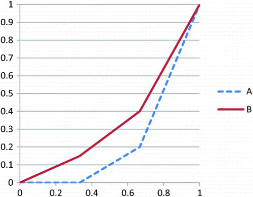
Figure 2: Lorenz dominance after adding a constant
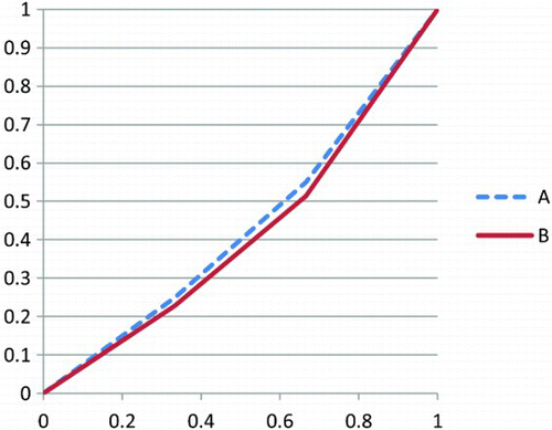
The fundamental point is that adding a constant to all the asset indices not only changes the aggregate measure of inequality – it has unpredictable consequences on how much inequality measures on subgroups will be affected. That means that neither the ‘trend’ analysis (i.e. changes of inequality over time) nor the decompositions by subpopulations (the decompositions of the Theil index by race groups) are robust.
4. How do we interpret the results?
One of the dangers of the exercise undertaken by Bhorat and van der Westhuizen is that the output can easily be misinterpreted. Many analysts (by now) have an intuitive understanding that an income Gini coefficient of 0.64 is ‘high’. This value is high by comparison with other countries and it is high when we bear in mind that the maximum value of the Gini (achieved when one person has all the income) is one.
There is no equivalent way to interpret the Gini coefficients reported for the (shifted) asset index. Firstly there are no comparators (nobody else has tried to calculate Gini coefficients using asset indices). Secondly, the maximum attainable Gini in this case is not clear. If the index is not shifted, there is no reason to suppose that the coefficient is bounded above by one;Footnote2 if the index is shifted so that all numbers are positive, it may have an effective bound that is considerably less than one. Thirdly, it is not even theoretically feasible for one person to have all the asset index with everybody else at zero due to the way in which the asset indices are calculated.
The danger is that the ‘asset index Gini coefficients’ will be interpreted against the background of income Gini coefficients. Bhorat & van der Westhuizen are, on the whole, careful not to talk about the absolute magnitudes of the coefficients, but they do lapse at one stage and state that ‘The Gini coefficients for coloureds, Asians and whites were very low in all three years’ (2013:309). Other readers of their article are likely to be less cautious and draw the inference that inequality, when measured by assets, is much lower than inequality when measured by income.
There is a further problem with interpreting the asset inequality work. The Lorenz curve depicted in Figure 3 of Bhorat and van der Westhuizen's paper invites the interpretation that the bottom 40% of households own around 20% of aggregate assets in 1999. But of course this is completely fictional. What is graphed is the cumulative share of an asset index that has been shifted. It has no meaning at all. The fundamental problem is that inequality in a shifted index is not the same as inequality in assets. It is, however, the latter interpretation that people will put on the results.
Acknowledgement
The author would like to thank Haroon Bhorat for constructive discussions around this article, which led to the correction of a number of errors. He is, of course, not responsible for any remaining mistakes.
Notes
2Assuming that due to sampling issues the mean is not precisely zero, just very close to it.
References
- Bhorat, H & van der Westhuizen, C, 2013. Non-monetary dimensions of well-being in South Africa, 1993–2004: A post-apartheid dividend? Development Southern Africa 30(3), 295–314. doi:10.1080/0376835X.2013.817308. doi: 10.1080/0376835X.2013.817308
- Deaton, A, 1997. The Analysis of Household Surveys. Johns Hopkins University Press for the World Bank, Baltimore, MD.