ABSTRACT
Focusing on maps, a common technique for conveying climate change information, this study uses an experiment (N = 423) to test how the type (static vs. animated) and repeated exposure (one vs. two) of visualizations impact biased perceptions. Presented with a pro-climate change regulations news article, participants who read the version with animated visualizations perceived the story to be more biased than those who were presented with static images. Further, a perceived advocacy motive mediated the triggering of an animated visualization to arouse more biased perceptions in favor of climate regulations. The implications for democratic ideals are discussed.
Introduction
The abundance of big data has made data visualization a useful tool to consolidate complex information visually. In particular, it is not uncommon to observe the use of data visualization by journalists (Lowrey & Hou, Citation2021). Very often, news stories involve both the use of data and visuals to inform, explain, persuade, or engage readers (Kelliher & Slaney, Citation2012; Ojo & Heravi, Citation2018). As defined by Lowrey and Hou (Citation2021), data journalism refers to “informational, graphical accounts of current public affairs for which data sets offering quantitative comparison are central to the information provided” (p. 7). For instance, The New York Times revealed how American adults think about the issue of global warming using six distinct maps (Popvich et al., Citation2017). As documented by Cleveland (Citation1993), “Visualization is an approach to data analysis that stresses a penetrating look at the structure of data. No other approach conveys as much information” (p. 5). Data visualizations can not only facilitate the understanding of data in a short period of time, but also allow the revealing of unanticipated patterns in the data (Ware, Citation2019).
The increasing popularity of data visualizations has led to two lines of research regarding their impacts: the trends and design of successful visualization (Ojo & Heravi, Citation2018), and the role of data visualization in influencing readers’ learning and perceptions (Oh et al., Citation2018). In Alieva’s (Citation2021) study on the 2016 United States presidential election, an examination of data visualizations from both The New York Times and The Washington Post using textual and visual analysis showed that framing the election using visualizations can potentially lead to an increase in political polarization. Given the increasing use of animated data visualizations in journalism (de Haan et al., Citation2018), this research highlights the potential impact of animated visualizations (vs. static visualizations) as well as repeated exposure to visualizations (one vs. two) on audiences’ bias perceptions, illuminating the implications of data visualizations for democratic ideals.
Theoretical Background
Data Visualizations in Journalism
According to Howard (Citation2014), one way that data journalism differs from traditional journalism is its application of data science to journalistic work, which involves gathering, analyzing, and visualizing data to generate news stories (Berret & Phillips, Citation2016). The visualization component improves data stories’ ability to increase public engagement on issues such as climate change (Appelgren & Jönsson, Citation2021), and the use of visuals has been shown to be instrumental in making climate change understandable (Boykoff & Boykoff, Citation2007). Among the different types of visualizations, the use of maps, which can illustrate causes and impacts, was found to be effective in persuasion. Thus, in turn, maps can have implications for translating knowledge to the public or for policymaking (Fish, Citation2020).
Comparing Static and Animated Maps
The inclusion of maps is not new in journalism, but visuals in traditional print journalism are static. In contrast, data stories online usually involve animated visuals, and these are likely to be more attractive than static images. Animation can be broadly defined as “any application that generates a series of frames, so that each frame appears as an alteration of the previous one” (Bétrancourt & Tversky, Citation2000, p. 313). One way to incorporate a series of frames in news content is to use graphic interchange format (GIF), an image file format that supports looping sequences of static image formats such as Joint Photographic Experts Group (JPEG) and Portable Network Graphics (PNG), and which allows the presentation of frames on repeat (Ajilore et al., Citation2021).
The automatic looping of a GIF can not only highlight details of a frame, but can also encourage repeated viewing of content and illustrate layers of meanings (Miltner & Highfield, Citation2017). More importantly, these animated GIFs can display the entire movement of a process, rather than pausing at a single frame (Ajilore et al., Citation2021). Although not all animated visualizations are GIFs, these kinds of animated visualizations can provide audiences with more detail. In the case of map visualizations, changes over time in a system, an entity, or a geographical location, can be made visible (Ojo & Heravi, Citation2018) by showing changes through the display of multiple frames. The display of changes across time is particularly useful for the communication of abstract and complex concepts, particularly for topics such as natural phenomena (Berney & Bétrancourt, Citation2016) and environmental problems (Heise, Citation2014). Given that digital technology changes the way in which news stories are created and presented, it is necessary to evaluate how people process data stories to better incorporate emerging techniques such as visualizations into journalistic practices (Duan et al., Citation2021).
The Effect of Animated Maps on Bias Perception
Perceived media bias refers to the extent to which an individual perceives media content (Vallone et al., Citation1985), a media outlet (Kohn, Citation2003), or the media industry (Bozell, Citation2004; Brock, Citation2005) as biased. Even though journalists mostly strive to be objective (McLeod et al., Citation2017), it is commonplace for people to observe that biases exist in news reporting and to question whether those biases benefit or harm a political or issue stance. Accusations of biased news reporting have intensified over the years (Niven, Citation2001), and involve audience perceptions that journalists,’ media owners,’ or politicians’ agendas take precedence over the public good. Whether the media is biased in favor of liberal (Bozell, Citation2004) or conservative stances (Brock, Citation2005), the perception that the media provides unbalanced treatment toward a position or issue is often seen as a detriment to democracy. People who view the media as biased tend to distrust it and view it more skeptically (McLeod et al., Citation2017), and if the bias is seen to be hostile toward a position that one personally holds, it can lead to their distrust in democracy (Tsfati & Cohen, Citation2005). Not to mention, individuals tend to avoid disconfirming information sources, which are often seen as biased against positions they personally hold, and which can escalate the polarization of views (Stroud, Citation2010). This is particularly the case when it comes to the topic of climate change, as political groups are divided over whether to support certain climate change policies and whether to carry out specific personal actions to help protect the environment (Funk & Hefferon, Citation2019; Kennedy et al., Citation2022).
Tully et al. (Citation2020) showed that bias was evidenced by “word choice, tone, and terminology in the article” (p. 216). The current research suspects that data visualization also contributes to biased perceptions. As Tufte (Citation1985) argued, data graphics can be used to deceive, and visualizations can be used to tell lies about public policy issues. By virtue of being more visually interesting, animated graphics help viewers store and retrieve information to a greater extent than the text used on television news (Fox et al., Citation2004). Vivid information that includes novel engaging elements, such as animated data visualizations in this case, can have a positive influence on a message’s persuasiveness (Fish, Citation2020). Supported by marketing literature, messages including a high degree of vividness (e.g., the inclusion of animations) can not only generate a more favorable impact on people’s attitudes in comparison to messages of comparable levels of interactivity (Fortin & Dholakia, Citation2005) but also in comparison to messages of moderate or low vividness (Coyle & Thorson, Citation2001). Hence, the following is proposed:
H1:
Respondents exposed to animated visualization(s) will be more likely to perceive the news data story as biased in favor of climate change regulations than those exposed to static visualization(s).
The Effect of Animated Maps on Perceptions of Journalistic Motive
This research takes further steps to identify the mechanism underlying the potential for animated data visualizations to impact readers’ bias perceptions. According to Ojo and Heravi (Citation2018), there are seven reasons to produce a data story: refuting claims, revealing unintended consequences, revealing information of personal interest, enabling a deeper understanding of a phenomenon, revealing anomalies and deficiencies in systems, tracking changes in systems, and revealing information about an entity in increasing levels of detail (p. 705). In other words, there can be various reasons as to why journalists and media outlets are driven to publish a data story. From an audience perspective, news readers can form different perceptions as to why a data story is created. Studies on perceived journalistic motives (Tsang, Citation2022) suggest that news audiences do come to attribute different motives to the journalist or media outlet responsible for a news story, and this attribution largely depends on the readers’ personal stance on the issue involved in the story.
Following Tsang’s study (Tsang, Citation2022), the current research expects that audiences will assess that media outlets and journalists are motivated by the following four intentions: (a) to advocate a position, (b) to mobilize the public, (c) to serve as a watchdog, and (d) to defend authorities. When a pro-climate change regulations news story is presented, participants are likely to see the journalist responsible as (a) advocating their personal opinions on climate change to sway public opinion to support climate change regulations, (b) encouraging public involvement to make demands of relevant authorities to implement more regulations, (c) holding the authorities accountable and protecting public interests such as the environment, but less (d) defending the interests of authorities.
In general, respondents who received a vivid data story with animated visualizations are expected to rate it as more motivating than those who read a less vivid data story with static visualizations. Data stories with animated visualization(s) are expected to be more attractive and exciting to users than non-animated stories (Nisbett & Ross, Citation1980); readers might then perceive these stories to be more sophisticated and that more effort and resources were put into the journalistic work compared to data stories with only static visualizations. Since more work is expected to be involved in the data story, readers might see the publishers as trying harder to achieve certain goals (more motivated regardless of which motive is concerned)—in the context of this study, making a case for climate change regulations. Given that no prior studies have examined data visualizations with perceived journalistic motive, a research question is raised to explore the effects of data visualizations:
RQ1:
What are the effects of animated data visualizations (vs. static data visualizations) on (a) advocacy motive, (b) mobilization motive, (c) watchdog motive, and (d) power defender motive?
Preexisting Attitudes as Moderators
According to the literature on hostile media perceptions (Vallone et al., Citation1985), people’s media bias perceptions are largely dictated by their prior attitude toward an issue, and party identification is one of the major prior attitudes that should be considered (Perloff, Citation2020). As explained by the confirmation bias theory (Giner-Sorolla & Chaiken, Citation1994), while people tend to see information with which they agree as less biased (fairer and more objective/neutral), people see information with which they disagree as biased in favor of the opposing side. To examine the impact on audience’s assessment of whether a data story is biased, favoring one side of a controversy (e.g., climate regulations), this study hypothesizes that prior beliefs will impact how participants perceive extra, elaborate visualizations to be biased, as well as to be motivating.
In general, people were found to attribute malicious intent to the publisher of a counter-attitudinal message. Tsang (Citation2022) has found that audiences’ attribution of motives to journalists can also affect news evaluations. When given the same political news article to read, readers who were anti-government were found to perceive the journalists responsible to be defending the government, whereas readers who were pro-government perceived the journalists to be advocating personal opinions on the issue (Tsang, Citation2022). In other words, people who receive an attitudinal-inconsonant message are likely to perceive the message publisher to publish out of malicious intent. Since climate change remains a polarizing issue in the United States, such that most views are divided along party lines (Tyson & Kennedy, Citation2020), this research anticipates similar findings, such that preexisting attitudes will impact the relationship between visualization type and perceived media bias, as well as perceived journalistic motives. The motives of defending power, advocating, and swaying public opinion can all be seen as the author’s attempts to achieve goals through visualizing data and publishing the story. As no prior research has been devoted to this subject, all the motives are lumped into one hypothesis, which is expected to be influenced by perceived journalistic motives in similar matters.
As Alieva’s (Citation2021) suggested, personal political biases can come into play and interact with readers’ perceptions of data and visualizations. People with prior convictions have different sets of working memory with which to process visual patterns and representations. The encoding process of visuals is dependent on the recipient’s goals and expectations, in which some aspects of the visual might become more salient than other aspects (Ratwani et al., Citation2008). Individuals’ existing knowledge, including how data are typically represented or articulated (Ratwani et al., Citation2008), plays a role in the interpretation of visuals. Given that presentation style can affect persuasion, moderated by prior attitudes, two hypotheses were presented:
H2:
Climate regulation denialists will perceive higher levels of media bias than climate regulation believers.
H3:
Climate regulation denialists will perceive greater motivation, (a) advocacy motive, (b) mobilization motive, (c) watchdog motive, and (d) power defender motive than climate regulation believers.
Repeated Exposure
Besides manipulating static and animated visualizations, another way to vary the degree of vividness is by alternating the quantity of data visualizations present. The rationale for comparing one and two visualizations is that an average of two visualizations has been observed in a single data story (Stalph, Citation2018). According to the “self-fulfilling prophecy” hypothesis (Sundar, Citation2000) again, the sheer presence of multimedia can yield positive impressions about a website; hence, the presence of two visualizations (two points of presence) are anticipated to trigger the impression of more favorable reporting and positive attitudes toward a story than one visualization (one point of presence). Overall, messages with higher levels of vividness are expected to be more emotionally provoking (Nisbett & Ross, Citation1980) and, in turn, more likely to be memorable and interesting (Fox et al., Citation2004). As a result, recipients of these vivid stories with two visualizations would perceive more favorability and bias than recipients of less vivid stories with only one data visualization. Further, a research question was raised as to whether an interaction between the type and the quantity of visualizations was present.
H4:
Respondents exposed to two visualizations will perceive the news outlet as more biased in favor of climate change regulations than those exposed to one visualization.
RQ2:
Will the type and quantity of data visualizations interact on perceived media bias?
Since journalists and editors usually back up a news story by selecting specific facts and visualizing specific data (Lee et al., Citation2015), newsreaders may perceive them to be achieving some “high-level goals” intended by the publishers themselves (Ojo & Heravi, Citation2018, p. 696). Given that vivid journalistic work is likely to be perceived as resulting from much work and effort, it is then likely that the publishers responsible will be perceived as more motivated to achieve specific goals. For example, to better inform and persuade the public that climate change is happening and that actions are needed, more visualizations can be added to give a persuasive punch to the news story. This could also be the case if the journalists or media outlets wanted to mobilize activists and non-activists to perform actions or to hold accountable the authorities or people in power. Overall, stories with two visualizations are expected to invoke higher levels of vividness and hence be seen as more motivating, regardless of which motives we refer to.
H5:
Respondents exposed to two visualizations will perceive higher levels of (a) advocacy motive, (b) mobilization motive, (c) watchdog motive, and (d) power defender than those exposed to one visualization.
RQ3:
Will the type and quantity of data visualizations interact to impact the four perceived journalistic motives?
The Mediation Effect of Perceptions of Journalistic Motives
Lastly, studies have found that perceived motive may mediate the relationship between perceived message accuracy and the perceived fakeness of a news story (Tsang, Citation2022). Indeed, when an author or publisher of a news story is perceived to be advocating for a position of controversy, the published work is likely to be viewed as favoring one side of the controversy. Not only are animations expected to make a data story more motivating, but such a perception of motive is also anticipated to mediate the relationship between data visualization type and perceived media bias. Hence, mediation is expected as follows:
RQ4:
Which of the motives in RQ1 can mediate the relationship between visualization type and perceived media bias?
Method
Sample and Procedures
An online experimental survey was conducted from November 21 to November 22, 2019, using a U.S. adult sample from Amazon’s Mechanical Turk (N = 423). The sample has a median age range of 41 to 50 years, ranging from 18 to 80 years old, with 57.7% of them being female. The respondents first provided informed consent and completed a pretest questionnaire that included reporting their position on climate change issues. They were asked about the extent to which they agreed or disagreed with the assertion that: (a) the Earth is getting warmer mostly because of natural patterns, (b) there is no solid evidence of global warming, (c) the federal government is doing too much to reduce the effects of climate change, and (d) policies aimed at reducing climate change can harm the economy, on a 6-point scale from 1 (agree strongly) to 6 (disagree strongly). The four items referenced questions employed on different occasions by Pew Research (Funk & Hefferon, Citation2019; Tyson & Kennedy, Citation2020) and were averaged to measure their stance on climate change (M = 3.02, SD = 1.31). Of the respondents who completed the survey, 340 (54.0%) scored below the mean (mostly disagreed with the above statements) and were labeled as pro-climate regulation participants; 290 (46.0%) scored above the mean (mostly agreed with the above statements) and were labeled as anti-climate regulation participants.
Respondents then read a hypothetical news story. To ensure that participants read through the article, two multiple-choice questions were asked concerning the topic of the news article and which news source was responsible for the story they had just read. Those who failed to answer, “climate regulations” and “USA Today,” respectively, were terminated from the survey. A total of 423 completed responses were obtained.
Experimental Design and Stimuli
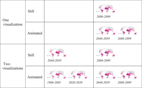
The hypotheses were tested using a 2 (type of visualizations: static versus animated) × 2 (quantity of visualizations: one versus two) × 2 (measured preexisting position: pro-climate regulations versus anti-climate regulations) design. While visualization type and the quantity of visualizations constituted four manipulated conditions, the preexisting position was a measured variable.
Regarding the visualization type, respondents were shown either a static map or an animated map illustrating snapshots of global climate change (see Appendix 1), which displayed temperatures for 1986–2005, 2020–2039, 2040–2059, and 2080–2099. Regarding the quantities of visualization manipulations, the participants were presented with either one or two visualizations of the same kind. To ensure that the respondents were aware of the visualizations, they were asked to recall how many visual(s) they had just seen, from zero to four. An independent-samples t-test showed that the respondents exposed to two visualizations (M = 1.20, SD = 1.15) generally recalled seeing significantly more visuals than those exposed to only one visualization (M = 0.69, SD = 1.06, p < .001).
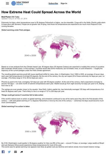
Participants were randomly exposed to one of the four conditions. The hypothetical article shown for all four conditions was presented as having been published on the website of USA Today, and all the elements – including the headline, the text, the author of the article, and the date it was released – were held constant across all conditions. The story, which was titled “How Extreme Heat Could Spread Across the World” (see Appendix 2), reported that high temperatures are expected to be much more frequent in the coming decades and that extremely hot days will become much more commonplace if countries fail to act.
Measurement
Perceived Media Bias. Respondents were asked to report to what extent they found that the media outlet that wrote the article was against (−5) or in favor of (5) climate regulations using a slider, with strictly neutral (0) as the midpoint (Christen et al., Citation2002). They were also asked to assess whether the media outlet responsible was biased against (−5) or in favor of (5) climate regulations, again with strictly neutral (0) as the midpoint. Adapting from previous research on hostile media perceptions (Schmitt et al., Citation2004), responses from the two questions were averaged to produce the measure of perceived media bias (M = 2.29, SD = 2.21, Cronbach’s alpha = 0.86).
Perceived Journalistic Motives. All of the motive measures were adapted from Tsang (2020)’s study. The advocacy motive was measured by asking respondents the extent to which they found that the journalist responsible for the news they had just read: (a) gave his/her opinion on climate regulations, (b) gave his/her judgment on climate regulations, (c) took a side, and (d) positioned himself/herself as a climate regulations advocate, on a 6-point scale from definitely not (1) to definitely (6). The four items were averaged (M = 3.46, SD = 1.21, Cronbach’s alpha = 0.86). Using the same scale as above, the mobilization motive asked respondents to what extent they found that the journalist responsible for the news: (a) proposed actions, (b) demanded actions, (c) swayed readers to support climate regulations, and (d) influenced public opinion. The four items were then averaged (M = 3.82, SD = 1.09, Cronbach’s alpha = 0.83), with higher scores indicating higher levels of mobilization motive. Regarding the news they had just read, respondents were asked to rate to what extent the journalist: (a) sought to hold the government accountable, (b) sought to hold businesses accountable, (c) made visible facts hidden by those in power, (d) protected public interest, (e) questioned and criticized elites, and (f) helped maximize government efficiency, on a 6-point scale from definitely not (1) to definitely (6). The six items were averaged to measure watchdog motive (M = 3.26, SD = 1.06, Cronbach’s alpha = 0.82). Using the same 6-point scale, respondents were asked to rate the extent the journalist: (a) supported the agenda set by the government, (b) defended the administration’s policies, (c) gave a positive image of businesses, and (d) cooperated with business elites. The four items were averaged to obtain scores for the power-defending motive (M = 2.61, SD = 1.12, Cronbach’s alpha = 0.89).
Party Identification. Respondents self-reported whether they considered themselves a Democrat (31.9%), a Republican (27.7%), an independent (34.5%), or something else (5.9%). Those who reported being independent or something else were considered to be neutral (40.4%). While 1 denoted Democrats, 3 denoted Republicans, and neutrals were denoted by 2.
Results
Perceived Media Bias
To test the effects of visualization type, the quantity of visualizations, and preexisting attitudes of perceived media bias (H1, H2, H4, RQ3), a series of three-way analyses of covariance (ANCOVA) was conducted, controlling for party identification. While visualization type and the quantity of data visualizations were not found to interact on perceived media bias (RQ3), visualization type was found to have a main effect on perceived media bias (F[1,414] = 6.18, p = .013, η2 = .015). In general, respondents exposed to an animated visualization(s) (M = 2.63, SD = 2.22) found the news to be more biased in favor of climate regulations than those exposed to a static visualization(s) (M = 2.05, SD = 2.14), supporting H1. However, preexisting attitudes (F[1, 414] = 1.13, p = .289) and the quantity of visualizations (F[1, 414] = 1.24, p = .267) had no significant impact on perceived media bias. Thus, H2 and H4 were not supported.
Perceived Journalistic Motives
Regarding the effects of visualization type, the quantity of visualizations, and preexisting attitudes on the four perceived journalistic motives (RQ1, H3, H5, and RQ4), another series of three-way ANCOVA was conducted, while controlling for party identification. First, the visualization type was found to have a main effect on the advocacy motive (F[1,414] = 6.85, p = .009, η2 = .016). Respondents in the animated condition (M = 3.61, SD = 1.20) assessed higher levels of advocacy motive than did those in the static condition (M = 3.32, SD = 1.15). While the quantity of visualizations had no impact (F[1,414] = 0.39, p = .531), climate regulation believers (M = 3.92, SD = 1.18) perceived the news story to be more motivated by advocacy purposes than did participants who were against climate regulations (M = 3.26, SD = 1.13; F[1, 414] = 21.57, p < .001, η2 = .050), supporting H3a but not H5a.
Regarding the mobilization motive, the quantity of visualizations had a main effect (F[1,414] = 4.64, p = .032, η2 = .011). Respondents exposed to two visualizations (M = 3.99, SD = 1.08) assessed higher levels of mobilization motive than did those exposed to only one visualization (M = 3.75, SD = 0.96). While the type of visualization had no impact (F[1,414] = 3.679, p = .056, η2 = .009), climate regulation believers (M = 4.10, SD = 0.97) perceived the news to be more motivated by mobilization purposes than did denialists (M = 3.77, SD = 1.04; F[1, 414] = 9.27, p = .002, η2 = .022), supporting both H3b and H5b.
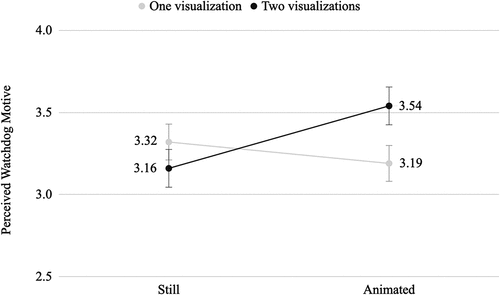
Regarding the watchdog motive, visualization type and quantity were found to interact (F[1,414] = 5.44, p = .020, η2 = .013). In response to RQ4 (see ), further pairwise comparisons controlled for Bonferroni showed that, among respondents exposed to two visualizations, those in the animated condition (M = 3.54, SD = 1.16) inferred higher levels of watchdog motive than those in the static condition (M = 3.19, SD = 0.98, p = .023). In addition, among respondents in the animated condition, those exposed to two visualizations (M = 3.36, SD = 1.08) rated greater watchdog motive than those exposed to one visualization (M = 3.20, SD = 1.00, p = .013). Since preexisting attitudes were not found to be a significant predictor (F[1,414] = 0.46, p = .498), H3c was not supported.
Figure 1. Interaction effects on perceived watchdog motive among climate regulation believers and denialists.
Regarding the power defender motive, visualization type and quantity were not found to interact (F[1,414] = 0.94, p = .334), nor did they have main effects. However, preexisting attitudes were found to be a strong, significant predictor of the power defender motive (F[1,414] = 34.49, p < .001, η2 = .077), supporting H3d but not H5d. Climate regulation believers (M = 3.15, SD = 1.27) rated the news as having significantly lower levels of power defender motive than did deniers (M = 2.47, SD = 1.01).
Mediation
Given that visualization type related significantly to both the perceived advocacy motive and perceived news bias, and because the perceived advocacy motive related significantly to perceived news bias, whether the perceived advocacy motive mediates the relationship between visualization type and perceived news bias (RQ4) was tested. The 95% confidence interval (CI) for the indirect effect was obtained from 5,000 bootstrapping samples (Preacher & Hayes, Citation2008), and the results supported the mediating role of the perceived advocacy motive in the relationship between visualization type and perceived news bias (β = 0.20, SE = 0.08, CI = 0.043 to 0.373). To answer RQ4, an animated map visualization was able to arouse higher levels of perceived advocacy motive and, in turn, higher levels of perceived media bias in favor of climate regulations.
Discussion
Given that the use of big data and animated visualizations are now common in journalism (de Haan et al., Citation2018), it is necessary to extend media effects research beyond the context of plain text and static visuals. The present study found that, in comparison to static visualizations, animated visualizations can further enhance people’s perceptions of the media bias of a news story. More importantly, that relationship is likely to be driven by the extent to which people believe the journalists to be motivated to advocate their personal stance on an issue – in this case, climate change. Overall, the data suggest that animated visualizations are perceived to be more favoring and biased toward climate regulations than static visualizations. Two potential mechanisms can account for this phenomenon. While studies have reported that participants might find a news story with animated visualizations to be visually more interesting (Fox et al., Citation2004) and vivid (Fish, Citation2020) than stories with static visualizations, other studies have found that messages with animated images are more persuasive (Fish, Citation2020). In this sense, people find stories with animated visualizations to be more persuasive, such that the story favors a particular stance on an issue.
Besides, people might perceive articles with animated visualizations to be more impactful than articles with static visualization in persuading others. According to Nisbett and Ross (Citation1980), data stories with animated visualization(s) tend to be more attractive to users, and this study adds that readers might then perceive that, in comparison to news stories with only static visualization(s), greater effort and more resources were put into the journalistic work to achieve certain goals. When greater effort or more resources are put into a piece of journalistic work, readers might see the responsible journalist as being a stronger advocate for a position, and therefore more biased. In this case, to better inform and persuade the public that climate change is happening and that actions are needed, journalists insert more visualizations in a news story to make it more persuasive as a vehicle for advocacy. While the former is more about the readers themselves finding the story persuasive, the latter is about the readers finding the story to be impactful to other potential readers.
Consistent with the literature on perceived journalistic motives (Tsang, Citation2022), readers’ perceptions of an author’s intent were found to impact the effects of a visualization. When people were exposed to an animated map visualization, as opposed to a static map visualization, they were likely to perceive that the news was created by the journalist to advocate climate change and thus viewed it as being more biased in favor of climate regulations. In other words, when animation was involved, people saw the data story as journalists taking sides and positioning the news based on their personal preference, favoring one side of the controversy. Animation not only makes a data story more favorable to the position being presented, but it also motivates readers to think that the story is engaging in advocacy. Among the four motives adopted from Mellado (Citation2015) and Tsang (Citation2022), only the perceived advocacy motive had those effects. A post-hoc explanation for this is that advocacy relies on the degree to which the message is persuasive. If a journalist has an agenda, he/she will invest more resources and effort into the work – in this case, the creation of animation and its inclusion in the news story.
While the quantity of data visualizations in a news story had no impact on perceived media bias, it did impact the perceived mobilization motive. When two visualizations were presented, participants perceived the journalist as having a higher level of mobilization motive than when only one visualization was present. Although the two motivations, advocacy and mobilization, are closely related concepts, inserting more visualizations to convey the need for climate regulations tends to make people think that journalists want to mobilize but not to advocate. This finding contributes to the literature on journalistic role conception in journalism (Mellado, Citation2015) and perceived journalistic motives (Tsang, Citation2022), in that different degrees of intensity (quantity of visualizations) can trigger readers to think that the journalists are trying to influence public opinion on climate regulations and to demand action. Regarding the watchdog motive, visualization type and number were found to interact. In comparison to a story with one static visualization, a story with two animated visualizations was seen to have a watchdog motive. In other words, people perceived the journalists to be holding the government and businesses accountable in order to protect the public interest via climate regulations. In summary, across all motives, the use of more visualizations and the use of animated visualizations resulted in higher levels of motive perceptions.
Lastly, the findings on preexisting attitudes can help to determine whether the post-hoc explanation presented above is supported. The data show that preexisting attitudes can predict the power-defender motive the most. Compared to denialists, climate regulation believers rated the news as having lower levels of support for regulations and as defending the government and businesses. In general, climate regulation believers exposed to an attitudinal-congruent (pro-climate regulations) news story found the story to be impacted more by the advocacy and mobilization motive and less by the power-defender motive. Given that it was the attitudinal-congruent individuals who saw the bias/favoritism at the same time, we can assume that they mostly perceived that the journalists responsible for the story had a beneficent, rather than malicious, motive for writing it.
In fact, the impact of the use of data visualizations on democratic ideals depends on whether people see the intention of the advocacy motive as being malicious or benevolent. If people on opposing sides translate malicious motives into bias perceptions, the impact could be harmful. Congruent with Kim’s (Citation2011) observations that the inclusion of data visualizations may promote subjective interpretations and even biases, the use of data visualizations is also found to contribute to the perception of bias. Even though the literature would expect animated visualizations to contribute to selective avoidance of disconfirming information sources (Stroud, Citation2010), they are not necessarily harmful. The present findings show that those exposed to an attitudinal-congruent story perceived journalistic motives (advocating, mobilizing, and power-defending), not those who were reading a dissenting news article. Consequently, it is safe to conclude that exposure to data visualizations does not necessarily compromise democratic ideals, even though people see news stories with animated visualizations as being more biased and favoring. In other words, it has less to do with hostile media (Perloff, Citation2020; Vallone et al., Citation1985) than about finding the article to be persuasive toward one’s point of view. In this study, climate regulation believers saw the pro-regulation stories as more highly impacted by the motivations of the journalist. To them, an attitudinal-congruent story is more motivating, probably due to the fact that they themselves found it to be persuasive. Following this logic, it has less to do with potential readers seeing such a story as being persuasive and being swayed by it.
Even though journalists or media outlets might expect graphic data visualizations to reflect a news phenomenon objectively, the findings show that this might not be the case. The inclusion of data visualizations may promote subjective interpretations, just like the different components in traditional print journalism (headline, word choice, source cues, tone) (Tully et al., Citation2020). While Lee et al. (Citation2015) found that data visualizations can be created to support one or more intended messages, the findings from the present research study suggest that readers form perceptions of what the producers are trying to achieve, regardless of whether the producers actually hold those intentions. This study also found that data visualizations arouse bias perceptions, but mostly among those who read a likeminded story. Given the abundance of data and the advances in technology for news content delivery, the findings of this research contribute to knowledge about how media organizations and public communication practitioners can guide audiences to make informed decisions when considering the use of data visualizations in the stories that are being reported. In comparison to traditional news stories, the policies about, and norms for how to effectively use and present news that is produced wholly or in-part by these technologies, must also consider the differing knowledge and needs of experts.
Limitations
Given that preexisting attitudes cannot be manipulated, the experimental design relied on measured manipulations. Although individuals with diverse preexisting attitudes were randomly assigned to read one of the news stories, future studies should aim to replicate the results of this one using other samples. Moreover, while this study used a liberal-leaning news source, USA Today, as a stimulus, future research should aim to replicate the findings by manipulating left-leaning news sources as well. Nonetheless, since the stimulus took a liberal stance on climate change, it would make little sense to manipulate its appearance in a left-leaning news source. Given that every participant was exposed to the same source, and comparisons were not performed across various news sources, the validity of the findings is affirmed. Finally, this study focused only on maps, one of many data visualization techniques. Given the abundance of visualization types that exist (bar charts, pie charts, tables, graphics, etc.), future research should explore how other types of visualizations impact the ways people process information and form attitudes in both political and health contexts. There are contexts in which messages can be manipulated in different political leanings.
Conclusion
Although journalistic practices mostly aim to produce objective news, the public does perceive bias, and this can have serious consequences for how people interact with the news and how they engage in politics (Feldman et al., Citation2017). To contribute to the role of the modality of news presentation in data communication practices and the role of data visualization in influencing readers’ learning and perceptions, this study revealed the nuances underlying the formation of media bias perceptions (Bozell, Citation2004; Brock, Citation2005; Niven, Citation2001) by blending in the literature on journalistic motives (Tsang, Citation2022). Overall, given that animated visualizations mainly enhance the degrees of perceived media bias among audiences who read an attitudinal-congruent story, potential negative impacts on democratic ideals should be limited.
Ethical Approval
Ethical approval for this study was obtained from the Research Ethics Committee at Hong Kong Baptist University (REC/18–19/0274).
Disclosure Statement
No potential conflict of interest was reported by the author.
Additional information
Funding
Notes on contributors
Stephanie Jean Tsang
Stephanie Jean Tsang (Ph.D., University of Wisconsin-Madison) is an assistant professor of the Department of Communication Studies at the Hong Kong Baptist University. Her research interests include media psychology, science communication, and online misinformation.
References
- Ajilore, O., Malaka, L., Sakpere, A., & Oluwadebi, A. (2021). Interactive survey design using pidgin and GIFS. In 3rd African Human-Computer Interaction Conference: Inclusiveness and Empowerment, 52–64. https://doi.org/10.1145/3448696.3448701
- Alieva, I. (2021). How American media framed 2016 presidential election using data visualization: The case study of the New York times and the Washington post. Journalism Practice, 1–27. https://doi.org/10.1080/17512786.2021.1930573
- Appelgren, E., & Jönsson, A. M. (2021). Engaging citizens for climate change—challenges for journalism. Digital Journalism, 9(6), 755–772. https://doi.org/10.1080/21670811.2020.1827965
- Berney, S., & Bétrancourt, M. (2016). Does animation enhance learning? A meta-analysis. Computers & Education, 101(2016), 150–167.
- Berret, C., & Phillips, C. (2016). Teaching data and computational journalism. Columbia School of Journalism.
- Bétrancourt, M., & Tversky, B. (2000). Effect of computer animation on users’ performance: A review/(Effet de l’animation sur les performances des utilisateurs: une sythèse). Le Travail humain, 63(4), 311.
- Boykoff, M. T., & Boykoff, J. M. (2007). Climate change and journalistic norms: A case-study of US mass-media coverage. Geoforum, 38(6), 1190–1204.
- Bozell, L. B. (2004). Weapons of mass distortion: The coming meltdown of the liberal media. New York, NY: Crown Forum.
- Brock, D. (2005). The republican noise machine: Right-wing media and how it corrupts democracy. Three Rivers Press (CA).
- Christen, C. T., Kannaovakun, P., & Gunther, A. C. (2002). Hostile media perceptions: Partisan assessments of press and public during the 1997 united parcel service strike. Political Communication, 19(4), 423–436.
- Cleveland, W. S. (1993). Visualizing data murray hill NJ. AT&T Bell Laboratories.
- Coyle, J. R., & Thorson, E. (2001). The effects of progressive levels of interactivity and vividness in web marketing sites. Journal of Advertising, 30(3), 65–77.
- de Haan, Y., Kruikemeier, S., Lecheler, S., Smit, G., & van der Nat, R. (2018). When does an infographic say more than a thousand words?: Audience evaluations of news visualizations. Journalism Studies, 19(9), 1293–1312. https://doi.org/10.1080/1461670X.2016.1267592
- Duan, R., Crosswell, L., & Barber, K. (2021). Animation in environmental journalism: Effects on news perception and information seeking. Journal of Broadcasting & Electronic Media, 1–23. https://doi.org/10.1080/08838151.2021.1923716
- Feldman, L., Hart, P. S., & Milosevic, T. (2017). Polarizing news? Representations of threat and efficacy in leading US newspapers’ coverage of climate change. Public Understanding of Science, 26(4), 481–497.
- Fish, C. S. (2020). Cartographic content analysis of compelling climate change communication. Cartography and Geographic Information Science, 47(6), 492–507. https://doi.org/10.1080/15230406.2020.1774421
- Fortin, D. R., & Dholakia, R. R. (2005). Interactivity and vividness effects on social presence and involvement with a web-based advertisement. Journal of Business Research, 58(3), 387–396.
- Fox, J. R., Lang, A., Chung, Y., Lee, S., Schwartz, N., & Potter, D. (2004). Picture this: Effects of graphics on the processing of television news. Journal of Broadcasting & Electronic Media, 48(4), 646–674. https://doi.org/10.1207/s15506878jobem4804_7
- Funk, C., & Hefferon, M. (2019, November 25). U.S. public views on climate and energy. Pew Research Center Science & Society. https://www.pewresearch.org/science/2019/11/25/u-s-public-views-on-climate-and-energy/
- Giner-Sorolla, R., & Chaiken, S. (1994). The causes of hostile media judgments. Journal of Experimental Social Psychology, 30(2), 165–180.
- Heise, U. K. (2014). Plasmatic nature: Environmentalism and animated film. Public Culture, 26(2), 301–318.
- Howard, A. B. (2014). The art and science of data-driven journalism.
- Kelliher, A., & Slaney, M. (2012). Tell me a story. IEEE MultiMedia, 19(1), 4–4. https://doi.org/10.1109/MMUL.2012.13
- Kennedy, B., Tyson, A., & Funk, C. (2022, July 14). Americans divided over direction of Biden’s climate change policies. Pew Research Center Science & Society. https://www.pewresearch.org/science/2022/07/14/americans-divided-over-direction-of-bidens-climate-change-policies/
- Kim, L. (2011). Media framing of stem cell research: A cross-national analysis of political representation of science between the UK and South Korea. Journal of Science Communication, 10(3), A02.
- Kohn, B. (2003). Journalistic fraud: How the New York times distorts the news and why it can no longer be trusted. Thomas Nelson Inc.
- Lee, B., Riche, N. H., Isenberg, P., & Carpendale, S. (2015). More than telling a story: Transforming data into visually shared stories. IEEE Computer Graphics and Applications, 35(5), 84–90.
- Lowrey, W., & Hou, J. (2021). All forest, no trees? Data journalism and the construction of abstract categories. Journalism, 22(1), 35–51. https://doi.org/10.1177/1464884918767577
- McLeod, D. M., Wise, D., & Perryman, M. (2017). Thinking about the media: A review of theory and research on media perceptions, media effects perceptions, and their consequences. Review of Communication Research, 5, 35–83. https://doi.org/10.12840/issn.2255-4165.2017.05.01.013
- Mellado, C. (2015). Professional roles in news content: Six dimensions of journalistic role performance. Journalism Studies, 16(4), 596–614.
- Miltner, K. M., & Highfield, T. (2017). Never gonna GIF you up: Analyzing the cultural significance of the animated GIF. Social Media + Society, 3(3), 2056305117725223. https://doi.org/10.1177/2056305117725223
- Nisbett, R. E., & Ross, L. (1980). Human inference: Strategies and shortcomings of social judgment. Englewood Cliffs, NJ, USA: Prentice-Hall.
- Niven, D. (2001). Bias in the news: Partisanship and negativity in media coverage of presidents George Bush and Bill Clinton. Harvard International Journal of Press/politics, 6(3), 31–46. https://doi.org/10.1177/108118001129172215
- Oh, J., Lim, H. S., Copple, J. G., & Chadraba, E. K. (2018). Harnessing the persuasive potential of data: The combinatory effects of data visualization and interactive narratives on obesity perceptions and policy attitudes. Telematics and Informatics, 35(6), 1755–1769. https://doi.org/10.1016/j.tele.2018.05.004
- Ojo, A., & Heravi, B. (2018). Patterns in award winning data storytelling: Story types, enabling tools and competences. Digital Journalism, 6(6), 693–718. https://doi.org/10.1080/21670811.2017.1403291
- Perloff, R. M. (2020). Hostile media effect. In Jan Van den Bulck (eds.), The International Encyclopedia of Media Psychology (pp. 1–8). https://doi.org/10.1002/9781119011071.iemp0149
- Popovich, N., Schwartz, J., & Schlossberg, T. (2017). How Americans think about climate change, in six maps. The New York Times. https://www.nytimes.com/interactive/2017/03/21/climate/how-americans-think-about-climate-change-in-six-maps.html
- Preacher, K. J., & Hayes, A. F. (2008). Asymptotic and resampling strategies for assessing and comparing indirect effects in multiple mediator models. Behavior Research Methods, 40(3), 879–891.
- Ratwani, R. M., Trafton, J. G., & Boehm Davis, D. A. (2008). Thinking graphically: Connecting vision and cognition during graph comprehension. Journal of Experimental Psychology: Applied, 14(1), 36.
- Schmitt, K. M., Gunther, A. C., & Liebhart, J. L. (2004). Why partisans see mass media as biased. Communication Research, 31(6), 623–641.
- Stalph, F. (2018). Classifying data journalism: A content analysis of daily data-driven stories. Journalism Practice, 12(10), 1332–1350.
- Stroud, N. J. (2010). Polarization and partisan selective exposure. The Journal of Communication, 60(3), 556–576. https://doi.org/10.1111/j.1460-2466.2010.01497.x
- Sundar, S. S. (2000). Multimedia effects on processing and perception of online news: A study of picture, audio, and video downloads. Journalism & Mass Communication Quarterly, 77(3), 480–499. https://doi.org/10.1177/107769900007700302
- Tsang, S. J. (2022). Issue stance and perceived journalistic motives explain divergent audience perceptions of fake news. https://journals.sagepub.com/doi/10.1177/1464884920926002
- Tsfati, Y., & Cohen, J. (2005). Democratic consequences of hostile media perceptions: The case of Gaza settlers. Harvard International Journal of Press/politics, 10(4), 28–51.
- Tufte, E. R. (1985). The visual display of quantitative information. The Journal for Healthcare Quality (JHQ), 7(3), 15.
- Tully, M., Vraga, E. K., & Smithson, A. -B. (2020). News media literacy, perceptions of bias, and interpretation of news. Journalism, 21(2), 209–226. https://doi.org/10.1177/1464884918805262
- Tyson, A., & Kennedy, B. (2020, June 23). Two-thirds of Americans think government should do more on climate. Pew Research Center Science & Society. https://www.pewresearch.org/science/2020/06/23/two-thirds-of-americans-think-government-should-do-more-on-climate/
- Vallone, R. P., Ross, L., & Lepper, M. R. (1985). The hostile media phenomenon: Biased perception and perceptions of media bias in coverage of the Beirut massacre. Journal of Personality and Social Psychology, 49(3), 577.
- Ware, C. (2019). Information visualization: Perception for design. Morgan Kaufmann.
Appendices Appendix 1.
Visualization Manipulations
Appendix 2
Sample Stimulus