
ABSTRACT
The No Free Lunch (NFL) Theorem imposes a theoretical restriction on optimization algorithms and their equal average performance on different problems, under some particular assumptions. Nevertheless, when brought into practice, a perceived “ranking” on the performance is usually perceived by engineers developing machine learning applications. Questions that naturally arise are what kinds of biases the real world has and in which ways can we take advantage from them. Using exploratory data analysis (EDA) on classification examples, we gather insight on some traits that set apart algorithms, datasets and evaluation measures and to what extent the NFL theorem, a theoretical result, applies under typical real-world constraints.
Introduction
The No Free Lunch (NFL) theorem (Wolpert Citation1996a, Citation1996b) states, in short, that under some particular circumstances (e.g. homogeneous loss functions), all algorithms perform equally well, averaging over all possible datasets (with a fixed length). In other words, if one algorithm performs remarkably well in one dataset, there exists another dataset that such algorithm would have remarkable trouble with.
Despite the prevalence of the NFL theorem, there are significant and obvious differences between the performances of different machine learning classification algorithms on real-world datasets. In our last publication, we provided a qualitative overview on the most common traits of these and contrasted them with a few popular datasets used as a preliminary benchmark. These traits were studied as part of a post factum analysis on results gathered on previous unrelated experiments (Gómez and Rojas Citation2015), so a more rigorous and extensive approach was needed.
The next step is to quantify and summarize similar classification results into conclusions useful for predictive modeling purposes. More than a hundred datasets were collected from public repositories to study possible similarities, their statistical and information-theoretic traits and the performance we obtain with different algorithms. Similar research has been conducted before (Ali and Smith Citation2006), including more specialized research areas such as automatic image description (Bernardi et al. Citation2016), (Hodosh, Young, and Hockenmaier Citation2013), but our particular interests in this project are threefold: the algorithms, the dataset structural properties and the relationship between both.
First, we intend to examine the algorithms themselves and the circumstances under which they display good performance. Many informal heuristics and rules of thumb exist when a data analyst needs to choose which model to use for prediction, often obtained through empirical, trial-and-error approaches, such as the helpful diagram on the popular python library scikit-learn’s website (Pedregosa et al. Citation2011). An exploratory analysis can provide additional insight and become a tool to evaluate future classifiers as well.
Using a similar reasoning but considering the datasets this time, we find substantial structural properties of widely available and studied data worth exploring. By summarizing the whole statistical complexity of a full dataset to a handful of carefully chosen metrics, we can find out which of these include relevant and concise information that can potentially be used to improve our learning efforts. Moreover, different sets of evaluation metrics will be considered to explore the relationships between them and to provide information on how useful they can be in different situations.
This document will proceed with a more detailed explanation of the experimental setup in Section 2, followed by the results in Section 3. Finally, in Section 4 we will present our conclusions and we will discuss the impact these ideas have for data analysis.
Methodology
The setup for this first section consists of the study on 101 classification datasets, gathered from the UCI and KEEL repositories (Alcalá-Fdez et al. Citation2011; Bache and Lichman Citation2013). These datasets have been considered as a representative sample of a common (but not unique) real-world use case in data analysis: modest-sized sets with many more examples than features (commonly known as case) with no trivial problems (otherwise we wouldn’t be using machine learning). Moreover, there has been no prior filtering mechanism, relying instead on the judgment of the sources in order to minimize any kind of selection bias on the subsequent statistical analysis. Lastly, no customized preprocessing or modification of any kind was made on any individual dataset to ensure the data is representative of the original sources. However, we performed a series of steps to ensure the integration of our analysis.
Remove features with null entropy.
Impute missing values of a feature as the median of the known values.
For calculations requiring numeric values, transform nominal features using dummy coding.
For calculations requiring nominal values, transform numeric features by discretization using the Freedman–Diaconis rule.
With this homogeneous dataset collection, we developed a set of metrics with the intention of summarizing each set in a few values. These metrics were chosen with some considerations in mind: being relevant, inexpensive to compute and as few in number as possible. This last parsimony constraint is necessary in order to carry out a sound statistical analysis; with many variables and/or interactions between them, the chances increase of finding some spurious structure that would invalidate the conclusions. In particular, we chose the metrics detailed in .
Table 1. Metrics computed for each classification dataset.
Developing a new meta-dataset with these metrics allows us to conduct an exploratory data analysis (EDA) to identify relations between them. Note that this step involves only the data; we are not accounting for the algorithms at this stage.
As a follow-up experiment, these metrics are compared to the results of different algorithms for each set. In particular, five classifiers (from the sklearn library implementation) are tested: naive Bayes, k-nearest neighbor (kNN), linear kernel support vector machines (SVMs), random forests and neural networks. The hyper-parameters for the training of these models are found via grid search, and in the case of neural networks we use a single hidden layer with units using logistic activation functions, trained via BFGS quasi-Newton back-propagation.
To allow a fairer comparison between datasets, we chose Cohen’s kappa () instead of the absolute error since our interest lies in finding out how the classifiers are able to improve on the baseline accuracy.
If we define the baseline, , as the fraction of the most populated class and
as the accuracy of a model in that set, kappa is defined as
. A
means that the model is unable to provide further insight than a simple educated guess (e.g. choosing always the most probable answer a priori). A positive value indicates the magnitude on such insight, whereas a negative value means that it is worse than an educated guess. Such a metric is more reasonable than accuracy to evaluate algorithms: for example, a 50% accuracy on biometric authentication is drastically different than a 50% accuracy in predicting the next winning lottery number.
One consequence of choosing kappa is the impossibility of the NFL theorem to strictly hold if we consider this measure instead of the loss function. Using the definitions in , we have the following.
Table 2. Mathematical notation and definitions.
The NFL applies on the loss function and its average, but on kappa we see that the value depends on the classifier, , and, therefore, is not constant. Furthermore, such value is not well defined, since the baseline,
, can be equal to one (and, thus, the baseline odds remain indeterminate) if all training examples belong to the same class.
With that consideration in mind, the objective is to model the algorithm outcomes as a function of the different metrics we implemented in the previous stage.
As we mentioned in the introduction, two different models will be considered. First, an explanatory model will be constructed for each algorithm to determine any kind of significance in the parameters. This will aid us in understanding which traits have the most impact on each algorithm; the NFL theorem states that we can’t make any (statistically significant) a priori distinction between them, but once we start breaking down datasets in relevant measures, we may start to observe differences.
Our second objective will be to explore how accurate a predictive model can be in representing an algorithm’s performance. It is fair to say that this is no trivial task, so a high variance model is expected, but some intuition can be gained on how much we can improve on trivial guessing (i.e. averaging) and possible paths of improvement.
Results
Before the exposition of our results, a caveat must be considered: since our meta-dataset is small, we are forced to use the entirety of it in order to be able to extract any meaningful conclusions. That, in turn, means that the subsequent modeling can, and will probably, be contaminated by hypothesis suggested by the data. Therefore, any insight obtained from the modeling performed has to be interpreted mostly as working hypotheses for future research.
Dataset metrics
The NFL theorem works under the assumption of a uniform prior over all datasets: to understand how much we deviate from uniformity on the chosen datasets, figures with descriptive statistics are included in this section, starting with . These shed some light on the kind of assumptions under which the conclusions of this analysis will hold, namely the following.
Figure 1. Boxplot of the different dataset metrics.
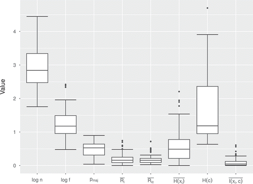
Compared to many practical uses in the industry, the datasets reviewed are small. The number of instances (
) is on average (
There is a fairly uniform distribution on class balance, ranging from 0.3 bits of entropy to 4.7. The only exception is a sharp peak slightly under 1 bit entropy distributions, representing (nearly) balanced binary class datasets. These are very common particular cases in practice that will have an important representation in the study.
The inter-attribute correlation is low (
Both the attribute–class correlation and their mutual information are low as well (
Both the class and the average attribute have relatively low entropy:
These traits are usually found in many datasets used in practical applications, so the conclusions should be applicable to many particular real-world cases. Not all usual problems are represented, though, since recent machine learning studies are performed on very large datasets (e.g. millions of examples or more) using big data infrastructures and state-of-the-art techniques such as deep learning, which are usually not as effective in more memory-manageable sets prone to over-fitting. Applications in these cases usually require some customized fine-tuning to perform well (Ruiz-Garcia et al. Citation2016).
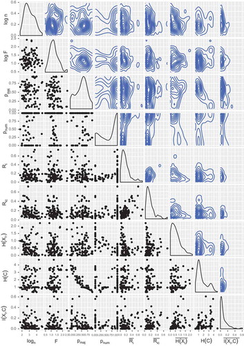
The dataset uniform distribution required by the NFL theorem holds partially, as seen in the scatterplots in , even if almost all contour plots (and density estimates) resemble more a radial distribution. The exception is the evident correlated relationship between and
(a highly populated class implies a more imbalanced dataset and, thus, lower entropy).
Figure 2. Scatterplots, density estimation and contour plots of the dataset metrics.
Evaluation metrics
Besides the metrics we defined for the datasets disregarding the target values, and since the interest of the study lies in the aggregated performance of different algorithms on multiple datasets, it is worthwhile to compare different alternative measures.
As established before, the “gold standard” measure (for this paper’s purposes) will be the kappa coefficient to evaluate how much the classifiers improve on random guesses. This kappa needs an implicit “baseline” to be defined; a popular choice, used here, is to consider the loss of the most populated class in the dataset, but there are others (Powers Citation2012). This measure is considered alongside seven more measures: accuracy, precision, specificity, F1 score, Youden’s (Youden Citation1950):
and Matthews Correlation Coefficient (MCC) (Matthews Citation1975):
with the last five measures weighted according to each class’s weight.
A class-weighted recall score is not necessary to consider, since it can be quickly seen that it is equivalent to accuracy. Let be the set of classes in the data and
be the number of instances belonging to class
, classified as class
:
The algorithms’ evaluation uses the usual classification or zero-one loss, so the homogeneity required by the NFL theorem applies.
No drastic differences can be observed among algorithms, even if some subtleties emerge. As a global note for all classifiers, a high correlation is obvious between almost all of the evaluation measures, sensibly enough. Later on in this section, we will discuss how these measures are related.
Moving on to the evaluation metric analysis, the green (highest-scoring) sets form a denser cluster than the other groups, especially in the random forest and neural network algorithms. On the other extreme, the red (lowest-scoring) sets have a very high dispersion among a large range, especially in the naive Bayes classifier. These observations make sense since there are more ways to be “wrong” than to be “right,” but that makes it more difficult to further characterize low-performance datasets.
Among the different classifiers, we can identify three groups comparing point dispersion and density estimation overlap, most notably in the red and green dots: naive Bayes as the least defined cloud of points, followed by the kNN and SVM with a more compact distribution and lastly the random forest and neural network having the sharpest distinctions.
From a different point of view, a Principal Component Analysis (PCA) analysis can shed some light on how these measures are related. By reducing the dimensionality of these seven measures, we are able to project them into two principal components while being able to explain more than 95% of the variance of the original points. The results are plotted in , and they are reasonably unanimous on all five algorithms. There are three perfectly separate groups of evaluation measures, correlation-wise:
Figure 3. Bi-plots of the first two principal components for the evaluation metrics for each algorithm. The red vectors are the projections of the original metrics onto these components, and each label represents a dataset in these new coordinates.
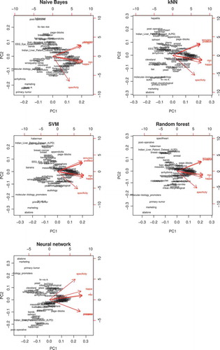
Accuracy, precision, F1
Specificity
Kappa, Youden’s J, MCC
Accuracy, precision and F1 all take into account the true positive rate, ignoring the true negative rate. On the other hand, specificity considers the true negative rate, while ignoring the true positive rate. Of the third group, Youden’s J and the MCC take both rates into consideration, explaining their middle ground between the first and second groups. Less trivial and more surprising is the fact that the kappa score fits in this third group consistently among algorithms too. This reinforces the idea that kappa is a better and more useful metric to evaluate classifiers than accuracy or other single-faceted estimates.
Dataset metrics grouped by kappa
In this section, we will break down by kappa ranges, in a similar manner to the analysis performed in the previous section. Just like in the previous plot, the (pairwise) distributions are much more difficult to analyze as well. There is not much apparent insight in the point clouds, showing no clear patterns. In most cases, the Kernel Density Estimation (KDE) for each of the three kappa ranges (green, blue, red) within the same variable pairs follows very similar marginal distributions, suggesting that no significant difference exists between the groups.
A dimensionality reduction approach does not work as well here as it did before. A PCA applied in this case reduces the number of variables from eight to an average of around six if a significant percentage of explained variance is desired ( 95%). This data cannot be meaningfully represented in a single two-dimensional figure without missing a considerable amount of information.
A noticeable difference in the pair plot is the correlation KDE for naive Bayes; unlike the rest of the classifiers, it is shown how naive Bayes is able to obtain a flatter distribution for the first quartile datasets, implying better results with higher inter-attribute correlations due to its attribute-independence assumption. This contrasts with the rest, which follow a high peak on low correlations (especially seen in the random forests and neural networks) and low density on high values.
Datasets
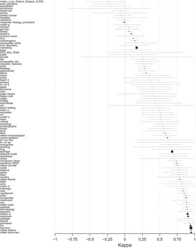
Focusing now on the datasets themselves, an evocative ranking emerges when comparing the kappa scores individually. plots the intervals between the minimum and maximum kappa scores for each dataset. It is remarkable to note the smooth slope followed by the (ordered) means of the different kappa scores; there are no significant gaps on the whole positive semi-axis, so we might conclude that the (randomly chosen) sets cover the whole range of “difficulty.”
Figure 4. Dataset ranking, as intervals with the minimum, mean and maximum kappa scores among the five algorithms used.
A small adjustment had to be made in the particular case of the naive Bayes classifier. Five outliers were found within the original set of datasets where the kappa scores were extremely negative; these datasets were called ThoraricSurgery (actual spelling), hypothyroid, thyroid, sick, coil2000. To find out the reason for these extreme results, a decision tree (C4.5) was fit: it turned out that a clear difference of these offending sets was both a high class imbalance (major class accumulating 85% of instances) and a very low mean attribute correlation (
0.07). According to these results, in these circumstances, the naive Bayes performs exceptionally poorly, even though a more comprehensive list of datasets should be compiled to confirm this conclusion.
It should be noted that this outlier removal was performed on all classifier simulations in order to preserve comparable results among algorithms.
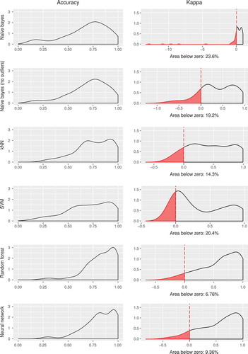
Outliers aside, another metric of interest for a classifier might be an estimation on how many datasets perform worse than random chance, that is, how many sets score lower than zero. shows that the proportion of such datasets is small, but noticeably different among algorithms. As in other parts of this analysis, once again two groups can be identified: naive Bayes and kNN (12–18%) and SVM, random forests and neural networks (5–7%).
Figure 5. Density estimation for accuracy and kappa for the datasets. In the case of kappa, the red area represents the proportion of datasets with negative kappa, that is, the times that the model is unable to outperform a trivial educated guess.
With this ranking, one can go further and check, for each dataset, not only the highest-scoring classifier but also the worst, as in . For each classifier, a count on the number of datasets on which the said classifier scored the highest over the five models is considered. Moreover, the same is performed on the lowest scores and, finally, a ratio highest/lowest (H/L) can be calculated as the global “reliability” (within the studied sample) of a classifier.
Figure 6. Number of highest/lowest kappa scores for each classifier. The left figure indicates the number of times (normalized to one) a classifier has been the highest (green) and lowest (red) scoring model. The right figure shows their highest/lowest ratios.
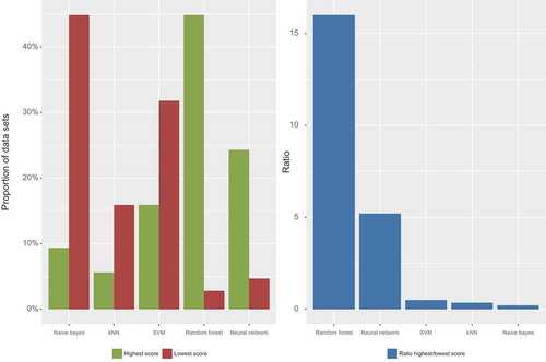
As in previous sections, three separate clusters can be observed this time, judging by this ratio.
Neural networks and, specially, random forests have excellent global results, with only a minority of bad cases, obtaining high H/L ratios (
Naive Bayes and kNN have a majority of lowest-scoring cases, achieving low H/L ratios (
Even though we could group the SVMs under the previous group, it is interesting to note that SVMs have a significant number of both highest- and lowest-scoring cases. The end result, though, is a low H/L ratio as well.
Considering all of these points, we can see that even the globally “worst” classifiers are still the best in some datasets. This is true even when three of the models belong to the same expresiveness hierarchy: linear SVMs are strictly less expressive than random forests, and these are less expressive than neural networks. However, with the increased degrees of freedom, the complexity of fitting the model rises as well, so it is less likely to find the optimal parameters. That is the reason why, in some cases, linear SVMs outperform random forests or neural networks: it is a limitation of our stochastic training procedure. It is almost a certainty that, for each of the included datasets, there exists a set of weights and biases that would make a neural network the best-performing classifier in all cases, even if it might be hard to find using standard back-propagation. (right) suggests that our training procedure for neural networks is not sophisticated enough to take advantage of its inherent expressiveness.
The minimums and maximums of have been mentioned, but the variance between algorithms for each dataset can explain something about their global performance too. If one interprets this dispersion as the “agreement” on the inference difficulty, it might be worthwhile to explore the circumstances and reasons for the disagreement. Ordering the datasets by this variance and estimating the density (weighted by the total number of cases) of highest- and lowest-scoring results for each of them, we get .
Figure 7. Representation of the (weighted) distribution of the worst (left figure) and best (right figure) performing algorithms according to the variance between the results of the five of them: the datasets with more accuracy/kappa agreement between algorithms lie on the left, whereas the ones with more disagreement are on the right side of the horizontal axis.
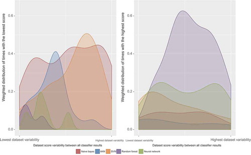
Starting with the highest-scoring densities, a clear negative skew is evident in the random forests, indicating that they work better than the rest on disputed datasets. This has been observed in other studies (Niculescu-Mizil and Caruana Citation2005) of ensemble classifiers: the votes of different trees are more helpful to reach a decision on a difficult dataset than a single classifier. On the other hand, SVMs seem to be skewed the other way, while the rest seem fairly uniform.
Moving to the lowest-scoring cases, the most peculiar aspect is how the naive Bayes and the kNN complement each other. Being the classifiers with the lowest average performance, it is interesting to see that naive Bayes has a worse result when there is a very low or very high disagreement, whereas kNN is more problematic with a medium amount of variance. SVMs remain mostly flat, whereas both random forests and neural networks have too few points (five) to extract meaningful conclusions.
Predictive modeling
One final way that we can determine the impact of each metric into the result is by modeling each algorithm’s evaluation measure as a function of the dataset metrics. In the first place, the focus will be on figuring out the statistically significant coefficients () and, second, consider the effect by examining the 95% confidence interval.
A total of 40 models (eight evaluation metrics for each of the five algorithms) will be trained, so in order to keep a fair bound on false positives, a multiple comparison p-value adjustment, Holm–Bonferroni correction (Holm Citation1979), will be applied. A common, yet unsurprising, theme among all classifiers (with the arguable exception of random forests) is the significance of the mean attribute–class correlation for all evaluation metrics. Accuracy, precision, specificity, recall and F1 for all classifiers have around 0.6, whereas kappa, Youden’s J and MCC roughly double that value. This is consistent with the fact that the former metrics have values ranging from 0 to 1, whereas the latter range from –1 to 1, twice as large.
Since correlation has a range of 1, assuming linearity we can say that for each 0.1 change in in average, we can obtain an increment of 0.06 in the evaluation. That is not an insignificant improvement, but a 0.1 increase in correlation is no small change either.
Another recurring significant dataset metric is . It is significant in all evaluation metrics in kNN and random forests, as well as in some measures of neural networks. The effect is questionable, though, as an increase of 1 in
(i.e. increasing the number of instances tenfold, an increasingly difficult task to achieve) produces an average increase of 0.13. This is an interesting conclusion to note, but probably impractical for real applications. As for naive Bayes and SVMs, this metric is not really significant in any case.
Other effects are more surprising. For example, the intercept for almost all models is nonsignificant except for specificity. This fact occurs in all classifiers, so it is unlikely to be a coincidence. In addition, the metric on class imbalance, , appears as significant in some cases too, impairing the model the more imbalanced it is. This is especially observed in the kappa evaluation on naive Bayes classifiers, with a coefficient of 1.8, large when compared to the rest.
Conclusions and future work
We have discussed five widely used classifiers, which were tested on a decent variety of datasets in order to learn more about the optimal circumstances under which they should be used, all by using EDA. A follow-up experiment was also carried out to perform a statistical characterization of real classification practices, with some insight on some differences between algorithms.
Further predictive models were also developed, but results imply that, unfortunately, the available data are not sufficient to extract significant conclusions this way, differing little from random guessing. To be able to narrow down the variance on the output, and thus obtain accurate predictions, more sophisticated models and more data to feed these models would be necessary.
A further development along the lines of this analysis would be to come up with novel ways to describe the dataset with other summarizing metrics. Desirable properties these metrics should have include density of information, lightweight computation and easy interpretation, among others.
Another evident extension to this work is the opportunity to replicate these results with more and/or larger datasets. A more extensive sample would increase the statistical power of a regression model to describe the relationship between evaluation metrics, whereas larger datasets would be representative of other kinds of widely used applications such as big data environments.
This is not only a mere matter of scale; some classification algorithms, particularly ensembles, usually don’t have a stellar performance unless trained with a sufficient amount of data. The differences are not only of magnitude, but new behaviors can also emerge for these sets, which can drastically change the output.
References
- Alcalá-Fdez, J., A. Fernández, J. Luengo, J. Derrac, S. Garcá, L. Sanchez, and F. Herrera. 2011. KEEL data-mining software tool: Data set repository, integration of algorithms and experimental analysis framework. Journal of Multiple-Valued Logic and Soft Computing 17:255–87.
- Ali, S., and K. A. Smith. 2006 January. On learning algorithm selection for classification. Applications Soft Computation 6 (2):119–38. doi:10.1016/j.asoc.2004.12.002.
- Bache, K., and M. Lichman. 2013. UCI machine learning dataset repository. http://archive.ics.uci.edu/ml.
- Bernardi, R., R. Cakici, D. Elliott, A. Erdem, E. Erdem, N. Ikizler-Cinbis, F. Keller, A. Muscat, and B. Plank. 2016 January. Automatic description generation from images: A survey of models, datasets, and evaluation measures. Journal Artificial International Researcher 55 (1): 409–42.
- Gómez, D., and A. Rojas. 2015. An empirical overview of the no free lunch theorem and its effect on real-world machine learning classification. Neural Computation 28:216–28. doi:10.1162/NECO_a_00793.
- Hodosh, M., P. Young, and J. Hockenmaier. 2013 May. Framing image description as a ranking task: Data, models and evaluation metrics. Journal Artificial International Researcher 47 (1): 853–99.
- Holm, S. 1979. A simple sequentially rejective multiple test procedure. Scandinavian Journal of Statistics 6 (2):65–70.
- Matthews, B. W. 1975. Comparison of the predicted and observed secondary structure of T4 phage lysozyme. Biochimica Et Biophysica Acta (BBA) - Protein Structure 405 (2):442–51. doi:10.1016/0005-2795(75)90109-9.
- Niculescu-Mizil, A., and R. Caruana. 2005. Predicting good probabilities with supervised learning. Proceedings of the 22Nd International Conference on Machine Learning, ICML ‘05. New York, NY, USA: ACM, 625–32.
- Pedregosa, F., G. Varoquaux, A. Gramfort, V. Michel, B. Thirion, O. Grisel, M. Blondel, P. Prettenhofer, R. Weiss, V. Dubourg, J. Vanderplas, A. Passos, D. Cournapeau, M. Brucher, and M. Perrot. 2011. Scikit-learn: Machine learning in Python. Journal of Machine Learning Research 12:2825–30. http://scikit-learn.org/stable/tutorial/machine_learning_map/index.html.
- Powers, D. M. W. 2012. The problem with Kappa. Proceedings of the 13th Conference of the European Chapter of the Association for Computational Linguistics, EACL ‘12. Stroudsburg, PA, USA: Association for Computational Linguistics, 345–55.
- Ruiz-Garcia, A., M. Elshaw, A. Altahhan, and V. Palade. 2016. Artificial Neural Networks and Machine Learning. In Deep learning for emotion recognition in faces, eds. A. E. P. Villa, P. Masulli, and A. J. P. Rivero, ICANN 2016: 25th International Conference on Artificial Neural Networks, Barcelona, Spain, September 6-9, Proceedings, Part II. Cham: Springer International Publishing.
- Wolpert, D. H. 1996a, October. The existence of a priori distinctions between learning algorithms. Neural Computation 8 (7):1391–420. doi:10.1162/neco.1996.8.7.1391.
- Wolpert, D. H. 1996b October. The lack of a priori distinctions between learning algorithms. Neural Computation 8 (7):1341–90. doi:10.1162/neco.1996.8.7.1341.
- Youden, W. J. 1950. Index for rating diagnostic tests. Cancer 3 (1):32–35. doi:10.1002/(ISSN)1097-0142.