
ABSTRACT
This paper examines the marketing of trending green cosmetic products containing natural ingredients and coming with claims to keep skin health-enhancing and age-defying benefits. This is fostered by the growing importance of successful ageing and the neoliberal self-care agenda. Adopting the notion of “integrated design” from Multimodal Critical Discourse Analysis (MCDA), this paper looks at the communicative affordances of the web and how marketers of “green” cosmetics connect these to science. The analysis shows that the integrated design of the webpages allows cosmetic companies to connote science while glossing over significant details, leaving causalities, classifications, and processes unspecified. This marketing frames fighting the “look” of ageing as a moral and ethical consumption choice. Such choices relate to self-care regimes of a “successful” neoliberal citizenship.
Introduction
Several studies focusing on gender and the marketing of cosmetics show that women’s appearances are constructed as an individual project, something to be continuously worked on, to “fix” age-related problems (Coupland Citation2007, Citation2009), providing a way for successful ageing (Kenalemang Citation2021). According to Gill (Citation2021, 13) the surveillance, particularly of women’s faces, has intensified and “is becoming forensic in its gaze” through its microscopic scrutiny of the ageing skin. The intensified scrutiny of the face provides a lucrative market for anti-ageing products and is expected to reach 331 USD billion by 2021 (Nguyen, Masub, and Jagdeo Citation2020, 1555). These products are compellingly promoted as pharmaceutical products, through what Chen (Citation2015, 207) refers to as “the scientifization of beauty” (cf. Coupland Citation2007; Arroyo Citation2013, Citation2014), which allows cosmetic companies to benefit from the social impact of science and position their highly chemicalised products as advanced innovations, often by using a technologised, discipline-specific, and for many consumers inaccessible language (Mire Citation2012; Arroyo Citation2013; Chen Citation2015). While the research in this area has mainly looked at the marketing of more traditional cosmetics, this study focuses on the new trend in food and cosmetic convergence (Faria-Silva et al. Citation2020) and analyses the marketing of “green cosmetics.” In such marketing, cosmetics brands emphasise a lack of chemicals and a more “natural” approach to skincare (Ringrow Citation2016, 83; cf. Faria-Silva et al. Citation2020), profiting on the positive connotations and claimed anti-ageing effects of so-called superfoods (cf. MacGregor, Petersen, and Parker Citation2018). These cosmetics are, thus marketed to female consumers who not only care about their looks or well-being, but also about their safety and ecological footprint (Faria-Silva et al. Citation2020).
Taking off from the theory of social semiotics (Kress and van Leeuwen Citation1996, Citation2001; Kress Citation2010) and using the methods of multimodal critical discourse analysis (MCDA) (Machin Citation2013; Ledin and Machin Citation2018; Citation2020), in this paper we examine how the marketing of “green” cosmetics addresses female consumers and how these products are assumed to fit into how women should think and act. While previous research mainly studied printed advertisements in magazines, and as marketing and shopping are increasingly taking place online, we examine how the communicative affordances of the web are used to promote these products. More specifically, we analyse how marketers use these affordances to emphasise the functions and powers of natural ingredients, while still making use of links to science. Social semiotic research on web marketing shows that the affordances of what Ledin and Machin (Citation2018, Citation2020) term “integrated design” play a major role to connect products to science (Chen and Eriksson Citation2021). In line with these ideas – and based on an analysis of 27 green cosmetic advertisements from Clarins and Clinique – this study will show that a detailed and systematic social semiotic approach is crucial towards understanding how this kind of marketing now operates. The following questions are posed: How are marketers designing their websites to inform and convince consumers of the “green” and “natural” products’ age-preventing effects? How are products appearing as not just natural, but also as “scientific” and “safe” through this design? How is the female consumer addressed and positioned through this kind of marketing? New paragraph: use this style when you need to begin a new paragraph.
Commodity feminism and the scientifization of cosmetics
It has been shown that the marketing of cosmetics can serve very specific ideological purposes by bringing about a neoliberal governance that emphasises the need for individuals to take responsibility for their own well-being through active engagement in forms of self-improvement and self-management (Gill Citation2021); individuals are interpellated and constructed as entrepreneurial and responsibilised subjects invested in self-transformation (Brown Citation2005; Gill Citation2021). Subsequently, cosmetics advertisements constantly address women with images and messages that suggest that their bodies are always at risk of “failing” (Gill Citation2007a) and in need of continuous improvement. The female body is thus treated as a lifelong project that needs to be monitored and worked on (Kenalemang Citation2021), through a discourse of empowerment that invites women to consume products (Lazar Citation2006, Citation2011). As Lazar (Citation2011, 43) puts it, such marketing constructs a “self-help discourse that suggests that emancipation lies in their own hands.”
In gender studies, scholars have long observed that advertisers incorporate feminism or feminist-sounding terms such as “empowerment” or “emancipation” into signs or semiotic markers that can be attached to commodity products, what they term “commodity feminism” (Goldman, Heath, and Smith Citation1991). Gill (Citation2008, 583) aptly defines commodity feminism as the way “feminist ideas and icons are appropriated for commercial purposes, emptied of their political significance and offered back to the public in a commodified form.” Beauty advertisements tend to employ the feminist notion of “choice” to encourage women to take control of their own lives (Lazar Citation2011), and thus their ageing, through individual consumption (cf. Gill Citation2008). This individualisation of feminist ideas depoliticises the feminist movements overall social and emancipatory goals, translating feminism into an issue of consumption and lifestyle choices (Goldman Citation1992; Gill Citation2007b). At the same time, it puts a moral obligation on women to mask the physical signs of ageing (Featherstone Citation2010), and emulate more closely to the youthful ideal, which is often used as a marker of good health (Calasanti et al. Citation2016). Women are, thus, compelled to practice self-care by purchasing beauty products and channel dissent from failed citizenship (Johnston and Taylor Citation2008) to avoid being perceived as immoral, irresponsible, unhealthy, failed citizens who lack self-control (e.g. Rozanova Citation2010).
Previous research on gender and advertising of cosmetics convincingly demonstrates the importance played by science in this context (Mire Citation2012; Arroyo Citation2013, Citation2014; Chen Citation2015). This “scientifization” is the result of promotional strategies such as the presentation of numbers and statistics, scientific or pseudoscientific vocabulary and other characteristics of scientific discourse such as asterisks and bullet points (e.g. Mire Citation2012; Arroyo Citation2013; Chen Citation2015). Reference to medical and scientific expertise such as scientist or doctors is also a common strategy to make the cosmetics appear as results of scientific advances (Arroyo Citation2014; Chen Citation2015). Together, these strategies help advertisers to convince consumers that a product is an intricate blend deriving from a complex production process and to convey that such a product is of high-quality, effective and reliable (Arroyo Citation2013, 198). It thus helps to convince consumers that skin care is a serious business selling highly technologised products. Interestingly, this research also demonstrates that this marketing is characterised by a discourse which tends to pathologise ageing and treat it as an entity that can be stopped if not cured if one is committed to ageing successfully (Kenalemang Citation2021; cf. Coupland Citation2007).
The insights coming from this research are crucial for the present study, but this research focuses mainly on the language of printed ads and does not engage in analysing other semiotic resources such as images, colours, symbols, fonts etc, and how those jointly operate to promote these products. As shown by studies of food marketing, how advertisements are designed, how marketers combine different semiotic resources, is crucial for how science is connoted and associated with products (Chen and Eriksson Citation2021; cf. 2019). For instance, infographics, elements such as flow charts, lists, or tables, are often used to connote science and to symbolise classifications or causalities instead of being accounted for in running texts. Studying the marketing of functional drinks, Chen and Eriksson (Citation2021) show that through infographics classifications, processes, practices, and causalities are often abstracted and glossing over important details, but still connoting science. For instance, a flow chart can allow information to appear as a technical process or a bullet list seems to break something down to its core (cf. Ledin and Machin Citation2020). In this way, the use of infographics is a way to use the positive connotations science can bring to products while at the same time glossing over important information (cf. Chen and Eriksson Citation2021).
The analysis below looks at how the web-marketing of “green” cosmetics through its design and the use of infographics and various semiotic resources works to legitimate the products by linking it to science. It includes a focus on how this marketing operates to convey ideas of choice and empowerment and convince consumers that products are safe and sustainable and a morally righteous choice.
Method and data
This study uses the analytical tools of MCDA proposed by Ledin and Machin (Citation2018, Citation2020). MCDA is a Social Semiotic approach to communication, built on the idea that communication is always multimodal (Kress Citation2010, 36) and concerned with the nature of the relationship among semiotic materials, power, and ideology (Ledin and Machin Citation2020). Discourse is a key concept here and is defined as a set of socially constructed beliefs, a form of knowledge forming certain ideas and values, crucial for how we think and act in particular situations (Foucault Citation1977). The analysis examines webpages of cosmetic advertisements to reveal how ideas and values about women’s ageing is communicated and especially how the “green” cosmetics are supposed to fit in to how women should think and act.
A key idea of MCDA is analysing how communicators use the available choices for creating meaning through a range of semiotic resources. Semiotic resources carry different meaning potentials that are realised in specific social contexts and are constantly transformed to communicate certain ideas (van Leeuwen Citation2005; Kress Citation2010). In MCDA, these semiotic resources are not regarded individually, but as whole semiotic materials, located in social practices such as advertising and packaging. Semiotic materials are always loaded with affordances that shape communication and social behaviour (Ledin and Machin Citation2018, Citation2020). For example, the choice and use of images, colours, fonts, and textures on anti-ageing products can be used to communicate very specific ideas about ageing and the importance of keeping healthy lifestyles. Hence, it is through such semiotic materials that people can interact with, experience, and understand ageing in relation to cosmetic products.
The design of the cosmetic webpages examined in this paper can be described through the notion of integrated design as they make use of diagrammatic structures and visual compositions together with language to communicate science in an integrated fashion (Ledin and Machin Citation2018, Citation2020; cf. van Leeuwen Citation2008). Ledin and Machin (Citation2018) use this concept to highlight that communication has become more multimodal and has changed the ways semiotic resources are combined and used for communicative purposes. For instance, in cosmetic webpages, claims about the health-enhancing properties of cosmetic products are afforded through both the use of language as well as through other elements such as images, graphics, bullet lists, fonts, colours and so forth, are used together in combination to operate as coherent wholes and communicate meaning (Ledin and Machin Citation2018, 29). Things like causalities, categorisations, coherence, and cohesions are no longer communicated by running text but through symbolism, which makes it possible to codify ideas such as successful ageing into what appear as measurable and manageable concepts (Ledin and Machin Citation2020). Complexities and contradictions can be concealed, abstracted, or substituted to serve the interests of the communicator (ibid.). A key concept here is communicative affordances. Different media technologies come with different communicative affordances (cf. Hutchby Citation2001, 26–7). While a printed ad in a glossy magazine is restricted to a certain space and is unchangeable as soon as it is printed, online marketing comes with other affordances which allows the communicator, to for instance, link to other webpages, to include videos, provide numerous images etc, and afford the user to interact with the content. Webpages thus offer other possibilities to realise meaning potentials.
To identify the meaning potentials of these designs, we use a model proposed by Ledin and Machin (Citation2020) and look at five semiotic features and how they work: (1) classification looks at how things and processes are grouped together to make them part of a certain category; (2) symbolisation is about combining different graphic elements to create meaning, through for instance, fonts, colours, shapes and diagrams; (3) orientation involves the organisation of information in spatial compositions such as left-right, bottom-up and centre–margin orientations; (4) framing relates to how elements are separated on grounds of sameness and difference, usually through space, frames or colours; and (5) causality is concerned with how the representation of graphic elements have effects on each other often through arrows between elements and linguistic labels. Besides this we also analyse the lexical choices in the occurring texts.
The broader sample of this paper consists of a corpus of 241 cosmetic web advertisements from cosmetic companies, Clarins, Clinique, Dior, Estée Lauder, L’Oréal, and Olay that make both references to science, e.g. “L’Oréal laboratories,” and to natural ingredients, e.g. “containing natural-origin ingredients such as longoza” (Dior). The sample was narrowed down by selecting ads that made use of the interactive communicative affordances of the web. This left us with a total of 27 green cosmetics ads from Clarins and Clinique. From the Clarins sample, we selected products from their “Super Restorative” and “Nutri-Lumière” ranges, marketed to women 50+; while our sample from Clinique contains products from their “de-aging” routine for women, which we then analysed in detail using MCDA. In this paper, we use examples from Clarins and Clinique to best demonstrate the way that various cosmetic companies use integrated design to recontextualise and commercialise discourses of nature and science.
Analysis
The following analysis first looks at how discourses of empowerment and self-care are communicated through the affordances of listings. This is followed by an examination of how nature and science converge through the use of subtle visual cues. Finally, the analysis shows how the designs work to make products come across as safe, sustainable, and morally righteous choices.
Empowerment and the affordances of listing
The discourse of empowerment is crucial for the way that “green” cosmetics are marketed; the advertisements are designed to come across as informing and educating the consumers about the benefits of the skincare products. The affordances of different kinds of lists play important roles here. Lists keep the affordance of representing different elements as being of the same kind and belonging to a common paradigm (Kress Citation2010; Ledin and Machin Citation2018). They also have the semiotic affordance to demonstrate a sense of breaking down items, such as an anti-ageing cream, into separate components. The visual lists, then, play a crucial role for the companies to convey the idea they are empowering consumers with knowledge (cf. Lazar Citation2006), as well as magnify the natural ingredients of the anti-ageing products (cf. Gill Citation2021) to help consumers understand why the product is good and how it will help them to take care of themselves and prevent ageing. A good example of this is the Clarins Double Serum advertisement (see ), in which ingredients are visually listed with a brief text underneath, detailing the benefits of each individual ingredient. As shown in , the ingredients appear listed horizontally from left to right. This orientation, which often demonstrates progression over time and proposes causality, here rather gives a sense of sequentiality, suggesting that the ingredients are listed in a logical sequence as they share certain qualities (Ledin and Machin Citation2015, Citation2020). Each one of the ingredients sits on their own, separated by a white space. This separation through the absence of clear boundaries at first suggests difference, but it simultaneously conveys an impression of connectivity, thus also indicating a relationship between them (cf. van Leeuwen Citation2005). This impression is supported by the equal presentation of them; the images and the texts are of the same size and rhyme with each other (Ledin and Machin Citation2020, 184). So, although the separation of the ingredients and contrasting colours between them suggests difference, this visual classification has the affordance of signalling sameness, thus making the ingredients to appear as part of the same paradigm.
Figure 1. Horizontal listing of the “21 active plant extracts” from left to right Clarins Double Serum (https://www.clarins.co.uk/double-serum/80025863.html).
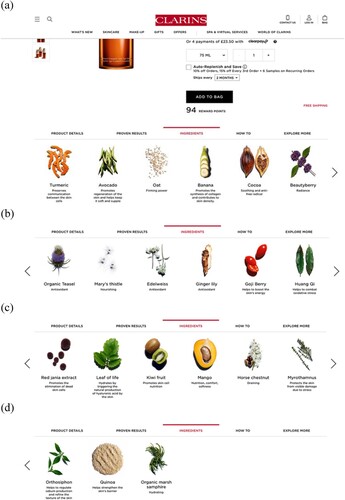
The way the Clarins webpage and the visual list is organised also has the affordance to make the product come across as carefully designed to be a very potent mixture. In total, there are 21 ingredients, but these are not shown on one single webpage. Instead, the user must click the arrow on the side of the image to move forward (or backwards) to see them all, which makes it hard to overview all the ingredients and to appear as a huge amount of ingredients.
The design of the visual listing in shares similarities with educational posters usually found in classrooms. The list, demonstrating what the ingredients look like in its more natural, unprocessed condition, accompanied with the informing texts underneath, suggests that consumers will gain knowledge and “empower” themselves by taking part of this listing. And towards the white background the list also appears as offering transparency. However, taking a closer look at these texts indicates that the information presented to the consumer is rather limited. In some cases, the heading is just followed by single terms as “nourishing” (Mary’s thistle) or “antioxidant” (Edelweiss, Ginger lily) (see ). These nominalisations are the kind of buzzwords we know from food marketing (cf. Eriksson and Machin Citation2020) and from other sources as cookbooks and media reporting on healthy food (Scrinis Citation2013). Here they are used to connote something good and healthy. The female consumers are thus addressed as aware of the health providing effects of antioxidants from a nutritional point. Interestingly, here we find no information regarding how and why these ingredients are good when applied on the skin (thistle is not something you normally smooth your skin with). Other texts contain short descriptions of the benefits of the ingredients, describing them in terms of their functions, and provide ideas on why it is beneficial. For example, under the heading “Avocado” the text reads: “Promotes regeneration of the skin and helps keep it soft and supple” and “Banana” “Promotes the synthesis of collagen and contributes to skin density.” These sentences use the same wording and follow a similar sentence structure, typical for advertising (Myers Citation1999), and those kinds of functionalisation’s link positive values to the product, appearing as informative, yet still suppressing important information as regards to causalities. For instance, how avocado can promote “regeneration of the skin” and what “the synthesis of collagen” actually means, are concealed to the consumers. It is, however, a common advertising strategy in green cosmetics to promote products documented as effective agents for improving skin appearance and its functioning (e.g. Faria-Silva et al. Citation2020). Interestingly, in the latter case we see an example of how nature merges with science. The banana’s qualities and powers are depicted through a scientific language. So, appearing educational and empowering, and as being transparent about the product’s qualities, this visual list nevertheless provides very little information about the ingredients and why those are good to use on the skin.
The benefits of this product also occur in a bullet list (see Example 1).
Example 1
The skin is firmed
Wrinkles are visible smoothed
Radiance and evenness are restored to the complexion
Pores are diminished
Bullet lists come with the affordance of creating an idea of equal but mutually exclusive elements; they bring a sense of order and connotes science (Ledin and Machin Citation2015). Here, it links to the educational and “empowering” ambition coming with visual listing of ingredients and suggests that these are the core things to learn about this serum. Interestingly, the claims are presented with a high-level of commitment: “The skin is firmed”; “Wrinkles are visibly smoothed”; “Pores are diminished.” Three of these four benefits do not seem to be mutually exclusive. For instance, how does the effect of making the skin “firmed” differ from “wrinkles are visibly smoothed?” Or from “pores are diminished?” The fourth effect is about the colour of the skin but what does it mean that “radiance and evenness are restored to the complexion?” This bullet list nevertheless brings a sense of logic, transparency, and certainty about the product’s effects, which works to convince consumer to use the anti-ageing product through its visual appearance as well as its content. In this sense, the bullet list works as “checklist” in which women should scrutinise and surveil their faces for “deficiencies,” that they need to improve through lifelong investments in the body, emphasising the idea that women’s ageing appearances are under constant (magnified) surveillance (Gill Citation2021). For instance, in the Clinique Daily Booster ad, Vitamin C (and other key ingredients) is presented with one sentence and below there is a link named “Learn more,” thus suggesting that the consumers can deepen their knowledge about each component. Interestingly, when the pointer is placed over the ingredient there is a close-up on it as we can zoom in and “examine” it in more detail. This gives a feeling of looking on the ingredient through a microscope. The microscope works as a symbol to show how women can relate to, not just product, but to their own skin and examine it in detail (cf. Gill Citation2021). Clicking the Learn-more-link also provides a feeling of “digging deeper,” going to the next and more “scientific” level of knowledge, which gives consumers a sense of empowerment (Arroyo Citation2014) associated with the scrutiny of the body, especially the face (Gill Citation2021).
The listings of these cosmetic web advertisements come with the affordances of giving an opportunity for the consumer to learn about the ingredients and their anti-ageing properties, thus, to empower themselves. Paradoxically, the empowerment discourse at the same time is used to magnify the “problems” associated with the ageing skin, calling on women to work on and improve the self. The visual list makes a huge amount of ingredients to appear as part of the same paradigm of components with anti-ageing properties and the serum to be highly effective, although this is not explicitly stated. To this, the bullet list brings a sense of logic and transparency. The consumer is in this way, addressed as a consumer who can make good and informed decisions.
Unifying science and nature
In our corpus, the scientifization of the products is often conveyed through integrated designs involving subtle visual cues. Clarins’s advertisement shown in is a good example of this. It shows an image of a split turmeric stem, here being presented as the key ingredient, symbolising nature, something natural. The stem is placed over a molecule structure. Such structures are used in chemistry to illustrate the spatial arrangement of atoms in a molecule and the bonds keeping the atoms together. It is unclear what molecule is imaged here, if it got anything to do with turmeric, but it serves the purpose to lead thoughts to chemistry and advanced science. The link between turmeric and science emerges not only through its placement but also through the carefully coordinated colours, tone-in-tone, between the images of the turmeric, the molecule structure, and the transparent bottle containing the product. This suggests unification; these different semiotic resources come together as a whole to communicate an idea suggesting that nature and science are unified in the production of this anti-ageing product.
Figure 2. Screenshot of the Clarins Double Serum (https://www.clarins.co.uk/double-serum/80025863.html).
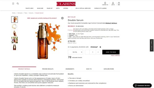
Under the webpage that contains the list of ingredients, we also find a tab with “product details,” which contains more information about the product and its effects. In the text in Example 2, “turmeric,” being the only ingredient mentioned explicitly, is singled out as a key ingredient. Here, the marketers draw on the benefits of turmeric and its capacity to improve the appearance of the ageing face (“renowned for its exceptional anti-aging properties”) to highlight the natural medicinal powers of plants used to cure signs of ageing. Interestingly, we get no reference to the effectiveness of turmeric, i.e. who is it “renowned” by and what exactly its “exceptional” powers are, although this is stressed as the main substance. The lack of information regarding the extracting and processing of turmeric (and other ingredients) into the product, thus, suggests that the anti-ageing product contains natural healing properties, it is untainted, less processed, which distinguished it from other industrially produced creams. In addition, the unification suggested by the colour coordination, and that the product is contained in a transparent bottle, connotes transparency and lead thoughts away from this as an industrially produced and chemicalised item. Moreover, the presentation of the turmeric stem in its natural form gives a sense that the ingredient is unprocessed. Consumers are thus convinced to buy the anti-ageing product because of its “natural” properties that make it “good” to use (cf. Coupland Citation2003; Ringrow Citation2016), without further explanation of what makes it “good” or why natural is good.
Example 2
Clarins Double Serum is a Complete Age Control Concentrate formulated to give you healthier, visibly younger looking skin.
Clarins Double Serum acts on the appearance of major signs of skin-aging and contains 21 active plant extracts, including turmeric, renowned for its exceptional anti-aging properties. Skin is left looking more radiant, firmer, fine lines are smoothed and pores appear reduced.
The bottle’s rotating push button also delivers a made-to-measure dosage of serum.
Clarins uses lexical choices such as “serum,” “concentrate” and “formulated” which lead thoughts to chemistry and science (cf. Coupland Citation2007, 44) and make it appear effective. The serum is said to be a “Complete Age Control Concentrate formulated to give you healthier, visibly younger looking skin” which “acts on the appearance of major signs of skin-aging.” Consumers, however, do not get any information on what is considered as “major signs of skin-aging” or how the serum is “formulated” to give the consumer a “healthier, visibly younger looking skin.” By omitting this kind of information, the marketers can instead highlight the product’s claims to help skin “look more radiant, firmer,” “smooth fine lines and reduce the appearance of pores” (ibid.), again constructing women’s appearances of ageing as something to be constantly magnified and surveilled (Gill Citation2021). Evidently, the claims made here are all about bodily appearance and are presented with rather low commitment to real effects on the skin. The consumers are thus presented with “scientificised solutions” that might not have any actual effects but help them to temporarily mask the “problems” associated with ageing (Chen Citation2015, 220; cf. Benwell and Stokoe Citation2006; Ringrow Citation2016). The marketers nevertheless use science to promote the effectiveness of the serum in reducing visible signs of ageing. The serum is said to contain “21 active plant extracts.” The lexical choice “active” comes with clinical connotations and together with the claim that there are 21 such substances, gives the idea that the serum is an effective scientific solution (cf. Coupland Citation2003; Ringrow Citation2014). There is, however, no information regarding how the turmeric, or the other 20 ingredients were extracted, why this serum is effective and how it can help consumers achieve “healthier, visibly younger looking skin.” Concealing the processes of how the ingredients were extracted or how the serum was “formulated” is a way for Clarins to make their “scientific” product appear more natural and hence make the product more appealing to consumers (cf. Fowler, Reisenwitz, and Carlson Citation2015).
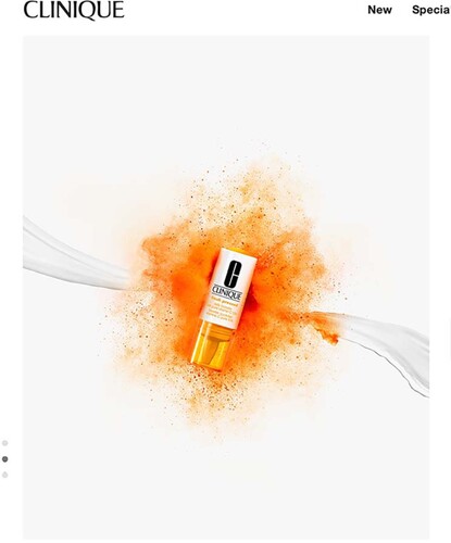
Clinique’s product called Clinique Fresh Pressed™ Daily Booster with Pure Vitamin C 10% is another interesting example of how links between the healthiness of natural food ingredients and the cosmetic products is established, and in turn being connected to science through visual cues. On the product’s overview page, Clinique refers to “Pure Vitamin C” as their key ingredient, to highlight the anti-ageing’s natural healing powers. Vitamin C is known to be an essential nutrition often used as an age-correcting agent in cosmetics (e.g. Coupland Citation2003). As seen in Example 3, the Daily Booster is said to “visibly rejuvenate skin from the outside” and “to reinvigorate your de-aging routine without changing a thing.” The lexical choices “rejuvenate,” “reinvigorate” and “de-aging” here suggests that the Daily Booster contains transformative agents that can help cure signs of ageing through nature and “without changing a thing.” The active prefix “re” and “de” suggests that women can take positive action to erase signs of ageing (Searing and Zeilig Citation2017), which as LaWare and Moutsatsos (Citation2013) argue, symbolises the “right” attitude towards ageing and suggests control over one’s body and one’s life (cf. Kenalemang Citation2021). In this sense, any visible signs of ageing reflect not only a lack of correct attitude and action, but even moral decay (e.g. Featherstone Citation2010; LaWare and Moutsatsos Citation2013). Women are, thus, implicitly asked to “choose” to take control of their own lives through a self-help discourse (“reinvigorate your de-aging routine”) (e.g. Lazar Citation2011) in defiance of ageing (Johnston and Taylor Citation2008; Rozanova Citation2010). Further, explicitly comparing the use of the Daily Booster to the “healthy” intake of “fresh-pressed juice in the morning” implies that the anti-ageing is newly made from natural ingredients and thus provides an instant energy boost to the skin (“visibly rejuvenate skin from the outside”) (see ). As van Leeuwen (Citation2008, 111) states, comparisons often have a legitimating function and here the analogy of drinking “fresh-pressed juice in the morning” works to legitimate a daily and unproblematic use of the product. It is obvious that the Daily Booster is not fresh-pressed, but it nevertheless benefits from the comparison to appear as something “natural” although nothing is stated about the production process and how the Vitamin C (or rather ascorbic acid) is extracted and transformed to a product to “visibly rejuvenate skin” and “reinvigorate the de-aging routine.” Furthermore, the orange colour, which is used to symbolise energy or vitality is a way to emphasise the power of nature in curing age-related problems (e.g. Searing and Zeilig Citation2017). For instance, in one of the images, the product is placed on an irregular background of orange (). The colour has a deeper and darker nuance closer to the container, but we also see small stains of this nuance a bit away from it. Together with the uneven shape we get a sense of a burst of energy, some kind of energetic eruption. The colour of the lid and the text is tone in tone with this backdrop and together it suggests the “natural” power and the effectivity of the product.
Figure 3. Screenshot of presentation of Clinique Fresh Pressed™ Daily Booster with Pure Vitamin C 10% (https://www.clinique.com/product/18919/45677/skincare/fresh-pressed/clinique-fresh-pressedtm-daily-booster-with-pure-vitamin-c-10).
Appearing contradictive, the product name also contains the word “clinical™,” which suggests that the anti-ageing product is a scientific innovation, a strategy common in marketing of cosmetics (Chen Citation2015), but here linking nature (“fresh-pressed”) to science. In addition, describing the product as a “super-potent Booster designed as a daily supplement” carries medical connotations that help position the product as a powerful and highly effective “de-aging routine” (e.g. Arroyo Citation2014). The lexical choices “super-potent,” “booster” and “supplement,” link the anti-ageing product to food, and shows how cosmetics are increasingly being moved “inside” the body, promoted as “daily” drinks that help cure age-related problems (cf. Gill Citation2021). Such a rhetorical strategy draws a parallelism between the (natural) anti-ageing product and medicine (“daily booster, daily supplement”) to suggest that the product has “designed” by scientists to restore and maintain skin health (Arroyo Citation2014), and thus legitimise people’s trust in the products through their trust in science (Chen Citation2015, 214–215; cf. Arroyo Citation2014).
Example 3
What It Does
Just like your morning fresh-pressed juice or vitamin helps you stay healthy on the inside, this super-potent Booster was designed as a daily supplement to visibly rejuvenate skin from the outside– and a simple, seamless way to reinvigorate your de-aging routine without changing a thing.
Clinique Fresh Pressed™ Daily Booster with Pure Vitamin C 10% | Clinique
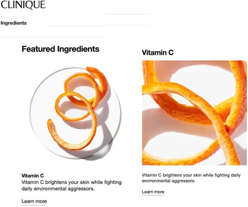
This connection to oranges is prominent also in the presentation of the ingredients where Vitamin C is represented by twist of orange peel (see ). On the webpage the ten key ingredients are presented as “powerful ingredients” and are visually listed in alphabetic order. Small pieces and drops/fluids of the ingredients are very carefully placed on a glass slide similar to the ones used in microscopes and those are shown towards a white and clean background, which leads thoughts to a highly hygienic context such as a medical or laboratory environment and provides a sense of transparency. The affordances of the webpage allows consumers to navigate through the ad and examine the overview of Vitamin C presented under five bolded headings, creating salience – “Skin Concerns,” “What You’ll See On The Ingredient List,” “Why Your Skin Needs it,” “The Clinique Expertise,” “What Our Clinique Derm Says” – which gives a sense of organisation and systematically ordered “scientific” information, and hence reinforce the scientific evidence of the product (Arroyo Citation2014). By referring to “The Clinique Expertise” and “What Our Clinique Derm Says” the marketers appeal to the expertise of science, which is common in this kind of advertising (ibid.; Chen Citation2015). For example, under the heading “What Our Clinique Derm Says,” the company’s dermatologist argues for the importance of Vitamin C on skin treatments and protection against ageing. Referring to the dermatologist, whose voice is presented as authoritative, thus gives more credibility to the claims made about the product (ibid.). But as is the case with Clarins’s serum, there is no information regarding the extracting and processing of ingredients. Interestingly, under “What You’ll See On The Ingredient List” heading, Vitamin C is listed under the name ascorbic acid (the pure form of Vitamin C). The representation of orange, symbolised by the twisted peel, naturalises and implicitly implies that the Vitamin C is sourced from oranges. This helps to signify Vitamin C and its health-providing properties in a more natural way, even though the ascorbic acid might have another source and be chemically processed. This information is, however, concealed from consumers.
Figure 4. Screenshot of peel of orange (https://www.clinique.com/ingredients).
Through integrated design in which the use of subtle visual cues plays a crucial role, the cosmetic companies were able to convey the naturalness of their products, although they are produced in industrialised and chemicalised processes. These cues also connect the products to science and their anti-ageing effects appear as significant and reliable. The female consumer is thus positioned as desiring a sign value associated with the goodness of nature, but still coming with a scientific rationality.
Communicating safety and sustainability as a “Moral” choice
Throughout the webpages we see a connection to safety and sustainability, used to infuse anti-ageing products with a sense of “morality” (Banet-Weiser Citation2012), here coded through the integrated design. Unsurprisingly, the companies draw on the connotations of natural ingredients to promote their products as safer and healthier options. The ad for the Clinique Smart Clinical Repair™ Wrinkle Correcting Serum, for instance, provides an overview of the serum presented under eight headings that have been highlighted to create salience: “Who It’s For,” “What It Is,” “What is Does,” “Proven Results,” “Key Ingredients,” “How To Use,” “What else is this product free of?” and “Our Clinique Clean Philosophy.” Under the heading “Our Clinique Clean Philosophy,” the consumer gets little information explaining Clinique’s clean philosophy: “No parabens. No phthalates. No fragrance. Just happy skin.” The anaphoric “No-list” is a way for cosmetic companies to market themselves as “natural” and thus place emphasis on their plant-based ingredients (e.g. Ringrow Citation2016). Through the affordances of the web, consumers can learn more about Clinique’s philosophy under the webpage “Our Clinique Clean Philosophy” ().
Figure 5. The Clinique “clean philosophy” (https://www.clinique.com/why-clinique).
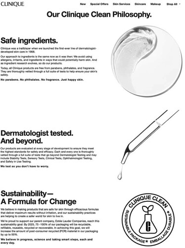
On this webpage, Clinique present their ideas regarding safety and sustainability. To start with, the term “philosophy” suggests something well-thought through, something more profound, while “clean” suggests purity; it is a philosophy that is straight forward, which helps to add a sense of morality and transparency to their products. At the same it comes with clinical and scientific associations. The webpage uses muted, monochrome, black and white tones, which gives a sense of restraint and classic associations, leading thoughts to more formal documents. The heading “Our Clinique Clean Philosophy” is bold and appears heavy, implying something serious and can also translate to high levels of commitment. To the left we see three equally sized text blocks and to the right three different images or symbols. The design is thus following “the rule of three,” a key rhetorical device used for effective communication. The text blocks are uniformly outlined with a bold heading, a running text, and text in bold characters at the end. This creates a sense that they are of the same order, part of the same philosophy. The texts blocks are not framed, just separated by an empty white space, which underlines their belonging (Ledin and Machin Citation2020). The three headings (“Safe ingredients”; “Dermatologist tested. And beyond”; “Sustainability – A formula for change”) appear as catch-phrases and the use of the bold typeface increases salience, suggesting something substantial for the “Clean Philosophy” and something consumers must draw their attention to. In contrast, the smaller and not-bolded typefaces used in the running text, suggests that the information provided there is of less importance. Although the link between these three elements and how they together build the “clean philosophy” is unclear, but the way this is designed allows those to be presented as part of some kind of moral whole.
The images to the right help to accentuate the seriousness and connection to science. On the top right corner in , we see a symbol resembling a yin-yang symbol. This is an image of one of the ten key ingredients carefully placed on a microscopic looking glass slide. The yin-yang symbol is often used to describe how things that are seemingly opposite are actually interconnected. This helps to create harmony and rhyme between science, again implied through the microscopic glass slide, and nature, suggesting that the very different elements are coherent and interrelated. However, it is not clear how the relationship between nature and science is connected to safety. Consumers are, instead convinced to trust the products “you don’t have to worry” because they have been “thoroughly vetted through a full suite of tests” as the text on the left goes. The consumer gets no information about how the tests are conducted, how they “ensure skin safety” or how they are “evaluated to ensure they meet the highest standards for safety and efficacy.” However, mentioning these “safety tests” is a way for the marketers to make safety salient, which is uncommon in cosmetic advertising. But here it allows Clinique to list things that show their “moral goodness.” Below the yin-yang, is a pipette, a common laboratory tool used to make accurate tests and measurements, enhances the idea of “thoroughly vetted” products, that the tests are controlled and “clinically formulated” and guarantees the products are “safe” to use. Interestingly, the information provided in the running texts do not provide any information regarding the results of the tests. Instead, the company stresses that they use “safe ingredients” that are “free from parabens, phthalates and fragrance,” which make them “safe for skin” and thus implies that their products are safe. But the consumers have no way of knowing if these products are indeed “safe” or “efficient” for their skin, although the way the semiotic resources are used work to connote so.
The third image shows a symbol () communicating sustainability. It appears as an emblem with a beaker marked with a bold C and a fern sprouting out of it at the centre, with text in a circle around it containing the words Clinique Clean and Sustainable package/Emballage durable. This emblem has resemblance with authorised symbols often found on food packages to signal a product is free from certain ingredients or is sustainable. It is thus a form of codification we know as indicators from other areas, an affordance Clinique exploits in this context (Chen and Eriksson Citation2021). In the context of food marketing, we often find images of hands holding a small seedling plant (hands are often dirty from handling the soil) to suggest care of the environment and the unity of humanity and nature (cf. Chen and Eriksson Citation2021). Here, the hands are replaced by a beaker commonly used in laboratories and with the fern springing out of it suggests a unity between science and nature. It draws on the underlying assumption that this unity promises a good and healthy form of beauty for ageing women (Chen Citation2015). Consumers are, thus, presented with a “natural” product, which becomes collated as a morally legitimate means to care for the body and by extension the environment.
Yet, consumers get no information on if the “natural” product is better for consumers than the chemically produced variant. Consumers are, however, presented with vague information under the third heading “Sustainability – A formula for change,” on how Clinique intends on achieving sustainability “By 2025, 75–100% of our packaging will be recyclable, refillable, reusable, recycled or recoverable.” Notably, these sustainability practices are imagined for the future, they are yet to be achieved. The use of the verb “will” shows a low commitment to claim and means that Clinique does not have to specify exactly what they will do to be sustainable. Nonetheless, such statements help Clinique appear as doing good for the environment and for the individual through “sustainability practices that help create a safer world for skin to live in.” Still, there is no information on what exactly makes the products safe, if they are indeed chemical free, or in how exactly they do good for the environment.
Underpinned by a notion of individual choice, this marketing addresses women as empowered consumers who can set themselves apart by making morally conscious and righteous choices by consuming “green” cosmetics, thus comprising a kind of “moral consumerism” (Banet-Weiser Citation2012). Women’s “choices” over natural vs. “unnatural” products here become collated as morally legitimate means to care for the self. Although this is presented as a “clean philosophy” it is unclear in what way this thinking actually works to do “good” and be better for the environment than other products, but it gives consumers a sense that they are doing good.
Conclusion
We have analysed how marketing of the trending green cosmetics uses the affordances of integrated design to construct a sense of consumer empowerment and choice, and to connect the products to science, safety, and sustainability. Lists (visual and bullet) play a major role to convey a scientific rationality, by connoting transparency, a logic and technical order, and by appearing to break down information into its most crucial aspects. Visual cues are used to connect the natural ingredients with science and to suggest that their effects are significant and reliable. The green cosmetics’ safety and sustainability is conveyed through more formal looking forms of design. But we also see that this kind of technologised communication glosses over important details. Causalities, classifications, and processes are poorly specified and explained.
The scientifization taking place through this kind of integrated design allow this marketing to serve the ideological purpose of maintaining commodity feminism. The analysis shows that lists and the affordances of the web work to empower women through self-help discourses that continually encourage them to take individual responsibility for their health through their control of visible signs of ageing, underscoring the idea that women’s appearance are always under constant magnified surveillance (e.g. Lazar Citation2011; Gill Citation2021; Kenalemang Citation2021). Personal responsibility for their health, which here is closely accorded to the “look” of ageing, becomes framed as a moral and ethical consumption choices relating to practices of self-care that show good, responsible, and “successful” neoliberal citizenship. Choice, thus, becomes a semiotic marker attached to anti-ageing products, commodified through entrepreneurial modes of the self (Gill Citation2021). For women, working on the self through the lifelong project of the body, thus symbolises the “right” attitude towards ageing, and suggests control over one’s body and one’s life (e.g. LaWare and Moutsatsos Citation2013; Kenalemang Citation2021). Women who are unable to “successfully” resist ageing are, hence, could easily be blamed for “letting themselves go” when control is in their hands and more problematically, as immoral, irresponsible, and failed citizens who lack self-control (e.g. Rozanova Citation2010). Women are thereby positioned as neoliberal subjects who through the rhetoric of choice and empowerment, are haunted by notions of consumerism to construct morally good bodies. This works to distinguish moral and responsible women from “the rest.”
Disclosure statement
No potential conflict of interest was reported by the author(s).
Correction Statement
This article has been corrected with minor changes. These changes do not impact the academic content of the article.
Additional information
Funding
Notes on contributors
Lame M. Kenalemang-Palm
Lame Maatla Kenalemang-Palm is a doctoral candidate in Media and Communication Studies, Örebro University, Sweden. She is a member of the research group: Successful Ageing. Her work is interested in showing how older women are constructed and addressed in advertising discourse through a multimodal critical discourse analysis.
Göran Eriksson
Göran Eriksson is Professor of Media and Communication Studies, Örebro University, Sweden. He works in the area of Discourse Studies and has published in leading international journals, such as Critical Discourse Studies, Discourse, Context and Media, Journal of Language and Politics and Journalism Studies. His most recent project deals with the sociology of health and focuses on how healthy food and healthy eating is multimodally communicated. Ongoing studies look at different kinds of marketing and are especially focusing on how science and scientific expertise is communicated.
References
- Arroyo, M. D. 2013. “Scientific Language in Skin-Care Advertising: Persuading Through Opacity.” RESLA 26: 197–213.
- Arroyo, M. D. 2014. ““Ageing Youthfully” or the Rhetoric of Medical English in Advertising.” Ibérica 28: 83–106.
- Benwell, B., and E. Stokoe. 2006. Discourse and Identity. Edinburgh: Edinburgh University Press.
- Brown, W. 2005. Edgework: Critical Essays on Knowledge and Politics. New Jersey: Princeton University Press.
- Banet-Weiser, S. 2012. Authentic TMs: Politics and Ambivalence in a Brand Culture. New York: New York University Press.
- Calasanti, T., N. King, I. Pietila, and H. Ojala. 2016. “Rationales for Anti-Aging Activities in Middle Age: Aging, Health or Appearance?” The Gerontologist 58 (2): 233–241. doi:10.1093/geront/gnw111.
- Chen, J.-Y. 2015. “Investigating the Discursive Productions of Science in Advertising.” Intercultural Communication Studies 24 (2): 207–224.
- Chen, A., and G. Eriksson. 2021. “Connoting a Neoliberal and Entrepreneurial Discourse of Discourse of Science Through Infographics and Integrated Design: The Case of ‘Functional’ Healthy Drinks.” Critical Discourse Studies, 1–19. doi:10.1080/17405904.2021.1874450.
- Coupland, J. 2003. “Ageist Ideology and Discourses of Control in Skincare.” In Discourse, the Body and Identity, edited by J. Coupland, and R. Gwyn, 127–150. Basingstoke: Palgrave Macmillan.
- Coupland, J. 2007. “Gendered Discourses on the ‘Problem’ of Ageing: Consumerized Solutions.” Discourse and Communication 1 (1): 37–61. doi:10.1177/1750481307071984.
- Coupland, J. 2009. “Time, the Body and the Reversibility of Ageing: Commodifying the Decade.” Ageing and Society 29: 953–976. doi:10.1017/S0144686X0g008794.
- Eriksson, G., and D. Machin. 2020. “Discourses of ‘Good Food’: The Commercialization of Healthy and Ethical Eating.” Discourse, Context and Media 33: 1–7. doi:10.1016/j.dcm.2019.100365.
- Faria-Silva, C., A. Ascenso, A. M. Costa, J. Marto, M. Carvalheiro, H. M. Ribeiro, and S. Simoes. 2020. “Feeding the Skin: A New Trend in Food and Cosmetics Convergence.” Trends in Food Science and Technology 95: 21–32. doi:10.1016/j.tifs.2019.11.015.
- Featherstone, M. 2010. “Body, Image and Affect in Consumer Culture.” Body and Society 16 (1): 193–221. doi:10.1177/1357034X09354357.
- Foucault, M. 1977. The Archaeology of Knowledge. London: Tavistock.
- Fowler, J. G., T. H. Reisenwitz, and L. Carlson. 2015. “Deception in Cosmetics Advertising: Examining Cosmetics Advertising Claims in Fashion Magazine Ads.” Journal of Global Fashion Marketing 6 (3): 194–206. doi:10.1080/20932685.2015.1032319.
- Gill, R. 2007a. “Postfeminist Media Culture: Elements of a Sensibility.” European Journal of Cultural Studies 10 (2): 147–166. doi:10.1177/1367549407075898.
- Gill, R. 2007b. Gender and the Media. Cambridge: Cambridge University Press.
- Gill, R. 2008. “Commodity Feminism.” In Vol. 3 The International Encyclopaedia of Communication, edited by W. Donsbach, 583–585. Malden: Blackwell Publishing.
- Gill, R. 2021. “Neoliberal Beauty.” In The Routledge Companion to Beauty Politics, edited by M. Leeds Craig, 9–18. New York: Routledge.
- Goldman, R. 1992. Reading Ads Socially. London: Routledge.
- Goldman, R., D. Heath, and S. L. Smith. 1991. “Commodity Feminism.” Critical Studies in Mass Communication 8: 333–351.
- Hutchby, I. 2001. “Technologies, Texts and Affordances.” Sociology 35 (2): 441–456. doi:10.1177/S0038038501000219.
- Johnston, J., and J. Taylor. 2008. “Feminist Consumerism and Fat Activists: A Comparative Study of Grassroots Activism and the Dove Real Beauty Campaign.” Signs: A Journal of Women in Culture and Society 33 (4): 941–966.
- Kenalemang, L. M. 2021. “Visual Ageism and the Subtle Sexualisation of Older Celebrities in L’Oréal’s Advert Campaigns: A Multimodal Critical Discourse Analysis.” Ageing and Society, 1–18. doi:10.1017/S0144686X20002019.
- Kress, G. 2010. Multimodality. London: Routledge.
- Kress, G., and T. van Leeuwen. 1996. Reading Images: The Grammar of Visual Design. London: Routledge.
- Kress, G., and T. van Leeuwen. 2001. Multimodal Discourse: The Modes and Media of Contemporary Communication. London: Arnold.
- LaWare, M. R., and C. Moutsatsos. 2013. “’For Skin That’s Us, Authentically Us’: Celebrity, Empowerment, and the Allure of Antiaging Advertisements.” Women’s Studies in Communication 36 (2): 189–208. doi:10.1080/07491409.2013.794753.
- Lazar, M. M. 2006. “‘Discover the Power of Femininity!’ Analyzing Global ‘Power Femininity’ in Local Advertising.” Feminist Media Studies 6 (4): 505–517. doi:10.1080/14680770600990002.
- Lazar, M. M. 2011. “The Right to Be Beautiful: Postfeminist Identity and Consumer Beauty Advertising.” In New Femininities: Postfesminism, Neoliberalism and Subjectivity, edited by Rosalind Gill, and Christina Scharff, 37–51. London: Palgrave Macmillan.
- Ledin, P., and D. Machin. 2015. “How Lists, Bullet Points and Tables Recontextualize Social Practice.” Critical Discourse Studies 12 (4): 463–481. doi:10.1080/17405904.2015.1039556.
- Ledin, P., and D. Machin. 2018. Doing Visual Analysis from Theory to Practice. London: Sage.
- Ledin, P., and D. Machin. 2020. Introduction to Multimodal Analysis. London: Bloomsbury Publishing.
- MacGregor, C., A. Petersen, and C. Parker. 2018. “Promoting a Healthier, Younger You: The Media Marketing of Anti-Ageing Superfoods.” Journal of Consumer Culture 21 (2): 164–179. doi:10.1177/1469540518773825.
- Machin, D. 2013. “What is Multimodal Critical Discourse Studies?” Critical Discourse Studies 10 (4): 347–355. doi:10.1080/17405904.2013.813770.
- Mire, A. 2012. “The Scientification of Skin Whitening and the Entrepreneurial University-Linked Corporate Scientific Officer.” Canadian Journal of Science, Mathematics and Technology 12 (3): 272–291..
- Myers, G. 1999. Ad Worlds: Brand, Media, Audiences. London: Arnold.
- Nguyen, J. K., N. Masub, and J. Jagdeo. 2020. “Bioactive Ingredients in Korean Cosmeceuticals: Trends and Research Evidence.” Journal of Cosmetic Dermatology 19: 1555–1569. doi:10.1111/jocd.13344.
- Ringrow, H. 2014. “Peptides, Proteins and Peeling Active Ingredients: Exploring ‘Scientific’ Language in English and French Cosmetics Advertising.” Études de Stylistique Anglaise 7: 183–210. doi:10.4000/esa.1322.
- Ringrow, H. 2016. The Language of Cosmetic Advertising. London: Springer.
- Rozanova, J. 2010. “Discourse of Successful Aging in The Globe and Mail: Insights from Critical Gerontology.” Journal of Aging Studies 24: 213–222..
- Scrinis, G. 2013. Nutritionism: The Science and Politics of Dietary Advice. New York: Columbia University Press.
- Searing, C., and H. Zeilig. 2017. “Fine Lines: Cosmetic Advertising and the Perception of Ageing Female Beauty.” International Journal of Ageing and Later Life 11 (1): 7–36. doi:10.3384/ijal.1652-8670.16-290.
- van Leeuwen, T. 2005. Introducing Social Semiotics: An Introductory Textbook. London: Routledge.
- van Leeuwen, T. 2008. “New Forms of Writing, New Visual Competencies.” Visual Studies 23 (2): 130–145. doi:10.1080/14725860802276263.