
Abstract
The 2016 Guidelines for Assessment and Instruction in Statistics Education (GAISE) College Report emphasized six recommendations to teach introductory courses in statistics. Among them: use of real data with context and purpose. Many educators have created databases consisting of multiple datasets for use in class; sometimes making hundreds of datasets available. Yet “the context and purpose” component of the data may remain elusive if just a generic database is made available. We describe the use of open data in introductory courses. Countries and cities continue to share data through open data portals. Hence, educators can find regional data that engage their students more effectively. We present excerpts from case studies that show the application of statistical methods to data on: crime, housing, rainfall, tourist travel, and others. Data wrangling and discussion of results are recognized as important case study components. Thus, the open data based case studies attend most GAISE College Report recommendations. Reproducible R code is made available for each case study. Example uses of open data in more advanced courses in statistics are also described. Supplementary materials for this article are available online.
1 Background
In 2016, the 11-year-old Guidelines for Assessment and Instruction in Statistics Education (GAISE) College Report was revised. There were two reasons for the revision, the increase in available data and the emergence of data science as a discipline (GAISE Citation2016). The GAISE College report recommends the use of real data with context and purpose. The report even mentions the New York City open data portal as a reference. However, almost all datasets used as example or referred to in the report cannot be considered regional for most course students. Furthermore, most datasets referred to in the report contain fewer than a few thousand observations.
Two important obstacles to effective statistical education for non-statistics majors that receive little attention from statisticians are statistics anxiety and attitude toward statistics. Statistics anxiety has been defined as the feelings of anxiety encountered when taking a statistics course or doing statistical analysis (Cruise, Cash, and Bolton Citation1985). Attitude toward statistics is an individual’s disposition to respond either favorably or unfavorably to statistics or statistics learning (Chew and Dillon 2015). It has been found that a negative attitude toward statistics results in statistics anxiety (Chew and Dillon Citation2014). Several studies have found that there is a negative association between statistics anxiety and achievement in statistics courses (Chew and Dillon Citation2014), although some studies have suggested that some statistics anxiety (but not too much) may be beneficial to students (see Onwuegbuzie and Wilson Citation2003; Keeley, Zayac, and Correia Citation2008). Statistics anxiety also affects non-statistics major graduate students (Williams Citation2010) and is more prevalent for women (Baloğlu, Deniz, and Kesici Citation2011). The influence of statistics anxiety on student achievement has led to several recommendations, among them using real data (Neumann, Hood, and Neumann Citation2013), and the reduction of mathematical emphasis (Chew and Dillon Citation2014).
The curriculum must prepare students to engage in the entire data analysis process including data wrangling (Horton and Hardin Citation2015). With the emergence of big data, data science, and data analytics, more emphasis in large data is needed in courses. Ridgway (Citation2016) suggests devoting course time to open data. Manyika et al. (Citation2013) define open data as information available to everyone; at zero cost; without limits of reuse and redistribution; and that are machine readable (in formats that can be easily retrieved and processed by computers). However, this definition leaves out several open data traits that are important when teaching statistics:
Open data are current and localized, allowing users to incorporate current hot topics into the course.
Filtering, aggregating, cleaning, and other preprocessing could be needed; presenting an opportunity to introduce students to data management and data wrangling.
Open data can be very large, and even massive.
In contrast, other data available for courses are rarely current; are always neat and ready for use; and rarely exceed a few hundred observations (Baumer Citation2015; Grimshaw Citation2015).
In this article, we present a series of uses of open data in class. We argue that in terms of student exposure, open datasets are an excellent resource. Challenges of bringing open data into the classroom are also discussed.
2 Case Studies
A set of case studies revolving around open data are covered in this section. Usually, students are presented with the problem addressed in the case study and asked what they think the solution or answer should be before seeing the results of the statistical procedure. Later students are introduced to the data. Even if the data are downloaded and made accessible to the students, we encourage instructors to briefly show the students the data from the website so that they can appreciate the authenticity of the observations. Any data wrangling is either completed together with the class or pointed out as an already performed task. One final remark is that for presentation and reproducibility purposes, all statistical procedures in this article were performed through R (R Core Team Citation2016). Codes are available as supplementary materials. Statistics majors can use the codes to replicate the results or modify them for a different purpose. However, considering the influence of statistical anxiety on the performance of non-statistics majors, we recommend instructors rely on a more user friendly software than R for any coursework. We have successfully required students to use Minitab and visualization tools (e.g., dashboards) accessible through many open data portals.
2.1 Obtaining a Metric of Violence in Puerto Rico
The learning objectives of this case study are:
Understand how data wrangling can be applied.
Interpret computer generated descriptive statistics.
Evaluate the limitations of the case study.
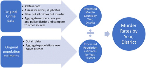
How can we compare violence in one place to violence in another? At first we simply state we will use murder data; a natural choice, to compare violence between multiple locations. Students tend to quickly realize that such a comparison should not be solely based on the number of murders; the demographics of the places to be compared play a role. In this case study, Puerto Rico murder rates per 100,000 people are computed from open data and compared among several regions. As a first look at data science, students are told that the murder rates were obtained by processing two datasetsFootnote1 from two open data portals (see ). The crime data used includes dates, times, and locations of nine different types of crimes. As of this writing, the raw crime dataset had over 250,000 rows.Footnote2 Only data from 2012 to 2015 were considered, since 2016 data were incomplete. Furthermore, even if data would have been available until the end of 2016, many current cases were still under investigation. Vintage 2016 U.S. Census annual population estimates for the period of interest were also retrieved.Footnote3 The quality of the crime data was assessed via checking for duplicated entries and comparison of annual number of murders found in other sources.
Fig. 1 Steps required to calculate murder rate data for Puerto Rico by year and police district.
Initially, a comparison of yearly murder rates in four police districts (San Juan, Fajardo, Ponce, and Mayaguez) in Puerto Rico was performed. It was found that San Juan had the highest murder rate among the four police districts, with results of 49.6, 42.2, 43.1, and 33.2 murders per 100,000 people for 2012, 2013, 2014, and 2015, respectively. As in the other three regions, the murder rate in San Juan had been decreasing. Without prior knowledge about murder rates, it is still hard to grasp the meaning of the San Juan murder rates. Thus, San Juan murder rates are compared next to cities of at least 250,000 people in the United States. To get this stage of the case study going, students are asked which U.S. cities have the highest murder rates. New York City, Los Angeles, and Chicago are frequently mentioned. Next, the audience is presented with , which lists the cities with the five highest 2015 murder rates according to the 2015 FBI violent crime report,Footnote4 San Juan would place fifth highest among all large cities.
Table 1 Top five 2015 murder rates (per 100,000 people) in U.S. cities and San Juan, Puerto Rico.
Given the status of Puerto Rico as a commonwealth, one can compare the overall island murder rate with U.S. states and with other countries as well. summarizes the murder rates for Puerto Rico, New York, Florida, and California. The statistics for the island are always over three times higher than these benchmarks. Moreover, the 2014 murder rate in Puerto Rico was almost twice as high as that of Louisiana, which was the state with the highest murder rate in the U.S. back then.
Table 2 Murder rate per 100,000 residents in some of U.S. states and Puerto Rico.
The United States’ overall 2015 murder rate was about 4.9 murders per 100,000 people, up 10% from the previous year, yet still far below the 16.9 murders per 100,000 people in Puerto Rico. Now, it has to be highlighted that the United States is a large country and there is considerable variability in murder rates within it. Also, gun violence is considered an important public health challenge in the country (Kalesan and Galea Citation2017). To further put things in perspective, many European countries have murder rates below 1 murder per 100,000 people, while Honduras had 84.6 murders per 100,000 people in 2014. In summary, the good news is that the computed murder rates indicate a decrease in violence in Puerto Rico; but much work is needed. The case study is finalized with a discussion of the results, including the limitations of the statistical procedure. Among the limitations: no crime expert was involved in the study, murder is not the only measure of violence (e.g., violent crime data can also be used; Short Citation2018), and variables such as population density and economic hardship play a role in violence, but were not included in the presentation.
2.2 Do Police Searches During Vehicle Stops in San Diego Depend on Driver’s Race?
The learning objectives of this case study are:
Recognize that data wrangling is often needed.
Interpret bar plots.
Evaluate the limitations of the case study.
Students are presented with a case study aiming to visually assess the question that is the title of this section. Students are allowed to argue why they think police searches depend or do not depend on race before using the data. The original San Diego vehicle stop data are shown to the students.Footnote5 Whether gender has any impact in the results is also assessed. Observations with missing values in race, search, or gender were removed from the dataset.
The statistical concept to be taught is data visualization, specifically bar plots, summarizing multiple categorical variables. However, this case study can very well be applied in the context of probability, or inference on two categorical variables. The original data consist of over 100,000 incidents of vehicle stops. After exploring the data, one of the noticeable things is that the race variable is rather specific (Korean, Japanese, Indian, etc.). To simplify our task, race is reclassified into five categories: Blacks, Hispanics, Whites, Asians, and Others.
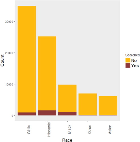
summarizes the 2016 San Diego vehicle stops by race and whether the driver was searched. Overall, White drivers were stopped the most, but it is explained to students that this does not mean that White drivers are more likely to be stopped by police than drivers from other races (according to race distribution, we should expect that the majority of drivers stopped are White or Hispanic). Assessing likeliness of being stopped by race could benefit from using other data such as time of day of vehicle stops (during the day it is easier to identify the race of a driver). Drivers who are Black or Hispanic appear to be searched more often than drivers from other races. Specifically, for Black drivers the red bar covers more of the entire race bar than for White drivers. The same can be said for Hispanic drivers.
Fig. 2 Number of vehicle stops and searches by race in San Diego in 2016.
summarizes the 2016 San Diego vehicle stops by race, gender, and whether the driver was searched. The class is asked to interpret the stacked bar chart, at first comparing genders and then just focusing on men. In summary:
Fig. 3 Number of vehicle stops and searches by race and gender in San Diego in 2016.
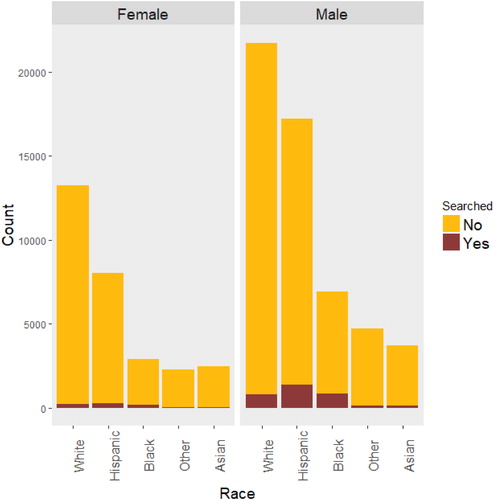
indicates that searches occur more frequently when the driver is Black or Hispanic.
Overall, men are generally stopped more frequently than women, with White men being stopped the most.
Drivers from “Asian” and “Other” races had the fewest stops and fewest searches.
To have a better idea of what is suggested by these bar charts, numbers are needed. The percentage of stopped drivers who were subsequently searched, according to whether they were Black, Hispanic, or White, were 12.4%, 7.84%, 3.57%, respectively.
Limitations of the completed statistical procedure must be pointed out. The assessment does not answer why there is such a discrepancy in searches of drivers by race. For one, the summary does not consider the cause for the vehicle stop, or location in San Diego. Also, the data do not include the race of the officer which may (or may not) be associated to the chance that a vehicle stop involves a search. Furthermore, statistical inference would be needed to draw conclusions from the current data since the discrepancy by race could be due to random chance. The presentation is followed by a discussion.
2.3 Other Open Data Based Ideas
Many other case studies can be created using open datasets. An introduction to time series analysis could be presented using monthly hotel registration data (). Data visualization has received a lot of attention lately (Hullman, Resnick, and Adar Citation2015; Nolan and Perrett Citation2016). Hans Rosling (O’Neill Citation2018) showed how effective data visualization can be in engaging the audience. More frequently, traditional graphics are being extended by adding additional dimensions: more variables (; see supplementary materials for the interactive version). This has made displaying complicated information more aesthetically appealing ().
Fig. 4 Left panel displays the time series plot of monthly nonresident hotel registrations in Puerto Rico (in thousands). Right panel shows the separate distributions of monthly nonresident registrations (in thousands) for each calendar month.
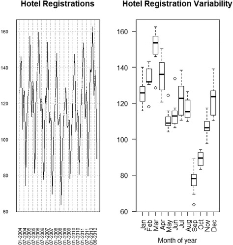
Fig. 5 Screen shot of the Baltimore housing variables motion chart, showing percent of residential properties vacant versus percent of properties under mortgage foreclosure. Variables to show can be selected from pull down menus that appear when the arrows are pressed (black circles). Selecting a community (green circle) and then running the animation will track the chosen community over time.
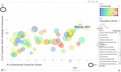
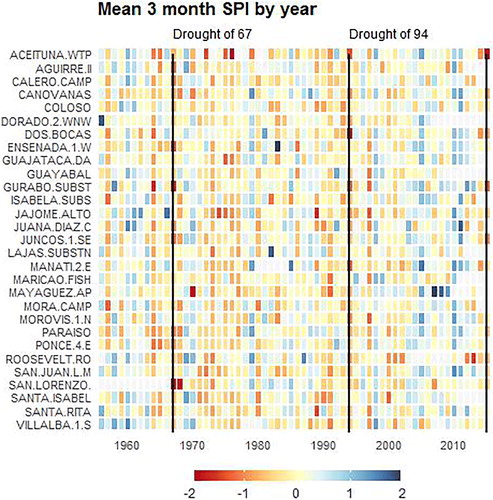
Fig. 6 Annual average of Standardized Precipitation Index (SPI), McKee, Doesken, and Kleist (Citation1993), for accumulation of rain every 3 months across many weather stations in Puerto Rico. Each line represents a station and each column indicates a year. Period covered is 1956 through 2015. Negative SPI indicates below average rain at the weather station while positive SPI indicates above average rain. Vertical lines for droughts of 1967, 1994, and 2015 serve as benchmarks.
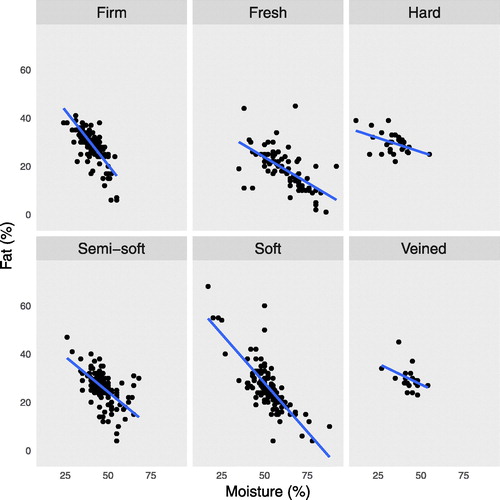
Interactive plots have generated a lot of buzz. For one case study, a motion chart was created by combining several different datasets.Footnote6 Users can select variables to compare and track how the measure of a location changes in time. While aesthetic appeal is important and certainly catches the attention of students during class, one of the key roles of visualization techniques in data analysis is to present information effectively. On occasion, attractive plots () may not be as effective in providing information, as more basic visualization techniques of the same data (, where correlation coefficients, in alphabetic order of cheese type, are: –0.78, –0.64, –0.47, –0.62, –0.70, and –0.38).
Fig. 7 Scatterplot of cheese fat percentage and moisture percentage color coded by cheese type, using Canada open data (https://open.canada.ca/en/open-data). It is hard to tell in this chart if cheese type has any influence in the association between fat percentage and moisture percentage.
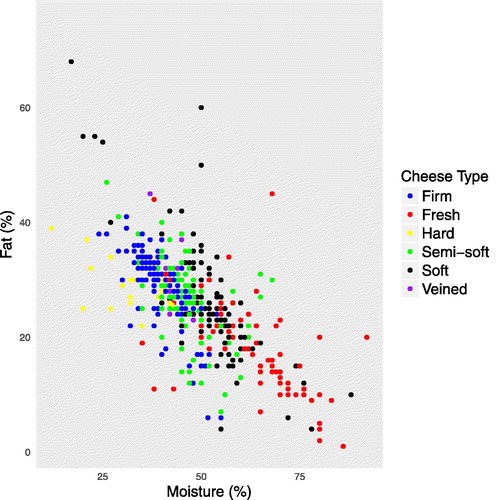
Fig. 8 Scatterplots of cheese fat percentage and moisture percentage per cheese type, using data from the Canada open data portal. It is easier to tell in this chart that cheese type has some influence in the association between fat percentage and moisture percentage. See supplementary materials for reproducible R code.
The sample case studies presented in this article only scratch the surface of the possible ways open data can be incorporated into courses. The San Diego vehicle stops data presented in Section 2.2 could be used while discussing empirical probabilities or hypothesis testing on the dependence of two categorical variables. The Canadian cheese data could serve as a platform to teach multiple linear regression with interactions. presents a few more ideas of statistical methods that can be taught using open data. The Chicago taxi ride data includes over 113 million records, and it is so large that it cannot be opened with most statistical software (including R); requiring big data tools such as querying, subsetting, or the use of special software/hardware (Baumer, Kaplan, and Horton Citation2017). The supplementary materials provide code to subset the data. In advanced courses, a sophisticated model can be fit to the taxi ride data for the purpose of flexibility and accounting for all available predictors in the dataset.
Table 3 A few more ideas for incorporating open data into introductory statistics.
Case studies are not the only pedagogical tool that can be developed from open data. Class projects are also possible. Open data can also have a role in homeworks, quizzes, or exams. For example, the class can be assigned a dataset on which to perform a statistical procedure. Assignments can be individualized by asking pupils to take a sample of size n based on, say, the last two digits of the student’s identification number. For example, if a student’s last two digits are 14 and n = 50, then the student must perform the assignment using observations from rows 14 to 63. This way, the instructor can create R code to efficiently reproduce each student sample and grade the assignments.
3 Discussion
The ubiquity of open data has the advantage of allowing instructors to easily “locally adapt” lesson plans; which would follow more faithfully the 2016 GAISE College Report recommendation to integrate real data with context and purpose. Specifically, there is crime data from Los Angeles, New York, and other cities with which a case study analogous to Section 2.1 can be built. Similarly, vehicle stops data are available for Austin, Texas and other locations. R code for the case studies presented can be found in the supplementary materials.
Another benefit of open data is that it is often raw and very large. Thus, students get a first look into data science and big data with such datasets. For example, the Chicago taxi ride raw data have over 113 million records; requiring big data methods (Baumer, Kaplan, and Horton Citation2017). Case study 1 required combining several datasets, filtering, aggregation, and the creation of a new variable: murder rate (). The supplementary materials shed light on these steps and the assessment of errors. Although we advocate performing data wrangling in class, we do not recommend its implementation on every single dataset presented. Instead, we propose implementing basic data preprocessing a few times, and reminding students of its importance throughout the course. Understanding the role of data preprocessing is no less important for nonmajors. It is unlikely that nonmajors perform data science or statistical analyses themselves; but they could contribute in the creation of a cohesive data analysis process. The reader should refer to the supplementary R codes to see more examples of data wrangling. Although the emphasis in this article is introductory statistics courses, the applications proposed can be modified accordingly for more specialized courses.
There are some challenges to be aware of when incorporating open data into the classroom. Sometimes it is not clear where the data come from, which puts the reliability of the data in question (Rivera Citation2016); or there is no variable dictionary available with the dataset. Depending on the dataset and context of a case study, parameters can be obtained, not statistics (e.g., calculating October 2015 mean number of Orleans Parish Prison inmates, using their daily inmate data). Some open data websites do not work properly on some web browsers. Furthermore, since a few datasets are routinely updated in open data portals, for certain tasks it is wise to ensure everyone is using the same version of the data by providing a downloaded version. Moreover, the data may hold hidden surprises. For example, lead measurements from sampled tap water in Toronto are available online. A potential application is regression by postal code, or ANOVA. However, the lead measurements are censored, requiring more advanced procedures for inference than are seen in introductory statistics courses. Instructors are advised to carefully explore the data before using it in class. Part of the idea is that the data are realistically complicated, but not too complicated for academic use.
Making data available through open data portals offers valuable potential benefits. Use of open datasets for statistical analysis and to teach statistics courses can encourage open portal managers to share data in a more efficient way. In principle, enough academic interest in open data could lead to improvements in open portal platforms: more data, better accessibility, and faster updating of data.
Supplementary Materials
Supplementary material includes reproducible R codes for multiple case studies. If data files are no longer available online, contact the main author of this paper.
Supplemental Material
Download Zip (490.3 KB)Acknowledgments
The authors would like to thank the anonymous referees and associate editor for their helpful recommendations.
Notes
1 Sources: https://data.pr.gov/api/views/pzaz-tkx9/rows.csv, https://www.indicadores.pr/dataset/estimados-anuales-poblacionales
6 See supplementary materials.
Related Research Data
References
- Baloğlu, M., Deniz, M. E., and Kesici, Ş. (2011), “A Descriptive Study of Individual and Cross-Cultural Differences in Statistics Anxiety,” Learning and Individual Differences, 21, 387–391. DOI: 10.1016/j.lindif.2011.03.003.
- Baumer, B. (2015), “A Data Science Course for Undergraduates: Thinking With Data,” The American Statistician, 69, 334–342. DOI: 10.1080/00031305.2015.1081105.
- Baumer, B. S., Kaplan, D. T., and Horton, N. J. (2017), Modern Data Science With R, Boca Raton, FL: Chapman and Hall/CRC Press.
- Chew, P. K., and Dillon, D. B. (2014), “Statistics Anxiety Update: Refining the Construct and Recommendations for a New Research Agenda,” Perspectives on Psychological Science, 9, 196–208. DOI: 10.1177/1745691613518077.
- Chew, P. K., and Dillon, D. B. (2015), “Statistics Anxiety and Attitudes Toward Statistics,” in Proceedings of the 4th Annual International Conference on Cognitive and Behavioral Psychology (CBP 2015), Singapore, ed. D. Chhabra.
- Cruise, R. J., Cash, R. W., and Bolton, D. L. (1985), “Development and Validation of an Instrument to Measure Statistical Anxiety,” Paper presented at the Annual Meeting of the Statistical Education Section, Chicago, IL, p. 92.
- GAISE (2016), “Guidelines for Assessment and Instruction in Statistics Education College Report,” Tech. Rep., ASA Revision Committee.
- Grimshaw, S. (2015), “A Framework for Infusing Authentic Data Experiences Within Statistics Courses,” The American Statistician, 69, 307–314. DOI: 10.1080/00031305.2015.1081106.
- Horton, N. J., and Hardin, J. S. (2015), “Teaching the Next Generation of Statistics Students to Think With Data: Special Issue on Statistics and the Undergraduate Curriculum,” The American Statistician, 69, 259–265. DOI: 10.1080/00031305.2015.1094283.
- Hullman, J., Resnick, P., and Adar, E. (2015), “Hypothetical Outcome Plots Outperform Error Bars and Violin Plots for Inferences About Reliability of Variable Ordering,” PLoS One, 10, e0142444. DOI: 10.1371/journal.pone.0142444.
- Kalesan, B., and Galea, S. (2017), “Patterns of Gun Deaths Across US Counties 1999–2013,” Annals of Epidemiology, 27, 302–307. DOI: 10.1016/j.annepidem.2017.04.004.
- Keeley, J., Zayac, R., and Correia, C. (2008), “Curvilinear Relationships Between Statistics Anxiety and Performance Among Undergraduate Students: Evidence for Optimal Anxiety,” Statistics Education Research Journal, 7, 4–15.
- Manyika, J., Chui, M., Groves, P., Farrell, D., Van Kuiken, S., and Doshi, E. A. (2013), “Open Data: Unlocking Innovation and Performance With Liquid Information,” McKinsey Global Institute, p. 21.
- McKee, T. B., Doesken, N. J., and Kleist, J. (1993), “The Relationship of Drought Frequency and Duration to Time Scales,” in Proceedings of the 8th Conference on Applied Climatology (Vol. 17), American Meteorological Society, Boston, MA, pp. 179–183.
- Neumann, D. L., Hood, M., and Neumann, M. M. (2013), “Using Real-Life Data When Teaching Statistics: Student Perceptions of This Strategy in an Introductory Statistics Course,” Statistics Education Research Journal, 12, 59–70.
- Nolan, P., and Perrett, J. (2016), “Teaching and Learning Data Visualization: Ideas and Assignments,” The American Statistician, 70, 260–269. DOI: 10.1080/00031305.2015.1123651.
- O’Neill, J. (2018), “Swansong of Hans Rosling, Data Visionary,” Nature, 556, 25. DOI: 10.1038/d41586-018-03921-y.
- Onwuegbuzie, A. J., and Wilson, V. A. (2003), “Statistics Anxiety: Nature, Etiology, Antecedents, Effects, and Treatments—A Comprehensive Review of the Literature,” Teaching in Higher Education, 8, 195–209. DOI: 10.1080/1356251032000052447.
- R Core Team (2016), R: A Language and Environment for Statistical Computing, Vienna, Austria: R Foundation for Statistical Computing.
- Ridgway, J. (2016), “Implications of the Data Revolution for Statistics Education,” International Statistics Review, 84, 528–549. DOI: 10.1111/insr.12110.
- Rivera, R. (2016), “A Dynamic Linear Model to Forecast Hotel Registrations in Puerto Rico Using Google Trends Data,” Tourism Management, 57, 12–20. DOI: 10.1016/j.tourman.2016.04.008.
- Short, J. F., Jr. (2018), Poverty, Ethnicity, and Violent Crime, New York: Routledge.
- Williams, A. S. (2010), “Statistics Anxiety and Instructor Immediacy,” Journal of Statistics Education, 18, 1–18. DOI: 10.1080/10691898.2010.11889495.