
Abstract
In the United States, air pollution is primarily measured by Air Quality Monitoring Networks (AQMN). These AQMNs have multiple objectives, including characterizing pollution patterns, protecting the public health, and determining compliance with air quality standards. In 2006, the U.S. Environmental Protection Agency issued a directive that air pollution agencies assess the performance of their AQMNs. Although various methods to design and assess AQMNs exist, here we demonstrate a geographic information system (GIS)-based approach that combines environmental, economic, and social indicators through the assessment of the ozone (O3) and particulate matter (PM10) networks in Maricopa County, Arizona. The assessment was conducted in three phases: (1) to evaluate the performance of the existing networks, (2) to identify areas that would benefit from the addition of new monitoring stations, and (3) to recommend changes to the AQMN. A comprehensive set of indicators was created for evaluating differing aspects of the AQMNs’ objectives, and weights were applied to emphasize important indicators. Indicators were also classified according to their sustainable development goal. Our results showed that O3 was well represented in the county with some redundancy in terms of the urban monitors. The addition of weights to the indicators only had a minimal effect on the results. For O3, urban monitors had greater social scores, while rural monitors had greater environmental scores. The results did not suggest a need for adding more O3 monitoring sites. For PM10, clustered urban monitors were redundant, and weights also had a minimal effect on the results. The clustered urban monitors had overall low scores; sites near point sources had high environmental scores. Several areas were identified as needing additional PM10 monitors. This study demonstrates the usefulness of a multi-indicator approach to assess AQMNs. Network managers and planners may use this method to assess the performance of air quality monitoring networks in urban regions.
Implications:The U.S. Environmental Protection Agency issued a directive in 2006 that air pollution agencies assess the performance of their AQMNs; as a result, we developed a GIS-based, multi-objective assessment approach that integrates environmental, economic, and social indicators, and demonstrates its use through assessing the O3 and PM10 monitoring networks in the Phoenix metropolitan area. We exhibit a method of assessing network performance and identifying areas that would benefit from new monitoring stations; also, we demonstrate the effect of adding weights to the indicators. Our study shows that using a multi-indicator approach gave detailed assessment results for the Phoenix AQMN.
Introduction
In the United States, the primary method of measuring ambient air is through a system of government-regulated air quality monitoring networks (AQMNs), usually operated by state, tribal, or local agencies at regional or local scales (U.S. Environmental Protection Agency [EPA], Citation2011, Citation2012). These AQMNs have multiple design objectives, including characterizing population exposure to pollutants, tmonitoring source impacts, measuring maximum and background pollutant concentrations, providing data for modeling purposes, and documenting air quality trends over time. In addition, a primary mission of an AQMN is to determine compliance with U.S. National Ambient Air Quality Standards (NAAQS), which are defined levels of criteria pollutants considered potentially harmful to public health and the environment (EPA, Citation2011). Thus, a properly designed AQMN is important for protecting the health and welfare of the public.
In 2006, the EPA introduced a requirement for air pollution control agencies to perform assessments of their monitoring networks once every 5 years (40 CFR pt 58.10 Citation2007; Scheffe et al. Citation2009). These periodic assessments are intended to determine “whether new sites are needed, whether existing sites are no longer needed and can be terminated, and whether new technologies are appropriate for incorporation in to the ambient air monitoring network” (40 CFR pt 58.10 Citation2007). These periodic assessments are also expected to reevaluate the objectives and budget for the network, and to determine its effectiveness and efficiency relative to its intended goals. Thus, recommendations to reconfigure and improve AQMNs are also expected in the assessments (Raffuse et al., Citation2007). To assist state and local entities in developing these assessments, the EPA supplied guidance documents detailing assessment projects performed at the regional level, including analytical techniques and indicators that state and local agencies could employ (EPA, Citation2001; Raffuse et al., Citation2007; Scheffe et al., Citation2009).
A number of methods have been developed for designing and assessing AQMNs. Some early information theory-based approaches utilize Shannon’s entropy as a measure of uncertainty to optimally locate monitoring stations (Lindley, Citation1956; Husain and Khan, Citation1983; Caselton and Zidek, Citation1984). Other modeling approaches for AQMN design employ various techniques. For example, geostatistical modeling is used to locate monitors with the least amount of predictive error (Trujillo-Ventura and Ellis, Citation1991; Haas, Citation1992; Kanaroglou et al., Citation2005). The use of sampling campaigns to collect high-resolution data on the spatial pattern of pollutants is another method, and is often paired with geostatistical modeling when designing a network (Cocheo et al., Citation2008; Lozano et al., Citation2009; Ferradás et al., Citation2010). Simulation modeling (e.g., using atmospheric dispersion models such as Eulerian grid-based or Gaussian plume) also can be used to determine the spatial pattern of pollutants and thus help network design and assessment (McElroy et al., Citation1986; Bauldauf et al., Citation2002; Mazzeo and Venegas, Citation2008; Mofarrah and Husain, Citation2009; Zheng et al., Citation2011).
Because different air pollutants behave differently, multiple methods are necessary to optimally design an AQMN. For example, Trujillo-Ventura and Ellis (Citation1991) confront the problem of designing a suitable network for various air pollutants by applying multiple methods such as geostatistics, pollutant violation of standards, data validity, and network cost. Mofarrah and Husain (Citation2009) integrated the multiple-criteria method with spatial correlation techniques, using data from a Gaussian plume model and applying environmental, social, and economic criteria via a weighting scheme to identify potential site locations. These locations were then evaluated with the sphere-of-influence spatial correlation technique suggested by Liu et al. (Citation1986). Chen et al. (Citation2006) proposed that sustainable development principles be considered when designing an AQMN. In their study, environmental objectives were related to the concentrations of air pollutants and the emission quantity of sources; social objectives were related to the location of monitoring stations with population, sensitive receptors (e.g., schools and hospitals), traffic areas, and air pollution complaints; and economic objectives focused on lowering the cost for the AQMN. Their sustainable development procedure combines system analysis and multi-objective planning to determine optimal locations for monitoring stations (Chen et al. Citation2006).
However, most of today’s AQMNs did not begin operation as planned integrative wholes; instead, they began as a small number of stations that grew and evolved over time as circumstances dictated (Pope, Citation2011; Chen et al., Citation2006; Demerjian, Citation2000). The growth of these government AQMNs in the United States was often planned using the EPA monitoring objectives mentioned previously, and these objectives have changed over time as air pollution regulations have matured (Demerjian, Citation2000). Thus, while the previously mentioned design methods can be used to assess certain aspects of an existing network, it is necessary to employ multiple measures in order to adequately assess the multidimensional objectives of AQMNs; environmental indicators and indices are effective measures for communicating air quality information to network managers, and are especially relevant at the city scale (Engel-Cox et al., Citation2013; Hsu et al., Citation2013).
Some previous studies have considered multiple indicators or objectives for performing assessment. For example, Gramsch et al. (Citation2006) assessed the AQMN of Santiago, Chile, using a cluster analysis approach based on the Pearson’s correlation between monitoring stations. The study followed earlier attempts to optimize the AQMN in Santiago using Shannon’s information index, which excluded the least informative stations (Silva and Quiroz, Citation2003), and a simulation modeling study in the Santiago airshed (Schmitz, Citation2005). Another cluster analysis assessment was performed by Ignaccolo et al. (Citation2008) in Italy, which used a functional data analysis approach. Other types of assessment studies include correlation analysis (Morawska et al., Citation2002), principal component analysis (Pires et al., Citation2009), and geostatistical methods (Briggs et al., Citation1997; Van Egmond and Onderdelinden, Citation1981).
In this study, we develop a GIS-based, multi-objective assessment approach that integrates environmental, economic, and social indicators, and demonstrate its use through assessing the O3 and PM10 monitoring networks in the Phoenix metropolitan area. The assessment was conducted in three phases:
A site-to-site comparison of each monitoring station by a series of indicators: This section scores each station as compared to its assessed objective.
Geographic information system (GIS)-based spatial models identify areas where the existing AQMN does not adequately represent potential air pollution problems to show where additional sites are needed.
Recommendations are developed on reconfigurations necessary to improve the AQMN.
The original periodic network assessment performed for the Maricopa County Air Quality Department (MCAQD) was conducted for the time period 2005–2009 and included the criteria pollutants carbon monoxide (CO), nitrogen dioxide (NO2), ground-level ozone (O3), particulate matter less than 10 and 2.5 μm (PM10 and PM2.5,, respectively), and sulfur dioxide (SO2) (Pope Citation2011). For brevity, this paper only details the results for O3 and PM10, as the Phoenix metropolitan area is in NAAQS nonattainment for these pollutants and therefore has the largest network of stations (Pope and Wu, Citation2013). This paper emphasizes the sustainable development approach as detailed by Chen et al. (Citation2006) and Moldan et al. (Citation2012), and indicators are classified as supporting environmental, social, or economic objectives, if applicable. This study also includes indicators to emphasize environmental justice issues; that is, it includes analyses to determine whether minority populations were experiencing a disproportionate amount of risk from air pollution. This study describes a multi-objective assessment technique to answer the following research question: Does the monitoring network of the Phoenix metropolitan area effectively and efficiently represent spatial pollution patterns and trends, and does it provide all population groups with adequate information on the quality of their air?
Methods
Study area and data sources
The study addresses the Phoenix metropolitan area in south-central Arizona (), a thriving area comprised of more than 20 self-governing municipalities. The region, including the rural areas of Maricopa and adjacent Pinal counties, contains significant agriculture, including livestock and irrigated cropland. The region has experienced dramatic growth since the end of World War II, with population expanding from 331,000 in 1950 to almost 4.2 million in 2010 (Wu et al., Citation2011). This growth has been exponential, with populations in Pinal and Maricopa Counties increasing by 99.9% and 24.2%, respectively, between 2000 and 2010 (U.S. Census Bureau Citation2011).
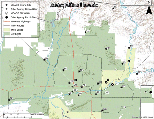
Figure 1. Map of the metropolitan Phoenix area including O3 and PM10 monitoring stations for MCAQD (labeled) and other area agencies. Note that some site locations contain monitoring stations for both O3 and PM10.
The Phoenix region is situated in a river valley surrounded by mountainous topography and desert vegetation. The region is located in arid, subtropical latitudes and has predominantly high atmospheric pressure, and thus light winds and weak atmospheric circulation. This prevailing lack of strong atmospheric circulation, in combination with the valley location, impedes the dispersion of pollutants out of the urban area (Ellis et al., Citation1999; Ellis et al., Citation2000). Industries (e.g., agriculture, mining, and construction) and transportation (e.g., vehicle traffic on unpaved roads or re-entrainment from paved roads) in the South-Central Arizona region, in combination with windblown dust, create considerable sources for PM10 pollutants (Bolin et al., Citation2000; MCAQD, Citation2009). Abundant sources of O3 precursors—that is, volatile organic compounds (VOC), CO, and oxides of nitrogen (NOx)—and the commonly warm, sunny days together create an environment where active photochemical reactions produce significant amounts of ground-level O3 (Ellis et al., Citation1999; MCAQD, Citation2009).
Though the original assessment performed for the MCAQD (Pope, Citation2011) included all the criteria pollutants (note that air toxic species are not monitored by the MCAQD and were not included), for brevity, only O3 and PM10 are highlighted in this paper as they are of most concern within Maricopa County (). While concentrations of other criteria pollutants in the region are below the NAAQS, O3 and PM10 have both been classified as being in nonattainment of the NAAQS. Thus, these pollutants are given a high priority for air pollution monitoring and have the largest network of monitoring stations to use within a multi-objective assessment (MCAQD, Citation2011). Although this study focuses primarily on the 17 O3 and 14 PM10 monitoring stations operated by the MCAQD (), other federal, tribal, state, and local agencies in Arizona also operate O3 and PM10 stations (). Where applicable, these stations were also included in the assessment to increase the robustness of the analyses, giving a total of 45 O3 and 48 PM10 stations to draw data from ().
Figure 2. Map depicting pattern of average 2009 pollution concentrations in metropolitan Phoenix. (a) O3 concentrations and monitoring stations. (b) PM10 concentrations and monitoring stations. Note that though the map differentiates between MCAQD and other agency monitoring stations, this ordinary kriging interpolation was created from all stations.
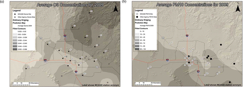
Table 1. MCAQD monitoring stations assessed within this study
Table 2. Agencies providing data and the number of monitoring stations used within this study
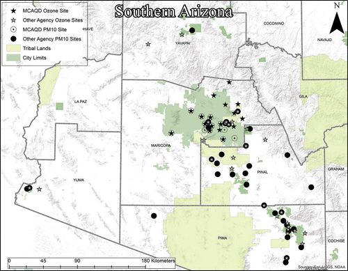
Figure 3. Map of southern Arizona including location of all O3 and PM10 monitoring stations used for data purposes in the study. The two largest metropolitan areas on this map are Phoenix, located in Maricopa County, and Tucson, located in Pima County to the south.
We obtained O3 and PM10 data from the Air Quality System (AQS) database maintained by the EPA. Each of the previously mentioned agencies is responsible for entering data from their stations into AQS. These stations all complied with the EPA Federal Reference Method or Federal Equivalency Method; thus the sampling equipment was approved for taking official air pollution measurements and quality assurance plans for the equipment and data were required and verified (40 CFR pt 58 appx A, Citation2010; MCAQD, Citation2011; ADEQ, Citation2013). Raw pollution values were averaged into yearly and 5-year numbers for use in the assessment. Note that not all stations were fully operational during the 2005–2009 time period; stations that did not meet a 75% data completeness level, as required by the EPA (40 CFR pt 50 Citation1971), were excluded where applicable.
Phase I: Indicators for evaluating the existing monitoring network
The first phase of the study consists of a site-to-site comparative assessment of each monitoring station. The purpose of this assessment is to evaluate the performance of existing stations of the AQMN using multi-objective indicators (). The mix of indicators was chosen to reflect multiple aspects of the AQMN and the indicators score for a comprehensive array of traits desired in monitoring stations; for example, one indicator gives the highest scores for stations located in urban areas measuring the highest concentration of pollutants, whereas another indicator favors rural stations monitoring background concentrations of pollutants. Most of the indicators were based on existing guidance documents, such as Raffuse et al. (Citation2007), though some were developed independently. These indicators are used to obtain information about the performance of each station, and after aggregating and applying appropriate weights, the scores give an overall network performance for each station. The indicators also provide information on the three sustainability aspects of the station (environment, social, and economy).
Table 3. Indicators and their categories used in Phase I and II of the study
Sustainability descriptors of environmental, social, or economic were assigned to the 11 different indicators following the format described by Chen et al. (Citation2006); that is, environmental indicators are related to the emissions and concentrations of sources and air pollutants; social indicators are related to population and sensitive receptors; and economic indicators are related to the cost-effectiveness, efficiency, and leveraging capability of stations within the AQMN. The specific indicators are as follows:
(1) Measured Concentrations (Environmental): This indicator scored stations on the concentration of measured pollutants using the design value of each station; the design value is generally the highest annual concentration measured in that averaging interval, which is based upon the NAAQS. Higher design values received higher scores. This indicator provides information that is important from a regulatory standpoint for determining NAAQS compliance and for performing model evaluations (Raffuse et al., Citation2007; Schmidt, Citation2001).
(2) Deviation from the NAAQS (Environmental): This indicator also uses the design values from each monitoring station; however, this technique uses the absolute value between the design value and the NAAQS exceedance threshold. Monitoring stations whose design values are closest to the exceedance threshold, either below or above, were given the highest score as they were considered to provide more information in terms of NAAQS compliance (Raffuse et al., Citation2007; Schmidt, Citation2001).
(3) Area Served (Environmental/Social): This indicator scored monitoring stations based upon their area of coverage. Using ArcView 10.0 GIS to create Thiessen polygons (a standard technique used in geography to assign a zone of influence around a point), spatial areas that are closest to an existing station were collected into one proximity polygon (O’Sullivan and Unwin, Citation2003; Environmental Systems Resource Institute [ESRI], 2010). Stations having the largest proximity polygons were scored the highest, which tends to give those stations in suburban or rural areas a higher score. Though these stations often have low concentration scores, they have high value for determining background concentrations, conducting air quality modeling, adding spatial coverage and interpolation points to a large metropolitan area, and giving air quality information to people living in less densely populated areas (EPA, 2001).
(4a) Emissions Inventory (Environmental): This indicator scores stations based on their proximity to point sources of pollution and the density of emissions in the surrounding area. Using the 2008 Periodic Emissions Inventory reports from the MCAQD, which includes reported emissions from approximately 1000 permitted sources within Maricopa County (MCAQD, Citation2011), point sources were geolocated using a GIS and emissions from these sources were spatially aggregated using the township, range, and section grid system, with each section being 1.6 km square in size. Though PM10 monitoring stations used reported emissions of corresponding PM10, O3 stations used reported emissions of VOCs instead, as ozone formation in the Phoenix metropolitan area is VOC-limited (Kleinman et al. Citation2005). Emissions were summed within the area served by each station’s Thiessen proximity polygon from the Area Served indicator. These results were normalized for emission density by dividing the emission sums by the Thiessen polygon area; this aids the technique by taking weight away from the rural and urban fringe stations that have large Thiessen proximity polygons, and thus emission sources that are farther away from the station. Since this analysis only included point sources within the limits of Maricopa County, the Thiessen polygons were trimmed to only include areas within the county. Stations with higher emission densities in their area served were scored higher.
(4b) Emissions Inventory—Predicted Ozone (Environmental): This indicator, which was only used for the O3 parameter, scores stations based upon their proximity to long-term O3 concentrations. Since ground-level O3 is a secondary pollutant, emissions inventory lists of primary sources are insufficient at longer temporal scales. Furthermore, although O3 needs NOx in its formation reaction, it is also scavenged by NOx in the atmosphere (Seinfeld and Pandis, Citation2006). Because of these chemical dynamics, O3 concentrations follow different patterns than other primary pollutants. In the short term (several hours or less), O3 will form near its precursor sources and increase as the plume moves downwind and has more time to react with the sun. At night, with the photochemical reaction stopped, O3 concentrations within the urban area will decrease as NOx compounds in the area scavenge them. However, outside of the urban areas, where NOx concentrations are low, O3 will persist longer in the environment before deposition or decomposition. Thus, O3 concentrations tend to be much higher in the rural areas downwind of an urban area when averaged over long temporal periods (Pope and Wu, Citation2013; Gregg et al., Citation2003). Therefore, it is insufficient to only use emission densities of VOC point sources to score O3 stations. To address this, we created an interpolated O3 surface using the longer scaled 2008 annual average. The mean O3 concentrations were calculated within each O3 station’s area served Thiessen polygon, and stations with higher mean concentrations were scored higher. Thus O3 stations were scored for both proximity to VOC sources (for the short term) and proximity to annual O3 concentrations (for the long term).
(5) Traffic Counts (Environmental): Point sources only account for a portion of the pollution emission sources within an area, with other major sources including mobile sources and transported pollutants. Transports were not addressed in this study, but this indicator does consider mobile source emissions. Emissions from mobile sources can vary; factors that can affect the amount of pollution released include road type, as fast-moving vehicles on a freeway generally emit less pollution per mile than vehicles on arterial roads and collectors; vehicle type, for example, diesel- versus gasoline-powered vehicles; traffic congestion; and age and size of vehicles. Ideally, a method that attempts to account for traffic emissions would account for all of these variables in a model that would give high spatial detail to mobile sources of pollution. Such traffic modeling is outside the scope of this study; instead, traffic count and road density were used as a proxy to approximate the spatial variability of mobile source pollution.
The average weekday traffic (AWT) counts for Maricopa County in 2007 were obtained from the Maricopa Association of Governments, which in turn collected them from various state, county, and municipal agencies. The dataset includes counts for freeways and arterial roads with extensive sample location coverage; however, it is difficult to ascertain whether AWT sample locations cover all arterial roads with the same density, and it is likely that additional new roads were not sampled. To normalize these data for evaluation, both the AWT and the length of roads within each monitoring station’s Area Served Thiessen proximity polygon were selected. These were divided by the area of the polygon to determine the traffic and road density. The densities were averaged together to obtain the score for each station.
(6) Monitor-to-Monitor Correlation (Environmental/Economic): This indicator scored stations based upon their distinctiveness of pollution data. Using annual-average data from 2009, the concentration of each station was compared to every other station by evaluation within a matrix where the coefficient of determination (r2) was generated for each pair of stations. Stations were scored based on their maximum correlation, with higher values, showing more redundancy, receiving a lower score. This indicator was useful in identifying redundancy between stations and can be used as evidence in justifying the cost-effectiveness of shutting down a station (EPA, Citation2003; Ito et al., Citation2005).
(7) Removal Bias (Environmental/Economic): This indicator evaluates the long-term contribution of each station to the creation of an interpolation map. Using the 5-year average from each monitoring station, a kriging interpolation map was created that incorporates all stations. Each station was then systematically removed from the data set and the interpolation map was recreated. The difference, or removal bias, between the actual value from the station and the predicted value from the interpolation once the station was removed was recorded. Sites were then scored using the absolute value of the bias; a higher value equates to a higher score.
Removal bias is a useful technique for noting redundancies in the monitoring network. Sites with high bias are important for creating the interpolation map, and thus their values add a unique perspective to the overall modeled pollution surface. Sites with a low bias could possibly be redundant with other sites, at least in the long-term temporal scale of this analysis (Cimorelli et al., Citation2003; Schmidt, Citation2001; EPA, Citation2002).
(8) Population Served (Social): This indicator used data from the 2000 U.S. Census to create a GIS polygon map of census block groups within Maricopa County, and the map was then converted to centroid points containing the population count information. Using Thiessen polygons, the total population within the area served by each monitoring station was counted and stations with the highest population counts were given the highest score. This technique provides more weight to stations that have a high surrounding population and a large area of representation. Note that in the case of large areas served, population far away from the monitoring site might not necessarily be adequately represented by that station. However, it is the closest perspective station, so this technique assumes that it is the most representative, even though this is purely spatial in construction and does not consider meteorology, topology, or location of sources (EPA, Citation2001; O’Sullivan and Unwin, Citation2003).
(9) Environmental Justice—Minority Population Served (Social): The EPA has the goal of providing an environment where all people enjoy the same degree of protection from environmental and health hazards and equal access to the decision-making process to maintain a healthy environment in which to live, learn, and work (EPA, Citation2010). This environmental justice mandate extends to all areas the EPA works with, including AQMN assessments. As this study was based upon the EPA’s periodic assessment requirement, it includes this social indicator as a basic test of how the AQMN relates to environmental equity issues, in this case minority populations within Maricopa County. This indicator follows a methodology identical to the population served indicator described earlier, but uses the total population minus the non-Hispanic white population listed in the 2000 U.S. Census to determine the total minority population in each census block group. The percentage of minority population was determined within each monitoring station’s Area Served Thiessen proximity polygon, and stations were then scored with the highest percentages having the greatest score.
(10) Trends Impact (Social/Economic): This indicator was based on the historical monitoring record of the station, that is, the length of time the station has been in operation as of 2009. Stations that have a long historical record are valuable for tracking trends; continuation of a long unbroken monitoring record is desirable for providing modeling data or determining chronic population exposure to pollutants. Note that if stations had alternating periods of operation, not including seasonal schedules, only the most recent operating period was considered. Seasonal O3 stations were counted as if they were in continual operation (Raffuse et al., Citation2007; Cimorelli et al., Citation2003).
(11) Number of Other Parameters Monitored (Economic): This indicator counted the number of different parameters monitored at each site. Parameters counted were those that are entered into the AQS database, including criteria pollutants and wind meteorological parameters; ancillary parameters were not included. Multiple monitored parameters make a site more valuable, as they have increased cost-effectiveness, and collocated pollutant measurements can be compared and modeled together (Raffuse et al., Citation2007; Cimorelli et al., Citation2003; Scheffe et al., Citation2009).
Phase II: Identifying areas of insufficient AQMN representation
The second phase of the study utilizes spatial indicators in the framework of a GIS to quantify the representation of the existing AQMN and identify areas that are possibly deficient in coverage and could benefit from the addition of a monitoring station. This phase has eight different spatial indicators grouped into three different groups: source-oriented, population-oriented, and spatially oriented ( and ). These groups consider characteristics that are associated with monitoring station representation, for example, the location of point and mobile sources, the density of population, or the straight-line distance to the next closest monitoring station.
Figure 4. The weighted spatial output model. Spatial indicators, i.e., raster maps, are inputted, reclassified, and spatially averaged to create the final spatial output map.
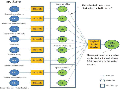
Each spatial indicator consists of a GIS raster map with a 100-m grid pattern. These rasters were reclassified in ArcView 10.0 so that the data distribution of each indicator was scored with values from 1 to 10. The reclassified rasters were then spatially averaged with calculated weights (q.v.) using the weighted spatial overlay tool of ArcView 10.0, giving each indicator a weighted-average score. A higher score signified a greater likelihood that a spatial location would benefit from additional monitoring representation. The specific indicators are as follows:
Emissions Inventory Point Sources (Source-Oriented): This indicator is a raster map of point emission sources taken from the MCAQD Periodic Emissions Inventory report (MCAQD, Citation2009). The emission sources were aggregated into each township, range, and section; the sum of emissions in each sector was used as the raster value. When reclassifying the raster, the entire distribution of emissions was divided into 10 equal parts and assigned a score of 1–10 with 10 signifying the highest emission quantities.
Arterial Road Traffic Count (Source-Oriented): First of the mobile source indicators, this used the AWT count from arterial roads in Maricopa County. AWT counts were averaged in each township, range, and section, with the average result being used as the raster value. Higher AWT counts were assigned higher scores as they are representative of higher mobile-source emissions.
Freeway Traffic Count (Source-Oriented): Second of the mobile source indicators and similar to the Arterial Road Traffic Count, this indicator used the AWT from interstate and state highways in Maricopa County. AWT counts were also averaged in each township, range, and section. As with arterial road traffic counts, higher freeway AWT counts were assigned higher scores.
Road Density (Source-Oriented): Third of the mobile source indicators, this assessed the density of roads, both arterial and freeways, in a given area and returned the result as the raster value. This indicator was designed to give support to the traffic counts indicator in determining emissions from mobile sources. Since traffic counts are based upon discrete sampling locations and it is difficult to ascertain if these locations are evenly sampled, the road density serves as another proxy in determining mobile source emissions. The densities of roads (lines) were calculated within 1-km cells; higher densities were assigned higher scores.
Population Density (Population-Oriented): This indicator used the 2000 U.S. Census block groups to account for total population. The population density of each block group was calculated and used for each raster cell. Higher population densities were assigned higher scores.
Minority Population Density (Population-Oriented): This indicator is identical in design to the Population Density indicator, except that instead of total population in each census block group, the total population minus the non-Hispanic white population was used. This indicator provides a method of accounting for environmental equity issues. Areas with higher minority population densities were assigned higher scores, as ensuring that these populations have adequate monitoring representation is necessary to identify equity issues.
Euclidean Distance Between Sites (Spatially Oriented): This indicator is based on the straight-line distance away from an existing monitoring site. The implied assumption is that it is more desirable to have a new monitoring site farther away from an existing site. In practice this method created concentric rings of 3 km for O3 and 1.5 km for PM10 around each monitoring site. This distance was an a priori decision based upon the spatial autocorrelation characteristics of each pollutant (Pope and Wu, Citation2013). The score increases the farther away in space that the location is from existing monitoring sites.
Standard Error From Predicted Pollution (Spatially Oriented): This indicator accounts for the actual modeled pollution surface. This was accomplished by creating a kriging interpolation map for each pollution parameter using annual average data from each existing monitoring site. However, instead of a standard pollution surface output, a standard error map was generated. This map shows areas of highest uncertainty in the kriging model. After converting the map to a raster, the areas of highest uncertainty were reclassified with the highest score.
Weights
The methodology used in this study relies on different indicators to provide a comprehensive analysis of different factors. However, we did not assume that these factors were all equally important. Instead, weights were used to emphasize particularly important indicators. There are multiple weighting methods mentioned in the literature, including judgment-based expert opinion and data-dependent statistical methods (Garriga and Foguet, Citation2010; Zheng et al., Citation2011). This study utilized the expert opinion method, as this is a common method of assigning weights, though it is likely biased toward the subjective perception of the expert or policymaker (Booysen Citation2002). Still, given the strong relationship of this study with air quality policymaking, we argue that this is an effective method for weighting these indicators. A panel of 10 air quality experts, policymakers, and academics was invited to answer a survey with their opinions on the relative importance of Phase I and II indicators and how they should be weighted. Survey answers were averaged together and used for the weighting scheme ().
Table 4. Weights for Phase I of the study and weights for Phase II of the study
To analyze the sensitivity of the chosen weights, results were also calculated from the unweighted indicators and compared to the weighted results. For the sustainability results, because there are unequal numbers of indicators for each sustainability category, indicators from each category were averaged together and compared with the original results in the format demonstrated by Van de Kerk and Manuel (Citation2008).
Results
Phase I: Indicators for evaluating the existing AQMN
Displaying results
Each O3 and PM10 monitoring station earned a score for the 11 individual indicators. The score was based upon that station’s placing in each indicator’s distribution; for example, for the 17 assessed O3 stations, there were 1–17 points possible depending on the station’s placing. Tied results earned the stations an average score from the placing. For the original unweighted results, the 11 indicator scores were averaged together and a rank for the station was determined. Weights were then applied to each indicator score and the average and rank for each station was recalculated (; see Supplemental Materials for complete chart results).
Table 5. Raw and weighted average scores and ranks for the Phase I O3 and PM10 assessment
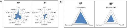
Individual indicator results from each site were also displayed in a radar chart format with the indicators arranged by their sustainability descriptor, that is, environmental, social, and economic. This provided a convenient visualization of individual sustainability aspects for the entire network (). The 11 individual indicator results were further aggregated into the three sustainability groups of environmental, social, and economic, and a score and rank for each group was generated for each monitoring station. These results were also displayed in radar charts, which allow the viewer to quickly ascertain the network’s sustainability strengths and weaknesses (; see Supplemental Materials for complete chart results).
Figure 5. (a) Radar charts of Phase I indicator results for the highest and lowest ranked O3 monitoring stations, North Phoenix and Blue Point, respectively. Labeled numbers correspond to the 11 Phase I indicators listed in . Graph gridlines each represent 0.5 points of score, from 0 to 2.0. (b) Radar charts of sustainability results for the same stations. Each sustainability group is an aggregation of the appropriate Phase I indicators. Graph gridlines each represent 0.3 points of score, from 0 to 1.2.
Results for O3 monitoring stations
The final weighted scores and rankings revealed that the three highest ranked stations, North Phoenix, Glendale, and West Chandler, are located within urban areas, while the bottom two ranked stations, Buckeye and Blue Point, are located in suburban or rural areas (). Applying weight to the original scores did not affect the top or bottom ranked stations, but it did have effect on the stations in between (). Individual indicator analyses, such as Monitor-to-Monitor Correlation and Removal Bias, revealed redundancy among the urban O3 stations. On the other hand, the Population Served indicator demonstrated that the urban stations each represented a sizably higher number of people then the suburban and rural stations, even when considering the much greater area served of those stations.
Figure 6. Map of relative sustainability results for O3 monitoring stations in MCAQD’s network. The label for each monitoring station gives its overall analysis rank.
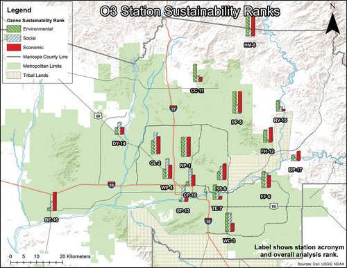
Table 6. Comparison of raw and weighted Phase I rankings for O3 and PM10 sites
The sustainability results for O3 demonstrated that the monitoring stations located in urban settings tended to score higher on the social sustainability indicators. Rural monitoring stations to the northeast of the urban area tended to have higher environmental indicators, following the known patterns of O3, which tends to accumulate in the mountainous downwind area northeast of the metropolitan area (Pope and Wu, Citation2013) (). However, this environmental pattern was nebulous, as several of the urban stations scored high and several of the rural stations scored low. Economic indicator scores were mixed between urban and rural stations; some of the large, long-term urban stations scored high, but several of the more remote rural stations also scored high as their unique data is useful for modeling purposes, thus bringing a high score on those indicators.
Results for PM10 stations
The final weighted scores and results for the PM10 stations revealed that the highest ranking station, Central Phoenix, did not have any top scores in the heaviest weighted indicators and many of its scores were in the bottom half, but it did have the highest score in Traffic Count and high enough scores in other indicators to give it the top ranked average (). The second overall ranked station was Mesa, even though it scored near the bottom in Measured Concentrations, which is the most heavily weighted indicator. The stations scoring highest in Measured Concentrations tended to rank poorly in the overall results. Applying weights to the raw scores did not change the rank of the five highest scoring stations, but it did have some effect on the ranks of the lower scoring stations (). The Monitor-to-Monitor Correlation and Removal Bias indicators also displayed redundancy among the PM10 stations, especially among the clustered stations in southwest Phoenix. These same urban stations tended to score low in the social indicators, as their clustered positions caused them to serve smaller areas and populations.
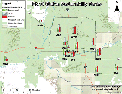
Sustainability results for PM10 demonstrated a regional pattern with stations in the southern portion of the AQMN, which tend to be closer to agricultural, mining, and industrial sources, ranking higher in the environmental indicators (). The clustered stations in southwest Phoenix tended to score the lowest in the social and economic indicators due to their redundancy and small service areas. The Supplemental Materials contain complete Phase I analysis results for each indicator for both O3 and PM10 parameters.
Figure 7. Map of relative sustainability results for PM10 monitoring stations in MCAQD’s networks. The label for each monitoring station gives its overall analysis rank.
Phase II: Identifying areas of insufficient AQMN representation
Displaying results
Each Phase II spatial indicator was entered into the spatial output model () and two separate spatial outputs, that is, raster maps, were created. The first output did not use any weights and equal emphasis was placed on each indicator in the spatial averaging; the second used the weights from the expert opinion survey as listed in . Each spatial output raster consists of a scored map of the Phoenix metropolitan region with higher scores giving a relative representation of locations that could possibly benefit from the addition of a monitoring station. One to 10 points were possible for each grid of the spatial output; however, for these results the spatially averaged scores did not exceed 4 or 5 points for O3 and PM10, respectively.
Results for O3 monitoring stations
The spatial output for O3 displayed relatively low scores for most of the metropolitan area, demonstrating that it is well represented by existing monitoring stations (). Much of the region outside of the metropolitan area received higher scores, though this is because the low density of existing stations in those areas gave them maximum individual scores in the Euclidean distance and spatial error indicators. Inside the metropolitan boundaries, areas nearby major transportation corridors mainly received the highest scores.
Figure 8. Scored spatial output map for the O3 Phase II analysis showing the suitability for adding additional O3 monitoring stations. Grid scores represent relative suitability for adding a new O3 monitoring station (higher score equals greater suitability). (a) Weights were added to spatial indicators before averaging the output. (b) Results from using unweighted indicators.
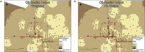
When the weights were removed from the input indicators, a similar pattern emerged, though scores were emphasized more along the transportation corridors ().
Results for PM10 monitoring stations
The spatial output for PM10 displayed higher average scores than the O3 output, even in areas close to existing monitoring stations (). Scores for the PM10 output ranged from 1 to 5 points out of the 10 possible points, though only two grid cells, which are the location of power generating plants approximately 35 km west of the metropolitan area, scored 5 points. As with the O3 stations, major transportation corridors within the metropolitan area tended to have the highest scores. However, there were also many locations within the metropolitan area that scored high because they have high population counts or large PM10 emission sources. Three locations in the spatial output map were particularly evident as being likely candidates for new monitoring stations: the town of Avondale in the western metropolitan area, Deer Valley and northern Scottsdale in the northern area, and Tempe and Mesa in the eastern area ().
Figure 9. (a) Scored spatial output map for the PM10 analysis using weighted indicator inputs. Numbered callouts represent areas indicated for new PM10 stations, 1 = Avondale, 2 = Deer Valley, 3 = Tempe. Only two grid cells, not pictured in this map, earned a score of 5. These cells are located in western Maricopa County approximately 35 km from the western edge of this map. (b) The same analysis using unweighted indicators.
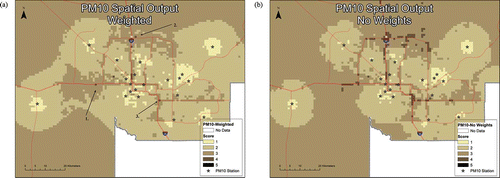
Adding weights to the spatial indicators did not greatly change the pattern of the PM10 scores. The spatial output using unweighted indicators appears to emphasize the same portions of the metropolitan area, though, on average, scores in each location are higher ().
Discussion
Station design objectives
The techniques and indicators used in this study are not meant to be used and applied in a rote manner; rather, the intention is to use the indicator results and spatial outputs to gather greater knowledge about the existing monitoring stations and suitable locations for new stations. Indicators might be codependent with one another and this should be taken into account, for example, for the monitor-to-monitor correlation and the removal bias indicators. For example, even though they would likely score low in the monitor-to-monitor correlation and removal bias indicators, monitoring stations with high correlation but more distant apart are more valuable than those that correlate well in close proximity. Logic and reason must be applied to properly interpret the results and evaluate the AQMN. An important consideration that must be taken into account when applying this logic is the design objectives that are required for every monitoring station and network.
Design objectives can take several forms, such as the need to characterize population exposure to pollutants, monitoring the impact of certain sources, or measuring the maximum expected or background pollutant concentrations. These objectives were considered when creating the multiple indicators used in this study; nevertheless, when analyzing results individual station objectives should be reviewed. For instance, a station might rank poorly in the Phase I assessment because it scored poorly in all but one or two indicators, but those high-scoring indicators are that site’s objective, for example, it is a maximum concentration station or it is located near a specific industry to monitor its emissions. If this objective is uniquely fulfilled by that station, then it has worth outside of what the general assessment results might suggest, and that should be taken into consideration when making decisions regarding the network.
O3 monitoring stations
The assessment of O3 stations revealed that the region is well represented by the AQMN, though there is likely redundancy in urban areas. The monitor-to-monitor correlation indicator found an average of 81% correlation among the O3 stations, though when selecting only urban area stations the average changes to 88% as compared to rural/suburban stations with an average of 74%. From a sustainability standpoint, all of the urban stations do have strong social scores, though low performance in the correlation and removal bias indicators affects many of the urban stations in their environmental and economic scores. Spatial patterns for economic indicators were mixed; many of the urban stations scored well with the Trends Impact and Number of Parameters indicators, but their low scores in the correlation indicators hurt their overall economic average, thus giving an economic advantage to some of the rural stations.
Based on an evaluation of the Phase I assessment, the AQMN would likely benefit from closing or moving certain O3 stations, such as some of the eastern downwind rural stations or the highly redundant urban stations, though at the current time this was not recommended. The reason for this decision was due to the objectives of these stations and the policy issues that could arise from closing them in a nonattainment area (see CitationScheffe et al. [2009] for greater detail on policy issues in these cases); the downwind sites were designed to measure maximum concentrations in areas that frequently violate health standards, and the urban sites provide neighborhood representation and are relied upon by many people for local air quality information (thus the high social scores). However, the results do suggest that the objectives for some of the downwind stations should be reevaluated.
Especially when considering the Phase I results, the Phase II assessment did not find areas that were seriously underrepresented by O3 stations. However, there are several areas of the city, especially along freeway transportation corridors with adjacent high population densities, that would benefit from new stations. The recommendation is not to open a new site just for O3 monitoring, but if another station is to be opened for other parameters or if an existing station needed to be moved, then adding or moving an O3 monitor into those deficient areas should be considered.
PM10 monitoring stations
The assessment of PM10 stations shows areas that are overrepresented, as well as areas that lack adequate representation. The PM10 stations in Maricopa County’s AQMN are located in both urban and suburban areas and most show a great deal of redundancy. On average, stations throughout the metropolitan region exhibit 86% correlation, though the clustered stations in the south-central region exhibit 90% correlation. However, many of these clustered stations are positioned so as to monitor ambient pollution in areas near specific point sources and/or have an objective to measure maximum concentrations and thus receive much attention from managers and policymakers.
The Phase I assessment shows that these clustered stations score high in the Measured Concentrations and Emissions Inventory indicators, but their low Area Served and Population Served scores hurt them in the overall rankings. From a sustainability viewpoint, the most important stations were those that represent larger areas and populations, while also having significant environmental impact from surrounding sources. While this would suggest that the AQMN would benefit if some of these clustered stations were closed or moved, this is difficult to accomplish when considering their aforementioned objectives; also, these stations frequently violate health standards and have considerable political import. Therefore, it was not recommended to close any PM10 stations, but evidence from these indicators should be closely considered while modifying the AQMN in the future.
The Phase II assessment does show areas that are deficient in monitoring representation. Rural areas were uniformly indicated as in need of representation, mainly because of the lack of rural stations, but monitoring objective considerations, such as population coverage in rural towns or monitoring major point sources, needs to be considered before adding stations to these areas. It was recommended to add PM10 stations to two small rural towns, Gila Bend and Wickenburg, located in Maricopa County to the southeast and northeast of the metropolitan area, respectively. Urban areas within the metropolitan region were also indicated as needing PM10 stations. After evaluating the spatial output maps, the location of existing monitors, and possible monitoring objectives, recommendations were made to add stations to the metropolitan neighborhoods of Avondale, Deer Valley, and Tempe (). MCAQD has added, or has preliminary plans to add, PM10 stations to all of these localities (Pope Citation2011).
Multiple indicators for multiple objectives
This study has demonstrated the usefulness of using multiple indicators to assess the various objectives of an AQMN. This multi-objective technique has the advantage of providing a broad view of the various aspects of each monitoring station, though at the cost of greater detailed knowledge on each aspect. Nevertheless, when evaluating the performance of existing monitoring stations, or attempting to locate areas where new stations are needed, these various objectives all have worth and should be evaluated with differing indicators. The use of weights to provide emphasis to more critical aspects can be important, and this study has demonstrated, through the comparison of weighted and unweighted indicators, how much effect those weights can have. It should be noted that future assessments could be improved with the inclusion of additional indicators to evaluate further sources and objectives, for example, including agricultural source indicators or evaluating the effects of transported sources, or more detailed indicators, such as including socioeconomic status with race/ethnicity environmental justice indicators.
Adding the sustainability component to the assessment provides an effective method of aggregating the many indicators into a straightforward display of the results. The spatial patterns that result from this sustainability aggregation were also useful for evaluating network performance and finding areas of deficiency. Because of the usefulness of data that were produced with this technique, it is recommended that MCAQD utilize sustainability indicators in all future assessments of their AQMN.
Managers and planners should take note of the effect of multiple objectives on the AQMN and utilize their available resources appropriately. This has not always been done in the past, and resources were not always used to best effect. For example, there is often great concern among government planners regarding monitoring stations with the objective of measuring maximum concentrations. This concern is warranted, as pollution exceedances at maximum concentrations sites may cause the AQMN to be in violation of clean air regulations. However, while placing a large amount of resources, such as compliance inspectors or remediation efforts, around maximum concentration sites might be effective in controlling pollution in the area local to these sites, this could come at a cost of resources around monitors that represent greater numbers of population or more sensitive receptors, thus ignoring or exacerbating environmental justice issues. With more knowledge on environmental, social, and economic conditions, managers can make better decisions on how to deploy new monitoring resources to create a more comprehensive AQMN that best serves government regulations and the general public, thus giving information resources about air quality so that health risks can be recognized and citizens can make proper choices to benefit their lifestyles.
Acknowledgment
The authors thank the panel of experts from MCAQD, Arizona Department of Environmental Quality, Pinal County for their assistance in the creation of indicator weights. The authors also thank Robert Downing of the MCAQD for his assistance in editing the draft article. Finally, they thank the anonymous reviewers for their very constructive comments on the article.
Funding
JW’s research in urban ecology and sustainability has been supported in part by the National Science Foundation under grants BCS-1026865 (CAP3), DEB-0423704 (CAP2), and DEB-9714833 (CAP1) for the Central Arizona–Phoenix Long--Term Ecological Research (CAP-LTER).
Supplemental Material
Supplemental data for this article can be accessed on the publisher’s website.
Supplemental_Material.docx
Download MS Word (968.1 KB)Additional information
Notes on contributors
Ronald Pope
Ronald Pope is a Ph.D. candidate at the School of Life Sciences at Arizona State University in Tempe, AZ; he is also an analyst with the Maricopa County Air Quality Department in Phoenix, AZ.
Jianguo Wu
Jianguo Wu is Dean’s Distinguished Professor in Landscape Ecology and Sustainability Science at Arizona State University, Tempe, AZ.
Related Research Data
References
- 40 CFR pt 50. 1971. National Primary and Secondary Air Quality Standards. Washington, DC: U.S. National Archive and Records Administration.
- 40 CFR pt 58 appx A. 2010. Quality Assurance Standards for State and Local Air Monitoring Stations (SLAMS). Washington, DC: U.S. National Archive and Records Administration.
- 40 CFR pt 58.10. 2007. Annual monitoring network plan and periodic network assessment. Washington, DC: U.S. National Archive and Records Administration.
- ADEQ. 2013. Arizona Department of Environmental Quality Annual Reports, 2011. http://www.azdeq.gov/environ/air/assessment/download/networkplan_2011.pdf ( accessed October 8, 2013).
- Bauldauf, R.W., R.W. Wiener, and D.K. Heist. 2002. Methodology for siting ambient air monitors at the neighborhood scale. J. Air Waste Manage. Assoc. 52(12): 1433–1452. doi:10.1080/10473289.2002.10470870
- Bolin, B., E. Matranga, E.J. Hackett, E.K. Sadalla, K.D. Pijawka, D. Brewer, and D. Sicotte. 2000. Environmental equity in a sunbelt city: the spatial distribution of toxic hazards in Phoenix, Arizona. Environ. Hazards 2:11–24. doi:10.1016/S1464-2867(00)00010-3; 10.3763/ehaz.2000.0203
- Booysen, F. 2002. An overview and evaluation of composite indices of development. Social Indicators Res. 59(2): 115–151. doi:10.1023/A:1016275505152
- Briggs, D., S. Collins, P. Elliott, P. Fischer, S. Kingham, E. Lebret, K. Pryl, H.V. Reeuwijk, K. Smallbone, and A.V.D. Veen. 1997. Mapping urban air pollution using GIS: A regression-based approach. Int. J. Geogr. Information Sci. 11(7): 699–718. doi:10.1080/136588197242158
- Caselton, W.F., and J.V. Zidek. 1984. Optimal monitoring network designs. Stat. Prob. Lett. 2(4): 223–227. doi:10.1016/0167-7152(84)90020-8
- Chen, C.-H., W.-L. Liu, and C.-H. Chen. 2006. Development of a multiple objective planning theory and system for sustainable air quality monitoring networks. Sci. Total Environ. 354(1): 1–19. doi:1016/j.scitotenv.2005.08.018
- Cimorelli, A.J., A.H. Chow, C.H. Stahl, D. Lohman, E. Ammentorp, R. Knapp, and T. Erdman. 2003. Region III ozone network reassessment. September 9–11 Air Monitoring & Quality Assurance Workshop, Atlanta, GA, U.S. Environmental Protection Agency, Region 3.
- Cocheo, C., P. Sacco, P.P. Ballesta, E. Donato, S. Garcia, M. Gerboles, D. Gombert, B. McManus, R.F. Patier, C. Roth, E. de Saeger, and E. Wright. 2008. Evaluation of the best compromise between the urban air quality monitoring resolution by diffusive sampling and resource requirements. J. Environ. Monit. 10(8): 941–950. doi:10.1039/b806910g
- Demerjian, K.L. 2000. A review of national monitoring networks in North America. Atmos. Environ. 34(12–14): 1861–1884. doi:10.1016/S1352-2310(99)00452-5
- Ellis, A.W., M.L. Hildebrandt, and H.J.S. Fernando. 1999. Evidence of lower-atmospheric ozone sloshing in an urbanized valley. Phys. Geogr. 20(6): 520–536.
- Ellis, A.W., M.L. Hildebrandt, W.M. Thomas, and H.J.S. Fernando. 2000. Analysis of the climatic mechanisms contributing to the summertime transport of lower atmospheric ozone across metropolitan Phoenix, Arizona, USA. Clim. Res. 15(1):13–31., doi:10.3354/cr015013
- Engel-Cox, J., N.T. Kim Oanh, A. van Donkelaar, R.V. Martin, and E. Zell. 2013. Toward the next generation of air quality monitoring: Particulate matter. Atmos. Environ. 80(0):584–590. doi:http://dx.doi.org/10.1016/j.atmosenv.2013.08.016.
- Environmental Systems Resource Institute. 2010. ArcMap Version 10.0. ESRI (Environmental Systems Resource Institute), Redlands, CA.
- Ferradás, E.G., M.D. Miñarro, I.M. Morales Terrés, and F.J. Marzal Martínez. 2010. An approach for determining air pollution monitoring sites. Atmos. Environ. 44(21–22): 2640–2645. doi:10.1016/j.atmosenv.2010.03.044
- Garriga, R.G., and A.P. Foguet. 2010. Improved Method to Calculate a Water Poverty Index at Local Scale. J. Environ. Eng. 136(11): 1287–1298. doi:10.1061/(ASCE)EE.1943-7870.0000255
- Gramsch, E., F. Cereceda-Balic, P. Oyola, and D. von Baer. 2006. Examination of pollution trends in Santiago de Chile with cluster analysis of PM10 and Ozone data. Atmos. Environ. 40(28): 5464–5475. doi:10.1016/j.atmosenv.2006.03.062
- Gregg, J.W., C.G. Jones, and T.E. Daws. 2003. Urbanization effects on tree growth in the vicinity of New York City. Nature 424:183–187. doi:10.1038/nature01728
- Haas, T.C. 1992. Redesigning continental-scale monitoring networks. Atmos. Environ. Part A Gen. Topics 26(18): 3323–3333. doi:10.1016/0960-1686(92)90349-P
- Hsu, A., A. Reuben, D. Shindell, A. de Sherbinin, and M. Levy. 2013. Toward the next generation of air quality monitoring indicators. Atmos. Environ. 80:561–570. http://dx.doi.org/10.1016/j.atmosenv.2013.07.036.
- Husain, T., and H.U. Khan. 1983. Shannon’s entropy concept in optimum air monitoring network design. Sci. Total Environ. 30:181–190. doi:10.1016/0048-9697(83)90010-4
- Ignaccolo, R., S. Ghigo, and E. Giovenali. 2008. Analysis of air quality monitoring networks by functional clustering. Environmetrics 19(7): 672–686. doi:10.1002/env.946
- Ito, K., S. De Leon, G.D. Thurston, A. Nadas, and M. Lippmann. 2005. Monitor-to-monitor temporal correlation of air pollution in the contiguous US. J. Expos. Anal. Environ. Epidemiol. 15(2): 172–184. doi:10.1038/sj.jea.7500386
- Kanaroglou, P.S., M. Jerrett, J. Morrison, B. Beckerman, M.A. Arain, N.L. Gilbert, and J.R. Brook. 2005. Establishing an air pollution monitoring network for intraurban population exposure assessment: A location-allocation approach. Atmos. Environ. 39:2399–2409. doi:10.1016/j.atmosenv.2004.06.049
- Kleinman, L.I., P.H. Daum, Y.N. Lee, L.J. Nunnermacker, S.R. Springston, J. Weinstein-Lloyd, and J. Rudolph. 2005. A comparative study of ozone production in five U.S. metropolitan areas. J. Geophys. Res. Atmos. 110(D2): D02301. doi:10.1029/2004JD005096.
- Lindley, D.V. 1956. On a measure of the information provided by an experiment. Ann. Math. Stat. 27(4): 986–1005. doi:10.1214/aoms/1177728069
- Liu, M.K., J. Avrin, R.I. Pollack, J.V. Behar, and J.L. McElroy. 1986. Methodology for designing air quality monitoring networks: I. Theoretical aspects. Environ. Monit. Assess. 6(1): 1–11. doi:10.1007/BF00394284
- Lozano, A., J. Usero, E. Vanderlinden, J. Raez, J. Contreras, B. Navarrete, and H.E. Bakouri. 2009. Design of air quality monitoring networks and its application to NO2 and O3 in Cordova, Spain. Microchem. J. doi:10.1016/j.microc.2009.07.007.
- Mazzeo, N., and L. Venegas. 2008. Design of an air-quality surveillance system for Buenos Aires City integrated by a NOx monitoring network and atmospheric dispersion models. Environ. Model. Assess. 13(3): 349–356. doi:10.1007/s10666-007-9101-y
- MCAQD. 2009. Emissions inventory—Maricopa County Air Quality Department. http://www.maricopa.gov/aq/divisions/planning_analysis/emissions_inventory/Default.aspx ( accessed October 6, 2009).
- MCAQD. 2011. Maricopa County Air Quality Department annual air monitoring network reviews. http://www.maricopa.gov/aq/divisions/monitoring/network.aspx ( accessed August 15, 2011).
- McElroy, J.L., J.V. Behar, T.C. Meyers, and M.K. Liu. 1986. Methodology for designing air quality monitoring networks: II. Application to Las Vegas, Nevada, for carbon monoxide. Environ. Monit. Assess. 6(1): 13–34. doi:10.1007/BF00394285
- Mofarrah, A., and T. Husain. 2009. A Holistic Approach for optimal design of Air Quality Monitoring Network Expansion in an Urban Area. Atmos. Environ. doi:10.1016/j.atmosenv.2009.07.045.
- Moldan, B., S. Janoušková, and T. Hák. 2012. How to understand and measure environmental sustainability: Indicators and targets. Ecol.l Indicators 17:4–13. doi:http://dx.doi.org/10.1016/j.ecolind.2011.04.033.
- Morawska, L., D. Vishvakarman, K. Mengersen, and S. Thomas. 2002. Spatial variation of airborne pollutant concentrations in Brisbane, Australia and its potential impact on population exposure assessment. Atmos. Environ. 36(21): 3545–3555. doi:10.1016/S1352-2310(02)00293-5
- O’Sullivan, D., and D.J. Unwin. 2003. Geographic Information Analysis. Hoboken, NJ: John Wiley & Sons, Inc.
- Pires, J.C.M., M.C. Pereira, M.C.M. Alvim-Ferraz, and F.G. Martins. 2009. Identification of redundant air quality measurements through the use of principal component analysis. Atmos. Environ. 43(25): 3837–3842. doi:10.1016/j.atmosenv.2009.05.013
- Pope, R.L. 2011. Maricopa County Air Monitoring Network: Technicalassessment 2005–2009. Phoenix, AZ: Maricopa County Air Quality Department.
- Pope, R.L., and J. Wu. 2013. Characterizing air pollution patterns on multiple time scales in urban areas: A landscape ecological approach. Urban Ecosystems. doi:10.1007/s11252-014-0357-0
- Raffuse, S.M., D.C. Sullivan, M.C. McCarthy, B.M. Penfold, and H.R. Hafner. 2007. Ambient Air Monitoring Network Assessment Guidance: Analytical Techniques for Technical Assessments of Ambient Air Monitoring Networks. Research Triangle Park, NC: U.S. Environmental Protection Agency.
- Scheffe, R.D., P.A. Solomon, R. Husar, T. Hanley, M. Schmidt, M. Koerber, M. Gilroy, J. Hemby, N. Watkins, M. Papp, J. Rice, J. Tikvart, and R. Valentinetti. 2009. The National Ambient Air Monitoring Strategy: Rethinking the role of national networks. J. Air Waste Manage. Assoc. 59(5):579–590. doi:10.3155/1047-3289.59.5.579.
- Schmidt, M. 2001. Monitoring strategy: National analysis. Paper presented at RTP Monitoring Strategy Workshop, Research Triangle Park, NC, October.
- Schmitz, R. 2005. Modelling of air pollution dispersion in Santiago de Chile. Atmos. Environ. 39(11): 2035–2047. doi:10.1016/j.atmosenv.2004.12.033
- Seinfeld, J.H., and S.N. Pandis. 2006. Atmospheric Chemistry and Physics—From Air Pollution to Climate Change (2nd ed.). Hoboken, NJ: John Wiley & Sons.
- Silva, C., and A. Quiroz. 2003. Optimization of the atmospheric pollution monitoring network at Santiago de Chile. Atmos. Environ. 37(17): 2337–2345. doi:10.1016/S1352-2310(03)00152-3
- Trujillo-Ventura, A., and J.H. Ellis. 1991. Multiobjective air pollution monitoring network design. Atmos. Environ. Part A Gen. Topics 25(2): 469–479. doi:10.1016/0960-1686(91)90318-2
- U.S. Census Bureau. 2011. Profile of general population and housing characteristics: 2010. http://factfinder2.census.gov/faces/nav/jsf/pages/index.xhtml(accessed August 21, 2011).
- U.S. Environmental Protection Agency. 2001. National assessment of the existing criteria pollutant monitoring networks O3, CO, NO2, SO2, Pb, PM10, PM2.5—Part 1, July 25, 2001. http://www.epa.gov/ttn/amtic/files/ambient/monitorstrat/netpres1.pdf ( accessed September 15, 2010).
- U.S. Environmental Protection Agency. 2002. Assessment of the ambient air monitoring networks. Draft report prepared for the U.S. Environmental Protection Agency, Research Triangle Park, NC, by the U.S. Environmental Protection Agency, Region 4. http://www.epa.gov/ttn/amtic/files/ambient/pm25/workshop/atlanta/r4netas.pdf ( accessed September 15, 2010).
- U.S. Environmental Protection AgencyA. 2003. Region 5 network assessment. http://www.epa.gov/ttn/amtic/files/ambient/pm25/workshop/atlanta/r5netas.pdf ( accessed September 15, 2010).
- U.S. Environmental Protection Agency. 2010. Environmental Justice. http://www.epa.gov/environmentaljustice ( accessed November 3, 2010).
- U.S. Environmental Protection Agency. 2011. The Ambient Air Monitoring Program. http://www.epa.gov/air/oaqps/qa/monprog.html ( accessed August 15, 2012).
- U.S. Environmental Protection Agency. 2012. Clean Air Act. http://www.epa.gov/air/caa/ ( accessed August 15, 2012).
- Van de Kerk, G., and A.R. Manuel. 2008. A comprehensive index for a sustainable society: The SSI—The Sustainable Society Index. Ecol. Econ. 66 (2–3):228–242. doi:10.1016/j.ecolecon.2008.01.029
- Van Egmond, N.D., and D. Onderdelinden. 1981. Objective analysis of air pollution monitoring network data; spatial interpolation and network density. Atmos. Environ. 15(6): 1035–1046. doi:10.1016/0004-6981(81)90104-9
- Wu, J., G.D. Jenerette, A. Buyantuyev, and C.L. Redman. 2011. Quantifying spatiotemporal patterns of urbanization: The case of the two fastest growing metropolitan regions in the United States. Ecol. Complexity 8(1): 1–8. doi:10.1016/j.ecocom.2010.03.002
- Zheng, J., X. Feng, P. Liu, L. Zhong, and S. Lai. 2011. Site location optimization of regional air quality monitoring network in China: Methodology and case study. J. Environ. Monit. 13(11): 3185–3195. doi:10.1039/c1em10560d