
ABSTRACT
The word “Light” has two common meanings, one is illuminant (referred as LIGHT in this paper), and the other is something of little weight (referred as light in this paper). The “Weight of LIGHT” is an art of creating visual illusion applied in architecture design, which is a new understanding about LIGHT as well as the relationship between LIGHT and users. This study develops the concept of “the weight of LIGHT” through analyzing of the contradictions between the two concepts, and looking into several specific LIGHT designs to discuss the mediums through which LIGHT acts on buildings and occupants. The author then focuses on the library of Faculty of Architecture of Porto University (FAUP) designed by Alvaro Siza and argues that by providing a unique “Triangular Prism” inside the building, Siza conveyed “the weight of LIGHT” indirectly through the container (size, shape, material) and the relationship between the container and the surroundings (roof, wall, ceiling).
1. Introduction
The word “light” has abundant meanings. In architecture, two most common meanings are illuminant (noun) and something of little weight (adjective).Footnote1
This paper mainly discusses LIGHT as an optical source in the field of architecture. LIGHT is considered as an indispensable element to buildings, which helps people perceive space and forms of buildings.. Many peculiarities of LIGHT such as colours, intensity, temperature and shadow are widely used in architecture design. Moreover, LIGHT have a great influence on creating an atmosphere of the space which affects the occupants psychologically (Rasmussen Citation1964).
When the two words “light” and “weight” appear together in architecture, the combination of the two words is “lightweight”, which means lightness or weightless. Early in 1996, an exhibition named “Light Construction” was held by MOMA, which predicted the following trend and theme of architecture would be lightweight.Footnote2 The explorations of lightweight have lasted since. Bogle Annette and Schmal Peter Cachola explored and pursued light and efficient structure in Light structure (Annette and Cachola Citation2004). Frei Otto’s design philosophy of light and moveable buildings was stated in Light weight construction, Natural Design (Citation2005). He established Institute for Lightweight Structures to explore the design of lightweight structures. “Lightweight” here is used to express anti-gravity structure of architecture.
However, the term “weight of LIGHT” is not widely used or discussed so far. The actual weight of LIGHT is discussed in physical field firstly in 2001 by Robert V. Pound in Weighing Photons, II (Pound Citation2001). The term appeared in an fiction novel The Weight of Light: A Collection of Solar Futures (Eschrich and Miller Citation2019). In the field of architecture, few researchers proposed the concept of the “weight of LIGHT”, as LIGHT is mostly regarded as an element that has no mass or gravity when we interpret LIGHT. This paper attempts to define the term “weight of LIGHT” from the macroscopic perspective, where the “weight of LIGHT” is sensed through a visual illusion created by the design of architect, providing a new perspective and understanding about LIGHT.
After the introduction, Section 2 of this paper identifies the definition of LIGHT and weight, and further analyses the contradictions between these two terms. Section 3 looks into the mediums which are able to show certain attributes of LIGHT through three architectural precedents and proposes the medium to express the conceptual idea of “weight of LIGHT”. In Section 4, the author briefly introduces Alvaro Siza and his design of Faculty of Architecture of Oporto University (FAUP). The building is then used as the main case study of “weight of LIGHT” in Section 5. The author analyses the relationship between the container and the surroundings to explore the concept of “weight of LIGHT” expressed in Alvaro Siza’s magnificent work. The last section of this paper concludes the ideas discussed in this paper and evaluation of design concept of the “weight of LIGHT” in architecture studies.
2. Interaction and contradiction
2.1. Light
As defined earlier, the commonly used meanings of the word “light” are 1) illuminant (noun, referred as “LIGHT” in this paper) and 2) something of little weight (adjective, referred as “light” in this paper). When the word used as an adjective (light), it describes something of little weight or something easy to lift, while when it is used as a noun (LIGHT), it has more complex meanings.
LIGHT is described in the Oxford Living Dictionary as “the natural agent that stimulates sight and makes things visible.”Footnote3 As a fatal optical source, LIGHT helps people see the surroundings. Without LIGHT, people are not able to live or work indoor and at night. For architects, LIGHT is not only referring to an illuminant, it is also a special material which has no entity. Other construction materials, like stone, brick, steel can be touched and weighed. However, LIGHT could only be seen through the shadow of objects, it is distinguished by its colours, and it is shaped by the container on which or into which it moves and can be felt. Though we can see and feel LIGHT, we have no way to weigh it.
2.2. Weight
The Oxford Living Dictionary gives the definition of weight as “the amount or quantity of heaviness or mass; amount a thing weighs”.Footnote4 The most direct and precise way to know the weight of something is to take a certain amount of the thing and pesare the mass and calculate the weight. But when we judge the weight of building or part of the building, it mainly depends on our visual sense and our common knowledge.
Ancient Roman Architect Vitruvius listed three principles for a good building in The ten books on architecture: commodity (usefulness), firmness (solidity or strength) and delight (beauty).Footnote5 To ensure the stability of buildings, stone was mostly used for construction in particular in pre-modern Europe.
Richard Buckminste Fuller (Citation1938) proposed an idea of “More with Less”, which promoted the building conversion of “heavy” to “light”. With the widely usage of glass and steel, buildings looked much lighter than those stone or concrete buildings. Apart from using new material and new construction techniques, design tricks are also feasible to make buildings look light, such as hiding weight and showing lightness, mutualism of blankness and fullness, breaking up the whole into parts, light touching and flowing form (Xiaozhu, Jianfeng, and Zhouyi Citation2018).
2.3. Contradiction
The idea of “weight of LIGHT” is an unconventional concept incompatible to our common knowledge. When we talk about the weight of something, we usually refer to things with volume or shape that can be seen by eyes or measured by machine. Though LIGHT can be seen by our eyes and can be felt by our skin (heat), it cannot be grasped as it has no entity. Therefore, there is no way to put a certain amount of LIGHT into a container and weigh it. It seems like that there is no interaction between LIGHT and weight.
Another way to sense the “weight of LIGHT” is through our eyes and judge it by our common knowledge. This paper is not trying to explain how to weigh LIGHT or to show how much weight that LIGHT has, but to display the concept from microscopic level. In another word, the “weight of LIGHT” refers to the design tricks employed by architects to create the visual illusion and provide psychological hints.
3. Medium
LIGHT is always one of the most important elements in architecture design. “A room is not a room without natural LIGHT. Natural LIGHT gives the time of the day and the mood of the seasons to enter.” (Kahn, 1995, cited in Ander Citation2003, xvi)
To some extent, natural LIGHT designing in architecture is the art of controlling LIGHT. As interior space is different from external environment, architects design the distinct mediums between natural LIGHT and buildings to emphasize certain attributes of LIGHT and enrich their space and create new spatial perceptions.
In order to develop the concept of the “weight of LIGHT” and understand how to emphasize the materiality of the immaterial elements, it is vital to analyse those special mediums that used to express the attributes of LIGHT which are commonly applied in architecture design by looking into some precedents. These attributes of LIGHT are 1) shadow, 2) intensity, and 3) colours.
3.1. Shadow
The first attributes of LIGHT discussed in here is shadow. According to Japanese writer Junichiro Tanizaki, Shadow or shade is not as an opposite to LIGHT, but precisely as a revelation or epiphany of LIGHT. (Tanizaki Citation1977)
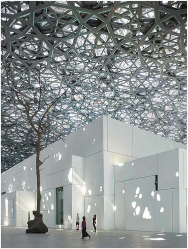
In his Project Louvre Abu Dhabi, which was built in 2017, Jean Nouvel designed an extraordinary double dome, 180 meters in diameter, which acted like a parasol producing a rain of LIGHT. The idea came from the palm tree of Abu Dhabi. In order to cast a shadow on the floor and wall, every ray of LIGHT has to penetrate eight layers of the dome which is made from a randomly perforated woven material. The shadow, together with the LIGHT spots, formed the dome which is thus named as “the rain of LIGHT” and the effect makes it feel as if the occupants are in a large and thickly overgrown forest with all kinds of leaf-bearing trees.
In this case, the specially designed eight-layer dome is the medium which breaks LIGHT into small piece and creates the feeling of forest in the building ().
Figure 1. The shadow in Louvre Abu Dhabi, UAE (Source: Roland Halbe, 2017)
3.2. Intensity
The intensity of LIGHT is also crucial to space atmosphere. High level of intensity encourages participation and increases enjoyment; while low level of intensity helps a person feel contented, comfortable, focused, and relaxed.
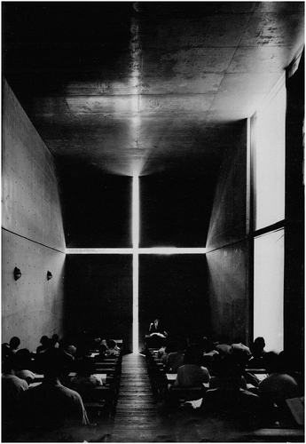
In his fabulous project the Church of Light in Osaka, Japan (Citation1999), Tadao Ando designed a cross in the thick concrete wall of Prayer room which allows LIGHT to pour into the space throughout the day. There are only a few lamps on the wall providing glimmer illumination for Bible reading and the main optical source comes from the cross in the east leads to dark interior space. It is the sharp contrast of LIGHT intensity between interior and exterior that makes the occupants concentrate on the spiritual and secular within themselves.
In this chapel, the concrete wall with a cross is the medium. The wall separates inside and outside space and introduces the floating cross of LIGHT to true darkness. Outdoor LIGHT that has been architecturalized and rendered abstract by the opening in the wall imparts tension to the space and makes it sacred (quoted in Francesco Dal and Ando, Citation1997)().
Figure 2. The intensity in the Church of Light, Osaka, Japan (Source: Richard C. Levene, 1994)
3.3. Colour
The third attribute of LIGHT is colour. As Le Corbusier once said, “For me, for twenty years, in my work where colour occupied half of my day”. (Corbusier Citation1932) For him, colour was an indispensable element both in his life and his design. It is said that Colour and LIGHT are inseparable for Le Corbusier, and he always used LIGHT to bring colours into buildings (Samuel Citation2007).
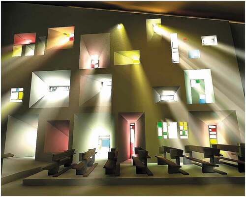
In his classic work Notre Dame du Haut in Ranchamp, France (1955) Le Corbusier intentionally designed a thick wall with voids expanding through the section of the wall smaller on the outside face, bigger on the inner face. These voids form deep openings in the wall which change the direction of the entered LIGHT. Windows with different colours are installed in those various openings through which sunlight turns into abundant colours. The LIGHT effect creates sensations in tune with the religious activities and promotes the quality of expressive and emotional space.
Obviously, in this precedent, the stained glasses are the mediums. The stained glasses change the isotropic natural LIGHT outside into different colours which intensely create religious atmosphere ().
Figure 3. Abundant colors in Notre Dame du Haut, Ronchamp, France (Source: Jim Lane, 2015)
3.4. Weight
Through these precedents, it is easy to understand that the mediums can be anything, like a randomly perforated woven material dome, a wall with a cross or coloured windows, as long as they can distinguish the indoor and outdoor space and convert natural LIGHT to precisely controlled interior optical source which can provide special space atmosphere.
In the same way, the expression of the weight of LIGHT also needs a medium. As LIGHT does not have weight or mass in any real sense, the medium should give the real sense of the volume of LIGHT, like a container filled with LIGHT. And the concept of “weight” is shown through the container and the relationship with the surroundings.
4. Alvaro Siza & FAUP
4.1. Design of FAUP by Alvaro Siza
Alvaro Siza was born in 1933 in Matosinhos, a small coastal town near Porto, Portugal. He graduated with an undergraduate degree of architecture in 1955, from the former School of Fine Arts of the University of Porto, the current Faculty of Architecture of Porto University (FAUP).
Siza is one of the most highly regarded architects of his generation, who is known for his sculptural works that have been described as modern poems. He was awarded with the renowned Pritzker Prize for his architectural designs in 1992.
In 1985, Alvaro Siza, already the preeminent Portuguese architect, was appointed to design his Alma Mater, the Faculty of Architecture for the University of Porto.
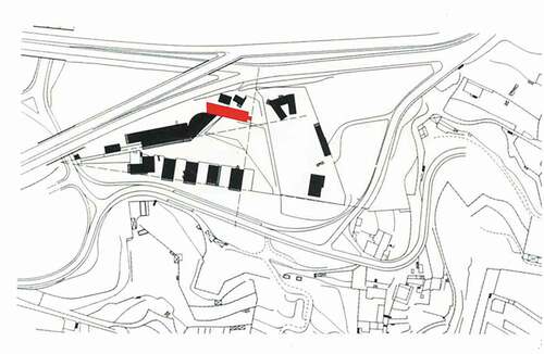
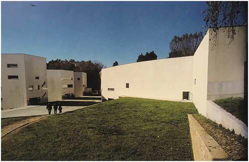
Siza wanted to make faculty buildings as 1:1 scale models for future architecture students to experience different spaces and various architectural elements. Instead of constructing a single block, he broke the whole building into small volumes according to specific activities and arranged the complex of buildings into two wings to fit in the triangular site. Four pavilions in the south wing are mainly studios for architecture students while the north wing is occupied by the breakfast hall, administration offices, semi-circular exhibition gallery and a library. All buildings are connected by an underground network of building-pathways (Dias Citation2009) ().
Figure 4. Site plan of FAUP
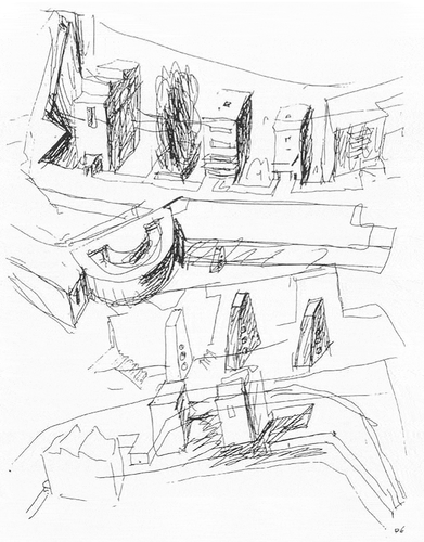
FAUP is a representative “lesson” in architecture education, in which Siza discusses the LIGHT related to different architecture elements (). The four pavilions of the studios are almost equivalent in their volume but differentiated by systems of openings in the façade creating different qualities of natural LIGHT. (Dias Citation2009) Siza discussed the relationship between LIGHT and sun shield in the administration building. He explored the top lighting both in the semi-circular exhibition gallery and library. In the gallery, he talked about the reflection: LIGHT reflected around different levels of ceilings and came gently into the semi-cylindrical space of the exhibition hall. As for the library, Siza particularly set a triangular prism to introduce the skylight into the library, which will be further discussed later in this paper.
Figure 5. Faculty complex Sketch by Alvaro Siza (Source: El Croquis Alvaro Siza 1958–2000, 2005)
4.2. Library and the triangular prism
Alvaro Siza (Citation2008) agreed with Frank Lloyd Wright that a building without windows looked more beautiful and he also admired Adolf Luth’s way of setting windows which was not limited by order and alignment but based on people’s activities in the room.
Those ideas had great impact on Siza and he believed the location or the shape of the openings in the building were related to special needs of interior space instead of architectural form or external imagination. The relationship among view of landscape, natural LIGHT and the interior space were the keys to set windows.
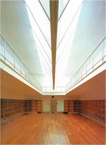
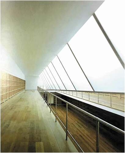
In this case, the library located between the urban road and playground, the acoustic isolation should be the first thing to consider. Therefore, no side-window was set but the top lighting system was introduced to the library ().
Besides, the local climate was considered in the design. Porto is located in north of Portugal but still belongs to the southern Europe which has strong sunlight from April to October with over 12 hours’ daylight in a day. In order to achieve a more uniform LIGHT for the reading needs of the library, the opening in the roof was oriented to the north with semi-transparent glass.
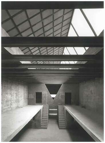
Inside the library, there was an inverted triangular prism crashing into ceiling, sharply cutting the space into two, like a blade (). The huge glass prism became the focus of the space that culminates the entire sequence. (Frampton Citation1999)
5. The weight of LIGHT
According to the analysis of colour, intensity, shadow of LIGHT mentioned above, obviously, these attributes are expressed through the container and the relationship with the surroundings, which can also be applied to the expression of the “weight of LIGHT”.
Based on a large number of studies and experiments, Rudolf Arnheim listed a large number of examples to demonstrate the existence and role of visual motivation in visual arts. He illustrated that the size, shape, color and other elements of the visual object would affect its visual weight. (Arnheim Citation[1954] 1974)
In the Porto University Library, the metal keeled prism equipped with obscured glass is the container of LIGHT. According to the research by Arnheim, the illusion of “the weight of LIGHT” is affected by features of the container, such as size, shape, material and state. In addition, the location of the container and the relationship between the container and the ceiling also impact the illusion creating ().
Figure 8. Library of FAUP (Source: El Croquis Alvaro Siza 1958–2000, 2005)
5.1. Container
5.1.1. Size
Common sense tells us that with objects that look identical apart from size, the bigger one is always heavier than the other. That is, volume is quite an important factor when we judge the weight of objects.
In Siza’s library, the volume of the prism seems relatively large. Compared to the volume of the library, the side length of the prism is 1/3 of the roof and the height is almost equal to that of the second floor. The size of the triangular prism is so big that it blocks the view of reading space in the second floor, giving maximum presence to the occupants.
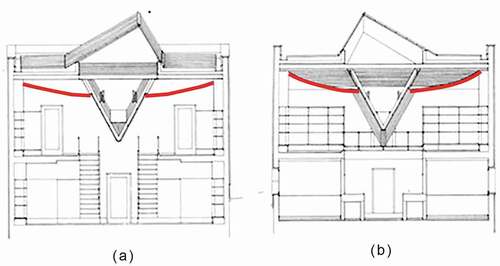
As shown in ), if the side length of the prism shortens to 1/5 of the roof length, the presence of the prism may decline. People are likely to regard it as a long strip of illuminate hanging on the roof. Worse still, the shrunken prism is not able to provide sufficient daylight for the whole space.
Figure 9. Container size
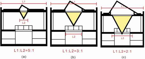
If the side length of the prism increases to the 1/2 of the roof length, shown in ), the prism would be much larger than the previous one. The lowest point of the prism would be lower than the floor slab. The increased volume of the prism makes the illuminate look heavier, but the oversized prism wold break the balance of the library space.
The appropriate volume of the prism was chosen in Siza’s work as in ), which was able to provide adequate LIGHT and also gave intense visual impact. Through the container, LIGHT was shaped in huge volume and given the basic impression of weight.
5.1.2. Shape
The shape of the illuminate is also a distinct factor to create the feeling of “weight of LIGHT”. The three containers with an equal cross-sectional area but in different shapes in presents various senses of “weight”.
Figure 10. Container shape
According to the foreshortening effects, the closer distance between the object and the observer is, the bigger the object looks. In the , it is easy to see that the lowest point of the triangular prism is closer than the cuboid and the half-cylinder to the observer. Therefore, the triangular shape is seen bigger in the eyes of observer.
Moreover, when something hanging upside, the shorter the distance is, the more oppressing sensation the observers receive. Apart from the distance, the shape of the triangular prism which was described as a blade by Frampton also leads to oppressing sensation which imply the weight of the LIGHT device. (Frampton Citation1999)
5.1.3. Material
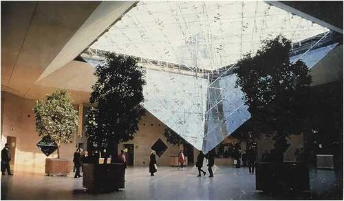
The material of objects is also a basic criterion to judge the “weight of LIGHT” when the objects are of the same size and shape. Different kinds of glass are used in the library of FAUP and the Louvre Pyramid creating distinct feelings about the glass volume in the space. I.M. Pei designed an inverted pyramid with transparent glass to illuminate the underground entrance to the museum (). The volume of the pyramid was quite big and also left a strong visual impact on visitors, but the huge volume could raise the awareness of the weight of LIGHT as they were able to clearly see the structure and the views above ground through the transparent glass. In this case, I.M. Pei took advantage of transparent glass to show the “light structure” of the inverted pyramid which stressed the striking contrast with the “heavy structure” of stone in the old buildings of the Louvre Palace.
Figure 11. Transparent glass in Louvre Pyramid (Source: Jianmin Huang, 1996)
The prism in Siza’s library was framed by a metal keel and equipped with obscured glass (). LIGHT slants through the opening of the slab. Then it reflects and diffuses between the concrete slabs and glass prism, which providing soft LIGHT into the space and creating better reading condition for readers. Siza applied the obscured glass in the prism to block the views behind the prism and stop people thinking about the openings as well as structures of the prism, which helped people concentrate on the LIGHT itself and feel the LIGHT was contained in the prism.
Figure 12. Obscured glass in the library
5.1.4. State
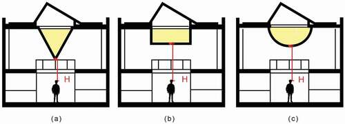
The slant angle always gives visitors an impression of unbalance. It is general knowledge that the heavier an object is, the greater force that gravitation exerts upon it. Just like water in a bottle, if the bottle of water is lifted at any point, the side which contains more water is heavier than the other side and thus the heavier side will be pulled down under gravitation.
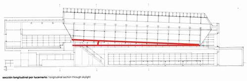
In the library, Siza set a slant angle to the prism that the lowest edge of the inverted triangular prism is not parallel to the slab. The east endpoint starts at the floor level of the first floor and the west endpoint stops in the wall about 60 cm higher (Shown in ). The slant angle of the prism suggested that the east end contained greater amount of LIGHT than the other side, creating an illusion that the west side is so heavy that this side leaned towards the earth.
Figure 13. Longitudinal section
5.2. The relationship between the prism and the surroundings
5.2.1. The position of openings
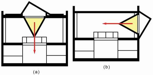
According to mechanics, when the earth’s gravity acts on an object, the force points toward the centre of the earth. In other word, tilt down force and horizontal force weaken or eliminate the feeling of weight.
In the library, the inverted triangular prism crushed into the roof like a giant crater colliding on the earth. The relationship between the prism and the roof gave occupants the illusion that the slot in the roof was cracked by the LIGHT prism under the gravitation.
If the position of the prism was changed into exterior walls, it would be easy for occupants to think that the prism is pushed into wall under a horizontal force. The weight of the prism (LIGHT) would be neglected therefore ().
Figure 14. The location of openings
As shown in , there was a triangular opening in the wall between the reading room and studying room which emphasis the rigidity of the LIGHT prism that was hard enough to cut the concrete wall apart. What’s more, thanks to the opening in the wall, people could not see the whole prism in the reading room and the volume of the prism would be exaggerated in their imagination.
Figure 15. Openings in the roof and wall
5.2.2. The ceiling and the roof
It is clearly shown in the two transverse sections that the ceiling of the library is arcuate and the side connected to the prism is relatively lower, which looks like the ceiling is trying to stop the prism from sinking but failed and curved down under the force of gravitation ().
Figure 16. Cross sections
5.3. Space and feeling
As we have developed the understanding of the “weight of LIGHT”, we may have a fresh idea about the space of the library that Siza created. A library was always considered to be the symbol of knowledge which has similar qualities to LIGHT in that they are both intangible and cannot be measured. The prism was the container to contain LIGHT through which the weight of LIGHT could be totally expressed. As for knowledge, the brain was the container, the more knowledge we gained, the more “weight” our brains would get. The design of the LIGHT prism inspired the readers to gain more knowledge when they study in this space. What’s more, the ways to create visual illusions to express the weight of LIGHT have positive effects on cultivating the creative thinking and innovation in education for architecture students.
6. Conclusion
The “weight of LIGHT” is an oxymoron in which apparently contradictory terms appear in conjunction. The concept is perhaps intangible as well as inconceivable, however, as seen in the discussion above, by exploiting our cognition of weight expressions and using the presence of a void to control the LIGHT is feasible to create a visual and emotional response to the abstract concept.
In the library of FAUP, the keel-framed container with obscured glass creates the void and the characteristics of the container and the relationship between the container and ambient architecture elements build the visual illusions of the LIGHT’s weight. The size, shape, material and the slant angle of the container leads to the weight of the “LIGHT prism” perceptible and the openings in the roof and walls as well as the curving ceiling strengthen the visual illusions.
The creative expression of the “weight of LIGHT” is a totally new understanding of the LIGHT. As we figure out the essences of the expression of the weight of LIGHT, we are able to develop other attributes of LIGHT, such as volume and thickness which are rich spatial experiences for the occupants.
Figure Credits
1. Roland Halbe, (2017) Louvre Abu Dhabi, http://www.jeannouvel.com/projets/louvre-abou-dhabi-3/, [Accessed: 5 January 2020]
2. Richard C. Levene, Fernando Márquez Cecilia. (1994), El Croquis: Tadao Ando 1983-1992, Italia: Asociación de Editores de Madrid
3. Jim Lane, (2015) Art Now and Then, http://art-now-and-then.blogspot.com/
2015/05/notre-dame-du-haut-ronchamp-france.html, [Accessed: 5 January 2020]
6,7. Translated by Lin Chonghua, Wu Lifeng (2008), Alvaro SIZA,Beijing: China Electric Power Press
11. Jianmin Huang. (1996). The art world of i.m. pei. Beijing: China planning press
15. Rui Morais de Sousa, (1993) tobebuild.archi,http://tobebuild.archi/post/164034275253/faup-library-porto-alvaro-siza-1993-rui-morais-de, [Accessed: 5 January 2020]
5,8,12,16. Fernando Mrquez Cecilia. (2005), El Croquis Alvaro Siza 1958-2000, Spain: El Croquis.
4,9-10,13-14,16. Figures were redrawn by the authors
Acknowledgments
I am grateful to Penny Lewis, Delia Gallagher and Jing Zheng for reading the earlier version of this paper and giving constructive suggestions.
Disclosure statement
No potential conflict of interest was reported by the authors.
Additional information
Notes on contributors
Hanxiao Zhu
Hanxiao Zhuis a graduate student of Wuhan University. She obtained her bachelor of architecture degrees both from University of Wuhan (China) and University of Dundee (UK) in 2018. She is interested in western modern architecture and Chinese vernacular architecture.
Yansong Wang
Yansong Wang is a professor of Wuhan University. He mainly does research into Chinese vernacular architecture.
Notes
1 In the following paper, the “LIGHT” will be used as noun, and the “light” will be used as adjective.
2 Light Construction [MoMA Exh. #1726,New York, September 20(21), 1995–2 January 1996].
3 Oxford Living Dictionary, Powered by Oxford University, available at: https://sso.oxforddictionaries.com/definition/light, Accessed: 15 January 2020.
4 Oxford Living Dictionary, Powered by Oxford University, available at: https://sso.oxforddictionaries.com/definition/weight, Accessed: 15 January 2020.
5 Translated by Morgan (Citation1914), Vitruvius: The ten books on architecture.
References
- Ander, G. D. 2003. Daylighting Performance and Design. 2nd ed. Canada: John Wiley & Sons. Hoboken, New Jersey.
- Annette, B., and S. P. Cachola. 2004. Light Structures. Beijing: Building industry press.
- Arnheim, R. [1954] 1974. Art and Visual Perception: A Psychology of the Creative Eye. Berkeley and Los Angeles: University of California Press.
- Corbusier, L. 1932. “Polychromie Architecturale.” unpublished preface for the Claviers Salubra, FLC B1(18), 1, 4. Cited in Colli, ‘La Couleur qui cache’, 22.
- Dias, A. 2009. “Faculty of Architecture, FAUP, Porto.” In Alvaro Siza, edited by G. Leoni, 54–57. Milan: ORE Motta Cultura srl.
- Dal Co, F., and Ando, T., 1997. Tadao Ando: complete works. Italy: Phaidon Press, P455.
- EL Croquis editorial. 2008. El Croquis: ‘The Meaning of Things: A Conversation with Alvaro Siza 2001-2008, 35. Italia: InterLogds S.R.L.
- Eschrich, J., and C. A. Miller. 2019. The Weight of Light: A Collection of Solar Futures. Tempe: Center for Science and the Imagination, Arizona State University.
- Frampton, K. 1999. “Architecture as Critical Transformation: The Work of Alvaro Siza.” In Alvaro Siza, edited by K. Frampton, 11–65. London: Phaidon Press Limited.
- Fuller, R. B. 1938. Nine Chains to the Moon: An Adventure Story of Thought. 1st ed. Philadelphia: Lippincott.
- Jianguo, W., and Z. Tong. 1999. Tadao Ando. Beijing: China building industry press.
- Translated by Morgan, M. H. 1914. Vitruvius: The Ten Books on Architecture. Cambridge, MA: Harvard University Press.
- Nerdinger, W. 2005. Frei Otto. Complete Works: Lightweight Construction - Natural Design. Boston: Birkhäuser.
- Pound, R. V. 2001. “Weighing Photons, II.” Physics in Perspective 3 (1): 4–51. doi:https://doi.org/10.1007/s000160050055.
- Rasmussen, S. E. 1964. Experiencing Architecture. Massachusetts: MIT Press.
- Samuel, F. 2007. Le Corbusier in Detail, 64. Burlington: Architectural Press.
- Tanizaki, J. 1977. In Praise of Shadows. USA: Leete’s Island Books.
- Xiaozhu, H. W., L. Jianfeng, and J. Zhouyi. 2018. “A Study on Visual Form of Light Tendency Architecture.” New Architecture 2018 (5): 93–97.