
ABSTRACT
Geographic visualization tools with coordinated and multiple views (CMV) typically provide sets of visualization methods. Such configuration gives users the possibility of investigating data in various visual contexts; however, it can be confusing due to the multiplicity of visual components and interactive functions. We addressed this challenge and conducted an empirical study on how a CMV tool, consisting of a map, a parallel coordinate plot (PCP), and a table, is used to acquire information. We combined a task-based approach with eye-tracking and usability metrics since these methods provide comprehensive insights into users’ behaviour. Our empirical study revealed that the freedom to choose visualization components is appreciated by users. The individuals worked with all the available visualization methods and they often used more than one visualization method when executing tasks. Different views were used in different ways by various individuals, but in a similarly effective way. Even PCP, which is claimed to be problematic, was found to be a handy way of exploring data when accompanied by interactive functions.
1. Introduction
Geographic visualization (geovisualization) tools that integrate several visualization methods and are equipped with a number of interaction techniques are usually known as coordinated and multiple views (CMV) tools. Integrating various views can be more helpful than using individual displays (Edsall Citation2003a), but users may become confused and overwhelmed when using a CMV tool (Baldonado et al. Citation2000) and even more so because of a growing diversity of representations (Griffin and Fabrikant Citation2012). Although several authors have addressed the issue of how CMV tools work for users (e.g. Andrienko et al. Citation2002, Guo et al. Citation2005, Robinson et al. Citation2005, Marsh et al. Citation2006, Demšar Citation2007, Bhowmick et al. Citation2008), we still need to know more about how users of CMV tools apply and understand different visualization methods that present the same input data. We revisited this issue by conducting a study on a CMV tool that consisted of a map, a parallel coordinate plot (PCP) and a table. We selected these three visualization methods for the following reasons: maps are canonical in geographical displays (Roberts Citation2008), data displays such as interactive PCPs serve as components in most CMV tools, while tables are well known to users and are useful if equipped with the proper interaction techniques (Rao and Card Citation1994). We wanted to know whether users would willingly use a variety of displays that had different visualization methods, or reluctantly refer to different views in order to reduce the cognitive effort connected with context switching. Context switching is when a user switches from one display, based on one particular visualization method, to another display, based on another visualization method (Baldonado et al. Citation2000). Three research questions motivated our efforts:
Do individuals make use of several visualization methods even though they present the same input data?
Does the use of visualization methods differ between the types of tasks being executed?
Do individuals avoid working with a PCP if the same content is displayed simultaneously in other views?
By addressing these questions we hope to contribute to an increased understanding of how CMV geovisualization tools should be designed in order to support users effectively.
2. Background
2.1. Coordinated and multiple views
Visualization methods in CMV often include map displays, charts, graphs and PCPs, as well as networks, trees, hierarchies, routing diagrams and tables. Typically, all these visualization methods are interactive since they assist users in exploring the data sets in various ways (Baldonado et al. Citation2000). Of special interest to our study are situations in which CMV tools contain a set of views presenting the same data but in various forms, and whether or not this makes visualization more effective. An effective visualization is characterized by the use of minimum cognitive effort, but may be violated due to context switching (Baldonado et al. Citation2000). There is a risk that a user, when exploring the data, may not take advantage of the CMV tool and use only one view where it presents the same data as the other views, assuming that using only one view reduces demand on cognitive attention.
Some authors, nevertheless, report that the time cost for context switching may not be significant (Convertino et al. Citation2003) or that users tend to perceptively integrate information given in various components (Opach et al. Citation2014). In the latter study, however, the authors admit that cognitive shortages may occur if a CMV tool is composed of both static and animated map components. Yet they applied a limited number of visualization methods in their studies.
2.2. Effectiveness of parallel coordinate plots in the context of CMV tools
Two of the three selected visualization methods for our study (map and table) are widely applied in CMV tools and recognized for their usefulness (Edsall Citation2003a, Koua et al. Citation2006). However, some GIScience studies have revealed that the third visualization method, PCP, is confusing and difficult to use (Convertino et al. Citation2003, Robinson et al. Citation2005). Other studies have shown that when used together with maps, PCP may facilitate the understanding of spatial characteristics (Edsall Citation2003a, Opach and Rød Citation2014).
Users may select and apply a method that is not the most effective for a task (Mendonça and Delazari Citation2012) and, therefore, may not discover ‘the richness of the underlying data’ (Roberts Citation2007, p. 61). People may not take full advantage of CMV tools and may avoid using some views if they are perceived as challenging to learn. In order to fully exploit CMV tools it is important to understand how users work with CMVs in situations where they are free to use any of the implemented visualization methods.
3. Human–computer interaction and CMV tools
CMV tools are important in the explorative and analytical phases of the map use space (MacEachren and Kraak Citation1997) that is commonly enabled by interactive techniques with dynamic linking and brushing functionalities. However, due to the CMV tool’s inherent complexity, such tools can be problematic for users and are therefore seldom used by non-specialists (Andrienko and Andrienko Citation2006a). For wider use of CMV tools, it is, therefore, necessary to understand how these tools are used, and usability studies that compare and evaluate selected user tasks (e.g. Tobón Citation2005, Koua et al. Citation2006) are recognized as appropriate (Slocum et al. Citation2001, Citation2003, Koua and Kraak Citation2004). This formal evaluative approach is complementary to an exploratory, insight-based approach, where users are engaged in free data exploration (Demšar Citation2007, Chang et al. Citation2009). It also provides precise metrics. For instance, error rates and response times refer to users’ performance and provide information about effectiveness and efficiency, respectively (e.g. Çöltekin et al. Citation2009); whereas learnability focuses on the ability of users to understand the purpose of the tools and learn how to use them; while memorability refers to the ability of users to retain the acquired skills and utilize the tools after a period of time (e.g. Andrienko et al. Citation2002).
Tasks in a formal evaluation are typically derived from task taxonomies. For instance, Koua et al. (Citation2006) assessed the usability of three visualization methods using Zhou and Feiner’s (Citation1998) visual task taxonomy. Çöltekin et al. (Citation2010) used tasks from Gotz and Zhou’s (Citation2009) taxonomy when comparing differently designed geovisualization applications. The latter example shows that task taxonomies are helpful in studies that apply the eye-tracking method.
GIScience researchers often use eye-tracking in usability studies (Çöltekin et al. Citation2009, Ooms et al. Citation2012) and it still holds the promise of new insights (Montello Citation2009). Since this technique records the location of fixations (stable points of regard, held for a length of time, which suggests that a person is reading the content at this location), it provides insight into visual behaviour in an unobtrusive manner (Fabrikant et al. Citation2008). Eye-tracking data, when combined with usability metrics (the accuracy and time of response), give answers to what users tend to look at, and why they do so.
However, eye-tracking is seldom applied to studies of CMV geovisualization tools. An exception is Convertino et al. (Citation2003), who investigated the differences between the most and the least successful individuals in respect to correctness when working with a dual-view layout. Although inspiring, Convertino et al.’s study applied eye-tracking in a basic way. To the best of our knowledge, more extensive studies using eye-tracking to understand how people work with CMV tools do not exist in GIScience literature.
4. Empirical study
We conducted an eye-tracking study to learn more about how users of CMV tools apply three different visualization methods that present the same input data. As context switching may be an issue, we wanted to find out whether users of CMV tools tend to keep their attention within one visualization component or rather jumped across components in their search for information.
4.1. Materials and methods
We used a web-based tool (Opach and Rød Citation2013) with map, table and PCP views () as the study material (http://setebos.svt.ntnu.no/viewexposed/). All views are linked, so that if a user selects one or more objects in one view, the same data items are simultaneously highlighted in the other views: for example, the map is centred on selected objects, and those objects are highlighted in the PCP and table views.
Figure 1. The layout of the CMV tool used as the study material.
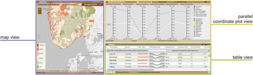
The tool contained information on integrated vulnerability to natural hazards in Norway. Integrated vulnerability combines indices on exposure to floods, landslides and storms with indices of social vulnerability; recognizing that the interaction between physical and socio‐economic factors is essential in determining the outcome of extreme events. High values for any of these indices on exposure means that a proportionally high number of buildings are situated in a potentially dangerous place. The indices of social vulnerability represent the capacity of the municipalities to prepare for, respond to, and recover from extreme events. Combining information on integrated vulnerability with various visualization methods enables users to explore data in different ways: maps help to identify the most exposed and/or vulnerable places (answers ‘where?’), PCPs help with understanding what makes a certain municipality exposed and/or vulnerable (answers ‘why?’), and tables let the user access the raw data (see Rød et al. Citation2015 for details).
Since people tend to look at the things they are thinking about (Nielsen and Pernice Citation2010), we asked the participants to solve five tasks, and recorded their eye movements during task execution. As converging methods are essential for assessing complex geospatial interfaces (Buttenfield Citation1999, Robinson et al. Citation2005), we combined eye-tracking with usability metrics (time and accuracy of answers). The study was conducted in an area used for controlled audio and visual perception experiments: the Speech, Cognition and Language Laboratory (SCaLa) at the Department of Psychology of the Norwegian University of Science and Technology (NTNU). An SMI RED500 eye-tracker was used. The stimulus was displayed on a 21-inch screen with a resolution of 1680 × 1024 pixels while the recording sample was set at 120 Hz.
We used four analytical approaches to investigate the eye-tracking data that was collected. We divided the tools’ layout into three areas of interest (AOI), covering each view: the map (33% of the layout), the PCP (31%) and the table (20%). A separate AOI called ‘Task’ (14% of the layout) was situated at the bottom part of the interface, and displayed the task questions. First, to get an overview of the tool usage, we compared total fixation lengths for each AOI.
Next, we applied sequence alignment analysis (SAA) to investigate how visual attention changes during task execution and to identify whether any patterns could be distinguished among visual behaviours. SAA allows for the identification of similarities between sequences of objects based on the frequency and position of the objects and the transition between them. It has previously been used within GIScience in general (Shoval and Isaacson Citation2007, Golebiowska Citation2015), and for eye movement studies in particular (Fabrikant et al. Citation2008, Opach et al. Citation2014). As did the latter authors, we too used ClustalG software (Wilson Citation2008) to determine the sequences of the viewed AOIs for each task.
Unfortunately, SAA does not include fixation duration. Hence, both a quick glance and a long fixation are treated equally. In order to verify whether the user groups distinguished in the SAA also differed when fixation duration was taken into account, we performed a task execution analysis (TEA). TEA is an approach that makes it possible to investigate the location of points of regard on a screen over time. To eliminate differences between particular task execution times, all eye movement recordings are standardized to one equal length.
Finally, we analysed viewing purpose (VPA) to identify the visualization methods used for conducting the two critical stages of tasks execution: selection and information extraction. The stages refer to the two parts for all possible tasks: the constraint (the conditions the information needs to fulfill) and the target (the information that needs to be obtained) (Andrienko and Andrienko Citation2006b). In order to get this data, we overlaid the animated eye-movement paths onto the screen recordings showing the interactions with the tool, and synchronized it with recordings of the participants’ verbal answers. In this analysis we were also able to find out which visualization was successfully used in each task, since a high number or long fixation on a given view does not necessarily mean that it is helpful: the reason may be that it is problematic and time-consuming and thus users have to make more effort to get the information (Jacob and Karn Citation2003).
4.2. Tasks
As little research has focused on how humans perceive, understand and use geovisual analytics tools (including CMV) to gain insight into complex data and visualizations; we decided to start exploring the problem using a formal evaluative approach that demands less cognitive effort from the user than an exploratory usability evaluation (Marsh et al. Citation2006, Demšar Citation2007). We focused on the specific visual operations that are carried out in the process of exploring (large) data sets. The exploration process can be viewed as a set of basic tasks (Koua and Kraak Citation2004, Koua et al. Citation2006) such as checking the spatial positioning of elements of interest in order to verify spatial proximity among them, or obtaining an overview of how a target value measured at one particular spatial location varies for different attributes. To complete these various tasks, the user has to execute different types of visualization operations (Tobón Citation2005). Such operations have proved to be helpful in the evaluation of geovisualization tools (Tobón Citation2005, Koua et al. Citation2006).
We chose the taxonomy of Amar et al. (Citation2005), which refers to low level operations, i.e., the ones that correspond to, or build up, tasks derived from other taxonomies (). This feature makes it easier to compare results between studies. Furthermore, since CMV tools are developed not only within the GIScience domain, we wanted to use a taxonomy that refers to visualization activities in general, not only those typical of geovisualization. Out of the 10 tasks in the taxonomy, we selected five that could be executed using all three of the visualization methods selected for the study. The tasks were not laborious, but they differ in terms of cognitive load. We believe that cognitive load is connected with the dimensionality of the task (number of variables) and spatial extent/scale (number of cases/objects) they involve. Therefore, the cognitive load increases from T1, which involves one variable and one case, to T5, which involves multivariate analysis of multiple cases ().
Table 1. Task questions and the task types they represent according to different task taxonomies.
4.3. Participants
Taking part in the study were 29 participants (11 females and 18 males), aged from 22 to 41 years (with an average of 27 years). All of them were geography students at either masters (79%) or PhD level (21%). The sample size was based on recommendations from usability engineering literature (Nielsen Citation1994) regarding final testing that involves actual use. It is also in accordance with the sample sizes used in successful empirical studies of geovisualization tool evaluation (Koua et al. Citation2006, Çöltekin et al. Citation2009).
In the background questionnaire participants reported using interactive maps mainly to locate interesting places, plan journeys, or for fun. They were also asked to estimate their level of training in several fields using a scale ranging from 1 (no training) to 5 (full training). The average score for training in cartography was 2.8, for computer graphics, web-mastering and user interface design they scored: 2.0, 1.5 and 1.7, respectively. All users were provided with a 10-minute introduction to the general tool interface directly before solving the tasks.
5. Data analysis and results
5.1. Areas of interest analysis: total fixation length
The AOI analysis revealed that the participants tended to look at all views when executing tasks T1 through T5 (see ). A factorial ANOVA yielded the main effect for the visualization method on fixation length. The table view received the longest fixation length among the implemented visualization methods (see last row in ). The main effect of the task type was also significant (F = 9.992, p = 0.001), fixation length was the longest for T5 and the shortest for T2 (see last two columns in ). Moreover, the factorial ANOVA confirmed an interaction effect for visualization method and task type for fixation length (F = 36.221, p = 0.001), indicating that the visualization method effect differs between tasks. For T1 (retrieve value) the participants viewed the table for significantly longer than the map (F = 3.383, p = 0.041), in T2 (filter) the table was viewed for significantly longer than the map (F = 35.682, p = 0.001) and the PCP (p = 0.001), whereas in T3 (characterize distribution) the map was viewed for a significantly shorter time than the PCP (F = 9.513, p = 0.020) or the table (p = 0.001). In T4 (correlate) users viewed the table for the longest period (F = 15.059, p = 0.001 for both the map and the PCP). Finally, in T5 (find anomalies), the map was viewed for a significantly shorter time than both the PCP (F = 10.742, p = 0.001) and the table (p = 0.003). Moreover, the map view was viewed significantly longer in T4 than in T2 (F = 3.831, p = 0.005), the PCP view was viewed significantly longer in T5 than other tasks, and viewed longer in T2 than in T3 (F = 23.448, p = 0.001).
Table 2. Total average fixation times for the three views while executing tasks.
5.2. Sequence alignment analysis
The SAA revealed that patterns representing participants’ visual behaviour varied depending on the task, except in the initial stages (marked with TQ in ) where individuals focused on the question AOI. For all tasks except T2, eye-movement recordings distinguished the participants into three groups of users: map-oriented, PCP-oriented and table-oriented (). T2 resulted in a homogenous visual behaviour: all were classified as table-oriented as they worked mostly with this component.
Figure 2. The sequence alignment analysis results with subgroups of the participants distinguished by tasks. Each row indicates a sequence of eye-fixations recorded for one participant.
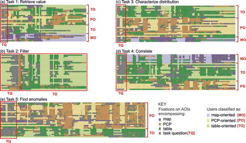
We checked if particular participants were classified in the same group (map-, table- or PCP-oriented) across tasks. It turned out that most participants were changing their preferences, as only one participant was classified in the same (table-oriented) group for all five tasks.
5.3. Task execution analysis
The TEA approach enabled us to identify the dominant places of attention during the task execution’s relative start, middle and end, and compare participants’ visual behaviours. We developed the Eye Movement AOI Aggregation Tool (EMAAT) using JavaScript and HTML5 with a web browser-based interface, since available eye-movement software lacked the required sophisticated functionality (Fabrikant et al. Citation2008). The EMAAT filters eye-movement data based on tasks and the participants’ IDs. The tool depicts aggregated AOI locations of fixations over standardized task execution times. Five AOIs were included in the interface as horizontal parallel axes (see screenshots in ).
Figure 3. Screenshots from the EMAAT tool arranged by task number (rows) and user group (columns). The screenshots depict individuals’ visual behaviour during relative task execution time: the thicker the line, the more the participants fixated on a particular AOI.
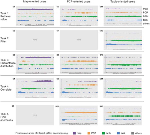
The TEA confirmed the differences in individuals’ visual behaviours that were revealed in the SAA (). The behaviours were aggregated for user groups (columns) and arranged by the five tasks (rows). Only the table-oriented users focused mostly on one view in all tasks (screenshots: S12, S13, S14, S15). PCP-oriented users often referred to the table (S6, S8, S9), whereas map-oriented users often referred to two other views (S1, S3). Map-oriented users focused on the map, although not from the very beginning of the task execution (S1, S3, S4). At the beginning and end of all task executions, there was higher attention targeted on the task AOI: participants first read the task questions, while at the end they double-checked the questions before answering.
5.4. Viewing purpose analysis
Let’s consider one case from , screenshot S4, which summarizes the map-oriented users’ visual behaviour in T4. First, the question area was frequently viewed. Subsequently, participants focused mainly on the table; and then the focus moved to the map. Such shifts may indicate that visual behaviour consists of stages where different views are preferred and used for different purposes. As was mentioned in Section 4.1, we divided each task into two stages (selection and information extraction), and identified which views were applied in each stage.
In all but one task, participants used most of the implemented visualization methods for both stages (). Only T2 was solved through interacting with one view alone, the table (), which confirms the SAA outcomes. In T1 most participants used the table in order to select the required municipality (). A majority used the same view for both stages (mostly the table). Three participants used the PCP for information extraction, although the PCP-oriented group was higher (). Even though certain participants started with the PCP, a portion of them moved their attention to other views where they finally managed to find the answer. T3 was executed mainly through the use of the PCP and table (). Most participants used the PCP for selection. Two-thirds of this group continued to work with this view for information extraction. Others shifted attention to the table and only one participant to the map. The latter finding differs from the SAA’s outcomes where the map-oriented group included four individuals, but only one of them found the information searched for in the map. T4 was solved in the most heterogeneous way (). Of the participants, 67% used the table for selection, but only half of this group continued with this view, the rest of them worked mainly with the map for information extraction. Of the users, 28% used the map for selection and, except one, for the information extraction stage. Even though the SAA classified seven participants as PCP-oriented (), the PCP was used by the lowest number of participants. In T5, 83% of participants used the PCP for object selection, and 62% of users also used this view for information extraction, which confirms the results of the SAA, classifying the majority of participants as PCP-oriented.
Figure 4. Visualization methods that users referred to in the two critical stages of task execution.
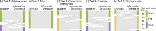
Despite the need for context switching, participants who applied different visualization methods for selection and for information extraction did not need longer response times for most of the given tasks. A factorial ANOVA showed the interaction effect between variables: ‘number of visualization methods applied when executing a task’ and ‘task types’ (F = 56.706, p = 0.001). Only for T4 did we find a significant difference between the scores of those who applied the same view (M = 64.97 sec, SD = 24.46) and those who applied different views (M = 139.87 sec, SD = 66.11); t(27) = −4.451, p = 0.001. Most of those who applied different views (7 out of 10) for this task used the table for selection and the map for information extraction. Table and/or map was thus the least appropriate for the correlate task, an issue we will further elaborate in the discussion section.
5.5. Answer correctness
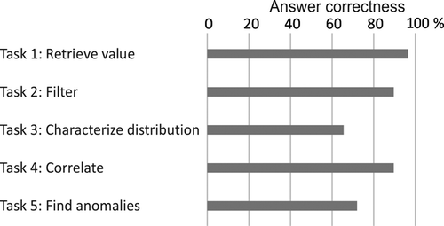
Although most users gave correct answers, none of the tasks was solved correctly by all. As presented in , T1 resulted in the highest rate of correct answers, whereas T3 resulted in the lowest value of correctness, as 35% of the participants answered it incorrectly.
Figure 5. Answer correctness.
There was no significant difference in answer correctness between participants who were classified as map, PCP or table-oriented in tasks 1–4. Only in T5 did users, classified as table-oriented, gave more incorrect answers than those classified as PCP-oriented (χ2 (1, N = 29) = 24.22; p < 0.01). There was no statistically significant change in response time between the subgroups of participants. Moreover, any significant differences regarding answer correctness were observed between those who applied different visualization methods for selection and information extraction in tasks 1–4, and those who applied the same method in those stages. Again, in T5, users who applied the table for information extraction gave more incorrect answers than other users (χ2 (2, N = 29) = 19.94; p < 0.01).
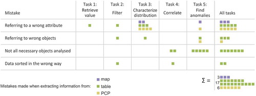
It turned out that most of the incorrect answers were given when the table was used for information extraction (). The mistakes were primarily caused by referring to a wrong attribute (65% of incorrect answers) in the table. Other causes concerned referring to the wrong object, not analysing all the necessary objects, and incorrect data sorting.
Figure 6. Mistakes and their causes.
6. Discussion
All five analytical approaches used to investigate the empirical data revealed that participants worked with the three visualization methods in CMV for most of the tasks. The VPA revealed that different visualization methods were applied for selection and for information extraction. In four out of five tasks, some participants used different views during the task execution and this behaviour did not result in lower answer correctness. Like Convertino et al.’s (Citation2003) study, we did not find that using different views resulted in longer response times. The one exception was for T4, where a longer response time for users applying different views was observed, mainly when switching from the table to the map. Contrary to the visualization methods applied in other views, choropleth map display only one variable at a time. Consequently, CMV tools often use several layers of choropleth maps to present multivariate data. The variable required for T4 was portrayed on one of the map layers, but not the one enabled by default. Additionally, analysis of screen recordings revealed that participants who used the map for information extraction were unsure as to whether the units selected in the table were visible within the current extent of the map. They were panning the map to check the areas outside the map’s display range, consequently resulting in a longer response time.
We also investigated whether there were any patterns regarding the way in which individuals interacted with the tested tools. Participants were classified as map, table and PCP-oriented in the SAA and confirmed by the TEA. Apart from T2, map, PCP and table-oriented users were distinguished by tasks. Participants’ willingness to work with a particular visualization method in various task types supports Roberts’s (Citation2008) claim that users might find different methods better for data manipulation. Response times and accuracy did not differ for users who focused on different views and those who used only one view in a particular task, confirming Edsall’s (Citation2003a) conclusion that there is no difference in response accuracy between visualization methods. However, Edsall (Citation2003a) examined PCP and scatterplot only, whereas we investigated map, PCP and table.
We further analysed how the use of visualization methods differed between stages of selection and information extraction for the five tasks. Only T2 resulted in a fairly homogenous users’ attention, as all participants used the table for selection and information extraction. Although tables are often considered inconvenient and ineffective for data display, data filtering and sorting implemented within the table made it preferable for many individuals. Koua et al. (Citation2006), who tested map and PCP for similar tasks, found that individuals prefer the map and considered it suitable. However, those individuals were not offered a table for filter operations. A complex task, such as T5, was conducted mainly with the use of the PCP. Those who chose to use the table view for this task gave significantly more incorrect answers. The result confirms the usefulness of PCPs in the analysis of multivariable data (Edsall Citation2003a).
The participants were free to use any of the available visualization methods, allowing us to identify if participants avoided using the PCP. Although the use of PCPs is believed to be undesirable by people, our study suggests otherwise. Koua et al. (Citation2006) reported that users working with PCP to solve the locate task (analogue to T1 in our study), required twice as much time as those who used the map for the same task. We concluded differently. The individuals classified in the SAA as map-oriented were not significantly faster than PCP-oriented participants. Participants willingly used the PCP, and we believe the efficient use of the PCP is a result of individuals being able to filter the PCP’s polylines and dynamically brush them through other views. Furthermore, in T3, most participants were classified as PCP-oriented, i.e. they fixated most on the PCP, and the PCP was used by the majority of participants for object selection. This data filtering, implemented in the PCP, helped overcome its visual clutter (Heinrich and Weiskopf Citation2013). For T1 and T4, participants often selected data items in views other than the PCP. However, the dynamic linking implemented in the tool highlighted the selection in the PCP. Thus, selections made in other views overcame the visual clutter in the PCP and individuals frequently read the searched for information from the PCP. All these findings support Edsall’s (Citation2003b) claim that interaction techniques may remedy the negative effects of the visual clutter typical of PCPs. We therefore claim that tables as well as PCPs can be a handy way of displaying data even for simple tasks: if it is accompanied by interactive functions that help explore the data.
7. Conclusion
We examined the way in which people interacted with the CMV tool when they were free to use any of the three implemented visualization methods, even if they presented the same input data. It turned out that the individuals willingly worked with all the available visualization methods without any time cost for context switching. The freedom to choose a preferred visualization method (due to custom, experience, or just an on-the-spot decision) is the essential power of CMV tools. Different views were used in different ways by various participants, but they performed in a similarly efficient way. Such an outcome proves that integrating various visualization methods in a CMV tool can be more effective than using them separately.
Adequate interaction techniques are crucial to a CMV tool’s effectiveness, even for visualization methods like PCP that is claimed to be challenging. A set of interaction techniques, for example, the ability to filter data and dynamically brush them through other views, made the PCP attractive to participants.
We hope that our results encourage a deeper investigation of how people interact with CMV tools. Having conducted an inquiry using simple visualization operation tasks that built up the process of data exploration, we have seen how three different visualization methods were applied during the execution of five tasks. A further valuable investigation would be to study how users develop hypotheses (similar to e.g. Demšar Citation2007), without the predefined tasks, but still with the help of a CMV geovisualization tool. We believe that obtaining such knowledge will help identify issues and design solutions so that CMV geovisualization tools can be applied successfully.
Acknowledgments
This research was supported by the Research Council of Norway and by the Top-level Research Initiative/NordForsk through the contribution to the Nordic Center of Excellence for Strategic Adaptation Research (NORD-STAR).
Disclosure statement
No potential conflict of interest was reported by the authors.
Additional information
Funding
References
- Amar, R., Eagan, J., and Stasko, J., 2005. Low-level components of analytic activity in information visualization. In: IEEE Symposium on Information Visualization, 23–25 October 2005 Minneapolis. Los Alamitos, CA: IEEE, 111–117.
- Andrienko, N. and Andrienko, G., 2006a. The complexity challenge to creating useful and usable geovisualization tools. In: M. Raubal, ed. Geographic Information Science: fourth International Geoconference, GIScience 2006, September 2006 Münster, Solingen: Verlag Natur & Wissenschaft, 23–27.
- Andrienko, N. and Andrienko, G., 2006b. exploratory analysis of spatial and temporal data. A systematic approach. Berlin Heidelberg: Springer.
- Andrienko, N., et al., 2002. Testing the usability of interactive maps in CommonGIS. Cartography and Geographic Information Science, 29 (4), 325–342. doi:10.1559/152304002782008369
- Baldonado, M.Q.W., Woodruff, A., and Kuchinsky, A., 2000. Guidelines for using multiple views in information visualization. In: AVI ‘00 Proceedings of the working conference on Advanced visual interfaces, 24–26 May 2000 Palermo. New York: ACM, 110–119.
- Bhowmick, T., et al., 2008. Distributed usability evaluation of the Pennsylvania Cancer Atlas. International Journal of Health Geographics, 7, 36. doi:10.1186/1476-072X-7-36
- Buttenfield, B., 1999. Usability evaluation of digital libraries. Science & Technology Libraries, 17 (3–4), 39–59. doi:10.1300/J122v17n03_04
- Chang, R., et al., 2009. Defining insight for visual analytics. IEEE Computer Graphics and Applications, 29 (2), 14–17. doi:10.1109/MCG.2009.22
- Çöltekin, A., Fabrikant, S.I., and Lacayo, M., 2010. Exploring the efficiency of users’ visual analytics strategies based on sequence analysis of eye movement recordings. International Journal of Geographical Information Science, 24 (10), 1559–1575. doi:10.1080/13658816.2010.511718
- Çöltekin, A., et al., 2009. Evaluating the effectiveness of interactive map interface designs: a case study integrating usability metrics with eye-movement analysis. Cartography and Geographic Information Science, 36 (1), 5–17. doi:10.1559/152304009787340197
- Convertino, G., et al., 2003. Exploring context switching and cognition in dual-view coordinated visualizations. In: Proceedings of The Coordinated & Multiple Views in Exploratory Visualization, 15 July 2003 London. Los Alamitos, CA: IEEE, 55–62.
- Demšar, U., 2007. Investigating visual exploration of geospatial data: an exploratory usability experiment for visual data mining. Computers, Environment and Urban Systems, 31 (5), 551–571. doi:10.1016/j.compenvurbsys.2007.08.006
- Edsall, R.M., 2003a. Design and usability of an enhanced geographic information system for exploration of multivariate health statistics. The Professional Geographer, 55 (2), 146–160.
- Edsall, R.M., 2003b. The parallel coordinate plot in action: design and use for geographic visualization. Computational Statistics & Data Analysis, 43 (4), 605–619. doi:10.1016/S0167-9473(02)00295-5
- Fabrikant, S.I., et al., 2008. Novel method to measure inference affordance in static small-multiple map displays representing dynamic processes. The Cartographic Journal, 45 (3), 201–215. doi:10.1179/000870408X311396
- Golebiowska, I., 2015. Legend layouts for thematic maps: a case study integrating usability metrics with the thinking aloud method. The Cartographic Journal, 52 (1), 28–40. doi:10.1179/1743277413Y.0000000045
- Gotz, D. and Zhou, M.X., 2009. Characterizing users’ visual analytic activity for insight provenance. Information Visualization, 8 (1), 42–55. doi:10.1057/ivs.2008.31
- Griffin, A.L. and Fabrikant, S.I., 2012. More maps, more users, more devices means more cartographic challenges. The Cartographic Journal, 49 (4), 298–301. doi:10.1179/0008704112Z.00000000049
- Guo, D., et al., 2005. Multivariate analysis and geovisualization with an integrated geographic knowledge discovery approach. Cartography and Geographic Information Science, 32 (2), 113–132. doi:10.1559/1523040053722150
- Heinrich, J. and Weiskopf, D., 2013. State of the art of parallel coordinates. In: M. Sbert and L. Szirmay-Kalos eds. Eurographics 2013: STAR – state of the art report. Geneva: The Eurographics Association, 95–116.
- Jacob, R.J.K. and Karn, K.S., 2003. Eye tracking in human-computer interaction and usability research: ready to deliver the promises. In: J. Hyona, R. Radach, and H. Deubel, eds. The mind’s eye: cognitive and applied aspects of eye movement research. Amsterdam: Elsevier Science, 573–605.
- Koua, E.L. and Kraak, M.-J., 2004. A usability framework for the design and evaluation of an exploratory geovisualization environment. In: Proceedings of the Eight International Conference on Information Visualization, 14–16 July 2004. Los Alamitos: IEEE, 153–158.
- Koua, E.L., MacEachren, A., and Kraak, M.-J., 2006. Evaluating the usability of visualization methods in an exploratory geovisualization environment. International Journal of Geographical Information Science, 20 (4), 425–448. doi:10.1080/13658810600607550
- MacEachren, A. M. and Kraak, M.-J., 1997. Exploratory cartographic visualization: advancing the agenda. Computers & Geosciences, 23 (4), 335–343.
- Marsh, S.L., Dykes, J., and Attilakou, F., 2006, Evaluating a geovisualization prototype with two approaches: remote instructional vs. face-to-face exploratory. In: Proceedings of the Information Visualization, 5–7 July 2006 London. Los Alamitos, CA: IEEE, 310–315.
- Mendonça, A.L.A. and Delazari, L.S., 2012. Remote evaluation of the execution of spatial analysis tasks with interactive web maps: a functional and quantitative approach. The Cartographic Journal, 49 (1), 7–20. doi:10.1179/1743277411Y.0000000020
- Montello, D., 2009. Cognitive research in GIScience: recent achievements and future prospects. Geography Compass, 3 (5), 1824–1840. doi:10.1111/geco.2009.3.issue-5
- Nielsen, J., 1994. Usability engineering. San Francisco, CA: Morgan Kaufmann.
- Nielsen, J. and Pernice, K., 2010. Eyetracking web usability. Berkeley: New Riders.
- Ooms, K., et al., 2012. Interpreting maps through the eyes of expert and novice users. International Journal of Geographical Information Science, 26 (10), 1773–1788. doi:10.1080/13658816.2011.642801
- Opach, T., Gołębiowska, I., and Fabrikant, S.I., 2014. How do people view multi-component animated maps? The Cartographic Journal, 51 (4), 330–342. doi:10.1179/1743277413Y.0000000049
- Opach, T. and Rød, J.K., 2013. Cartographic visualization of vulnerability to natural hazards. Cartographica, 48 (2), 113–125. doi:10.3138/carto.48.2.1840
- Opach, T. and Rød, J.K., 2014. Do choropleth maps linked with parallel coordinates facilitate an understanding of multivariate spatial characteristics? Cartography and Geographic Information Science, 41 (5), 413–429. doi:10.1080/15230406.2014.953585
- Rao, R. and Card, S.K., 1994. The table lens: merging graphical and symbolic representations in an interactive focus+context visualization for tabular data. In: Proceedings of ACM SIGCHI Conference on Human Factors in Computing Systems, April 1994 Boston, New York: ACM Press, 318–322.
- Roberts, J.C., 2007. State of the art: coordinated & multiple views in exploratory visualization. In: Proceedings of the Fifth International Conference on Coordinated and Multiple Views in Exploratory Visualization, 2 July 2007 Zurich, Los Alamitos: CPS, 61–71.
- Roberts, J.C., 2008. Coordinated multiple views for exploratory geovisualization. In: M. Dodge, M. McDerby, and M. Turner, eds. Geographic visualization. Chichester: John Wiley & Sons, 25–48.
- Robinson, A.C., et al., 2005. Combining usability techniques to design geovisualization tools for epidemiology. Cartography and Geographic Information Sciences, 32 (4), 243–255. doi:10.1559/152304005775194700
- Rød, J.K., Opach, T., and Neset, T.-S., 2015. Three core activities toward a relevant integrated vulnerability assessment: validate, visualize, and negotiate. Journal of Risk Research, 18 (7), 877–895. doi:10.1080/13669877.2014.923027
- Shoval, N. and Isaacson, M., 2007. Sequence alignment as a method for human activity analysis in space and time. Annals of the Association of American Geographers, 97 (2), 282–297. doi:10.1111/j.1467-8306.2007.00536.x
- Slocum, T.A., et al., 2001. Cognitive and usability issues in geovisualization. Cartography and Geographic Information Science, 28 (1), 61–75. doi:10.1559/152304001782173998
- Slocum, T.A., et al., 2003. Evaluating the usability of a tool for visualizing the uncertainty of the future global water balance. Cartography and Geographic Information Science, 30 (4), 299–317. doi:10.1559/152304003322606210
- Tobón, C., 2005. Evaluating geographic visualization tools and methods: an approach and experiment based upon user tasks. In: J. Dykes, A.M. MacEachren, and M.-J. Kraak, eds. Exploring geovisualization. Amsterdam: Elsevier, 645–666.
- Wehrend, S. and Lewis, C., 2000. A Problem-oriented classification of visualization techniques. In: Proceedings of the 1st IEEE Conference on Visualization, 23–26 October 1990, San Francisco, CA, 139–143.
- Wilson, C., 2008. Activity patterns in space and time: calculating representative Hagerstrand trajectories. Transportation, 35, 485–499. doi:10.1007/s11116-008-9162-z
- Zhou, M.X. and Feiner, S.K., 1998. Visual task characterization for automated visual discourse synthesis. In: Human Factors in Computing Systems Conference, 18–23 April 1998 Los Angeles. New York: ACM Press, 392–399.