
 ?Mathematical formulae have been encoded as MathML and are displayed in this HTML version using MathJax in order to improve their display. Uncheck the box to turn MathJax off. This feature requires Javascript. Click on a formula to zoom.
Abstract
Origin–destination (OD) visualizations can help to understand movement data. Unfortunately, they are often cluttered due to the quadratic growth of the data and complex depictions of the multiple dimensions in the data. Many domain experts have designed visualizations to reduce visual complexity and display multiple data variables. However, OD visualizations have not been well classified, which makes it hard to employ such methods for reducing the visual complexity systematically. In this article, we propose a novel classification scheme for static OD visualizations that considers five aspects: the granularity of flows, the dimensionality in and of the display space, the semantics of the display space, the representation of nodes and flows, and the ways of relating two visualizations. We evaluate the proposed classification scheme using published visualization examples and show that it is effective and expressive.
1. Introduction
Movement is a spatio-temporal phenomenon of objects changing locations and attributes over time. It is often conceptualized as origin–destination (OD) movement with explicit start and end points. In OD movement, positions and attributes of the moving objects start to change when they leave their origins and continue to change until they reach their destinations. There are many examples of OD movement in physical and human geography, including migration of humans and animals (Tobler Citation1981, Lawler et al. Citation2013), public transport (Wood et al. Citation2011), shipping of goods (Minard Citation1864), and online data exchange (Iqbal et al. Citation2014). An understanding of OD movement benefits decision making and knowledge discovery in many fields, such as historical research (Van Lottum et al. Citation2011), urban planning (Nagel and Pietsch Citation2016), and environmental protection (Lawler et al. Citation2013).
OD data, such as data on OD movements, usually provide information on the origin, destination, and process of the movement, which we call flow in this manuscript. Such data usually have three components: a spatial component, a temporal component, and one or more attribute components, which can contain both qualitative and quantitative descriptions. OD data are often structured as OD matrices (Andrienko et al. Citation2017a) because they minimize data size in many situations by representing origins and destinations as columns and rows and flows as matrix entries. In an OD matrix, the number of nodes that a potential flow can connect grows quadratically (Mocnik Citation2015). This emphasizes the need to cope with the resulting complexity in OD visualizations to make them easy to read. Visual complexity is defined as the amount of detail or intricacy of line in the picture (Snodgrass and Vanderwart Citation1980), which impairs the readability of the visualization.
Domain experts have proposed several ways to reduce visual complexity in OD visualizations to improve their readability (Ellis and Dix Citation2007), including reorganizing data, optimizing visual symbols, and reducing unwanted overlapping or intersecting. Designers can also aggregate origins, destinations, and flows to reduce the number of flow symbols (Andrienko and Andrienko Citation2008, Guo Citation2009). The layout of OD visualizations can be optimized by shifting the positions of origin and destination symbols or by reshaping flow symbols (Phan et al. Citation2005, Cui et al. Citation2008), and OD data can be explored from multiple aspects by creating multiple views (van den Elzen and van Wijk Citation2014). Three-dimensional visualizations have an extra dimension, and thus fewer intersections or overlaps than two-dimensional visualizations (Cox and Eick Citation1995, Munzner et al. Citation1996). Several preliminary usability tests have shown that three-dimensional OD visualizations are advantageous in certain conditions (Zhang et al. Citation2016, Yang et al. Citation2018); however, the design space of three-dimensional OD visualizations has not been explored in detail. Moreover, few studies have explored how OD visualization can be viewed in three-dimensional space (Collins and Carpendale Citation2007). To fill this gap, we have proposed a scheme that classifies OD visualizations that considers spatial dimensionality.
In the first part of this paper, we summarize relevant published work on OD visualization, methods for reducing visual complexity, and classifications proposed by domain experts (Section 2). After a brief discussion of OD data (Section 3), we discuss four key aspects of OD visualization design and propose a novel classification scheme based on these aspects (Section 4). Then, we evaluate the proposed scheme by classifying 40 published OD visualizations (Section 5). Finally, we discuss the strengths and weaknesses of the scheme and future work (Section 6).
2. Related work
OD data can be visualized in a host of ways by focusing on different aspects of the data. Most OD visualizations are cluttered and different designs have different solutions for this. In this section, we summarize OD visualization designs, solutions to visual complexity, and classifications of OD visualizations.
2.1. Visualization of OD data
Flow maps have linear symbols representing the flows between origins and destinations. The first known flow map was designed by Harness in 1837 (Harness Citation1838, Robinson Citation1955). Later, Minard also created many flow maps, including the highly praised map of Napoleon’s Russian Campaign in 1812 (Minard Citation1869, Tufte Citation1983). In Minard’s map, every stop (city) of the troops can be considered as the destination (origin) of the last (next) trip. Tobler (Citation1987) created the first flow maps using a computer and since then, more and more flow maps have been created using computers (Klein et al. Citation2014, Jenny et al. Citation2018, Romat et al. Citation2018). Others have combined flow maps with other types of visualizations to display the many facets of OD data (Boyandin Citation2013). Flow maps are prevalent (Kraak Citation2014) because they successfully encode many data components with flow symbols and visualize directed and undirected movement efficiently (Dent Citation1999), allowing the intuitive understanding of OD movement. OD data can also be visualized in many other types of thematic map. These maps do in many cases not have line symbols indicating flow between origin and destination; instead, flow is represented by other visual variables (Bertin Citation1967). Another way is to plot graphics, such as pie charts on a map to visualize flow attributes. Thematic maps, in particular flow maps provide cartographic context, which often makes it easy to perceive movement in relation to geographic features.
As an alternative to maps, OD data can be visualized by other diagrams, such as bar charts, pie charts, and network visualizations with a large variety of layouts. Flows from one origin to many destinations, or from many origins to one destination, can be visualized in a bar chart, pie chart, or treemap (Shneiderman Citation1992). Color and size can be used to visualize OD matrix entries and turn a table of numeric flow data into an OD visualization (Wilkinson and Friendly Citation2009, Bach et al. Citation2014). Furthermore, a timeline can be used that allows the user to see data at a specific point in time (Rosenberg and Grafton Citation2013). In these visualizations, flow data do not need to be represented with linear symbols. There are different techniques for visualizing flow with lines. Node-link diagrams use node symbols to visualize origins and destinations, and linear symbols to visualize flows (Battista et al. Citation1994). Node symbols can be arranged in different layouts, such as linear, parallel, circular, and radial. Examples of these layouts include arc diagrams (Wattenberg Citation2002), alluvial diagrams (Holtz Citation2018), Circos (Krzywinski et al. Citation2009), and hive plots (Krzywinski et al. Citation2012). The visualizations discussed so far are mainly two-dimensional. Three-dimensional visualizations will be discussed next.
Three-dimensional OD visualizations are often designed to reduce visual complexity (Tobler Citation1987). In some circumstances, a three-dimensional OD visualization may facilitate insight more easily than a two-dimensional OD visualization. The third dimension in a three-dimensional OD visualization can encode any of the OD components. For example, the third dimension can display the elevation to convey topography, thus the third dimension encodes spatial components (Buschmann et al. Citation2016). The third dimension can also encode time components, for example in a space–time cube (Hägerstrand Citation1970, Kraak Citation2008). When encoding attribute components, the third dimension can display both qualitative and quantitative attributes (Itoh et al. Citation2013). In some cases, the third dimension only displays connections between nodes (Schich et al. Citation2014) and thus does not encode all three data components.
Multiple OD visualizations can be linked to explore multifaceted OD data. Some designs show multiple OD visualizations of the same dataset, such as a map showing the locations of origins and destinations, and a heatmap showing the total number of flows (Guo et al. Citation2006). In some designs, several separate OD visualizations are integrated into a compound OD visualization. For example, a necklace map (Speckmann and Verbeek Citation2010) consists of a circular layout network and a map with the same color-coding of the node symbols, which visualizes quantitative attributes of nodes and flows in a geographic context, making it easy to estimate and compare symbol size correctly. In Flowstrates (Boyandin Citation2013), a heatmap and two maps are connected via link symbols. In some OD visualizations, diagrams are plotted onto other diagrams. For example, the mosaic diagram designed by Andrienko and Andrienko (Citation2008) plots heatmaps onto a gridded map. Inspired by the idea of nesting diagrams, Wood et al. (Citation2010) designed the ‘OD map’.
The OD visualizations mentioned above have various features, and two distinct features can be distinguished: geographic context and line symbols. Flow maps use line symbols plotted on maps to show changes in geographic location and flow attributes over time. Therefore, they are intuitive for visualizing the progress of the movement. However, flow maps encounter visual clutter with too many line symbols. Other thematic maps, such as pie chart maps, visualize flow attributes under geographic context without using line symbols, which may reduce visual clutter. Compared to flow maps, network visualizations with various layouts are more flexible in arranging node symbols and have an advantage in revealing patterns of relations among nodes. Other diagrams do not use line symbols and do not provide geographic context, but they may facilitate visualization with the ability to visualize the time component or attribute component of OD data.
These different OD visualizations help users explore OD data. However, large amounts of data can lead to complexity, which needs to be addressed to improve the clarity of the visualization.
2.2. Visual complexity reduction
When too much data is displayed on a size-limited canvas, it is difficult to make sense of the data because of visual complexity. Visual complexity is problematic for most visualizations, particularly OD visualizations where the number of flows grows quadratically with the number of nodes. To reduce visual complexity, many researchers are looking for ways that vary from filtering OD data to optimizing the symbols and layout. Aggregating nodes and flows reduces the amount of OD data by reducing flow symbols, and several algorithms concentrate on different OD data components (Andrienko and Andrienko Citation2008, van den Elzen and van Wijk Citation2014). Displacement of node symbols and deformation of flow symbols can reduce the intersection and overlap of symbols. For example, layout adjustment methods (Verbeek et al. Citation2011), edge-bundling algorithms (Cui et al. Citation2008, Lambert et al. Citation2010), and interactive triangular irregular networks (TIN) modification (Dakowicz and Gold Citation2005) change patterns in the visualization. A compound OD visualization offers multiple views, consisting of different types of visualization from the same data. This reduces potential overlaps when the layers are overlayed (Yang et al. Citation2017). To compare various OD visualizations and recommend appropriate designs for a particular dataset, the different OD visualizations need to be summarized and classified.
2.3. Classifications of OD visualizations
Several schemes have been proposed to classify OD visualizations. Boyandin (Citation2013) proposed a classification for OD data representation techniques that considers layout, node, flow, direction, and magnitude. He extended this classification to the temporal component of OD data, where he made suggestions for OD visualization design. Although Boyandin’s classification includes the space–time cube where time is represented by the third dimension, it focuses on two-dimensional visualizations and does not consider three-dimensional visualizations and compound visualizations in detail. Dubel et al. (Citation2015) proposed a classification of visualization techniques based on dimensionality, referring to the presentation of attribute space and reference space. Although this classification was not developed for OD visualization, it still helps to understand the difference between dimensionalities of the display. Dubel’s classification is suitable for two-dimensional and three-dimensional visualizations but lacks the discussion on the spatial semantics of the display. Schöttler et al. (Citation2021) also proposed a classification for geospatial networks that considers geographic representation, network representation, composition, and interactivity. In Schöttler’s classification, the ‘composition’ describes how network and geographical information are integrated visually, which is similar to ‘relating two visualizations’ in our classification scheme (see Section 4.6). Schöttler’s classification contains ‘node representation’ and ‘link representation’ to specify whether nodes and links are explicit, aggregated, or abstract. However, since her classification does not distinguish between origins and destinations, it cannot be used to specify how to represent origins, destinations, and flows. Schöttler collected several three-dimensional examples, but she does not discuss the use of the third dimension in her classification. In this paper we propose a classification that includes the spatial semantics of the third dimension, going beyond what has been offered by Boyandin, Dubel et al., and Schöttler et al.
3. OD data
Before we introduce a classification of OD visualizations, it is necessary to build up a conceptual understanding of OD data.
3.1. OD data components
OD data describes OD movements, which refer to flows and nodes (including origins and destinations). Both flows and nodes usually expose three data components: a spatial component, a temporal component, and potentially one or more attribute components (). The attribute component can include qualitative and quantitative attributes or just the pure relatedness of the origin and destination. The OD data can be recorded in different formats, for example, as text, lists, or matrices.
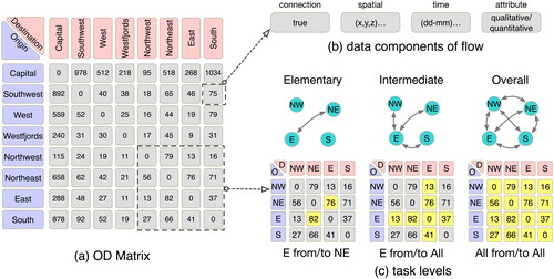
Figure 1. The OD matrix: (a) An example of an OD data matrix, with regional migration data in 2018, Iceland (Iceland Citation2023). The numbers represent migrating people. (b) OD data components: connection (true or false); spatial (description of trajectory); time (duration); attribute (qualitative and/or quantitative). (c) OD matrix reading levels (highlighted cells): elementary (cell to cell), intermediate (cell to row or column); overall (all to all). Schematic diagrams on the top show examples of three reading levels. The matrix at the bottom shows the lower right section from the OD matrix in (a).
3.2. OD matrix and three reading levels
Origin–destination matrices are a straightforward way of representing OD data. The columns and rows represent origins and destinations, and the entries represent flows. The OD matrix consists of entries, and the number of entries needed to answer particular questions determines their reading level. There are several definitions of reading levels. Bertin proposed three reading levels: elementary, intermediate, and overall (Bertin Citation1967; ), and Koussoulakou and Kraak (Citation1992) expanded this to nine basic questions to include temporal data components. Andrienko and Andrienko (Citation2006) proposed an elementary level and a synoptic level by combining Bertin’s intermediate and overall levels into the synoptic level. We will, in the following, refer to three reading levels for OD data: one for the OD matrix as a set of entries (elementary level), one for the rows and columns (intermediate level), and one for the entire matrix (overall level). These correspond to one-to-one, one-to-many, and many-to-many flow visualizations. As we will see later, these three reading levels can be used to classify visualizations of OD data. With an understanding of OD data, we are now able to explain our classification of OD visualizations.
4. Aspects for a classification scheme of OD visualizations
Both OD data and OD visualizations refer to many different types of phenomena of physical or social reality. Such visualizations range from ones that employ point and linear symbols, to more complex combinations of symbols and even combinations of maps and other types of visualizations. Yet, all these OD visualizations share a common idea, which is expressed by the OD data themselves and underlies the interpretation of the visualizations. In this section, we develop a classification scheme to describe how the various OD visualizations encode this common idea visually.
4.1. Overview and terminology
Each OD visualization needs to visually reflect the main conceptual elements: OD data consist of nodes (origins and destinations) as well flows between them. That is, it needs to visually encode these elements in some way, the resulting symbols of which we refer to as node symbols (or, origin and destination symbols) and flow symbols. How many of such symbols are included in the visualization and how they encode the information varies, however, among the various visualizations. In particular, there is no one-to-one correspondence between the origins, destinations, and flows, and their corresponding symbols. A node might, for instance, be represented twice in the visualization: by an origin and by a destination symbol. How the main conceptual elements of OD data are represented in the visualization is thus a more complex question.
The classification scheme proposed in this article aims to capture how the visual symbols in the canvas encode origin and destination nodes, as well as their corresponding flows (). The first aspect of this classification, the granularity of flows, indicates whether the flow represents individual movement between origin and destination or aggregated movement. The granularity of the flows to be used in the visualization influences the strategy for choosing corresponding visualization methods.
Table 1. The classification scheme and the structure of the section.
The second aspect of this classification, the dimensionality in and of the display space, refers to the dimension of the display space as well as to the dimension of the node and flow symbols included. As the concept of the display space refers here to the space that contains the node and flow symbols (and which is then usually displayed on or projectedFootnote1 to a piece of paper or monitor), the dimension of the symbols is always smaller than the one of the display space.
The third aspect of the classification concerns the semantics of the display space. While the display space is usually represented spatially, like when being printed on a piece of paper or displayed on a monitor, it can be equipped with different types of interpretations (cf., Ogden and Richards Citation1925). These interpretations can refer to spatial or temporal information about the OD movement, to thematic information related to the movement, or even to a combination thereof. When node symbols are included in a map, for instance, this indicates the display space to resemble physical space. It is endowed with a spatial meaning in the sense that each location in the display space refers to some location in physical space, such as a coordinate on Earth. In that case, we speak of a space-related semantics to indicate that an interpretation pattern related to (physical) space is employed in the display space. In a similar way, the display space can be equipped with a time-related semantics if it is meant to resemble temporal information related to the OD movement, or an attribute-related semantics if it is meant to resemble some (thematic) attribute space.Footnote2
After classifying the semantics of the display space, the fourth aspect focuses on the representation of the nodes and flows in the display space, and thus on the way the node and flow symbols need to be interpreted. First, this concerns how often each origin and destination node is represented in the display space with the idea to create several contexts, consisting of several node symbols that afford to be related by corresponding flow symbols. In case of a map containing country borders with corresponding pie charts—each pie chart could indicate OD movements from that particular country to other ones—each such pie chart constitutes such a context but the several pie charts contained in different countries remain mutually unrelated in terms of flow symbols. Secondly, this concerns the way flows are represented through the semantics of the display space, or by adding additional symbols to it. Thirdly, this relates to whether movements are represented as undirected or directed flows.
The fifth aspect of the classification scheme concerns the mechanism of relating multiple OD visualizations in case of a compound visualization. Such relations can be introduced by either spatially relating these visualizations in the display space, or by inducing such a relation through the systematic use of the visual variables of the symbols already included in these visualizations. As should become obvious from this overview, each aspect builds on the previous one, and their joint consideration can be used to systematically describe the display space and its semantics, how the symbols included refer to the actual OD movement, and how such visualizations can even be mutually related. shows an overview of this classification scheme, and also the structure of this section.
4.2. Granularity of flows
The granularity of flows varies from individual flows to grouped flows. Individual flows refer to particular objects moving between certain pairs of origins and destinations, such as trains, planes, or ships. Visualizing an individual flow, for example, a train moving between two stations can be achieved by using a liner flow symbol on a flow map or an entity in the OD matrix. However, when the number of moving objects increases, the complexity of flow maps and the size of the OD matrix also increase. Moreover, movements are not always limited to fixed nodes, like trains traveling between stations. For example, the movements of taxis or birds can be arbitrary, as they can start at any time and any place. Visualizing massive arbitrary movements with line symbols can lead to intersections and overlaps on the canvas (Andrienko et al. Citation2017b). Thus, there are reasons to visualize grouped flows, which involve aggregating individual lines.
Grouped flows are aggregations of individual flows along space or time or both. For example, in the visualization of migration (as shown in ), the flows are aggregated by regions and time intervals (years). Grouped flows ignore details about individual moving objects and instead focus on showing patterns of movement. Visualizing grouped flows instead of individual flows may reduce visual complexity.
4.3. Dimensionality in and of the display space
Node symbols, flow symbols, and the display space can be described in terms of their dimensionality.
4.3.1. Dimensionality of the node and flow symbols
In an OD visualization, nodes and flows can be visualized as node symbols or flow symbols. The dimensionality of these symbols can be zero, one, two, or three-dimensional—referred to as point symbols, linear symbols, areal symbols, or volume symbols, respectively.
Nodes can be visualized as point symbols, such as dots or labels, which are zero-dimensional. Linear node symbols, such as vertical lines positioned on a horizontal map, with line heights encoding quantities, are one-dimensional. Areal node symbols, such as polygons on maps and rectangles in treemaps are two-dimensional. Node symbols that have volumes, such as globes and cubes, are three-dimensional. Correspondingly, flow symbols can also be classified according to their dimensions.
An example of a zero-dimensional flow symbol is a label that represents the flow magnitude. One-dimensional flow symbols are linear symbols, such as paths on a map that connect origins and destinations. Two-dimensional flow symbols are areal symbols, such as segments in a pie chart or rectangles in a treemap. Three-dimensional flow symbols have volume, such as tubes that represent flows in a three-dimensional visualization. In addition to the dimensionality of symbols, the dimensionality of the display space is also essential for OD visualization design.
4.3.2. Dimensionality of the display space
The dimensionality of the display space varies from zero to three-dimensional. In this article, we focus on two and three-dimensional space. The two-dimensional display space uses two axes to display flow symbols and node symbols, similar to most charts (x-axis and y-axis) and maps (latitude and longitude). The three-dimensional display space uses three axes to display symbols, such as the space–time cube. While a two-dimensional symbol can be shown in a three-dimensional display space, a three-dimensional symbol cannot be shown in a two-dimensional display space.
Dimensions of the display space have different meanings depending on the spatial semantics of the display.
4.4. Semantics of the display space
The display can be either two-dimensional or three-dimensional, and these dimensions can be interpreted according to four types of spatial semantics: space-related, time-related, attribute-related, and hybrid semantics. These correspond to three components of OD data.
4.4.1. Utilizing the various dimensions of the display space
Space-related semantics concern the representation of the physical world. The display space is either a model of the three-dimensional physical world or a projection of the physical world—either a one-dimensional or a two-dimensional projection. In maps, both dimensions employ a semantic, for example, the one of geographical coordinates in case of maps.
Time-related semantics and theme-related semantics allow spatial dimensions to encode temporal components and attribute components. In many cases, different semantics are applied to different dimensions, in case of which we speak of hybrid semantics. In the following, we elaborate on three-dimensional OD visualization, whose dimensions use space-related semantics or hybrid semantics.
4.4.2. Combining cartographic representations with the third dimension: an example of a hybrid case
In the following example, we use space-related semantics along two dimensions for three-dimensional OD visualizations to keep the cartographic context. Three-dimensional OD visualizations may have advantages because they provide an extra dimension for semantics. shows four possibilities for the semantics of the third dimension.
Figure 2. Appling different semantics to the third dimension, two flows (from A to B, and from A to C) are visualized with example data. (a) Application of space-related semantics to the third dimension. Lines are imitations of plane trajectories. (b) Application of time-related semantics to the third dimension. It is an example of space-time cube. (c) Application of attribute-related semantics to the third dimension, where the third dimension represents the attribute component. (d) Application of attribute-related semantics to the third dimension, where the third dimension represents connection.
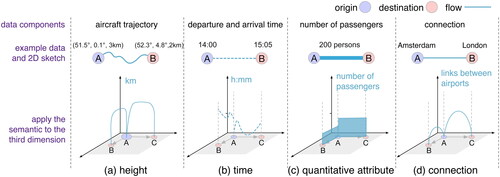
shows the third dimension with space-related semantics. The height of the third dimension may represent the altitude or depth of moving objects. When space-related semantics are applied to all three dimensions, visualization can be seen as a model of the physical world. illustrates the application of time-related semantics to the third dimension and is related to the space–time cube. One temporal dimension and two spatial dimensions can jointly reveal spatio-temporal patterns of OD movements. When attribute-related semantics are applied to the third dimension, it can encode qualitative or quantitative attributes (), which helps to reduce overlap between symbols on the plane. In addition, the third dimension may not encode data, but simply provide space for the representation of connections between nodes (). Drawing arcs ‘in the air’ to indicate connections can avoid intersects to some degree. The data encoded in the third dimension show flow between an origin and a destination.
It is possible to apply more than one type of semantics to the third dimension. A space–time cube can be visualized together with a three-dimensional model of the topography. More conditions of hybrid semantics in the third dimension can be designed.
4.5. Representation of nodes and flows
The dimensionality and semantics of the display space provide the basis for understanding how to interpret the node and flow symbols contained in the display space. In the following, we discuss the various ways these symbols can be arranged in the display space.
4.5.1. Representation of nodes
In many OD visualizations, the same node is represented several times, like when representing origin and destination nodes with different symbols, or when indicating the destination nodes by the slices of a pie chart that is attached to a corresponding spatial unit. In the latter case, each such slice acts as a destination symbol, and the several slices are grouped into one pie chart per origin. This is interesting insofar as a flow can only be visually indicated between the spatial unit and the destination nodes of the respective slice. In this setting, however, it is not possible to visually indicate a flow from one spatial unit to another, for example by an arrow, or between the different slices. The semantics with which the display space is equipped only allow flows to be visually indicated between certain origin and destination symbols. Arbitrary pairs of node symbols, however, do not necessarily possess this affordance, even if a flow exists between the corresponding nodes themselves.
The OD-joint and Ungrouped cases. The representation of the nodes in the display space can be categorized based on this observation (). At one extreme is the case where each node is represented only once in the display space (regardless of whether it is used as the origin or destination). In this case, each pair of node symbols affords to indicate flows between them (OD-jointFootnote3). An example is a node-link diagram (). At the other extreme, all pairs of origin and destination nodes are separately represented in the display space (ungrouped). This is, for instance, the case with a table where each row refers to a combination of origin and destination node and where flows can visually only be indicated in the display space within such a row (cf., ). At the same time, this means that each origin node and each destination node must potentially be included several times in the representation. Conceptually, the OD-joint case can be transformed into the Ungrouped one by duplicating the node symbols such that there exists a copy of these for each possible flow. Conversely, the Ungrouped case can be transformed into the OD-joint one by unifying the corresponding node symbols that refer to the same node.
Figure 3. Representation of nodes. The five columns show five categories of node representations. The first row indicates how can the five categories are conceptually transformed. The second row are sketches of four flows between two nodes. The third row shows the context of each category. The last row shows examples of each category.
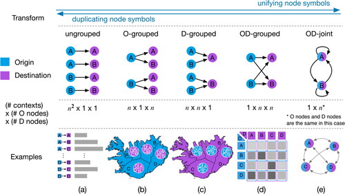
The O/D-grouped and OD-grouped cases. Several cases exist between these extremes. For example, there are cases where each origin node is represented only once in the display space, but each destination node is multiple times. If each origin is only represented once and if for each origin symbol, there is potentially a destination symbol to which a flow can be visually indicated, but the destination symbol does not have this affordance with respect to other origin symbols than the one in question, then the various destination symbols are in a sense grouped to the origin symbols (O-grouped). This is, for instance, the case for the pie charts placed on the map (cf., ). Of course, the same situation exists with reversed roles of origin and destination (D-grouped; cf., ). These two cases result from unifying origin and destination symbols, respectively. When interpreting the rows of an OD matrix as origin symbols and the columns as destination symbols, the OD matrix can be understood as a combination of the two previous cases (cf., ). This is because a flow from an origin symbol (i.e., a row) to each destination symbol (i.e., each column) can be visually indicated by placing numbers at the corresponding positions, and this is also the case with reversed roles of origin and destination (OD-grouped). At the same time, each origin and destination node is represented only once, which is in contrast to the O-grouped and the D-grouped cases, and origin and destination symbols are disjunct, which is in contrast to the OD-joint case.
It should be noted that these different cases utilize the display space to different degrees. In the ‘OD-joint’ case, for instance, the semantics of the node and flow symbols leaves space for an interpretation of the display space in terms of geographical space (or some other interpretation), while this is not the case in the OD-grouped case. In the O-grouped case, however, only the spatial units can be interpreted geographically, while the location of the slices within a pie chart does not allow for such a geographical interpretation. Instead, they constitute an interpretational context of its own.
4.5.2. Representation of flows
As is interesting to note, the number of contexts multiplied by the number of origin symbols and destination symbols is constant for each of the cases outlined in the previous section, apart from in the OD-joint case (see ). While this may seem circumstantial, it is critical to how flows can be represented visually. In the OD-joint case, arrows or similar mostly linear symbols are often employed to link origins to destinations. There is a great risk that these symbols clutter because they are all interpreted in the same context, which makes them incidentally overlap in many cases. In the OD-grouped case, a larger number of node symbols is used and systematically arranged to avoid such cluttering. The clutter is reduced at the cost of duplicating node symbols. In the O/D-grouped cases and to an even higher degree in the ungrouped case, the complexity is further reduced by a larger number of coexisting contexts, which independently co-exist in the display space.
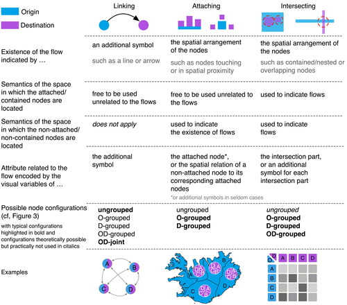
How these flows can be visually conveyed depends on the configuration of node symbols and which possibilities that offer to indicate relations between these symbols. Besides the use of symbols to indicate a relation between distant symbols (linking), topological relations may be used to indicate such relation in case the corresponding nodes are used in a non-geographical context (cf., Egenhofer Relations; Egenhofer and Franzosa Citation1991). Among these are node symbols that are intentionally arranged in spatial proximity (attaching; e.g., slices of a pie chart) or even indicate a relation by an intentionally overlap or containment (intersecting; e.g., rows and columns of an OD matrix). An overview of these means can be found in .
Figure 4. Representation of flows: linking, attaching, and intersecting. In linking, the relation between the origin symbols and the destination symbols is disjoint. In attaching, the relation between the origin symbols and the destination symbols is adjacent or touching. In intersecting, the relation between the origin symbols and the destination symbols is overlap or containment.
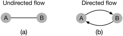
4.5.3. Direction of flow symbols
Flow symbols can be either directed or undirected (). In the case of directed flow symbols, two opposing flows can be represented between a pair of nodes. Several techniques can be used to visualize the direction of flows, such as arrow symbols, gradient symbols, or animation.
Figure 5. Direction of flow symbols. (a) Undirected flow. (b) Directed flow.
4.6. Relating two visualizations
Everything mentioned so far applies to single visualizations. However, multiple visualizations can be related to each other to accomplish more complex tasks. There are two ways to combine two visualizations: identification of nodes or nesting.
4.6.1. Relating two visualizations by identification of nodes
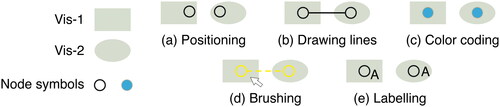
To display different facets or patterns in the same dataset, two or more visualizations may be needed. In this case, one node has two different representations. Users can relate these two symbols by identifying the node they are representing. Many techniques can help users identify the nodes, such as drawing lines, color-coding, brushing, positioning, or labelling the symbols. shows examples of relating two visualizations by node identification.
Figure 6. Examples of the identification of nodes. In the two visualizations (Vis-1 and Vis-2), nodes are represented by several node symbols. Node symbols in the two visualizations can be identified in several ways. (a) Positioning: Nodes can be positioned close to each other, in corresponding positions in each visualization, or by other rules. (b) Drawing lines between node symbols, indicating that they are representing the same node. These lines need to differ from flow symbols. (c) Color-coding the node symbols. (d) Brushing: Interaction can be applied to node identification. When selecting the node symbol in Vis-1, the corresponding symbol in Vis-2 will be highlighted. (e) Labelling: Labels are used to identify nodes directly.
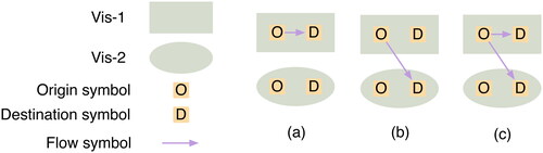
There are three possibilities of flow representation when relating two OD visualizations. Flow symbols can be isolated in each visualization, drawn across two visualizations, or both. These three conditions are illustrated in .
Figure 7. Three possibilities of flow representation when relating two OD visualizations. (a) Flow symbols are connecting origins and destinations within one visualization. (b) Flow symbols are connecting origins and destinations across two different visualizations. (c) Combination of (a) and (b).
4.6.2. Relating two visualizations by nesting
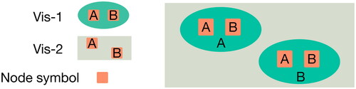
Nesting is another way of relating two visualizations. Nesting is when one visualization is embedded into another, and flow can be identified by the hierarchy of nesting. The nesting procedure is illustrated in .
Figure 8. Relating two visualizations by nesting. There are two visualizations (Vis-1 and Vis-2). Multiple Vis-1 are nested into Vis-2, which are positioned where the node symbols in Vis-2 are located.
In this section, we have discussed the five aspects of classifying OD visualizations: granularity of flows, dimensionality in the display, spatial semantics of the display, representation of nodes and flows, and ways of relating two visualizations. In the next section, we discuss relationships between these aspects and how they can be applied to classify examples of OD visualizations.
5. Evaluation of the classification scheme
This section reviews published OD visualizations and provides a visual clustering perspective based on our classification scheme. We examined 40 OD visualizations in total, including 14 compound OD visualizations, which were created by relating two visualization techniques. We characterize these visualizations using our scheme of five aspects discussed in Section 4 and cluster them using hierarchical methods. We also visualize the mutual correlations between variables. These correlations may facilitate further design decisions by following common choices or experimenting with choices that yield different visualizations.
5.1. Characterizing and clustering of OD visualizations
In the following, we examine 40 different examples of OD data visualizations. These visualizations are designed to visualize OD data or analyze OD data visually. Some of these are compound OD visualizations, which consist of more than one visualization each, resulting in 54 examples in total. The classification of these 54 examples according to our scheme is presented in . We also used a distance matrix to visually indicate clusters in terms of this classification ().
Figure 9. Reordered distance matrix for 54 OD visualization examples. The 54 × 54 matrix represents distances among 54 OD visualizations. It is reordered by the single-linkage clustering method. Certain visualizations are more similar than others, and these are grouped in a blue rectangle.
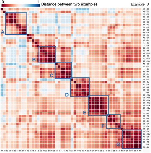
Table 2. Classifying existing OD visualization examples in the literature.
The rows of refer to considered examples (E), and the columns refer to the five aspects of the classification scheme. The columns have three hierarchical levels: aspects (A), variables (V), and features (F), corresponding to the five aspects presented in Section 4, their nine variables, and their 27 features. The rectangle in the rows indicates whether the example can be characterized by the corresponding features in the columns. Examples 1–14 are compound OD visualizations. They consist of two OD visualizations each and are related. The two parts of a compound OD visualization are referred to as a and b (e.g., 1a, 1b, 2a, 2b, etc.). The two right-hand columns show how two such visualizations that are part of a compound visualization relate to each other (Section 4.6). Examples 15–40 are not compound OD visualizations.
After characterizing the examples, we computed distances between every two examples according to the characterization in , which yielded a 554 matrix. More specifically, we computed the distance of two example visualizations with the first three aspects A, while ignoring how two OD visualizations were related in a compound visualization. The distance dist(Ei, Ej) between two visualizations Ei and Ej was defined in terms of the six groups of features F from variables V. That is, it was defined in terms of the features Fi,n,k which relate to the variables Vn of visualization Ei. The distance between two visualizations is then defined as the normalized accumulation of comparison results:
shows the distance matrix, which is reordered via the single-linkage clustering method (Seifoddini Citation1989). The matrix reveals the cluster pattern marked by a blue rectangle in . The blue marks show visualizations that are similar to each other based on this classification scheme, indicating that this categorization scheme can be used to cluster OD visualizations.
In , seven clusters (A-G) can be distinguished. In cluster E (1b, 4b, 10a, 11a, 12a, 13b, 14a), mainly maps in a compound OD visualization are shown, providing a geographic context where no flow symbols are displayed. Visualizations in the other clusters share certain characteristics:
Cluster A (20, 34, 35, 36, 37, 38, 39, 40) mainly consists of 3D visualizations. The representation of flows in this cluster is “linking”, with most of them using “hybrid” or “space-related” semantics of the display space.
Cluster B (10b, 11b, 14b, 15, 16, 17) consists of diagrams that do not provide geographic context, such as pie charts and rose charts. The representation of nodes in this cluster is “O/D grouped”.
Cluster C (2b, 3b, 6b, 8a, 9b, 30) mainly consists of visualizations of matrix views. Most of them have “attribute-related” semantics of the display space, with nodes representation being “OD-grouped” and flows representation being “intersecting”.
Cluster D (4a, 9a, 13a, 22, 23, 26, 29) consists of node-link diagrams. The representation of nodes and flows is “OD-joint” and “linking” correspondingly. All visualizations in this cluster have “undirected” flow representation.
Cluster F (5a, 7a, 19, 21, 24) mainly consists of flow maps, most of which use “linking” flow representation to visualize individual flows.
Cluster G (1a, 6a, 7b, 12b, 18, 25, 28) consists of chord charts and Sankey diagrams. Their dimensionality of nodes is “2D”, and they all visualize the magnitude of nodes.
5.2. Correlation of features
To understand how the first 25 features (i.e., the features of the first three aspects) correlate, we introduced another distance function, which yields another matrix (). The correlation of two features corr(Fi,Fj) was, according to the definition chosen, determined by the frequency of their co-occurrence in a visualization. The features Fk,i and Fk,j related to example Ek.
Figure 10. Reordered distance matrix showing the correlation among the 25 features.
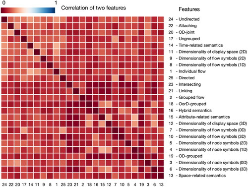
displays the reordered distance matrix of the 25 features, to which the single-linkage clustering method was applied. As is visible from the matrix, the features correlated with each other, with values ranging from 0.04 to 0.32. However, there were no particularly strong correlations between any feature pairs, showing that the features are largely independent. This demonstrates that the feature choice is meaningful and that the classification scheme is effective and expressive at classifying the examples.
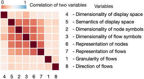
5.3. Correlations of the variables
In addition to correlations between the features, we also examined correlations between the variables, which were determined by the accumulation of conditional distance between the two examples. The conditional distance between the two examples is similar to the visualization distance in Section 5.1, considering only two variables. The features corresponding to the variables Vm and Vn were referred to as Fm,k and Fn,l, respectively. Correspondingly, the features Fi,m,k and Fj,m,k related to examples Ei and Ej. The correlation between two variables can be expressed as:
shows the distance matrix, which was reordered using the single-linkage clustering method. The matrix shows that the variables correlated to varying degrees, with values ranging from 0.192 to 0.464. This indicated that the variables were independent to a large degree, similar to the conclusion drawn in Section 5.2, showing that the classification scheme is effective and expressive in terms of classifying the example.
Figure 11. Reordered distance matrix showing the correlation of the eight variables.
6. Conclusion
In this article, we have proposed a classification scheme for OD visualizations which we evaluated by a study of existing OD visualizations. We studied the many OD visualization designs and how other researchers have classified OD visualizations from various perspectives. Our scheme concerns five aspects of OD visualizations: the granularity of flows, the dimensionality of the display space, the semantics of the display space, the representation of nodes and flows, and the relating two visualizations. The five aspects contain eight variables and 25 features.
To evaluate the classification scheme proposed in this research, we classified 40 existing OD visualizations and created a 54 × 54 distance matrix, including 14 compound OD visualizations. The resorted matrix revealed a cluster pattern (see ), from which seven clusters can be distinguished. The cluster result successfully classified typical OD visualizations, which tests the effectiveness of the aspects and variables in this classification scheme. For example, cluster A consists of 3D visualizations (dimensionality of the display space). Cluster B consists of diagrams that do not provide geographic context, such as pie charts and rose charts, and their representation of nodes is “O/D grouped” (representation of nodes). Cluster C mainly consists of visualizations of matrix views, in which the representation of flow is “intersecting” (representation of flows), and most of them have “attribute-related” spatial semantics (semantic of the display space). Cluster D consists of node-link diagrams, in which the representation of nodes is “OD-joint” and the representation of flows is “linking”, with all of them having “undirected” flow representation (representation of nodes and flows). Cluster F consists of various flow maps, most of which visualize individual flows (granularity of flows). Cluster G consists of visualizations where the dimensionality of nodes is “2D”, and they all visualize the magnitude of nodes (dimensionality of nodes). The clusters prove that the classification scheme can be effectively used to group OD visualizations.
We then evaluated the correlation of the first 25 features. We created a 25 × 25 matrix and sorted it (see ), which showed no significant clusters. Meanwhile, the correlations between every two features had a value lower than 0.5, indicating that the features are largely independent. After that, we evaluated the correlation of the first eight variables in the same way, and the result showed that they are also largely independent (see ). The evaluations show that the classification scheme is effective and expressive in terms of classifying the examples.
This classification scheme can help people without previous experience to quickly create OD visualizations. A designer can easily find a visualization method for various representations and switch the style of visualizations by adapting one or more variables. This classification scheme can also help to develop existing OD visualizations. For example, by adapting the dimensionality of node symbols and flow symbols of the Necklace map, it can be developed into a 3D visualization. Moreover, this classification benefits OD visualization design by trying different ways of relating two OD visualizations. Designers can try new combinations of OD visualizations aimed at fulfilling certain tasks or reducing visual complexity.
However, the design of OD visualizations should consider several other factors besides the five aspects studied in this research, such as data, task, users, interaction, display environment, and scalability. When it comes to data, components, volume, structure, format, and source can influence the design of OD visualizations, affecting visual complexity and system performance. Tasks can be further specified as elementary or synoptic tasks (Andrienko and Andrienko Citation2006), depending on the data relevant to the task, which determines the choice of visualization strategy. Designed OD visualizations do not always function well without a solid user study (Koua and Kraak Citation2004). Factors in the interaction process, such as objective, operator, and operand, can all influence the design of OD visualizations (Roth and MacEachren Citation2016). From this point of view, data, user, task, and interaction build a complex system for OD visualization designers to explore. The same OD visualization design can be implemented and rendered in different environments, such as monitor, virtual reality, or augmented reality environments. User experience in various environments may differ, and therefore, the usability of the same design will also differ. Additionally, the scalability of OD visualizations has an influence on complexity, which should also be considered when designing OD visualizations.
The future work of this research will focus on designing user-centred, task-oriented, and interactive OD visualizations. Using this classification scheme, we will explore new combinations of OD visualizations and three-dimensional OD visualizations for problem-solving purposes. Meanwhile, we will carry out usability tests with the designed OD visualizations.
Author contributions
The idea of this research was mainly proposed by Yuhang Gu and Menno-Jan Kraak, and all authors worked jointly on the classification scheme. The manuscript was written by Yuhang Gu with parts written by Franz-Benjamin Mocnik (Sections 4.1, 4.5.1, and 4.5.2). Figures in this paper were mainly created by Yuhang Gu, with some of them proposed by Menno-Jan Kraak () and Franz-Benjamin Mocnik ( and ). The evaluation was proposed Yuhang Gu and Franz-Benjamin Mocnik, and executed by Yuhang Gu. All authors commented on the final manuscript and improved it.
Data and codes availability statement
The data and codes are available on figshare.com with the link: https://doi.org/10.6084/m9.figshare.21176320.v3. The data is a matrix created according to in this manuscript. The code computes the three functions in Section 5 correspondingly.
Disclosure statement
No potential conflict of interest was reported by the author(s).
Additional information
Funding
Notes on contributors
Yuhang Gu
Yuhang Gu is working toward a Ph.D. degree in cartography and geographical information system with the Faculty of Geoinformation Science and Earth Observation, University of Twente. His research interests are spatio-temporal visualization and thematic cartography.
Menno-Jan Kraak
Menno-Jan Kraak is a professor of Geovisual Analytics and Cartography at the University of Twente/ITC, where he currently is Vice-Dean Capacity Development. He is past President of the International Cartographic Association (ICA). He wrote more than 200 publications, among them the books ‘Cartography, visualization of geospatial data’ (with Ormeling), ‘Mapping time’, and ‘Mapping for a sustainable world’ (with Roth, Ricker, Kagawa, and Le Sourd).
Yuri Engelhardt
Yuri Engelhardt is an Assistant Professor of Information Visualization at the University of Twente, The Netherlands. He studied medicine, biology of ageing, cognition, language, communication, computer science, and design. Among his key areas of curiosity are visual thinking and design decisions for useful charts and diagrams, while his key passion is working on the necessary sustainability transitions in the face of the climate crisis.
Franz-Benjamin Mocnik
Franz-Benjamin Mocnik is an Assistant Professor at the University of Twente, where he conducts research about platial information as well as structural aspects in Geographical Information Science. He received a doctoral degree from the Vienna University of Technology, worked at Heidelberg University as a postdoctoral fellow in Geography, and was a twin fellow of the Hanse-Wissenschaftskolleg, Institute for Advanced Study. He was awarded the Waldo-Tobler Young Researcher Award.
Notes
1 The dimension of the display space can be larger than the one of the piece of paper or the monitor, like when a three-dimensional display space is projected to a two-dimensional piece of paper.
2 Acknowledging that thematic (i.e. non-spatial and non-temporal) information related to the OD movement can be quite complex and very different in nature, the display space (or a subspace of it) usually refers to only some particular facet of the thematic information and not its entirety. To distinguish the concept of such a particular facet from thematic information as a more holistic concept, we refer to the former as an attribute and to the collection of such attributes as an attribute space.
3 The terms chosen to refer to the five cases described below and summarized in is self-explanatory to varying degrees. The description of the cases introduced here should therefore be understood as definitions of these introduced terms.
References
- Andrienko, G. and Andrienko, N., 2008. Spatio-temporal aggregation for visual analysis of movements. In: IEEE symposium on visual analytics science and technology, VAST’08, Columbus, OH, 51–58.
- Andrienko, G., et al., 2017a. Revealing patterns and trends of mass mobility through spatial and temporal abstraction of origin-destination movement data. IEEE Transactions on Visualization and Computer Graphics, 23 (9), 2120–2136.
- Andrienko, G., et al., 2017b. Visual analytics of mobility and transportation: state of the art and further research directions. IEEE Transactions on Intelligent Transportation Systems, 18 (8), 2232–2249.
- Andrienko, N. and Andrienko, G., 2006. Exploratory analysis of spatial and temporal data: a systematic approach. Heidelberg, Germany: Springer Science & Business Media.
- Archambault, D., Munzner, T., and Auber, D., 2007. Grouse: feature-based, steerable graph hierarchy exploration.
- Bach, B., Pietriga, E., and Fekete, J.D., 2014. Visualizing dynamic networks with matrix cubes. In: Conference on human factors in computing systems – proceedings, 877–886.
- Battista, G.D., et al., 1994. Algorithms for drawing graphs: an annotated bibliography. Computational Geometry, 4 (5), 235–282.
- Bertin, J., 1967. Sémiologie graphique: les diagrammes–les réseaux–les cartes. Paris: Mouton.
- Boyandin, I., 2013. Visualization of temporal origin-destination data.
- Buschmann, S., Trapp, M., and Döllner, J., 2016. Animated visualization of spatial–temporal trajectory data for air-traffic analysis. The Visual Computer, 32 (3), 371–381.
- Collins, C. and Carpendale, S., 2007. VisLink: revealing relationships amongst visualizations. IEEE Transactions on Visualization and Computer Graphics, 13 (6), 1192–1199.
- Cox, K.C. and Eick, S.G., 1995. Case study: 3D displays of internet traffic. In: Information visualization, 1995. Proceedings. IEEE, 129–131.
- Cox, K.C., Eick, S.G., and He, T., 1996. 3D geographic network displays. SIGMOD Record (ACM Special Interest Group on Management of Data), 25 (4), 50–54. Available from: https://www.scopus.com/inward/record.uri?eid=2-s2.0-0002766331&partnerID=40&md5=878279d380753ae5f0ccd6a8ad00172c.
- Cui, W., et al., 2008. Geometry-based edge clustering for graph visualization. IEEE Transactions on Visualization and Computer Graphics, 14 (6), 1277–1284.
- Dakowicz, M. and Gold, C.M., 2005. Interactive tin modification with a cutting tool. In: Proceedings of 4th ISPRS workshop on dynamic and multi-dimensional GIS, Pontypridd, Wales. Citeseer, 5–9.
- Dent, B.D., 1999. Cartography-thematic map design.
- Dubel, S., et al., 2015. 2D and 3D presentation of spatial data: a systematic review. In: 2014 IEEE VIS international workshop on 3DVis, 3DVis 2014, 11–18.
- Egenhofer, M.J. and Franzosa, R.D., 1991. Point-set topological spatial relations. International Journal of Geographical Information Systems, 5 (2), 161–174.
- Ellis, G. and Dix, A., 2007. A taxonomy of clutter reduction for information visualisation. IEEE Transactions on Visualization and Computer Graphics, 13 (6), 1216–1223.
- Franklin, R., and Lewis, H.R., 1978. 3-D graphic display of discrete spatial data by prism maps. In: Proceedings of the 5th annual conference on Computer graphics and interactive techniques, 70–75.
- Guo, D., 2009. Flow mapping and multivariate visualization of large spatial interaction data. IEEE Transactions on Visualization and Computer Graphics, 15 (6), 1041–1048.
- Guo, D., et al., 2006. A visualization system for space-time and multivariate patterns (VIS-STAMP). IEEE Transactions on Visualization and Computer Graphics, 12 (6), 1461–1474.
- Hägerstrand, T., 1970. What about people in regional science? Papers of the Regional Science Association, 24 (1), 6–21.
- Harness, H.D., 1838. Report from Lt. H. D. Harness, R.E., explantory of the principles on which the population, traffic and conveyance maps have been constructed. Railway Commissioners (1838a), Appendix 3.
- Henry, N., Fekete, J.D., and McGuffin, M.J., 2007. NodeTrix: a hybrid visualization of social networks. IEEE Transactions on Visualization and Computer Graphics, 13 (6), 1302–1309.
- Holtz, Y., 2018. Researcher network and migration flows. Available from: https://www.data-to-viz.com/story/AdjacencyMatrix.html.
- Hu, H., Zhang, H., and Li, W., 2013. Visualizing network communication in geographic environment. In: Proceedings – 2013 international conference on virtual reality and visualization, ICVRV 2013, 206–212.
- Iceland, S., ed. 2023. Internal migration between regions by sex and age 1986–2018. Available from: https://px.hagstofa.is/pxen/pxweb/en/Ibuar/Ibuar__buferlaflutningar__buferlaflinnanlands__buferlaflinnanlandseldra/MAN01001.px/table/tableViewLayout1/?rxid=79b1787a-a295-4882-98ba-2190fb8d1889.
- Iqbal, M.S., et al., 2014. Development of origin–destination matrices using mobile phone call data. Transportation Research Part C: Emerging Technologies, 40, 63–74.
- Itoh, M., et al., 2013. Visualization of passenger flows on metro. In: IEEE Conference on Visual Analytics Science and Technology, VAST.
- Jenny, B., et al., 2018. Design principles for origin-destination flow maps. Cartography and Geographic Information Science, 45 (1), 62–75.
- Klein, T., Van Der Zwan, M., and Telea, A., 2014. Dynamic multiscale visualization of flight data. In: VISAPP 2014 – proceedings of the 9th international conference on computer vision theory and applications, 104–114. Available from: https://www.scopus.com/inward/record.uri?eid=2-s2.0-84906899161&partnerID=40&md5=83a870d630e0ee7dd4775806be65a823.
- Koua, E.L. and Kraak, M.-J., 2004. A usability framework for the design and evaluation of an exploratory geovisualization environment. In: Proceedings. Eighth international conference on information visualisation, 2004. IV 2004. IEEE, 153–158.
- Koussoulakou, A. and Kraak, M.-J., 1992. Spatia-temporal maps and cartographic communication. The Cartographic Journal, 29 (2), 101–108.
- Kraak, M.-J., 2008. Geovisualization and time – new opportunities for the space-time cube. In: Geographic visualization: concepts, tools and applications. West Sussex, England: John Wiley & Sons, Ltd., 293–306.
- Kraak, M.-J., 2014. Mapping time: illustrated by Minard’s map of Napoleon’s Russian campaign of 1812.
- Krzywinski, M., et al., 2009. Circos: an information aesthetic for comparative genomics. Genome Research, 19 (9), 1639–1645.
- Krzywinski, M., et al., 2012. Hive plots – rational approach to visualizing networks. Briefings in Bioinformatics, 13 (5), 627–644.
- Lambert, A., Bourqui, R., and Auber, D., 2010. 3D edge bundling for geographical data visualization. In: Proceedings of the international conference on information visualisation, 329–335.
- Lawler, J.J., et al., 2013. Projected climate‐driven faunal movement routes. Ecology Letters, 16 (8), 1014–1022.
- Loua, T., 1873. Atlas Statistique de la Population de Paris. Paris: J. Dejey and Co. Editeurs.
- Minard, C.J., 1864. Carte figurative et approximative des quantités de vin français exportés par mer en 1864. Available from: http://nvac.pnl.gov/vacviews/VACViews_feb07.pdf.
- Minard, C.J., 1869. Carte figurative des pertes successives en hommes de l’Armée Française dans la campagne de Russie 1812–1813. Paris, France: Graphics Press.
- Mocnik, F.-B., 2015. A scale-invariant spatial graph model. Doctoral Thesis. Vienna University of Technology.
- Munzner, T., 1997. H3: laying out large directed graphs in 3D hyperbolic space. In: Proceedings of the IEEE symposium on information visualization, 2–10. Available from: https://www.scopus.com/inward/record.uri?eid=2-s2.0-0031353494&partnerID=40&md5=02cf763b0e27d296f17cd4396335389c.
- Munzner, T., et al., 1996. Visualizing the global topology of the MBone. In: Proceedings of the 1996 IEEE symposium on information visualization, Piscataway, NJ, USA. San Francisco, CA: IEEE, 85–92. Available from: http://www.scopus.com/inward/record.url?eid=2-s2.0-0030405302&partnerID=40&md5=6c378911850ed196ee37d74749d75391.
- Nagel, T. and Pietsch, C., 2016. CF. CITY FLOWS: A comparative visualization of urban bike mobility. Available from: https://uclab.fh-potsdam.de/cf/.
- Nagel, T., Pietsch, C., and Dork, M., 2017. Staged analysis: from evocative to comparative visualizations of urban mobility. In: 2017 IEEE VIS arts program (VISAP), 1–8.
- Ogden, C.K., and Richards, I.A. 1925. The meaning of meaning: a study of the influence of language upon thought and of the science of symbolism. Vol. 29. New York: Harcourt, Brace.
- Otten, H., et al., 2018. Shifted maps: revealing spatio-temporal topologies in movement data. In: Proceedings of the IEEE VIS arts program, VISAP 2018.
- Phan, D., et al., 2005. Flow map layout. In: IEEE symposium on information visualization, InfoVis 05, Minneapolis, MN, 219–224.
- Robinson, A.H., 1955. The 1837 maps of Henry Drury harness. The Geographical Journal, 121 (4), 440–450.
- Romat, H., et al., 2018. Animated edge textures in node-link diagrams: a design space and initial evaluation.
- Rosenberg, D. and Grafton, A., 2013. Cartographies of time: A history of the timeline. New York: Princeton Architectural Press.
- Roth, R.E. and MacEachren, A.M., 2016. Geovisual analytics and the science of interaction: an empirical interaction study. Cartography and Geographic Information Science, 43 (1), 30–54.
- Sankey, H.R., 1898. Introductory note on the thermal efficiency of steam‐engines.. In: Minutes of proceedings of the institution of civil engineers, vol. 134, 278–283.
- Schich, M., et al., 2014. A network framework of cultural history. Science, 345 (6196), 558–562.
- Schmidt, M., 2008. The Sankey diagram in energy and material flow management. Journal of Industrial Ecology, 12 (1), 82–94.
- Schöttler, S., et al., 2021. Visualizing and interacting with geospatial networks: a survey and design space. Computer Graphics Forum, 40 (6), 5–33.
- Seifoddini, H.K., 1989. Single linkage versus average linkage clustering in machine cells formation applications. Computers & Industrial Engineering, 16 (3), 419–426.
- Shneiderman, B., 1992. Tree visualization with tree-maps: 2-D space-filling approach. ACM Transactions on Graphics, 11 (1), 92–99.
- Snodgrass, J.G. and Vanderwart, M., 1980. A standardized set of 260 pictures: norms for name agreement, image agreement, familiarity, and visual complexity. Journal of Experimental Psychology. Human Learning and Memory, 6 (2), 174–215.
- Speckmann, A. and Verbeek, K., 2010. Necklace maps. IEEE Transactions on Visualization and Computer Graphics, 16 (6), 881–889.
- Stephen, D.M., 2016. Automated layout of origin-destination flow maps: US county-to-county migration 2009–2013.
- Streit, M. and Gehlenborg, N., 2014. Points of view: bar charts and box plots. Nature Methods, 11 (2), 117.
- Tobler, W.R., 1981. A model of geographical movement. Geographical Analysis, 13 (1), 1–20.
- Tobler, W.R., 1987. Experiments in migration mapping by computer. The American Cartographer, 14 (2), 155–163.
- Tominski, C., et al., 2012. Stacking-based visualization of trajectory attribute data. IEEE Transactions on Visualization and Computer Graphics, 18 (12), 2565–2574.
- Tufte, E.R., 1983. The visual display of quantitative information. Cheshire, CT: Graphics Press.
- van den Elzen, S. and van Wijk, J.J., 2014. Multivariate network exploration and presentation: from detail to overview via selections and aggregations. IEEE Transactions on Visualization and Computer Graphics, 20 (12), 2310–2319.
- Van Lottum, J., Lucassen, J., and Van Voss, L.H., 2011. Sailors, national and international labour markets and national identity, 1600–1850. In: Global Economic History Series, 309–351. Available from: https://www.scopus.com/inward/record.uri?eid=2-s2.0-84947740894&partnerID=40&md5=a13e7239911402073a0cbfe8a8b742ab.
- Verbeek, K., Buchin, K., and Speckmann, B., 2011. Flow map layout via spiral trees. IEEE Transactions on Visualization and Computer Graphics, 17 (12), 2536–2544.
- Wattenberg, M., 2002. Arc diagrams: visualizing structure in strings. In: Proceedings – IEEE symposium on information visualization, INFO VIS, 110–116.
- Wilkinson, L. and Friendly, M., 2009. The history of the cluster heat map. The American Statistician, 63 (2), 179–184.
- Wilkinson, L., et al., 1994. SYSTAT for DOS: advanced applications, version 6 edition. Evanston, IL: SYSTAT Inc.
- Wood, J., Dykes, J., and Slingsby, A., 2010. Visualisation of origins, destinations and flows with OD maps. The Cartographic Journal, 47 (2), 117–129.
- Wood, J., Slingsby, A., and Dykes, J., 2011. Visualizing the dynamics of London’s bicycle-hire scheme. Cartographica: The International Journal for Geographic Information and Geovisualization, 46 (4), 239–251.
- Yang, Y., et al., 2017. Many-to-many geographically-embedded flow visualisation: an evaluation. IEEE Transactions on Visualization and Computer Graphics, 23 (1), 411–420.
- Yang, Y., et al., 2018. Maps and globes in virtual reality. Computer Graphics Forum, 37 (3), 427–438.
- Yi, J.S., Elmqvist, N., and Lee, S., 2010. Timematrix: analyzing temporal social networks using interactive matrix-based visualizations. International Journal of Human–Computer Interaction, 26 (11–12), 1031–1051.
- Zeng, W., et al., 2013. Visualizing interchange patterns in massive movement data. Computer Graphics Forum, 32 (3pt3), 271–280.
- Zhang, M.-J., et al., 2018. Visual exploration of 3D geospatial networks in a virtual reality environment. The Computer Journal, 61 (3), 447–458.
- Zhang, M.-J., Li, J., and Zhang, K., 2016. An immersive approach to the visual exploration of geospatial network datasets. In: Proceedings of the 15th ACM SIGGRAPH conference on virtual-reality continuum and its applications in industry – volume 1. Zhuhai: ACM, 381–390.