
ABSTRACT
Visualizations are increasingly important for environmental policy and planning. They have great impact on how we perceive environmental problems, their solutions, and if we consider policies legitimate. The systematic review in this paper brings together 20 years of studies in visualization in environmental policy and planning. This review shows that over the last two decades, more and more studies have demonstrated that visualization plays a role in data-communication, influences decision making, public perception, public participation, and knowledge cocreation. Based on the systematic review, three research lines are developed that aim to better take into account the challenges of a global and active public that through internet and social media is formed around environmental and planning issues. We can do this by (1) moving beyond a knowledge deficit model (2) pay more attention to the material dimensions of visualizations and their role in opening up spaces for cocreation, and (3) include the study of found images as these contain information on public sentiment, and are a form of public accountability.
1. Intro
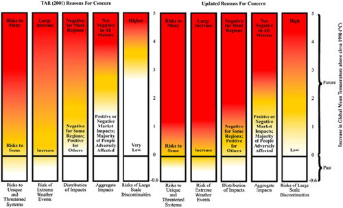
The Blue Marble is one of the most influential photographs of the earth that the Apollo 17 crew took from the earth (). It became a symbol of the vulnerability of the earth. Supposedly it is also one of the most wide-spread images across the globe (Wuebbles, Citation2012) that was produced in the same year as the influential Limits to Growth report (Club of Rome, Citation1972). Up till today these together symbolize the increasing impact of the environmental movement and its uptake on political agendas across the world. It is but one example of the importance of visualizations for environmental policy and planning. Visualization is the representation of an object, situation or set of information in a diagram, photograph, or other sort of image, as well as forming a mental image. Other classic examples of influential visualizations in environmental policy and planning are maps and plans. A famous example is the synthesized map the ‘Blue Banana’ which is representing the main axis of socio-economic activities in Europe, see (Bouattou et al., Citation2017; Brunet, Citation1989). Other examples of influential visualizations come from data-visualization, such as the diagram of the ‘Burning Embers’ from the IPCC report in 2001 (updated in 2009). This diagram visualizes the risks coming from the heating up of the earth (see ) (Schellnhuber, Citation2010). Studies show how these embers have been adapted and contested over time (Mahony, Citation2015; McMahon et al., Citation2016; Wardekker & Lorenz, Citation2019).
Figure 1. The Blue Marble. Source: NASA/Apollo 17 crew; taken by either Harrison Schmitt or Ron Evans.
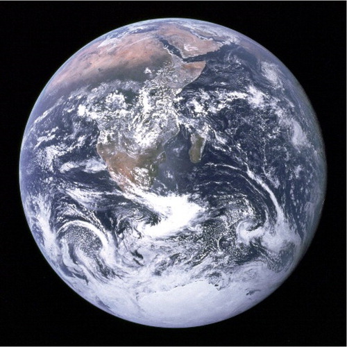
Figure 2. Blue Banana (Bouattou et al., Citation2017).
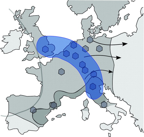
Figure 3. Burning Embers Evolution (Schellnhuber, Citation2010).
The examples illustrate, first of all, that visualizations in environmental policy and planning, range from freehand sketches to virtual reality tools (Al-Kodmany, Citation2002), and can be photographs, maps, diagrams, figures, tables, infographics, stills, artist impressions, cartoons, paintings, 3D, and 4D realities.
Second, these visualizations make selections in their representations. As do all sorts of symbols (numbers, metaphors), visuals synthesize, simplify, affirm, and are sticky: visualizations make you remember well a particular argument, pieces of knowledge, feelings, information (Keller & Keller, Citation1993). For example, the Blue Marble was zooming out of the world that had not been possible before. Portraying the world in a different context. The Blue Banana aggregated data about the socio-economics of Europe and visualized it in a rough sketch of its location. The Burning Embers displays data in particularly alarming colours and words, to flag how risky global warming is. Hence, visualizations always represent a part of a reality and select information, as such they are a ‘picture frame’ (Goffman, Citation1974; Lakoff, Citation2003).
Third, visualizations tell stories. They provide narratives by which we can make sense of the world. In addition, those visual framings are sometimes used strategically to convince audiences. The Blue Marble shows the vulnerability of the earth; the Blue Banana conveys success of a European region; and the Burning Embers tell a story of risk of global warming. Rodriguez and Dimitrova (Citation2011) distinguish four levels of this type of visual framing. Framing takes place at the level of (1) the denotative system – what is in the image: a landscape, people, nature, animals and so on; (2) the stylistic-semiotic system, such as conventions on the use of colours, shading, the camera shot (close up for intimacy for example); (3) the connotative system: what ideas or concepts are narrated by use of symbols and metaphors; and (4) their ideological representation: what interests are served, what voices are heard and which ideas, narratives, dominate (Rodriguez & Dimitrova, Citation2011). Visual framing at these four levels is done tacitly and strategically, and has effects on the audience. However, the audience itself is not only a passive receiver – it also frames the visualizations.
Fourth, the three examples illustrate that the meaning of visualizations is not fixed. It is dynamic in three ways: (1) The maker of the visual may tell a different story than the audience understands it to convey; (2) People have different cultural backgrounds and are part of different denotative and connotative systems and will interpret visualizations differently; and (3) through time, meanings of visualizations will change: there may be changes to the visual itself (in colour, zooming, or adding additional information), and the narratives change (Rodriguez & Dimitrova, Citation2011; Rose, Citation2001; Wong, Citation2019). Think of the Blue Marble: the photographer may just have been in awe of what they saw. In the 1970s we agreed that it symbolizes a vulnerable earth that needs protection. However, at the time there were people who consider it a symbol of crazy environmentalism that threatens the growth of our GDP. This is also the case for graphs and figures that visualize academic findings. For example, the ‘Burning Embers’ diagram from the IPCC report from 2001 that demonstrates the warming up of the earth. Its meaning has been contested and interpreted in different ways (Mahony, Citation2015).
Based on a systematic review of publications on visualizations and environmental policy and planning over the last 20 years, I will discuss the state of the art in the study of visualization in our field. I will look into (1) the type of visuals being studied; (2) the objectives of the study of the visualizations: are authors aiming to more accurately visualize data, to better communicate those, to better understand the impact they have on decision making, on public acceptance, on collaborative planning; or are authors aiming to unravel the changing narratives the visualizations tell?; and (3) the issues that are being visualized: city plans, regions, landscapes, ecological indicators, and so on. Based on the results, I will set an agenda for studies into visualizations in which the public plays an even more active role.
2. Methods
A Boolean search for visual* AND planning in the title of peer-reviewed articles was conducted in the Web of Science core collection and Scopus between 2000 and 2020. These key words were chosen after testing several similar combinations of key words, such as image AND planning; map AND planning, or visual* AND policy, or visual* AND ‘environmental policy’. These search terms delivered respectively a too broad or too narrow set of articles. The search term visual* included all sorts of visualizations, and the term planning gave a broad enough sample for environmental policy and planning journals. The search in Web of Science was conducted on 04022020. A total of 502 articles was retrieved. From these results a sub-selection in the ‘field’ of web of science was created. This selection was: environmental studies, regional urban planning, urban studies, and environmental sciences. This refined the results to 72 articles. In the next step the following fields were excluded: geography, ecology; geography physical; engineering environmental; computer science interdisciplinary applications; operations research management science; economics, business, marine freshwater biology; plant sciences. This left me with 40 results. A citation report was created and exported to excel. This included the complete references and the citation scores for the 40 articles over the last 20 years.
An additional similar search was conducted on the same day in SCOPUS document search for articles or reviews. In total 439 articles were retrieved. We limited the results to the areas: social sciences and environmental sciences. This resulted in 117 articles. I manually excluded 62 articles that were not in the domains of environmental policy and planning, but for example, in education or computer science. To conclude the construction of the set of articles, the Journal of Environmental Policy and Planning was searched for visual* in the title of articles. The result was: two publications over the last 20 years. These three searches resulted in one set of a hundred articles. The set was cleaned for double mentions in the SCOPUS and Web of Science searches. The final set consisted of 66 articles. These articles were manually coded for: (1) what type of visualization was looked into; (2) what role visualization plays in environmental policy and planning processes; and (3) what type of issues were being addressed. This inductive analysis resulted in six categories of types of visuals; (1) photograph; (2) traditional map; (3) traditional sketch or vision; (4) digital visualization (most often GIS maps but also 3D); (5) visual art; and (6) a mix of visualizations. There were five categories discerned of objectives of the study of the visualizations: (1) data-visualization for communication; (2) visualization and effects on and improvement of decision making; (3) visualization and effects on or improvement for public perception/acceptance; (4) visualization and effects on or improvement of public participation cocreation/dialogue; and (5) visualization and how for example NGO’s use it for public accountability and/or activism. The inductive coding of the type of issues being addressed resulted in the following list: urban planning, landscape planning, ecological, and sustainability issues; climate change; coastal issues; wind farms; risk; natural resource management; and studies that looked into all sorts of environmental policy and planning issues.
In addition, in Excel, a chronological analysis was conducted to manually sort the type of visuals and the objectives per paper addressed in the publications per year. This provided an overview of shifts in type of visual and objectives over time. A chronological order was also created for the issues covered in the publications. These were relatively evenly spread out over the years and ranged from urban planning, landscape planning (a.o. wind parks), to natural resources, ecological indicators, and sustainability issues.
Last but not least, a top five highest cited papers within the SCOPUS and Web of Science data-set was created. The two sets were combined into one ranking. Two authors and their groups are cited most: Al-Kodmany with two papers about all sorts of visualization tools for participatory planning (Al-Kodmany, Citation2001; Al-Kodmany, Citation2002); and a team of which S.J.R. Sheppard is part which publishes about the role of visualizing climate change in participatory processes (Burch et al., Citation2010; Salter et al., Citation2009). In addition, it was checked in Scopus and Web of Science, which authors and in what journals the top five papers were cited. This painted a very dispersed picture of the body of scholarship. Authors citing these articles were most of all publishing in interdisciplinary journals, such as Environmental Management; Global Environmental Change; Sustainability Science; Landscape and Urban planning, Computers, Environment and Urban Systems; Ecological Indicators, and so on.
3. Systematic review: visualization in environmental policy and planning research
Over the last 20 years, there is a slight increase in studies of visualization in environmental policy and planning journals (see ). Thirty-five papers of the 66 published over the years, focus on data-visualization for better communication, of which four discuss traditional visualization tools. This majority of publications aims to develop and improve complex digital data-visualization for communication. They aim to contribute to better information-uptake through better visualization of digital data from environmental studies. This confirms earlier studies (Al-Kodmany, Citation2002; Gobster et al., Citation2019). Thirteen studies look into the effects of visualization on decision making and public perception or acceptance, of which seven focus on traditional visualizations. This smallest group of studies looks into public perception of the aesthetics of landscapes and of visualizations of impact of planned for policies. The third group of publications – which is a set of 19 studies – focusses on the role of visualization in processes of public participation and cocreation. Two of those studies focus exclusively on traditional forms of visualization. These scholars study how visualizations are applied to improve public participation and collaborative planning processes and cocreation of knowledge or policies ( and ) ().
Figure 4. Number of articles about visual* per year between 2000 and 2019.
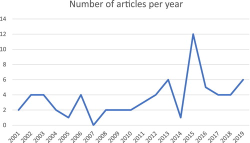
Figure 5. Objectives of the papers about visuals over the years.
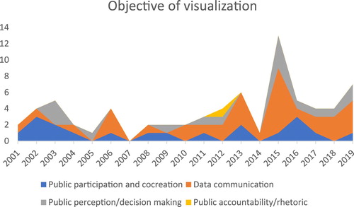
Figure 6. Types of visuals discussed over the years.
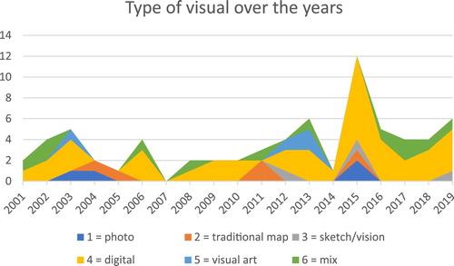
Table 1. An overview of the number of visualization studies in environmental policy and planning according to their main objectives and type of visualization.
3.1. Visualization for improvement of data- communication
The largest category of papers in environmental policy and planning (35) has the objective to improve the techniques and tools for data-visualization in order to better communicate those data. Although the authors of these papers often do mention the importance of improving data-visualization for better decision making or public participation; these studies have modelling and data-visualization literature as a starting point. Their main objective is to contribute to combining and representing data graphically - either digitally or manually (Kirk, Citation2016).
These studies aim to contribute to the connection different sets of data and improve modelling techniques to connect different types of knowledge also in visual ways, with the help of, for example, Geographic Information Systems (GIS) or 3D modelling (Sheppard, Citation2008, p. 38), or a visualization of a sustainability index comparing ecological indicators of different communities (Andersson et al., Citation2013). The connection of different types of knowledge includes the challenge of integration of local specific and experiential knowledge or preferences of citizens with the knowledge of experts (Orenstein et al., Citation2015). The studies also aim to translate numbers, or graphical type of data to symbolic representation. In other words, the studies transform numbers first into a figure (diagram, flow chart), and then into symbols or even images, photographs that represent risks or impact (e.g. Burch et al., Citation2010; Eppler & Platts, Citation2009; Kask et al., Citation2018; Lovett et al., Citation2015; Newell et al., Citation2017). Over the years, the authors increasingly include the public in the development of the datasets and visuals, for example, by including them in the development of 3D visualizations for strategic tourism planning (STP) (see, for example, Kask et al., Citation2018, p. 375; Orenstein et al., Citation2015).
This set of papers shows that is hard to formulate general conclusions on best methods or visuals for data-visualization. A general observations is that many of the papers pay attention to computer graphics and 3D possibilities (e.g. Lewis & Sheppard, Citation2006; Paar, Citation2006), and that the authors consider the public increasingly an important source of information, that needs to be included in the development of the visualizations (see also Sheppard et al., Citation2011).
3.2. Visualization as information and learning for decision making, public perception, and acceptance
The second and smallest set of studies into visualizations – a total of 13 – pay attention to three aspects: (1) how visualizations do or do not contribute to public acceptance of decisions (e.g. Berry & Higgs, Citation2012); (2) how the public perceives and uses the information (e.g. Hayek, Citation2011), and (3) how decision makers use the visualizations in their decisions (e.g. Bryan, Citation2003; Glaas et al., Citation2017)
Contribution: Most of these studies argue and empirically demonstrate that information and learning are key in decision making, public perception, and acceptance. The more and better information is communicated, the better decisions are made, and policies and plans are accepted (see, for example, Burch et al., Citation2010; Glaas et al., Citation2017; Hamilton et al., Citation2001).
Public perception: Many of the papers focus on the visual perception of the landscapes. In the perception studies, there seems to be an agreement that there are many factors that influence people’s perceptions of the beauty of landscapes: since these are cultural associations that people have with the landscape, depending on their age, or life cycle, the naturalness of the landscape, the familiarity, or professional engagement with the landscape (see for an overview Scott, Citation2003; or Filova et al., Citation2015, p. 2038).
Decision making: A subset of the papers are about visual assessment and visual impact studies of environmental, ecological, sustainability policies and decisions on the landscape (Gobster et al., Citation2019). In landscape and urban planning there is a tradition of visual assessment or impact studies. These studies aim to describe and evaluate ‘scenic beauty of landscapes’ (Daniel, Citation2001). In their overview paper, Gobster et al. (Citation2019), dedicate one section to the role of visualization in these studies. They conclude that over the last 40 years there have been many innovations of which (1) the use of digital photomanipulation to visualize possible intervention in the landscape is an important one; and a second one is the increased user-friendliness of technologies that allows for broad participatory approaches in visualization (Gobster et al., Citation2019, p. 4 and 5).
I observe another trend in these studies: they are more and more about data-visualization of climate change (Burch et al., Citation2010; Glaas et al., Citation2017; Mahony, Citation2015; Sheppard, Citation2005). These studies want to raise public awareness for an urgent but rather abstract problem. There is also a growing body of literature in energy policies and that looks into the visualization in planning process or siting of wind turbines or solar parks (Baile et al., Citation2011; Berry & Higgs, Citation2012; Haggett, Citation2008; Lange & Hehl-Lange, Citation2006; Lewis, Citation2012).
Again, it is hard to draw general conclusions from this set of papers. The authors seem to agree that visualizing information is necessary to improve learning by decision makers and the public. The studies also demonstrate that people have context-bounded visual preferences for visual outlook of landscapes. These preferences are depending on their cultural background, age, professional engagement with the landscape, and so on. Compared to the data-visualization papers in the section above; all of the papers in this set give more agency to the public and decision makers. The public and decision makers not only passively receive information but actively process information.
3.3. Visualization for public participation and cocreation
In the third broad group of literature on visualization (18 papers), the authors develop visualizations together with diverse groups of stakeholders. Similar to the studies in previous categories, the scholars consider the visualizations ways to provide knowledge, and inform citizens and decision makers in accessible ways. However, they also have the ambition to empower citizens, and through (collaborative) visualizations facilitate their participation in decision making processes. Decision making needs to go beyond ‘Informing citizens to enable them to make empowered decisions (Forester, Citation1989)’ and have them play a much more active and influential role. For example, maps are considered particularly helpful tools in breaking down power hierarchies (Guldi, Citation2017, p. 80). There are also authors with the ambition to increase the legitimacy of decision making processes through the use of visuals in participatory processes. Other authors offer reasons for efficiency: for example, they argue visualization can help to bridge the ‘implementation gap between vision and action’ (Billger et al., Citation2017).
Based on the review of all of the papers in this set, I draw five conclusions. First of all, visualizations contribute to learning and participation. The use of visuals for this reason once started with the ‘crowdsourced map’ in urban planning (Guldi, Citation2017, p. 99), and more recently virtual reality tools have been introduced. Second, especially these digital or e-planning tools are promising for high levels of interaction. According to the authors, the visual and even virtual reality elements make it easier to communicate complex information (An & Powe, Citation2015; Billger et al., Citation2017).
Third, the studies also suggest that the computerized visualizations are most useful to convey information and engage in conversations about the meaning of data; but that the more traditional visualizations tools ‘create the social learning environment that enables participants to talk about a project together, to interact with other stakeholders, and to propose ideas’ (Al-Kodmany, Citation2001; An & Powe, Citation2015). Hence, digital tools facilitate the reflection on the meaning of data – but the traditional tools facilitate a creative process.
Fourth, in this set of articles, the public is addressed a lot of agency, and the authors seek ways to empower them. The authors show that the public contributes with ideas and information necessary for the development of scenario’s, policy options that can be visualized. Very often the ambition is to increase participants’ understanding of what is at stake – and to facilitate collaborative exploration of possible outcomes (e.g. Gill et al., Citation2013; Salter et al., Citation2009).
A fifth conclusion is that the authors pay less attention to the specifics of the visualizations. There is hardly any study that addressed their material dimension: what is on it, in it, their style, shape, colours, and form – are often understudied. With the exception of some papers that indicate that the visualization tools very often limit the type of visual input – and determines the visual language participants have to speak. There is also a warning against ‘mis-empowerment’ – which means that the tools may empower stakeholders and citizens in environments in which they do not have influence (Billger et al., Citation2017, p. 1026).
4. A research agenda: visualization in environmental policy and planning
The systematic review demonstrates that over the last 20 years the journals in environmental policy and planning have increasingly published about the role of visualizations (1) as tools for data-communication (2) as providing information and learning tools for decision makers and the general public (3) as part of knowledge cocreation and participatory planning processes. The review also demonstrates that the Journal of Environmental Policy and Planning has not been part of this trend. Yet, the journal has an important role to play. It provides a platform for studies that engage critically with theories and analytical approaches, which is much needed for the study of visualizations, especially in times mediatization and digitalization (see below).
Before formulating the research agenda, I would like to point out that for this review, I am relying on a data-set that may not represent the full population of articles. The searched titles and search terms were constrained. Other approaches to searching for articles might yield more or different results. In addition, I have conducted a manual analysis, which is prone to a difference of interpretation of the text by researchers, and other interpretations of the literature are possible.
4.1. Despite these constraints, there are three main agenda setting points, that I put forward
Digital visualizations for data-communication: moving beyond the knowledge deficit model.
The review shows that digital visualizations are further developed in order to better integrate academic knowledge, the concerns, interests, and experiential knowledge of stakeholders and citizens. There is a trend to be discerned, also in the publications about data-communication – to include stakeholders, citizens, and decision makers in the creation of new models, and visualizations. Their inclusion is aimed for in order to make the visualization tools more accurate, adaptive, or inclusive. Still, these studies are mostly working within a linear knowledge model (Turnhout et al., Citation2013). In a linear knowledge model, visualizations provide a form and style of science communication and are communication tools to address a ‘knowledge gaps’ from the public: make them more aware, better inform them. Although better informing is one role visualizations may play, many other studies demonstrate that a knowledge deficit is usually not the issue. The public that is concerned and involved in environmental policy and planning issues does gather knowledge, gets access to information. However, very often they will argue based on counter-facts, make use of uncertainties, ambiguity, and controversies within the academic world (Metze, Citation2017; Oreskes & Conway, Citation2010; Pielke, Citation2004; Sarewitz, Citation2004). The challenge for visualizations studies is to move beyond the idea that more and better information through visualizations will improve environmental policies and planning. Scholars in data-visualization should make even more use of the participatory concepts and methods developed in the second largest strand of literature on visualizations in knowledge-cocreation and participatory planning (see below). In this cocreation literature, the linear model is replaced with a dialogue mode, and the role of scientists is not only to produce and communicate about their knowledge; but to also listen to society and engage in conversations in order to better integration of different types of knowledge – including that of the general public. In order to successfully do so, scholars need to produce visuals that not only speak to the mind but also to the heart (Lakoff, Citation2003; Lakoff, Citation2010).
(2) The cocreation literature can make further explicit and learn about the specifics of visualizations in collaborative processes.
A second conclusion is that indeed visuals and visual methods in environmental policy and planning, are considered devices or even tools for knowledge cocreation, collaborative planning, and participatory decision making. In these collaborative processes, academics are participatory knowledge producers (Pielke, Citation2007). Rather than providing information and knowledge, together with other societal actors, academics engage in knowledge cocreation and participatory planning processes (see also Sheppard, Citation1995). These studies do start from a knowledge-brokering model in which the academics supply relevant knowledge, bridge between different types of expertise from science, society and politics, and facilitate an integration of different types of expertise, norms, and values from science, society, and politics (Turnhout et al., Citation2013). This strand of literature could consider and further develop visualizations as ‘boundary objects’, which help to bridge and integrate different types of expertise, norms, and values (Carlile, Citation2002; Star & Griesemer, Citation1989). Through these boundary objects, actors can cocreate, learn and participate in policy and planning (Klerkx et al., Citation2012; Metze, Citation2010). Different types of boundary objects, such as sketches and prototypes can help in the knowledge integration process.
In addition, these studies could even better scrutinize the particularities of visualizations as enablers of cocreation: what is it that makes visuals particularly suitable for engaging, connecting, and integrating different types of knowledge? Is there a more universal language in colours, symbols, styles, and forms of visuals, that makes it possible to overcome language barriers or cultural barriers? Visualizations speak to us in different ways than numbers and language: less cognitive, more directly to the eye and heart (Berger, Citation1972), and able to cross language barriers (Doerr, Citation2017a, p. 7). We have the tendency to trust what we see; more than the words we hear (Berger, Citation1972). Even though we know that visualizations are simplifications and sometimes even manipulated purposefully. Hence, in future research we could better scrutinize the role of the ‘material’ dimensions of visualizations. It is interesting to better understand how the ‘denotative system’ of an image (what is in the image: a landscape, people, nature, animals, and so on); and the ‘stylistic-semiotic system’, such as conventions on use of colours, shading, the camera shot (close up for intimacy, for example) (Rodriguez & Dimitrova, Citation2011) and how these enable or constrain participatory planning processes, and processes of knowledge cocreation for environmental policy and planning. Insights, theories, and methods from art and the humanities, for example (Rose, Citation2007) or (Krause & Bucy, Citation2018; Lewis, Citation2012; Wong, Citation2019); but also closer to home from ‘research by design’ (Roggema, Citation2016; Servillo & Schreurs, Citation2013) may be very helpful. In these studies, specific attention is being paid to material dimensions of objects, designs, concepts, and how they can be applied in the development of transdisciplinary knowledge, or participatory decision making.
(3) Found visualizations by citizens, NGO’s and others as sources of information and learning
A third conclusion is that notably little attention is being paid to the more active role citizens and other actors can play in visualizing their preferences in so-called found visualizations. Visuals that not have been created with the purpose of contributing to an academic study, but those to be found in magazines, art exhibitions, reports by, for example, NGO’s and governmental actors, and on the internet and in social media. For academics, we need to consider these visualizations as a form of public ‘knowledge brokering’ (Ryan, Citation2011). We can study these visualizations in order to better understand the public sentiment, and we can consider these visuals to carry information through which NGO’s and the general public hold governing actors accountable: it is a form of public accountability (Bekkers & Moody, Citation2014; Karlsson-Vinkhuyzen et al., Citation2016). In other words, this type of visualization of information and opinions offers insights into what may optimistically be called ‘societal intelligence’: how do societal actors perceive particular issues, what and how facts become public, what information is overlooked in academic studies and decision making, and what information is travelling around at what speed and why?
Online circulating visuals may serve as an entry point to social sciences to study the connections between data production by academics but also societal actors, information-storage and circulation. Academics and policy makers can learn from the study of the visual societal mood about particular issues, and it is not only the facts that count in understanding and defining environmental and planning issues but also the values, norms, and emotions (Metze, Citation2018). This is already done in some social sciences, for example, in social movement studies (Della Porta et al., Citation2014; Doerr, Citation2017b), visual communication and culture (Mitchell, Citation2005; Shanken, Citation2018), visual rhetoric and visual framing (Clancy & Clancy, Citation2016; Rodriguez & Asoro, Citation2012), and visual anthropology (Balayannis, Citation2019; Cerku, Citation2019; Frosh, Citation2001; Spiegel, Citation2019). More recently, also in critical policy analysis (Hendriks et al., Citation2017), and digital sociology (Stocchetti, Citation2014). The critical and engaged citizens, NGO’s, photo-journalists and others play an important role in environmental policy and planning issues by making visible what is left invisible, and should be taken seriously in academic studies and in decision making (Clancy & Clancy, Citation2016; Pearce et al., Citation2019). We can make use of digital methods to study how and why actors on the internet and on social media visualize information and spread this information (see, for example, Rogers, Citation2013). Including those who are purposefully spreading fake news and fake facts. We would want to know what their influence is, and why they are successful (Johnson et al., Citation2020).
5. Conclusion
In visualizations studies in environmental policy and planning, the public is increasingly included in the development of visuals for the improvement of data-communication. In addition, there is a long-standing tradition of using visualizations in participatory planning and knowledge cocreation, and there is substantial knowledge available about the public perception of visualizations, and visual elements in the landscape. This provides environmental policy and planning with a sound basis for handling the challenges from what Green (Citation2010) has called an ‘ocular turn’. In a mediatized and globalized world, the visual becomes increasingly influential. Data-visualizations but also photographs such as the Blue Marble and the flaming faucet in the shale gas controversy are used and (re)produced by a global public that aims to make visible the invisible. The visualizations travel fast across the internet and in social media: they cross linguistical barriers; and in forms of data-visualization – convey information in more convincing ways than words, and as such are very influential in opinion formation and decision making. In response to this, academics in environmental policy and planning can further develop their role of knowledge brokers (next to those of the pure scientists) and further develop their data-visualizations in imaginative directions that also speak to the heart and not only minds of the general public. In addition, academics can better take into account the visualizations that all sorts of actors use and (re)produce. This makes it possible to know what societal actors deem important and include that in environmental policy and planning, but also in the improvement of data-visualization. Last but not least, in these studies, we can look into what actors and types of visualizations are being used to spread fake news and fake facts. This may help practitioners to debunk this information and develop strategies to cope with fake news and fake facts. An ocular turn in environmental policy and planning is not necessary; the recognition of the importance of visualizations is omni-present. However, the acknowledgement of an active global public – that is not only receiving visual information but also producing influential visualizations leads to innovations in visualization-research.
Disclosure statement
No potential conflict of interest was reported by the author(s).
Notes on contributor
Tamara Metze is associate professor in the Public Administration and Policy group at Wageningen University and Research. She works at the intersection of public administration and science and technology studies. Her research concerns questions about the possibility of democratic innovations, with special interest in deliberation, boundary objects, visuals, framing, scenario development for energy and food controversies, and urban planning. Metze is project leader of the NWO-MVI project Traveling of Framed Facts and Uncertainties. Her research has been published in a.o. Environmental Communication, Journal of Cleaner Production, Current Opinion in Environmental Sustainability.
Additional information
Funding
References
- Al-Kodmany, K. (2001). Visualization tools and methods for participatory planning and design. Journal of Urban Technology, 8(2), 1–37. https://doi.org/10.1080/106307301316904772
- Al-Kodmany, K. (2002). Visualization tools and methods in community planning: From freehand sketches to virtual reality. Journal of Planning Literature, 17(2), 189–211. https://doi.org/10.1177/088541202762475946
- Alshuwaikhat, H. M., & Nkwenti, D. I. (2002). Visualizing decisionmaking: Perspectives on collaborative and participative approach to sustainable urban planning and management. Environment and Planning B: Planning and Design, 29(4), 513–531. https://doi.org/10.1068/b12818
- An, K., & Powe, N. A. (2015). Enhancing ‘boundary work’ through the use of virtual reality: Exploring the potential within landscape and visual impact assessment. Journal of Environmental Policy and Planning, 17(5), 673–690. https://doi.org/10.1080/1523908X.2015.1012757
- Andersson, K., Angelstam, P., Axelsson, R., Elbakidze, M., & Tornblom, J. (2013). Connecting municipal and regional level planning: Analysis and visualization of sustainability indicators in Bergslagen, Sweden. European Planning Studies, 21(8), 1210–1234. https://doi.org/10.1080/09654313.2012.722943
- Axelsson, R., Angelstam, P., Degerman, E., Teitelbaum, S., Andersson, K., Elbakidze, M., & Drotz, M. K. (2013). Social and cultural sustainability: Criteria, indicators, verifier variables for measurement and maps for visualization to support planning. Ambio, 42(2, SI), 215–228. https://doi.org/10.1007/s13280-012-0376-0
- Baile, I., West, J., & Whitehead, I. (2011). Out of sight but not out of mind? Public perceptions of wave energy. Journal of Environmental Policy and Planning, 13(2), 139–157. https://doi.org/10.1080/1523908X.2011.573632
- Balayannis, A. (2019). Routine exposures: Reimaging the visual politics of hazardous sites. GeoHumanities, 1–19. https://doi.org/10.1080/2373566x.2019.1624189
- Bekkers, V., & Moody, R. (2014). Accountability and the framing power of visual technologies: How do visualized reconstructions of incidents influence public and political accountability discussions? The Information Society, 30(2), 144–158. https://doi.org/10.1080/01972243.2013.873749
- Beratan, K. A. (2019). Improving problem definition and project planning in complex natural resource management problem situations using knowledge brokers and visual design principles. Ecology and Society, 24(2), https://doi.org/10.5751/ES-10815-240231
- Berger, J. (1972). John berger. Ways of Seeing, 50, 249–259. http://www.ncbi.nlm.nih.gov/entrez/query.fcgi?cmd=Retrieve&db=PubMed&dopt=Citation&list_uids=19833147
- Berry, R., & Higgs, G. (2012). Gauging levels of public acceptance of the use of visualisation tools in promoting public participation; a case study of wind farm planning in South Wales, UK. Journal of Environmental Planning and Management, 55(2), 229–251. https://doi.org/10.1080/09640568.2011.591925
- Billger, M., Thuvander, L., & Wastberg, B. S. (2017). In search of visualization challenges: The development and implementation of visualization tools for supporting dialogue in urban planning processes. Environment and Planning B-Urban Analytics and City Science, 44(6), 1012–1035. https://doi.org/10.1177/0265813516657341
- Bouattou, Z., Laurini, R., & Belbachir, H. (2017). Animated chorem-based summaries of geographic data streams from sensors in real time. Journal of Visual Languages and Computing, 41(October), 54–69. https://doi.org/10.1016/j.jvlc.2017.03.002
- Brunet, R. (1989). Les villes ‘europeennes’ (RECLUS). Rapport pour la Datar.
- Bryan, B. A. (2003). Physical environmental modeling, visualization and query for supporting landscape planning decisions. Landscape and Urban Planning, 65(4), 237–259. https://doi.org/10.1016/S0169-2046(03)00059-8
- Burch, S., Sheppard, S. R. J., Shaw, A., & Flanders, D. (2010). Planning for climate change in a flood-prone community: Municipal barriers to policy action and the use of visualizations as decision-support tools. Journal of Flood Risk Management, 3(2), 126–139. https://doi.org/10.1111/j.1753-318X.2010.01062.x
- Carlile, P. R. (2002). View of knowledge and boundaries : Boundary objects in new product development. Organization Science, 13(4), 442–455. https://doi.org/10.1287/orsc.13.4.442.2953
- Cerku, A. (2019). Applied visual anthropology in the progressive era: The influence of Lewis Hine’s child labor photographs. Visual Anthropology, 32(3–4), 221–239. https://doi.org/10.1080/08949468.2019.1637670
- Chau, K. W., Anson, M., & Zhang, J. P. (2003). Implementation of visualization as planning and scheduling tool in construction. Building and Environment, 38(5), 713–719. https://doi.org/10.1016/S0360-1323(02)00239-1
- Clancy, K. A., & Clancy, B. (2016). Growing monstrous organisms: The construction of anti-GMO visual rhetoric through digital media. Critical Studies in Media Communication, 33(3), 279–292. https://doi.org/10.1080/15295036.2016.1193670
- Club of Rome. (1972). The Limits to growth. A Potomac Associates Book.
- Daniel, T. C. (2001). Whither scenic beauty? Visual landscape quality assessment in the 21st century. Landscape and Urban Planning, 54(1–4), 267–281. https://doi.org/10.1016/S0169-2046(01)00141-4
- Della Porta, D., Diani, M., Doerr, N., Mattoni, A., & Teune, S. (2014). Visuals in social movements. In The Oxford handbook of social movements, March 2018 (pp. 1–13). https://doi.org/10.1093/oxfordhb/9780199678402.013.48
- DeSimone, J. C., Everling, S., & Heath, M. (2015). The antisaccade task: Visual distractors elicit a location-independent planning ‘cost.’ PLoS ONE, 10(4), e0122345. https://doi.org/10.1371/journal.pone.0122345
- Doerr, N. (2017a). Bridging language barriers, bonding against immigrants: A visual case study of transnational network publics created by far-right activists in Europe. Discourse and Society, 28(1), 3–23. https://doi.org/10.1177/0957926516676689
- Doerr, N. (2017b). How right-wing versus cosmopolitan political actors mobilize and translate images of immigrants in transnational contexts. Visual Communication, 16(3), 315–336. https://doi.org/10.1177/1470357217702850
- Dühr, S. (2004). The form, style, and use of cartographic visualisations in European spatial planning: Examples from England and Germany. Environment and Planning A: Economy and Space, 36(11), 1961–1989. https://doi.org/10.1068/a35262
- Dupont, L., Antrop, M., & Van Eetvelde, V. (2015). Does landscape related expertise influence the visual perception of landscape photographs? Implications for participatory landscape planning and management. Landscape and Urban Planning, 141, 68–77. https://doi.org/10.1016/j.landurbplan.2015.05.003
- Eppler, M. J., & Platts, K. W. (2009). Visual strategizing. The systematic use of visualization in the strategic-planning process. Long Range Planning, 42(1), 42–74. https://doi.org/10.1016/j.lrp.2008.11.005
- Feng, W., Wenhua, L., & Xiangguan, G. (2019). The research on the construction of urban visual planning system based on the development of cultural tourism industry. Open House International, 44(3), 136–140.
- Filova, L., Vojar, J., Svobodova, K., & Sklenicka, P. (2015). The effect of landscape type and landscape elements on public visual preferences: Ways to use knowledge in the context of landscape planning. Journal of Environmental Planning and Management, 58(11), 2037–2055. https://doi.org/10.1080/09640568.2014.973481
- Forester, J. (1989). Planning in the face of power. University of California Press.
- Frosh, P. (2001). The public eye and the citizen-voyeur: Photography as a performance of power. Social Semiotics, 11(1), 43–59. https://doi.org/10.1080/10350330123316
- George Szekely. (2006). 30 years of planning an artist-teacher’s visual lesson plan books. Art Education, 59(3), 48–54. https://doi.org/10.1080/00043125.2006.11651595
- Gill, L., Lange, E., Morgan, E., & Romano, D. (2013). An analysis of usage of different types of visualisation media within a collaborative planning workshop environment. Environment and Planning B: Planning and Design, 40(4), 742–754. https://doi.org/10.1068/b38049
- Girling, C., Senbel, M., & Kellett, R. (2016). Effects of visualizations and information rich public engagement in planning for energy and emissions. Journal of Architectural and Planning Research, 33(2), 140–158.
- Glaas, E., Ballantyne, A. G., Neset, T. S., & Linnér, B. O. (2017). Visualization for supporting individual climate change adaptation planning: Assessment of a web-based tool. Landscape and Urban Planning, 158, 1–11. https://doi.org/10.1016/j.landurbplan.2016.09.018
- Gobster, P. H., Ribe, R. G., & Palmer, J. F. (2019). Themes and trends in visual assessment research: Introduction to the landscape and urban planning special collection on the visual assessment of landscapes. Landscape and Urban Planning, 191(July), Article 103635. https://doi.org/10.1016/j.landurbplan.2019.103635
- Goffman, E. (1974). Frame analysis: An essay on the organization of experience. Northeastern Univrsity Press.
- Green, J. E. (2010). The eyes of the people: Democracy in an age of spectatorship. Oxford University Press.
- Guldi, J. (2017). A history of the participatory map. Public Culture, 29(1), 79–112. https://doi.org/10.1215/08992363-3644409
- Haara, A., Pykalainen, J., Tolvanen, A., & Kurttila, M. (2018). Use of interactive data visualization in multi-objective forest planning. Journal of Environmental Management, 210, 71–86. https://doi.org/10.1016/j.jenvman.2018.01.002
- Haggett, C. (2008). Over the sea and far away? A consideration of the planning, politics and public perception of offshore wind farms. Journal of Environmental Policy and Planning, 10(3), 289–306. https://doi.org/10.1080/15239080802242787
- Hamilton, A., Trodd, N., Zhang, X., Fernando, T., & Watson, K. (2001). Learning through visual systems to enhance the urban planning process. Environment and Planning B: Planning and Design, 28(6), 833–845. https://doi.org/10.1068/b2747t
- Hayek, U. W. (2011). Which is the appropriate 3D visualization type for participatory landscape planning workshops? A portfolio of their effectiveness. Environment and Planning B-Planning & Design, 38(5), 921–939. https://doi.org/10.1068/b36113
- Hemmersam, P., Martin, N., Westvang, E., Aspen, J., & Morrison, A. (2015). Exploring urban data visualization and public participation in planning. Journal of Urban Technology, 22(4), 45–64. https://doi.org/10.1080/10630732.2015.1073898
- Hendriks, C. M., Ercan, S. A., & Duus, S. (2017, June 28–30). A picture worth a thousand words? Visuals in public deliberation. 3rd International Conference on Public Policy (ICPP3), Singapore.
- Huggins, T. J., & Peace, R. (2014). Visually planning sustainability research: A case study of interdisciplinary collaboration. Sustainability: The Journal of Record, 7(4), 209–218. https://doi.org/10.1089/SUS.2014.9781
- Jász, B. (2018). Mental map of the city: Elements of visual argumentation and creativity in modern city planning. Creativity Studies, 11(2), 284–293. https://doi.org/10.3846/cs.2018.6901
- Jeong, J. S., Jesus Montero-Parejo, M., Garcia-Moruno, L., & Hernandez-Blanco, J. (2015). The visual evaluation of rural areas: A methodological approach for the spatial planning and color design of scattered second homes with an example in Hervas, Western Spain. Land Use Policy, 46, 330–340. https://doi.org/10.1016/j.landusepol.2015.04.001
- Johnson, N. F., Velásquez, N., Restrepo, N. J., Leahy, R., Gabriel, N., El Oud, S., Zheng, M., Manrique, P., & Wuchty, S. (2020). The online competition between pro- and anti-vaccination views.. Nature. https://doi.org/10.1038/s41586-020-2281-1
- Karlsson-Vinkhuyzen, S. I., Friberg, L., & Saccenti, E. (2016). Read all about it!? Public accountability, fragmented global climate governance and the media. Climate Policy, 3062(August), 1–12. https://doi.org/10.1080/14693062.2016.1213695
- Kask, S., Kull, T., & Orru, K. (2018). The use of 3D visualization for sustainable tourism planning. Journal of Baltic Studies, 49(3), 371–385. https://doi.org/10.1080/01629778.2018.1455719
- Keller, P. R., & Keller, M. M. (1993). Visual cues: Practical data visualization. IEEE ComputerSocietyPress.
- Kim, K. H., & Wilson, J. P. (2015). Planning and visualising 3D routes for indoor and outdoor spaces using CityEngine. Journal of Spatial Science, 60(1), 179–193. https://doi.org/10.1080/14498596.2014.911126
- Kirk, A. (2016). Dat visualization: A handbook for data driven design. Sage.
- Klerkx, L., van Bommel, S., Bos, B., Holster, H., Zwartkruis, J. V., & Aarts, N. (2012). Design process outputs as boundary objects in agricultural innovation projects: Functions and limitations. Agricultural Systems, 113, 39–49. https://doi.org/10.1016/j.agsy.2012.07.006
- Kozaki, M & Hirate, K. (2016). Basic research for developing lighting planning chart of retail: Focusing on visual environmental index and lighting environmental factors. Journal of Environmental Engineering (Transactions of AIJ), 81(724), 503–512. https://doi.org/10.3130/aije.81.503
- Krassanakis, V., & Vassilopoulou, V. (2018). Introducing a data-driven approach towards the identification of grid cell size threshold (CST) for spatial data visualization: An application on marine spatial planning (MSP). Journal of Urban and Environmental Engineering, 12(1), 3–14. https://doi.org/10.4090/juee.2018.v12n1.003014
- Krause, A., & Bucy, E. P. (2018). Interpreting images of fracking: How visual frames and standing attitudes shape perceptions of environmental risk and economic benefit. Environmental Communication, 12(3), 322–343. https://doi.org/10.1080/17524032.2017.1412996
- Krisp, J. M. (2010). Planning fire and rescue services by visualizing mobile phone density. Journal of Urban Technology, 17(1), 61–69. https://doi.org/10.1080/10630731003597330
- Lakoff, G. (2003). George Lakoff and Mark Johnsen (2003) metaphors we live by. The University of Chicago Press. Noter om layout : Innholdsfortegnelse i Word : In Journal of Philosophy.
- Lakoff, G. (2010). Why it matters how we frame the environment. Environmental Communication, 4(1), 70–81. https://doi.org/10.1080/17524030903529749
- Lange, E., & Hehl-Lange, S. (2006). Integrating 3D visualisation in landscape design and environmental planning. GAIA - Ecological Perspectives for Science and Society, 15(3), 195–199. https://doi.org/10.14512/gaia.15.3.15
- Lee-Miller, T., Marneweck, M., Santello, M., & Gordon, A. M. (2016). Visual cues of object properties differentially affect anticipatory planning of digit forces and placement. PLoS ONE, 11(4), e0154033. https://doi.org/10.1371/journal.pone.0154033
- Lewis, J. L. (2012). More art than science: The sources and effects of stylistic variation in visualization for planning and design. Environment and Planning B-Planning & Design, 39(3), 551–565. https://doi.org/10.1068/b37148
- Lewis, J. L., & Sheppard, S. R. J. (2006). Culture and communication: Can landscape visualization improve forest management consultation with indigenous communities? Landscape and Urban Planning, 77(3), 291–313. https://doi.org/10.1016/j.landurbplan.2005.04.004
- Lovett, A., Appleton, K., Warren-Kretzschmar, B., & Von Haaren, C. (2015). Using 3D visualization methods in landscape planning: An evaluation of options and practical issues. Landscape and Urban Planning, 142, 85–94. https://doi.org/10.1016/j.landurbplan.2015.02.021
- Maffei, L., Masullo, M., Pascale, A., Ruggiero, G., & Romero, V. P. (2016). Immersive virtual reality in community planning: Acoustic and visual congruence of simulated vs real world. Sustainable Cities and Society, 27, 338–345. https://doi.org/10.1016/j.scs.2016.06.022
- Mahony, M. (2015). Climate change and the geographies of objectivity: The case of the IPCC’s burning embers diagram. Transactions of the Institute of British Geographers, 40(2), 153–167. https://doi.org/10.1111/tran.12064
- McMahon, R., Stauffacher, M., & Knutti, R. (2016). The scientific veneer of IPCC visuals. Climatic Change, 138(3–4), 369–381. https://doi.org/10.1007/s10584-016-1758-2
- Metze, T. (2010). Innovation Ltd.: boundary work in deliberative governance in land use planning. Eburon.
- Metze, T. (2017). Fracking the debate: Frame shifts and boundary work in Dutch decision making on shale gas. Journal of Environmental Policy & Planning, https://doi.org/10.1080/1523908X.2014.941462
- Metze, T. (2018). Visual framing for policy learning. In N. F. Dotti (Ed.), Knowledge, policymaking and learning for European cities and regions (pp. 165–180). Edward Elgar (New Horizons in regional science series ).
- Mitchell, T. W. (2005). What do pictures want? The lives and loves of images. University of Chicago.
- Natori, Y., Fukui, W., & Hikasa, M. (2005). Empowering nature conservation in Japanese rural areas: A planning strategy integrating visual and biological landscape perspectives. Landscape and Urban Planning, 70(3–4 SPEC. ISS), 315–324. https://doi.org/10.1016/j.landurbplan.2003.10.025
- Newell, R., Canessa, R., & Sharma, T. (2017). Visualizing our options for coastal places: Exploring realistic immersive geovisualizations as tools for inclusive approaches to coastal planning and management. Frontiers in Marine Science, 4. https://doi.org/10.3389/fmars.2017.00290
- Olfat, H., Jani, A., Shojaei, D., Darvill, A., Briffa, M., Rajabifard, A., & Badiee, F. (2019). Tackling the challenges of visualising digital cadastral plans: The Victorian cadastre experience. Land Use Policy, 83, 84–94. https://doi.org/10.1016/j.landusepol.2019.01.037
- Onitsuka, K., Ninomiya, K., & Hoshino, S. (2018). Potential of 3D visualization for collaborative rural landscape planning with remote participants. Sustainability, 10(9), https://doi.org/10.3390/su10093059
- Orenstein, D. E., Zimroni, H., & Eizenberg, E. (2015). The immersive visualization theater: A new tool for ecosystem assessment and landscape planning. Computers, Environment and Urban Systems, 54, 347–355. https://doi.org/10.1016/j.compenvurbsys.2015.10.004
- Oreskes, N., & Conway, E. M. (2010). Merchants of doubt. Bloomsburry Press.
- Paar, P. (2006). Landscape visualizations: Applications and requirements of 3D visualization software for environmental planning. Computers, Environment and Urban Systems, 30(6), 815–839. https://doi.org/10.1016/j.compenvurbsys.2005.07.002
- Paklone, I. (2011). Conceptualization of visual representation in urban planning. Limes, 4(2), 150–161. https://doi.org/10.3846/20290187.2011.631046
- Pearce, W., Niederer, S., Özkula, S. M., & Sánchez Querubín, N. (2019). The social media life of climate change: Platforms, publics, and future imaginaries. Wiley Interdisciplinary Reviews: Climate Change, 10(2), 1–13. https://doi.org/10.1002/wcc.569
- Pielke, R. A. (2004). When scientists politicize science: Making sense of controversy over The Skeptical Environmentalist. Environmental Science and Policy, 7(5), 405–417. https://doi.org/10.1016/j.envsci.2004.06.004
- Pielke, R. (2007). The honest broker: Making sense of science in policy and politics. Cambridge University Press.
- Radinsky, J., Milz, D., Zellner, M., Pudlock, K., Witek, C., Hoch, C., & Lyons, L. (2017). How planners and stakeholders learn with visualization tools: Using learning sciences methods to examine planning processes. Journal of Environmental Planning and Management, 60(7), 1296–1323. https://doi.org/10.1080/09640568.2016.1221795
- Robert, S. (2018). Assessing the visual landscape potential of coastal territories for spatial planning. A case study in the French Mediterranean. Land Use Policy, 72, 138–151. https://doi.org/10.1016/j.landusepol.2017.12.037
- Rodriguez, L., & Asoro, R. L. (2012). Visual representations of genetic engineering and genetically modified organisms in the online media. Visual Communication Quarterly, 19(4), 232–245. https://doi.org/10.1080/15551393.2012.735585
- Rodriguez, L., & Dimitrova, D. V. (2011). The levels of visual framing. Journal of Visual Literacy, 30(1), 48–65. https://doi.org/10.1080/23796529.2011.11674684
- Rogers, R. (2013). Digital methods. MIT Press.
- Roggema, R. (2016). Research by design: Proposition for a methodological approach. Urban Science, 1(1), 2. https://doi.org/10.3390/urbansci1010002
- Rose, G. (2001). Visual methodologies. SAGE.
- Rose, G. (2007). Visual methodologies an introduction to the interpretation of visual materials. Sage.
- Royse, K. R., Reeves, H. J., & Gibson, A. R. (2008). The modelling and visualization of digital geoscientific data as a communication aid to land-use planning in the urban environment: An example from the Thames Gateway. Geological Society, London, Special Publications, 305(January), 89–106. https://doi.org/10.1144/SP305.10
- Ryan, B. D. (2011). Reading through a plan: A visual interpretation of what plans mean and how they innovate. Journal of the American Planning Association, 77(4), 309–327. https://doi.org/10.1080/01944363.2011.616995
- Salter, J. D., Campbell, C., Journeay, M., & Sheppard, S. R. J. (2009). The digital workshop: Exploring the use of interactive and immersive visualisation tools in participatory planning. Journal of Environmental Management, 90(6, SI), 2090–2101. https://doi.org/10.1016/j.jenvman.2007.08.023
- Sarewitz, D. (2004). How science makes environmental controversies worse. Environmental Science and Policy, 7(5), 385–403. https://doi.org/10.1016/j.envsci.2004.06.001
- Schellnhuber, H. J. (2010). Tragic triumph. Climatic Change, 100(1), 229–238. https://doi.org/10.1007/s10584-010-9838-1
- Schmid, W. A. (2001). The emerging role of visual resource assessment and visualisation in landscape planning in Switzerland. Landscape and Urban Planning, 54(1–4), 213–221. https://doi.org/10.1016/S0169-2046(01)00137-2
- Scott, A. (2003). Assessing public perception of landscape: From practice to policy. Journal of Environmental Policy and Planning, 5(2), 123–144. https://doi.org/10.1080/1523908032000121193
- Servillo, L., & Schreurs, J. (2013). Pragmatism and research by design: Epistemological virtues and methodological challenges. International Planning Studies, 18(3–4), 358–371. https://doi.org/10.1080/13563475.2013.837136
- Shanken, A. M. (2018). The visual culture of planning. Journal of Planning History, 17(4), 300–319. https://doi.org/10.1177/1538513218775122
- Sheppard, E. (1995). GIS and society: Towards a research agenda. Hy and Geographic Information Systems, 1995(22), 5–16. https://doi.org/10.1559/152304095782540555
- Sheppard, S. R. J. (2005). Landscape visualisation and climate change: The potential for influencing perceptions and behaviour. Environmental Science and Policy, 8(6), 637–654. https://doi.org/10.1016/j.envsci.2005.08.002
- Sheppard, S. R. J. (2008). Local change climate visioning: A new process for community planning and outreach using visualization tools. Plan Canada, 8(1), 36–40.
- Sheppard, S. R. J., Shaw, A., Flanders, D., Burch, S., Wiek, A., Carmichael, J., Robinson, J., & Cohen, S. (2011). Future visioning of local climate change: A framework for community engagement and planning with scenarios and visualisation. Futures, 43(4, SI), 400–412. https://doi.org/10.1016/j.futures.2011.01.009
- Sizarta Sarshar, S. H. (2018). Visualizing risk related information for work orders through the planning process of maintenance activities. Safety Science, 2018(101), 144–154. https://doi.org/10.1016/j.ssci.2017.09.001
- Sklenicka, P., & Zouhar, J. (2018). Predicting the visual impact of onshore wind farms via landscape indices: A method for objectivizing planning and decision processes. Applied Energy, 209(December 2017), 445–454. https://doi.org/10.1016/j.apenergy.2017.11.027
- Spiegel, S. J. (2019). Visual storytelling and socioenvironmental change: Images, photographic encounters, and knowledge construction in resource frontiers. Annals of the American Association of Geographers, 1–25. https://doi.org/10.1080/24694452.2019.1613953
- Star, S. L., & Griesemer, J. R. (1989). Institutional ecology, ‘translations’ and boundary objects: Amateurs and professionals in Berkeley’s museum of vertebrate zoology. Social Studies of Science, 19(3), 387–420. https://doi.org/10.1177/030631289019003001
- Stocchetti, M. (2014). Images and power in the digital age: The political role of digital visuality. Kome, 2(2), 1–18. https://doi.org/10.17646/KOME.2014.21
- Sui, K. (2019). Kun Sui, Hyung-Gi, Kim. 17.
- Torabi Moghadam, S., Coccolo, S., Mutani, G., Lombardi, P., Scartezzini, J. L., & Mauree, D. (2019). A new clustering and visualization method to evaluate urban heat energy planning scenarios. Cities, 88(December 2018), 19–36. https://doi.org/10.1016/j.cities.2018.12.007
- Tress, B., & Tress, G. (2003). Scenario visualisation for participatory landscape planning – a study from Denmark. Landscape and Urban Planning, 64(3), 161–178. https://doi.org/10.1016/S0169-2046(02)00219-0
- Turnhout, E., Stuiver, M., Klostermann, J., Harms, B., & Leeuwis, C. (2013). New roles of science in society: Different repertoires of knowledge brokering. Science and Public Policy, 40(3), 354–365. https://doi.org/10.1093/scipol/scs114
- Tyrväinen, L., Gustavsson, R., Konijnendijk, C., & Ode, Å. (2006). Visualization and landscape laboratories in planning, design and management of urban woodlands. Forest Policy and Economics, 8(8), 811–823. https://doi.org/10.1016/j.forpol.2004.12.005
- Wardekker, A., & Lorenz, S. (2019). The visual framing of climate change impacts and adaptation in the IPCC assessment reports. Climatic Change, 156(1–2), 273–292. https://doi.org/10.1007/s10584-019-02522-6
- Wissen, U., Schroth, O., Lange, E., & Schmid, W. A. (2008). Approaches to integrating indicators into 3D landscape visualisations and their benefits for participative planning situations. Journal of Environmental Management, 89(3), 184–196. https://doi.org/10.1016/j.jenvman.2007.01.062
- Wong, M. (2019). Multimodal communication: A social semiotic approach to text and image in print and digital media. In Multimodal communication: A social semiotic approach to text and image in print and digital media. doi: 10.1007/978-3-030-15428-8
- Wuebbles, D. J. (2012). Celebrating the ‘blue marble.’ Eos, Transactions American Geophysical Union, 93(49), 509–510. https://doi.org/10.1029/2012EO490001
- Zheng, Y., Lan, S., Chen, W. Y., Chen, X., Xu, X., Chen, Y., & Dong, J. (2019). Visual sensitivity versus ecological sensitivity: An application of GIS in urban forest park planning. Urban Forestry and Urban Greening, 41(March), 139–149. https://doi.org/10.1016/j.ufug.2019.03.010
- Zhou, Y., Dao, T. H. D., Thill, J.-C., & Delmelle, E. (2015). Enhanced 3D visualization techniques in support of indoor location planning. Computers, Environment and Urban Systems, 50(3), 15–29. https://doi.org/10.1016/j.compenvurbsys.2014.10.003