
Abstract
Universities routinely employ research impact assessment mechanisms and tools for grant proposals, resource allocation decisions, and funding budget requests. These impact metrics are often displayed in interactive visualizations and dashboard displays. There is a growing trend for libraries to be cooperatively involved in the gathering and provision of research intelligence and impact data. The University of Illinois at Urbana-Champaign Library has developed a system for generating research impact visualizations for research groups within the newly established Carle Illinois College of Medicine. Using the Elsevier Scopus database Applications Programming Interface, we have created a series of scripts to extract article, conference paper, and book chapter metadata and build supporting database tables. From the database, a dashboard visualization of scaled and clickable display bubbles and publication number labels is generated for each individual researcher. The interactive visualization can retrieve articles and papers published over the last five years, citation information (as cited by number) for each researcher, National Science Foundation and National Institutes of Health grant matches, and a visualization of the coauthored papers for each author within the cohort. These activities enhance the role of the library in supporting knowledge management and scholarly communication and in fostering campus partnerships and collaborations.
Introduction
Universities employ research impact assessment measures and tools in their decision-making processes and program modeling.Citation1 Individual academic departments and research groups use scholarly communication metrics in grant proposals, resource allocation decisions, and budget requests. University administrators find these metrics helpful in assisting in data-driven strategic and programmatic assessments involving unit budgets, hiring patterns, and recruiting decisions. As Braun notes, “it is difficult to ignore the integral role that research impact metrics now play in scholarly communication.”Citation2 The medical literature is replete with discussions of the role of academic productivity and research impact metrics in promotion and tenure processes, external grant funding endeavors, and school and college rankings.Citation3,Citation4 These efforts are often aimed at compiling assessment and productivity measures of individual faculty and research groups and departments.
Impact metrics and data are often displayed within interactive visualizations and dashboard displays. Universities have shown much interest in developing and licensing visualization tools and data-analytic dashboard systems for visualizing patterns and trends to facilitate decision making and strategic planning. These tools are continually being made available to administrators, their support teams, and other stakeholders across campuses.Citation5
In addition, there is a growing trend for multiple campus entities and units, often including the library, to be cooperatively involved in the gathering and provision of research intelligence and impact data.Citation6 For some time, libraries have been developing visualization applications that support internal decision making and information services. Many of these applications focus on the assessment of library services and collections. The 2017 Practical Guide for Informationists notes that “visualization can be a highly effective means for understanding the types of large and complex datasets that characterize both scientific research and clinical practice.”Citation7 Eric Phetteplace notes that the purpose of data visualization in libraries is to aid our understanding of data, but he also describes a number of display pitfalls. He cautions that the first step to good data visualization is gathering good data.Citation8 Chen describes a number of examples of library-developed visualization projects that demonstrate the value of visualization as a tool for discovery and data analysis.Citation9,Citation10
This article describes a library project designed to provide detailed research impact metrics and data visualizations for a research group in the Carle Illinois College of Medicine (CI COM) at the University of Illinois at Urbana-Champaign. The project illustrates the library’s leadership in providing research metric services and collaborating with other campus units.
Literature review
There is a growing body of literature on library applications of visualization technologies designed to enhance data analytics and the decision-making process. Much of this effort has been directed at improving library collection development and access services. Buhler, Lewellen, and Murphy, using examples from three libraries using the Tableau software, note that information visualization can help libraries produce custom dynamic dashboards that can blend data from multiple resources to create dynamic, interactive graphics. These visualizations enhance library services and programs for the library and its stakeholders.Citation11
Murphy argues that visualization techniques play an important role in how libraries contribute to assessment, marketing, and other data-driven activities.Citation12 Rose notes that data visualization tools in libraries make analyzing and sharing data analysis faster than ever, but she also cautions that these visualization tools require consistent and rapid access to raw data.Citation13
Much of the literature on library data visualization is centered on modeling collection measures and providing detailed subject area analyses. Finch and Flenner generated data visualizations to compare different sections of the library book collection at the College of Charleston, showing expenditures in various subject areas in comparison with student enrollment and the number of courses in these areas.Citation14 Eaton used the Ex Libris Primo Applications Programming Interface (API) in creating proof-of-concept visualizations over the collection at Kingsborough Community College.Citation15 Murphy used the Tableau software package to create visualizations to interactively promote library collections and digitization priorities for library resources at The Ohio State University Library.Citation16
A number of medical libraries have engaged in visualization activities. The Health Sciences Library at the University of North Carolina built a visualization infrastructure and created an information visualization service in their Collaboration Center services to support epidemiological data studies.Citation17 University of Houston (UH) librarians collaborated with faculty in the School of Nursing and the Department of Psychological Health and Learning Sciences to develop data visualization instructional sessions for classes in two different health degree programs. The UH library also used data dashboards and Tableau to provide students with hands-on experience in data visualization.Citation18
Libraries are also becoming more involved in campus efforts to generate research impact measures. Braun described the development and deployment of the Manifold platform for the production and visualization of research impact metrics at the University of Minnesota Medical School.Citation2,Citation19 The project was initiated in response to research publication mandates prescribed in the Scholarship Metrics Initiative at the University of Minnesota Medical School. This initiative is designed to increase the visibility and impact of the school’s medical faculty and programs. The Manifold project is viewed as an example of a library’s ability to forge strategic partnerships with other campus units and expand a library’s involvement in the design and development of data visualization tools.
Project methodology
Libraries are playing an increasingly important role in campus initiatives for measuring and displaying research impact metrics in an institutional setting. From the library standpoint, research impact measures are valuable for a variety of reasons and in a number of services, including liaison and outreach programs, collection development, grant support activities, assisting with campus requests for promotion and tenure support data, and data management services. Research productivity information is also used within library faculty profiling systems and in providing assistance in recommending graduate student advisors and journal publishing venues.
The University of Illinois at Urbana-Champaign Library has been involved in the generation of research impact metrics for several groups within the newly established CI COM. The CI COM is an engineering-based college of medicine with a curriculum focused on educational experiences that merge clinical education and engineering from the first day of class. Many of the 100 initial CI COM faculty hold primary appointments in the College of Engineering (particularly within the Bioengineering Department), the School of Chemical Sciences, or the School of Molecular and Integrative Biology. The inaugural class was admitted for study in July 2018.
The Grainger Engineering Library Information Center (GELIC) has developed custom web-based retrieval and visualization tools that provide access to researcher scholarly productivity data. The authors have been working with the Illinois Cancer Center (ICC) and the CI COM Faculty Mentors program on prototype visualization applications. This article reports on the ICC visualization system prototype. The ICC comprises 73 cancer researchers in various colleges and departments across the University of Illinois at Urbana-Champaign campus and several adjunct or affiliated researchers at the CI COM.
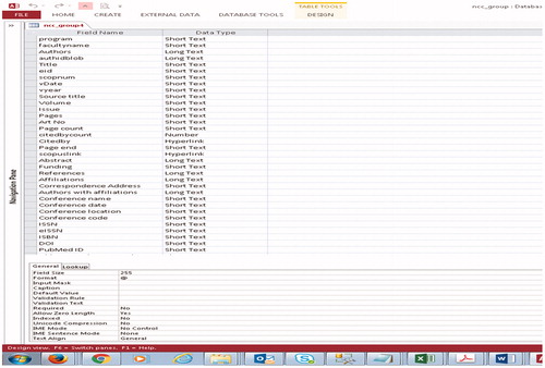
The visualization and retrieval applications have been built using an underlying bibliographic metadata database generated using data from the Elsevier Scopus database, which is a comprehensive abstracting and indexing service covering roughly 28,000 journals, conference proceedings, and monographs. Scopus provides a robust API that this project used to extract bibliographic metadata from the database. The retrieval and visualization tools in this project are built from a single initial relational database table comprising two columns containing researchers’ full names and Scopus ID numbers. The Scopus API is used to extract article, conference paper, and book chapter bibliographic metadata. From there, a series of scripts have been written to compile supporting database tables with publication, citation, author summary data, and coauthor tables that are used for the visualizations and search retrieval functions.
The underlying publications metadata and scholarly measures database is currently a Microsoft Access database, but it will be upgraded to a more industry standard Microsoft SQL Server database as the applications grow. For the ICC application, the Scopus API was used to extract metadata for articles and papers published by the cohort of 73 researchers over the last five years (from 2013 to the most recent run data of June 2018). The number of publications from the 73 authors in this time period totaled 3,155 papers, including 2,876 unique papers – given that a number of papers have more than one author from the 73 researcher cohort.
The database elements extracted via the Scopus API and stored as columns of data in the relational database are:
authors of the paper (up to 75 authors);
Scopus author IDs for all authors;
the title of the article/paper;
the Scopus EID (unique article ID number);
the source title (journal title, conference title);
volume, issue, pages, and date information;
the cited-by count (the number of times the article has been cited in Scopus);
a link to the Scopus display record;
a link to the citing articles in Scopus;
abstract of the paper;
the ISSN and EISSN;
the DOI (Digital Object Identifier) of the article or paper;
the document type (journal article, review article, conference paper, book chapter).
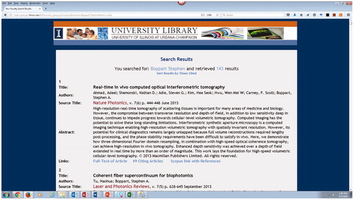
The Microsoft Access database Design View of these elements is shown in . Many of these document elements are displayed in the publication results window when the researcher visualization article bubble is clicked or when performing a search in the Search Interface shown in .
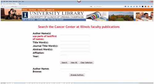
Figure 1. Search interface with author browse capability.
From this initial bibliographic database, a series of scripts and database SQL statements are executed to generate additional tables in the database. These include a coauthors array table, and a summary table of author names with number of publications, H-Index, number of coauthored papers within the cohort of 73 ICC researchers, number of National Science Foundation (NSF) or National Institutes of Health (NIH) grants received, and total number of times their articles from the last five years have been cited. Several other custom tables, including a table providing the number of coauthored works by year, are also compiled. Additional research metrics data can be generated and provided to the ICC research group administrators.
Additionally, an author table comprising all authors of the papers, be they in the ICC cohort or from other institutions, is generated for author browse searches and to retrieve papers by any authors. This table currently contains 23,260 entries, with an entry for each author of one of the cohort papers.
Access and visualization tools
Two separate interfaces have been built to provide access to researcher publication and productivity data. The interface shown in provides search access by author, article title, journal title, abstract word(s), affiliation, and year across the underlying database of ICC publications in the last five years. An additional author browse function is provided on the lower portion of the interface to provide access to any of the authors of the 2,876 unique papers from the ICC cohort.
Figure 2. Illinois Cancer Center researcher productivity visualization.
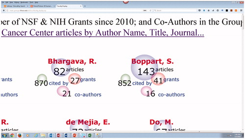
In addition, an interactive web-based dashboard visualization of scaled and clickable display bubbles and frequency labels for each faculty member’s research output has been created. This visualization provides publication numbers over the last five years, citation information (a cited by number), NSF and NIH grant totals, and a separate coauthor visualization showing the number of coauthors within the ICC cohort. The bubbles are scaled to the number value range within each of the four reported metrics and are clickable. shows the faculty research measures in the overarching display, and shows a close-up view of the visualization bubbles for several faculty members.
Figure 3. Close-up of the ICC researcher metrics visualization.
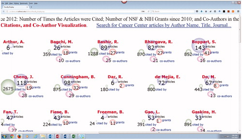
Figure 4. Publication record with links to full-text and citing articles.
The ICC research visualization can be displayed on individual monitors and in a special high-definition visualization wall version. The IDEA (Innovation, Discovery, DEsign, and DAta) Laboratory in the GELIC contains a 13′ by 8.5′ 33 million pixel visualization wall and several other large display screens. For research groups larger than the 73-member ICC cohort, the visualization wall version can offer optimum viewing interaction.
Clicking on the visualization’s author article publication bubble opens up a new window displaying short entries of the matching articles. These displays are populated from the underlying database comprising metadata extracted from Scopus. The article metadata display shown in includes a link to the full-text (via the DOI), a link to the Scopus detailed record page (with references and abstract), and a link to the complete citing articles display in Scopus. The same results display is retrieved from searches performed in the search interface shown in .
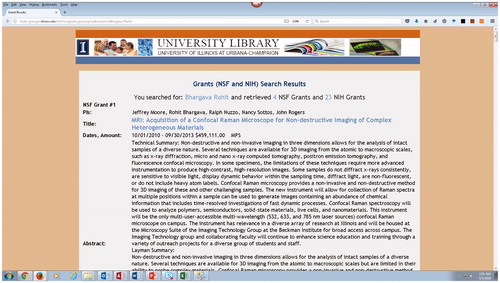
Figure 5. Researcher grants from NSF and NIH.
The visualization’s “cited by” bubble link currently displays the Scopus author information page containing the author’s H-Index, the number of times the author has been cited, a link to all articles citing the author, and a link to an author analysis display.
The grants link displays matches from a locally produced database of metadata on NSF and NIH grants awarded to the University of Illinois over the last 10 years. shows an example display from the grants table. The grants database is generated from downloading search results from the NSF site and the NIH Explorer site and importing the results into a relational database table. The grant title link goes to the appropriate NSF and NIH site grant description page.
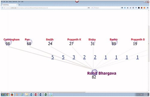
Figure 6. Coauthor display with clickable links to articles.
The coauthors display bubble links to another visualization that shows coauthorship within the group and a clickable label showing the number of coauthored papers between authors. An example of a coauthor visualization is shown in . The clickable labels bring up the appropriate matching article search results shown in . There are 225 papers coauthored by multiple researchers within the cohort in the latest ICC research metrics database.
Figure 7. Coauthor display with clickable links to articles.
Discussion
From a technical standpoint, any library wishing to develop this type of research impact visualization and retrieval application must possess expertise in the Scopus database and in Scopus API calls, XML result parsing, server side scripting techniques, and relational database processing.
There are several processing issues that must be overcome. The Scopus database sometimes contains multiple ID numbers for the same author. The API scripts accommodate multiple IDs and turn these into Boolean “OR” searches for the specified author IDs. The Scopus API is straightforward to use and is well supported, but there are a few limitations. Because only 25 metadata result records can be returned at one time by the API, retrieving all the publications by a prolific author requires multiple calls into the API. This needs to be done within an iterative script, using multiple calls to extract first all the works by an individual author and then moving on in the same way through each author in the cohort. Different API calls are needed to retrieve all the authors of an article and to retrieve and process the citing articles and citation numbers.
The website is dynamically generated from the database values and the visualization bubbles and graphics are rendered using HTML5 Scalar Vector Graphics (SVG).
For the 73-member ICC cohort, the entire process of generating the underlying bibliographic metadata database and the associated supporting coauthor and author summary tables takes less than an hour. There are approximately eight scripts executed in a specified order. The visualization display is database driven and dynamic. All the researcher bubble information is read from database tables. Rather than incrementally adding to the database, the entire process is currently re-run on a monthly basis. This is advantageous since the ICC periodically adds new researchers or drops researchers from its roster. It also allows us to incorporate any corrections or modifications to records in the Scopus database we have reported or that have been made.
These techniques will be extended to generate visualizations over other CI COM and university research groups. These Scopus API procedures can be applied to researchers at multiple institutions, so implementing a discipline-specific set of visualizations across institutions is straightforward. Enhancement of the visualizations by adding additional impact measures, such as altmetric data, is also expected.
The research impact visualizations produced for CI COM groups such as the Illinois Cancer Center have been well received. The ICC data are used as supporting data in grant applications. It is anticipated that one of the primary uses of the application would be to support grant proposals that require research productivity measures, including aggregate and individual researcher publication, citation, and coauthor collaboration information, in the proposal.
For the library, research impact measures are important for liaison and outreach programs, collection development, grant support activities, assisting with campus requests for promotion and tenure support data, and data management services. Given the engineering and interdisciplinary focus of the CI COM, these research measures and visualizations greatly assist the library in identifying areas of research focus.
One can expect to see an increasing use of research impact metrics in the university and in the library. This is part of the library’s changing role in knowledge management services and scholarly communication support. These activities also exemplify the library’s increasing involvement in fostering campus partnerships and collaborative endeavors.
Notes
- Chris Tachibana. “New Tools for Measuring Academic Performance.” Science 355, no. 6325 (2017): 651–653. http://www.sciencemag.org/features/2017/02/new-tools-measuring-academic-performance (accessed February 10, 2017).
- Steven Braun. “Supporting Research Impact Metrics in Academic Libraries: A Case Study.” Portal: Libraries and the Academy 17, no. 1 (2017): 111–127.
- Christopher R. Carpenter, David C. Cone, and Cathy C. Sarli. “Using Publication Metrics to Highlight Academic Productivity and Research Impact.” Academic Emergency Medicine 21, no. 10 (2014): 1160–1172. https://doi.org/10.1111/acem.12482
- Erin N. Wimmer, Melissa L. Rethlefsen, Christy Jarvis, Jean P. Shipman. “Understanding Research Impact: A Review of Existing and Emerging Tools for Nursing.” Journal of Professional Nursing 32, no. 6 (2016): 401–411. https://doi.org/10.1016/j.profnurs.2016.05.005
- Michael Wolf, Martha Taimuty, Monal Patel and Jeffrey Meteyer. “The Dean’s Information Challenge: From Data to Dashboard.” Educause Review (2016). https://er.educause.edu/articles/2016/11/the-deans-information-challenge-from-data-to-dashboard (accessed November 28, 2016).
- Tom Cramer. “RIALTO: Research Intelligence at Stanford.” (paper presented at Coalition for Networked Information CNI Spring 2018 Meeting, San Diego CA April 13, 2018). https://www.cni.org/topics/ci/rialto-research-intelligenceat-stanford
- Antonio P. DeRosa (ed.). A practical guide for informationists: supporting research and clinical practice (Cambridge, MA: Chandos Publishing, imprint of Elsevier, 2018).
- Eric Phetteplace. “Effectively Visualizing Library Data.” Reference and User Services Quarterly 52, no. 2 (2012): 93–97.
- Hsuanwei Michelle Chen. “Information Visualization Meets Libraries” Library Technology Reports, Chapter 3 of Library Technology Reports, “Information Visualization.” Library Technology Reports 53, no. 3 (2017): 17–20.
- Hsuanwei Michelle Chen. “Real-World Uses for Information Visualization in Libraries.” Library Technology Reports, Chapter 4 of Library Technology Reports (vol. 53, no. 2), “Information Visualization.” Library Technology Reports 53, no. 3 (2017): 21–25.
- Jeremy Buhler, Rachel Lewellen, and Sarah Anne Murphy. “Tableau Unleashed: Visualizing Library Data.” Research Library Issues: A Report from ARL, CNI, and SPARC, no. 288 (2016): 21–36. http://publications.arl.org/rli288
- Sarah Anne Murphy. “Data Visualization and Rapid Analytics: Applying Tableau Desktop to Support Library Decision-Making.” Journal of Web Librarianship 7, no. 4 (2013): 465–476.
- Kristina Rose. “Data on demand: A model to support the routine use of quantitative data for decision-making in Access Services.” Journal of Access Services 14, no. 4 (2017): 171–187.
- Finch, J. L. and A. R. Flenner. “Using Data Visualization to Examine an Academic Library Collection.” College and Research Libraries 77, no. 6 (2016): 765–778.
- Mark Eaton. “Seeing Library Data: A Prototype Data Visualization Application for Librarians.” Journal of Web Librarianship 11, no. 1 (2017): 69–78.
- Sarah Anne Murphy. “How Data Visualization Supports Academic Library Assessment: Three Examples from The Ohio State University Libraries Using Tableau.” College & Research Libraries News 76, no. 9 (2015): 482–486.
- Barrie Hayes, Yi Hong, Andres Villaveces. “Information Visualization Services in a Library? A Public Health Case Study.” Bulletin of the American Society for Information Science & Technology 35, no. 5, (2009): 13–18
- Michelle Malizia Catalano, Porcia Vaughn & Joshua Been. “Using Maps to Promote Data-Driven Decision-Making: One Library’s Experience in Data Visualization Instruction”, Medical Reference Services Quarterly 36, no. 4, (2017): 415–422.
- Steven Braun. “Manifold: a Custom Analytics Platform to Visualize Research Impact.” The Code4Lib Journal 30, (2015). https://journal.code4lib.org/articles/10948