
In the interest of satisfying the reviewers of your paper, and facilitating the subsequent editing process if your paper is accepted for publication, here are some basic points to keep in mind with regard to the formatting and presentation of the figures. Some of these points are requirements of the journal (that is, not optional), whereas others are simply suggestions.
Label each figure. When the paper is sent out for review, the figures are typically presented in one group at the end of the unformatted manuscript. If there are more than 3 or 4 figures it can be quite frustrating for the reviewer when these are not clearly numbered.
Label the panels. This additional labeling makes it much easier to refer to different parts of the figure when reading the text of the manuscript. Do not put a box around the panel label, and do not follow the label with a period. Use capital letters to label the panels. In addition, in my experience, reviewers find it confusing and/or frustrating when authors use multiple labels (when needed) without changing the hierarchy of the labels. That is, it is preferable to start with A, B, etc. and then to use Roman numerals i, ii and finally, lower case a, b. Thus, Ai, Aii, Bi, Bii is preferable to Aa, Ab, Ba, Bb.
Each individual figure (including those in the supplement) must fit on one page in the portrait orientation, with all labels still easily legible (). If the figures do not fit on a single page, the paper must be returned to the authors so the appropriate figures can be broken into multiple separate figures, and renumbered. Note that the font size of every label in the figure should generally be the same size or at least close to the same size (). Otherwise, when the figure is presented at its final print size some labels may be too big and others too small to be easily legible (). Along these lines, it is not appropriate to change some of the labels to a smaller font size so that they now fit into the figure (). If labels need to be made smaller, you probably need to separate the image into more than one figure. Alternatively, be creative in the labeling to present the critical information, while avoiding redundancy ().
Figure 1. Present the figure in the portrait, not the landscape orientation. Figures must be presented in the portrait orientation with each individual figure on a single page and all of the labels easily legible.
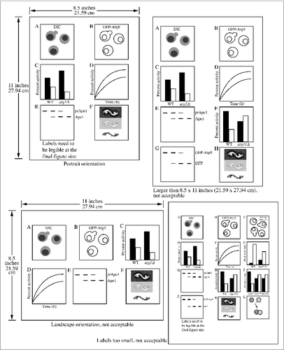
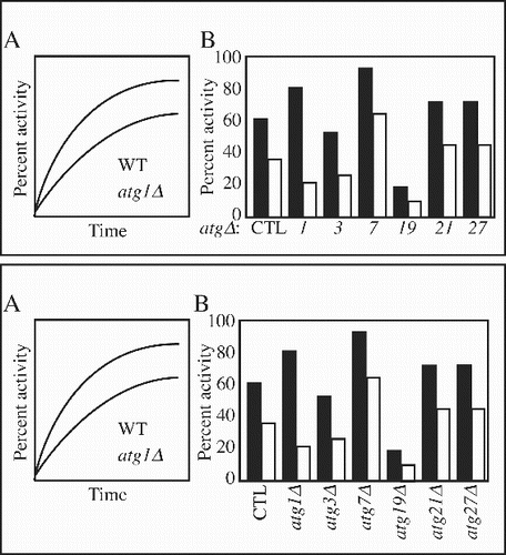
Figure 2. Use the same size font. If all of the labels are the same size, they will all be legible when the figure is reduced to its final print size.
Figure 3. Use a constant font size and style, especially within an individual figure. If figures use variable font sizes, some of the labels will be too large and/or too small in the final figure.
Figure 4. Do not use smaller font sizes to force all of the labels to fit within the figure. If you cannot fit in labels of the same or similar sizes, you may need to generate a separate figure, or think of a more creative way to present the information.
Figure 5. Avoid redundant information in the labels to allow more space to increase the font size. For example, it is more efficient to label “Time (min): 0 10 20 30 40 50” than it is to use “0 min 10 min 20 min 30 min 40 min 50 min” especially when you have a lot of time points. Be sure to insert a space between numbers and unit designations, such as “1 h” instead of “1h” or “10 μM” instead of “10μM." Also consider alternative ways to present the labels such as rotating them (lower panel).
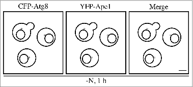
Use labels on the figure whenever possible. Ideally, the reader/reviewer should not have to refer to the figure legend to understand the figure. That is, all of the key information should be presented in the figure itself, leaving additional details for the figure legend. A figure that otherwise contains solid data () can be frustrating to analyze, whereas the simple addition of labels () can greatly simplify the process of interpretation. Also, include units in the figures whenever appropriate (e.g., “h,” “kDa,” “μM,” etc., but note that “MW” should not be used along with “kDa” because molecular weight does not have units); be sure to insert a space before units as in 0 h.
Figure 6. Do not rely on the figure legend. Readers of your paper should not have to look at the figure legend to understand the most basic points about your figure.
Figure 7. Label the panels. The addition of even simple labels can make the figure easier to understand.
Consider that the space in a paper is limited and/or that you are paying for every square inch. Thus, you want to maximize the space that you use. There are also aesthetic considerations to the planning of your figure and the placement of the panels. Thus, it is generally a good idea to minimize the presence of blank, empty space (). Obviously you want to leave enough space to clearly delineate separate panels, but not much more. Similarly, consider the most optimal geometric placement of the panels (), in terms of reducing unused space, and making the overall figure more appealing. Along these lines, panels should be presented consecutively (and both figures and panels within figures should be referred to in the text in a consecutive manner with appearing before , etc.), but there is some latitude in how the panels are arranged (). Basically, if you can connect all of the panels with a continuous line that does not cross over on itself the arrangement is probably fine.
Figure 8. Eliminate wasted space. Use the minimal amount of space needed between panels to clearly delineate them.
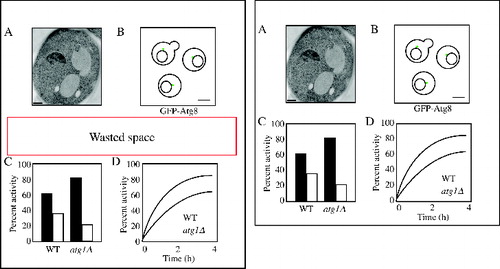
Figure 9. Geometry. Some consideration of the geometry of the panel placement can reduce wasted space and also make the figure more aesthetically appealing.
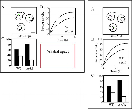
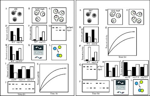
Figure 10. Consecutive placement of panels. Although the panel presentation on the left uses the space slightly more efficiently, it is not appropriate because the panels are not presented in a consecutive manner (as is the case with those on the right).
This work was supported by NIH grant GM053396 (to DJK). Drs. Aileen Ariosa, Amélie Bernard, Elizabeth Delorme-Axford, and Hana Popelka provided helpful comments.