
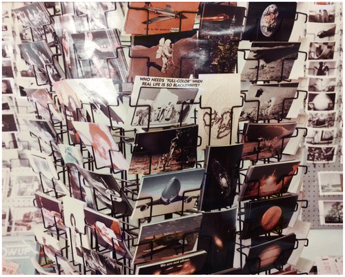
Many years ago, I came across a tiny postcard shop in which I felt it would be ideal to make a shot for inclusion in a gallery show I was preparing. One of the postcards in particular struck my attention. ‘Who needs full color,’ it said boldly, ‘when real life is so black and white?’ In the image as I composed it, this black-and-white card, ‘stark’ and ‘real,’ was surrounded by dozens of absurd and hilarious vividly colored others of many sorts. The irony of the composition somehow dulled the question that card posed, yet it continued to riddle me: ‘Who needs full color when real life is so black and white?’ There was no doubt in my mind that I, for one, needed color, and not only as an artistic medium; nor that the real world, the world of equality and inequality, power and powerlessness, luxury and hunger – not to say a world of race and racism – was in many ways, at least theoretically, black and white.
I needed to know then, and persistently need to be asking myself now, what it is that color is for – for me, anyway, because I know it is of the most supreme value, as important as the flavor of air. To speak of it from an esthetic point of view, an esthetic and technical point of view, color operates, I think, in two different, divergent ways, both on the screen and in our real-world experience. Screen color is the more provocative, however, because it is bounded, composed, subjected to an artist’s laws of balance, gravity, and pulse. Cinematic color is representational and it is evocative but, I would argue, not both of these at the same instant. Our readiness to be informed is not the same as our readiness to be touched. As representation, color calls up a perception of ‘the real.’ That is, it offers us a version of the world congruent with what the normal (non-colorblind) eye sees in looking at ‘reality,’ thus a view that indexes and substantiates ‘real life,’ a view in which lipstick is, roughly, red (Cate Blanchett in Carol), and trees in the spring are green (Boyhood), the sky can be blue (The Tree of Life), a horse might be chestnut brown running across a lush green, grassy field (Sense and Sensibility). Or, to see a less elite corner of the world: an out of luck street person might inhabit a dull, browny-gray territory (The Fisher King). Yet while the vastly expansive display of colorful facts such as these unrolls onscreen as we look, we can be making only the scantiest notations about color, beyond the quick and transient recognition. Things simply are what they are (as we already know them) – and in the film construction denote themselves accordingly – due to nature or human (now capitalist-influenced technological) agency. Our perception of this ‘realistic’ color, while instigating acknowledgment, does not move us to action or thought or rapture in and of itself. Outside Ben Affleck and Rosamund Pike’s house in Gone Girl, I see a gray sky and think possibly rain is coming, but I don’t meditate, through praxis or a search for the sublime, on the grayness of that easy, suburban gray. I acknowledge it only by way of identification, and then I move on. This color that points to an underlying pre-dramatic actuality – yet under other circumstances it could also point to the fabular, as when, say, in the photographs of Sandy Skoglund, we see a room painted green from floor to ceiling with orange fish swimming through the air – this color that states but does not affect, that shows itself and moves on, one might think of in terms of shallowness or topography. Shallow, surfacy, topographic color is perfunctory. Irrevocably and finally, it is; and while it may have capacity to signal yet it does not touch.
To elaborate for a moment on the perfunctoriness of shallow color:
In motion pictures shallow color, as I am calling it, might serve to produce a sense of the everyday, a marker of place, say, or a clue to character, as happened, with emphasis and considerable frequency in the 1960s and 1970s, when shooting migrated out into the streets in lieu of studio set-ups. If watching black-and-white film one found one’s imagination piqued, one’s viewing experience personalized without necessarily being focused upon a sharp prickle of feeling, still one projected knowledge and a sense of ‘the real’ onto the film plane by ‘coloring’ the tonal image with everyday, appropriate infusions. Everyday infusions: colors, present or imagined, that were essentially known in advance of sighting; colors that signaled but were taken for granted in doing so. A great deal of color cinematography after the expressive 1950s – by which time Kodak negative film had replaced the black-and-white recording film and imbibition process used by Technicolor – offered such a world of distinctive everydayness. We may think of the see-through plastic raincoat worn by Gene Hackman in the color-negative production The Conversation (1974), or Benjamin Braddock’s snazzy red Alfa Romeo (appropriate for a young man with snazzy hopes for his future) in The Graduate (1967), or Tony Manero’s swank white suit, with colored disco lights spinning off it, in Saturday Night Fever (1977): all of these colorations were local, true to fact, in a way invisible. To shoot in color was to claim a kind of social and cultural authenticity instead of an estheticized abstraction, which applied to black-and-white work (such as Woody Allen’s Stardust Memories [1980]). To shoot in color was to show the world. And when, as viewers, we saw the world photographed that way, we took it as given. Took it much as, when we were children, we looked at the color of the food set before us and, if it more or less mimicked what we had seen the day before, paid no attention: a bag of popcorn was creamy white, a bowl of tomato soup was orangey-red. When in An Age of Innocence (1993) Martin Scorsese’s camera peered down upon an elaborately decorated upper-class dinner table (in New York, at the beginning of the twentieth century), the vividness of the color was an alarming shock, a directorial gesture: the table cloth, the flowers, the dinner service, the sparkling wine glasses. This was preparation for a different kind of color experience, something entirely beyond the merely quotidian (even beyond acknowledgment by a middle-class audience that did not immediately recognize the opulence of the Manhattan aristocracy of another day). By contrast, when in All the President’s Men (1976) we panned across the Washington Post newsroom, seeing people typing or racing for a conference, the authenticity and perfunctoriness of the color, its surface indications, signaled that the way things looked to the eye, ‘actual’ or fabricated as it may have been, did not constitute the central feature of the scene: the superficial color told us to look superficially, and instead to listen to what was being said. The clues were in the dialog, not the color of the shirt anybody wore.
It is also the case that shallow color may be denotative, if not provocatively so. It may lead us through a maze of signs, and thus propel us forward, offering a rudimentary kind of map. Let me return briefly to Coppola’s The Conversation to point to some surface color that boldly stands out from its surround without ever quite escaping its superficiality. Harry Caul (Gene Hackman) has a royal-blue plastic document keeper, with which he pays an important visit to the estimable offices of an unnamed magnate played tautly by Robert Duvall. Money exchanges hands there. Caul removes some tapes from the keeper and gives them over. But, finding the meeting entirely unsatisfactory in regards to an outcome he was hoping to resolve, and strolling away outside the skyscraper where it took place, he crumples that blue keeper in a fit of anger and tosses it onto a very well manicured shiny green lawn. But then he has a second thought – propriety, civility – and strides over to pick it up. Soon later, we find him at the Jack Tarr Hotel, in a room adjacent to room 773 – where he has heard on his tapes that a key encounter is to take place. He is ducked under the sink, working to drill a hole through the wall for his microphone, so that he can eavesdrop. But on the toilet, holding his tools, is a brittle plastic workman’s case, royal blue. Harry is thus associated with this color, a cool blue, which is saturated, brilliant, even arrogant in the way it stands out from his otherwise retiring self. He is a blue man, say. The office building he was visiting was being maintained by a floor-cleaning janitor garbed in saffron yellow. Now, prying into room 773, Harry discovers the bedcovers are – yes, saffron yellow; the man booked into that room, and who paid him for the tapes (Duvall), is thus affiliated with that bright, penetrating color. A yellow man. Perhaps Caul’s blueness suggests firmness, masculinity, definitiveness, even height; or recalls Tennessee Williams’s Don Quixote in Camino Real, chanting ‘Blue is for distance. Distance is blue.’ The yellow, on the other hand, is the hot proximate radiation of the sun, the glowing personality, the openness to possibility (even death). In this film, these two colors point metaphorically, and thus set up a kind of logic by which the ongoingness unfolds. They act signally, thus intentionally, but by way of emerging from the omnipresent array of colorations that sum to a depiction of diegetic ‘reality.’ Neither the blue nor the yellow is interesting, fascinating, captivating, alluring, hypnotizing in itself. Still one more color emerges in a quite different way, oozing away from its practical surface and embedding itself in memory: this is a pale aqua, visible on the walls of Harry’s apartment if we turn away from him for a moment and gaze at his startling background; and in the waters of San Francisco Bay as depicted in a wallpaper presentation in the Jack Tarr Hotel. This aqua suggests more than it represents; points, but away from the shallow immediacy of the fictional world and toward something like dreamland. (It is, of course, also what a blue would look like if intermediated with a yellow.)
If in our experience shallow color is – I am using the word ‘shallow’ specifically to denote a mode of experiencing color; writing about color as though it is the way that we experience it – if it is superficial, fleeting, instantaneously recognized if not quite appreciated, and valued according to its accuracy, it is distinct from another way of apprehending that brings sensation into a penetrating, enduring, and affecting relation with us. That second mode is inspired by what I would call deep color. When we see deep color we are surprised, even shocked, particularly by the way it leaps away from the perfunctory background. Deep color triggers memory and aspiration, calls up the past and projects the future, seems to swell up from an abysm of sentimental connection. Say that one could follow Barthes (in Camera Lucida) and think of perfunctory, shallow color as a studium and of deep color as a punctum. The one establishes a field, bounded and graded, rich with probability: but only probability. The other is a prickling point of emerging affective contact, the opening to a well of interest. Deep color has a punctual effect, yet also one that lingers and resonates in its unsure magic, irresolvable and mysterious. It would make sense to think of individual experiences of deep color, or at least individualized evocations of it in conversational speech: with the proviso that others are capable of grasping the profundity of a deep color, sharing a sense of its resonating, even interminable, quality.
The exact nature of a deep color, a sentimental color, will depend significantly not only on the context in which it is seen but on the technical process whereby it was achieved, although for the purposes of appreciation and critique one could hardly claim it imperative that technical reference be made. Nevertheless, the color as we have it is a chemical production. The pink and mint green of Anna May Wong’s garments in The Toll of the Sea (1922) come from relatively early two-strip Technicolor, as does the infernal, intoxicating red of Carl Laemmle’s The Phantom of the Opera (1925). But by 1939, the red of Dorothy’s enchanted shoes is a vibrant, blaring three-strip effect, impossible before the late 1930s and very difficult to simulate, too, after 1955, when for the richest color Hollywood filmmakers were having Eastmancolor negatives (not black-and-white separation masters) printed (not shot) by Technicolor. The color onscreen flows from both filmic material and lighting. I saw a pair of those red slippers on show at the Smithsonian, in a glass cabinet: they were nothing compared to what we see onscreen, shoes that radiate with a deep fire, true ‘ruby slippers.’ But even long after a screening of The Wizard is done, after the most affecting characters have faded into farmhands and the dark action found resolution, the shine of the slippers remains in the viewer’s memory. The film as an unfolding becomes attached to the memory vision of that red.
The depth of deep color may vary in intensity and quality; and may strike a viewer – I would argue, in fact does strike – in a momentary, entirely evanescent way. Even a film suffused with deep color, such as Antonioni’s Blow-Up (1966), will have moments of staid, perfunctory color as well as powerfully affective moments. The viewer’s mode of color perception is thus spontaneous and responsive, modulated, and variable. I am trying here to differentiate between two distinctive ways of apprehending color and being grazed or deeply touched by it, not to formulize schemes of arrangement to be found in one film or another. When I think of my own experiences of deep color, the sentimental touches that come to mind are Monica Vitti’s rust-red hair in The Red Desert (1964), Fred Astaire and Cyd Charisse’s creamy clothing as they dance in the dark in The Band Wagon (1953), the pink city of Basra or the Genie’s bottle-green smoke in The Thief of Bagdad (1940), Leonardo DiCaprio’s chilled, bluing skin in the bathtub in What’s Eating Gilbert Grape (1993), the absinthe green Parisian apartment in The Dreamers (2006), the beige sand dunes in Stairway to Heaven (1946), the white milk that James Dean swigs in Rebel Without a Cause (1955) – this last one no mere trace of Helmut Dantine’s desperate swigging in Mrs. Miniver (1942) but, because it pricks us with startling white as seen against Dean’s classic red jacket, and because it is stretched across the screen, a veritable explosion. All of these (and countless more) deep colors both appertain logically and structurally to a particular scenic development – thus, lie within the ongoing unfoldingness of the story as visually told – and leap away as distinct points palpably without scenic reference. Further, in any film, any moment of deep color might multiply, as might any moment of perfunctory color; and so by citing these examples I hardly mean to isolate. Vitti’s hair leads to her son’s sharp, blue room and her husband’s white shirt, to the colored pipes in his factory, to the turquoise waters in the child’s dream, to the gray of a street beside a shop she is renting, and so on: this pathway of linkages is my arbitrary construction – I do not claim to discover and appreciate some secret pathway Antonioni constructed from point to point in his film, even if he has done so. But by offering these deep colors, he has made it possible for me to envision my own experiential chain.
As to color saturation and brilliance: it might seem evident that what I am calling ‘deep’ or ‘sentimental’ color is highly saturated and very brilliant, whereas ‘shallow’ or ‘perfunctory’ color is washed out and without clear contrast against other colors in the scene, yet I can think of many depictions that would contradict such a view. When a filmic moment is deeply affecting (sentimental, not haptic), possibly because of an arrangement or movement of objects, possibly because of a musical cue, possibly because of a camera movement, we are opened to deeper sensitivities; some point of color may emerge profoundly for us. When a filmic passage is heavily plotty, when it contains a chain of movements that must progress onward for the story to properly unfold, it may offer less opportunity for penetrating affection and musing, and we may be more prone to judging and calculating the color effects as merely genuine, which is to say, socially revealing. In Eric Rohmer’s Pauline à la plage (1983) there are exceptionally powerful renditions, by Nestor Almendros, of various characters’ skin colorations in sunlight at different times of day. One carries away these deep colorations, but none of them are especially saturated in the technical sense. By contrast, in the Disney production 20,000 Leagues Under the Sea (1954) we have numerous very saturated color constructions depicting aspects of Capt. Nemo’s submarine world, but they pass as perfunctory against the relative depth of Ned Land’s (Kirk Douglas) sparkly blue-and-white mariner’s shirt, which tags his cheery – narratively central – personality.
It is possible to give some real extension to a discussion of a moment of deep color, so as to lift it above the commonplace status of a mere personal delight and show how it can have broad, even philosophical significance. I mean here only to point to the fact that one could go far beyond merely pointing to a moment of deep color and really meditate upon it, in esthetic, sociological, philosophical, even political terms. To do this is one way of opening and developing discussion of a filmic moment, and, of course, from the filmgoer’s point of view the moment is the central constructional element of the form. Moments are what we apprehend; or what, racing along to capture the treasure of a story’s punchline, we signally withdraw from apprehending. When we are involved in our seeing, the film is a collection of moments, as we apprehend, reflect upon, and remember it.
Here, then, are some detections and explorations of color in its depths. May they produce the pleasure of reflection, and even some surprise (Figure ).
Figure 1. Postcard photograph by the author.
Disclosure statement
No potential conflict of interest was reported by the author.