
ABSTRACT
Riding on the rising concern of public health and the growing neoliberal self-care agenda, the food market has witnessed a surge in ‘healthy’ food despite the criticism of this food does not help consumers eat more healthily. A growing interest in Critical Discourse Studies (CDS) is how food marketers colonise not only the food discourse but also the broader ideas and values such as health, politics, and environment. Contributing to this growing body of research, we look at one of the fastest-growing food trends, ‘functional drinks’, which claim to target physiological and psychological processes in the body, so that consumers can manage their health and performance. Company websites rely on forms of infographics to communicate how the products work. Adopting the notion of ‘integrated design’ from multimodal CDS, we show how these infographics, drawing on their affordances, are particularly useful in symbolising classifications and causalities which could not be accounted for in running texts. The paper argues that this is a way health and science converge with a neoliberal discourse of self-management and enterprise culture. Given the increased use of forms of integrated design in communication, more critical discursive work is needed in this area.
Introduction
At the time of writing, there has been rising attention in public health along with a neoliberal self-care agenda (cf. Ayo, Citation2012; Crawford, Citation1994; Tulchinsky & Varavikova, Citation2010). Governments, mindful of the costs of healthcare and lost working hours, publicise the need for the public to maintain a reasonable level of fitness and avoid unhealthy foods. In the new public health era, with diminishing state support and care infrastructure, it is the individual who has the responsibility to manage these things (Crawford, Citation1994). As Cederström and Spicer (Citation2015) discuss, it puts the pressure on individuals to stay not only healthy but super healthy. Such neoliberal health ideology easily leads to feelings of shortcomings and bad conscience (ibid). From this follows a widespread stigma in which unhealthy has become a signifier of weakness, laziness, lacking willpower and morals and failures of today’s society (Puhl & Brownell, Citation2001; Rao et al., Citation2013; Traverso-Yepez & Hunter, Citation2016). Food marketers have also been able to ride upon, shape and foster this trend by selling more and more foods marketed as having health benefits (Eriksson & Machin, Citation2020; Patterson & Johnston, Citation2012; Weeramanthri & Ballie, Citation2015). These products, however, have been criticised for carrying often contradictory and confusing health buzzwords to conceal their unhealthy qualities and possibly even distract people from eating healthily (Aarset et al., Citation2004; Siipi, Citation2012).
In this paper, we are interested specifically in the growing market of what are known as ‘functional foods’, specifically what are known as nootropic drinks (Williams, Citation2019). A look at drinks now available in stores reveals a range of products offering, or implying, a variety of health benefits: ‘low sugar’, ‘low carb’, ‘high energy’, ‘high in protein’, ‘vitamin enriched’, or with other added ingredients such as ginger, ginseng, echinacea, Himalayan berries. Such health drinks and snacks are the largest growing sector of the food market globally (Eriksson & Machin, Citation2020). These nootropic drinks represent a development on these as they promise a range of highly targeted specific health benefits for the body but also enhancing memory, concentration, alertness and overall well-being. When viewing the marketing material and websites of nootropic drink companies, these drinks easily come across as cutting-edge scientific innovations that provide a quick-fix solution to the demands of the neoliberal health ideology and make the path to success clear and easy. In Critical Discourse Studies (CDS) much has been learned about the use of scientific language, the presence of science/medical expertise, and the role visuals play, in advertising, for promoting products as credible and superior (cf. Arroyo, Citation2013; Chen, Citation2015; Koteyko, Citation2009). But, as we show in this paper, much more research of the detailed and systematic nature which characterises CDS is needed on how science and technical information is presented through the use of infographics, or more accurately, what Ledin and Machin (Citation2018, Citation2020b) refer to as ‘integrated designs’. Such designs have become ubiquitous across communicative settings, in marketing, in our institutions, in news reporting and social media. These authors argue that specific tools are needed to draw out the very unique way that they can communicate ideologies and recontextualise social practices, drawing on the affordances of flow charts, tables, lists and other icons are particularly useful in symbolising classifications and causalities which could not be accounted for in running texts. The paper argues that this is one way that health and science converge with a neoliberal discourse of self-management and enterprise culture. It also argues that given the increased use of forms of integrated design in communication, more critical discursive work is needed in this area.
Neoliberal health discourse
The Alma-Ata declaration published in 1978 marks the beginning of the ‘New Public Health’ and its primary health care approach is now widely accepted by member countries of the World Health Organisation (WHO) (Tulchinsky & Varavikova, Citation2010). Through different health promotion policies, individuals are encouraged to implement a self-care regime, including adopting healthy diet routines and being physically active, to minimise the harm and burden one might bring to society (Bunton, Citation1997; Rose, Citation2006). As Ayo (Citation2012) points out, these ideas and policies are key elements of a prominent health discourse fostered by the dominant political ideology of neoliberalism. In such a discourse, health becomes a personal value and ‘an opportunity to reaffirm the values by which self is distinguished from other’ (Crawford, Citation1994, p. 1353). Staying healthy is a way to be a ‘good’ and responsible citizen (Ayo, Citation2012).
The neoliberal health discourse is closely related to the ‘enterprise discourse’ (Keat & Abercrombie, Citation1991, p. 3), which is cultivated by the demands for self-improvement and self-management. This discourse builds on a commercial model in which competition is fundamental and promotes what Bröckling (Citation2015) describes as ‘entrepreneurial self’, making people think of and run their lives following a business model. It stresses personal characteristics such as ‘initiative, energy, independence, boldness, self-reliance’ (Keat & Abercrombie, Citation1991, p. 3) as key values in today’s society. From this, it also follows that individuals are supposed to perform at their best and that they are responsible for their own success and failures (Bröckling, Citation2015). Food marketed as having the capacity to improve health and physical function and especially the kind of nootropic drinks we examine is connected to such enterprise discourse as it makes the consumption of nootropic drinks appear essential and natural. This discourse also provides food producers with the opportunity to act as life coaches and for their products to become the solutions and means for people to fulfil their ‘entrepreneurial self’.
The marketing of nootropic drinks is another example of what previous research within CDS consider as a process in which how we think and act related to food and health is colonised and shaped by commercial interests (cf. Eriksson & Machin, Citation2020). According to this research, communication about food and health is highly characterised by what Fairclough (Citation1992) describes as a technologised discourse, in which a standardisation and codification of language and multimodal semiotic resources serve commercial objectives. Food producers have advanced strategies of coding ideas and values into the design of marketing items such as packages and websites with the aim to appeal to particular market segments (cf. Ledin & Machin, Citation2020a). For instance, Andersson (Citation2019) shows how Arla (a dairy company) use images of nature to signify ideas about a political past and to associate their products with progress and the building of the Swedish welfare society in the twentieth century. Ledin and Machin (Citation2020a) demonstrate that by positioning itself as an underdog against dairy farming, Oatly (an oat drink company) exploits the discourse of political activism and makes the consumption of Oatly appear as a morally righteous choice. Mapes (Citation2020) points to a range of semiotic resources, such as symbolic Swiss visuals, region dialect, and aesthetical packaging design are assembled together to signify a sense of locality, authenticity and sustainability for products designed for wealthy middle-class consumers. Chen and Eriksson (Citation2019) show how food producers reinforce the myth of high-protein consumption by linking it to neoliberal ideas about wellness and demands for an active lifestyle. Of importance is that the way nature, political past, morality, sustainability or being fit and healthy is conveyed ceases to be concrete or transparent but colonised by commercial interests. These issues are codified into signifiers, which guide us and shape our ideas of what it means to be healthy and to act as good citizens. Contributing to this growing strand of research, we examine how science and ideas associated with enterprise culture are codified into the design of producers’ websites.
Codification of science
References to science are common in marketing and have been proven to have positive effects on consumers (Pitrelli et al., Citation2006). Studies of scientific language in skin-care advertisements show that persuasion strategies, such as the presence of science and medical expertise, the presentation of statistics, the mixture of familiar scientific terms with unintelligible scientific terminologies, and positioning products as scientific innovations as an answer to (skin) problems, allow advertisers to take advantage of the social impact of science (Arroyo, Citation2013; Chen, Citation2015). Research of probiotic yoghurt advertising demonstrates that referring to science is a way to stress the products’ positive effects and provide consumers with hope and promises (Burges Watson et al., Citation2009). Also studying the marketing of probiotic yoghurt, Koteyko (Citation2009; see also Koteyko & Nerlick, Citation2007) shows that using references to science is a way to add health-values to the products. Marketers rely on the authority and opaqueness of science and frequently use phrases like ‘research shows’, ‘experts suggest’, and ‘studies have found’. Science can also sometimes be used to, as Jovanovic (Citation2014) points out in her analysis of Becel’s use of statistics, amplify risks and the fear of illnesses associated with competitors’ products. These studies provide important insights into and stress the need to further study the use of science in food marketing, but little to no attention has been paid to the way integrated design and the affordances of infographics are used to recontextualise science for marketisation and legitimisation.
Given this background, we look at how infographics, with integrated design, are used to transform the language of science for the codification and commodification of food and health discourse. Of course, science is signalled through language and expert statements, but it also relies heavily upon, we show, the affordances of these semiotic resources. As we will also show, infographics and integrated design do not only communicate logic and rationality but also gloss over important details in order to legitimise the drinks. Processes, causalities, relationships, classifications and agency are abstracted or concealed. This allows these products to appear as a quick-fix and one-size-fits-all solution for the demand carried in the neoliberal ideology that we self-care, self-improve and self-manage.
Method and data
The analysis draws on the theory and analytical tools of MCDA (Ledin & Machin, Citation2018; Machin & Myar, Citation2012). Aligned with the basic principles of CDA, MCDA studies the role of discourse in the functioning of social and political life. Discourse here points to a form of knowledge, significant for the way people think and act in particular situations (Fairclough, Citation1992; Foucault, Citation1972; Machin & Myar, Citation2012). The aim is to critically analyse how texts, through language and other semiotic resources, carry discourses that legitimise and maintain social inequalities and injustices and support the interests of the powerful in society.
A key principle of MCDA is to analyse communication as in terms of the choices the communicator deploys from a set of established semiotic resources. Semiotic resources have certain meaning potentials and can be applied for specific contexts and purposes, which means that discourses can be manipulated to sustain certain ideologies (Kress, Citation2010; Van Leeuwen, Citation2005). Semiotic resources are deployed as part of semiotic materials, with which we interact and use as part of social practices, such as a website, a food package, a photograph, an item of clothing, or a list or a graph. These materials have evolved to have affordances, meaning that we do some things, but not others, with them. And the concept of affordances is very important for the analysis we carry out here since the elements and features which comprise infographics and integrated designs bring a very specific set of these.
Science on the nootropic drinks websites, in regard to how the drinks and the body work, is presented through diagrams, flow charts, lists and bar charts. Such texts have been referred to as ‘new writing’ (Van Leeuwen, Citation2008), in that writing appears not as running sentences but as part of these structures. Ledin and Machin (Citation2018; 2020) describe these forms of communication as ‘integrated design’ to emphasise how affordances of the charts, tables, lists, icons and chunks of language are deployed in ways where meaning arises through their integration. Here meaning, classifications, processes, agency, causalities and co-ordinations are not communicated through running text but are symbolised. Yet at the same time, such integrated designs can connote precision and clarity, breaking down things and processes into precise parts. It suggests that complex processes can be coded into measurable and manageable units. Yet, as Ledin and Machin (2020) show these designs can abstract, conceal and substitute actual causalities, and relationships and shape processes and outcomes in the interest of the communicator.
In the analysis of the integrated design and the use of infographics, we apply a model proposed by Ledin and Machin (Citation2016; Citation2020b). We look at five semiotic features and how they function in order to identify the meaning potentials that is created by this design:
Symbolisation relates to the meanings linked to the basic shapes of graphic elements, for instance, the purport of curvature or angularity, curved or straight lines.
Framing concerns how elements are separated on the ground of sameness and difference. Often this is done through frames, colours or spaces.
Orientation is about how the website is organized in terms of spatial composition such as centre-margin, bottom-up or left-right.
Classification means looking at how the analytical and taxonomic relations typical for graphic representation makes elements part of a certain category.
Causality is about how graphic elements are represented as having effects on each other, for instance through arrows between elements.
Table 1. Data set.
Analysis
In the following analysis, we start by looking at how the unity of high-tech science and nature is codified into the presentation of a nootropic drink. We then move on to show how the affordances of a bar chart and the integrated design are used to visualise the healthiness and quality of the drink. Finally, we examine the way that the enterprise culture discourse is coded into these drinks’ webpages and discuss the consequences of such technologisation of communication.
The unity of high-tech science and natural
Example 1
Red Algae
Presently, several lines of studies have provided insight into biological activities and neuroprotective effects of marine red algae including antioxidant, anti-nueroinflammatory, cholinesterase inhibitory activity and the inhibition of neuronal death.
Fucoidan Seaweed
Research on fucoidans has advanced to demonstrate extraordinary health properties, including:
Anti-cancer
Anti-coagulant
Anti-inflammatory
Immune-enhancing
Besides this, the term Neurocellin is placed in the centre of a hexagon block, leading thoughts to a chemistry cell. The hands are holding the hexagon block as if this was something very special and valuable. At the same time, the hands are open in a gesture offering this to the consumer, and linked to the text above stating that this is a ‘patented nootropic blend’ which is a ‘highly effective concentrated of natural, yet powerful ingredients based on plant stem-cells’. We often see this kind of image of hands holding a small seedling plant in soil to connote the care of environment and signal a union of humanity and nature. In this case, the seedling plant is replaced by a hexagon block, and this image becomes a way to suggest the unity of technology, nature and humanity. This unity not only highlights the value of science but also backgrounds the paradox that such natural ingredients have to be processed in highly industrialised methods to be drinkable. The process here is symbolised through integrated design. The text blocks of ingredients at the bottom overlay the hands holding the hexagon block which creates a connection between the ingredients and the drink. The creation of Neurocellin is communicated through the affordance of the bottom-up oriented design, and a sense of graduation and progression of the natural ingredients being elevated, without explaining the manufacturing process. Here some ingredients are also presented in their natural state, such as ‘Fucoidan Seaweed’ and ‘Red Algae’ (see Example 1), without details of how roses and algae are processed into drinks. If the process of extracting and combining ingredients was described in a running text, Neurocellin would appear less natural.
Figure 1. Teslanootropics’ webpage named ‘Neurocellin’.
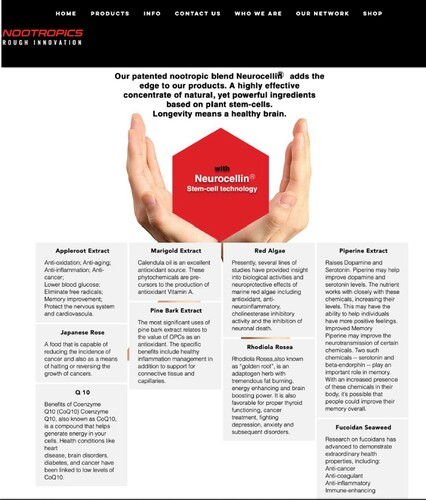
The visual organisation of these texts signals some kind of unity and classification. Instead of being presented in a running text, or another kind of ordered list, the ingredients are presented in blocks in four neat columns, which have the affordance of signalling something methodical and carefully classified. Grouping the text blocks in this manner creates a sense of a paradigm from which could be expected that the included elements belong together and share certain properties (Ledin & Machin, Citation2020b). As these ingredients are not numbered or in any other way highlighted, there seems to be no hierarchy among the ingredients. The font style, spacing and text alignments are consistent in every block, which not only reinforces the sense of precision but also helps to classify the ingredients as the same. The space between each block is even and small. A bigger space would easily counter the idea of unity, as would an irregular space. A design in which the ingredients overlap each other would have suggested some kind of interaction or maybe hierarchy between them. But now each one stays within its particular area which makes the ingredients appear as comparable units. The texts underneath each heading do, however, differ in length, which could suggest that these have a more significant role in this mixture, but this is not obvious if one looks at the texts. There is no information regarding the amount of each ingredient, nor the nutritional value (see Example 1). So each ingredient rather appear as an equally crucial ingredient of Neurocellin. The design thus communicates a form of transparency and logic as regards what makes this mixture remarkable, but this kind of coding rather conceals the incompatibility among the ingredients, such as, for example, among Japanese rose, Q10, and different kinds of extracts ().
Table 2. Ingredients of ‘Neurocellin’.
The texts that describe the ingredients neither explained the causality nor the classification that is missing from the visual design (see Example 1). Instead, they refer to research and include an arbitrary collection of health benefits (underlined in Example 1) to further legitimise Neurocellin. These benefits, clustered in , communicate that this mixture has omnipotent health functions. Altogether, there are 33 different health-related functions originating from the ingredients. Interestingly, many of those are not at all related to improving brain functions, the function that nootropic drinks claim to provide. There are very scattered benefits such as ‘anti-cancer’, ‘immune-enhancing’, and ‘fat burning’. And some even not explain the exact benefit the ingredients provide but simply stated as, for example, ‘Diabetes’, ‘Heart disease’ or ‘Thyroid function’. Only eight of them (bold texts in ) refer to brain functions but some of these are also vaguely defined like ‘Brain boosting’, ‘Brain disorder’ and ‘Neuroprotective’. When grouped together, as in , the totality of the positive effects appear as rather bizarre and lacking unity and logic. Could this blend really have all those positive effects? Furthermore, we are not given any medical or scientific details in the usage of these ingredients. For example, the dosage needed for gaining the benefits and the effect of combining these ingredients. The ingredients and benefits, however, appear as being broken down to present the essence, relying on the affordance of the text blocks and listing unconnected discipline-specific terminologies. This way of handling the information differs from what we would expect in a more scientific, medical context which the discipline-specific and scientific-looking terminologies used here connote. Without medical or scientific details this terminology simply serves the purpose to symbolically legitimise the benefits of the drink and to take advantage of the positive connotations scientific/medical language entails (Irwin & Wynne, Citation1996).
Table 3. Health benefits of Neurocellin’s ingredients.
What we see here, is that the transparency regarding the product’s formulation which would be crucial in a medical context is deleted. Instead, the scientific logic, classification and causality are signalled through the visual impressions created through the bottom-up orientated structure, the integrated design of text blocks, and the iconography. Besides, the binary concepts of Neurocellin being ‘natural’ yet ‘technical’ can sit harmoniously together, and the arbitrary collection of ingredients and health benefits can be presented as compatible and unproblematic.
Science and nutritional safety
Recurrent through our corpus of functional drink websites is the use of infographics to visualise nutrition and health. Of course, infographics can signal to science and utilise the positive connotations science brings, but more importantly, through such representation nutrition and health come across as something quantifiable and measurable. The sense of quantification and measurement, however, are signified through integrated design and the affordances of infographics rather than in a manner that would be acceptable in regular medical science. In the following section, we will use the example of a bar chart, and the integrated design of which it is deployed, to show closely how this signification is done.
A bar chart comes with the affordances of showing a quantitative comparison between units of similar character (Ledin & Machin, Citation2018), which also, as we will show here, make it possible to communicate that measurement and/or comparison are taking place, when in fact it is not and the units are incompatible. is from the TruBrains’ webpage, presented under the tab ‘SCIENCE’. At the first glance of the bar chart, it appears clear and obvious that TruBrain, the third bar from the left with relatively low coloured bar, is safe, reinforced by the text on the top of the bar chart ‘Trubrain is safer than salt. Each bar is framed with borders to separate individual elements. The frame is of the same width and same height, which indicates things being compared on the same fixed scale, thus connoting objective scientific measurement. The sameness of the bars also helps to classify each element as part of the same paradigm and as comparable. However, with a closer read of the bar chart and the texts, one may notice the information presented here is far from comparable, scientific or logical. Firstly, the bar chart compares a range of very different elements, such as salt (a mineral), taurine (an amino acid), vitamin D, cola (a soft drink) and Adderall (a prescription medication). There is no information on why these different elements are included in this comparison.
Figure 2. TruBrain’s webpage named ‘Science’.
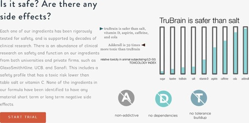
The bars are filled with turquoise colour in different heights to indicate a value, in this case, the level of toxicity, but there is no scale. So here the bars mainly serve a symbolic role which becomes clear if we look at the comparison between Adderall and TruBrain. The former is claimed to be ‘39 times more toxic than TruBrain’. Looking at the colour level of the bars this difference is impossible to interpret from this diagram. The affordance of the bar chart and the sameness in the design of each bar nevertheless suggest very precise measurement.
These affordances also help to conceal the contradictions and illogicality of the information provided through this bar chart. The text ‘relative toxicity in animal subjects (mg/LD-50) TOXICOLOGY INDEX’ appears to provide further information as regards measurement and the science behind the comparison. What ‘mg/LD-50’ means is questionably understandable for laypeople. With some investigation, the authors found that LD50 is an abbreviation for Lethal Dose, 50% (LeBeau, Citation1983). It refers to the amount of the substance required, per body weight, to kill 50% of the test subject. So here mg/LD-50 points to the amount in milligram needed, per body weight, for a lethal dose for 50% test subject. By this logic, the lower the number the more toxic/lethal a substance is, but this is contradictory to what the bars indicate, in which the lower the coloured bar is, the safer it is.
Below the bar chart, there are three symbols in the form of coloured circles around the capital letters A, D and T, which have been crossed out by a white line from top left to the bottom right. These symbols are not recognised symbols and do not in themselves, and immediately, convey anything about the products. However, these symbols have the affordance to support the bar chart and work as a form of safety and quality indicators, a form of codification we know from traffic signs and food packages. On food packages, similar symbols are, for instance, used to signal that a product is free from certain components, such as gluten. The letter A, D, and T, with different colours of each circle, classify three different safe qualities of the drink. But it is difficult to see the differences between the three qualities from the texts that anchor the meanings of the symbols: ‘non-addictive’, ‘no dependencies’, ‘no tolerance buildup’. The first two ‘non-addictive’ and ‘no dependencies’ are the same concept in different wording. The third, ‘no tolerance build-up’, appears as rather superfluous as there is most likely no addiction or dependency unless a person builds up a certain degree of tolerance. The causality of how it is non-addictive is not indicated by the symbols, nor explained in the text on the left. The symbols rely on their affordance to communicate that tested results are presented in a simplified manner. This affordance neutralises the missing essential information for accessing the safe quality of the product. The relationship between the symbols and the toxicology level in the bar chart is nor explained but rather signified through the colour coordination and rhyming in font style.
So far, we have seen that an array of mismatched information and pseudo-science are glossed over by technologised communication. The affordance of infographics, along with integrated design, make it possible to communicate transparency and scientific logic when there is none. The nootropic drinks are communicated as healthy, safe and having qualities that help people achieve better physical and mental functions. But through the technologised way information is presented, aspects that could be expected from such products are glossed over or totally set aside. Still, the impression that these products functions’ are assured by science is communicated. In the next section, we will further show how the ideas and values of the neoliberal enterprise culture are also codified and communicated through infographics and integrated design, neutralising the need for functional products and thereby shape our ideas about human functions.
Science and entrepreneurial human being
The neoliberal mentality of self-management and self-improvement underpins the existence of functional food, especially the kind of nootropic drinks we look at. The idea of managing oneself as an enterprise is permeated across the collection of our nootropic drink websites. At no point do the texts overtly state people should manage themselves to function and perform at their best at all time, such an idea is however coded in and signified through infographics and integrated design and is something taken for granted in this context.
In the case of TruBrain, the affordances of a circular diagram play an important role. Like other forms of diagrams, such visualisation can work to simplify a process and present what appear to be the key aspects of this process (Ledin & Machin, Citation2020b). This particular diagram – called THE STIMULANT CYCLE () is supposed to provide the consumers with knowledge about why TruBrains’ products are different from coffee or caffeine. The diagram is accompanied by a text on its left-hand side. The font of this text and its heading is rounded and the spacing is larger than the texts for the diagram which are in a serif font with smaller spacing. This makes the text appear as more friendly and more casual than the texts in the diagram, which in turn suggests that the diagram provides more methodical and formal information. Even though the text to left has no immediate connection to the diagram as it does not explain or in any way comment on the diagram, it is still of importance for the design of the webpage. The text at the centre of the diagram is written in capital letters with the largest font size to create salience. This is also the only text that is in italics. In scientific writing, proper nouns, for example, the name of diseases, are often written in italics, as are technical and Latin terms. In broader language, italics can also be used for publication titles, or to draw extra emphasis. Using italics with centre alignment here can create an assertive, authoritative and technical sense for the diagram.
Figure 3. ‘The stimulant cycle’ on TruBrain’s webpage named ‘Science’.
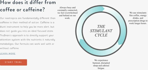
According to the diagram ‘THE STIMULANT CYCLE’ consists of three stages: ‘Always busy and constantly connected, we feel overwhelmed and behind on our work’; ‘We use stimulants like coffee, energy drinks, and prescription drugs to work longer hours’; ‘We experience burnout, disrupted sleep and adrenal fatigue’. Each stage refers to bodily functions and/or mental states and is coded into an arrow. The colour of these arrows changes from faint to more saturated turquoise, suggesting some kind of dynamic and an increase in what appears as an ongoing and unbreakable cycle. One stage naturally leads into the next, and the next and so forth. There are no other possible paths. The logic of this causality is symbolised through the circle, arrow and change of colour saturation. The causalities of the three stages yet are not necessarily as the diagram shows. It can be that ‘we experience burnout’ which leads to ‘we use stimulants’; or we ‘work longer hours’ so ‘we feel overwhelmed’, which are the reverse causality of what the diagram suggests.
This unbreakable cycle leaves out all other possible reasons why we might experience burnout, work longer hours and feel overwhelmed. These states are taken for granted, as they are expected and naturally occur in peoples’ lives. This creates an unquestioned need for products like TruBrain to act as a quick fix to all these problems. It departs from and conceals the actual complexities of other crucial contextual aspects, social matters and responsible agents: What is the doctors’ role and what do they do/suggest when work-caused fatigue and stress become a medical condition? What are the social welfare and labour laws that are implemented by the government to protect and help people in such situations? In this way, this diagram reduces well-being to a question of functions and performance. It normalises the ideas that people are supposed to make sure they can constantly perform at their very best. Scholars have criticised the neoliberal health discourse or what is called ‘new public health’ era in which the responsibility and intervention of government are taking the sideline while individuals are laden with a self-care regime (O’Neill & Silver, Citation2017). What we see here is such self-care regime pervading in broader domains of our lives and the technologisation of communication plays a role in neutralising the enterprise culture, leaving state duties and market interests unquestioned.
We now turn our attention to Teslanootropics’ webpage called ‘Nootropic 101’ (), which its visual design works slightly differently to the same end. Using the term ‘101’ this page connects to knowledge and education as this indicates that consumers can learn all the basic principles and concepts concerning nootropic drinks. It points to empowerment and a go-getting attitude. On the top left side of the page, we find a numbered bullet list and to the right an image seemingly illustrating brain activity. Below this, we find an interlocking pattern of texts and images. The images’ actual linkage to the text blocks, and the information in those, are never explained. It is not obvious whether the image with ‘LEARN’ is related to the text on the left of the text below it. The even size text blocks and image, however, classify all texts and images as of the same order and interrelated. The texts are to be understood through the images as something to ‘LEARN’, ‘UNDERSTAND’ and ‘KNOW’, characterising an educational intention of this webpage. The use of nominalisation as headings – ‘LEARN’, ‘UNDERSTAND’ and ‘KNOW’ – however deletes the process aspect of verbs and removes the need to specify who, where, what and why, but it still gives a sense of knowledge being presented. What you know and understand is less relevant as long as you go and get it and empower yourself.
Figure 4. Teslanootropics’ webpage named ‘Nootropic 101’.
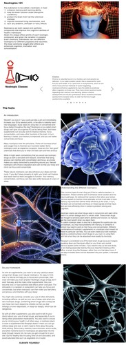
The text blocks are also to be understood through the style of the images. We can see space-age-tech computer-generated images highlight brain activities, and exploration and visualisation of science. For instance, the image in the right top corner shows a skull of a human-like head. The top is open, very precisely, mechanistically cut. There are spirals in a bright orange to yellow moving into, or out of, the head. These spirals are more intensely gathered and brighter over where we assume the brain to be. The bright colours indicate energy, implying that highly energetic activities are taking place. In the open skull, there are also small circles including a minus or a plus sign. These are similar to how electrons and protons of atoms are represented in nuclear physics, again leading thoughts to the complex yet powerful physical combination of components and physical changes. On the right side of the head, we see illustrations of what looks like cogs or pieces of machinery which could be found in a clock, associated with very precise and unfailing machinery, thus highlighting something functional and mechanistic. These illustrations are made in a highly digitalised and futuristic mode, also connoting innovative and advanced technology. These images not only link nootropic drinks to advanced and futuristic technology, symbolise the function of the drink as unleashing the optimum brain functions, but also set the tone for the overall impression of the webpage as a whole. The information presented becomes part of this high-tech science. Yet, with a closer look at the texts, we will see the information does not resemble what one would expect from a rigorous scientific text.
The numbered bullet list (Example 2) on the top of the website provides information on what a nootropic is.
Example 2
Any substance to be called a nootropic, it must:
enhance memory and learning ability,
help the brain function under disruptive conditions,
protect the brain from harmful chemical damage,
improve neuronal firing mechanisms, and
lack any sedative, stimulant or toxic effects.
Here, we see that a nootropic is defined mainly through its functions, for example, how it affects the brain. The first four claims concern the benefits of a nootropic, while the fifth is related to the lack of side-effects. The affordance of the list suggests that the distinctive features within an entity, a nootropic, are presented. Here, linking back to the underlying sense of education and knowledge of the webpage, consumers are supposed to learn five core details of a nootropic’s cognitive benefits, which make a nootropic omnipotent in benefiting brain functions. However, on closer inspection, the list becomes incoherent. It is questionable how point 1 ‘enhance memory and learning ability’ is different from point 4 ‘improving neuronal firing mechanisms’? And in point 1, two complex brain functions ‘memory’ and ‘learning ability’ are treated as one compatible unit.
The numbering here indicates the relationship between each point, as if there is a hierarchy, or progression, hence connoting logic and reasoning. Yet, the numbering here, in fact, does not rank or classify the information, the texts neither present any sort of connections among each other. Is point 1, 3, 4 part of ‘help the brain function’ (point 2)? And therefore can a nootropic ‘enhance memory and learning ability’ (point 1), ‘protect brain from handful chemical damage’ (point 3) and ‘improve neuronal firing mechanisms’ (point 4) when individuals are ‘under disruptive conditions’ (point 2)?
The list here, relying on its affordance of numbered lists and linking to ‘Nootropic 101’, indicates all relevant knowledge of nootropic is broken down logically. This can create a sense that it is made easy for consumers to grasp the essence and to empower consumers with such knowledge. It, however, is decontextualised and conceals that crucial aspects of understanding nootropics are missing. Things that are not represented in the lists cease to exist (Foucault, Citation1972). For example, usage conditions and possible individual differences.
The functionalisation of nootropics in the list signals to the focus and importance of achieving optimal brain function, without questioning why. The images discussed earlier, similarly focus on and reduce the representation of humans to the functions of the brain. Through what Hight (2008, p. 19) calls the ‘invasive surveillance’ mode, the images bring specific focus ‘into the interior of human body’, in this case, bring a specific focus into merely the human brain. This kind of computer-generated imagery has been criticised as creating a false sense of romanticised reality (Jefferies, Citation2003) and leaves out the people and politics that contribute to how the real world is (Bouse, Citation2000). What we see here is a romanticised brain, in which the human and humanity are reduced to highly functionalised and technologised brain activity. Underlying this is a taken-for-granted idea that optimal cognitive functions are the key to success in today’s society, normalising the enterprise notion of making people manage themselves as competitive entities. The core purpose of a human, relying on their brains to act like machines, is to perform and produce at their very best. Overall, the webpage uses a sense of education to increase credibility and uses visual scientific display techniques to validate the scientific basis of the texts, which all seem very ‘real’. Consumers are, however, arguably falsely empowered by the symbolic knowledge, pseudo-science and the products that reinforce the neoliberal demands of self-care, self-improvement and self-management. They are drawn away from asking the questions Bouse (ibid) has raised, where are the people and the politics that contribute to this kind of world we believe in and how does enterprise culture become reality?
Conclusion
In this paper, we have looked at how the semiotic meanings and affordances of infographics and integrated design are used to communicate science in a marketised context. The use of scientific language, the presence of medical experts and scientists, as well as scientific images in advertising have been observed by CDA scholars, pointing to marketers taking advantage of the positive connotations science brings to products. What we have shown is that technologised communication, and especially the use of integrated design and the affordance of infographics, play a major yet less explored role in recontextualising science. At one level, the technologised communication glosses over details one would expect in a medical or scientific report. The casualties, classifications and processes are never clearly specified. Integrated design and the affordances of infographics, however, allow information to be presented as a technical process, breaking things down to their cores, bringing greater clarity, and quantifying, measuring and managing the most important aspects. At another level, a very specific ideological purpose is served. The demands carried in the neoliberal ideology that we self-manage, self-improve, and perform at one’s best are coded in as taken-for-granted. It is never questioned where and how all these ideas come from nor why we pursue our lives in such fashion. It is unquestioned that the state responsibility is subsided, leaving it individuals’ responsibility to be a healthy good citizen and to perform and succeed. The neoliberal health discourse and enterprise culture ultimately favour market interests, bringing about products that exist to provide all the solutions to fix our lives and make us successful.
Disclosure statement
No potential conflict of interest was reported by the author(s).
Additional information
Notes on contributors
Ariel Chen
Ariel Chen is a post-doctoral researcher at Örebro University. Her research interests lie in Multimodal Critical Discourse Analysis especially applied to media discourse in relation to neoliberal society. She is currently working on a research project which focuses on the way health discourse is constructed by commercial forces.
Göran Eriksson
Göran Eriksson is a professor of Media and Communication studies at Örebro University, Sweden. He works in the field of discourse analysis and his works has been published in journals such Media, Culture and Society, Critical Discourse Studies, and Food, Culture and Society. He is currently involved in a research project focusing on how food packaging communicates, informs and guides the public as to making healthy diet choices.
References
- Aarset, B., Beckmann, S., Bigne, E., Beveridge, M., Bjorndal, T., Bunting, J., McDonagh, P., Mariojouls, C., Muir, J., Prothero, A., & Reisch, L. (2004). The European consumers’ understanding and perceptions of the ‘‘organic” food regime: The case of aquaculture. British Food Journal, 106(2), 93–105. https://doi.org/https://doi.org/10.1108/00070700410516784
- Andersson, H. (2019). Recontextualizing Swedish nationalism for commercial purposes: A multimodal analysis of a milk marketing event. Critical Discourse Studies, 16(6), 583–603. https://doi.org/https://doi.org/10.1080/17405904.2019.1637761
- Arroyo, M. D. (2013). Scientific language in skin-care advertising: Persuading through opacity. RESLA/ Spanish Journal of Applied Linguistics, 26, 197–213.
- Ayo, N. (2012). Understanding health promotion in a neoliberal climate and the making of health conscious citizens. Critical Public Health, 22(1), 99–105. https://doi.org/https://doi.org/10.1080/09581596.2010.520692
- Bouse, D. (2000). Wildlife films. University of Pennsylvania Press.
- Bröckling, U. (2015). The entrepreneurial self: Fabricating a new type of subject. Sage.
- Bunton, R. (1997). Popular health, advanced liberalism and good Housekeeping magazine. In R. Bunton, & A. Petersen (Eds.), Foucault, health & medicine (pp. 223–249). Routledge.
- Burges Watson, D. L., Moreira, T., & Murtagh, M. J. (2009). Little bottles and the promise of probiotics. Health: An Interdisciplinary Journal for the Social Study of Health, Illness & Medicine, 13(2), 219–234. https://doi.org/https://doi.org/10.1177/1363459308099685
- Cederström, C., & Spicer, A. (2015). The wellness Syndrome. Polity Press.
- Chen, J. (2015). Investigating the discursive productions of science in advertising. Intercultural Communication Studies, 24(2), 207–224.
- Chen, A., & Eriksson, G. (2019). The mythologization of protein: A multimodal critical discourse analysis of snack packaging. Food, Culture & Society, 22(4), 423–445. https://doi.org/https://doi.org/10.1080/15528014.2019.1620586
- Crawford, R. (1994). The boundaries of the self and the unhealthy others: Reflections on health, culture and AIDS. Social Science and Medicine, 38(10), 1347–1356. https://doi.org/https://doi.org/10.1016/0277-9536(94)90273-9
- Eriksson, G., & Machin, D. (2020). Discourses of ‘good food’: The commercialisation of healthy and ethical eating. Discourse, Context and Media, 33, 1–7. https://doi.org/https://doi.org/10.1016/j.dcm.2019.100365
- Fairclough, N. (1992). Discourse and social change. Polity Press.
- Foucault, M. (1972). The archaeology of knowledge. Pantheon Books.
- Irwin, A., & Wynne, B. (1996). Introduction. In A. Irwin, & B. Wynne (Eds.), Misunderstanding science? The public reconstruction of science and technology (pp. 1–17). Cambridge University Press.
- Jefferies, M. (2003). BBC natural history versus science paradigms. Science as Culture, 12(4), 527–545. https://doi.org/https://doi.org/10.1080/0950543032000150346
- Jovanovic, M. (2014). Selling fear and empowerment in food advertising. Food, Culture & Society, 17(4), 641–663. https://doi.org/https://doi.org/10.2752/175174414X14006746101871
- Keat, R., & Abercrombie, N. (eds.). (1991). Enterprise culture. Routledge.
- Koteyko, N. (2009). ‘I am a very happy, lucky lady, and I am full of vitality!’ analysis of promotional strategies on the websites of probiotic yoghurt producers. Critical Discourse Studies, 6(2), 111–125. https://doi.org/https://doi.org/10.1080/17405900902749973
- Koteyko, N., & Nerlick, B. (2007). Multimodal discourse analysis of probiotic web advertising. The International Journal of Language Society & Culture, 23, 20–31.
- Kress, G. (2010). Multimodality: A social semiotic approach to contemporary communication. Routledge.
- Kress, G., & Van Leeuwen, T. (1996). Reading images: The grammar of visual design. Routledge.
- LeBeau, J. (1983). The role of the LD50 determination in drug safety evaluation. Regulatory Toxicology and Pharmacology, 3(1), 71–74. https://doi.org/https://doi.org/10.1016/0273-2300(83)90051-X
- Ledin, P., & Machin, D. (2016). The evaluation of performance management discourse in corporate strategy diagrams for public institutions. Discourse, Context & Media, 13(B), 122–131. https://doi.org/https://doi.org/10.1016/j.dcm.2016.05.004
- Ledin, P., & Machin, D. (2018). Doing visual analysis. Sage.
- Ledin, P., & Machin, D. (2020a). Replacing actual political activism with ethical shopping: The case of Oatly. Discourse, Context & Media, 34, https://doi.org/https://doi.org/10.1016/j.dcm.2019.100344
- Ledin, P., & Machin, D. (2020b). Introduction to multimodal analysis. Bloomsbury.
- Machin, D., & Myar, A. (2012). How to do critical discourse analysis: A multimodal introduction. Sage.
- Mapes, G. (2020). Marketing elite authenticity: Tradition and terroir in artisanal food discourse. Discourse, Context & Media, 34, https://doi.org/https://doi.org/10.1016/j.dcm.2019.100328
- O’Neill, K., & Silver, D. (2017). From hungry to healthy. Food, Culture & Society, 20(1), 101–132. https://doi.org/https://doi.org/10.1080/15528014.2016.1243765
- Patterson, M., & Johnston, J. (2012). Theorizing the obesity epidemic: Health crisis, moral panic and emerging hybrids. Social Theory and Health, 10(3), 265–291. https://doi.org/https://doi.org/10.1057/sth.2012.4
- Pitrelli, N., Manzoli, F., & Montolli, B. (2006). Science in advertising: Uses and consumption in the Italian press. Public Understanding of Science, 15(2), 207–220. https://doi.org/https://doi.org/10.1177/0963662506061126
- Puhl, R. M., & Brownell, K. D. (2001). Bias, Discrimination, and Obesity. Obesity Research, 9(12), 788–905. https://doi.org/https://doi.org/10.1038/oby.2001.108
- Rao, M., Afshin, A., Singh, G., & Mozaffarian, D. (2013). Do healthier foods and diet patterns cost more than less healthy options? A systematic review and meta-analysis. BMJ Open, 3(12), e004277. doi:https://doi.org/10.1136/bmjopen-2013-004277
- Rose, N. (2006). The politics of life itself: Biomedicine, power, and subjectivity in the twenty-first century. Routledge.
- Siipi, H. (2012). Is natural food healthy? Journal of Agricultural and Environmental Ethics, 26(4), 797–812. https://doi.org/https://doi.org/10.1007/s10806-012-9406-y
- Traverso-Yepez, M., & Hunter, K. (2016). From ‘healthy eating’ to a holistic approach to current food environments. SAGE Open, 6(3), 1–9. https://doi.org/https://doi.org/10.1177/2158244016665891
- Tulchinsky, T., & Varavikova, E. (2010). What is the ‘new public health’? Public Health Review, 32(1), 25–53. https://doi.org/https://doi.org/10.1007/BF03391592
- Van Leeuwen, T. (2005). Introducing social semiotics. Routledge.
- Van Leeuwen, T. (2008). New forms of writing, new visual competemcoes. Visual Studies, 23(2), 130–135. https://doi.org/https://doi.org/10.1080/14725860802276263
- Weeramanthri, T., & Ballie, R. (2015). Grand challenges in public health policy. Frontiers in Public Health, 3, 29. https://doi.org/https://doi.org/10.3389/fpubh.2015.00029
- Williams, M. F. (2019, July 14). Nootropic beverages set to take over the $16 billion dollar energy drink market. Financial News Now. https://financial-news-now.com/nootropic-beverages-set-to-take-over-the-16-billion-dollar-energy-drink-market/