
ABSTRACT
Little is known about the spatial clustering of neighborhood deprivation across the United States (US). Using data from the 2010 US Census Bureau, we created a neighborhood deprivation index (NDI: higher NDI indicates higher deprivation/ lower neighborhood socioeconomic status) for each county within the US County level scores were loaded into ArcGIS 10.5.1 where they were mapped and analyzed using Moran’s I and Anselin Local Moran’s I. Ultimately, NDI varies spatially across the US. The highest NDI scores were found in the Southeastern and Southwestern US states, and inland regions of Southern California. This information is critical for public health initiative development as planners may need to tailor the scale of their efforts based on the higher NDI neighborhoods of the county or geographic region with potentially greater chronic disease burden.
1. Introduction
Living in an area with lower socioeconomic status (SES) has been linked to poor physical and mental health outcomes as SES indicators (e.g. income, poverty, education) are major predictors of health and health disparities not just in the United States (US), but across the world (CitationCommission on the Social Determinants of Health, 2008; CitationDiez Roux et al., 2010; CitationRobinette et al., 2017). A recent study illuminated the link between neighborhood SES and 18 mental and physical health conditions using a nationally representative cohort, the longitudinal Midlife in the United States (MIDUS) study (CitationRobinette et al., 2017). Results indicated that even after adjusting for individual-level factors, the odds of developing two or more health conditions (mental and/or physical illness) was lower for every $10,000 increase in neighborhood income regardless of length of time spent in the neighborhood (CitationRobinette et al., 2017). These relationships may be due to neighborhood socioeconomic level influencing the number of grocery stores, recreation centers, and other available health-promoting community assets (CitationDiez-Roux et al., 1999; CitationMoore et al., 2008; CitationMorland et al., 2002; CitationSchootman et al., 2007; CitationYen & Kaplan, 1998).
In recent years, Geographic Information Systems (GIS) have been beneficial in community assessments, particularly in representing the distribution of resources within specific geographic areas (CitationGraham et al., 2011). For instance, GIS has been used to examine the socioeconomic distribution across particular states such as through the South Carolina Commission for Minority Affairs which identified South Carolina’s most socioeconomically affluent and deprived counties (CitationCarter, 2018). Using z-standardized scores from variables on poverty, unemployment, per capita income, and median household income, these values were used to create ordinal categories (below average, average, and above average) (CitationCarter, 2018). Their maps illustrated that the most deprived counties appear to cluster in rural parts of South Carolina, where the more affluent counties appear to cluster in the more urban parts of the state (CitationCarter, 2018). On a broader scheme, the distribution of zip code-level neighborhood disadvantage throughout the US has recently been examined (CitationKind & Buckingham, 2018). The area deprivation index was created using 17 variables taken from the 2013 American Community Survey data, where higher deprivation represents lower SES. The most deprived zip codes appear to be geographically clustered (i.e. unusually concentrated) in the Southeastern and Southwestern regions of the US; however, there was no statistical analysis to examine the extent of the spatial clustering of deprivation in the US (CitationKind & Buckingham, 2018). In examining these studies that have developed deprivation indices in the US, in fact, very few have examined the spatial distribution and spatial clustering of neighborhood deprivation using GIS across the US and within geographic regions (CitationCarter, 2018; CitationKind & Buckingham, 2018).
Using publicly available data from the US Census Bureau, we sought to create a neighborhood deprivation index (NDI) to visually represent county level deprivation across the US. We investigated the spatial distribution of NDI scores on the county level across the United States. Thus, the objectives of this study were to plot NDI across the US and to test whether NDI varies spatially. Ultimately, identifying where NDI clusters geographically in the US may be important in helping to inform community-based research, aid in targeting public health resources, and inform policy makers about potential deleterious characteristics within their jurisdictions.
2. Methods
2.1. Data and measures
The NDI was created using publicly available data from the 2010 5-year estimates of the American Community Survey from the US Census Bureau (CitationBureau USC, 2010), and the methods for creating this NDI were adapted from those published previously (CitationDiez Roux et al., 2004 CitationLian et al., 2016;). We gathered 13 sociodemographic variables on employment/occupation, education, housing conditions, wealth, and income from the 2010 American Community Survey (additional information on the variables within these constructs can be found in ) (CitationFeng et al., 2014). Each variable was then loaded into SPSS, where they were z-standardized. Using Promax rotation, having a minimum loading score of 0.40, and a minimum eigenvalue of 1, factor analysis was conducted. Ultimately, those factors with a Cronbach’s alpha greater than 0.70 were used to create the final NDI measures. The variables from the factors that fit the criteria were: (1) Household Income, (2) Home Value, (3) % Public Assistance, (4) % Family Poverty, (5) % Employed in Management, (6) % Housing Units Receiving Rental Income, (7) % Female-Headed Household, (8) % Households Without Telephone, (9) % Owner Occupied Housing Units, (10) % High School Graduates, and (11) % Bachelor’s Degree or Higher. The sum of these variables was used to create the final NDI measure at the county level. Higher scores are associated with higher deprivation, indicating that these areas have lower SES.
Table 1. Neighborhood deprivation index construct variables and descriptions.
Additional data on the racial/ethnic and age composition of these counties were downloaded from the 2010 Census Summary File. Data on health outcomes and behaviors were downloaded from the 2014 Robert Wood Johnson Foundation County Health Indicator Data as this report contains data from the 2010 study period. These data came from the National Center for Health Statistics, Behavioral Risk Factor Surveillance System, National Center for Chronic Disease Prevention and Health Promotion, Dartmouth Atlas of Health Care, and OneSource Global Business Browser. 2010 Rural Urban Classification Codes were downloaded from the US Census Bureau. These data were used to further contextualize the results of our Anselin Local Moran’s I analyses.
2.2. GIS process
County cartographic boundary shapefiles were downloaded from the US Census Bureau and then uploaded into ArcGIS 10.5.1 (ESRI, Redlands, CA). NDI scores for each county were converted from Microsoft Excel into a comma separated value (CSV) file. The NDI CSV file was uploaded to ArcGIS 10.5.1 and spatially joined with the county shapefile data. Using choropleth maps in ArcGIS 10.5.1, NDI scores were divided into quintiles and subsequently mapped across the US and stratified by the four US regions (South, Northeast, Midwest, West), presented based on quintiles of NDI scores.
2.3. Analysis
The analysis was completed in a two-step process. In the first step, we used the Global Moran’s I to investigate if NDI scores at the county level were spatially autocorrelated (i.e. similar scores are located near each other) based on the location of counties and the associated NDI values (CitationMoran, 1950). Moran’s I values range between −1 and +1. If Moran’s I is positive, it represents a clustering of NDI values across the geographic area. If Moran’s I is negative, it means that the NDI values are dispersed across the geographic area. Inverse distance was applied to conceptualize these spatial relationships whereby neighboring features have a larger influence on the computations for a target feature than those further away (CitationESRI). Using this method, we expected to identify evidence of areas of statistically significant NDI score clustering across the US.
In the second step, we used the Anselin Local Moran’s I to identify specific regions within the United States with high and low NDIs in addition to attributes that are significantly different than those near it (CitationAnselin, 1995). The resulting output provides a map of the spatial distribution of significant clustering to identify hot spots (areas of higher neighborhood deprivation), cold spots (areas of low neighborhood deprivation), and spatial outliers (e.g. a county with a low neighborhood deprivation index that is surrounded by high deprivation counties). Given that both of these analytical tools rely on the attributes of neighboring counties, we used data only for counties in the contiguous US. (CitationArcGIS, 2018).
3. Results
3.1. Overall and regional distributions of NDI
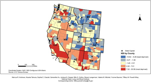
The NDI ranged from −15.62 (least deprived) to 30.58 (most deprived) across the 3,109 counties in the contiguous United States ( Main Map). Based on the distribution of NDI scores, higher NDI scores can be found along the Mississippi River and Southeastern US. ( Main Map, ). Lower NDI scores tend to be found in Northeast and Midwest regions of the country ( and ), in addition to coastal areas of California ().
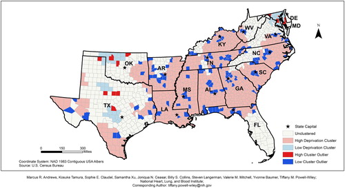
Figure 1. 2010 Southeastern states neighborhood deprivation index (NDI).
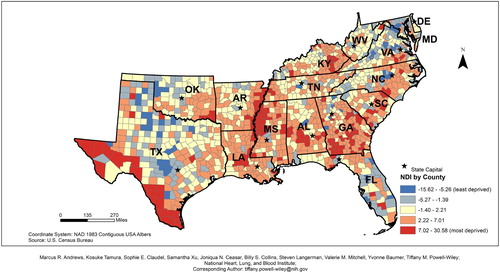
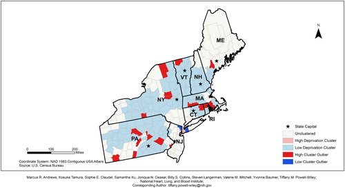
Figure 2. 2010 Northeastern states neighborhood deprivation index (NDI).
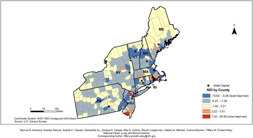
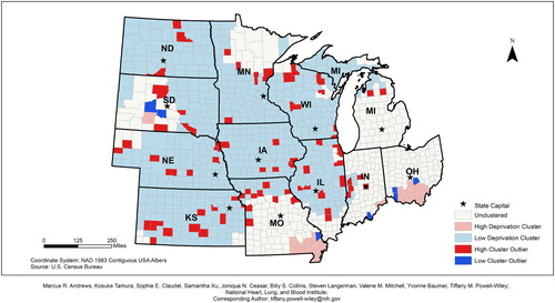
Figure 3. 2010 Midwestern states neighborhood deprivation index (NDI).
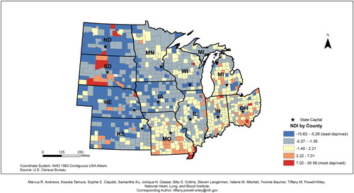
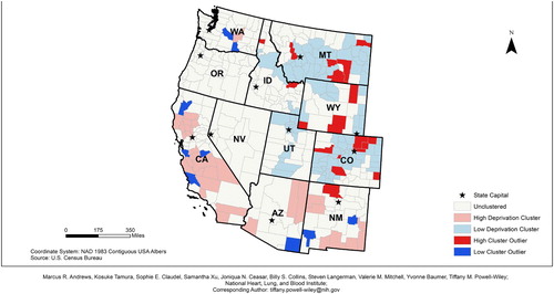
Figure 4. 2010 Western states neighborhood deprivation index (NDI).
3.2. Moran’s I values
The value of Moran’s I for the contiguous areas of the US was 0.41, indicating an overall spatial clustering of NDI by county (). Since the z-score was 80.57, there was a less than 1% chance that this pattern could have happened by chance. On a regional level, these relationships still existed. Southern states had a Moran’s I value of 0.37 and a z-score of 34.46, Northeast states had a Moran’s I value of 0.21 with a corresponding z-score of 8.55, Midwestern states had a Moran’s I of 0.29 and a z-score of 21.81, and Western states had a Moran’s I of 0.30 and a subsequent z-score of 13.01. Based on the z-scores for each of these variables, there was spatial clustering for NDIs at the county level. For each of these regions, there is a less than 1% chance that these clustering patterns could have happened by chance.
Table 2. Moran’s Ia results for United States and region-specific neighborhood deprivation index.
3.3. Anselin’s local Moran’s I – overall
The Anselin Local Moran’s I identified five different groups of counties based on their similarity or difference to the adjacent counties’ NDI (). However, there were distinct differences in these relationships based on region. For example, 33% of counties in the South, 35% of counties in the Northeast, 32% of counties in the Mid-West, and 60% of counties in the West were classified as unclustered.
Table 3. Localized clusters of neighborhood deprivation index (NDI) based on Anselin Moran’s I statistics*.
In the US, there were statistically significant clusters of both high and low NDIs (). For example, 27% of all US counties were considered to be within statistically significant clusters of high NDI values. These relationships differed by region with 53% of Southern counties, 2% of Northeastern counties, 3% of Mid-Western counties, and 8% of Western counties being within statistically significant clustering of high NDI values. Similarly, 28% of all US counties were classified as being within a clustering of low NDI values. There are regional differences in the clustering of low NDI scores with 4% of Southern counties, 53% of Northeastern counties, 57% of Mid-Western counties, and 25% of Western counties being classified within a statistically significant cluster of low NDI scores.
3.4. The Anselin local Moran’s I – Regional
The results of the Anselin Local Moran’s I indicated that high deprivation clusters are located in counties in Northern Arizona, California, and southern Texas in addition to the majority of the Southeastern US ( Main Map). Clustering of low NDI scores are primarily located in the Northeastern and Midwestern states ( Main Map).
In the Southeastern states, the highest deprived areas appear to be widespread among all of the states, except for Texas. In Texas, high deprivation clusters appear to be in areas bordering Louisiana, Oklahoma, and Arkansas in addition to southern and western Texas (). Large clusters of low deprivation areas appear to be clustered in Maryland and northern Virginia, northern Oklahoma, and central Texas. Several low deprivation cluster outliers can be found around several major cities including Frankfort and Lexington, Kentucky; Nashville and Knoxville, Tennessee; Birmingham, Huntsville, and Montgomery, Alabama; Jackson, Mississippi; Little Rock, Arkansas;; Atlanta, Georgia; Columbia, South Carolina; and Raleigh-Durham, North Carolina ().
Figure 5. 2010 Southeastern states neighborhood deprivation Anselin Moran's I results.
In the Northeastern US, the high deprivation clusters are found in the New York City metropolitan area and near Concord, New Hampshire. Large clusters of low deprivation areas are found throughout the majority of these states. However, there are high deprivation outliers located throughout central and south Pennsylvania, east New York, counties in southern Massachusetts, counties in northeastern Connecticut, and counties in northern Rhode Island (). Low deprivation outliers were located in the counties outside of the New York City metropolitan area.
Figure 6. 2010 Northeastern states neighborhood deprivation Anselin Moran's I results.
In the Midwestern states, the highest deprived areas appear to be concentrated in southern Missouri and southern Ohio (). Low deprivation clusters are found primarily in most states except Ohio; however, high deprivation outliers appear to be concentrated around several midwestern cities including Chicago and Springfield, Illinois (). Low deprivation outliers are relatively sparse in this region except for several counties in central South Dakota, southern Indiana, and southern Ohio.
Figure 7. 2010 Midwestern states neighborhood deprivation Anselin Moran's I results.
In the western states, areas with a high NDI clusters appear to be located throughout California, northeastern Arizona and northwestern and southeastern New Mexico (). Low deprivation clusters are located primarily in Colorado, Wyoming, Utah, and Montana. High deprivation outliers are found primarily in northeastern Colorado, southern Wyoming, and southeastern Montana. Low deprivation outliers are located in several counties near coastal California, southeastern Arizona, western New Mexico, and inland Washington.
Figure 8. 2010 Western states neighborhood deprivation Anselin Moran's I results.
3.5. County characteristics based on Anselin local Moran’s I results
When examining characteristics of counties based on deprivation categories, we found that high deprivation counties were more likely to be mostly rural (n = 406) where low deprivation counties were more likely to be mostly urban (n = 310) (). Additionally, high deprivation counties had a higher percentage of people who are under 45 (58.38%), whereas low deprivation counties had a higher percentage of people 45 and older (46.59%). Out of those who live in low deprivation areas, 90.04% of them were White, 1.54% were Black, 4.50% were Hispanic, 0.89% were Native American, 0.93% were Asian, 0.04% were Pacific Islander, 0.07% were Other, and 0.07% were two or more races. Out of those who live in high deprivation areas, 65.74% were White, 21.57% were Black, 8.06% were Hispanic, 1.30% were Native American, 0.74% were Asian, 0.04% were Pacific Islander, 0.08% were Other, and 1.27% were two or more races. In the high deprivation areas, there were 9,922 years of potential life lost, 23% of people reporting fair or poor health, 24% of adults who smoke, 34% of adults who were obese, and 32% of adults who were physically inactive; all of these health outcomes were more prevalent in the high deprivation areas compared to the other types of geographic areas. However, 42% of adults in high deprivation clusters had access to exercise facilities, which was the lowest prevalence across the geographic regions. Low deprivation clusters had the highest percentage of adults with Medicare who received diabetes screening (84.35%) as compared to the other regions.
Table 4. County characteristics based on Anselin Moran’s I results.
4. Discussion
Despite being one of the highest income countries around the world, the US has significant disparities in overall NDI. These geospatial analyses demonstrate that NDI scores are significantly clustered across the US. Based on the maps, NDI varies spatially within the US. For example, the highest deprivation areas are found in the Southeastern and Southwestern US and inland regions of Southern California, while the lowest deprivation areas are located in both the Northeastern and Midwestern regions of the US. Moreover, lower NDI scores are found in many metropolitan areas across the United States, especially in the Southern states, which may be related to these areas being centralized locations for post-secondary education, company headquarters, and military bases, thus drawing in a large population that allows these areas to be economically stable and wealthier. The Anselin Local Moran’s I illustrated a significant clustering of counties with high NDI found along the Mississippi River in northeastern Louisiana, western Alabama, and eastern Arkansas and extending through southern regions of Alabama, Georgia, and South Carolina. These findings tend to overlap with regions that are considered to be part of the ‘Stroke Belt/Alley’ suggesting that neighborhood deprivation is likely be related to cardiovascular disease (CVD) burden and CVD events in these regions. (CitationPrevention C-D for HD and S. Stroke Death Rates, 2018)
Our findings contribute to the literature regarding the spatial distribution of neighborhood deprivation index scores across the US counties. Given the link between NDI and cardiovascular disease, it is important to examine the regionality of cardiometabolic outcomes (CitationStimpson et al., 2007). For example, research has found that Type II diabetes appears to be clustered in the ‘Stroke Belt’ region of the Southeastern US (CitationCushman et al., 2008 CitationLee et al., 2014;). Using data from the Reasons for Geographic and Racial Difference in Stroke (REGARDS) Study, counties within the highest tertile of coronary heart disease mortality formed a band stretching from the Northeast through Texas through Southern California (CitationShuaib et al., 2012). Data from the Robert Wood Johnson Foundation indicated a similar pattern based on Anselin’s Morans I results. For example, high deprivation areas had higher premature deaths and a higher percentage of people reporting fair or poor health, adult smokers, adults who are obese, and adults who are physically inactive when compared to the other deprivation groups. Leonard et al., found that poor health and high clusters of food insecurity were common in the Mississippi Delta, Black Belt, Appalachia, and Alaska (CitationLeonard et al., 2018). Our findings are supported by this paper and illuminate how social determinants of health are key to understanding the spatial distribution between material deprivation and adverse health outcomes.
Our Anselin Local Moran’s I results take the existing knowledge around neighborhood deprivation and present it visually using GIS technology. Our study illustrated stark differences in the spatial distribution of both low and high areas of NDI based on region. Our results suggest that more urban areas are considered to be low deprivation areas, whereas rural areas are considered to be high deprivation areas. Additionally, 2010 Census data suggest that those who are in these high deprivation areas are younger and more likely to be Black, Hispanic, or Native American. Most of the largest visual differences can be identified in the Southeast as compared to counties in the Northeast. For example, in the Southeast, clusters of counties with low NDI scores are found in the capital cities including Austin (Texas), Tallahassee (Florida), Atlanta (Georgia), Columbia (South Carolina), Frankfort (Kentucky), Charleston (West Virginia), Annapolis (Maryland), and Raleigh (North Carolina). Richmond, Virginia is located in an area without any significant clustering and Dover, Delaware is located in a high deprivation cluster. While the counties immediately surrounding these cities have low NDI values, the counties that are located further away from these regions have clusters of high NDI values. However, the inverse of this phenomenon can be found in the Northeastern counties. With the exception of Providence (Rhode Island), Newark (New Jersey), Bronx (New York), and Boston (Massachusetts), the remaining major cities in the north are located in areas that are classified as a low deprivation area. Overall, these differences suggest to rurality may serve as a catalyst for deprivation in the South, whereby deprivation is concentrated in urban areas within the North.
4.1. Strengths and limitations
This investigation has several strengths and limitations. Strengths of this study include objective and publicly available measures of county level characteristics. Additionally, we tested for spatial autocorrelations using Moran’s I and Anselin Local Moran’s I, which have not been used in relation to NDI across the US. Limitations include the geographic scale as NDI may be better illustrated on the census tract or census block level to draw more specific conclusions regarding a specific population’s neighborhood-level exposure. Additionally, since we are using the county as our unit of analysis, there may be evidence of the modifiable areal unit problem as geopolitical boundaries may change over time, which may ultimately influence our results and the subsequent comparison of these results across multiple years (CitationWaller & Gotway, 2004). Drawing attention to disparities in neighborhood deprivation can aid in developing health-related interventions for disadvantaged populations.
4.2. Future directions
These maps can be used in a variety of ways by public health professionals, local government, city planners/developers, and the public. For example, the Kirwan Institute for the Study of Race and Ethnicity from The Ohio State University was commissioned by the Massachusetts Law Reform Institute to examine the geography of opportunity within Massachusetts (CitationReece & Gambhir, 2009). Specifically, GIS was used to examine the concentration of subsidized housing, housing foreclosures, and subprime lending (CitationReece & Gambhir, 2009). By using maps highlighting socioeconomic disadvantage, policy makers could yield insight into the contextual factors faced by their constituents. This information is critical when considering public health or public policy initiatives on a regional scale. Based on the NDI, neighborhood initiatives implemented in the Midwest region may not be as successful or applicable to the Southeast region due to differences in overall deprivation, rurality, and racial composition. In addition, it may be important for public health organizations in the Southeast region to place an emphasis on the neighborhood socioeconomic environment and community assets when planning public initiatives given the widespread clustering of high NDI in the Southeast. For example, The Georgia Smoke and Heart Attack Prevention Program provides monitoring, health assessments, and lifestyle coaching to low-income state residents with hypertension (CitationHealth T for A, 2009). North Carolina’s Medicaid managed care program, North Carolina Area Health Education Centers, the University of North Carolina School of Medicine and primary care groups have collaborated to improve chronic disease self-management efforts which led to an increase in the overall number of patients meeting goals for diabetes and cholesterol control (CitationHealth T for A, 2009).
In the Texas border areas, Northeastern, Midwestern, and Western states, specifically counties in Southern California, efforts to improve neighborhood deprivation, and subsequent health disparities, should consider focusing on individual counties and regions. For example, The Steps Program in Broome County, New York enrolled rural families in the area in a walking program to increase the number of adults that were walking for more than 30 min per day at least 5 days per week. Their efforts led to a nearly 7% increase in the number of adults meeting the activity recommendations of 150 min of physical activity per week (CitationHealth T for A, 2009; CitationUS Department of Health and Human Services, 2008). Additionally, many of the highest deprivation areas found in Arizona, New Mexico, Colorado, Utah, North Dakota, South Dakota, Minnesota, and Wisconsin are located on Native American/Indigenous reservations. These maps can be used to target resources for community-based interventions, healthcare facilities, improvements in the built environment, and other funding allocations that will improve health for individuals living on reservations. For example, The Racial and Ethnic Approaches to Community Health (REACH) project and The Albuquerque Area Indian Health Board, Inc., worked with the Ramah Band of Navajo Indians to provide mammograms for indigenous populations in addition to providing public health training and cancer screening techniques to tribal leaders (CitationHealth T for A, 2009). The development of future, targeted public health initiatives, similar to the examples provided above, may benefit from the visual representation of the spatial distribution of county-level NDI. However, this study highlights the future need for more granular geographic investigations of neighborhood deprivation. The maps developed in the study can provide policy makers, medical and lay health professionals alike, with insight into socioeconomic factors that are likely to influence adverse health outcomes for their patients (CitationKind & Buckingham, 2018).
We recognize the barriers to changing the health status of disadvantaged communities, such as financial limitations of the tax base in high NDI areas with subsequent limited investment and available resources for healthy living (CitationLeonard et al., 2018; CitationCenter FR & A). Our maps also demonstrate the clustering of limited-resource communities, which exacerbates these barriers. However, ongoing partnerships between public health departments in high NDI communities and academia may help in addressing these barriers. Ultimately, these maps can not only aid policy makers, but can help academic researchers when partnering with disadvantaged communities to empower advocacy work by these communities’ leaders, particularly through community-based participatory research efforts to improve population health. Engagement efforts, including community-based participatory research, can also facilitate improved neighborhood social cohesion as increased neighborhood social cohesion has been shown to be protective against adverse health outcomes (CitationBrisson et al., 2018). Recent research has also highlighted the impact of community and research partnerships. The Academic Community Engagement Core of the Mid-South Transdisciplinary Collaborative Center for Health Disparities Research partnered with a disadvantaged community in Birmingham, Alabama to engage in coalition building and a community survey (CitationBateman et al., 2017). By engaging the community, the research team was able to establish a community coalition to better address the needs of their community. An additional approach for community-academic partnerships could include asset mapping (CitationKretzmann & McKnight, 1993). By identifying community assets, researchers can work to help community leaders link residents in these disadvantaged communities to existing resources and identify additional resource needs for which programing can be developed.
Additionally, disadvantaged communities have a variety of structural disadvantages including an increased density of fast food establishments, less conducive environments for physical activity, increased violence, and lack of adequate housing (CitationKhullar & Chokshi, 2018). A potential policy recommendation could include increasing the number of affordable housing developments in disadvantaged neighborhoods. A recent Stanford University study examined the impact of multifamily housing developments funded by the Low Income Housing Tax Credit on surrounding neighborhoods. Their results indicated that building more affordable housing units in low income areas would lead to a reduction in violent and property crime, an increase in the income of home buyers, and an increase in income diverse populations (CitationDiamond & McQuade, 2019). These increases could potentially lead to more investment and community assets within these materially deprived areas.
Software
NDI data were collected from the United States Census Bureau and downloaded as Microsoft Excel files. NDI data were then loaded into ArcGIS 10.5.1 as a CSV file and spatially joined with United States County Cartographic Shapefiles based on County FIPS Codes. Final map production was conducted using ArcGIS 10.5.1.
Main_Map.pdf
Download PDF (1.7 MB)Acknowledgements
The Powell-Wiley laboratory is funded by the Division of Intramural Research of the National Heart, Lung, and Blood Institute and the Intramural Research Program of the National Institute on Minority Health and Health Disparities (National Institutes of Health). This research was also made possible by the National Institutes of Health (NIH) Medical Research Scholars Program, a public-private partnership supported jointly by the NIH and generous contributions to the Foundation for the NIH from the Doris Duke Charitable Foundation, Genentech, the American Association for Dental Research, the Colgate-Palmolive Company, Elsevier, alumni of the student research programs, and other supporters via contributions to the Foundation for the National Institutes of Health. The views expressed in this manuscript are those of the authors and do not necessarily represent the views of the National Heart, Lung, and Blood Institute; the National Institute on Minority Health and Health and Health Disparities; the National Institutes of Health; or the US. Department of Health and Human Services.
Disclosure statement
No potential conflict of interest was reported by the author(s).
Additional information
Funding
Related Research Data
References
- Anselin, L. (1995). Local Indicators of Spatial Association—LISA. Geographical Analysis, 27(2), 93–115. https://doi.org/10.1111/j.1538-4632.1995.tb00338.x
- ArcGIS. (2018). How Spatial Autocorrelation (Global Moran’s I) works. http://pro.arcgis.com/en/pro-app/tool-reference/spatial-statistics/h-how-spatial-autocorrelation-moran-s-i-spatial-st.htm
- Bateman, L. B., Fouad, M. N., Hawk, B., Osborne, T., Bae, S., Eady, S., Thompson, J., Brantley, W., Crawford, L., Heider, L., & Schoenberger, Y. M. M. (2017). Examining neighborhood social cohesion in the context of community-based participatory research: Descriptive findings from an academic-community partnership. Ethnicity & Disease, 27(Suppl. 1), 329–336. https://doi.org/10.18865/ed.27.S1.329
- Brisson, D., Lechuga Peña, S., & Plassmeyer, M. (2018). Prioritizing choice: Perceptions of neighborhood social cohesion for residents in subsidized housing. Journal of Social Service Research, 44, 267–278. https://doi.org/10.1080/01488376.2018.1457592
- Bureau USC. (2010). American community survey . https://factfinder.census.gov/faces/nav/jsf/pages/searchresults.xhtml?refresh=t
- Carter, C. (2018). Identifying South Carolina’s affluent and deprived counties: Computing with standard scores and visualizing with Tableau Choropleth Maps.
- Center FR & A. Why low-income and food-insecure people are vulnerable to poor nutrition and obesity.
- Commission on the Social Determinants of Health. (2008). Closing the gap in a generation: Health equity through action on the social determinants of health. Final Rep Comm Soc, 246, https://scholar.google.co.in/scholar?q=closing+the+gap+in+a+generation&btnG=&hl=en&as_sdt=0%2C5#2
- Cushman, M., Cantrell, R. A., McClure, L. A., Howard, G., Prineas, R. J., Moy, C. S., Temple, E. M., & Howard, V. J. (2008). Estimated 10-year stroke risk by region and race in the United States: Geographic and racial differences in stroke risk. Annals of Neurology, 64, 507–513. https://doi.org/10.1002/ana.21493
- Diamond, R., & McQuade, T. (2019). Who wants affordable housing in their Backyard? An equilibrium analysis of low-income property development. The Journal of Political Economy, 127(3), 1063–1117. https://doi.org/10.1086/701354
- Diez Roux, A. V., Borrell, L. N., Haan, M., Jackson, S. A., & Schultz, R. (2004). Neighbourhood environments and mortality in an elderly cohort: Results from the cardiovascular health study. Journal of Epidemiology & Community Health, 58, 917–923. https://doi.org/10.1136/jech.2003.019596
- Diez Roux, A. V., Mair, C., Roux, A. V. D., Mair, C., Diez Roux, A. V., & Mair, C. (2010). Neighborhoods and health. Annals of the New York Academy of Sciences, 1186(1), 125–145. http://search.ebscohost.com/login.aspx?direct=true&db=a9h&AN=48116272&site=ehost-live https://doi.org/10.1111/j.1749-6632.2009.05333.x
- Diez-Roux, A. V., Nieto, F. J., Caulfield, L., Tyroler, H. A., Watson, R. L., & Szklo, M. (1999). Neighbourhood differences in diet: The Atherosclerosis Risk in communities (ARIC) study. Journal of Epidemiology & Community Health, 53(1), 55–63. http://www.ncbi.nlm.nih.gov/pubmed/10326055 https://doi.org/10.1136/jech.53.1.55
- ESRI. Spatial autocrrelation (Global Moran’s I).
- Feng, C., Wang, H., Lu, N., Chen, T., He, H., Lu, Y., & Tu, X. M. (2014). Log-transformation and its implications for data analysis. Shanghai Archives of Psychiatry, 26, 105–109. https://doi.org/10.3969/j.issn.1002-0829.2014.02.009
- Graham, S. R., Carlton, C., Gaede, D., & Jamison, B. (2011). The benefits of using geographic information systems as a community assessment tool. Public Health Reports, 126(2), 298–303. https://doi.org/10.1177/003335491112600224
- Health T for A. (2009). Examples of successful community-based public health interventions (State-by-State). https://www.tfah.org/wp-content/uploads/2018/09/Examplesbystate1009.pdf
- Khullar, D., & Chokshi, D. A. (2018). Health, income, & poverty: Where we are & what could help. Health Affairs, 1–6. https://doi.org/10.1377/hpb20180817.901935
- Kind, A. J. H., & Buckingham, W. R. (2018). Making neighborhood-disadvantage metrics accessible – The neighborhood atlas. New England Journal of Medicine, 378, 2456–2458. https://doi.org/10.1056/NEJMp1802313
- Kretzmann, J. P., & McKnight, J. L. (1993). Introduction. Build Communities from Insid Out A Path Towar Find Mobilizing a Community’s Assets, 1–11.
- Lee, L. T., Alexandrov, A. W., Howard, V. J., Kabagambe, E. K., Hess, M. A., McLain, R. M., Safford, M. M., & Howard, G. (2014). Race, regionality and pre-diabetes in the Reasons for Geographic and Racial Differences in Stroke (REGARDS) study. Preventive Medicine (Baltim), 63, 43–47. https://doi.org/10.1016/j.ypmed.2014.02.013
- Leonard, T., Hughes, A. E., Donegan, C., Santillan, A., & Pruitt, S. L. (2018). Overlapping geographic clusters of food security and health: Where do social determinants and health outcomes converge in the US? SSM - Population Health, 5, 160–170. https://doi.org/10.1016/j.ssmph.2018.06.006
- Lian, M., Struthers, J., & Liu, Y. (2016). Statistical assessment of neighborhood socioeconomic deprivation environment in spatial epidemiologic studies. Open Journal of Statistics, 6(3), 436–442. http://www.ncbi.nlm.nih.gov/pubmed/27413589%5Cnhttp://www.pubmedcentral.nih.gov/articlerender.fcgi?artid=PMC4940131 https://doi.org/10.4236/ojs.2016.63039
- Moore, L. V., Diez Roux, A. V., Evenson, K. R., McGinn, A. P., & Brines, S. J. (2008). Availability of recreational resources in minority and low socioeconomic status areas. American Journal of Preventive Medicine, 34(1), 16–22. https://doi.org/10.1016/j.amepre.2007.09.021
- Moran, P. A. (1950). Notes on continuous stochastic phenomena. Biometrika, 37(1–2), 17–23. https://doi.org/10.1093/biomet/37.1-2.17
- Morland, K., Wing, S., & Roux, A. D. (2002). The contextual effect of the local food environment on residents’ diets: The atherosclerosis risk in communities study. American Journal of Public Health, 92(11), 1761–1768. https://doi.org/10.2105/AJPH.92.11.1761
- Prevention C-D for HD and S. Stroke Death Rates. (2018). Total Population 35+ . Retrieved September 8, 2018, from https://www.cdc.gov/dhdsp/maps/national_maps/stroke_all.htm
- Reece, J., & Gambhir, S. (2009). The geography of opportunity: Building communities of opportunity in Massachusetts. http://kirwaninstitute.osu.edu/reports/2009/01_2009_GeographyofOpportunityMassachusetts.pdf
- Robinette, J. W., Charles, S. T., & Gruenewald, T. (2017). Neighborhood socioeconomic status and health: A longitudinal analysis. Journal of Community Health, 42(5), 865–871. https://doi.org/10.1007/s10900-017-0327-6
- Schootman, M., Andresen, E. M., Wolinsky, F. D., Malmstrom, T. K., Miller, J. P., Yan, Y., & Miller, D. K. (2007). The effect of adverse housing and neighborhood conditions on the development of diabetes mellitus among middle-aged African Americans. American Journal of Epidemiology, 166(4), 379–387. https://doi.org/10.1093/aje/kwm190
- Shuaib, F. M., Durant, R. W., Parmar, G., Brown, T. M., Roth, D. L., Hovater, M., Halanych, J. H., Shikany, J. M., Howard, G., & Safford, M. M. (2012). Awareness, treatment and control of hypertension, diabetes and hyperlipidemia and area-level mortality regions in the Reasons for Geographic and Racial Differences in Stroke (REGARDS) study. Journal of Health Care for the Poor and Underserved, 23, 903–921. https://doi.org/10.1353/hpu.2012.0045
- Stimpson, J. P., Ju, H., Raji, M. A., & Eschbach, K. (2007). Neighborhood deprivation and health risk behaviors in NHANES III. American Journal of Health Behavior, 31(2), 215–222. https://doi.org/10.5993/AJHB.31.2.10
- US Department of Health and Human Services. (2008). Physical activity guidelines for Americans.
- Waller, L. A., & Gotway, C. A. (2004). Applied spatial statistics for public health data. http://pubs.amstat.org/doi/abs/10.1198/jasa.2005.s15
- Yen, I. H., & Kaplan, G. A. (1998). Poverty area residence and changes in physical activity level: Evidence from the Alameda county study. American Journal of Public Health, 88(11), 1709–1712. http://ajph.aphapublications.org/doi/10.2105/AJPH.88.11.1709 doi: 10.2105/AJPH.88.11.1709