
ABSTRACT
NDS is an interactive, web-based system, for the visualization of multidimensional neighborhood dynamics across the 50 largest US Metropolitan Statistical Areas (MSAs) from 1980 to 2010 (http://neighborhooddynamics.dreamhosters.com). Four different visualization tools are developed: (1) an interactive time slider to show neighborhood classification changes for different years; (2) multiple interactive bar charts for each variables of each neighborhood; (3) an animated neighborhood’s trajectory and sequence cluster on a self-organizing map (SOM) output space; and (4) a synchronized visualization tool showing maps for four time stamps at once. The development of this interactive online platform for visualizing dynamics overcomes many of the challenges associated with communicating changes for multiple variables, across multiple time stamps, and for a large geographic area when relying upon static maps. The system enables users to select and dive into details on particular neighborhoods and explore their changes over time.
1. Introduction
In this article, we report on an interactive, web-based mapping system for visualizing multidimensional neighborhood dynamics. The use of online platforms for mapping neighborhood-scale demographic, housing, and investment data, for example, provide urban planners and policy makers as well as community members a valuable tool for understanding or potentially anticipating placed-based needs of residents (CitationChapple & Zuk, 2016). As such, the development of online neighborhood indicators projects aimed at democratizing these types of data became popular with municipalities alongside the advancement of commercial GIS (CitationChapple & Zuk, 2016). The bulk of these efforts have been aimed at developing tools that communicate risks of gentrification and displacement, while broader neighborhood changes capturing a fuller spectrum of possible changes have been less common (CitationCohen & Pettit, 2019). Many of these so-called neighborhood information systems serve as an open repository for aggregate administrative data and are available on a city-by-city basis (CitationCulhane & Breuer, 2008). Visualizing changes across the multiple attribute dimensions that define a neighborhood, for multiple time stamps of spatially situated units is a challenge that has limited the development of more interactive web-mapping applications featuring social data as compared to other domains (Smith, Citation2016). Nonetheless, such a system would enable a broader audience to examine temporal trends and perform fundamental exploratory mapping-type analyses. Thus, this research contributes to these efforts by creating such an interactive web-based system with various visualization techniques for multiple US cities.
Interactive mapping enables a two-way relationship between users and data that enables users to engage in exploratory analysis of data (Roth, Citation2013), while web-based solutions further enable a broader dissemination of data to academic and non-academic audiences alike. While web-based geovisualization systems have been developed for domains ranging from the visualization of Twitter data (Cheng, Schretlen, Kronenfeld, Bozowsky, & Wright, Citation2013; MacEachren et al., Citation2011; CitationNelson et al., 2015), spatio-temporal dynamics of mobile phone data (CitationWood et al., 2007), public health (CitationDelmelle et al., 2014; CitationKienberger et al., 2013; CitationRoth et al., 2008), shared mobility (CitationWood et al., 2011), climate (CitationSun et al., 2012), their uptake for socioeconomic data applications have been slower (Smith, Citation2016).
The visualization methods employed in this web-based system features 18 census variables describing the demographic, racial, ethnic, and housing characteristics of census tracts from the 50 largest US cities from 1980 to 2010, decennially. The selected variables are discriminatory in their selections and are based on a line of research that has sought to identify a parsimonious set of indicators for uniquely describing neighborhood characteristics (CitationDelmelle, 2015; CitationFoote & Walter, 2017; CitationNilsson & Delmelle, 2018; CitationReibel, 2011; CitationSpielman & Singleton, 2015; CitationWei & Knox, 2014). Several techniques are used to depict longitudinal trends. First, Census tracts are grouped into nine geodemographic typologies following the method described in Delmelle (Citation2017). This creates a distinct class for each tract in each of the four-time stamps. Changes in neighborhood typologies are depicted using a time slider on a map and also using a series of four linked maps that pan and zoom simultaneously enabling users to compare a neighborhood’s class assignment over time in one window. Changes in the individual attributes that comprise a neighborhood’s typology are visualized using bar charts for a selected neighborhood, thus enabling users to drill down and discover the specific variables that might be driving changes. This interactivity thus gives this type of system an advantage over static print maps normally used to show the results of neighborhood geodemographic studies (Delmelle, Citation2017; CitationSpielman & Singleton, 2015; CitationWei & Knox, 2014). Finally, neighborhood changes are also displayed using a combined self-organizing map and trajectory analysis approach (CitationLee & Rinner, 2015; Ling & Delmelle, Citation2016; CitationSkupin & Hagelman, 2005). In this geovisual technique, neighborhoods are assigned a position on a two-dimensional grid in a way that those most similar to one another across the 18 variables are located in close proximity on the grid. A neighborhood’s position on this grid is traced over time to depict its trajectory of change. In sum, the visualization methods implemented in this system depict the state of the art in terms of neighborhood change analysis (Rey, Knaap, Han, Wolf, & Kang, Citation2018), but expands this line of research by enabling interactivity with the data and results.
The developed system named Neighborhood Dynamics System (NDS http://neighborhooddynamics.dreamhosters.com), capitalizes on emerging interactive, open-source and web-based GIS techniques. The system and its components are described further in the sections below.
2. Data and methods
2.1. Data
The data used in this visualization are based on the clustering of neighborhoods by Delmelle (Citation2017). More details on the clustering method can be found in that article, but in short, 18 variables summarizing the demographic, housing, and socioeconomic characteristics of census tracts in the 50 largest MSAs from 1980, 19980, 2000, and 2010 are used to derive a set of nine neighborhood typologies. The selection of these variables was based on prior research that has sought to identify parsimonious indicators for neighborhood geodemographic segmentation studies (Delmelle, Citation2016; Wei & Knox, Citation2014) and include: (1) median home value, (2) percent of residents with a college degree, (3) percent unemployed, (4) percent employed in manufacturing, (5) percent below the poverty level, (6) percent of homes that are more than thirty years old, (7) percent of population age 60 or older, (8) percent vacant housing, (9) percent owner occupied housing, (10) percent multiunit structures, (11) percent aged eighteen and younger, (12) percent aged 60 and over, (13) percent black, (14) percent white, (15) percent Hispanic, (16) percent Asian, (17) percent employed in the service industry, and (18) percent foreign born. The initial input data come from the Longitudinal Tract Database (Logan, Xu, & Stults, Citation2014) which interpolates census tract data to the 2010 tract boundaries and is freely available; the census tract is therefore used as a proxy for a neighborhood. Because of this interpolation, some uncertainty arises in data estimates. This may be more acute for the older years and thus be a source of potential mis-classification of neighborhoods in the clustering algorithm (CitationSchroeder, 2017).
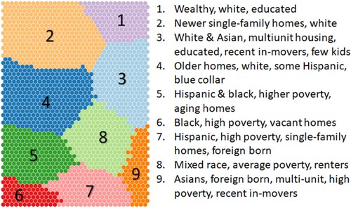
To cluster the data, all variables are normalized using a z-score based on the average and standard deviation of the larger metropolitan area in which a tract belongs, for each year. In this sense, all input variables are relative scores and therefore makes comparisons of values between metropolitan areas more feasible. It prevents raw home values, for example, in Kanas City to be compared to those in New York City and keeps them relative to each city’s average. It is also a necessary step in the clustering procedure. Given the large number of census tracts in the study (n = 37,479) for four-time stamps, a combined approach based on the self-organizing map (SOM) and k-means clustering was used to derive the nine classes. The SOM algorithm arranges the census tracts on a two-dimensional space in such a way that neighborhoods that are most similar to one another according to the initial set of 18 variables are placed closest to one another on the output space. This output grid is subsequently partitioned using k-means. A summary of the portioning and brief description of the resulting clusters is shown in . Each census tract is assigned one of these nine clusters in 1980, 1990, 2000, and 2010. Finally, to study change over time, each neighborhood’s position on the SOM output space is traced forming a trajectory of change and a sequence of change is constructed depicting its change in cluster membership through time. In the article, these sequences are then clustered, forming a general typology of neighborhood pathways of change across the United States. This step is completed using a sequence alignment algorithm. The visualization described in the following sections delves more deeply into these ways of communicating change. We demonstrate the components of our web-based system using an illustrative case study of a single neighborhood.
Figure 1. Segmentation of SOM output grid to 9 clusters and a brief description of each cluster type.
2.2. Website overview
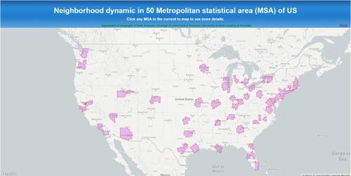
The neighborhood dynamics website features four visualization components: (a) a temporal sliding bar showing cluster membership through time; (b) Bar Charts that decompose changes to each variable over time; (c) Self-Organizing Map depicting a neighborhood’s trajectory through time and its sequence membership, and (d) Compare Maps visualization that also visualizes cluster membership through time, but in a series of linked sequential and interactive maps. Each of these components is explained in detail below, and a brief visual of the components is shown in .
Figure 2. Distribution of 50 MSAs presented in NDS.
2.2.1. Sliding bar
The first visualization depicts changes to a neighborhood’s cluster membership over time using a time slider. Users can also hover their cursor over a census tract to see its full sequence of cluster membership through time.
2.2.2. Bar graph
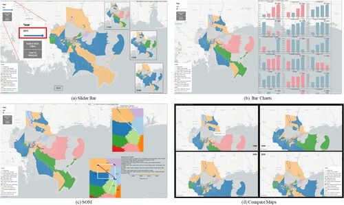
Once a user selects a neighborhood, a series of bar graphs are displayed to show the change in each of the individual variables through time, essentially decomposing the results of the cluster analysis. Given that the variables are standardized based on a Z-score to construct the clusters, each variable is subsequently presented on the same measurement scale, representing the relative change through time. Variables with a score of 0 are equivalent to the mean of its MSA in that decade, while positive values reflect values above the mean values, and negative numbers show values below the mean. For visualization purposes, positive values are shown in red while negative values are shown in blue, so all bars in the bar chart go in one upward direction ((b)).
Figure 3. Visualization tools for the system: (a) Slide Bar; (b) Bar Charts; (c) SOM: Neighborhood Trajectory; (d) SOM: Sequence Cluster.
2.2.3. SOM and sequence cluster
To further depict the magnitude of changes across all 18 attribute dimensions, a visualization based on a neighborhood’s movement on the SOM output space is presented (CitationDelmelle et al., 2013; CitationLee & Rinner, 2015; CitationSkupin & Hagelman, 2005). In this analysis, a neighborhood’s position is traced each decade to form a trajectory of change; larger trajectories indicate a large magnitude of change.
In addition to the single trajectory produced for a selected census tract, the sequence cluster to which its trajectory belongs is also displayed. This latter visualization displays results from CitationDelmelle’s (2017) clustering of neighborhood sequences into dominant themes based on their similarity. Thus, in this interactive visualization, users are presented with both the aggregate results necessarily condensed for a print publication and the specific path followed by a selected neighborhood.
2.2.4. Compare Maps
The final visualization component provides a complement to the sliding bar view on the spatial dynamics of neighborhoods, but rather than examining the distribution of neighborhoods assigned to the clusters for a single decade at a time, all four decades are shown in a series of four linked small multiples.
2.3. Technical implementation
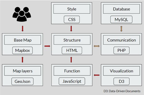
The NDS website is developed using HTML, CSS, JavaScript, and PHP. The structure of this webpage is built in HTML, and CSS describes the style of the website. In this system, Mapbox GL JS is used to render interactive maps and the base map. All map data are transferred into GeoJSON format to make them available to be served by Mapbox APIs. Following the web-based system developed by Nelson et al. (Citation2015), major functions of the website are defined using JavaScript and one JavaScript library called Data-Driven Documents (D3) for better visualization. MySQL is the database developed to store all of the data for the system, including the values of the 18 variables for each neighborhood in four time stamps. PHP scripts connect the web portal and the database. The PHP code acquires the information from the web portal and passes it to the database. The database queries the required information and passes it back to web portal which visualizes the results through PHP code. The following flowchart shows the mechanism of our system ().
Figure 4. Flowchart of web-based methods.
3. An example using NDS
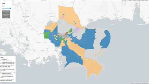
To demonstrate the utility of the system, we illustrate its functionality using the New Orleans MSA. In the first step, to navigate to the MSA, the user can zoom to the New Orleans MSA from the home page (see ). After the user selects this MSA, the website’s panel will visualize the sliding map functionality described above, and shown in . The map initially displays the cluster assignment of each census tract in 1980, with the option to change the date using the time slider on the upper left-hand corner of the map. Using this tool, the user generates a general impression of how the neighborhoods have changed cluster assignments over time in this MSA. Anytime the mouse hovers over a neighborhood in the map, a text box with the cluster change information from 1980 to 2010 will pop up. The legends for clusters are provided on each map’s left corner.
Figure 5. The slide bar functionality for the New Orleans MSA in NDS.
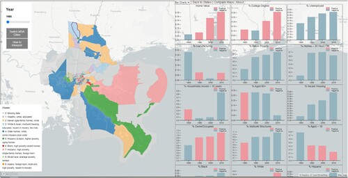
To further interact with the detailed changes for a single neighborhood, a user can select a census tract and access various data visualization tools to the right. For instance, a neighborhood -highlighted in purple in – is selected, and bar charts summarizing changes to the values of each of the 18 variables are displayed on the right-hand panel. The value for ‘Home Value’ in 1980 is colored in red, denoting a decrease, and values for ‘Home Value’ from 1990 to 2010 are colored in blue, suggesting an increase. Therefore, the relative home value for this neighborhood increased between 1980 and 2010. Corresponding with this increase in home values is a decline in the percentage of those unemployed, and a clear increase in the share of those with a college degree.
Figure 6. The ‘Bar Charts’ tools for one neighborhood in New Orleans MSA in NDS.
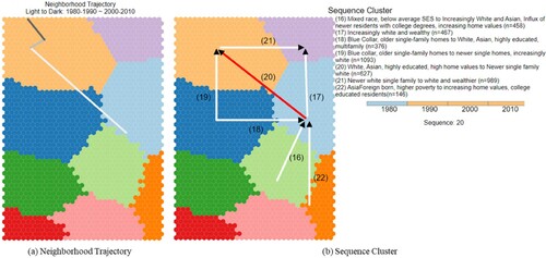
displays the SOM visualization for this same neighborhood. In the ‘Neighborhood Trajectory’ section ((a)), the white line represents the first sequence from 1980 to 1990; the gray line corresponds the second sequence from 1990 to 2000; and the dark line shows the third sequence from 2000 to 2010. These lines are combined as an animation starting at the earliest decade and ending with the last one. Corresponding with the cluster legend, this neighborhood changed from the south-west part of cluster 3 to north-west part of cluster 2, suggesting an increase in socioeconomic characteristics and a transition from denser, mixed-race to more stereotypically suburban traits and a less diverse population. The results of the SOM trajectory visualization enables users to see that the largest change occurred between 1980 and 1990. In the ‘Sequence Cluster’ section ((b)), the trajectory of this neighborhood belongs to sequence cluster 20 highlighted in red. This sequence cluster is named as ‘White, Asian, highly educated, high home values to Newer single family white’.
Figure 7. The result of ‘SOM’ tool for one neighborhood in New Orleans MSA in NDS: (a) neighborhood trajectory; (b) sequence cluster.
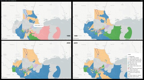
The last tool is the ‘Compare Maps’ which allow users to compare maps in four time stamps, and depicted in . The cluster change is revealed in the pop-up box when the mouse is hovered over the neighborhood. When the users zooms and pans one map, the other three maps also are zoomed and panned at the same time. From the figure, it is clear that there were few changes after 1990.
Figure 8. The result of ‘Compare Maps’ tool for one neighborhood in New Orleans MSA in NDS.
4. Discussion and conclusion
NDS is a novel interactive and web-based system to visualize neighborhoods dynamics. Current research on analyzing and visualizing neighborhoods change has been limited in its static portrait of these dynamics processes (see the main map as an static example). While advancements have been made in applying a variety of data mining methods to more easily digest and synthesize changes that consist of multiple attribute dimensions, multiple time stamps, and multiple spatial locations, these techniques necessarily hide details of individual neighborhoods as the general is presented at the expense of the particular. The methods demonstrated with this application overcome some of these challenges by enabling users to reconcile the general, broad trends with the details on individual neighborhoods and with respect to changes according to each of the variables examined. We suggest that these two complementary approaches provide both academics and the public the ability to understand the broader trends in neighborhood dynamics shaping cities and the country, and to drill down and examine details on individual neighborhoods.
The interactive website developed for this application features four main visualization modules for examining changes including a slide bar and a compare maps module for examining spatial dynamics, either one year at a time, or all four decades simultaneously. Bar charts decompose changes from 18 variables that are used to construct the multivariate geodemographic profiles of neighborhoods, and a SOM-based trajectory approach again synthesizes these dimensions, but enables users to more clearly understand the magnitude of changes between classes, which are perceived as uniform transitions in the maps, and to pinpoint when the most dramatic changes occurred.
While this website represents an advancement in the current state of neighborhood dynamics visualization methods available, it is not without limitations. First, the website currently uses data that were processed and analyzed separately, and visualizes those results on a web-based and interactive platform. Future research should allow users to upload their own data and to perform the processing online and then visualize the results. This would involve blending geocomputation with online or web processing as discussed in CitationDelmelle et al. (2014); CitationGahegan et al. (2001); CitationZhao et al. (2012).
Second, other methods of multivariate visualization could be implemented including parallel coordinate plots (PCP) and greater interactivity could be added to the site including on the SOM tool. CitationGuo et al. (2006) introduce a visualization system that contains a SOM, a PCP, and reorderable matrices to help users understanding spatio-temporal and multivariate patterns, and CitationZhang et al. (2016) embrace principle component analysis (PCA) scatterplot, PCP, and rose plot into their method of visualizing the impact of geographical variations on multivariate clustering. Currently, the Z-value of 18 given variables in this study is presented as a bar chart for each variable. While PCP seems to be another viable visualization tool for our work, the acceptability to users is an inevitable issue whenever implementing PCP. In other words, the crucial key of using PCP is to eliminate its fuzzy and indistinct impacts to users who have no knowledge of PCP.
Despite these limitations, this system offers a promising step in filling in some of the gap in terms of the web-based mapping and geovisualization platforms for socioeconomic applications (Smith, Citation2016). We believe that NDS provides an easy and vivid way to transfer neighborhood cluster information into maps and graphs implemented with interactivity.
Software
NDS is built with two open source JavaScript libraries for interactive visualization and a basemap, D3 (Data-Driven Documents) (CitationBostock et al., 2011) and Mapbox GL JS, with colors symbols from ColorBrewer.org (CitationHarrower & Brewer, 2003). To create a bridge from dataset to users, we also utilized two open source software in this system. MySQL is used to store and manage dataset as a database on the server side, and PHP (Hypertext Preprocessor) is used to communicate client side with database from server side. Recommended resolution of NDS is 1920*1200.
Supplemental Material
Download MP4 Video (15.9 MB)newMapsFeb24-2021.pdf
Download PDF (7.9 MB)Acknowledgements
The authors thank Alexander Marciniak and Elie Saliba for providing insight and support of the server-side development.
Disclosure statement
No potential conflict of interest was reported by the author(s).
Related Research Data
References
- Bostock, M., Ogievetsky, V., & Heer, J. (2011). D³ data-driven documents. IEEE Transactions on Visualization and Computer Graphics, 17(12), 2301–2309. https://doi.org/10.1109/TVCG.2011.185
- Chapple, K., & Zuk, M. (2016). Forewarned: The use of neighborhood early warning systems for gentrification and displacement. Cityscape, 18(3), 109–130.
- Cheng, D., Schretlen, P., Kronenfeld, N., & Bozowsky, N., & Wright, W. (2013). Tile based visual analytics for twitter big data exploratory analysis. Paper presented at the 2013 IEEE International Conference on Big Data.
- Cohen, M., & Pettit, K. L. S. (2019). Guide to measuring neighborhood change to understand and prevent displacement. National Neighborhood Indicators Partnership (NNIP). https://www.urban.org/research/publication/guide-measuring-neighborhoodchange-understand-and-prevent-displacement
- Culhane, D., & Breuer, B. (2008). The development of community information systems to support neighborhood change. In Handbook of community movements and local organizations (pp. 129–145). Springer.
- Delmelle, E. C. (2015). Five decades of neighborhood classifications and their transitions: A comparison of four US cities, 1970–2010. Applied Geography, 57, 1–11. https://doi.org/10.1016/j.apgeog.2014.12.002
- Delmelle, E. C. (2017). Differentiating pathways of neighborhood change in 50 US metropolitan areas. Environment and Planning A: Economy and Space, 49(10), 2402–2424. https://doi.org/10.1177/0308518X17722564
- Delmelle, E. C. (2016). Mapping the DNA of urban neighborhoods: Clustering longitudinal sequences of neighborhood socioeconomic change. Annals of the American Association of Geographers, 106(1), 36–56.
- Delmelle, E., Thill, J.-C.., Furuseth, O., & Ludden, T. (2013). Trajectories of multidimensional neighbourhood quality of life change. Urban Studies, 50(5), 923–941. https://doi.org/10.1177/0042098012458003
- Delmelle, E. M., Zhu, H., Tang, W., & Casas, I. (2014). A web-based geospatial toolkit for the monitoring of dengue fever. Applied Geography, 52, 144–152. https://doi.org/10.1016/j.apgeog.2014.05.007
- Foote, N., & Walter, R. (2017). Neighborhood and socioeconomic change in emerging megapolitan nodes: Tracking shifting social geographies in three rapidly growing United States metropolitan areas, 1980–2010. Urban Geography, 38(8), 1203–1230. https://doi.org/10.1080/02723638.2016.1217637
- Gahegan, M., Wachowicz, M., Harrower, M., & Rhyne, T.-M. (2001). The integration of geographic visualization with knowledge discovery in databases and geocomputation. Cartography and Geographic Information Science, 28(1), 29–44. https://doi.org/10.1559/152304001782173952
- Guo, D., Chen, J., MacEachren, A. M., & Liao, K. (2006). A visualization system for space-time and multivariate patterns (vis-stamp). IEEE Transactions on Visualization and Computer Graphics, 12(6), 1461–1474. https://doi.org/10.1109/TVCG.2006.84
- Harrower, M., & Brewer, C. A. (2003). Colorbrewer.org: An online tool for selecting colour schemes for maps. The Cartographic Journal, 40(1), 27–37. https://doi.org/10.1179/000870403235002042
- Kienberger, S., Hagenlocher, M., Delmelle, E., & Casas, I. (2013). A WebGIS tool for visualizing and exploring socioeconomic vulnerability to dengue fever in Cali, Colombia. Geospatial Health, 8, 313–316. https://doi.org/10.4081/gh.2013.76
- Lee, A. C.-D.., & Rinner, C. (2015). Visualizing urban social change with self-organizing maps: Toronto neighbourhoods, 1996–2006. Habitat International, 45, 92–98. https://doi.org/10.1016/j.habitatint.2014.06.027
- Ling, C., & Delmelle, E. C. (2016). Classifying multidimensional trajectories of neighbourhood change: a self-organizing map and k-means approach. Annals of GIS, 22(3), 173–186.
- Logan, J. R., Xu, Z., & Stults, B. J. (2014). Interpolating US decennial census tract data from as early as 1970 to 2010: A longitudinal tract database. The Professional Geographer, 66(3), 412–420.
- Maceachren, A. M., Robinson, A. C., Jaiswal, A., Pezanowski, S., Savelyev, A., & Blanford, J., & Mitra, P. (2011). Geo-twitter analytics: Applications in crisis management. Paper presented at the 25th international cartographic conference.
- Nelson, J., Quinn, S., Swedberg, B., Chu, W., & MacEachren, A. (2015). Geovisual analytics approach to exploring public political discourse on twitter. ISPRS International Journal of Geo-Information, 4(1), 337–366. https://doi.org/10.3390/ijgi4010337
- Nilsson, I., & Delmelle, E. (2018). Transit investments and neighborhood change: On the likelihood of change. Journal of Transport Geography, 66, 167–179. https://doi.org/10.1016/j.jtrangeo.2017.12.001
- Reibel, M. (2011). Classification approaches in neighborhood research: Introduction and review. Urban Geography, 32(3), 305–316. https://doi.org/10.2747/0272-3638.32.3.305
- Rey, S., Knaap, E., Han, S., Wolf, L., & Kang, W. (2018). Spatio-temporal analysis of socioeconomic neighborhoods: The Open Source Longitudinal Neighborhood Analysis Package (OSLNAP). Paper presented at the Proceedings of the 17th Python in Science Conference (SciPy 2018).
- Roth, R. E. (2013). Interactive maps: What we know and what we need to know. Journal of Spatial Information Science, (6), 59–115.
- Roth, E. R., Robinson, A. C., Stryker, M., MacEachren, A., Lengerich, E. J., & Koua, E. (2008). Web-based geovisualization and geocollaboration: Applications to public health [Paper presentation]. 2008 Joint statistical meeting, invited session on web mapping, Denver, CO, USA.
- Schroeder, J. P. (2017). Hybrid areal interpolation of census counts from 2000 blocks to 2010 geographies. Computers, Environment and Urban Systems, 62, 53–63. https://doi.org/10.1016/j.compenvurbsys.2016.10.001
- Skupin, A., & Hagelman, R. (2005). Visualizing demographic trajectories with self-organizing maps. GeoInformatica, 9(2), 159–179. https://doi.org/10.1007/s10707-005-6670-2
- Smith, D. A. (2016). Online interactive thematic mapping: Applications and techniques for socio-economic research. Computers, Environment and Urban Systems, 57, 106–117.
- Spielman, S. E., & Singleton, A. (2015). Studying neighborhoods using uncertain data from the American community survey: A contextual approach. Annals of the Association of American Geographers, 105(5), 1003–1025. https://doi.org/10.1080/00045608.2015.1052335
- Sun, M., Li, J., Yang, C., Schmidt, G., Bambacus, M., Cahalan, R., Huang, Q., Xu, C., Noble, E., & Li, Z. (2012). A web-based geovisual analytical system for climate studies. Future Internet, 4(4), 1069–1085. https://doi.org/10.3390/fi4041069
- Wei, F., & Knox, P. L. (1990). Neighborhood change in metropolitan America. Urban Affairs Review, 50(4), 459–489.
- Wei, F., & Knox, P. L. (2014). Neighborhood change in metropolitan America, 1990 to 2010. Urban Affairs Review, 50(4), 459–489. https://doi.org/10.1177/1078087413501640
- Wood, J., Dykes, J., Slingsby, A., & Clarke, K. (2007). Interactive visual exploration of a large spatio-temporal dataset: Reflections on a geovisualization mashup. IEEE Transactions on Visualization and Computer Graphics, 13(6), 1176–1183. https://doi.org/10.1109/TVCG.2007.70570
- Wood, J., Slingsby, A., & Dykes, J. (2011). Visualizing the dynamics of London's bicycle-hire scheme. Cartographica: The International Journal for Geographic Information and Geovisualization, 46(4), 239–251. https://doi.org/10.3138/carto.46.4.239
- Zhang, Y., Luo, W., Mack, E. A., & Maciejewski, R. (2016). Visualizing the impact of geographical variations on multivariate clustering [Paper presentation]. Computer graphics forum.
- Zhao, P., Foerster, T., & Yue, P. (2012). The geoprocessing web. Computers & Geosciences, 47, 3–12. https://doi.org/10.1016/j.cageo.2012.04.021