ABSTRACT
Cartographic display of cross-scale phenomena and user-centered design are considered through a discussion of the development of an interactive web map depicting local-to-national economic impacts of hurricane storm surge events in Galveston Bay, Texas. Map development and design (as informed by stakeholder focus groups) is described, including approaches to presenting complex, cross-scale impacts of surge events across multiple years and scenarios. Particular consideration is given to how designs may communicate complexity without overly taxing users’ mental and perceptual resources (measured via NASA task-load index) or outstripping their mapping/domain expertise. The map produced uses linked map views to communicate multiple, cross-scale storm surge impacts. The production process and associated user testing highlighted the importance of matching tool complexity to users’ needs and levels of expertise, including through the use of tiered interface design. Optimizing the design of such maps to meet users’ needs is essential to fostering public hazard literacy.
1. Introduction
Storm surges are the most deadly and costly impacts of hurricanes (CitationBorenstein, 2018). As sea levels rise and coastal populations increase, storm surge flood events are likely to become more damaging, particularly in densely populated and economically important coastal communities (CitationMcGranahan et al., Citation2007; CitationNeumann et al., Citation2015). Coastal zones are home to over half of the nation’s economic productivity, and they are at high risk: 72% of ports, 27% of major roads, and 9% of rail lines with the Gulf Coast region, for example, are at or below four feet of elevation (CitationNational Hurricane Center, Citationn.d.). Damages from storm surge not only threaten industry. A recent analysis of 19 coastal states from Texas to Maine reports that 7.3 million homes, with a reconstruction cost of $1.8 trillion, are at risk of damages from storm surge (CitationCoreLogic, Citation2019).
Recognizing the need for policy-makers, planners, and emergency responders to identify areas where surge flooding is likely, maps of storm surge extent (both predicted and observed) have been produced by researchers and government agencies (CitationMelton et al., Citation2010; CitationMorrow et al., Citation2015). Some of these mapping efforts also consider how demographic and economic factors may affect communities’ storm surge vulnerability (CitationCutter et al., Citation2000; CitationRygel et al., Citation2006; CitationShepard et al., Citation2012). Because non-governmental entities, ranging from businesses to residents, also benefit from information about their flood risk, several public-facing interactive web maps for storm surge flood extent and vulnerability have been produced to communicate these results (CitationVan Zandt et al., Citation2012; CitationZachry et al., Citation2015). While these products meet a need for maps communicating surge extent and vulnerability, existing maps have not fully captured the economic footprint of surge events. In particular, cross-scale economic impacts – which may extend thousands of miles inland, persist for decades, and carry important public policy implications – remain unaddressed. This paper describes the development of a tool to fill this gap: an interactive map of cross-scale economic impacts of storm surge (and associated mitigation scenarios) for the Houston-Galveston, Texas metro area.
The Houston-Galveston metro area offers a critical case study in the local-to-national economic impacts of storm surge events, as it is important to the national economy, has significant and increasing exposure to surge, and is considering a significant extension of its existing protective surge barrier. The region is a major hub for petroleum refineries and houses the second largest petrochemical complexes in the world (CitationHouston Galveston Area Council, Citation2017), as well as the largest port in the U.S. in terms of import and export tonnage (CitationPort of Houston, Citation2017). The area is also one of the most vulnerable regions to surge and flood threats in the United States (CitationBalaguru et al., Citation2016; CitationSURGEDAT, Citation2017) and these impacts are expected to become more frequent and severe with sea level rise (CitationFrumhoff et al., Citation2007). This physical vulnerability coupled with the exposure of people and critical assets exacerbates its vulnerability. The area is one of the most populous and fastest growing metropolitan areas in the nation, with 4.4 million people according to the 2010 U.S. Census, projected to surpass 6.33 million by 2040 (CitationHouston Galveston Area Council, Citation2017). To protect people and property in the Houston-Galveston region from surge events like Hurricane Ike – a 2008, category two storm that brought surge levels typically associated with category five hurricanes and was the costliest storm Texas had experienced at the time (CitationHarris County Flood Control District, Citationn.d.) – various forms of coastal surge barriers have been proposed. The State of Texas has endorsed a plan known as the ‘coastal spine’ (originally the ‘Ike Dike,’ CitationPowell, 2018): modeled after protective systems in the Netherlands, it features a network of levees and seawall extensions as well as a gate at the mouth of the Houston Ship Channel to block storm surge from entering the Bay (CitationBlackburn, Citation2019).
The coastal spine has been shown to reduce the negative direct and indirect economic impacts of surge events on regional and national economies (CitationAtoba et al., Citation2018; CitationDavlasheridze et al., Citation2019; CitationDavlasheridze et al., Citation2020). However, these effects are not unidirectional and show significant variation over space and time. This is in line with the literature: economic effects of disasters on growth may be positive or negative, depending on the type of disaster and its social-ecological context (CitationKellenberg & Mobarak, Citation2011; CitationPopp, Citation2006). These spatially and temporally uneven economic impacts make it difficult for a single, static planning tool to fully capture the post-disaster economic narrative. The use of scenarios, however, can be informative for understanding the impacts of disasters, both generally (CitationDavies et al., Citation2015) and on economies, specifically (e.g. CitationAli & Santos, 2012; CitationAnthoff et al., Citation2010). Interactive tools that facilitate spatiotemporal exploration of multiple scenarios may therefore be particularly well suited to generating insight into the complex economic impacts of surge events and other disasters.
To show cross-scale economic impacts of storm surge scenarios for the Houston-Galveston metro area – and the potential economic benefits of building the coastal spine – the authors developed an interactive web map, ‘Economic Impacts of Storm Surge in Galveston Bay’ (Main Map). Using maps of local and national storm surge impacts and accompanying data visualizations, this tool provides an overview of policy-relevant, cross-scale effects of surge events. It connects second-order, state-level economic effects to more frequently mapped, direct effects on local communities. Specific decision contexts supported by the map’s scenarios include local-to-regional level identification of hot spots for direct economic losses under present-day and future conditions, as well as state-to-national level planning for associated economic disruptions. This paper describes the development of the Economic Impact map – from data collection and processing to map design and iterative refinement of the user experience – and places it in the context of the broader literature on interactive mapping, cross-scale mapping, and user testing. Not only does this tool fill an important void in map products of storm surge impacts, it offers lessons that can inform the development and use of cross-scale mapping in other fields.
1.1. Literature review: design and testing for interactive maps of cross-scale hazards
Interactive, online maps (i.e. web maps) are increasingly the format of choice for meeting a number of map use objectives, from exploration, to route finding, to geovisualization-like insight and analysis tasks (CitationRoth, 2015; CitationRoth et al., Citation2017; CitationStephens et al., Citation2015). Interactive maps can facilitate cross-scale exploration (e.g. via pan-and-zoom interfaces) and data analysis (e.g. via filter functions and toggling and overlay of multiple thematic data layers; CitationRoth, Citation2012) (CitationBohman et al., Citation2015; CitationMuehlenhaus, Citation2013). These advantages for exploration and analysis likely derive from the interactive map’s customizability (i.e. its support for many-to-infinite realizations of the map; CitationMacEachren, Citation1994), support for filter and overlay functions, and compatibility with linked data visualizations that update based on the map extent and active overlays and filters (CitationNeset et al., Citation2016; CitationRoth, 2015).
Hazard maps in particular may benefit from interactivity for exploration and analysis (e.g. CitationChesneau, Citation2004; CitationOpach & Rød, Citation2013). Interactive hazard maps increase accessibility of spatial analysis for hazard preparedness and response, both by providing user-friendly interfaces for comparing impacts across space, time, and demographics and by making these tools available via any internet-connected device with web browser support (CitationHaimes et al., Citation2015; CitationNost et al., Citation2017; CitationStephens et al., Citation2015). Interactivity can facilitate multiscale analysis of a hazard’s effect on persons and property by permitting aggregation and disaggregation of impacts across the hierarchy of administrative divisions within the map extent (CitationNost et al., Citation2017). Customizable hazard maps may also help map users place the hazard in a more local, personally meaningful context, thereby increasing user engagement (CitationBostrom et al., Citation2008; CitationHaimes et al., Citation2015; CitationRetchless, Citation2018; CitationSchroth et al., Citation2015). This ability to personalize and contextualize hazards may be particularly important when mapping complex hazards associated with climate change, where the complexity of long time scales, multiple scenarios, and lagged responses create ‘wicked’ problems for cartographic risk communication (CitationMirel, Citation1998; CitationStephens et al., Citation2015). In such problem spaces, high interactivity may be needed to reduce the problem scope and dimensionality; through map interfaces that support shared agency in exploration and analysis of climate change impacts, such highly interactive maps permit filtering or other customization to better match users’ needs and interests (CitationBohman et al., Citation2015; CitationJohansson et al., Citation2017). When mapping complex hazards such as sea-level-rise enhanced storm surge, multiple linked views (including maps and charts) may also be needed to support effective communication and analysis of multivariate hazard vulnerability data (CitationOpach & Rød, Citation2013).
Development of interactive hazard maps also poses significant challenges, particularly with regard to managing interface complexity. To realize the advantages of interactive hazard mapping, map makers must carefully balance support for customization against users’ abilities and interface complexity (CitationNeset et al., Citation2016; CitationStephens et al., Citation2015; CitationVincent et al., Citation2019). In line with guidance from data visualization to provide ‘overview first, zoom and filter, then details on demand’ (CitationShneiderman, Citation1996, p. 337), web maps with more complex interfaces often display a large map area with floating windows or sidebars to support toggling of map overlays, zooming via ‘+/-’ buttons, and filtering using menus and/or sliders (with retrieval of attributes for specific map elements supported by clicking directly on the map) (CitationTimita, Citation2014; CitationVincent et al., Citation2019). However, this approach may overwhelm the user if it presents more interface functionality than is necessary to meet the user’s information retrieval needs, contributing to cognitive overload, dissatisfaction, and less effective decision making (CitationLópez-Ornelas et al., Citation2013; CitationNeset et al., Citation2016; CitationTimita, Citation2014; CitationVincent et al., Citation2019). Where extensive interface functionality is required to meet the needs of more advanced users, a tiered interface design that initially presents a simpler interface (to increase accessibility for the novice user) but also provides more advanced features (initially hidden but accessible by experts) may therefore be appropriate (CitationRoth, 2015; CitationRoth & Harrower, Citation2008; CitationShneiderman, 2002).
User input is essential to ensure that interactive map products meet users’ needs (CitationHennig & Vogler, Citation2016; CitationLópez-Ornelas et al., Citation2013; CitationPoplin, Citation2015); the literature presents recommendations for when such feedback should occur, how to collect it to maximize tool usability, and how it can be used to better meet the needs of users with varied abilities and skill levels. User-centered and participatory design approaches establish timelines and procedures for user evaluation and engagement, beginning early and continuing throughout the design process (CitationHennig & Vogler, Citation2016; CitationJohansson et al., Citation2017; CitationRobinson et al., Citation2005; CitationRoth et al., Citation2017; CitationRoth & Harrower, Citation2008). Usability-focused studies (e.g. CitationLópez-Ornelas et al., Citation2013; CitationPoplin, Citation2015) describe methods for evaluating usability and its dimensions (including effectiveness, efficiency, and satisfaction; see ISO 9241; CitationBevan et al., 2015), often combining quantitative (e.g. usability scales or eye tracking) and qualitative (e.g. observations or survey self-reports) approaches (e.g. CitationBartling et al., Citation2019; CitationPoplin, Citation2015). To meet the needs of diverse users, design evaluations for accessibility (CitationHennig et al., Citation2018) and usability across levels of technical or domain expertise (CitationBartling et al., Citation2019; CitationRinner & Bird, Citation2009) are also recommended.
2. Materials and methods
2.1. Map data
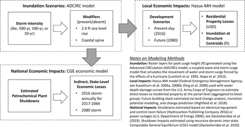
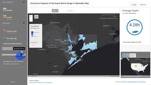
The Economic Impact map was built upon three main datasets: inundation, local economic impacts, and national economic impacts (). Inundation and local economic impacts were modeled for the three Texas counties bordering Galveston Bay: Chambers, Galveston, and Harris. Both the local and national datasets used the inundation datasets – under different natural process, mitigation, and development scenarios – to calculate impacts. Scenarios included intensity of the storm (Ike-like storm or proxy storm with 500-year, 100-year, or 10-year return period), presence or absence of sea level rise, presence or absence of a coastal spine, and whether the storm occurred with present-day (2016) or projected (2080) land use (local impacts) or economic conditions (national impacts). For local impacts, the estimated residential losses (as well as inundation at structure centroids, Citation‘Microsoft,’ n.d.) were aggregated to the block group, stored together in a SQL database, and loaded onto an ArcServer instance. This enabled a dynamic, queryable presentation of these losses in the local view of the Economic Impact map. Values on the national view of the Economic Impact map were calculated as state-level percent change (in economic activity, income, and prices) compared with the business as usual case, which assumes the economy will grow on its projected path without any surge interruption. The economic indicators calculated via this analysis were joined to states in long format by scenario. A total of 192 scenarios were generated for 51 years of data (2017-2066 for present-day storm, 2080 for future storm) for 50 states; to reduce the amount of data loaded at any given time, data are loaded only upon request.
Figure 1. Methods for generating map data.
2.2. Focus groups
While true user-centered design requires continuous user evaluation and engagement, resource constraints led to a more limited, usability assessment-focused approach. Based on a series of two focus groups, this approach evaluated the usability of an early version of the web tool via combined quantitative and qualitative assessments of participants’ experience completing assigned scenario tasks (as in CitationNewman et al., Citation2010). Held in fall of 2018, the focus groups included six participants from emergency management, city planning, neighborhood associations, and local chambers of commerce. Participants provided written and oral feedback on tool usability, including self-assessments of the difficulty of using the tool to explore each assigned scenario and group discussion of tool usability and usefulness at the conclusion of the focus group. Difficulty assessments were made using the NASA Task Load Index (TLI), a validated measure for perceived difficulty that accounts for mental, physical, and temporal demands on the tool user (CitationHart & Staveland, Citation1988). Scores on the index range from 1 (least demanding) to 5 (most demanding); scores were averaged across participants for each scenario to permit comparison of the difficulty of map tasks associated with each scenario (CitationMoroney et al., Citation1992; CitationSavelyev & MacEachren, Citation2018). A brief survey administered prior to tool use measured self-assessed computer skill and confidence and map expertise, on a scale from 1 (novice) to 5 (expert). A summary of focus group scenarios and associated workflows is provided in Appendix 1.
3. Results
3.1. Focus groups
Based on the NASA TLI, average load was 2.5 for training scenarios, 2.8 for scenarios requiring use of the local map, and 3.5 for the scenario requiring use of the national map, suggesting that participants found the national map more difficult to use than the local map. This is supported by written comments and group discussion from the participants, which noted that a line chart on the national map was too confusing and that the variables used for national impacts were not intuitive (e.g. gross domestic product). Participants found the overall tool design intuitive and clear (especially for the local map and switching between maps) and indicated that the layers and filtering options would be useful for preparedness, but also suggested that the initial view should show map directions. Computer skill and confidence was high for four participants (4) but low to moderate (2-3) for the other two. Map expertise was moderate to high (3-5) for all but one participant, who rated as low (2). Participants with lower computer and map skills had higher average task load scores (3.5) compared to other participants (2.8) and were more likely to express frustration, particularly early in their testing.
3.2. Design goals
Informed by our review of the literature and focus group feedback, we aimed to maximize the advantages of interactivity while minimizing associated challenges. Specific goals included:
Facilitate exploration of scenarios (CitationBohman et al., Citation2015; CitationMuehlenhaus, Citation2013; CitationRoth, Citation2012), including for construction of coastal spine, sea level rise, and current and future land use, selectable using large, clearly understood graphical icons (CitationPoplin, Citation2015; CitationRinner & Bird, Citation2009);
Clearly communicate links between local, direct impacts of storm surge on persons and property in the Houston-Galveston metro area and state-level economic impacts across the United States (CitationNost et al., Citation2017);
Responsive design for desktop and mobile (CitationHennig & Vogler, Citation2016; CitationLópez-Ornelas et al., Citation2013);
Linked views (CitationOpach & Rød, Citation2013) for summarizing aggregate impacts across multiple block groups (local map) or states (national map);
‘Details on demand’ (CitationShneiderman, Citation1996; focus group feedback) for individual block groups (local map) or states (national map)
Metrics for flooding and its economic impacts that are meaningful for both experts and the general public (focus group feedback); and
Interface design that meets needs of novice and expert users, including persistent display of map directions and advanced filtering capabilities (CitationPoplin, Citation2015; focus group feedback).
3.3. Map layout and user interface
The final map and user interface were designed to meet these goals by:
Creating a persistent left sidebar with large buttons for toggling scenario settings, including for current versus future land use, sea level rise (visible only with future land use scenarios), construction of coastal spine, and storm severity ( and );
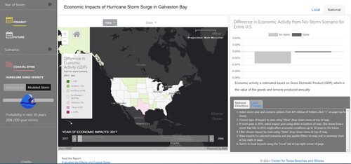
Providing two maps of storm surge impacts – local () and national () – that update in real-time based on scenario settings selected in the persistent left sidebar (shared across maps);
Creating tabbed interface for quickly switching between local and national maps (upper right of and );
Enabling side-by-side linked views of local and national impacts through a mini-map ‘preview’ of the map not currently in focus, accessible via the tabs at the lower right ();
Coding map and interface elements to shrink, stack, or hide when browser window size decreases, facilitating use on mobile devices (Video 1);
Implementing linked charts for aggregate impacts (Section 3.4);
Showing a detailed summary of block group-level (local map) or state-level (national map) impacts by opening a pop-up window when the user clicks on a specific geographic unit ();
Providing options to switch views from showing impacts well-understood by economists and policy makers (e.g. state-level gross domestic product changes) to those better understood by the public (e.g. state-level changes in gas prices) (Appendix 1); and
Initially showing directions in a tab at the lower right () and adopting elements of ‘tiered interface design’ by hiding or giving less visual emphasis to advanced features (e.g. by hiding ‘modeled storm’ slider for storm surge severity and submenus for applying filters, and by using higher contrast for the basic functionality of the ‘View’ dropdown button and lower contrast for dropdown buttons that provide optional, more advanced customizations, like ‘Filter by’ or ‘State’; for a detailed description of these interface elements, see Appendix 1).
Figure 2. Local impacts map, damage view.
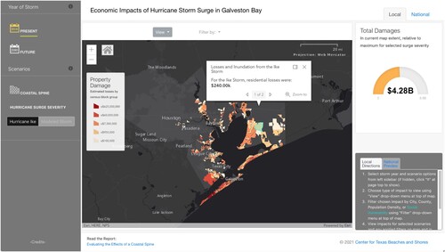
Figure 3. National impacts map.
The presentation is similar to that employed by geodashboards in that it displays important geospatial features and summary charts for decision support (CitationHorita et al., Citation2014, Citation2015), but differs in its use of affordances for cross-scale exploration and analysis (i.e. tabbed interface and linked views for local/national maps).
3.4. Linked charts
Special consideration was given to design of the charts that were linked to the local – and state-level impact maps. To aid understanding of flood impacts at an aggregate level, three charts were provided: two for the local view (storm surge damage in USD and average inundation levels) and one for the national view (state-level economic impacts). The design of the site allows the user to move between charts and linked map views non-linearly, facilitating data exploration and insight (CitationBohman et al., Citation2015; CitationMuehlenhaus, Citation2013; CitationPoplin, Citation2015).
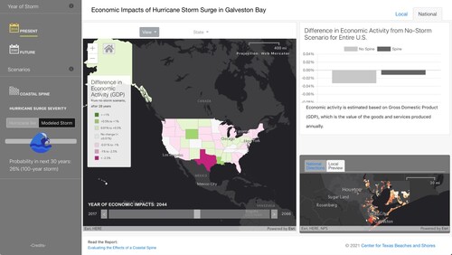
For the local map, the damages chart appears on page load alongside the default damage view (). It shows residential losses via a gauge comparing total damages within the current map extent with the overall maximum for a storm of the selected severity (i.e. if future land use and sea level rise are enabled, coastal spine is disabled, and the full map extent is shown). Switching the local map from damage to inundation view replaces the damage chart with the average inundation chart (). This shows the average estimated inundation (via a stylized blue flood gauge graphic that fills with higher water levels) for all structures on the map. Text below the chart gives the number of structures impacted. Both local charts are spatially dynamic; when the user zooms, pans, or filters the results, the charts adjust accordingly to reflect the amount of damage or inundation shown in the current extent. This dynamic design is consistent with the visual information seeking mantra (CitationCraft & Cairns, Citation2005; CitationShneiderman, Citation1996) as well as more recent literature on filter operations for interactive maps (e.g. CitationRoth, Citation2012; CitationRoth & MacEachren, Citation2016). Focus group participants found the local charts intuitive and potentially useful for disaster preparedness and response.
Figure 4. Local impacts map, inundation view.
The national map includes a bar chart displaying aggregate differences in economic activity for the U.S with and without the coastal spine (). The chart summarizes one of five economic metrics (chosen based on focus group feedback), selected via the national map’s ‘View’ menu: GDP, Per Capita Income, Gas Prices, Insurance Prices, or Housing Prices. While the local charts are spatially dynamic, the national bar chart is temporally dynamic and displays the differences from baseline economic activity, with or without the coastal spine, for a single user-selected impact year (reducing complexity per focus group recommendations). Years range from 2017 to 2066. If a user filters for a specific state, the chart is filtered as well.
4. Discussion
Guided by best practices from the interactive mapping literature and feedback from map users, we produced an interactive web map, ‘Economic Impacts of Storm Surge in Galveston Bay,’ that shows cross-scale economic impacts of storm surge events. The literature review, map development process, and user feedback suggest several lessons that may inform future development of similar cross-scale map tools:
Linked map views (switched via tabs and with thumbnail previews) may be used to effectively communicate multiple, cross-scale impacts of disaster events. The use of a dynamic interface that updates based on selected impacts and scales can facilitate user interaction with these maps. Existing literature has established the value of linked map and chart displays (CitationHorita et al., Citation2014; CitationOpach & Rød, Citation2013); feedback from our focus group participants suggests that with careful interface design similar benefits may derive from linked views of maps showing related phenomena at different scales.
Know your user base and engage early and often, particularly with regard to features such as cross-scale interface elements, linked views, and temporally dynamic data that may be less familiar to map users. Consistent with the user-centered design literature (e.g. CitationRobinson et al., Citation2005), we found user feedback invaluable in improving the map design and interactive features; earlier involvement of map users would have likely limited development time spent on features that were ultimately removed from the national map as too complex or confusing.
Match tool complexity to use cases appropriate for map scale or level of aggregation. For more abstract impacts aggregated at state or national level or over longer time frames, reduced complexity (in data, interface, and visualizations) may be appropriate. Users interested in such aggregated impacts and their implications for state or national level policy making likely want a simple, easy to understand, ‘big picture’ take home message, not a multitude of interface options and scenarios. This should be seen as complimentary to existing guidance regarding affordances for less technically proficient users (e.g. CitationBartling et al., Citation2019; CitationRinner & Bird, Citation2009).
These lessons suggest that while high interactivity may be essential to personalize and contextualize complex, climate-influenced hazards (CitationMirel, Citation1998; CitationStephens et al., Citation2015), map designers should also consider identifying cases where complexity should be managed on the back end through the elimination of customization options that are less relevant to user needs and interests. Through user-centered design, map makers should engage their user base to aid in identifying such less relevant options, thereby facilitating exploration and insight while limiting frustration and confusion. The interactive webmap tool described here fills a gap in map products by deploying linked map views to illustrate the substantial, cross-scale links between regional and national economic impacts for surge events in a major metro area. Other map products – including, but not limited to, maps of higher-order impacts of other natural disasters – can adopt similar methodology and tools to communicate other phenomena with a significant cross-scale component.
Software
The webmap is served on a windows 2012 server using SQL for the backend. Services are hosted through ESRI’s Portal (CitationESRI, Citationn.d.a). The frontend is coded using javascript using ESRI’s javascript 4.10 API (CitationESRI, Citationn.d.b). Three chart libraries were used during development the liquid chart was developed by D3 Liquid Fill gauge (CitationBratton, Citationn.d.); the damage chart was developed by justgage (CitationDjuricic, Citationn.d.); and the U.S. chart was developed by Chart.js (CitationBrunel, Citationn.d.).
Geolocation information
Local map
Houston-Galveston Bay Area (Harris, Galveston, and Chambers Counties, Texas) Extent: −95.9608, 30.1707 (northwest); −94.353329, 29.067156 (southeast)
National map
50 states of the United States
Extent: 172.45, 71.383333 (northwest); −66.95, 18.916667 (southeast)
National map-use scenario
Download MP4 Video (1.8 MB)Local map-use scenario
Download MP4 Video (3.8 MB)Responsive design with changing window size
Download MP4 Video (2.7 MB)Economic Impacts of Hurricane Storm Surge in Galveston Bay, National Map (with Local Preview)
Download PDF (627 KB)Acknowledgments
We acknowledge the invaluable contributions of the focus group participants who donated their time to review an early version of the economic impact map. Their feedback was essential in developing a more useful and usable map product.
Disclosure statement
No potential conflict of interest was reported by the author(s).
Data availability statement
The interactive web map is accessible at: https://www.texascoastalatlas.com/coastalspine/
The local and national datasets used to create the interactive web map are available via the following weblinks. Please include a citation to this manuscript in any publications or other products created using this data.
Local (Houston-Galveston) Impacts:
Damages:
http://atlas.texascoastalatlas.com/arcgis/rest/services/IkeScenarios/Damages
Inundation:
http://atlas.texascoastalatlas.com/arcgis/rest/services/IkeScenarios/Inundation_Scenarios/
National (US) Impacts: http://atlas.texascoastalatlas.com/arcgis/rest/services/IkeScenarios/US_Impacts_16_66
Additional information
Funding
Related Research Data
References
- Ali, J., & Santos, J. R. (2012, April 27). Framework for evaluating economic impact of IT based disasters on the interdependent sectors of the US economy. In 2012 IEEE systems and information engineering design symposium (pp. 1–6). IEEE.
- Anthoff, D., Nicholls, R. J., & Tol, R. S. J. (2010). The economic impact of substantial sea-level rise. Mitigation and Adaptation Strategies for Global Change, 15(4), 321–335. https://doi.org/10.1007/s11027-010-9220-7
- Atoba, K. O., Brody, S. D., Highfield, W. E., & Merrell, W. J. (2018). Estimating residential property loss reduction from a proposed coastal barrier system in the Houston-Galveston region. Natural Hazards Review, 19(3), 05018006. https://doi.org/10.1061/(ASCE)NH.1527-6996.0000297
- Balaguru, K., Judi, D. R., & Leung, L. R. (2016). Future hurricane storm surge risk for the U.S. Gulf and florida coasts based on projections of thermodynamic potential intensity. Climatic Change, 138(1-2), 99–110. https://doi.org/10.1007/s10584-016-1728-8
- Bartling, M., Resch, B., Eitzinger, A., & Zurita-Arthos, L. (2019). A multi-national human–computer interaction evaluation of the public participatory GIS GeoCitizen. GI_Forum, 1(7), 19–39. https://doi.org/10.1553/giscience2019_01_s19
- Bevan, N., Carter, J., & Harker, S. (2015, Aug 2). ISO 9241-11 revised: What have we learnt about usability since 1998? In 2015 International Conference on Human-Computer Interaction (pp. 143–151). Springer. https://doi.org/10.1007/978-3-319-20901-2_13
- Blackburn, J. (2019). Houston-Area surge Flooding and Its effects on regional and national security. Rice University’s Baker Institute for Public Policy. https://doi.org/10.25613/6bfp-gp42
- Bohman, A., Neset, T.-S., Opach, T., & Rød, J. K. (2015). Decision support for adaptive action–assessing the potential of geographic visualization. Journal of Environmental Planning and Management, 58(12), 2193–2211. https://doi.org/10.1080/09640568.2014.973937
- Borenstein, S. (2018, September 17). Storm Surges are most costly, dangerous result of hurricanes. Claims Journal. https://www.claimsjournal.com/news/national/2018/09/17/286778.htm
- Bostrom, A., Anselin, L., & Farris, J. (2008). Visualizing seismic risk and uncertainty. Annals of the New York Academy of Sciences, 1128(1), 29–40. https://doi.org/10.1196/annals.1399.005
- Bratton, C. (n.d.). D3 Liquid Fill Gauge · GitHub. Retrieved January 20, 2020, from https://gist.github.com/brattonc/5e5ce9beee483220e2f6
- Brunel, S. (n.d.). GitHub - chartjs/Chart.js: Simple HTML5 Charts using the <canvas > tag. Retrieved January 20, 2020, from https://github.com/chartjs/Chart.js
- Chesneau, E. (2004). Propositions pour une cartographie du risque. Le Monde Des Cartes, 181(September), 55–70.
- CoreLogic. (2019). The 2019 Storm Surge Report. https://www.corelogic.com/insights/storm-surge-report.aspx?WT.mc_id=crlg_190524_IJT0T
- Craft, B., & Cairns, P. (2005). Beyond guidelines: What can we learn from the visual information seeking mantra? Ninth International Conference on Information Visualisation, 2005. Proceedings, 110–118. https://doi.org/10.1109/IV.2005.28
- Cutter, S. L., Mitchell, J. T., & Scott, M. S. (2000). Revealing the vulnerability of people and places: A case study of Georgetown county, south carolina. Annals of the Association of American Geographers, 90(4), 713–737. https://doi.org/10.1111/0004-5608.00219
- Davies, T., Beaven, S., Conradson, D., Densmore, A., Gaillard, J. C., Johnston, D., Milledge, D., Oven, K., Petley, D., Rigg, J., Robinson, T., Rosser, N., & Wilson, T. (2015). Towards disaster resilience: A scenario-based approach to co-producing and integrating hazard and risk knowledge. International Journal of Disaster Risk Reduction, 13, 242–247. https://doi.org/10.1016/j.ijdrr.2015.05.009
- Davlasheridze, M., Atoba, K. O., Brody, S., Highfield, W., Merrell, W., Ebersole, B., Purdue, A., & Gilmer, R. W. (2019). Economic impacts of storm surge and the cost-benefit analysis of a coastal spine as the surge mitigation strategy in Houston-Galveston area in the USA. Mitigation and Adaptation Strategies for Global Change, 24(3), 329–354. https://doi.org/10.1007/s11027-018-9814-z
- Davlasheridze, M., Fan, Q., Highfield, W., Sypniewski, J., Ross, A., Lee, S., Driscoll, T., & Ebersole, B. (2020). Evaluating the Effects of a Coastal Spine: National-Level Economic Ripple Effects of Storm Surge Events (No. 18-159-000-A719; p. 7). Texas General Land Office.
- Ding, A., White, J. F., Ullman, P. W., & Fashokun, A. O. (2008). Evaluation of HAZUS-MH flood model with local data and other program. Natural Hazards Review, 9(1), 20–28. https://doi.org/10.1061/(ASCE)1527-6988(2008)9:1(20)
- Djuricic, B. (n.d.). GitHub - toorshia/justgage: Retrieved January 20, 2020, from https://github.com/toorshia/justgage
- ESRI. (n.d.a). Portal | ArcGIS Enterprise. Retrieved January 20, 2020, from https://enterprise.arcgis.com/en/portal/
- ESRI. (n.d.b). Release notes for 4.10 | ArcGIS API for JavaScript 4.14. Retrieved January 20, 2020, from https://developers.arcgis.com/javascript/latest/guide/4.10/index.html
- Frumhoff, P. C., McCarthy, J. J., Melillo, J. M., Moser, S. C., & Wuebbles, D. J. (2007). Confronting climate change in the US Northeast: Science, impacts, and solutions Confronting climate change in the US Northeast: science, impacts, and solutions.
- Haimes, P., Baba, T., & Medley, S. (2015). Mobile map applications and the democratisation of hazard information. SIGGRAPH Asia 2015 Mobile Graphics and Interactive Applications, 7.
- Harris County Flood Control District. (n.d.). “Hurricane Ike.” https://www.hcfcd.org/Additional-Resources/Flooding-and-Floodplains/Storm-Center/hurricane-ike-2008
- Hart, S. G., & Staveland, L. E. (1988). Development of NASA-TLX (task load index): results of empirical and theoretical research. In P. A. Hancock & N. Meshkati (Eds.), Advances in Psychology (Vol. 52, pp. 139–183). Elsevier.
- Hennig, S., & Vogler, R. (2016). User-centred map applications through participatory design: Experiences gained during the ‘YouthMap 5020’ project. The Cartographic Journal, 53(3), 213–229. https://doi.org/10.1080/00087041.2016.1148217
- Hennig, S., Zobl, F., & Wasserburger, W. W. (2018). Accessible web maps for visually impaired users: Recommendations and example solutions. Cartographic Perspectives, 88(88), 6–27. https://doi.org/10.14714/CP88.1391
- Highfield, W., Brody, S., Atoba, K., & Blessing, R. (2018). Identifying the future costs of flooding in the Houston-Galveston Region. Final report submitted to the Texas General Land Office. https://www.glo.texas.gov/coastal-grants/_documents/grant-project/17-358-final-rpt.pdf
- Hope, M. E., Westerink, J. J., Kennedy, A. B., Kerr, P. C., Dietrich, J. C., Dawson, C., Bender, C. J., Smith, J. M., Jensen, R. E., & Zijlema, M. (2013). Hindcast and validation of Hurricane Ike (2008) waves, forerunner, and storm surge. Journal of Geophysical Research: Oceans, 118(9), 4424–4460. https://doi.org/10.1002/jgrc.20314
- Horita, F. E. A., de Albuquerque, J. P., Degrossi, L. C., Mendiondo, E. M., & Ueyama, J. (2015). Development of a spatial decision support system for flood risk management in Brazil that combines volunteered geographic information with wireless sensor networks. Computers & Geosciences, 80, 84–94. https://doi.org/10.1016/j.cageo.2015.04.001
- Horita, F. E., Fava, M. C., Mendiondo, E. M., Rotava, J., de Souza, V. C., Ueyama, J., & de Albuquerque, J. P. (2014). AGORA-GeoDash: A geosensor dashboard for real-time flood risk monitoring. ISCRAM.
- Houston Galveston Area Council. (2017). Regional growth forecast. Retrieved January 15, 2017, from http://www.h-gac.com/community/socioeconomic/2040-regional-growth-forecast/default.aspx
- Hydrocarbon Publishing Company. (2016). Power outage mitigation. Multi-Client Strategic Reports. Retrieved June 1, 2016, from http://www.hydrocarbonpublishing.com/ReportP/report13/power.pdf
- Johansson, J., Opach, T., Glaas, E., Neset, T.-S., Navarra, C., Linnér, B.-O., & Rød, J. K. (2017). Visadapt: A visualization tool to support climate change adaptation. IEEE Computer Graphics and Applications, 37(2), 54–65. https://doi.org/10.1109/MCG.2016.49
- Kellenberg, D., & Mobarak, A. M. (2011). The economics of natural disasters. Annual Review of Resource Economics, 3(1), 297–312. https://doi.org/10.1146/annurev-resource-073009-104211
- López-Ornelas, E., Abascal-Mena, R., & Zepeda-Hernández, J. S. (2013). Geospatial web interfaces, why are they so “complicated”? In A. Marcus (Ed.), Design, user experience, and usability. Web, mobile, and product design (pp. 231–237). Springer. https://doi.org/10.1007/978-3-642-39253-5_25
- Luettich, R. A., Westerink, J. J., & Scheffner, N. W. (1992). ADCIRC: An advanced three-dimensional circulation model for shelves, coasts, and estuaries. Report 1, Theory and methodology of ADCIRC-2DD1 and ADCIRC-3DL.
- MacEachren, A. M. (1994). Visualization in modern cartography: Setting the agenda. In A. M. MacEachren & D. R. Faser Taylor (Eds.), Visualization in Modern Cartography (Modern Cartography Vol. 2, pp. 1–12). Elsevier.
- McGranahan, G., Balk, D., & Anderson, B. (2007). The rising tide: Assessing the risks of climate change and human settlements in low elevation coastal zones. Environment and Urbanization, 19(1), 17–37. https://doi.org/10.1177/0956247807076960
- Melton, G., Gall, M., Mitchell, J. T., & Cutter, S. L. (2010). Hurricane katrina storm surge delineation: Implications for future storm surge forecasts and warnings. Natural Hazards, 54(2), 519–536. https://doi.org/10.1007/s11069-009-9483-z
- Microsoft. (n.d.). Retrieved January 20, 2020, from https://github.com/microsoft/USBuildingFootprints
- Mirel, B. (1998). Visualizations for data exploration and analysis: A critical review of usability research. Technical Communication, 45(4), 491–509.
- Moroney, W. F., Biers, D. W., Eggemeier, F. T., & Mitchell, J. A. (1992). A comparison of two scoring procedures with the NASA task load index in a simulated flight task. Proceedings of the IEEE 1992 National Aerospace and Electronics Conference@m_NAECON 1992, 734–740 vol.2. https://doi.org/10.1109/NAECON.1992.220513
- Morrow, B. H., Lazo, J. K., Rhome, J., & Feyen, J. (2015). Improving storm surge risk communication: Stakeholder perspectives. Bulletin of the American Meteorological Society, 96(1), 35–48. https://doi.org/10.1175/BAMS-D-13-00197.1
- Muehlenhaus, I. (2013). Web cartography: Map design for interactive and mobile devices. CRC Press.
- National Hurricane Center. (n.d.). Storm surge overview. https://www.nhc.noaa.gov/surge/
- Neset, T.-S., Opach, T., Lion, P., Lilja, A., & Johansson, J. (2016). Map-based web tools supporting climate change adaptation. The Professional Geographer, 68(1), 103–114. https://doi.org/10.1080/00330124.2015.1033670
- Neumann, J. E., Emanuel, K., Ravela, S., Ludwig, L., Kirshen, P., Bosma, K., & Martinich, J. (2015). Joint effects of storm surge and sea-level rise on US coasts: New economic estimates of impacts, adaptation, and benefits of mitigation policy. Climatic Change, 129(1), 337–349. https://doi.org/10.1007/s10584-014-1304-z
- Newman, G., Zimmerman, D., Crall, A., Laituri, M., Graham, J., & Stapel, L. (2010). User-friendly web mapping: Lessons from a citizen science website. International Journal of Geographical Information Science, 24(12), 1851–1869. https://doi.org/10.1080/13658816.2010.490532
- Nost, E., Rosenfeld, H., Vincent, K., Moore, S. A., & Roth, R. E. (2017). Hazmatmapper: An online and interactive geographic visualization tool for exploring transnational flows of hazardous waste and environmental justice. Journal of Maps, 13(1), 14–23. https://doi.org/10.1080/17445647.2017.1282384
- Opach, T., & Rød, J. K. (2013). Cartographic visualization of vulnerability to Natural hazards. CartographicA: The International Journal for Geographic Information and Geovisualization, 48(2), 113–125. https://doi.org/10.3138/carto.48.2.1840
- Poplin, A. (2015). How user-friendly are online interactive maps? Survey based on experiments with heterogeneous users. Cartography and Geographic Information Science, 42(4), 358–376. https://doi.org/10.1080/15230406.2014.991427
- Popp, A. (2006). The effects of natural disasters on long run growth. Major Themes in Economics, 8(1), 61–82.
- Port of Houston. (2017). Port of Houston overview. Retrieved July 15, 2017, from http://porthouston.com
- Powell, N. (2018, October 26). Army corps gives nod to $31B ‘Ike Dike’ plan to protect Texas coast. The Houston Chronicle. https://www.houstonchronicle.com/news/houston-texas/houston/article/Army-Corps-gives-nod-to-31B-Ike-Dike-plan-13340756.php
- Retchless, D. P. (2018). Understanding local sea level rise risk perceptions and the power of maps to change them: The effects of distance and doubt. Environment and Behavior, 50(5), 483–511. https://doi.org/10.1177/0013916517709043
- Rinner, C., & Bird, M. (2009). Evaluating community engagement through argumentation maps—a public participation GIS case study. Environment and Planning B: Planning and Design, 36(4), 588–601. https://doi.org/10.1068/b34084
- Robinson, A. C., Chen, J., Lengerich, E. J., Meyer, H. G., & MacEachren, A. M. (2005). Combining usability techniques to design Geovisualization tools for epidemiology. Cartography and Geographic Information Science, 32(4), 243–255. https://doi.org/10.1559/152304005775194700
- Roth, R. E. (2012). An empirically-derived taxonomy of cartographic interaction primitives. GIScience, September, 18–21.
- Roth, R. E. (2015). Interactivity and cartography: A contemporary perspective on user interface and user experience design from geospatial professionals. Cartographica: The International Journal for Geographic Information and Geovisualization, 50(2), 94–115. https://doi.org/10.3138/cart.50.2.2427
- Roth, R. E., Çöltekin, A., Delazari, L., Filho, H. F., Griffin, A., Hall, A., Korpi, J., Lokka, I., Mendonça, A., & Ooms, K. (2017). User studies in cartography: Opportunities for empirical research on interactive maps and visualizations. International Journal of Cartography, 3(sup1), 61–89. https://doi.org/10.1080/23729333.2017.1288534
- Roth, R. E., & Harrower, M. (2008). Addressing map interface usability: Learning from the lakeshore nature preserve interactive map. Cartographic Perspectives, 60(60), 46–66. https://doi.org/10.14714/CP60.231
- Roth, R. E., & MacEachren, A. M. (2016). Geovisual analytics and the science of interaction: An empirical interaction study. Cartography and Geographic Information Science, 43(1), 30–54. https://doi.org/10.1080/15230406.2015.1021714
- Rygel, L., O’sullivan, D., & Yarnal, B. (2006). A method for constructing a social vulnerability index: An Application to Hurricane storm Surges in a developed country. Mitigation and Adaptation Strategies for Global Change, 11(3), 741–764. https://doi.org/10.1007/s11027-006-0265-6
- Savelyev, A., & MacEachren, A. M. (2018). Augmenting geovisual analytics of social media data with heterogeneous information network mining—cognitive plausibility assessment. PLOS ONE, 13(12), e0206906. https://doi.org/10.1371/journal.pone.0206906
- Scawthorn, C., Blais, N., Seligson, H., Tate, E., Mifflin, E., Thomas, W., Murphy, J., & Jones, C. (2006a). HAZUS-MH flood loss estimation methodology. I: Overview and flood hazard characterization. Natural Hazards Review, 7(2), 60–71. https://doi.org/10.1061/(ASCE)1527-6988(2006)7:2(60)
- Scawthorn, C., Flores, P., Blais, N., Seligson, H., Tate, E., Chang, S., Mifflin, E., Thomas, W., Murphy, J., & Jones, C. (2006b). HAZUS-MH flood loss estimation methodology. II. Damage and loss assessment. Natural Hazards Review, 7(2), 72–81. https://doi.org/10.1061/(ASCE)1527-6988(2006)7:2(72)
- Schroth, O., Pond, E., & Sheppard, S. R. J. (2015). Evaluating presentation formats of local climate change in community planning with regard to process and outcomes. Landscape and Urban Planning, 142, 147–158. https://doi.org/10.1016/j.landurbplan.2015.03.011
- Shepard, C. C., Agostini, V. N., Gilmer, B., Allen, T., Stone, J., Brooks, W., & Beck, M. W. (2012). Assessing future risk: Quantifying the effects of sea level rise on storm surge risk for the southern shores of long island, New York. Natural Hazards, 60(2), 727–745. https://doi.org/10.1007/s11069-011-0046-8
- Shneiderman, B. (1996). The eyes have it: A task by data type taxonomy for information visualizations. IEEE Symposium on Visual Languages, 1996. Proceedings, 336–343. https://doi.org/10.1109/VL.1996.545307
- Shneiderman, B. (2002). Promoting universal usability with multi-layer interface design. ACM SIGCAPH Computers and the Physically Handicapped, 73–74(73-74), 1–8. https://doi.org/10.1145/960201.957206
- Stephens, S. H., DeLorme, D. E., & Hagen, S. C. (2015). Evaluating the utility and communicative effectiveness of an interactive sea-level rise viewer through stakeholder engagement. Journal of Business and Technical Communication, 29(3), 314–343. https://doi.org/10.1177/1050651915573963
- SURGEDAT. (2017). SURGEDAT: The world’s storm surge data center. http://surge.srcc.lsu.edu/
- Timita, M. (2014). The usability of a web mapping application with a million rows of data. GIS Lounge. https://www.gislounge.com/usability-web-mapping-application-million-rows-data/
- U.S. Department of Energy. (2009). Infrastructure security and energy restoration; office of electricity delivery and energy reliability. Comparing the Impacts of the 2005 and 2008 Hurricanes on U.S. Energy Infrastructure. Report.
- Van Zandt, S., Peacock, W. G., Henry, D. W., Grover, H., Highfield, W. E., & Brody, S. D. (2012). Mapping social vulnerability to enhance housing and neighborhood resilience. Housing Policy Debate, 22(1), 29–55. https://doi.org/10.1080/10511482.2011.624528
- Vincent, K., Roth, R. E., Moore, S. A., Huang, Q., Lally, N., Sack, C. M., Nost, E., & Rosenfeld, H. (2019). Improving spatial decision making using interactive maps: An empirical study on interface complexity and decision complexity in the North American hazardous waste trade. Environment and Planning B: Urban Analytics and City Science, 46(9), 1706–1723. https://doi.org/10.1177/2399808318764122
- Zachry, B. C., Booth, W. J., Rhome, J. R., & Sharon, T. M. (2015). A national view of storm surge risk and inundation. Weather, Climate, and Society, 7(2), 109–117. https://doi.org/10.1175/WCAS-D-14-00049.1
Appendix 1: focus group scenarios
Below we summarize two scenarios – and associated map workflows – that structured the focus groups’ interactions with the Economic Impact map.
The first scenario explored the city of Dickinson, Texas. Dickinson is located between Galveston and Houston along I-45. The Dickinson Bayou splits the city in two flowing west-east and ending in Galveston Bay. Users were asked to assess future scenarios for the 10-year storm under sea level rise conditions, including how damages and inundation would affect Dickinson with and without the coastal spine and how these effects would vary from high-to-low population density areas.
To approach these questions, users were required to use interface elements from the left sidebar to change the year of the storm, the sea level rise toggle, and the storm severity (recurrence interval). Drawing on training provided through a brief tutorial and printed user guide, focus group participants interacted with several interface elements to perform these actions:
In the top left the user can toggle between present (2016) or a future (2080) storm (Figure A1a & b), with damage for future storms accounting for projected land use change.
When the future storm is selected, the sea level rise toggle becomes visible (Figures A1c [inactive] and A1d [active]).
When activated, the coastal spine toggle updates the maps and linked charts to show the projected effects of building the spine on damage, inundation, state-level economic activity (Figures A1e [inactive] and A1f [active]).
Changing the storm severity requires a few extra clicks. The map defaults to Hurricane Ike (Figure A1g), as this is the storm locals think of when talking about storm surge. However, the user can click the modeled storm button, which adds a slider (Figure A1h). The user can then select the 10-, 100-, or 500-year storm (Figure A1i). To reinforce the users’ understanding, the size of the wave-shaped slider-handle icon changes with storm severity.
Using the “filter by” drop down (Figure A1j) the user can filter by geography (city or county) or demographics (population density or social vulnerability) (Figure A1l). In this scenario users filtered to restrict the geography to the City of Dickinson and then applied filters for population density.
Using the View drop down directly above the map the user can select between storm damages and inundation (Figure A1k & m). The damages layer is the default.
Following this process, focus group users found that Dickinson can expect $217.51 million dollars in residential losses for a 10-year storm with 2080 land use and 2.4 feet of sea level rise (Figure A2, Video A1). With an average of 2.02 ft of storm surge within structures, 803 structures flooded. Additional filtering by population density showed that most of this damage (approximately 75%) would occur in high-density areas.
The second scenario explored state and national impacts from a 100-year storm. The focus group participants were asked to assess how the U.S. and Texas economies would be affected, both with and without the coastal spine. In addition to several of the left-sidebar interface elements described above (e.g. surge severity and coastal spine toggle), the participants also used several other interface elements.
To get the National Map, the user needs to click on the National Tab in the top right corner (Figure A1n).
The National map shows GDP by default. The chart on the right shows how GDP will differ, with and without the spine. Using the View drop down list (Figure A1k), the user can select between five economic indicators: (1) GDP; (2) Per Capita Income; (3) Gas prices; (4) Insurance Prices; (5) Housing Prices (Figure A1o).
The user can use the Year slider at the bottom of the map (Figure A1q), which allows the user to see how the selected economic indicator changes over time.
To filter out an individual state, the user can use the State drop down and select Texas (Figure A1p).
If they completed these interactions successfully, users found that across the U.S. the GDP was less impacted with a coastal spine than without it (Figure A3, Video A2). Gas and housing prices increase without the coastal spine. Most of this impact is due to Texas, for example in 2017 Texas’s GDP is 2.6% lower than business as usual, but only 0.6% lower if the spine is in place but the issues slowly move closer to business as usual. In 2045, Texas’s GDP is 2.5% lower than business as usual, but only 1.0% lower if the spine is in place.
Figure A1. Close-ups of interface elements.
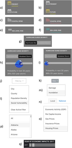
Figure A2. Local impacts map configured to answer questions from scenario 1.
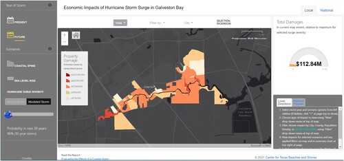
Figure A3. National impacts map configured to answer questions from scenario 2.