Abstract
Cartographic communication and support within emergency management (EM) are complicated issues with changing demands according to the incident extent and phase of the EM cycle. Keeping in mind the specifics of each purpose, it is obvious that spatial data used for maps preparation and production must be differently visualized even for the same type of emergency incident (traffic accident, fire, and natural disaster). Context-based cartography is a promising methodology to deal with the changing demands of an operational EM center.
An overview of cartographic communication is presented within the context of an operational EM center, activities of particular actors, and map use supporting the incident elimination. The authors of the paper respond to a series of questions, for example: what is the current cartographic support of operational EM in the Czech Republic in Digital Earth conditions? What possibilities are there to improve the cartographic communication? How can contextual cartographic services be implemented in a Web environment and how can the usability of results be tested? The paper gives several examples of the usage of cartographic technologies in map creation for various emergency situations.
1. Introduction
The idea of Digital Earth in a scientific, technological, and social context came after the successful and hopeful introduction and realization of the idea of the National Spatial Data Infrastructure, which was signed as one of the first Executive Orders (The White House Citation1994) by President Clinton. The framework of Digital Earth was formulated by Gore (1992 and mainly Citation1998), Vice President of the USA, at his memorable speech in Los Angeles. Gore defined Digital Earth as: ‘a multi-resolution, three-dimensional representation of the planet, into which we can embed vast quantities of geo-referenced data.’
His idea was followed by many other activities in different parts of the world (see also Foresman Citation2008, Goodchild Citation2008, Shupeng and van Genderen Citation2008). In Europe, the realization of the Digital Earth idea was going on successfully under a wide range of activities of e-Europe, e-Commerce, newly Digital Europe, or Digital countries (e.g. the UK, Germany), and many others which have been more oriented on e-Government and e-Governance design than on geospatial–oriented approaches. The latest initiatives of the European Union, Global Monitoring for Environment and Security (http://www.gmes.info), and especially the Infrastructure for Spatial Information in Europe (INSPIRE: http://inspire.jrc.ec.europa.eu) directive are rapidly and positively changing situation, and several countries have started discussing and designing spatial or localization strategies (such as the UK, Germany, and the Czech Republic). INSPIRE is based on three requirements: data must be available, accessible, and follow corresponding legal conditions. The vision of INSPIRE is to build a distributed network of databases on local, national, and European levels; each database will be managed in such a way that it will provide information and services required by both individual countries and the European Union. The databases will respect common standards and protocols, which will provide their interoperability and compatibility (Hrebicek and Konecny Citation2007, Konecny Citation2008).
The new generation of spatial data infrastructures (SDIs) and Digital Earth efforts fills up many requests and the current task is based on the effort to install a ‘spatial’ aspect in all governmental, societal, business, and other activities including the area of emergency management (EM). The idea of a ‘spatially enabled society’ coming from Australia and accompanied by support from many parts of the Earth is being formulated and developed.
Rajabifard (Citation2007) proposes the following definition: ‘society or a government can be regarded as spatially enabled when location and spatial information are regarded as common goods made available to citizens and businesses to encourage creativity and product development. Spatial enablement uses the concept of place and location to organize information and processes and is now a ubiquitous part of e-Government and broader government ICT strategies. It is also defined as an innovator and enabler across society and a promoter of e-Democracy. As a result of this, we are potentially on the verge of the most dramatic change in the use of spatial information in our lifetime’ (Rajabifard 2007, p. 1).
The development of the above mentioned ideas with the enhancement of the societal context of Digital Earth and its benefits, costs, policies, and regulations, together with efforts to also create Digital Earth strategies at local and regional levels, allows realization of new ICT-based approaches in EM. These are more user-oriented and their design is based on detailed investigation of real users' expectations and users' profiles. In cartography, new forms of cartographic communication are proposed.
2. The role of cartographic communication in emergency management (EM) decision support
2.1. Background
A decision-making process within EM involves a significant amount of communication related to spatial information. Especially in a case of spatial information, visual communication is considered one of the most effective types of communication, proved by millennia of maps usage. The saying ‘A good sketch is better than a long speech,’ attributed to Napoleon Bonaparte, has many variations that reflect if not its truthfulness then at least its popularity. This commonly accepted fact was also proved by several empirical studies like Bartram (Citation1980), Bell and Johnson (Citation1992), and Glenberg and Langston (Citation1992). Burkhard and Meier (Citation2005) summarized the scope of the advantages of visual communication: to illustrate relations, identify patterns, present an overview and details, improve understanding and problem solving, and communicate different types of knowledge. In this paper, the form of visual communication where a map is the focal point is addressed. In order to distinguish it from other types of visual communication, the term ‘cartographic communication’ will be used.
In relation to crisis management, as mentioned above, spatial information plays a significant but not exclusive role. Moreover, this spatial information is not at all exclusively communicated through maps. Our interest is to ascertain why maps are used in crisis management in a specific way and fashion and if possible to make improvements in crisis management with the aid of more effective cartographic communication. Obviously, cartographic communication is inseparable from the rest of the communication processes. But according to practice, the improvement of crisis management is an iterative evolutionary process. It is logical for us to predominantly focus on cartographic issues of the decision-making process with necessary links to other tools.
2.2. Cartographic communication during emergency situations
Usage of maps within crisis management has been frequently discussed especially in the context of geographic information systems (GIS) involvement in EM support (Grönlund Citation2005). Current developments within the information systems for emergency and crisis management focus on several geoinformation-relevant aspects. Interactive map technologies including mashups for spatiotemporal analysis using Google maps were introduced by Liu and Palen (Citation2009). Other aspects include rapid geoinformation dissemination via immediate use of geo-referenced images (Skinnemoen et al. Citation2009) and geo-collaborative techniques within EM using interactive cartographic tools (MacEachren and Cai Citation2006) and live video streaming from the field (Bergstrand and Landgren Citation2009). However, only limited attention has been paid to particular cartographic aspects which need to be further discussed.
It was documented that EM is a relatively conservative environment relying on paper maps. Therefore, proper implementation of GIS or computer cartography tools is not an easy task. The adoption of new technologies must be justified by a clear advantage over traditional tools. Such an advantage is achievable through a detailed understanding of the role of spatial information tools during the EM process. It is clear that GIS itself brings some significant improvements. Especially improved is the accessibility to information, amount of information, and topicality of information. But aspects of visual communication are often worsened by these advantages. The large amount of information combined with visual composition controlled by the user makes the processing of the information difficult. Graphical incapability (limited symbology, small display, etc.) also raises complications leading to a lingering preference for paper maps. In Sheppard and Blatchford (Citation1995), the main benefits of visual information for EM are described:
-
Speed of information access for the user.
-
Provides images (maps, photographs, video, diagrams, etc.) which allow people unfamiliar with the location to obtain a fuller more realistic picture.
-
Crosses cultural, language, and professional discipline boundaries.
-
Provides a rich source of quantitative data and chronological documentation or updates.
There are several domains in the above mentioned principles that are suitable for use in the improvement of cartographic communication effectiveness within the crisis management process:
-
To reorganize communication flows in order to use redundancy of cartographic communication. Obtaining the same information from various channels can improve understanding and in some cases extend awareness of relations between various parts of information. But there is a necessity to care about the time sensitivity of information transfer within crisis management. So it is desirable to remove information channel loops and equivalent information resources. To release the information channel it is also necessary to remove from cartographic communication all parts, which do not need to be communicated in this way. In accordance with Burkhard and Meier (Citation2005), the advantages of cartographic visualization are in the transfer of spatial relations, patterns, parallel display overview, and detail. If the knowledge requested is of a different kind from that mentioned above, it is not necessary to use cartographic communication for its transfer.
-
To improve cartographic representation. It is possible to divide this task into two segments; the first is manipulation with the content and the second is manipulation with symbolization. In this case, overloading is a crucial complication of cartographic communication. Merely identifying and removing unnecessary features is not enough (in fact, according to users' opinions there are nothing as thematic features at all; in general everything is important). The solution is to separate cartographic representations into smaller parts tailored to particular tasks, which would include only features in the necessary amount and granularity to make a decision. This approach, based on context, is demonstrated in Staněk et al. (Citation2007) and Mulíčková et al. (2009). Symbol handling presumes simplicity of drawing, familiarity and clarity of the symbol in relation to meaning, and clear identification of the symbol's importance. As already mentioned, topographic reference is most open to modification of representations.
-
To improve the user interface. Here there are several issues for improvement:
-
Context-based switching, which basically means minimizing the modification of map content by changing the item representing the solved task.
-
Making movement inside the map face easy through named locations and active map features.
-
Enabling geo-collaboration at least on the level of sharing of locations.
-
3. Map use within operational emergency management (EM)
The organization of EM within the Czech Republic was described in detail by Kubicek and Stanek (Citation2006) and Mulíčková et al. (Citation2009). Only the regional dispatch center responsible for the operational decisions (KOPIS in Czech terminology) is taken into account in the rest of the analysis. In case of any extraordinary emergency situation or incident the regional dispatch center is alerted through a 112 distress phone call (similar to 911 emergency calls in the USA). The dispatcher in the regional center mobilizes the required emergency service: fire brigade, police, or ambulance, which together form the basic parts of the integrated rescue system (IRS). During relatively small incidents each IRS part works independently, although they consult at the place of incident. This situation corresponds with the incident analysis done by Diehl et al. (Citation2006) and Snoeren et al. (Citation2007).
Step-by-step analysis was performed in order to formalize the needs and current status of the cartographic support. The first step was the description of information processes within the dispatch center activities including brief characteristics and actors. We used the operational management analysis done by T-mapy (Citation2004) and tested the real activities performance during the field surveys in KOPIS.
In the process of communication during the operational emergency situation, it is possible to distinguish several segments and roles. While the call operator only communicates with the emergency caller and his or her role is over after recording the accident, the incident operator is responsible for the successful accomplishment of the emergency situation/incident:
-
Communication between the incident operator and call operator: the call operator provides the localization of the incident and creates a record of the call which is transmitted to the responsible operator.
-
Communication between incident operator and spatial data source: the incident operator evaluates the situation and looks for appropriate information sources.
-
Communication between incident operators: according to various responsibilities, the operator communicates with other operators either to acquire additional knowledge or to transfer subtasks to other operators – this is mostly verbal communication.
-
Communication between incident operators and units in the field: finally the operator sends commands to field units and at the same time serves as the knowledge resource for this unit – this is verbal communication partially based on visual perception of the cartographic product.
Cartographic support within the particular information processes is the second step of the analysis. Despite the advent of digital geographic databases, many traditional paper-based cartographic tools are still in use and so relevant printed cartographic sources are also mentioned. Both steps are described in detail in and , respectively.
Table 1. Activities within the operational emergency management demanding spatial operations.
Table 2. A map handling overview.
Members of the fire brigade GIS commission play an active role in the development of an integrated emergency system (IES) GIS operational module, which is interconnected with the whole robust national system. Its infrastructure also serves as the technological platform for the whole operational management. Four basic types of cartographic outputs are used within the operational EM process: paper maps, Web maps, desktop GIS, and mobile GIS. Their particular output type, timeliness, geodata structure, potential links to the EM operational processes, and type of interaction are described in .
While the paper maps and selected Web sources are used only for specific purposes, the key role within the cartographic support is played by the GISel IZS desktop application (for details see Skrivanek et al. Citation2009). Both the geodata types and cartographic visualization have been changed and extended in the last years. However, in the description of modifications is the following peculiar statement:
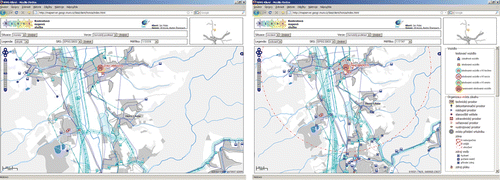
Current map project left the cartographic correctness of the map, uses non-contrast pastel colours for depiction of basic map (e.g. arable land is not depicted at all, see ), whilst important depictions created by annotations, territorial division and other points that are necessary for prompt and right decision of the operator, are highlighted and SQL inquiries were substituted by spatially generalized data kits. (Skrivanek et al. Citation2009)
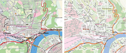
Figure 1. Original (left) and current (right) types of visualization used in GiSel IZS (from Skrivanek et al. 2009).
4. Possibilities for improvement in cartographic communication
Following the analysis of map use in the operation center, modifications for improvements were proposed. These improvements are based on a combination of empiricism, available studies, and recommendations from the areas of map use and psychology. As already stated, improvements were categorized according to their relation to information flows, map content, map symbology, and user interface. Nevertheless, issues of symbology are mutually related to information flows and map content. Symbology within all categories will therefore be discussed.
4.1. Information flow arrangement
When analysing the arrangement of information flows, it was possible to identify three issues:
-
Redundancy in symbol design.
-
Redundancy of maps.
-
Information loops.
4.1.1. Redundancy in symbol design
In the case of the arrangement of information flows, the first identifiable issue is the redundancy of attributes expressed by symbol. In principle, due to the redundancy's role in the cognition processes, avoidance of the redundancy is not completely desirable. Repetition of information has an important role in fixing patterns into the long-term memory (Alkon Citation1989). Even more frequent use of redundancy in cartography is the case when the same information is expressed by several graphical means. The goal is to accent either the importance of the feature or the main theme of the map (MacEachren Citation1995). But there is also the reverse side of the redundancy in the graphical encoding. The information capacity of the mapped area is obviously strongly decreased in the case of excessive redundancy. This consequently either limits the communication of multiple attributes related to the feature or increases graphical overloading and consequently makes reading of the map difficult ().
Figure 2. Multi-parametric symbol with (left) and without multiple attributes (right).
There are two hypotheses concerning improving usability:
-
Avoiding graphical variables redundancy for vital features (this is obvious in the case of background features). The full-size map usually has no place for graphical variables redundancy due to its complexity.
-
Using graphical redundancy for underlining the most important vital features. It is necessary to understand the possibilities and restrictions in combining various graphical variables in relationship to the feature they are representing. For example, changing the shape of the symbol together with the color can obscure the affiliation of the symbol with the group of symbols it belongs to. The shape and color are strongly bound to quality. To make the symbol easier to spot, it is better to use a graphical variable assigned to quantity, such as intensity or size.
4.1.2. Redundancy of maps
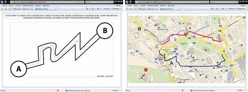
Another redundancy issue is offering the same vital information through several maps. Such a procedure is counterproductive for making an effective decision in limited time. Users spend the same effort on cognition to gain the same or similar information. Besides, processing another cartographic representation with different concepts, but the same meaning, decreases efficiency. A clear signal of the map's dysfunction is the necessity for the map user to consult another map for information included in the map originally used (). When communicating over the map, it is undeniably advantageous for both sides to have identical map environments covering all the necessary information.
Figure 3. Finding the way: by road atlas (part of the common knowledge; left), in an emergency management-oriented environment (expert knowledge; right).
The hypothesis for improvement is the map environment should be ‘all in one’; that is, the need for operators to consult different map systems has to be eliminated.
4.1.3. Information loops
The last case of flows organization issues is information loops. An information loop is caused by the necessity to gain again the same knowledge that has already been discovered. This issue is strongly related to the design of the user interface. An information loop is the consequence of the impossibility of making a graphical comment or bookmark tagging the already discovered knowledge inside the working environment. An information loop is also the consequence of usage of multiple disconnected cartographic environments.
The hypotheses tested here are:
-
Incorporation of ‘redlining,’ a simple comment layer with or without navigation over comments. Redlining comments can be realized by predefined symbols with distinct visual parameters.
-
Enabling named extents: a user can save the selected extent with a short explanation.
4.2. Map content and graphical load
It is possible to look at elements included in a map from at least three different angles:
-
Map content.
-
Graphical load.
-
Layering.
4.2.1. Map content
Map content is the scope of cartographic features (classes) present on the map. In the case of analogous maps, the content is fixed on the medium (paper, but it can also be a PDF file) and as such is visible from the first moment. The map content of electronic maps can be due to their ability to dynamically change width, and is then in the concrete moment visible on the screen. For map perception, it is generally convenient to minimize the content actually displayed.
It is possible to divide the features on a map into:
-
Background features, which play the role of spatial reference.
-
Vital or active features, which express the function of the map.
-
In some cases, complementary features, which link the map function to the broader context (some concurrent theme, features persistent through the task, or custom features).
-
From the topographic dataset, features which are not necessary for localization are omitted and the granularity of the remaining features is decreased by thematic aggregation. The visual appearance of the background is suppressed. The reduction cannot be uniform: in this case, space was divided into urban, suburban, and rural areas with different contents derived from user testing (for comparison, see ).
-
The granularity of the background features is reduced and their visual appearance is suppressed, but there is no omission of features.
-
Only suppression of the visual appearance of the background is carried out (the motivation here is to keep the standard topographic background familiar to users).
-
Using a standard topographic background of a virtual globe service and using a very simple representation of vital features with semi-opacity.
-
Masking the area of interest with a gray semi-opaque rectangle for visual suppression of the standard background.
-
Masking the area of interest with a proprietary topographic layer with similar parameters as discussed in the previous paragraph.
Figure 4. Comparison of the map with full-scale topography (left) and with strongly reduced features (right).
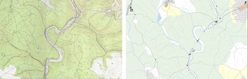
Table 3. Incident classification for emergency calls.
For the content change, there are two triggers: the users need to change the solved task and the level of detail (scale). The change of scale is less significant than the change of task, as most emergency situation solving happens at the operational scale only. The use of contextual cartography is the core of visualization improvement ().
Figure 5. Example of two different contexts (visualization for transport of dangerous cargo: monitoring (left) and incident (right)).
4.2.2. Graphical load
Graphical load is tied to the number of objects currently present in the mapped area and is usually represented by the percentage of the mapped area completely covered by graphical elements. Nevertheless, graphical load is hard to quantify, as not all the visualized elements are included in the final value of the coverage. The included areas do not allow another layer of the graphical object to be placed over them. This usually means graphical objects or their parts in black or dark colors, also including annotations. Hojovec (Citation1987) determined the average graphical load of a map as 20% and the maximum as 36% on the basis of various thumbnail rules.
It is necessary to mention that Hojovec (Citation1987) determined the graphical load for analogous maps. In the case of electronic maps, it is not advisable to try for higher values of the graphical load. On the other side, an ‘empty’ map can be the source of users' disturbance or dissatisfaction with the amount of information obtained.
4.2.3. Layering
The term ‘layering’ implies the visual order of objects where the upper ones are usually considered as more significant than the lower ones. But the first rule that the ‘thematic’ layering has to abide by is graphical correctness. All the objects on the map must be visible. Layering can be supported by opacity and shadow, but there is graphical impact on the coloring and the shape of the objects. Bertin's (1974) rules are followed as there is no space to reduce the number of layers.
4.3. Symbology
The graphical part of symbology in cartography deals with manipulation using graphical variables. Bertin (Citation1974) specified seven graphical variables: size, shape, color, orientation, texture, and position. These variables are dealt with pre-attentively in cognitive processing and are therefore quickly processed (Healey et al. Citation1995) and play a significant role in cartographic legibility.
Legibility can be defined as the amount of effort one needs to detect and discriminate objects symbolized on the map (this means there is a clear difference in graphical variables and the ability of the symbolized object to be separated from the surroundings). There is limited possibility to express multiple objects’ attributes by graphical variables. Every added variable has negative consequences for legibility.
Readability is, analogically to legibility, defined by the amount of effort one needs to make to correctly interpret a map. As already mentioned, map reading involves several issues, such as the meaning of symbols, patterns, and relations. Improper usage of graphical variables can support misleading patterns.
Most of the symbology issues can be fixed by the application of standard cartographic visualization approaches (for example usage of complementary colors). In cases where possible alternative approaches exist, it is necessary to evaluate the best option for the concrete situation. For immediate testing, the following set of hypotheses concerning symbol design was selected as the most common in reading issues:
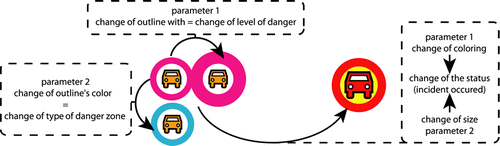
-
Enforcement of an important feature by:
-
Symbol size: the size of the symbol is ruled by its immediate importance in accordance with the concrete situation and is excluded from scaling.
-
Outline: the size of the symbol does not change, but there is an additional outline in a different color, width, or both.
-
Patch: the symbol is underlined by a colored area or shading. The effect can be very similar to the usage of outline.
-
-
Supporting understanding by association with:
-
Geometric shapes: these are easy to discriminate, but usually the associative power is very low.
-
Schematic pictograms: relatively thorough previous knowledge of the symbol system is assumed. This approach combines a good level of association with low impact on the graphical load of the map.
-
Complex pictograms: despite the near reality of the objects’ depiction, there is a possibility of confusion when representing an abstract object (e.g. a picture of a horse can represent stables but also a racecourse).
-
-
Enforced layering by:
-
Shade: simulated 3D effects.
-
Color: the enforced theme is represented by coloring the symbols with a specific tint.
-
Shape: the enforced theme is represented by uniform symbols.
-
-
Symbol hierarchy and articulation: it is possible to decompose the symbol. Individual parts of the symbol have specific meanings according to the object's attributes.
-
Color
-
Shape
-
Structure
-
-
Use of alerts and selections: similar to enforcement.
-
Highlighting by color.
-
Highlighting by size.
-
The proposed methods of possible improvements in this case are:
-
implementing the selected international standard (such as FGDC HSWG);
-
keeping those symbols that are already in use as far as possible; and
-
defining a system based on common conventions (for example, road signs of which there is common awareness).
4.4. Annotations
Special types of cartographic features are annotations. They are usually attached to objects bringing a name, additional attribute, or information about some significant aspect of the object to which they are attached. There exist independent annotations serving fuzzy definition of areas which are usually part of the topographic background (mountain ranges, regions without explicit boundaries; the annotation is not attached to any of the map objects, but stand in the object's place). In the case of vital features, a policy of avoiding annotations altogether and using just data tips is adopted. So there is only space to modify annotations in the background.
4.5. User interface
A user interface is nowadays an integral part of an electronic map. A user-friendly environment for map manipulation is crucial for its adoption by users. We can distinguish between a basic and an extended set of functions. All graphic tools contain a set of similar functions, which are anticipated by experienced users when moving from one environment to another. The functions included in this set are the basic ones. Based on longstanding research (for example You et al. Citation2007, Haklay and Zafiri Citation2008), the functions belonging there are:
-
Zoom and pan within the map face.
-
Feature visibility.
-
Switch on/off.
-
Simple full-text search.
-
Involvement of parametric queries, which extend the possibility to search for objects inside the map. Because the user usually does not know the parameters of the objects, there are lists of classes of parameters or intelligent features (type of query by example).
-
Involvement of a dynamic map key: a map key is bound with displayed features in contrast to so-called structured map keys (what is seen in the specific moment on the map is also seen in the map key).
-
Usage of data tips: predefined, dynamic by relevance, or user defined.
-
Minimization of the number of clicks needed to accomplish a desired goal.
-
Preserving overall orientation when moving between details.
-
Preserving continuity of the work logic during map use (steps back and forward, tracing of multiple solved objects, and visual situation indicators).
5. Testing of the map adjustments
5.1. Background of the map usability testing
Issues of the map's effectiveness can be generally addressed by map usability research (for example van Elzakker et al. Citation2004, Wachowicz et al. Citation2005). This kind of research follows longstanding study of map usage with the implementation of usability testing within the software engineering. This fusion is the result of modern computer cartography development. An electronic map becomes a software product as both a GIS front-end and an independent form. A graphical user interface is now an integral part of map design and in some senses the map itself becomes a user interface to GIS. Within usability testing, it is not possible to test just the speed of knowledge processing, because such results are difficult to interpret. It is necessary to decompose part of the knowledge acquisition for them to be more related to various parts of the map design. In relation to Larkin and Simon (Citation1987) and Burkhard and Meier (Citation2005), the parts of the process of knowledge acquisition are as follows:
-
Attention: visual attractiveness, readability, and legibility; there are significant perception issues, or to put it differently, the visual representation is easy for the user to follow.
-
Overview: an understanding of the general situation, relations, and patterns; this kind of knowledge is the ‘raison d’être’ of cartographic communication.
-
Detail: what is discoverable and what can be identified; despite the previous statement, it is also necessary to realize particular objects and their attributes on the map.
-
Metaphor: understanding the concept of how this particular map works: how the map generalizes reality and represents it by symbols. Full understanding is achieved if users can create a similar map. Another proof of concept understanding is parallel orientation in different maps.
-
Motivation: the ability to discover map possibilities and extend their use in case of another decision.
5.2. Testing
For the purposes of usability testing of proposed map improvements, an interactive Web-based testing tool was developed. The tool was designed in order to test a wide variety of inputs from isolated cartographic symbols or symbol sets to both static and interactive complex map composition. The main goal is to test different cognitive functions from long-term memory to immediate attention, perception, and decision functions. Test results are stored in a database and automatically evaluated for further statistical processing.
Basic test functionality includes the test person identification and pre-test calibration of individual computer and cartographic abilities. Within the test environment, three basic types of tasks/scenes exist: forms with pull-down menus with predefined testing answers; visual choice scenes, where the test person is forced to choose one or more possibilities among visual variables; and localization tasks, where the test person must place the symbol in the right position or draw a line or polygon of a certain task (). Both reaction times and positional accuracy are stored and processed further.
Figure 6. The testing tool – pre-calibration – task tests the ability of the test person to draw a line within the Web environment and to keep the edited line inside the bounding tolerance buffer (left); the real test task: choosing the evacuation route (right).
The influence of acute stress on cognitive processes and map reading was studied by Stachoň and Šašinka (Citation2009), who concentrated on understanding the stress mechanism and its influence on particular cognitive functions, such as short-term and long-term memory, attention, perception, and decision making. They further explored the possibilities and methods of testing the usability of maps and validated the results by statistical analysis tools using a combination of quantitative and qualitative methods.
Ongoing tests have more of a supporting role in the evaluation of the proposed thesis of map design discussed in Section 4. To make exact statements according to general map design is very difficult due to the size of tested samples and the holistic nature of cartographic mechanisms. Significant differences in map use can disappear with an increasing number of tested subjects (which is quite difficult). Every change of cartographic method interacts with the particular content of the map and it rarely makes sense to change just one graphical variable to achieve improvement. It is hard to identify one positive factor and even a complex of interacting factors cannot be easily appointed as a principal map improvement agent. So we are often limited in comparison of two maps and the empirical evaluation of causes.
With the above mentioned testing environment, we collected some results with the limitations mentioned in the previous paragraph. In a PhD thesis (Zboril Citation2010), existing maps used contemporarily in EM were compared with part of the project proposals on improvement. The following belong to the interesting results:
-
significantly better perception of ideograms over annotated symbols;
-
simple pictograms are better perceived than complex logo related pictograms;
-
changes in the font parameters used do not change the search effort;
-
a higher amount of visually enhanced features decreases the effectiveness of searching the map; and
-
a higher density of topographic background objects decreases the effectiveness of thematic feature searches.
A larger testing experiment accomplished in Autumn 2009 dealt with alternative base maps and the efficiency of use perceived by military users and geography students. Preliminary results have shown significant differences between the user groups, proving that the level of map use skills influences the speed and durability of task accomplishment. Besides that, simplified topographic base maps have proven higher suitability for localization than orthophoto base maps. Details of the test including descriptions of particular tasks are given in Konecny et al. (Citationin press).
5.3. Prototype implementation
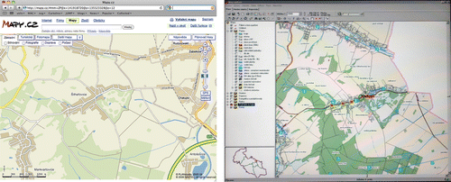
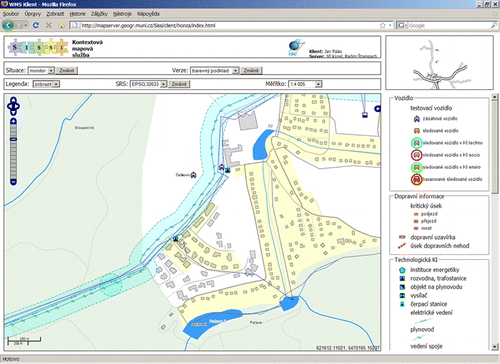
In order to realize the process of contextual cartographic visualization, a contextual map service called Sissi has been developed (Kozel and Štampach Citation2009). Sissi is a Web-based server application intended to provide contextual (or context aware) maps for map clients (). Communication between Sissi and map clients is ensured by an extension of the WMS specification (Open Geospatial Consortium (OGC) Citation2008). The extension has been designed in order to provide contextual abilities so that any WMS client can request any contextual map. A more detailed description of context types and Sissi implementation can be found in Kozel and Štampach (2009). One of the advantages of such technology has already been discussed. It is possible to combine WMS layers with virtual globes and therefore to incorporate a contextual map service into the Digital Earth framework.
Figure 7. Sissi contextual Web map service interface.
6. Conclusion and future work
As most of the maps used in EM are only modifications of already existing maps, overload of the maps is easily reached. The GIS and visualization tools used, for the most part, emulate analogous maps and propagate their disadvantages, such as inconsistent symbology (created by adding new symbols when needed without their integration into the existing graphical schema) or overload. Although there are clear improvements in the system over time, the changes are mostly on the surface and the structure of the system remains untouched. In the area of cartographic communication, there exists large space for improvements.
As there is a large quantity of studies on human perception, it was decided to adopt their results when possible and to focus on cognitive issues. Unfortunately, higher levels of cognition are strongly individual and the results of studies are mostly not transferable. This is probably also the reason for their rarity.
Due to map complexity, a simple change in the design of one map symbol has a deep impact on the psychological effect of the map. This means that it is much easier to evaluate map usability than to trace relations between the symbol change and the map use cognition process. We propose to involve more measurement of map complexity in results; nevertheless map improvements will follow the conceptual possibilities discussed in Section 4.
Testing results were very close to the assumptions based on empirical observations and expert-based knowledge. Nevertheless, it is necessary to state that the tested group was limited in numbers and did not include operators. Testing on incident operators is planned for the final stages of the project, when the proposed symbol systems will be completed.
To ensure the validity of testing, we propose to increase the number of tested persons to obtain sets exceeding 50 participants per task. We consider testing of the system of operations of EM dealing with maps to be even more important. A context-based approach leads to lighter maps which are supposed to be better and are likely to be more efficient than existing overloaded multipurpose maps. The aim is to prove that the chosen approach is significantly better in the whole operation process incorporating multiple uses of maps and collaboration between incident operators.
Notes on contributors
Karel Staněk has worked as an assistant professor at the Department of Geography, Masaryk University in Brno, since 1998, where he specializes in analytical and computer cartography.
Lucie Friedmannová has worked at the Department of Geography, Masaryk University in Brno, since 2000, where she specializes in cartographic visualization, graphical design, map use, and the relationship between art and cartography.
Petr Kubíček is Vice Chairman of the Czech Association for Geoinformation. Since 2005, he has worked at the Department of Geography, Masaryk University in Brno, where he specializes in digital cartography and geospatial solutions in crisis management.
Milan Konečný is a professor of Cartography at the Department of Geography, Masaryk University in Brno, where he specialize in GI studies and interoperability and is also the Head of the Laboratory on Geoinformatics and Cartography. He is also former President of ICA and Chairman of the ICA Working Group on Cartography for Early Warning and Crisis Management, Vice President of ISDE, and Member of the Task Force Group for Early Warning of JB GIS.
Acknowledgements
The project (No. MSM0021622418) is supported by the Ministry of Education, Youth and Sports of the Czech Republic.
References
- Alkon , D.L. 1989 . Memory storage and neural systems . Scientific American , 7 : 42 – 50 .
- Bartram , D.J. 1980 . Comprehending spatial information: the relative efficiency of different methods of presenting information about bus routes . Journal of Applied Psychology , 65 : 103 – 110 .
- Bell , D. and Johnson , P. 1992 . “ Support for the authors of multimedia tutorials ” . In Multimedia: systems, interaction and applications , Edited by: Kjclldahl , L. 307 – 323 . New York : Springer-Verlag .
- Bergstrand , F. Landgren , J. , 2009 . Information sharing using live video in emergency response work J. Landgren and S. Jul Proceeding of the 6th international ISCRAM conference . Gothenburg : ISCRAM , 5
- Bertin , J. , 1974 . Graphische semiologie. Diagramme, netze, karten . Semiology of graphics: diagrams, networks, maps Berlin : Walter de Gruyter
- Burkhard , R.A. and Meier , M. 2005 . Tube map visualization: evaluation of a novel knowledge visualization application for the transfer of knowledge in long-term projects . Journal of Universal Computer Science , 11 ( 4 ) : 473 – 494 .
- Diehl , S. 2006 . “ Investigation of user requirements in the emergency response sector: the Dutch case ” . In Proceedings of the second international symposium on geo-information for disaster management , Edited by: Rajawat , A.S. 1 – 6 . Ahmedabad : ISPRS .
- Dymon , U.J. 2003 . An analysis of emergency map symbology . International Journal of Emergency Management , 1 ( 3 ) : 227 – 237 .
- Foresman , T.W. 2008 . Evolution and implementation of the Digital Earth vision, technology and society . International Journal of Digital Earth , 1 ( 1 ) : 4 – 16 .
- Friedmannova , L. , 2009 . Designing map keys for crisis management on the regional operational and informational centre level: monitoring transport of dangerous goods via contextual visualisation M. Konecny , S. Zlatnova and T.L. Bandrova Geoinformation and cartography for early warning and crisis response . Berlin and Heidelberg : Springer Verlag , 425 437
- Glenberg , A.M. and Langston , W.E. 1992 . Comprehension of illustrated text: pictures help to build mental models . Journal of Memory and Language , 31 ( 2 ) : 129 – 151 .
- Goodchild , M.F. 2008 . The use cases of digital earth . International Journal of Digital Earth , 1 ( 1 ) : 31 – 42 .
- Gore , A. , 1998 . The digital earth: understanding our planet in the 21st century [online]. Available from: http://digitalearth.gsfc.nasa.gov/VP19980131.html [Accessed 14 February 2004] .
- Grönlund , A. 2005 . “ Methodology for making geographic information relevant to crisis management ” . In Geo-information for disaster management , Edited by: van Oosterom , P. , Zlatanova , S. and Fendel , E.M. 121 – 128 . Berlin and Heidelberg : Springer Verlag .
- Haklay , M. and Zafiri , A. 2008 . The usability engineering for GIS: learning from a screenshot . Cartographic Journal , 45 ( 2 ) : 87 – 97 .
- Healey , C.G. , Booth , K.S. and Enns , J.T. 1995 . Real-time multivariate data visualization using pre-attentive processing . ACM Transactions on Modeling and Computer Simulation , 5 ( 3 ) : 190 – 221 .
- Hojovec , V. , 1987 . Kartografie . Cartography Praha : GKP
- Hrebicek , J. Konecny , M. , 2007 . Introduction to ubiquitous cartography and dynamic geovisualization with implications for disaster/crises management A. Scharl and K. Tochtermann The geospatial Web: how geobrowsers, social software and the Web 2.0 are shaping the network society . London : Springer-Verlag , 209 214
- Konecny , M. , 2008 . Digital Earth idea: quo vadis? Consideration of Alexander Martynenko contributions and ideas. Systems and Tools of Informatics , Special Issue: Geoinformation Technologies , 339 356
- Konecny , M. , et al. ., in press . Usability of selected base maps for crises management – users perspectives . Applied Geomatics .
- Kozel , J. Štampach , R. , 2009 . Practical experience with contextual map service M. Konečný , S. Zlatanova , T.L. Bandrova and L. Friedmannova Proceedings of cartography and geoinformatics for early warning and emergency management: towards better solutions . Brno : Masaryk University , 304 312
- Kubicek , P. Stanek , K. , 2006 . Dynamic visualization in emergency management T. Bandrova Proceedings of the first international conference on cartography and GIS . Sofia : Sofia University , 40 51
- Larkin , J. and Simon , H. 1987 . Why a diagram is (sometimes) worth ten thousand words . Cognitive Science , 11 : 65 – 99 .
- Liu , S. Palen , L. , 2009 . Spatiotemporal mashups: a survey of current tools to inform next generation crisis support J. Landgren and S. Jul Proceedings of the 6th international ISCRAM conference . Gothenburg : ISCRAM , 12
- MacEachren , A. 1995 . How maps work: representation, visualization, and design , New York : Guilford Press .
- MacEachren , A.M. and Cai , G. 2006 . Supporting group work in crisis management: visually mediated human-GIS-human dialogue . Environment and Planning B: Planning and Design , 33 : 435 – 456 .
- Mulíčková , E. , et al. ., 2009 . Emergency management process support using geovisualization M. Konečný , S. Zlatanova , T.L. Bandrova and L. Friedmannova Proceedings cartography and geoinformatics for early warning and emergency management: towards better solutions . Brno : Masaryk University , 338 348
- Nivala , A.M. , Sarjakoski , L.T. and Sarjakoski , T. 2007 . Usability methods’ familiarity among map application developers . International Journal of Human-Computer Studies , 65 : 784 – 795 .
- Open Geospatial Consortium (OGC) , 2008 . Web map service implementation specification 1.1.0 [online] . OpenGIS project document: OGC 01-068r3. Available from: http://www.opengeospatial.org/standards/wms [Accessed 23 October 2009] .
- Rajabifard , A. , 2007 . Towards a spatially enabled society . Melbourne : The Center of SDIs and Land Administration, Department of Geomatics, the University of Melbourne
- Sheppard , S.R.J. Blatchford , D. , 1995 . Visual information systems and GIS in crisis management [online] . Available from: http://www.iosc.org/papers/02343.pdf [Accessed 26 April 2010]
- Shupeng , C. and van Genderen , J. 2008 . Digital Earth in support of global change research . International Journal of Digital Earth , 1 ( 1 ) : 43 – 65 .
- Skinnemoen , H. , Bjorgo , E. Hall , R. , 2009 . Rapid geo-image communications for disaster management J. Landgren and S. Jul Proceeding of the 6th international ISCRAM conference . Gothenburg : ISCRAM , 28
- Skrivanek , P. , et al. ., 2009 . Annual report of the GIS Commision of Fire and Rescue Service of the Czech Republic, period 2007–2008 . Bohdanec : IOOL Kralove
- Snoeren , G. , et al. ., 2007 . Spatial data infrastructure for emergency management: the view of the users S. Zlatanova , J. Crompvoets and H. Scholten Proceedings of the 3rd international symposium on geo-information for disaster management . Toronto : ISPRS , 1 12
- Stachoň , Z. Šašinka , C. , 2009 . Perception of various cartographic representations under specific condition M. Konečný , S. Zlatanova , T.L. Bandrova and L. Friedmannova Proceedings of cartography and geoinformatics for early warning and emergency management: towards better solutions . Brno : Masaryk University , 551 558
- Staněk , K. , Konečný , M. Friedmannová , L. , 2007 . An adaptive cartographic visualization for support of the crisis management XXIII international cartographic conference – cartography for everyone and for you . Moscow : Roskartografija , 1 9
- Svobodova , J. , 2009 . Srovnání orientace v prostoru pomocí různých variant kartografické vizualizace . (A comparison of the orientation in space based on various cartographic representations). Master's thesis. MU Brno (in Czech) .
- T-mapy , 2004 . Introductory study of GIS within fire rescue brigades Czech Republic (in Czech). Hradec Kralove : T-Mapy spol s.r.o .
- The White House , 1994 . Executive Order 12906: coordinating geographic data access . Federal Register , 59 71 , 17671 17674 .
- United States Federal Geographic Data Committee – Homeland Security Working Group (FGDC HSWG) . Symbology reference [online] . FGDC HSWG, USA. Available from: http://www.fgdc.gov/HSWG/index.html [Accessed 2 June 2009].
- van den Worm , J. , 2006 . Cartographic visualization aspects of the Web-based Dutch national risk map [online] . Available from: http://gis.esri.com/library/userconf/proc03/p0802.pdf [Accessed 30 November 2009]
- van Elzakker , C.P.J.M. , 2004 . The use of maps in the exploration of geographic data . Thesis (PhD). University of Utrecht .
- Wachowicz , M. 2005 . “ Uncovering the main elements of Geo-web usability ” . In Proceeding of the 8th AGILE conference on geographic information science , Edited by: Toppen , F. and Painho , M. 1 – 8 . Wageningen : Centre for Geo-Information .
- You , M. 2007 . A usability evaluation of Web map zoom and pan functions . International Journal of Design , 1 ( 1 ) : 15 – 25 .
- Zboril , J. , 2010 . Kontextová kartografická vizualizace a její využití v krizovém management . (Contextual cartographic visualization and its utilization in crisis). PhD thesis. MU Brno (in Czech) .