
Abstract
Virtual globes (VGs) allow Internet users to view geographic data of heterogeneous quality created by other users. This article presents a new approach for collecting and visualizing information about the perceived quality of 3D data in VGs. It aims at improving users' awareness of the quality of 3D objects. Instead of relying on the existing metadata or on formal accuracy assessments that are often impossible in practice, we propose a crowd-sourced quality recommender system based on the five-star visualization method successful in other types of Web applications. Four alternative five-star visualizations were implemented in a Google Earth-based prototype and tested through a formal user evaluation. These tests helped identifying the most effective method for a 3D environment. Results indicate that while most websites use a visualization approach that shows a ‘number of stars’, this method was the least preferred by participants. Instead, participants ranked the ‘number within a star’ method highest as it allowed reducing the visual clutter in urban settings, suggesting that 3D environments such as VGs require different design approaches than 2D or non-geographic applications. Results also confirmed that expert and non-expert users in geographic data share similar preferences for the most and least preferred visualization methods.
1. Introduction
The emergence of virtual globes (VGs), such as Google Earth and Bing Maps 3D, has significantly changed the way the general public interacts with geographic information. It provides unprecedented, easy, and generally free access to mapping applications and very large volumes of detailed geographic data (Riedl Citation2006; Craglia et al. Citation2012). While VGs are often used as a simple visualization platform for browsing earth imagery, they are also known to support a wider range of tasks, such as giving access to large volumes of scientific or professional data, representing or simulating 3D landscapes, or displaying animated maps that can support complex analyses (e.g. Tiede and Lang Citation2007; Goodchild Citation2008b; Sheppard and Cizek Citation2009; Hoeber et al. Citation2010; Schroth et al. Citation2011; Craglia et al. Citation2012).
VGs enable anyone with Internet access to integrate, display, create, and share geographic data. Sharing and using geographic data have, however, raised serious concerns because of the heterogeneous and often largely unknown quality of the data (e.g. Sheppard and Cizek Citation2009; Goodchild and Glennon Citation2010; Haklay Citation2010; Matyas et al. Citation2011). While some user-generated 3D data made available in the Trimble 3D Warehouse (http://sketchup.google.com/3dwarehouse/, formerly known as the Google 3D Warehouse) go through some quality control through the website managers before being made public, they are not provided with quality information that could help users better understand if those models can fit their intended uses.
Concerns have also been expressed about the general misuse, or unethical use, of 3D models and visualizations (e.g. Sheppard and Cizek Citation2009), sometime raised in the context of VGs. It includes, for instance, the creation of inaccurate 3D models by non-experts that are then used in an official context, such as an official full city 3D model. Generally, the lack of ethical guidelines for the use of 3D models in support of decision-making processes has created concerns from the professional and scientific communities and led to initiatives such as a code of ethics in landscape visualization (Sheppard Citation2001) and the recent creation of the 3D Ethics Charter initiative (http://www.3dok.org) that requests people signing the charter to follow a number of principles allowing a proper ethical dissemination and use of 3D models. Those charters call for a better communication of 3D models quality, which is the focus of this paper, and specifications that could help users better understand possible uses.
In this context, this paper presents and tests a quality recommender system for collecting and communicating information about the quality of 3D objects in VGs that documents and visualizes the quality being perceived by the various users. It is expected that such an approach could help reducing the risks of having adverse consequences resulting from the use of 3D models of inadequate quality. Providing inaccurate information about the 3D objects’ locations, shapes, or appearance could alter decisions based on those data. Examples range from misleading users navigating using those imperfect data as landmarks, to make users believe that buildings are better than what they are in reality in a real-estate context, or lead citizens to reject a new housing project based on misleading 3D representations created by opponents to the project. In the absence of appropriate metadata describing the quality of 3D objects and the inability to quantify data quality due to a lack of ground-truthing, the proposed approach takes advantage of individual users' experience about the real-world objects to qualify their representations. The paper describes the design, testing, and validation of a novel visualization method based on the five-star rating approach used in a number of recommender systems, that balances the amount of information communicated and the complexity of the visualization with the ease of implementation. Such an approach is identified in this paper as being symbiotic, an approach seeking a balance between the richness provided by the visualization method, its ease of understanding by users, and its technical feasibility, and is thought to be necessary for leading to a method that could gain broader acceptance. Note that the term ‘five-star’ refers generally in this text to any visualization based on star symbols, whatever the number of stars is. Four alternative visualizations based on the five-star method were implemented, and a user evaluation asked users to rank visualizations by preference. In addition, we explore whether there are significant differences in the methods preferred between expert and non-expert users.
Section 2 discusses and classifies VG users and usages. Section 3 presents an overview of the concepts of spatial data quality (SDQ) and the methods proposed for visualizing SDQ. Section 4 describes the proposed approach for visualizing perceived SDQ of 3D objects within VG, along with a discussion of the concept of perceived quality. Section 5 describes and discusses the prototype and the validation of the approach via a user evaluation through a quantitative ranking with additional qualitative questions. Finally, Section 6 discusses the findings and concludes the paper.
2. Categorizing VG users and usages
Proposing an appropriate visualization method for communicating the quality of 3D objects in VGs requires some understanding of users and usages of VGs. Due to the relatively recent emergence of VGs, few studies discuss and classify VG users and usages. Grossner, Goodchild, and Clarke (Citation2008) identify three categories of users: (1) non-expert users, such as a young child visiting a digital museum, (2) collaborative scientists, and (3) current GIS users, such as governments that are utilizing GIS capabilities. To add to the limited existing framework, proposes a new classification that combines the level of expertise of the user with the complexity of the task at hand.
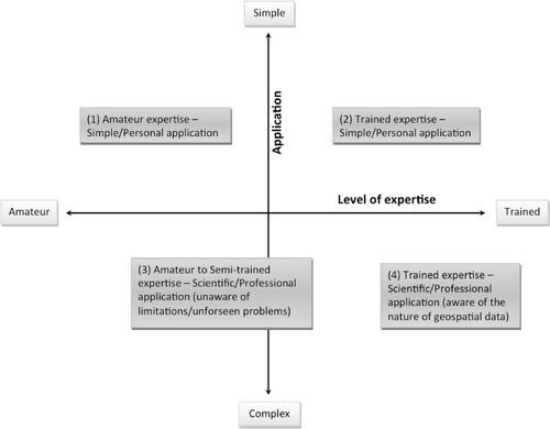
This framework allows characterizing different types of VG users and usages, such as:
Amateurs using VG for a simple application (e.g. viewing the road one lives on using Google Earth).
Trained experts using VG for a simple application (e.g. navigating the streets of New York at eye level using Google Earth; Jones Citation2007).
Amateurs or intermediate experts using VG for a scientific/professional/activist application (e.g. the use of landscape visualizations from Google Earth to visualize the skyline of the city; Sheppard and Cizek Citation2009; Schroth et al. Citation2011).
Trained experts who are capable of both understanding and analysis of geospatial data and are using VG for a scientific/professional application (e.g. dissemination of object-based change detection data by researchers; Tiede and Lang Citation2007).
The uses of VG range from very simple to complex, including diverse analytical tasks (Goodchild Citation2008a; Grossner, Goodchild, and Clarke Citation2008; Sheppard and Cizek Citation2009). Simple tasks can be viewing one's house, finding the location of a hotel, or getting driving directions. There are now many examples of more complex usages of VG in the literature. Some of the possible usages of VG include analytical decision-making, disseminating researches to the public, and supporting responses after natural disasters (Anon Citation2006). Tiede and Lang (Citation2007) describe a study where 3D symbols representing the distribution of dwellings in refugee camps in an area of Tanzania were created using Google Sketchup. Sheppard and Cizek (Citation2009) also discuss several cases where VG and data from VG are used for analytical purposes. Two examples given are the use of Google Earth to design visualizations of a projected development in Colorado Springs, and a landscape visualization of a future possible flooding scenario in the Lower Mainland of BC, Canada. Schroth et al. (Citation2011) discuss the role of VG in decision-making, arguing VG can be used in a bottom-up manner through the work of activists or non-government organizations (NGO), in a top-down manner by government, or collaboratively across various stakeholders. Such examples confirm the diversity of usages made of VG. Since this research aims to represent visually the SDQ for 3D objects in VG, the most important usages to be aware of are those that are complex and involve decision-making. Better understanding the quality of spatial data can then help reducing undesirable consequences that could result from using data that do not fit an intended use (e.g. using a dataset that has a poor positional accuracy for an application requiring accurate distance measurements).
3. Spatial Data Quality
3.1. Overview
SDQ is a term that has many definitions, ranging from statistical measurements of errors of map features, to qualitative descriptions of how a given dataset fits the needs of its users (Devillers et al. Citation2010). Tracing its roots to the work of the National Committee for Digital Cartographic Data Standards (NCDCDS) (Moellering Citation1982; Chrisman Citation1983), which led later to the Spatial Data Transfer Standards (SDTS) (FGDC Citation1991), the international community now largely agrees upon a set of criteria that can be used to describe what is named the internal quality of a dataset (Devillers and Jeansoulin Citation2006). The criteria for internal quality include the lineage, positional accuracy, attribute accuracy, logical consistency, and completeness (Kresse and Fadaie Citation2004). The internal quality is typically derived from measurements of the differences between the dataset and a reference dataset of higher quality representing the same region. On the other hand, external quality is defined as the fitness-for-use of a dataset (Devillers and Jeansoulin Citation2006). If the internal quality of a given dataset can be assessed, the external quality will vary for each user. While some studies explored methods for assessing the fitness-for-use, there is currently no broadly accepted method for measuring external quality (Devillers et al. Citation2010).
Visualizing the quality or the uncertainty of geographic data has been the focus of research for more than 20 years (Devillers and Jeansoulin Citation2006; Devillers et al. Citation2010). Many visualization methods have been proposed in order to reduce the risk of a dataset being used in an inappropriate way. However, despite these efforts, none of the proposed methods are currently used in the main commercial GIS technologies or online applications. In practice, the communication of SDQ is either not done, or is performed through the provision of textual metadata (i.e. data about data) known to be of limited use to most users (Devillers et al. Citation2005, Citation2010; Comber et al. Citation2006). Also, despite the recent standardization efforts, all those metadata do not follow a same standard.
Metadata usually describe the quality of an entire dataset and not its individual objects or attributes (Devillers et al. Citation2005). Drecki (Citation2002) points out that while the overall picture of the dataset is often satisfactory, it does not mean that data quality is evenly distributed within the dataset. Hunter and Goodchild (Citation1996) explain that this is a legacy of paper maps where the quality descriptions, located in the margins of the map, were usually describing the whole map. This information was simply transferred to today's digital metadata. Beard and Mackaness (Citation1993) outline that many statistical measures used to quantify the quality of a map, such as the root mean squared error (RMSE), are of global nature. This becomes important when considering visualization as a technique for communicating data quality, as spatial visualization techniques can display both local and global variation (Beard and Mackaness Citation1993). MacEachren et al. (Citation2005) examined the validity of the visual representation of data uncertainty, as many statistical methods used by professional analysts and researchers can be used to attain measures of uncertainty, but may not be understandable to lay users. Their work also discusses examples of lay users depending on heuristics to formulate decisions based on uncertainty, rather than relying on statistical output. Similarly, Buttenfield (Citation1993) exemplifies graphical depictions of error and confidence intervals for exploratory data analysis in statistical analysis, saying that graphical representations have historically been used to improve the study of statistical information, allowing the depiction of error and uncertainty.
3.2. SDQ visualization methods
Many methods have been proposed to communicate SDQ and uncertainty, most of them focusing on 2D maps and using visualizations based on variations in visual variables to portray different aspects of quality. Examples include the use of colour, levels of opaqueness, or fuzziness (Schlaisich, Mountrakis, and Agouris Citation2004; MacEachren et al. Citation2005; Zuk Citation2008). Visualization methods can be classified as being either static or dynamic (Davis and Keller Citation1997). Intrinsic or extrinsic variables can also be used. Intrinsic variables are inherent to the data display, such as the transparency of a 3D object, while extrinsic variables are added to the map or display, such as the overlay of glyphs onto a dataset (Hunter and Goodchild Citation1996; Peter Citation2009). Other recent approaches suggest the use of explicit warnings following the international ISO-3864-2 standard about product safety labels (Levesque et al. Citation2007).
Very few methods have been proposed for visualizing specifically the quality of 3D objects (Haberling Citation2008; Zuk Citation2008), although a number of approaches designed for 2D objects could be considered and tested for use in 3D environment. Peter (Citation2009) presents a method for evaluating inconsistencies in 3D building models that can be used for visually examining and identifying inconsistencies in 3D objects. The method requires, however, very detailed models for comparison, which are typically not available to data producers or users in the context of VG.
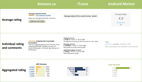
classifies methods from the literature according to 13 visual variables. Despite their scientific validity, these methods have not been put into widespread use or implemented in commercial applications for a number of reasons. First, most of these visualization methods require either a detailed and often quantitative assessment of the data quality, or an access to data of better quality representing the same object. Such information is often not available in practice. For instance, 3D objects stored in the Trimble 3D Warehouse can include a number of representations of a same reality, all being imperfect in different ways (see for an example). However, none of these models are made available to users along with a quality assessment resulting from comparison with a more accurate model. Second, many of the proposed visualization methods may not be intuitive to lay users and only few of these methods have been tested in formal user evaluations. For example, the use of glyphs to convey the direction and magnitude of uncertainty can be a rich but complex visualization method. Finally, many of these methods, such as increasing the transparency of a portion of a single 3D object of lower quality, would not be easy to implement for large datasets and would simply not be technically possible with a number of existing mapping technologies. Therefore, more accessible methods for visualizing data quality may benefit lay users of VGs.

Table 1. Examples of methods used to visualize the quality or uncertainty of spatial data. Methods are grouped by visual variable.
4. Data quality visualization approach
4.1. Concept of perceived quality
Quantitative quality information is rarely made available to users of user-generated geographic information. Grira, Bédard, and Roche (Citation2009, 67) state that ‘the different users' perceptions of quality are usually very far from the provided quality, especially in a volunteered context’. In this context, ‘perceived quality’ of spatial data is a novel approach in geographic information science, rooted in the Web 2.0 paradigm. Such an approach was used in the context of a collaborative quality-aware spatial database design method (Grira, Bédard, and Roche Citation2009). The concept of perceived quality allows the assessment and communication of SDQ for datasets that do not have well-documented quality information (e.g. metadata) and that cannot undergo a formal data quality evaluation. This approach is inspired from recommender systems used extensively across the Internet that encourage user assessments of various products, including for instance, the reviews of books on Amazon, of songs in iTunes, or hotels on Expedia Web sites (e.g. Resnick and Varian Citation1997). While the people doing these assessments are not professional book or music critics, it is assumed that they read the books or listened to the music and that their ratings and comments can be useful to other people. The number of reviews, the nature of the comments made, and the amount of divergence amongst reviews are examples of indicators that Internet users will take into consideration when trying to make up their own mind about the product's quality.
In contrast to more traditional descriptions of SDQ, perceived quality is an expression of the perception a user has about the quality of data, which is usually rooted in their experience with the real-world objects being represented. It is different from the concept of internal quality that measures, often quantitatively, the internal quality of a dataset by comparing the data to a more accurate dataset. It is also different from the concept of external quality (i.e. fitness-for-use) as it does not assess how well a dataset fits a specific user's requirements, but rather how the user perceives the quality of the data in the view of its use by another user. In examining a 3D model and looking at other users' comments, it is believed that a user can gain useful information about the quality of the data that can guide the user's own use of the data. Such data quality information can be related to the accuracy of the location of the 3D object in the geographic space, the accuracy of its shape, the possibility that some parts of the object modelled could be missing (i.e. completeness), etc.
4.2. Adopting a symbiotic approach
Our research adopts a symbiotic approach to overcome perceived limitations to the use of the visualization methods proposed in the literature. We use the term ‘symbiotic’ to seek a balance between the richness provided by the visualization method, its ease of understanding by users, and its technical feasibility. This trade-off is seen as necessary for solutions that can be widely adopted by a user community and is believed to have made the success of a number of methods on the Internet. By analogy with the biological meaning of ‘symbiotic’, this approach assumes an equilibrium state and a mutual benefit to the users, developers, and designers of the method.
4.2.1. Richness of visualization vs. ease of understanding
A number of methods for visualizing SDQ have been proposed in the literature (see Section 3.2), but not all users easily understand the various techniques (Aerts, Clarke, and Keuper Citation2003). The methods were often designed for a rich communication of quality information. However, complexity and richness of communication must be balanced against understanding by users of different expertise, particularly when the uncertainty communication is aimed towards non-expert users.
Visualization has been shown to be a more effective method for communicating uncertainty and quality to non-expert users than other methods, such as statistical output (Buttenfield Citation1993; Anon Citation2006). However, all visualization methods may not be equally appropriate in all contexts so empirical evaluations are crucial for assessing the effectiveness of uncertainty visualization methods. For example, while the use of transparency to visualize the uncertainty of structural attributes of 3D buildings (Zuk Citation2008) may be easily understood by someone familiar with this specific type of uncertainty, it may be difficult to comprehend for a non-expert user. Our research focuses on the non-experts’ ability to understand the underlying richness and complexity of the visualization.
4.2.2. Technical feasibility
Considering the feasibility and usability of visualization methods may increase the chances of having the methods used beyond the academic field. This trade-off between technical feasibility and complexity can depend on a number of factors, including the presence or ability to generate metadata, the amount of data being visualized, and the type of visual variable being used. Methods using or modifying the dataset itself may be more difficult to implement on a large scale. Also, VGs do not yet support the same range of visualization methods that GIS do. For example, using techniques such as wireframe or transparency (Zuk Citation2008) to communicate uncertainty in 3D objects could be difficult and time consuming to apply to large 3D datasets, in addition to not be supported by a number of existing technologies. Examining ways in which other domains currently visually communicate uncertainty and quality measures can help identify techniques that are easier to implement.
4.3. Communicating data quality using the five-star method
A number of studies have demonstrated the benefit of using quality recommender systems that allow users to rate products and share those ratings with other users (e.g. Resnick and Varian Citation1997; Duan, Gu, and Whinston Citation2008). Mudambi and Schuff (Citation2010) have demonstrated the benefits of combining visual and textual ratings in the same system, combining the simplicity of visual representation with the richness of the textual information. This type of approach, used by many systems, typically combines an individual rating of the product, an optional user comment providing more details about the assessment, and an average rating of all the reviews or for groups of users (see for examples). Such consumer feedback methods proved to be successful and are increasingly used for e-commerce and other online applications (Kim et al. Citation2006, Qu, Zhang, and Li Citation2008, Mudambi and Schuff Citation2010, Thoms, Garrett, and Ryan Citation2010), helping consumers assess the quality of products and building consumer trust in these websites (Qu, Zhang, and Li Citation2008; Mudambi and Schuff Citation2010).
Sparling and Sen (Citation2011) have compared user's satisfaction when using four different rating scales (i.e. unary – ‘like it’ –, binary – ‘thumbs up’ or ‘thumbs down’, five-star and 100-point slider), finding that users prefer using a five-star scale that compromises between simplicity and the ability to provide different levels of ranking. The five-star method was then chosen for this study as it also fits with the symbiotic approach for several reasons. First, the method is very easy to implement and is already used by a number of websites for communicating the quality of a broad range of products. Second, most Internet users are familiar with this method, which makes it easier to adopt by users of various levels of expertise. Finally, individual and average ratings offer a simple and intuitive communication of quality, while richer information can be gained from the detailed user comments.
Knowledge gained from crowdsourcing has often been suspected to be less reliable than knowledge generated by experts. While this can be true in some contexts, we think the approach is valid in the context of SDQ for two reasons. First, in practice experts will not be able to assess the quality of all objects in a spatial database. Having a crowd-based assessment is typically better than no or late and fragmented information (Goodchild and Glennon Citation2010). Second, the reliability of the assessment is generally proportional to the number of contributors and crowd-sourcing activities provided very reliable data in other spatial data applications. For instance, Haklay's (Citation2010) and Girres and Touya's (Citation2010) surprised the mapping community by showing that the spatial accuracy of OpenStreetMap data for the UK and France, respectively, was often as good as equivalent datasets produced by the national mapping agencies.
4.4. Selection of appropriate representations of the five-star method
The five-star method is typically used for non-geographic applications. In the few cases where this method is used for geographic data (e.g. Trimble 3D Warehouse), stars are rarely visualized in the mapping environment. In order to compare the traditional five-star visualization with other alternatives that may better fit a 3D mapping environment, our study designed and tested several alternative visualizations of the five-star method in a VG.
Our approach uses extrinsic and on-screen visualizations, where the visualization is added to the map instead of being an integral part of the dataset itself. A number of possible ways to represent the stars were explored, presenting three examples. Then, two GIS/Cartography experts were asked to evaluate several five-star visualization alternatives and identify a subset of visualizations to be tested that would best follow graphic semiology rules (e.g. proper combination of visual variables and data) as well as other criteria. For instance, the use of size was eliminated due to the fact that users may be confused between the size of the symbol, indicating the quality, and the change in size due to the distance of the object from the user's point of view. Colour hue was eliminated, as it could be difficult to distinguish some colours from colours used to represent the environment. Also, using different hues would simply not be appropriate for an ordinal ranking of the quality. The use of a colour value was considered, but preliminary tests indicated that low colour saturations were hard to distinguish from the 3D objects themselves. Final implementation and user evaluations were then performed with four visualizations selected by the consulted experts.
Another option was to either use 2D or 3D symbols for representing the five-star method in a geographic environment. In Google Earth, 3D symbols could only be implemented as static 3D objects. As a consequence, 3D stars do not rotate when changing the perspective, and can be viewed in some cases on their edge, which makes their interpretation harder. A 2D representation was hence chosen as 2D symbols are systematically placed perpendicularly to the viewer's perspective.
4.5. Assessing perceived quality using the five-star method
In the empirical part of this paper, VG users evaluated their perception of the four selected five-star methods used to visualize SDQ in a 3D environment. While some users may not be familiar with the real-world feature being represented, it is assumed that some will be able to compare the real-world feature with its representation. Similar assumptions were made and validated for volunteered geographic information (VGI) in general, where people contributing to geographic datasets are often living in the same neighbourhood is being mapped. Detailed comments are also a good way to understand the rationale for a given rating, and to assess the credibility of the user that has done the rating. The different ratings and comments about a 3D object are then communicated to new VG users that can make up their own mind about the quality. From consulting the ratings and comments by other users, one can assess what the quality of the dataset is for their personal use.
The example below illustrates the different general steps to assess, document, and share perceived quality:
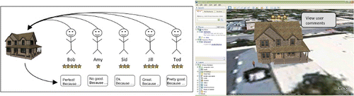
User 1 creates the model of a 3D object using an online application such as Trimble SketchUp (formerly known as Google SketchUp). This model can then be uploaded to an online warehouse such as the Trimble 3D Warehouse where other users can download and view the 3D object in a VG.
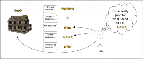
The model created by User 1 is viewed within a VG by several other users. These users can assess the quality of the model by giving it an overall rating using the five-star method, and adding comments to support their rating, if they wish, through a user feedback box. The rating and the feedback provided may be general, relating to their knowledge of the real-world feature it represents, or may reflect how the model would fit their own needs ().
The accumulation of several ratings and comments for the model then allows for an average rating of the model's perceived quality to be communicated ().
Each new user accessing the model can then view the overall rating, and the comments and individual ratings provided by the previous users. By filtering through the commentary and taking into consideration only the comments which pertain to their own personal use of the representation, the users then formulate their own perceived quality of the 3D representation and assess the fitness-for-use of the model in their context ().
5. Prototype and validation
5.1. Prototype development
The approach presented in this paper was implemented as a prototype using Google Earth 6.0. First, the accessibility and popularity of Google Earth influenced the choice of the platform, as the prototypes were to be tested by users that should be familiar with the technology. Second, the technical aspects related to the implementation of the approach were taken into consideration, and creating Keyhole Markup Language (KML) files is relatively straightforward. Furthermore, KML is increasingly supported by other VG and geospatial applications, so that the prototype could easily be adapted to other systems.
One hundred 3D buildings already available in Google Earth for two different cities were chosen for the prototypes. This number of 3D objects was deemed to be large enough to allow the users to immerse in an urban landscape during the tests and consider potential issues of perspective, cluttering, and occlusion of symbols. Each 3D building was assigned a quality rating of one through five using a random number generator, as the goal of this prototype was to compare four different five-star visualization methods, and not have users assess the actual quality of 3D models.
The two geographic regions selected for the prototype are the downtown cores of San Francisco, USA, and Prague, Czech Republic (). Two different urban settings were tested because differences in density, heights, and colour of the setting could influence the evaluation. San Francisco is a North-American city with a downtown core characterized by a relatively low density of buildings (compared to Prague) but of much higher height. Prague is a European city characterized by a relatively higher density of buildings of lower height. Using those two datasets allowed testing the methods in contexts where the star symbols clutter and occlusion in the viewshed are different.
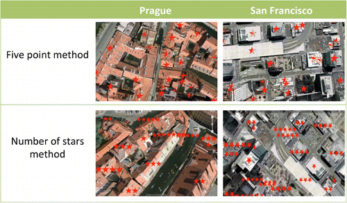
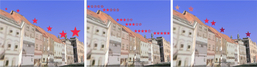
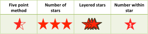
KML files were created for each pair of visualization methods and cities. Files were created from a spreadsheet containing buildings’ heights, latitude and longitude, along with the randomly assigned rating. Buildings’ heights allowed the symbols to be visualized at the top of the building to be visible from anywhere around it and limit occlusion. The four representations of the five-star method that were chosen by the experts for the prototypes were the ‘five point’, ‘number of stars’, ‘layered star’, and ‘number within star’ methods ().
5.2. User evaluation
Empirical quantitative and qualitative user evaluation of the prototype was conducted in spring and summer 2011 with 40 users, including 20 expert and 20 non-expert users of geographic data, all of whom were familiar with VG, i.e. the two upper use cases in the VG user classification (). The sample size (n=40) allowed a quantitative analysis of the user feedback and was complemented through the collection of user's comments.
Participants were first asked to answer four questions regarding their level of experience with geospatial tools: (1) how familiar they are with VG, (2) how often they typically use VG, (3) how familiar they are with GIS, and (4) if they received formal training in GIS. Answers to the last question were used to classify them as experts or non-experts.
In the user evaluation, participants were asked to explore the 3D data from San Francisco and Prague with each of the four five-star methods () in turn. To avoid any bias that could be introduced through the order in which each of the visualization method was viewed, each participant was given a different order based on the Latin squares method, using an array of order four (Leroy Citation2011).
After viewing each of the four visualization methods in both cities, the participants were asked to rank the methods in relation to their ease of understanding. They were then asked to provide reasons why they chose the first and last methods.
Results were analysed in SPSS PASW Statistics 18 using non-parametric statistical tests in order to answer the following questions:
Is there any significant difference in the rankings of the four five-star methods?
Is there any difference between the rankings of the five-star methods of expert and non-expert GIS users?
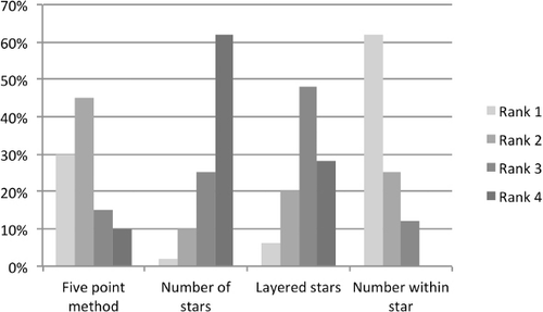
Friedman's test was used to answer Question 1 by comparing the mean ranks of each of the four methods. Results indicated that there was a significant difference in the rankings (p<0.001) and that the number within star method was consistently ranked highest, while the number of stars method was consistently ranked lowest. It should also be noted that 45% of the participants ranked the five-point method second and 30% ranked it first, making it the second most favoured method ().
The Mann–Whitney test was used to answer Question 2. No significant difference in ranking was found when comparing the group of experts with the one of non-experts (exact significance 2*[1-tailed Sig.] ranged from 0.192 to 0.602). This result indicates that the level of expertise seems to have no influence on the ranking of the methods preferred by the users.
Qualitative data obtained from written feedback about why each user ranked a method first or last gave further insights as to why these methods were selected. The main reasoning for choosing the number within star method as number one was that it was the easiest to understand as it used a number, and was not as cluttered as other methods. The primary reasons for ranking the number of stars method last was that it was too cluttered which obstructed the 3D buildings and made the rating confusing to read. These results are interesting for the design of SDQ communication methods in VG and other geospatial 3D applications because they contrast with five-star methods used in 2D environments and for non-geospatial applications. The qualitative feedback implies that other factors, including the number and density of objects that would have their quality visualized, would need to be considered when implementing such approach.
6. Discussion and conclusions
Visualizing SDQ has been the focus of a number of studies but the methods proposed in the literature have for a number of reasons not been used widespread in practice. This paper has presented a novel approach for collecting and communicating user perceptions of the quality of 3D objects in VG that does not rely on existing metadata or on formal data quality evaluation processes. Based on the concept of perceived quality, we have adapted the five-star visualization method widely used on the Internet to 3D geographic environments. We define our approach as being symbiotic, as it combines a simple visualization method that is both easily understood by non-expert users and easy to implement (i.e. stars), with detailed quality information (i.e. users' feedback). Four five-star visualization alternatives were tested by 40 users in the context of two 3D urban landscapes in Google Earth. Results from the user evaluation showed that users preferred the number within star method because of the method's visual simplicity. The least preferred method was the number of stars method, which is typically used on the Internet, as it was thought to bring too much visual clutter to the visualization environment. No significant difference was observed between the methods liked or disliked by expert users compared to non-expert users of geographic data. The same approach could likely be used to visualize the quality of any type of 3D object in VG but could benefit from further testing.
The user evaluation allowed testing the approach with a group of users of different levels of experience, but could benefit to be expanded. It is suggested that other traditional quality visualization methods for 3D objects are implemented and compared with the five-star approach. More complex use scenarios could also be used to assess more quantitatively the effectiveness of the communication and understand the role of the quality visualization in a larger decision-making process. The level of granularity of the quality information could also be explored as users could, instead or in addition to describe the overall quality of 3D objects, document the quality of parts of those more complex objects. Better understanding the impact of the realism of the representation on users' perception of the quality, as studied by Zanola, Fabrikant, and Çöltekin (Citation2009) could also provide further insights on the reliability of such approach for communication in the quality of the data.
Acknowledgements
We would like to thank the Canadian GEOIDE Network, the Natural Sciences and Engineering Research Council of Canada (NSERC), Memorial University of Newfoundland, the Canadian Foundation for Innovation (CFI), and the NSERC Industrial Research Chair in Geospatial Databases for Decision Support for the funding that made this research possible. We would also like to thank all of those from the Marine Geomatics Research Lab at Memorial University who have helped by providing critical feedback on the manuscript, and René Enguehard who helped implementing the prototypes. RD also thanks the 2008 Vespucci Summer Institute for being at the origin of this research idea.
References
- Aerts, J. C. J. H., K. C. Clarke, and A. D. Keuper. 2003. “Testing Popular Visualization Techniques for Representing Model Uncertainty.” Cartography and Geographic Information Science 30 (3): 249–261. doi:10.1559/152304003100011180
- Anon, 2006. “Think Global.” Nature 439 (7078): 76310.1038/439763a.
- Beard, K., and W. Mackaness. 1993. “Visual Access to Data Quality in Geographic Information Systems.” Cartographica 30 (2&3): 37–47. doi:10.3138/C205-5885-23M7-0664
- Buttenfield, B. P. 1993. “Representing Data Quality.” Cartographica 30 (2&3): 1–7. doi:10.3138/232H-6766-3723-5114
- Chrisman, N. R. 1983. “The Role of Quality Information in the Long-Term Functioning of a Geographic Information System.” In Proceedings of the International Symposium on Automated Cartography (AUTO-CARTO 6), edited by D. H. Douglas, 303–321. Ottawa, Canada: Canadian Institute of Surveying and Canadian Cartographic Association.
- Comber, A. J., P. F. Fisher, F. Harvey, M. Gahegan, and R. Wadsworth. 2006. “Using Metadata to Link Uncertainty and Data Quality Assessments.” In Progress in Spatial Spatial Data Handling, edited by A. Riedl, W. Kainz, and G. Elmes, 279–292. Berlin: Springer.
- Craglia, M., K. de Bie, D. Jackson, M. Pesaresi, G. Remetey-Fülöpp, C. Wang, A. Annoni. 2012. “Digital Earth 2020: Towards the Vision for the Next Decade.” International Journal of Digital Earth 5 (1): 4–21. doi:10.1080/17538947.2011.638500
- Davis, P., and C. Keller. 1997. “Modeling and Visualizing Multiple Spatial Uncertainties.” Computers and Geosciences 23 (4): 397–408. doi:10.1016/S0098-3004(97)00012-5
- Devillers, R., Y. Bédard, and R. Jeansoulin. 2005. “Multidimensional Management of Geospatial Data Quality Information for its Dynamic Use Within GIS.” Photogrammetric Engineering and Remote Sensing 71 (2): 205–215.
- Devillers, R., and R. Jeansoulin. 2006. “Spatial Data Quality: Concepts.” In Fundamentals of Spatial Data Quality, edited by R. Devillers and R. Jeansoulin, 31–42. London: ISTE Ltd.
- Devillers, R., A. Stein, Y. Bédard, N. Chrisman, P. F. Fisher, and W. Shi. 2010. “Thirty Years of Research on Spatial Data Quality: Achievements, Failures, and Opportunities.” Transactions in GIS 14 (4): 387–400. doi:10.1111/j.1467-9671.2010.01212.x
- Drecki, I. 2002. “Visualization of Uncertainty in Geographical Data.” In Spatial Data Quality, edited by W. Shi, P. F. Fisher, and M. F. Goodchild, 140–160. New York, NY: Taylor & Francis.
- Duan, W., B. Gu, and A. B. Whinston. 2008. “Do Online Reviews Matter? – An Empirical Investigation of Panel Data.” Decision Support Systems 45 (4): 1007–1016. doi:10.1016/j.dss.2008.04.001
- FGDC (Federal Geographic Data Committee). 1991. Spatial Data Transfer Standard. Washington: Department of the Interior.
- Girres, J., and G. Touya. 2010. “Quality Assessment of the French Openstreetmap Dataset.” Transactions in GIS 14 (4): 435–459. doi:10.1111/j.1467-9671.2010.01203.x
- Goodchild, M. F. 2008a. “Spatial Accuracy 2.0.” In Proceedings of the 8th International Symposium on Spatial Accuracy Assessment in Natural Resources and Environmental Sciences, June 25–27 2008, Shanghai, China, edited by J., Zhang and M. F., Goodchild, 1–7. Liverpool: World Academic Union.
- Goodchild, M. F. 2008b. “The Use Cases of Digital Earth.” International Journal of Digital Earth 1 (1): 31–42. doi:10.1080/17538940701782528
- Goodchild, M. F., and J. A. Glennon. 2010. “Crowdsourcing Geographic Information for Disaster Response: A Research Frontier.” International Journal of Digital Earth 3 (3): 231–241. doi:10.1080/17538941003759255
- Grira, J., Y. Bédard, and S. Roche. 2009. “Spatial Data Uncertainty in the VGI World: Going From Consumer to Producer.” Geomatica 64 (1): 61–71.
- Grossner, K. E., M. F. Goodchild, and K. C. Clarke. 2008. “Defining a Digital Earth System.” Transactions in GIS 12 (1): 145–160. doi:10.1111/j.1467-9671.2008.01090.x
- Haberling, C. 2008. “Proposed Cartographic Design Principles for 3D Maps: A Contribution to an Extended Cartographic Theory.” Cartographica 43 (3): 175–188. doi:10.3138/carto.43.3.175
- Haklay, M. 2010. “How Good is Volunteered Geographical Information? A Comparative Study of Openstreetmap and Ordnance Survey Datasets.” Environment and Planning B: Planning and Design 37 (4): 682–703. doi:10.1068/b35097
- Hoeber, O., G. Wilson, S. Harding, R. Enguehard, and R. Devillers. 2010. “Visually Representing Geo-Temporal Differences.” Proceedings of the 5th IEEE Symposium on Visual Analytics Science and Technology, October24–29 2010, Salt Lake City, UT, 229–230.
- Hunter, G. J., and M. F. Goodchild. 1996. “Communicating Uncertainty in Spatial Databases.” Transactions in GIS 1 (1): 13–24. doi:10.1111/j.1467-9671.1996.tb00030.x
- Jones, M. 2007. “Google's Geospatial Organizing Principle.” IEEE Computer Graphics and Applications 27 (4): 8–13. doi:10.1109/MCG.2007.82
- Kim, S., P. Pantel, T. Chklovski, and M. Pennacchiotti. 2006. “Automatically Assessing Review Helpfulness.” Proceedings of the 2006 Conference on Empirical Methods in Natural Language Processing, July22–23 2006, Sydney, Australia, 423–430.
- Kresse, W., and K. Fadaie. 2004. ISO Standards for Geographic Information, Berlin: Springer-Verlag.
- Leroy, G. 2011. Designing User Studies in Informatics, London: Springer.
- Levesque, M. -A., Y. Bédard, M. Gervais, and R. Devillers. 2007. “Towards Managing the Risks of Data Misuse for Spatial Datacubes.” Proceedings of the 5th International Symposium on Spatial Data Quality, June13–15 2007, Enschede, the Netherlands, .
- MacEachren, A. M., A. Robinson, S. Hopper, S. Gardner, R. Murray, M. Gahegan, E. Hetzler. 2005. “Visualizing Geospatial Information Uncertainty: What We Know and What We Need To Know.” Cartography and Geographic Information Science 32 (3): 139–160. doi:10.1559/1523040054738936
- Matyas, S., P. Kiefer, C. Schlieder, and S. Kleyer. 2011. “Wisdom About the Crowd: Assuring Geospatial Data Quality Collected in Location-Based Games.” In Proceedings of the 10th International Conference on Entertainment Computing, October5–8 2011, Vancouver, Canada, edited by J. Anacleto, S. Fels, N. Graham, B. Kapralos, M. Seif El-Nasr, and K. Stanley, 331–336. Berlin: Springer.
- Moellering, H. 1982. “The Goals of the National Committee for Digital Cartographic Data Standards.” Proceedings of the International Symposium on Automated Cartography (AUTO-CARTO 5), August22–28 1982, Crystal City, USA, 547–554.
- Mudambi, S. M., and D. Schuff. 2010. “What Makes a Helpful Online Review? A Study of Consumer Reviews on Amazon.com.” MIS Quarterly 34 (1): 185–200.
- Pang, A. 2001. “Visualizing Uncertainty in Geo-Spatial Data.” In Proceedings of the Workshop on the Intersections between Geospatial Information and Information Technology. Arlington, USA: National Academies Committee of the Computer Science and Telecommunications Board, 1–14.
- Peter, M. 2009. “Presentation and Evaluation of Inconsistencies in Multiply Represented 3D Building Models.” In First International Workshop on Quality of Context, June25–26 2009, Stuttgart, Germany, edited by K. Rothermel, D. Fritsch, W. Blochinger, and F. Dürr, 156–163. Berlin, Heidelberg: Springer.
- Qu, Z., H. Zhang, and H. Li. 2008. “Determinants of Online Merchant Rating: Content Analysis of Consumer Comments About Yahoo Merchants.” Decision Support Systems 46 (1): 440–449. doi:10.1016/j.dss.2008.08.004
- Resnick, P., and H. R. Varian. 1997. “Recommender Systems.” Communications of the ACM 40 (3): 56–58. doi:10.1145/245108.245121
- Riedl, A. 2006. “Digital Globes.” In Multimedia Cartography, edited by W. Cartwright, M. P. Peterson, and G. Gartner, 255–266. 2nd edBerlin, Heidelberg: Springer Verlag.
- Schlaisich, I., G. Mountrakis, and P. Agouris, 2004. “Visualization of Image Quality in Distributed Spatial Databases.” In Proceedings of the 20th Congress of the International Society for Photogrammetry and Remote Sensing, ISPRS, July12–23 2004, Istanbul, Turkey, edited by O. Altan, 513–524. ASPRS.
- Schroth, O., E. Pond, C. Campbell, P. Cizek, S. Bohus, and S. R. J. Sheppard. 2011. “Tool or Toy? Virtual Globes in Landscape Planning.” Future Internet 3 (4): 204–227. doi:10.3390/fi3040204
- Sheppard, S. R. J. 2001. “Guidance for Crystal Ball Gazers: Developing a Code of Ethics for Landscape Visualization.” Landscape and Urban Planning 54 (1–4): 183–199. doi:10.1016/S0169-2046(01)00135-9
- Sheppard, S. R. J., and P. Cizek. 2009. “The Ethics of Google Earth: Crossing Thresholds from Geospatial Data to Landscape Visualisation.” Journal of Environmental Management 90 (6): 2102–2117. doi:10.1016/j.jenvman.2007.09.012
- Slocum, T. A., R. B. McMaster, F. C. Kessler, and H. H. Howard. 2005. Thematic Cartography and Geographic Visualization, Upper Saddle River, NJ: Pearson Prentice Hall.
- Sparling, E. I., and S. Sen. 2011. “Rating: How difficult is it?” Proceedings of the 5th ACM Conference on Recommender Systems, October23–27 2011, Chicago, USA, 149–157.
- Thoms, B., N. Garrett, and T. Ryan. 2010. “The Design and Evaluation of a Peer Ratings System for Online Learning Communities.” Proceedings of the 43rd Hawaii International Conference on System Sciences, January5–8 2010, Poipu, USA: IEEE, 1–10.
- Tiede, D., and S. Lang. 2007. “Analytical 3D Views and Virtual Globes – Putting Analytical Results into Spatial Context.” Proceedings of the joint workshop on Visualization and Exploration of Geospatial Data, June27–29 2007, Stuttgart, Germany, . ISPRS, 6.
- Zanola, S., S. I. Fabrikant, and A. Çöltekin. 2009. “The Effect of Realism on the Confidence in Spatial Data Quality in Stereoscopic 3D Displays.” Proceedings of the 24th International Cartographic Conference, November15–21 2009, Santiago, Chile, [CD-ROM].
- Zuk, T. D. 2008. “Visualizing Uncertainty.” PhD Thesis,University of Calgary