
 ?Mathematical formulae have been encoded as MathML and are displayed in this HTML version using MathJax in order to improve their display. Uncheck the box to turn MathJax off. This feature requires Javascript. Click on a formula to zoom.
Abstract
There is currently no established methodology for the generation of synthetic stochastic internal load profiles for input into building energy simulation. In this paper, a Functional Data Analysis approach is used to propose a new data-centric bottom-up model of plug loads based on hourly data monitored at a high spatial resolution and by space-use type for a case-study building. The model comprises a set of fundamental Principal Components (PCs) that describe the structure of all data samples in terms of amplitude and phase. Scores (or weightings) for each daily demand profile express the contribution of each PC to the demand. Together the principal components and the scores constitute a structure-based model potentially applicable beyond the building considered. The results show good agreement between samples generated using the model and monitored data for key parameters of interest including the timing of the daily peak demand.
1. Introduction
No building energy simulation is complete without a specification of internal loads including electricity consumption due to plug loads and lighting and the thermal contribution of the building occupants. These are incontrovertibly interlinked as occupants actively operate lights and equipment which in turn generate heat impacting on heating, ventilation and air-conditioning requirements to maintain comfortable conditions. On an individual level, occupant actions may occur in response to certain stimuli – a need to open a window in response to feeling too warm, for example – but as occupant numbers grow the combined actions of many occupants result in an aggregate observed behaviour which appears stochastic. Yet schedules of occupancy and internal loads for both domestic and non-domestic buildings are usually specified as a deterministic diversity and peak load; this yields predictions of demand which may be significantly different from reality and contain no information about the uncertainty associated with the prediction (de Wilde Citation2014).
More realistic energy demand of individual buildings and building clusters requires a stochastic representation of the internal loads but as yet there is no established methodology for generating stochastic internal load profiles. This paper seeks to address this issue. The primary drivers of the stochasticity are weather and occupant actions, with the latter having a particular impact on electricity consumption when plug loads and lighting are considered separately from cooling loads. Indeed, Wang et al. (Citation2016) demonstrated that occupant ‘action’ in terms of lighting and appliance usage had a more significant impact on energy demand than occupant presence alone. A considerable body of research has been performed under the auspices of IEA Annex 66 in order to understand patterns of occupant actions, exploring the relationship between occupant presence and plug loads and inferring plug loads as a function of occupant presence. Gunay et al. (Citation2016) model detailed occupancy and plug load data for office spaces, generating stochastic plug load forecasts from predicted occupancy and learned plug load patterns. In addition, the study by Mahdavi, Tahmasebi, and Kayalar (Citation2016) highlights the need for better models of plug loads for building performance simulation and explores detailed monitored occupancy and plug load data for a selected office. They demonstrate that while simple models may be adequate for predictions of aggregate demand, probabilistic methods are better at capturing the time dynamics.
In this paper, we focus on three issues that are important for correct specification of stochastic internal load profiles, particularly for non-domestic buildings. The first is the influence of spatial resolution within a building; in addition to the time dynamics, this is an important factor. The study by Gilani, O'Brien, and Gunay (Citation2018) explores the applicability of individual occupant models at different spatial scales and concludes that, for lighting, the impact of individual occupants diminishes as the building size increases. However, for large buildings, it is not so much the nature of occupants but the nature of the function of the space that influences demand. For example, previous studies have shown that different types of functions in a university building exhibit different types of behaviours – notably later arrival and departure times for students when compared against administrative staff (Ward et al. Citation2016a). Accordingly, for large non-domestic buildings it is useful to simulate power demand according to space-use type.
The second issue is the availability and building-specific nature of monitored data. Most non-domestic buildings do monitor energy consumption in some form. This may be simply as utility bills, but increasingly, non-domestic buildings are being monitored at higher spatial and temporal resolutions for energy consumption, and by end-use. For existing buildings, top-down data-driven models may thus be used to infer realistic synthetic load profiles (O'Brien, Abdelalim, and Gunay Citation2018; Wang et al. Citation2016), but cannot as yet be used to attribute energy consumption to particular devices or areas of buildings, or to identify the sources and timing of large and/or inefficient energy consumers (Ward et al. Citation2016b). Furthermore, data derived from in-depth empirical occupancy monitoring studies are inextricably linked to the building from which the monitored data derives. It is therefore difficult to apply them beyond the building under consideration. Finally, high-resolution energy data from buildings are not typically available or straightforward to obtain in the modelling domain.
The third important factor for model development is usability. In a typical building energy simulation, internal loads are characterized by user-defined energy use intensity and diversity profiles per end-use (e.g. lighting, plug loads, large appliances) and per space-use type; this bottom-up approach is straightforward to implement and interpret and is accepted practice within the simulation community.
A stochastic model, even if far more accurate, will not be acceptable within modelling practice unless it can be interpreted in a straightforward manner and implemented seamlessly with current energy simulation tools. The National Calculation Methodology (NCM) used in the UK for calculations of compliance to Building Regulations (Building Research Establishment Citation2015) is one class of bottom-up model based on space-use type. Other bottom-up models focus on individual device types (Menezes Citation2013; Rysanek and Choudhary Citation2015) or individual occupant behaviours (Tanimoto et al. Citation2013). For non-domestic buildings as considered here, evidence suggests that the action of an individual occupant or individual device has less impact on the energy demand than the nature of the space use and hence a bottom-up model akin to the NCM approach would be the most suitable approach (Gilani, O'Brien, and Gunay Citation2018; Ward et al. Citation2016a).
So what insights can be gained from existing energy data from buildings and how can they be used to inform a stochastic model of energy demand?
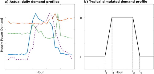
In this study, we are concentrating on a specific form of energy demand, namely plug loads from an office building; the form of the data for plug loads in an office space may vary considerably from day to day and between use types as illustrated in Figure (a) where four actual daily demand profiles are shown. By comparison, plug loads are conventionally modelled as a six-parameter (), five-section linear piecewise parametric model as shown in Figure (b) (O'Brien, Abdelalim, and Gunay Citation2018). It is clear that the real data exhibits features which are not represented in this model, such as the magnitude or timing of daily peaks. These may be as important if, for example, real-time energy pricing is a consideration.
Figure 1. Plug load profiles (a) monitored demand and (b) typical profile assumed for simulation (O'Brien, Abdelalim, and Gunay Citation2018).
The aim of this paper is to identify the fundamental structure of the plug loads data and to describe the significant features mathematically in a way which can be used to identify differences in space-use type and quantify their variation in timing and magnitude of demand, with quantification of uncertainties. To this end, plug loads in the form of metered electricity consumption from a case-study building sub-metered according to space-use type have been analysed using a Functional Data Analysis (FDA) approach in order to derive a bottom-up data-centric model of plug loads for different types of space use. FDA has been used previously for short-term forecasting of energy demand based on previous monitored data (Vilar, Cao, and Aneiros Citation2012). The novelty of the approach used here is that rather than using the functional description of the data to forecast short-term demand it is being used to uncover the fundamental structure of the data and the way in which different space-use types may be described mathematically. The analysis by space-use type is consistent with the approach used in the UK National Calculation Methodology (Building Research Establishment Citation2015), in which distinct spaces within a building are characterized by the activities of the occupants. The benefits of the methodology used here are that the model facilitates simulation of the inherent stochasticity and hence the uncertainties in the occupant-related loads. In addition, it is not just applicable to the case-study building but, as shown later in this paper, it is straightforward to calibrate for other similar spaces and buildings.
In the following section of this paper, the methodology is described. The building and the plug loads data used to develop the model are also detailed and a brief outline of the mathematical framework for the analysis is provided. Subsequent sections show the application of the methodology to the data of interest and the results in terms of sample plug load profiles. The model has been assessed against its ability to predict four Key Performance Indicators (KPIs), namely the base and peak loads, the timing of the daily peak demand and the daily total electricity consumption due to plug loads. The summary, discussion and conclusions provide a critique of the approach and assess the benefits of this model over models currently in use.
2. Methodology
A Functional Data Analysis (FDA) approach has been used for analysis of the data. FDA is a powerful set of techniques for analysing data that present as continuous functions rather than a set of discrete data points. By identifying the functions that best represent the data it is possible to gain insights into the data that are masked if the continuous properties are not considered. Examples of the use of this approach in fields as diverse as handwriting analysis, children's growth measurements and Canadian temperature data are given in the seminal work by Ramsay and Silverman (Citation2005) and the techniques have been applied widely in research in fields such as linguistic pitch analysis (Hadjipantelis, Aston, and Evans Citation2012; Aston, Chiou, and Evans Citation2010), analysis of SONAR data (Tucker, Wu, and Srivastava Citation2013) and population forecasting (Hyndman and Booth Citation2008) amongst others.
In our analysis, we consider each day of data per space-use type to be a data sample, in the form of 24 hourly values of electricity consumption attributable to plug loads, and a function is fitted to each data sample. A particularly useful aspect of FDA is functional Principal Component Analysis (fPCA). Similar to principal component analysis of discrete data, fPCA serves to identify the fundamental principal components of the data – in this case themselves functions – which can be used to generate the original data from the mean function together with a weighted sum of those components. A function , constructed from a mean
and i principal components
with weightings
, is simply represented using the equation:
(1)
(1) In this approach, the mean and principal component functions are the same across all the data samples. The only parameters that change from one sample to another are the weightings, or scores,
. This means that if we can find a set of principal components that govern the behaviour across all space-use types, the difference between the space-use types lies in the distribution of the scores for each principal component.
2.1. Phase and amplitude separation
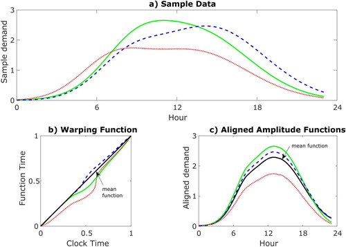
The features identified in Figure are related to the magnitude, or amplitude, of the demand, and also to the timing, or phase. In cases such as this, where the phase is an important part of the overall variation of the data, it has been found to be useful to analyse the amplitude and phase relationships separately (Tucker, Wu, and Srivastava Citation2013). In this case, it is necessary to first separate the phase and amplitude relationships for each data sample. This results in a set of aligned amplitude functions that are the relative magnitude variations of the data over the 24-hour period, and a set of phase functions that relate the original data samples to their aligned amplitude functions. These are termed warping functions. This is illustrated in Figure ; the warping functions shown in Figure (b) vary from 0 to 1 and relate function time to clock time, i.e. they govern whether the function is ahead of clock time, lying below the diagonal in Figure , implying features in the data are occurring earlier than the mean profile (shown in black on Figure c) or vice versa. By applying the warping functions to the corresponding amplitude functions, the original data are recovered. This is pertinent to our study; taking an example, if the red and blue curves equated to demand from different occupants of a space, say administrative staff and students, the warping function in red clearly indicates that the administrative staff demand is ahead of the mean demand i.e. they arrive and leave earlier. Conversely, the warping function for the blue curve lying above the diagonal in Figure (b) indicates that the student demand is behind the mean demand in time i.e. they arrive and leave later.
Figure 2. Sample demand profiles (a) may be generated from the action of a warping function (b) on an aligned amplitude function (c).
So how is the separation of the functional data into phase and amplitude performed? In itself, this is an extensive topic of research, but good results have been achieved using an ‘elastic shape analysis’ approach, as detailed in Srivastava and Klassen (Citation2016). Elastic shape analysis of the functional data f(t) relies on the calculation of the Square Root Slope Function, or SRSF, q(t), defined by
(2)
(2) The aim is to extract warping functions,
that map a set of aligned functions
to the original data functions
. However, if we consider two such data functions,
and
and a warping function γ (omitting the domain for clarity), in general it is the case that,
(3)
(3) i.e. the distance between two warped functions (represented by
) is not the same as the distance between amplitude functions. The problem with this is that the optimal alignment of the two functions will differ according to the direction of alignment. This may not be an issue if the warping functions themselves are not of interest i.e. if registration of the curves is the only aim. However, if the analysis of the warping functions is of interest, as here, it is necessary to find a symmetric approach. Using Equation (Equation2
(2)
(2) ) and calculating the SRSF values,
of
, it transpires that
(4)
(4) where
is the SRSF of
. This isometry property means that it is possible to align the SRSF values by minimizing the distance between the aligned SRSFs and a mathematical mean using a Dynamic Programming algorithm, and then to map the aligned SRSF values back to the function space to retrieve the aligned functions,
.
This approach delivers a set of aligned amplitude functions, and a set of warping functions
. So each data sample,
equates to an aligned amplitude function
acted on by a warping function,
.
Functional principal component analysis (fPCA) of both sets of functions is then performed. The fPCA results in a parameterization of the data in terms of a mean profile and i principal components,
, for the amplitude functions and another set of principal components for the aligned warping functions,
, together with scores,
and
for the amplitude and warping functions respectively. Separate linear equations similar to Equation (Equation1
(1)
(1) ) are thus used for the two elements. i.e. for a data sample
, the equation for the aligned amplitude function is
(5)
(5) and the equation for the warping function is
(6)
(6) The scores are specific to each data sample. The principal components however are independent of the data sample and hold for all of the data analysed, so each data sample may be characterized simply by the sets of principal component scores for that sample.
The advantages of this approach are fourfold; first, the principal components retain the temporal correlation across the 24-hour period. This is important as it can reflect behaviours such as the tendency for certain classes of occupants to arrive and leave earlier or later than the mean, e.g. the difference between administrative staff and students, and is not included in models that relate performance in 1 hour to the previous hour, such as Markov Chain approaches (Rysanek and Choudhary Citation2015). Second, the principal components can be interpreted intuitively as representing particular physical realities of the demand – the relationships between start and end of day for example, or the change in demand at lunchtime. Third, the scores contain all the information needed to differentiate between different types of space use. So for two different spatial zones, a difference in the magnitude of the score related to a principal component describing the change in demand at lunchtime indicates that the occupants of those spaces have different demand profiles at lunchtime. It also means that generating a stochastic sample of data for use in building energy simulation reduces to sampling from the scores alone. And a final benefit is that new data for similar building zones can be mapped to the original set of principal components, generating scores for the new data that can be compared directly against the original data set. This means that it is straightforward to calibrate the model as new operational data become available.
The full mathematical details of the approach are complex and are detailed in Srivastava and Klassen (Citation2016). It is important to note that the fPCA cannot be performed in the original function space for either of the elements; for the amplitude functions, the fPCA must be performed on the SRSF values. For the warping functions, the set of all warping functions is an infinite-dimensional nonlinear manifold which does not lend itself easily to statistical analysis. In order to proceed, the square root of the derivative of the warping function, , is calculated; the set of all ψ values is a Hilbert sphere, i.e. a unit sphere in Hilbert space, for which the distance between two ψ values is the arc length on the surface of the sphere. This facilitates calculation of a mean warping function, but principal component analysis still cannot be performed directly on the ψ values; instead the mappings of ψ into the tangent space to the mean ψ value – the so-called ‘shooting vectors’ – are used (Tucker, Wu, and Srivastava Citation2013).
Implementations of the approach for R and MATLAB are available from Tucker (Citation2015).
2.2. Case study
In this paper, metered electricity consumption due to plug loads from the Cambridge University Computing LaboratoryFootnote1, i.e. the William Gates building in Cambridge, UK, have been used as a basis for the model. This modern building, shown in Figure from the West side, was constructed on three storeys, each with a similar layout as indicated in Figure .
Figure 3. William Gates Building, Western side.

Figure 4. William Gates building, floor plan.
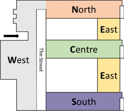
Within the building, spatial zones are identified according to the building orientation as indicated in Figure (Rice, Hay, and Ryder-Cook Citation2010), and individual zones are identified throughout this paper using direction and floor level abbreviations, e.g. South-West First Floor is denoted SW1. The spatial zones are also typically occupied by different types of user as indicated in Table . For this case study, therefore, each spatial zone equates to a separate space-use type and the terms ‘zone’ and ‘space-use type’ are used interchangeably hereafter. Mixed-use in this instance implies single or double occupancy student and academic staff cellular offices. With the exception of the SW1 zone, all of these spatial zones are metered separately at hourly intervals for plug loads and lighting using Autometers' IC995 submeters (Rice, Hay, and Ryder-Cook Citation2010). The plug loads data for a 12-month period from October 2013 to September 2014 for the 15 zones excepting SW1 were used to develop the model, with 10 zones specified as a training data set, and 5 zones retained to be used as a test data set (indicated in italics in the table). The total daily demand varies according to the zone, but are of a similar order of magnitude as the benchmark values for installed capacity given in CIBSE Guide F (Table 12.2) for office equipment demand i.e. 112–144 Wh/m2 for an 8-hour day (Chartered Institution of Building Services Engineers Citation2012).
Table 1. William Gates building, spatial zone use types.
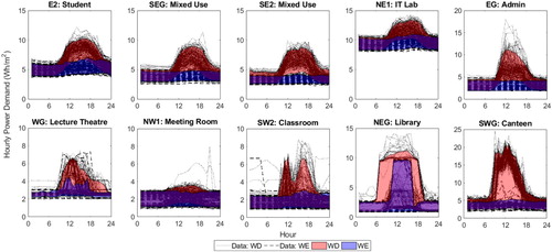
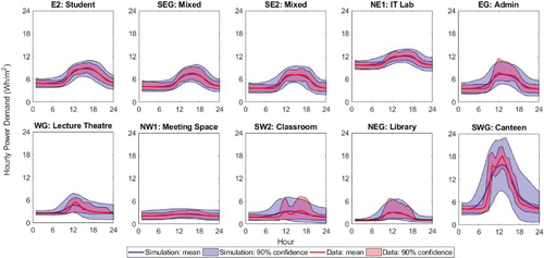
The data for each zone are illustrated in Figure . Shown in addition to the data samples are shaded zones which represent the 5–95% confidence limits for weekdays (red) and weekends (blue). Immediately apparent from the plots are a number of differences between zones or use types, for example:
base load – the IT Lab shows a much higher base load than the other zones,
peak load – both in terms of magnitude and timing, for example the Admin zone has a higher probability of a peak at around noon,
load range – the Canteen shows the greatest load range from base load to peak demand,
profile shape – the Lecture Theatre and Classroom show much more variable profiles over a 24-hour period than the Student and Mixed Use zones,
daily variability – the Lecture Theatre and Classroom also show much more variability day to day than the other zones,
weekday and weekend behaviour – for the majority of zones there is a clear difference between weekday and weekend profiles, although this is less clear for the Meeting Room.
Figure 5. Daily monitored plug loads for 1 year for 10 different spatial zones showing the 90% confidence limits of demand for weekdays (red) and weekends (blue) (note variable scale on y-axis).
2.3. Principal components
Using the approach described above, principal components (PCs) for amplitude and phase have been extracted from the data for the 10 test zones treated as a single dataset. These are shown in Figures and .
Figure 6. Amplitude principal components PCY 1–5, showing the impact of adding each PCY to the mean function (shown in black) using a positive (dashed) or negative (dotted) score.
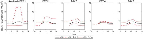
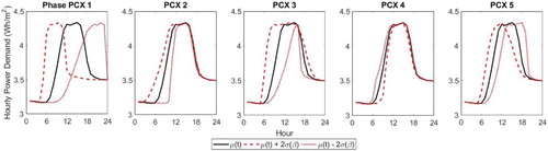
Figure 7. Phase principal components PCX 1–5, showing the impact of adding each PCX to the mean function (shown in black) using a positive (dashed) or negative (dotted) score.
To interpret the PCs, it helps to consider the impact of each PC on the mean profile individually. The plots show the mean profile, across all data in black, together with the impact of adding each PC individually multiplied by a +ve or −ve score equal in magnitude to 2 standard deviations of the score values (denoted by
for amplitude and
for phase). The PCs multiplied by a positive score are shown by the dashed line, and multiplied by a negative score by the dotted line. So for the first amplitude PC (Figure Amplitude PCY 1) a strongly positive score leads to a higher base load and range, whereas a strongly negative score loads to a lower base load and fairly flat profile compared against the mean profile. The second PCY has some impact on the base load, in particular the difference between the demand at the start and the end of the day, but primarily affects the relative amplitude at the start of the day, i.e. the rate of the rise. The third PCY also affects the base load and the propensity for the peak to occur in the morning or afternoon. The fourth PCY also affects the difference in demand between the start and end of the day, while the fifth PCY is similar but opposite to the third PCY.
Similar plots are given for the phase PCs in Figure . The first phase PC (PCX 1) can be seen to shift the entire profile in time, with a strongly positive score resulting in a much earlier start and end of day and a strongly negative score resulting in the opposite. A positive score on the second PCX stretches the timing at the start of the day with respect to the timing at the end of the day, and PCX 3 affects the peakiness of the profile. PCXs 4 and 5 have more subtle impacts, with PCX 4 primarily having an effect at the start of the day, and PCX 5 giving a shift in time similar but less extreme than PCX 1.
The PCs ordered in this way account for decreasing amounts of variability in the data – Figure shows scree plots for the phase and amplitude PCs. The first amplitude PC accounts for approximately 30%, with the first 5 PCYs accounting for 68% of the variability in the data. The variability attributable to the phase PCs are similar, with the first phase PC accounting for 26% and the first 5 PCXs accounting for 73% of the variability in the data. This variability is across all the data but for specific zones different PCs may be significant. For example, PCY8 only accounts for less than 5% variability in the data overall, yet is directly related to the base load and hence may be more significant for zones in which the base load is highly variable.
Figure 8. Scree plots showing the proportion of variability in the data accounted for by each PC for phase and amplitude.
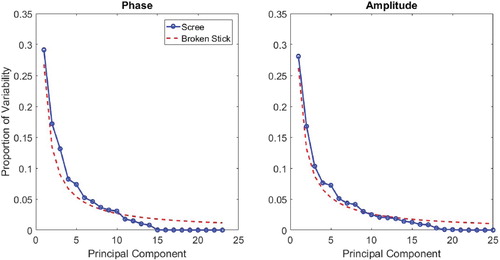
Conventional principal component analysis of discrete data is often performed in order to reduce the dimensionality of the data; significant PCs only are retained, with the significance determined according to the purpose of the analysis. So the question of how many PCs are significant for explanation of the data and how many are effectively noise terms is of interest.
One alternative is to only consider PCs which account for significant variability in the data, yet as described above considering variability across the entire dataset may lead to PCs which are significant for specific zones being incorrectly labelled as insignificant. Figure also shows so-called ‘Broken-Stick’ curves for the data. This curve is the distribution that would be expected for random data following a broken stick distribution (Bro and Smilde Citation2014), the point being that if looking to reduce the dimensionality of the data it makes sense to retain only those PCs that account for greater variability in the data than would be obtained from random data. This approach would suggest that approximately 10 PCs are significant for both phase and amplitude, accounting for 94% of the phase variability and 88% of the variation in amplitude across all samples. To explore whether this is the case, consider Figure . This shows the impact of progressively adding more PCY terms to reconstitute a single example amplitude function, using scores derived from the data for that day. The scores used are given in Table . Adding just a single PCY to the mean gives approximately the correct range, with too low a base load. Adding the second PCY has little impact and even with 5 PCYs the base load is still too low. PCY 8 primarily affects base load and for this example has a significant impact on the profile shape for this sample day, even though PCY 8 accounts for less than 5% variability in the data overall. PCYs 9–13 have little impact, but with the addition of PCY 14, the agreement becomes quite good, and with PCYs 15–18 included the agreement is almost exact. So although the higher number PCYs are less significant, it appears to be still necessary to include them if it is important to match all features of the data. In general there is little to be gained by reducing the dimensionality and hence all the PCs have been retained for this analysis.
Figure 9. Impact of increasing the number of PCs included in the summation on the re-generation of the original data; with 1–5 PCs the base load is too low, but by 18 PCs the agreement is good.
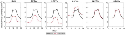
Table 2. PCY scores used for reconstitution of sample illustrated in Figure .
2.4. Scores
The role of the PCs is to define the fundamental structure of the data; the score distributions are important for distinction between zones and quantification of the potential variability of the data for each zone. Having extracted the PCs, a set of scores for amplitude and phase is calculated for each data sample as described previously. Figure shows the scores for the first amplitude PC (PCY 1) for each zone for all data samples, i.e. 365 days for each zone, from October 2013 to September 2014, and Figure similarly shows the scores for the first phase PC. There are three points of particular interest:
Figure 10. Scores for PCY 1 for 365 days' demand for each of 10 spatial zones; each point is the score for one day's data.
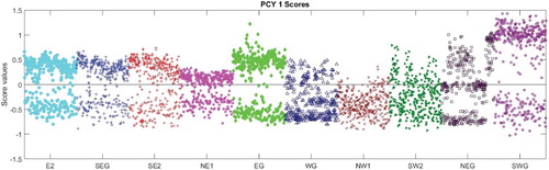
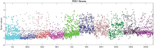
Figure 11. Scores for PCX 1 for 365 days' demand for each of 10 spatial zones; each point is the score for one day's data.
Each zone, and hence each use type, has a distinct score distribution and similar zones (e.g. zones SEG and SE2, both Mixed Use zones, have similar distributions). This supports the key hypothesis of this model, namely that there is potential for the scores to be used to differentiate between use types.
The absolute magnitude of the score for each PC is a direct reflection of the impact of that PC on the data sample. So considering Figure , the Canteen, zone SWG, has a main cluster of scores for amplitude with a high value around +1, indicating that this PC is a significant factor in the composition of the demand for this zone. And indeed the load range for the Canteen, governed by amplitude PCY 1, is significantly higher than the mean. By comparison, in Figure , the majority of the scores are close to zero for this zone. So, the first phase PC is not significant for this zone, indicating that there is no significant shift in the timing of the energy demand when compared with the mean profile. Compare this with the scores for the Student zone E2 in Figure which are negative indicating that the timing of the demand is later than the mean demand, i.e. the students tend to arrive and leave later.
The majority of the zones show two clusters of scores in Figure , for example zone EG has a cluster around a value of
and another cluster around a value of +0.5. This indicates two different types of behaviour – referring to the plot for amplitude PCY 1 in Figure , the positive value will give a higher range, whereas the negative value will give a much flatter profile. This clustering is not as obvious for the phase PCs, although the zones that exhibit this tight clustering for amplitude do show a cluster of scores for phase with a tailing off in the positive direction.
Figure 12. Amplitude scores (PCY 1) from Figure re-plotted by day of the week; weekend scores are noticeably lower for the majority of zones.
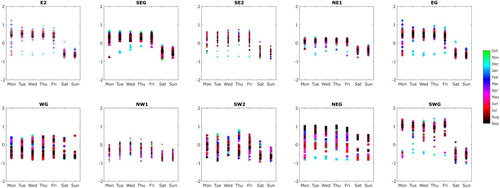
Figure 13. Phase scores (PCX 1) from Figure re-plotted by day of the week; weekend scores show a wider spread for the majority of zones.
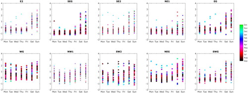
The scores for the first phase PC in Figure exhibit a much wider variation at the weekends than on weekdays for the majority of the zones. This reflects a much greater variation in timing of the demand at weekends than on weekdays when occupant working patterns tend to be more similar.
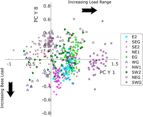
As highlighted above, different zones have different distributions of scores and this is not just the case for the first PC. For example Figure shows scores for two amplitude PCs, with scores for PCYs 1 and 8 plotted on the x and y axes respectively for Term 1 weekdays only for clarity. PCYs 1 and 8 have been selected as PCY 1 directly affects the load range and PCY 8 is one of the PCs which makes a significant contribution to the base load; increasingly positive scores for PCY 1 imply an increase to the load range, while increasingly negative scores for PCY 8 imply an increase to the base load. It is clear that demand data from different zones give rise to scores in different areas of the score space. This is very illuminating as it reveals fundamental correlations that distinguish between use types. For example, the IT lab, NE1 has a relatively high negative score for PCY 8 and a small positive score for PCY 1, implying a high base load and a slightly higher than average load range. In contrast, the canteen, SWG, scores highly for PCY 1 and hence range, but typically the score for PCY 8 is close to zero. In addition, the different zones exhibit different levels of variability in the score; scores for the office-type zones, including the students, E2, admin, EG, mixed-use, SEG and SE2, and the IT Lab, NE1, are all quite tightly distributed, whereas the classroom, SW2 and lecture theatre, WG, are widely spread indicating a high level of variability in the demand data. This reflects the actual use of these zones which are occupied intermittently by students according to the timetable of lectures and classes. The meeting space, NW1, has scores in the low range and the low base load quadrant; this zone is simply a meeting room used for ad hoc meetings and containing just a projector and sockets for individual laptops.
Figure 14. Scores for weekday (term 1) amplitude PCYs 1, primarily affecting load range, and 8, primarily affecting base load; an increase in score value in PCY 1 gives rise to an increasing load range, whereas a decrease in value in PCY 8 gives an increase in base load.
2.5. Generation of stochastic demand profiles
Using the scores and PCs extracted from the data, it is possible to recreate the original data as demonstrated in Figure . However, stochastic demand profiles are not just a re-creation of past reality, but instead are a projection of what future demand could look like based on previous demand. As detailed in the previous section, the distribution of scores is the key characteristic of a zone's energy demand. Therefore, it suffices to sample from the score distributions for each zone to generate a stochastic sample of demand on a zone-by-zone basis. The sample scores are then combined with the PCs for phase and amplitude in order to generate sample amplitude and warping functions and hence generate stochastic daily demand profiles.
There are certain practical considerations to be taken into account in sampling from the set of scores. When the entire dataset is considered, correlations between scores for different PCs are not detectable. However, significant correlations can exist which may only be observed once subsets of the data are explored, for example subsets corresponding to sets of scores for individual zones. It is important to take this into account by sampling from a multi-variate distribution fitted to the scores. However, in addition to being correlated, the scores are typically not normally distributed, so use of a multivariate normal distribution is not strictly applicable in this case.
Instead a multi-dimensional copula has been used. In simple terms, a copula is a function that describes the dependence structure between two or more one-dimensional probability distributions, which importantly, are not required to have the same form of distribution (Nelsen Citation2007). The mathematical formulation relies on Sklar's theorem which states that any multivariate joint distribution can be written in terms of univariate marginal distribution functions and a copula which describes the dependence structure between the variables. This allows specification of the univariate distributions separately from the multivariate dependence, which greatly improves the flexibility in fitting a model to the data (Patton Citation2012).
Given the clustering of scores for weekdays and weekends for many of the zones, the scores have been grouped by type of day – weekday or weekend – and also by term-time and holiday. Sample scores for each group of scores for each zone, for amplitude and phase, are then generated by fitting a Gaussian copula to the score set using MATLAB (Mathworks Inc Citation2018). This procedure involves the following steps:
for each set of scores, apply a transformation in order to represent each set as a uniform distribution on a unit scale,
fit a copula to the uniform distributions using the MATLAB function copulafit – a separate copula is generated for each zone,
generate sample scores from each copula,
transform the sample scores back to the original scale of the data.
The transformation required in this instance is based on a kernel estimator of the cumulative distribution function for each score set. In this way, the univariate distribution of each set of scores derived from the data is embedded in the transformation, and by transforming back to the original scale, the distribution is retained.
To illustrate this, Figure shows the distribution of scores for amplitude PCYs 1 and 2 for the Canteen zone, SWG, for term-time weekdays, 127 days in total, with a scatter plot showing the scores and histograms illustrating the distribution in each dimension. There are two main clusters of scores separated in PCY 2 with one cluster around a score value of 1, and a second cluster around zero. Considering this set of scores as a whole the distribution is clearly non-normal in both dimensions.
Figure 15. Scores for Zone SWG for amplitude PCs PCY 1/2, illustrating the non-normal scores distribution.
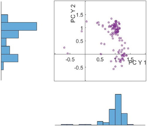
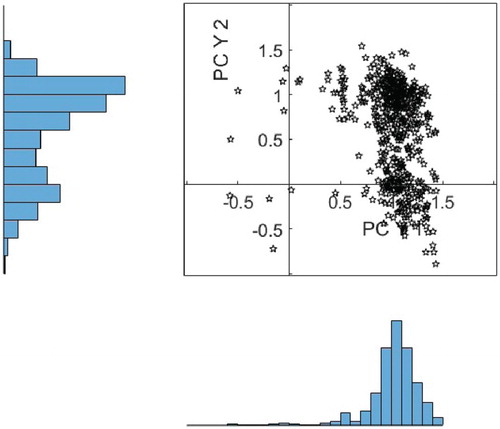
Figure shows a similar plot for a set of 1000 scores generated from a Gaussian copula fitted to the data, illustrating that the main features of the distribution i.e. number of peaks and skew, are being replicated well.
Figure 16. Sample scores for Zone SWG for amplitude PCs PCY 1/2, illustrating the fit achieved by using a Gaussian copula.
3. Results of the illustrative study
Using the sampling approach detailed in the previous section, 1000 sets of sample scores have been generated for each zone for term-time weekdays. These scores are then used in conjunction with the PCs to calculate sample amplitude and warping functions, which are then combined to give sample daily demand profiles. Figure provides a visual comparison of the generated daily profiles against the monitored training data, with the 5–95% quantiles coloured red for the monitored data and blue for the generated sample, with the overlap presented as purple. Noting that the intention here is not to recreate previous reality, but to project what may happen in the future, it is interesting to note that overall the comparison is close, with the generated samples enveloping the data; the samples are closest to the monitored data for those zones that demonstrate less variability in the scores, zone E2 for example. In a couple of instances, red coloured areas are visible, indicating that features of the monitored data are not being predicted; for example, the sharp peak in the Admin zone, EG, is under-predicted by the model. This suggests that events of this magnitude have not occurred frequently enough in the monitored data to appear in the stochastic samples. The significance of this depends on whether it has an impact on the key parameters of interest (KPIs).
Figure 17. Sample profiles, term-time weekday; 90% confidence limits for 1000 samples generated by sampling from a Gaussian copula fitted to the score distributions (blue), compared against the training data (red) for 10 spatial zones.
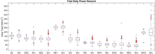
Figures and illustrate the comparison for each zone for 2 KPIs, namely base load and daily total. Figure shows for each zone the distribution of base load from the simulation compared against the data for term-time weekdays. The simulation is in good agreement with the data across all the zones, being in closest agreement for the zones which show more regular behaviour, for example the student zone, E2 and the two mixed use zones, SEG and SE2. For all of the zones the simulation predicts a wider spread in the results and a greater number of outlying points as would be expected from a stochastic model. Similarly, considering the daily total demand in Figure , for the Lecture theatre, WG, the inter-quartile range of the simulation results is significantly wider than the data; from Figure this is due to the spread in base load predicted at the end of the day and is a consequence of the highly variable demand in this zone which is harder to predict.
Figure 18. Base load for 1000 stochastic samples (Sim) compared against the training data for 10 spatial zones (term-time weekday).
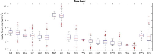
Figure 19. Daily total demand for 1000 stochastic samples (Sim) compared against the training data for 10 spatial zones (term-time weekday).
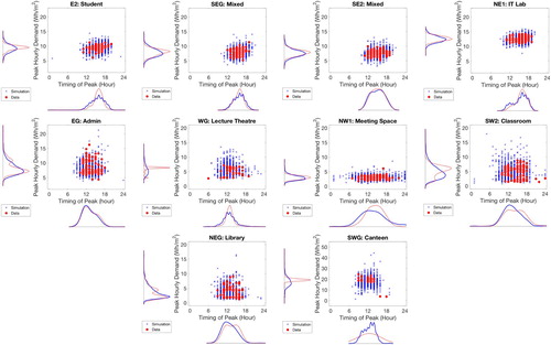
Simulation of peak demand requires both the magnitude of the peak and the time at which the peak occurs, which as described previously is typically not simulated in deterministic schedules, yet may be an important KPI. As these two parameters are inextricably linked they are displayed jointly in Figure , in which peak demand is plotted as a function of the timing of the peak and the probability distributions for both parameters are shown for each zone. As for the base load and total daily demand the magnitude and timing of peak demand show a similar pattern with a closer match for the zones with less variable demand. The majority of the zones tend to have a peak in mid-afternoon and this is also predicted by the simulation for the zones which exhibit relatively consistent daily demand. The Admin zone, EG has a relatively early daily peak and this is matched well by the simulation.
Figure 20. Peak load and timing of the peak for 1000 stochastic samples (Simulation) compared against the term-time weekday training data for 10 spatial zones (Data).
3.1. Application to new zones
The beauty of this fPCA approach is that it is not necessary to perform the full mathematical analysis and extract new PCs for newly available monitored data. Once monitored data are available, the daily demand profiles can be projected onto the PCs previously calculated. This is the case not only for the zones already included in the analysis but also for new zones.
First it is necessary to align the new data to the mean function calculated for the original data set; this provides a new set of warping and amplitude functions for the new data. Then, the aligned amplitude functions and the warping functions are mapped to the PCs for amplitude and phase, giving a set of scores for the new data.
As outlined in Section 2 data from five zones were excluded from the dataset used to generate the PCs in order to test this approach. Each of the five test zones has a space-use type similar to one or more of the training zones. Analysis of the scores so derived for the new data can shed light on the similarities and differences between the test zones and the training zones selected from the original data set. Figure shows this comparison for the amplitude PCs primarily affecting load range and the base load, i.e. PCYs 1 and 8 for the five test zones, with the scores for the training zones in colour and the test zones in black. Considering the new Student zone, E1, it is clear that compared against the original zone, E2, the scores are typically lower for the first amplitude PC (shown on the x-axis) and less negative for PCY 8 ( y-axis), giving rise to a lower range and base load than observed for zone E2. The data are illustrated in Figure and the correlation between the scores and the observed data can be clearly observed. Similar results are observed for the new Mixed-Use and Admin zones, SE1 and NWG. For the new IT Lab zone, NE1, the new scores are higher for PCY1 indicating a greater range, and although not as clear from Figure , the mean score for PCY 8 is 24% more negative for the new zone data, indicative of the higher base load observed in Figure . The scores for both classrooms are very similar, although the mean score for PCY 1 is lower for the new class, NW2, corresponding to the lower observed load range.
Figure 21. Comparison of amplitude scores for PCY1 and PCY8 generated for new spatial zones by mapping monitored data to the set of PCs derived from the training data, compared against scores for training zones with similar space-use type.
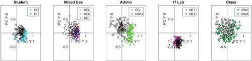
Figure 22. Comparison of monitored data for new spatial zones (grey) against monitored data for training zones with similar space-use type (90% confidence limit shown).
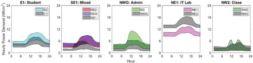
One potential use for this model is to generate data for zones for which data are not readily available, either as they are not built – the design case – or because the data are monitored in an aggregate fashion and there is need to understand the disaggregated performance. An important question is whether for the design case it is appropriate to use sample profiles generated for zones with similar space-use type? In this example, using sample profiles generated purely based on data from the training zones would lead to an over-estimation of the daily total demand for three of the five zones, whereas for the IT Lab, NE2, using the sample profiles would lead to a significant under-estimation of the daily total demand. This directly reflects the physical differences between the test zones and the training zones, e.g. while zone NWG is nominally an admin zone, it houses store rooms and hence doesn't present the same level of demand as zone EG which is the offices for the administrative staff. The classroom zone, NW2 appears quite similar to the comparable zone SW2, although the timing of the peak appears a bit different with peaks occurring later in the day for the new zone; this is because classes are held in zone SW2, and students typically then move to zone NW2 for independent study after the class.
However, in a design situation it is common to have estimates of base load, load range and daily total demand in mind. Given those estimates in conjunction with the stochastic profiles for zones of similar use type, it would be feasible to generate stochastic demand profiles for the design case by modifying the scores to reflect the design data.
4. Discussion and conclusion
This paper describes the development of a bottom-up data-centric model for plug loads for different types of space use in non-domestic buildings. A Functional Data Analysis approach has been used for analysis of metered electricity consumption due to plug loads for the William Gates building in Cambridge, UK, which is sub-metered at a high spatial resolution, with each zone hosting a different space-use type. The analysis approach starts with alignment of the data to a common mean function, which results in two functions for each day of data, namely:
an amplitude function which describes how the magnitude for the demand for that day varies compared against the mean demand profile, and
a warping function which describes how the timing of the day's profile compares against the mean demand.
An fPCA is then performed for both the amplitude and warping functions, permitting the extraction of a fundamental structure for the plug loads data that retains temporal correlations across the 24-hour period. This structure comprises a mean profile, a set of functional principal components for amplitude and phase which are the same across all the data samples, and score sets that express the combination of PCs for each data sample. Random samples are then taken from the sets of scores in order to generate synthetic stochastic demand profiles for use in building energy simulation.
This bottom-up data centric model reveals a fundamental structure not immediately obvious from the raw data. By fundamental structure, we mean that the PCs are the same across all data samples so they are fundamental to the structure of the data analysed. By describing the data structure in this way, each data sample, i.e. each day of data per space-use type, or zone in this case study, is reduced to a unique set of PC scores. As illustrated in Figure , the scores occupy different regions of the score space according to the type of space use and reflect the predilection for certain behaviours; students working late into the evening, or the canteen operating at hours to service the occupant schedule, for example. This is a significant result as it means that simulation of different types of use is reduced to estimation of the distribution of scores for each use type.
One benefit of this model, therefore, is that potentially it is not just applicable to the building data from which it has been derived. As the PCs describe the fundamental structure of the data these PCs could be applicable to plug loads for any building, provided the structure of the data is similar. This has been demonstrated using test zones from the same building, but could be applied to any such dataset. The scores derived from the data describe the type of use so may be applied beyond the building considered to spaces of similar use type. The model is particularly straightforward to calibrate for operational data as it is only necessary to map observed demand data to the PCs and extract the scores, as opposed to other bottom-up models which are based on numerous different types of data. Indeed, mapping new data to an existing set of PCs need not just be for zones from the same building, data for different space-use types and different buildings may be mapped to the same set of PCs and may then be compared directly against the known space-use types.
Equally, the PCs and scores can potentially be used as a design tool, with score distributions assigned according to knowledge from similar buildings supplemented by design parameters. For example, if the design value for the base load for a certain space is known, it is reasonable to propose that the scores for the PCs that have a significant impact on base load could be modified accordingly to ensure that representative profiles are generated. So this model has the potential to developed for use both at the design stage and post operation; it could also potentially be used for fault finding as scores located remote from their typical value indicate a behaviour outwith the usual behaviour for that zone.
This combination of fundamental and use-specific parameters lends itself very nicely to the specification of a model for plug loads based on space-use type or activity, similar to the UK National Calculation Methodology (Building Research Establishment Citation2015) in which different spaces within a building are assigned different activity types. But the approach developed here is potentially even more useful as it can encompass differences between parameters not well-represented by a deterministic model such as the timing of the daily peak. Also, by generating stochastic samples of plug loads, the uncertainty in demand can be quantified, useful for risk calculations and supply optimization investigations.
For the model developed here to be widely applicable beyond the building studied, what is needed is a set of fundamental PCs applicable to all buildings together with archetypal scores for each activity type. While the PCs extracted could be used as a fundamental set for similar buildings to the case-study, it is not clear whether they are the optimal set, or how applicable they would be to other types of non-domestic building. Equally, the score distributions derived here may be sufficiently archetypal, but further studies are needed to demonstrate the applicability to other spaces with similar use type. Nevertheless, the model presented here is capable of generating stochastic demand profiles, may be calibrated with post-occupancy demand data and has the capacity to be developed for use as a design tool.
There is significant potential for this model to be developed for use as a simulation tool for use in industry. Although the derivation of the model is mathematically complex, implementation as a design tool need not be, as all that is needed is a method for estimation of the distribution of scores for each use type or activity. This could be based on archetypal distributions, mapped from existing data or a combination. The model could very easily supplement the NCM approach with a means to provide a stochastic sample of demand profiles.
Disclosure statement
No potential conflict of interest was reported by the authors.
ORCID
R. M. Ward http://orcid.org/0000-0001-9384-1957
Additional information
Funding
Notes
1 Data available from www.cl.cam.ac.uk/meters
References
- Mathworks Inc. 2018. MATLAB and Statistics Toolbox Release 2018a. Natick, MA: The Mathworks Inc.
- Aston, John A. D., Jeng-Min Chiou, and Jonathan P. Evans. 2010. “Linguistic Pitch Analysis Using Functional Principal Component Mixed Effect Models.” Journal of the Royal Statistical Society: Series C (Applied Statistics) 59 (2): 297–317. Accessed March 24, 2016. http://onlinelibrary.wiley.com/doi/10.1111/j.1467-9876.2009.00689.x/full. doi: 10.1111/j.1467-9876.2009.00689.x
- Bro, Rasmus, and Age K. Smilde. 2014. “Principal Component Analysis.” Analytical Methods 6 (9): 2812–2831. doi: 10.1039/C3AY41907J
- Chartered Institution of Building Services Engineers. 2012. CIBSE Guide F: Energy Efficiency in Buildings. OCLC: 880900868, Accessed June 6, 2016. http://app.knovel.com/hotlink/toc/id:kpCIBSEGF7/cibse-guide-f.
- de Wilde, Pieter. 2014. “The Gap between Predicted and Measured Energy Performance of Buildings: A Framework for Investigation.” Automation in Construction 41: 40–49. Accessed October 21, 2014. http://linkinghub.elsevier.com/retrieve/pii/S092658051400034X. doi: 10.1016/j.autcon.2014.02.009
- Gilani, Sara, William O'Brien, and H. Burak Gunay. 2018. “Simulating Occupants' Impact on Building Energy Performance at Different Spatial Scales.” Building and Environment 132: 327–337. doi: 10.1016/j.buildenv.2018.01.040
- Gunay, H. Burak, William O'Brien, Ian Beausoleil-Morrison, and Sara Gilani. 2016. “Modeling plug-in Equipment Load Patterns in Private Office Spaces.” Energy and Buildings 121: 234–249. Accessed May 12, 2016. http://linkinghub.elsevier.com/retrieve/pii/S0378778816301268. doi: 10.1016/j.enbuild.2016.03.001
- Hadjipantelis, Pantelis Z., JohnA. D. Aston, and Jonathan P. Evans. 2012. “Characterizing Fundamental Frequency in Mandarin: A Functional Principal Component Approach Utilizing Mixed Effect Models.” The Journal of the Acoustical Society of America 131 (6): 4651–4664. Accessed March 24, 2016. http://scitation.aip.org/content/asa/journal/jasa/131/6/10.1121/1.4714345.
- Hyndman, Rob J., and Heather Booth. 2008. “Stochastic Population Forecasts Using Functional Data Models for Mortality, Fertility and Migration.” International Journal of Forecasting 24 (3): 323–342. Accessed January 21, 2016. http://linkinghub.elsevier.com/retrieve/pii/S0169207008000319. doi: 10.1016/j.ijforecast.2008.02.009
- Mahdavi, Ardeshir, Farhang Tahmasebi, and Mine Kayalar. 2016. “Prediction of Plug Loads in Office Buildings: Simplified and Probabilistic Methods.” Energy and Buildings 129: 322–329. Accessed February 21, 2017. http://linkinghub.elsevier.com/retrieve/pii/S0378778816307071. doi: 10.1016/j.enbuild.2016.08.022
- Menezes, Anna Carolina Kossmann de. 2013. “Improving Predictions of Operational Energy Performance Through Better Estimates of Small Power Consumption.” PhD diss., © Anna Carolina Kossmann de Menezes. Accessed February 26, 2016. https://dspace.lboro.ac.uk/dspace-jspui/handle/2134/13549.
- Building Research Establishment. 2015. National Calculation Methodology (NCM) Modelling Guide (for Buildings Other Than Dwellings in England). Technical Report.
- Nelsen, Roger. 2007. An Introduction to Copulas. New York: Springer.
- O'Brien, William, Aly Abdelalim, and H. Burak Gunay. 2018. “Development of an Office Tenant Electricity use model and its Application for Right-Sizing HVAC Equipment.” Journal of Building Performance Simulation 12 (1): 37–55. doi: 10.1080/19401493.2018.1463394
- Patton, J. Andrew. 2012. “A Review of Copula Models for Economic Time Series.” Journal of Multivariate Analysis 110: 4–18. doi: 10.1016/j.jmva.2012.02.021
- Ramsay, J. O., and B. W Silverman. 2005. Functional Data Analysis. 2nd ed. New York: Springer.
- Rice, Andrew, Simon Hay, and Dan Ryder-Cook. 2010. “A Limited-Data Model of Building Energy Consumption.” In Proceedings of the 2nd ACM Workshop on Embedded Sensing Systems for Energy-Efficiency in Building, 67–72. ACM. Accessed October 21, 2014. http://dl.acm.org/citation.cfm?id=1878447.
- Rysanek, Adam Martin, and Ruchi Choudhary. 2015. “DELORES an Open-Source Tool for Stochastic Prediction of Occupant Services Demand.” Journal of Building Performance Simulation 8 (2): 97–118. Accessed May 19, 2015. http://www.tandfonline.com/doi/full/10.1080/19401493.2014.888595.
- Srivastava, A., and E Klassen. 2016. Functional and Shape Data Analysis. New York: Springer.
- Tanimoto, Jun, Aya Hagishima, Takeshi Iwai, and Naoki Ikegaya. 2013. “Total Utility Demand Prediction for Multi-Dwelling Sites by a Bottom-Up Approach Considering Variations of Inhabitants' Behaviour Schedules.” Building Performance Simulation 6 (1): 53–64. doi: 10.1080/19401493.2012.680498
- Tucker, J. Derek. 2015. “fdaSRVF_MATLAB.” Dec. https://github.com/jdtuck/fdasrvf_MATLAB.
- Tucker, J. Derek, Wei Wu, and Anuj Srivastava. 2013. “Generative Models for Functional Data Using Phase and Amplitude Separation.” Computational Statistics & Data Analysis 61: 50-–66. Accessed June 6, 2016. http://linkinghub.elsevier.com/retrieve/pii/S0167947312004227. doi: 10.1016/j.csda.2012.12.001
- Vilar, Juan M., Ricardo Cao, and German Aneiros. 2012. “Forecasting Next-Day Electricity Demand and Price Using Nonparametric Functional Methods.” Electrical Power and Energy Systems 39: 48–55. doi: 10.1016/j.ijepes.2012.01.004
- Wang, Qinpeng, Godfried Augenbroe, Ji-Hyun Kim, and Li Gu. 2016. “Meta-modeling of Occupancy Variables and Analysis of their Impact on Energy Outcomes of Office Buildings.” Applied Energy 174: 166–180. Accessed May 6, 2016. http://linkinghub.elsevier.com/retrieve/pii/S0306261916304913. doi: 10.1016/j.apenergy.2016.04.062
- Ward, Rebecca, Ruchi Choudhary, Yeonsook Heo, and Serge Guillas. 2016a. “Data-Driven Bottom-Up Approach for Modelling Internal Loads in Building Energy Simulation Using Functional Principal Components.” Newcastle, UK, Sep.
- Ward, Rebecca, Ruchi Choudhary, Yeonsook Heo, and Adam Rysanek. 2016b. “Exploring the Impact of Different Parameterisations of Occupant-Related Internal Loads in Building Energy Simulation.” Energy and Buildings 123: 92–105. Accessed May 10, 2016. http://linkinghub.elsevier.com/retrieve/pii/S037877881630305X. doi: 10.1016/j.enbuild.2016.04.050