
ABSTRACT
Maps depicting different types of standardized data densities, general ratios/rates, and proportions/percentages are displayed as planimetric projections of continuous or discrete surfaces. However, these standardized data often have sub-layers that are used in compiling a final surface being mapped such as sub-layers stacked on top of one another, or sub-layers used to compute rates and percentages. In this study, we propose an interactive transect tool that allows the user to explore beneath the final surface to describe the patterns of these sub-layers. The tool was developed as a Python add-in for ArcGIS. This package provides two different representations of the cross-sections, a stacked profile tool and a line graph tool, for users to choose based on the type of surface and the purpose of the exploratory analysis. The illustrated applications of the transect tool include exploring the constituent layers of density surfaces, comparing different probability density surfaces, resolving the visual equalization issue for ratio surfaces, and interpreting the spatial patterns of areal classes. An empirical test finds that the transect tool is somewhat more time-efficient than when making visual comparison of values and more accurate in detecting the rank orderings of these values. Overall, it has potential as a visualization tool for multivariate spatial exploratory analysis.
1. Introduction
Over the past few decades, a major trend in exploratory data analysis has been the development of data mining procedures using various visualization tools. The term ‘data mining’ describes the process of using automated and semi-automated methods to uncover patterns and relationships in large data sets. The data mining metaphor has its roots in the process of extracting resources from beneath the surface of the earth or the seas. This research takes a more literal interpretation of data mining by investigating the development and use of tools that extract thematic values from beneath various forms of data surfaces. This research builds on trends in exploratory data analysis and geovisual analytics by developing an interactive tool that links on-screen map surfaces with data transects that depict in more detail information regarding patterns hidden by that surface.
2. Geovisual analytics and data transects
Interpretation is an important consideration in cartographic design. The ease at which information can be transmitted from the map author to map reader is the key component of the communication paradigm in cartography (Robinson and Petchenik Citation1975). It is also recognized that in scientific studies maps are not merely a display device, but serve as one of several techniques used for analytical investigations (Tobler Citation2000). Advances in GIS, computation, and statistical analysis, have expanded and integrated map visualizations as part of complex spatial and temporal investigations into multi-dimensional datasets. Over time geovisual analytics emerged out of geovisualization and visual analytics to assist with the problems of interpreting such data (Kraak Citation2008; Chen et al. Citation2008). These tools have been used: 1) to interpret a variety of outputs such as geographically weighted methods (Demšar, Fotheringham, and Charlton Citation2008a, Citation2008b), 2) as an aid in interpreting the differences between the outputs of non-spatial methods and their spatial counterparts (Foley and Demšar Citation2013), 3) to provide information for spatial decision support systems (Andrienko et al. Citation2007), and, 4) to facilitate the understanding and interpretation of complex spatial methods (Chen et al. Citation2008).
An important recognition to emerge from the use of geovisual analytics is that map outputs often serve as inputs for new analyses. Andrienko, Andrienko, and Gatalsky (Citation2003) note that an analyst has need for some information which can be described in terms of what is given and what is to be found. The analyst then plans a sequence of operations on the known data which are performed using a set of available tools. Researchers (e.g. Albrecht Citation1997; Andrienko, Andrienko, and Gatalsky Citation2003; Roth Citation2013; Schiewe Citation2016) have identified taxonomies of basic operations that are used in combination for performing different types of visualization tasks that enable the analyst to uncover patterns and relationships that represent actionable information for generating new hypotheses. However, there are usually multiple sequences involving different operations and tools that could be used to perform the required tasks.
In these circumstances, the set of available tools must be evaluated in terms of the efficiency by which individual tools can provide the analyst the needed information. With respect to ascertaining information regarding the components underlying map surfaces, more efficient tools are needed than the traditional map comparison of these components. Transect sampling, a form of distance sampling, has been used to estimate the abundance of different plant and animal communities or nutrients within an ecosystem (Buckland et al. Citation2001). It is a popular method for tracking gradients of various ecosystem components (Burnham, Anderson, and Laake Citation1980) and tracking changes in ecosystem properties specifically along boundaries between different ecosystems (Blackwood et al. Citation2013). Although transects are used to efficiently estimate the abundance of observed species on the landscape or abundance of nutrients in the landscape, one can also use a linear transect to investigate/visualize relationships between obscured sub-surfaces by switching to a profile perspective along a drawn transect. The transect tools developed in this article follow Szegö’s (Citation1984) concept to plot multiple attribute values simultaneously within a cross-section through certain area.
3. Methodology
The basic methodology of the data mining tools developed here is to examine the layers of data that lie beneath the surface displayed in a cross-sectional graph associated with a defined transect line. Two tools are developed for different representations of the cross-sections, a stacked profile tool, and a line graph tool. The stacked profile transect represents the data layers as strata piled on top of one another similar to geologic profiles of rock strata. In contrast, the line graph transect is simply a series of value lines superimposed over one another. By allowing the user to define a series of transect lines interactively using either tool, it is expected that the user will have a more thorough understanding of the forces that give rise to the surface values and features.
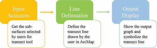
The interactive transect tools were constructed using the Python add-in, which was first introduced by the Environmental Systems Research Institute (ESRI) in 2012 with ArcGIS 10.1 and supported in later versions of ArcGIS Desktop. The developed add-in toolbars interact directly with ArcMap and thus can take full advantage of the strengths of the existing package. The basic inputs of either transect tool are raster dataset layers that can be displayed in ArcMap. The values of the sub-surfaces along the transect line are explored in an associated pop-up graph window. The framework of the add-in is illustrated in . The transect tool is built on the Stack Profile tool (3D Analyst) of ArcGIS, but with more emphasis on visualization and allowing the user to interactively define the transect for exploratory analysis.
Figure 1. The framework of the transect tool
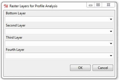
In the input selection module, a window with four drop-down lists for selecting and ordering sub-surface layers as shown in will ‘pop up’ after clicking on the add-in toolbar. The pop-up window is implemented using the combobox widget in the ttk module of Tkinter package. Tkinter is a standard library, which is available with the installation of Python. However, the direct use of Tkinter as an add-in script to create a graphical user interface (GUI) will result in the ArcMap module crashing. To resolve this issue, the script for implementing the dialog window was put in a separate Python script file, which was then saved in the add-in’s Instal directory. The dialog is launched in a sub-process, and then the names of input layers are stored as a list and pass back to the add-in script using the communicate method in the Popen class of the sub-process module. Currently, the maximum number of input layers for the transect tool is four; this limit could be increased but four layers are sufficient to demonstrate the utility of the tool. If there are fewer than four layers, the user would complete the drop-down list from the bottom layer to the top layer, and leave the remaining layers blank. The choices of each drop-down menu are the names of the raster layers that exist within the active data frame of the current map document; thus, the sub-surface datasets need to be added in ArcMap before applying the transect tool.
Figure 2. Pop-up window for selecting the sub-surfaces for a transect tool
The line delineation module then defines the transect line that the user interactively delineates in ArcMap. It is also implemented in the add-in script. The shape property of the tool class, which is used to specify the type of shape that is allowed to be drawn on the map, is defined as Line. The user moves the cursor over the surface and an initial click defines the starting point of a transect. The user then moves to the ending point and double-clicks the mouse button; the corresponding onLine function is incurred and the transect line is drawn as an input Polyline object. Within the onLine function, the obtained transect line is converted into a geodatabase feature class so that it can be symbolized and displayed in ArcMap.
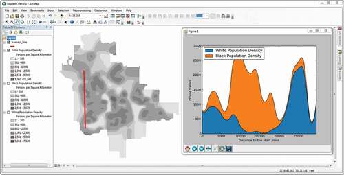
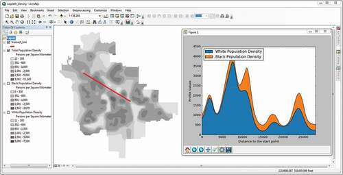
In the output display module, there are two types of output graphs associated with the transect tool, one is the stacked profile and the other is the line graph. shows the output for the stacked profile transect tool with two input sub-surfaces, which are isoplethic surfaces of white population density and black population density in the city of Akron, Ohio for the year 2010. The displayed transect of this tool is symbolized as a thick red line which is implemented using the ‘apply symbology from layer’ tool of the arcpy module with the template layer stored in the add-in’s Instal directory. In the pop-up graph, the blue area corresponds to the value of the white population density, which is specified as the bottom layer in the input selection window. The dark yellow area is the value of the black population along the same transect line and is stacked on the blue area. Thus, the graph can be conceived as the profile of the two surfaces with the white population density surface put beneath the black population density surface. The Tableau 10 colour palette is chosen for the stacked profile graph.
Figure 3. Typical output for the stacked profile transect tool
Values of profile targets and distance along the transect line from the output table of the Stack Profile tool in the arcpy module are used to generate the profile graph. They are converted to a list, respectively, before being used as input by the stackplot method in the pyplot module of the matplotlib library. The matplotlib library has been included with ArcGIS for Desktop since version 10.1; thus, no additional installation is needed. Because the default GUI package for matplotlib is Tkinter, showing the plot with matplotlib directly in an add-in script crashes ArcMap. The work-around is the same as that used to implement the input selection dialog window. The scripts for creating and showing the output graph are put into a separate Python script file, which is then saved in the add-in’s Instal directory and launched in a subprocess. Furthermore, the threading module is used to show the plot with matplotlib to avoid blocking the execution of the codes until the plot is closed.
shows the output for the line graph transect tool with the same input sub-surfaces and transect line as those for . The lines in the line graph transect are not stacked on top of one another but just drawn as separate lines. This approach highlights other information more easily such as which sub-surface has the greatest values over certain subsections of the transect line. The plot method in the pyplot module of the matplotlib library is used to implement the drawing of each line of the graph. The inputs of the plot method, which are values of each profile target and distance along the transect line, are also from the output table of the Stack Profile tool in the arcpy module. To avoid blocking the execution of the codes caused by the ’plot show’ function in the pyplot module and the crashing of ArcMap, the scripts also used threading and were launched in a sub-process as in the case of the stacked profile transect tool.
Figure 4. Typical output for the line graph transect tool
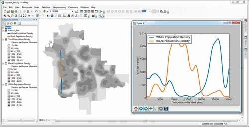
Different from the stacked profile tool, the displayed transect is drawn in a series of coloured segments that also match the colour of the sub-surface with the highest value along that segment in the pop-up line graph. In , the white population has higher density values than the black population along the first and third segments that are coloured as blue, and the reverse happens along the second segment that is coloured as dark yellow. The trend corresponds with the pattern in the adjacent line graph. The same colour palette is chosen for the line graph as for the stacked profile graph.
4. Different surface applications of the transect tools
As discussed in the introduction, there is a multitude of data surfaces regarding both display form (isopleth and choropleth) as well as different types of standardized data (densities, general ratios/rates, and proportions/percentages). In this section, the operations and utility of the transect tools for density surfaces are discussed first, followed by the discussion of other types of standardized data.
4.1. Density surfaces
The isopleth surface is a planimetric, smooth, and continuous representation of geographical volumes that traditionally is based on data previously aggregated into areas (Dent Citation1985; Robinson et al. Citation1995; Slocum et al. Citation2009). It is the form of an isarithmic surface used most often to display density. Because a density surface is based on aggregated data, at each cell the total density could be divided into the sub-variates that comprise it. In this situation, the sub-surfaces contain the density values of these sub-variates, respectively. Because the sub-surfaces are additive, the stacked profile transect tool is the most apparent tool to explore these sub-surfaces.
An exploratory analysis beneath an isopleth density surface using the stacked profile transect tool is illustrated in which both show the isopleth surface rendering of total population density. Each isopleth surface is constructed from Akron 2010 census block group data using Tobler’s (Citation1979) pycnophylactic method with the cell size set to 30 metres by 30 metres. In both figures, the white and black population density sub-surfaces are hidden by the total population density surface. In , an initial transect is drawn from Wallhaven to Kenmore along Hawkins Avenue. This transect line mainly passes through residential neighbourhoods in Akron. In the pop-up stacked profile graph, initially, the white population is in the majority until there is a sharp change and the highest overall density along the transect is encountered as the black population increases and the white population falls to near zero. Eventually, the roles reverse and the white population nears one hundred percent in Kenmore.
Figure 5. The stacked profile transect tool is used to explore the isopleth population density surfaces in Akron city
In , a second transect line is drawn from the northwest to the southeast. The neighbourhoods that the transect line passes through contain various landscapes of the city, including mixed commercial and residential areas. In the pop-up stacked profile graph, the initial neighbourhoods are predominately white which reaches a peak before reaching the Akron downtown. In the low population densities of the downtown, white and black populations are even and as one moves to the southeast, the white population is greater but not as much as before the downtown. Both transect lines in originate in the northeast Wallhaven area but diverge in different directions resulting in different population comparisons along the way. As more transects are defined the user gains increased knowledge of how the different populations locate concerning one another.
More recently, isopleth maps of density surfaces have also been constructed using kernel density estimation (KDE). Instead of data being aggregated into areal units, individual data points are used as input. In a KDE, a smoothly curved, probability density function surface is fitted over each data point using a kernel function and specified bandwidth. These individual surfaces are then aggregated to determine the overall kernel density surface. The volume under the final surface is equal to the sum of all points. KDE has a wide range of both environmental and socio-economic applications within geography and ecology (e.g. Langford and Unwin Citation1994; Guagliardo Citation2004; O’Sullivan and Wong Citation2007; Kenchington et al. Citation2014; Yu, Ai, and Shao Citation2015) and can represent a variety of spatial variables or relationships.
The kernel density example here uses data regarding Bismarck towers derived from information on the www.bismarcktuerme.de website. Two hundred and thirty-five towers were built between 1867 and 1935 across the German Empire. One attribute of each tower is the type of civic organization responsible for fundraising and guiding its construction. They are nationalist organizations, nature/beautification organizations, student organizations, and organizations established to perpetuate the Bismarck cult (Bielefeld and Büllesbach Citation2014). A kernel density sub-surface was created for each using the kernel density estimation tool in ArcToolbox for ArcGIS Desktop 10.7. Default settings were used with the raster extent being set to the borders of Imperial Germany in 1871.
A key difference between viewing landscapes in GIS compared to fieldwork related to cultural geography is that in the GIS perspective the landscape is viewed from above (also obliquely in a three-dimensional rendering) rather than in a profile as an embodied experience. The transect tool provides an example of how one can approach density surfaces from an alternative perspective. The overall kernel density surface indicates the regions within the German Empire where one is more likely to find a Bismarck Tower and the transects in display the undulations in kernel density sub-surfaces representing changes in the likelihood of observing a Bismarck tower constructed by a different type of civic group. These transects are drawn in meaningful ways to observe how the interrelations between the surfaces adjust to changing positions within the German Empire.
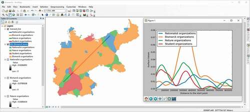
Figure 6. The line graph transect tool is used to explore the kernel density sub-surfaces of Bismarck towers across Imperial Germany
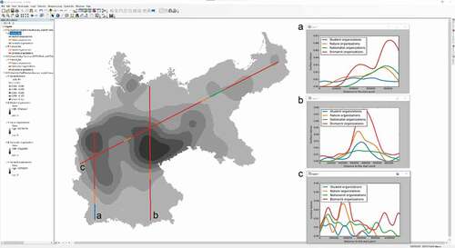
Transect A is drawn as a line along the western reaches of the empire. It roughly follows the course of the Rhine River as it flows from southern Germany to the North Sea. The changes in the profiles can be interpreted through our understanding of the political geography of Wilhelmine Germany. First, it is unsurprising that the south which was predominantly Catholic would have towers that were sponsored by Bismarck or nationalist organizations as Catholicism was a target of Bismarck’s cultural war in the 1870s. As the transect continues north it enters the Prussian Rhineland which coincides with a large uptick in the kernel density values for towers supported by Bismarck organizations and to a lesser extent by nationalist organizations. The values for student organizations stay relatively consistent across the transect.
Transect B moves through Bavaria, the Thuringian states, and through parts of Prussia as well as other smaller political entities. Here, the Bismarck organization sub-surface dominates. However, two noticeable trends occur: student organizations and nature organizations have higher values compared to nationalist organizations, and nationalist organizations do not have as strong of a characteristic peak in values along the transect as the other categories do. Transect C stretches from East Prussia to the Prussian Rhineland. While Bismarck organizations are again the most dominant type of group, nationalist organizations have the second-highest values and even overtake the Bismarck organization sub-surface as the transect moves through areas with larger numbers of ethnic Polish citizens. It is only when the transect passes out of the German provinces that now form part of the country of Poland that values for nature and student organizations increase. By identifying a series of transects in different parts of the empire, the user can receive a clearer understanding of the relationships between these organizations over space.
A choroplethic stepped surface is the simplest and most widely used form to display density based on aggregated data as the area of aggregation is presented directly, although its appropriateness is still debated (e.g. see Langford and Unwin Citation1994). It assumes a uniform density value within each original areal aggregation unit, and abrupt changes occur along the boundaries between adjacent areal units. A choropleth cross-section analogous to the stacked transect tool was used by Szegö (Citation1984) to explore the patterns of surfaces for residential and employment population densities in a hypothetical town. shows a vector-based choropleth map of total population density surface for Akron in 2010 at the block group level. This is the same dataset used in the previous isopleth analysis. The density values range from 118 to 8351 persons per square kilometre over the choropleth surface.
Figure 7. The stacked profile transect tool is used to explore the choropleth population density sub-surfaces in Akron
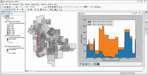
Although the surface density is displayed as a typical choropleth map, the sub-surfaces used as inputs for the stacked profile transect tool are gridded representations of the discrete black and white population density sub-surfaces. To explore the two choropleth sub-surfaces beneath the total population density surface, the same transect used in is again defined from Wallhaven to Kenmore in . In the pop-up graph, the population density pattern along the transect is very similar to that in , however, the profile values change abruptly when the transect crosses block group boundaries to reflect the stepped sub-surfaces, in contrast to the gradual change of profile values resulting from the smooth sub-surfaces in . Furthermore, both the peak values and the variance of white and black population density along the transect are less than those in as expected.
4.2. Non-density surfaces
Non-density surfaces are made from spatially intensive data surfaces in which the denominator is not a geographic area. Non-density surfaces include those based on general rates and balanced data. In a general rate, the numerator usually does not have the same unit as the denominator as in per capita income. For balanced data (Chrisman Citation1998), the numerator and denominator are expressed in the same unit in which the denominator is the whole and the numerator is a subset of the denominator such as a proportion or a percentage. These surfaces however have an interpretation issue because one cannot distinguish between high rate/large denominator areas from high rate/small denominator areas or low rate/large denominator areas from low rate/small denominator areas. This issue is important because it relates to the ‘small number problem’ in which rates based on small denominators are statistically less reliable; so it is important to ascertain in a visual display the location of rates having larger versus smaller denominators.
4.2.1. General rate surfaces
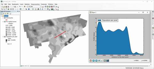
For general rates, the visual equalization issue has been addressed for choropleth maps and isopleth maps. Numerous solutions such as value-by-area (cartograms) (Dorling Citation1996; Gastner and Newman Citation2004) and value-by-alpha maps (Roth, Woodruff, and Johnson Citation2010) have been devised for choropleth maps and value-by-perspective height maps (Lin, Hanink, and Cromley Citation2017) have been developed for isopleth maps. The approach taken here is to use a transact as an aid in examining the range of denominator values using the stacked transect tool. Per capita income rates in Detroit for 1980 are evaluated along the same transect in central Detroit. In 1980 the population density ranges from 0.1 persons per pixel on the right end of the transect to 7.3 persons per pixel on the left end as shown in (The pixel size is 30 metres by 30 metres). A stacked transect graph with only one sub-surface is used to show changes in the denominator (a single line graph could be used as well). On the left side, the population is relatively high but drops precipitously on the right end of the transect suggesting unreliable rate values in that area.
Figure 8. The stacked profile transect tool is used to evaluate the reliability of the isopleth surface of per capita income of Detroit in 1980
4.2.2. Proportion and percentage surfaces
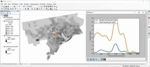
For proportions and percentages, the units are the same so that both the numerator and the denominator can be displayed on the same graph. Percent vacancy rates are displayed in the isopleth map presented in . The pixel size of the isopleth surface is again 30 metres by 30 metres. The density of total houses for 1980 has a similar pattern to that for the total population although there is a pronounced peak in the middle of the transect, which is the same as that defined to evaluate per capita income rates. In 1980, the total house density ranges from 0.07 houses per pixel on the right end of the transect to 4.34 houses per pixel in the middle of the transect. The precipitous drop of house density on the right end of the transect again suggests unreliable percentages in this area.
Figure 9. The line graph transect tool is used to evaluate the reliability of the isopleth surface of vacancy house percentage of Detroit in 1980
4.2.3. Area-class surfaces
In area-class maps, the surface is categorized into different areal units based on some underlying characteristics. The assignment of a class is connected to some maximum value such as rent in the case of land use allocation. In other instances, it is a likelihood. The KDE method discussed in a previous section is often used in nonparametric discriminant analysis (Murphy and Moran Citation1986). In geographic situations, it is used to establish regions where one class is more likely to be found than any of the others. shows the regionalization of organizations that led to the building of Bismarck towers based on the highest KDE value at each location. The transect in this figure runs from the Palatinate near Alsace Lorraine the southeast to Pomerania in the northeast. Along the transect nature organizations are more prominent first, followed next by student organizations, then Bismarck organizations, then nature organizations again, and finally nationalist organizations. However, for much of the transect, the line graph shows there is not much discrimination among the different organizations except in the central regions of Prussia moving along the edges of the Thuringian states. Here, Bismarck organizations dominate. Line graph transects can be used to investigate the surface construction of any area-class map to show more clearly how the classes transition from one to the next, rather than the abrupt change visualized by the map itself.
Figure 10. The line graph transect tool is used to explore the likelihood of each Bismarck tower type in Imperial Germany
5. An empirical test
To test the accuracy and efficiency of using the interactive transect tools to explore sub-surfaces, an empirical test was conducted involving 70 student volunteers (32 female and 38 male) who majored in Geography, Geology, and Atmospheric Science from the School of Earth Sciences at Zhejiang University during the middle of June 2020. The 46 Geography majors had taken GIS-related courses and were proficient in ArcGIS, 12 of the 20 Geology majors were familiar with ArcGIS, and the remaining eight Geology majors and all four Atmospheric Science majors almost had no experience with ArcGIS. The test compared using the transect tools versus visual map interpretations for extracting different types of information regarding the sub-surfaces. We hypothesized that the transect tools would result in faster and more accurate information extraction for thematic and spatial searches than visual map interpretations, especially with the increased number of the sub-surface layers. It was also hypothesized that transect tools could serve as an aid in identifying potential small number problems.
5.1. Test design
The test design here is primarily structured within Roth’s (Citation2013) taxonomy of interaction primitives for interactive cartography. The two transect tools correspond most closely to his ‘attributes-in-space’ operand primitive and the ‘procure’ interaction goal mapping system as these tools would be used to retrieve information directly regarding how the characteristics of geographic phenomena vary over space rather than to predict or prescribe future conditions over time. The transect tools also align with each of his objective primitives of ‘identify’, ‘compare’, ‘rank’, ‘associate’ and ‘delineate’. Three of these five objective primitives, ‘identify’, ‘compare’ and ‘rank’ are incorporated into four tasks involving different types of surfaces. Task One uses the two sub-surfaces from the isopleth surfaces of population densities in Akron; Task Two uses the sub-surfaces from the choropleth surfaces of population densities in Akron; Task Three uses the four sub-surfaces from the Bismarck Tower kernel density surfaces; and, Task Four uses the two sub-surfaces from the isopleth surfaces of vacancy rates in Detroit. Three different study regions are used to reduce any learning effect that a student might gain when continuously using the same study region. The full information regarding each task is given in the questionnaire in Appendix A.
The students were equally divided into two groups of thirty-five students each with a similar profile of gender, major, and GIS experience backgrounds. Two groups were used so that one group did a task one way (using the line graph or stacked profile transect tool) and the other group did the same task the other way (turning layers on and off to examine the maps). This would reduce bias in an individual doing the task both ways in a sequence because some knowledge would be gained doing the task both ways in that sequence. Furthermore, to reduce the bias caused by one group being better at the set of tasks, we had each group alternate its method for doing a task. For the four tasks in the test, one group would do Task One using transects, Task Two examining maps, Task Three using transects, and Task Four examining maps. The other group would do the reverse for each task.
Students in each group first took the following primer independently. The students were initially asked to install the add-in tool following the installation procedures. After the installation, students were instructed on how to perform each task using example data that were different from the test data both using the transect tool and visually examining the maps. Because the transect tools were designed to be used as exploratory tool in DiBiase’s private thinking realm (DiBiase Citation1990), the testing was conducted using ArcMap’s Data View in ArcGIS 10.7. For the visual map interpretation approach, it was decided to place each data layer in the same ArcMap data frame so that all layers were geo-registered to one another. The needed information was obtained by turning on and off the layers as necessary. The alternative would be to place each layer in a different data frame so that each data layer could be viewed simultaneously; however, this would reduce the size of each layer display. In addition, Tasks One and Two have two sub-tasks that correspond to what Andrienko, Andrienko, and Gatalsky (Citation2003) term a ‘when + where → what’ search and a ‘when + what →where’ search, respectively. A ‘when + where → what’ search describes for a given time and location the thematic values found there whereas a ‘when + what → where’ search describes for a given time and theme, the relationships between locations. Turning layers on and off to make comparisons is only needed for the ‘when + where → what’ searches as all of the data necessary to perform a ‘when + what → where’ search are contained in a single layer.
Finally, all isarithmic and choropleth surfaces were classified and grey shaded. The legend for each data layer was given in the ArcMap’s Table of Contents. After the primer was completed, a questionnaire was given out to each student to begin the testing. Students were asked to answer as quickly as possible and to use a count-up timer to record the time it took to complete each task.
5.2. Test results
As noted above, the first three questions of Task One ask students to perform a ‘when + where → what’ search by rank ordering the black and white population density sub-surfaces at points A, B, and C, respectively, while the fourth and fifth questions ask students to perform a ‘when + what → where’ search by rank-ordering the values at points A, B, and C for black and white population density sub-surfaces, respectively (see Appendix A). The map document file given out to each student contains three classified isopleth surface layers with total population density on top () and three point layers. To complete this task, students in Group A were asked to use the line graph transect tool, while students in Group B only used visual map interpretations. The results are shown in . 22 members of Group A were able to answer all 5 questions correctly whereas only 9 members of Group B answered all 5 questions correctly. Also, all members of Group A answered at least 3 of the 5 questions correctly while 11 members of Group B answered only 1 or 2 correctly. Overall, a higher number of Group A members answered each question correctly than did Group B members (see ). Concerning individual questions, an odds ratio test showed that there is a significant difference in outcomes for Questions One, Three, Four, and Five at 0.05 level based on the Fisher’s Exact Probability (see ).
Table 1. The number of individuals correctly answering each question
The next task is similar to the first task except that students are asked to identify the black and white population density sub-surfaces for three polygons using the map document file with three classified choropleth surface layers (see ). Students in Group A used visual map interpretations, while students in Group B used the stacked profile transect tool to complete this task. Only 3 members of Group A were able to answer all 5 questions correctly whereas 15 members of Group B answered all 5 questions correctly. Also, all members of Group B answered at least one question correctly while 4 members of Group A answered none correctly. Overall, a lower number of Group A members answered each question correctly than did Group B members except for Question Three (see ). The odds ratio test shows that there is a significant difference in outcomes for all questions except Question Three at 0.05 level based on Fisher’s Exact Probability (see ). The overall accuracy of this task is lower than that of Task One; one reason is that the density values of the three polygon locations are closer to each other. Another possible reason is the smooth isopleth surface better facilitates value inference based on its neighbours than a stepped choropleth surface does. For the difference in the results for the two transect tools, Cleveland and McGill (Citation1984) noted that detecting differences in magnitude bars not aligned (as in the stacked profile tool) was more difficult than detecting differences in graphs that are aligned (as in the line graph tool).
The third task involves a comparison of four kernel density surfaces at three different point locations. The map document file used for this task contains five classified kernel density surface layers with total Bismarck towers on top (). Students in Group A used the line graph transect tool, while students in Group B turned the layers on and off to examine the maps to complete the task. Group A had 34 students that did all of the sub-tasks correctly while Group B had only 22 students that did all of the sub-tasks correctly. Overall, a higher number of Group A students answered each question correctly than did Group B students (see ). However, only outcomes for the first two questions are significant at the 0.05 level based on Fisher’s Exact Probability test for the odds ratio (see ). Again in this task, the position-based line graph is better than visualizing and comparing four different isarithmic surfaces for conveying quantitative values.
The final task is to classify vacancy house percentage values at four different points into high percentage/large denominator, high percentage/small denominator, low percentage/large denominator, and low percentage/small denominator value. The map document used for this task included the three classified isopleth surface layers with the vacancy percentage on top (). Students in Group A used visual map interpretations, while students in Group B used the line graph transect tool to complete this task. Both groups had 21 students that answered all the questions correctly. The advantage of the line graph transect tool over visual map interpretations is not as obvious as for the previous tasks. Only the outcome for the first question is significant at the 0.05 level based on Fisher’s Exact Probability test for the odds ratio (see ). One reason is that fewer layers are involved and the task itself is more complicated in identifying the different combinations of numerator and denominator values.
Because all students were asked to answer the questionnaire as quickly as possible and to use a count-up timer to record the time it took to complete each task, the time used to complete each task for both groups was evaluated next (). Overall, the average times are not significantly different at the 0.05 level. The transect tool uses significantly less time to complete Task Three than visual map interpretations do, which indicates that the efficiency of the transect tool over visual map interpretations is more obvious when more layers are involved in the analysis. For tasks with two layers, it is more difficult to ascertain which method is more time-efficient. One probable reason that the use of the transect tool by Group A took more than the average time to complete Task One was that users were not as familiar with the tool at first as they were with map reading. Only Task Three has a significant difference in completion times because it involved the largest number of layers (see ). It seems that time efficiency is related then more to the number of data layers involved in the analysis and the transect tool could summarize multiple layers in less time.
Table 2. The average and variance of time used to complete each task for each group
6. Conclusions
One major component of exploratory data analysis has been the development of visualization tools for data investigation and summarization. For spatial data, the thematic surface has been an essential tool for exploratory analysis (Haining, Wise, and Ma Citation1998). It is univariate by nature, and thus cannot simultaneously explore patterns and relationships of initial data layers used to create the standardized data depicted by the final mapped surface. In this study, this traditional univariate tool was extended to a multivariate setting by examining the layers of data that lie beneath the surface in cross-sectional graphs associated with an interactively defined transect line. The stacked profile and line graph tools were developed for different representations of the cross-sections. The stacked profile represents the data layers as strata piled vertically on top of one another, and the additive sub-surfaces associated with this tool usually denote the various constituents of the thematic surface being mapped. Between the two tools, an empirical test showed that comparing values of individual sub-surfaces as stacked graphs was not as effective as the line graph for extracting information. The stacked graph uses non-aligned magnitudes whereas the line graph is simply a series of value lines superimposed over one another. However, the value lines are aligned to the same axis which makes it easier for users to compare sub-surface magnitudes over space.
The empirical test also demonstrated that the time effectiveness of transect tools in comparison to visual map comparisons improved as the number of data layer increases. Other factors, such as the scale of the examined region, that may boost the performances of the transect tools need further investigation. Overall, using the transect tools enable the user to be more accurate in assessing the rank order of data values. In the future, tools using other types of graphs will be developed and compared for the cross-section representations, such as the space-efficient horizon graph, which was originally developed for visualizing and comparing multiple time-series data (Heer, Kong, and Agrawala Citation2009).
Effective and efficient presentation of multivariate spatial data is an instance of a larger problem in geovisualization research. From a cartographic point of view, the problem could be partly solved by multivariate colour mapping techniques (for example, see Dunn Citation1989; Schumann and Müller Citation2000, pp. 163–165). Compared with position, colour hue ranks poorly for conveying quantitative information based on Bertin’s (Citation1967) theory of visual variables. Thus the graphical display of a cross-section, which encodes space as the distance from the start point of the transect line along the horizontal axis, and encodes spatial varying values along the vertical axis, facilitates quantitative perception of multivariate spatial data. The pilot study in this research shows that the transect tool could potentially enable map users to explore the sub-layers that give rise to and are covered by the spatial pattern being mapped in different forms, such as choropleth and isarithmic maps, more accurately and efficiently. Although the emphasis in this test design is on only three of Roth’s (Citation2013) objective primitives, a different empirical design could examine the ability of transect tools to evaluate delineations in area class map categories produced by kernel density surfaces.
Supplemental Material
Download MS Word (16.5 KB)Disclosure statement
No potential conflict of interest was reported by the author(s).
Supplementary material
Supplemental data for this article can be accessed here.
References
- Albrecht, J. 1997. “Universal Analytical GIS Operations: A Task-oriented Systematization of Data Structure-independent GIS Functionality.” In Geographic Information Research: Transatlantic Perspectives, edited by M. Craglia and H. Onsrud, 577–591. London, UK: Taylor & Francis.
- Andrienko, G., N. Andrienko, P. Jankowski, D. Keim, M. J. Kraak, A. MacEachren, and S. Wrobel. 2007. “Geovisual Analytics for Spatial Decision Support: Setting the Research Agenda.” International Journal of Geographical Information Science 21 (8): 839–857. doi:https://doi.org/10.1080/13658810701349011.
- Andrienko, N., G. Andrienko, and P. Gatalsky. 2003. “Exploratory Spatio-temporal Visualization: An Analytical Review.” Journal of Visual Languages and Computing & Computing 14: 503–541. doi:https://doi.org/10.1016/S1045-926X(03)00046-6.
- Bertin, J. 1967. Sémiologie Graphique. Paris, France: Gauthier-Villars.
- Bielefeld, J., and A. Büllesbach. 2014. Bismarcktürme: Architektur, Geschichte, Landschaftserlebnis. Munich, Germany: Morisel Verlag.
- Blackwood, C. B., K. A. Smemo, M. W. Kershner, L. M. Feinstein, and O. J. Valverde-Barrantes. 2013. “Decay of Ecosystem Differences and Decoupling of Tree Community-soil Environment Relationships at Ecotones.” Ecological Monographs 83 (3): 403–417. doi:https://doi.org/10.1890/12-1513.1.
- Buckland, S. T., D. R. Anderson, K. P. Burnham, J. L. Laake, D. L. Borchers, and L. Thomas. 2001. Introduction to Distance Sampling: Estimating Abundance of Biological Populations. Oxford, UK: Oxford University Press.
- Burnham, K. P., D. R. Anderson, and J. L. Laake. 1980. Estimation of Density from Line Transect Sampling of Biological Populations. Wildlife monographs 72: 3–202
- Chen, J., R. E. Roth, A. T. Naito, E. J. Lengerich, and A. M. MacEachren. 2008. “Geovisual Analytics to Enhance Spatial Scan Statistic Interpretation : An Analysis of U.S. Cervical Cancer Mortality.” International Journal of Health Geographics 7: 57. doi:https://doi.org/10.1186/1476-072X-7-57.
- Chrisman, N. R. 1998. “Rethinking Levels of Measurement for Cartography.” Cartography and Geographic Information Science 25 (4): 231–242. doi:https://doi.org/10.1559/152304098782383043.
- Cleveland, W. S., and R. McGill. 1984. “Graphical Perception: Theory, Experimentation, and Application to the Development of Graphical Methods.” Journal of the American Statistical Association 79 (387): 531–554. doi:https://doi.org/10.1080/01621459.1984.10478080.
- Demšar, U., A. S. Fotheringham, and M. Charlton. 2008a. “Exploring the Spatio-temporal Dynamics of Geographical Processes with Geographically Weighted Regression and Geovisual Analytics.” Information Visualization 7 (3–4): 181–197. doi:https://doi.org/10.1057/PALGRAVE.IVS.9500187.
- Demšar, U., A. S. Fotheringham, and M. Charlton. 2008b. “Combining Geovisual Analytics with Spatial Statistics: The Example of Geographically Weighted Regression.” The Cartographic Journal 45 (3): 182–192. doi:https://doi.org/10.1179/000870408X311378.
- Dent, B. D. 1985. Principles of Thematic Map Design. Reading, Massachusetts: Addison-Wesley.
- DiBiase, D. 1990. “Visualization in the Earth Sciences.” Bulletin of the College of Earth and Mineral Sciences, Penn State University 59 (2): 13–18.
- Dorling, D. 1996. “Area Cartograms: Their Use and Creation.” Concepts and Techniques in Modern Geography Series No. 59. Institute of British Geographers.
- Dunn, R. 1989. “A Dynamic Approach to Two-Variable Color Mapping.” The American Statistician 43 (4): 245–252.
- Foley, P., and U. Demšar. 2013. “Using Geovisual Analytics to Compare the Performance of Geographically Weighted Discriminant Analysis versus Its Global Counterpart, Linear Discriminant Analysis.” International Journal of Geographical Information Science 27 (4): 633–661. doi:https://doi.org/10.1080/13658816.2012.722638.
- Gastner, M. T., and M. E. J. Newman. 2004. “From the Cover: Diffusion-based Method for Producing Density-equalizing Maps.” Proceedings of the National Academy of Sciences of the United States of America 101 (20): 7499–7504. doi:https://doi.org/10.1073/pnas.0400280101.
- Guagliardo, M. 2004. “Spatial Accessibility of Primary Care: Concepts, Methods and Challenges.” International Journal of Health Geographics 3 (3): 1–13. doi:https://doi.org/10.1186/1476-072X-3-3.
- Haining, R., S. Wise, and J. Ma. 1998. “Exploratory Spatial Data Analysis in a Geographic Information System Environment.” Journal of the Royal Statistical Society Series D: The Statistician 47 (3): 457–469.
- Heer, J., N. Kong, and M. Agrawala. 2009. “Sizing the Horizon: The Effects of Chart Size and Layering on the Graphical Perception of Time Series Visualization.” Proceedings of the ACM CHI 2009 Conference on Human Factors in Computing Systems, Reading, Massachusetts, 1303–1312.
- Kenchington, E., F. J. Murillo, C. Lirette, M. Sacau, M. Koen-Alonso, A. Kenny, N. Ollerhead, V. Wareham, and L. Beazley. 2014. “Kernel Density Surface Modelling as a Means to Identify Significant Concentrations of Vulnerable Marine Ecosystem Indicators.” PLoS ONE 9 (10): e109365. doi:https://doi.org/10.1371/journal.pone.0109365.
- Kraak, M. 2008. “From Geovisualisation Toward Geovisual Analytics.” The Cartographic Journal 45 (3): 163–164.
- Langford, M., and D. J. Unwin. 1994. “Generating and Mapping Population Density Surfaces within a Geographical Information System.” The Cartographic Journal 31 (1): 21–26. doi:https://doi.org/10.1179/caj.1994.31.1.21.
- Lin, J., D. M. Hanink, and R. G. Cromley. 2017. “A Cartographic Modeling Approach to Isopleth Mapping.” International Journal of Geographical Information Science 31 (5): 849–866. doi:https://doi.org/10.1080/13658816.2016.1207776.
- Murphy, B. J., and M. A. Moran. 1986. “Parametric and Kernel Density.” Computers & Mathematics with Applications 12A (2): 197–207. doi:https://doi.org/10.1016/0898-1221(86)90073-8.
- O’Sullivan, D., and D. Wong. 2007. “A Surface-based Approach to Measuring Spatial Segregation.” Geographical Analysis 39 (1): 147–168. doi:https://doi.org/10.1111/j.1538-4632.2007.00699.x.
- Robinson, A. H., and B. B. Petchenik. 1975. “The Map as a Communication System.” The Cartographic Journal 12 (1): 7–15. doi:https://doi.org/10.1179/caj.1975.12.1.7.
- Robinson, A. H., R. D. Sale, J. L. Morrison, and P. C. Muehrcke. 1995. Elements of Cartography. 6th ed. New York: Wiley.
- Roth, R. E. 2013. “An Empirically-derived Taxonomy of Interaction Primitives for Interactive Cartography and Geovisualization.” IEEE Transaction on Visualization and Computer Graphics 19 (12): 2356–2365. doi:https://doi.org/10.1109/TVCG.2013.130.
- Roth, R. E., A. W. Woodruff, and Z. F. Johnson. 2010. “Value-by-alpha Maps: An Alternative Technique to the Cartogram.” The Cartographic Journal 47 (2): 130–140. doi:https://doi.org/10.1179/000870409X12488753453372.
- Schiewe, J. 2016. “Preserving Attribute Value Differences of Neighboring Regions in Classified Choropleth Maps.” International Journal of Cartography 2 (1): 6–19. doi:https://doi.org/10.1080/23729333.2016.1184555.
- Schumann, H., and W. Müller. 2000. Visualisierung. Heidelberg, Germany: Springer.
- Slocum, T. A., R. B. McMaster, F. C. Kessler, and H. H. Howard. 2009. Thematic Cartography and Geovisualization. 3rd ed. Upper Saddle River, New Jersey: Prentice-Hall.
- Szegö, J. 1984. Human Cartography: Mapping the World of Man. Stockholm, Sweden: Svensk Byggtjänst.
- Tobler, W. R. 2000. “The Development of Analytical Cartography: A Personal Note.” Cartography and Geographic Information Science 27 (3): 189–194. doi:https://doi.org/10.1559/152304000783547867.
- Tobler, W.R. 1979. Smooth Pycnophylactic Interpolation for Geographical Regions. Journal of the American Statistical Association, 74(367), 519–530. https://doi.org/10.1080/01621459.1979.10481647
- Yu, W., T. Ai, and S. Shao. 2015. “The Analysis and Delimitation of Central Business District Using Network Kernel Density Estimation.” Journal of Transport Geography 45: 32–47. doi:https://doi.org/10.1016/j.jtrangeo.2015.04.008.