
 ?Mathematical formulae have been encoded as MathML and are displayed in this HTML version using MathJax in order to improve their display. Uncheck the box to turn MathJax off. This feature requires Javascript. Click on a formula to zoom.
ABSTRACT
Information diffusion on social media during disasters is an important indicator of community resilience. As a common natural hazard in the U.S., winter storms often cause adverse socio-economic impacts on human society. Understanding people’s perception and behaviours during winter storms is important to mitigate negative impacts and promote community resilience. This study applies text mining and spatial analysis methods on Twitter data during Winter Storm Diego on 2018 December. Different from previous studies focusing on original tweets, this study utilized retweets to model information diffusion in the contiguous United States and analysed the geographic distribution of information flows in various topics. The diffusion extent and direction of the storm-related retweets were compared among different topics. Kernel density maps and standard deviational ellipse were applied to model the spatial distribution of the retweets in different topics. The result shows that people outside of the affected areas expressed more negative sentiment towards the storm than people in the affected areas. Also, distance decay of retweet density has been found and the decay rate differs in different topics. These findings of the analyses will provide support for disaster relief, information communication and broadcasting through social media platforms.
1. Introduction
Nowadays, social media has become a platform where numerous users publish and exchange information at any time and in any place. On social media, every user acts as an intelligent sensor that collects and shares information about their local environment (Goodchild, Citation2007a, Citation2007b) . The huge amount of real-time information crowdsourced in social media can be used to study individuals’ status, opinions, and behaviours. With the increasing popularity of GPS-enabled mobile devices, messages on social media can be associated with geographical locations. In emergency conditions, people are turning to social media to obtain the latest information and to share opinions in their social networks. Social media not only opens another channel for broadcasting but also allows for two-way communication between emergency managers and the public. The utility of social media for hazard response has two fundamental functions: (a) as a tool to monitor emerging crises and events as transmitted by users; (b) as an effective means of communicating emergency information to a broad audience (Goodchild, Citation2007a).
In recent years, the big data collected from social media platforms have been utilized to support disaster management in various ways. Social media data contributed by volunteer users provide first-hand information about disaster situations in real-time and real places (Kent and Capello Citation2013; Li et al. Citation2018). Spatio-temporal distributions of disaster-related social media data can be used as proxies to evaluate community resilience and social disparities (Zou et al. Citation2018, Citation2019). Additionally, government agencies and emergency response organizations use social media to broadcast official announcements and situational updates to individuals and communities in affected areas (J. Kim and Hastak Citation2018). To improve the efficiency of disaster information dissemination, studies have been conducted to examine the effects of various social network structures on user behaviours in disasters (Jiang, Li, and Cutter Citation2019; J. Kim and Hastak Citation2018). Empirical evidence shows that disaster information disseminated in various types of media can influence people’s perception of disaster risk (Västfjäll et al. Citation2008; Wahlberg and Sjoberg Citation2000), attitude towards climate change (Lowe et al. Citation2006), and their knowledge and intentions of coping with potential disasters and the long-term climate change (Houston et al. Citation2015). Thus, effective communication of disaster information prior to disasters can also increase the likelihood of individuals engaging in disaster preparedness activities (Y.-C. Kim and Kang Citation2010) and create coordination and social connections to improve community resilience (Alexander Citation2014).
Given the strong ability for information dissemination, social media is considered as an effective tool to build community resilience through effective communication of disaster information (Dufty Citation2012). As the primary means of information diffusion in Twitter, retweet function allows an original tweet to spread extensively across user networks, creating bi-directional information flows between emergency manager to individual citizens. To effectively apply social media platforms for disaster management, it is critical to answer (a) what are the prevailing topics on social media under a disastrous condition; (b) which topic/topics spread more extensively over the geographic space; (c) what is the spatial diffusion pattern (i.e. directions of information flows) of the disaster-related information. Answers to these questions would require interdisciplinary efforts that integrate geography and information science.
As an attempt to answer these questions, this article presents an exploratory analysis of the information diffusion pattern of Twitter messages (retweets) in Winter Storm Diego, which hit the Southeast United States between 7 December 2018 and 10 December 2018. This storm was one of the most popular topics on Twitter during the impact period. In addition to the affected areas, storm-related tweets also drew extensive attention in areas that are not directly affected by the disaster. This study applied natural language processing (NLP) to extract latent topics in the storm-related tweets and used spatial analysis methods to investigate the spatial diffusion patterns of topics in this storm. The results can improve the understanding of information diffusion on social media during natural hazards. The findings of the analyses can provide support for disaster relief, information communication and broadcasting through social media platforms.
2. Study Area and Data Collection
2.1 Study Area
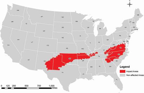
This study focuses on Winter Storm Diego in the 2018–2019 winter. Diego dumped heavy snow and damaging ice, and resulted in extensive travel delay, power outage, and property damage across the southeast region of the United States (). Diego was formed on 5 December and dissipated on 10 December. shows the affected regions where winter weather watches or winter weather warnings were issued by the National Weather Services. In this storm, Charlotte (North Carolina) received the heaviest snowfall since 1997 from Winter Storm Diego. Lubbock (Texas) also left one of the snowiest calendar days on its record. To avoid change blindness and improve the visualization (Fish, Goldsberry, and Battersby Citation2011), the impact areas of Winter Storm Diego were highlighted in all following maps (, , & ).
Figure 1. The impact areas and non-affected areas in Winter Storm Diego. The impact areas (red) are places where Winter Storm watches and/or alarms were issued.
2.2 Data collection
Tweets containing the keywords related to the storm were collected using Python and the standard Twitter streaming API (Twitter Inc. Citation2019). Using the keywords including ‘winter’, ‘storm’, ‘snow’, ‘freezing rain’, ‘ice’, and ‘frozen’, more than 1 million tweets were collected from 6 December to 12 December. Tweets collected by the streaming API represent a random sample of tweets generated in real-time. The collected data are in JavaScript Object Notation (JSON) format, and were later parsed into records with attributes, such as the user ID, text message, counts of favourite, post time, location, and Twitter status. However, based on the Twitter streaming logical rules (Twitter Inc. Citation2019), streaming with multiple keywords is a union query that collects tweets containing any one of the keywords. Due to the ambiguous semantics of the keywords, many of the collected tweets were irrelevant to the storm (e.g. tweets containing ‘ice-cream’, ‘frozen yogurt’). To eliminate the irrelevant tweets, an additional screening process was conducted to select tweets that contain words ‘Diego’ (excluding San Diego), ‘winter storm’, ‘winterstorm’, ‘snowstorm’, ‘snow storm’, ‘snowmageddon’. At this step, 47,604 tweets were kept after the screening.
3. Analysis
The traditional methods to identify information diffusion patterns are through social network and hashtags (Huang and Wong Citation2016; Jiang, Li, and Cutter Citation2019; Kent and Capello Citation2013). User networks (e.g. followers and friends) represent how users are connected in the social media, but cannot fully express information diffusion pattern between users. Similarly, hashtags are used as keywords to associate tweets to various topics, but cannot convey complete messages of the tweets. Tweets quoting the same hashtags may be generated by unrelated users and express very different meanings. Also, hashtags are often used in established communities for relatively mature topics. In a rapidly emerging event such as a winter storm, new hashtags are only known by limited Twitter users, and tracing the hashtag can limit the capture of diffusion process. In other words, tracing hashtags can only capture a partial (perhaps biased) sample of information flows. In our analysis, tweets with hashtags only occupies less than 40% in all the 47,604 selected tweets. Unlike tracing hashtags, tracing retweets can capture full messages of tweets and link the information flows among users. Therefore, this analysis utilizes retweets to track information diffusion in this storm.
3.1 Identifying Retweets
Each tweet has three possible statuses: origin, retweet, and quote. Retweets are reposted or forwarded messages of original tweets (origin), while quoted tweets (quote) include the original tweets and some new comments. In this study, quoted tweets are considered as a type of retweets. Different from original tweets, retweets never carry geotags. Quoted tweets and retweets store the text content of the original tweet in the ‘text’ field embedded under the ‘retweet_status’ attribute. Thus, quoted tweets and retweets can be linked to the original tweets by matching the text contents of original tweets. After preprocessing, we found that some tweets with an origin status are actually copied from other users. In Twitter, many users and robots copy popular tweets and repost as their original tweets to increase followers and popularity (Edwards et al. Citation2014). In the collected data, 1.78% of original tweets are identified as copied tweets (372 copied tweets out of 20,928 screened original tweets). Such copied tweets were detected by comparing the posting times. Among original tweets with the identical text messages, the one with the earliest posting time was identified as the real original tweets. In this study, copied original tweets were also considered as retweets since they also facilitate the spread of the original tweets. Retweets without identifiable original tweets within the streaming time frame were excluded. After labelling the retweets and original tweets, the number of retweets for each original tweet is counted using Equation 1.
Next, based on the retweet count, the tweets with more than 10 retweets were classified into the popular group while the tweets with 1–10 retweets were classified into the unpopular group. Word frequencies were generated to compare the textual contents between the two groups. These analyses aim to compare the contents (topics) of the popular tweets that have been widely spread with the other tweets.
3.2 Natural Language Processing (NLP)
Three types of NLP tools were utilized for text mining. First, to recognize informative words from the tweet texts, the Python package spaCy and NLTK were used (Isaak and Michael Citation2016; Honnibal and Montani Citation2017; Paramkusham Citation2017). Owing to spaCy’s strong ability in syntactic parsing, disorganized and lengthy texts in tweets were tokenized and lemmatized to informative keywords. Second, Gensim, which is a Python package for LDA (Řehůřek and Sojka Citation2011), was used for classifying tweets into different topics. LDA is one of the most popular unsupervised soft-clustering methods and has been frequently applied in topic modelling (Blei, Ng, and Jordan Citation2003; Resch, Usländer, and Havas Citation2018). As shown in the previous studies, LDA can detect topics covering different aspects in a crisis (Imran et al. Citation2015; Kireyev, Palen, and Anderson Citation2009). Gensim trains an LDA model that categorizes texts into different topics. The output of Gensim includes the percentage contribution of each tweet to the topic, which represents the importance the topic within that tweet. Third, the lexicon-based Python package VADER (Valence Aware Dictionary for sEntiment Reasoning) was used for sentiment analysis, which can help understand public opinions and perception towards the storm-related information (Caragea et al. Citation2014; Zou et al. Citation2018).
3.2.1 Topic Modelling
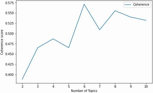
A Python program was developed to clean the tweet contents by removing stop words, newline characters, single quotes, punctuations, numbers, and extra white spaces. Using spaCy’s English multi-task CNN trained on OntoNotes (Honnibal and Montani Citation2017), the cleaned tweets were then tokenized and lemmatized to words with clear denotation. Word dictionary, term-document frequency, and the corpus of tweets were generated afterwards and fed into the LDA training model in the following step. Next, using Gensim, the popular tweets were categorized into different topics according to the topic coherence of their contents. Topic coherence measures the semantic similarity among the words in the topic (Aletras and Stevenson Citation2013). By comparing the coherence of each model under different numbers of topics (), the optimal number of topics with the best performance (i.e. highest coherence) was selected. At the optimal condition, popular tweets were categorized into six topics. Principal keywords of each topics are listed (). Observing salient components in each topic, topics were then combined into four major topics. Results of the topic modelling can be found in Section 4.2.
Table 1. Tweet classification in six topics (topic principal components are keywords that accounted for a large proportion of the variance in each topic)
3.2.2 Sentiment Analysis
Using the Python package NLTK (Paramkusham Citation2017), word stemming was conducted to reduce inflections of words to their root forms. Then, the textual content in a tweet was tokenized and assigned a sentiment score ranging from −1 (most negative) to 1 (most positive) through the VADER package. The sentiment score of each original tweet was attached to its retweets for further analysis. The average sentiment per topic is calculated using EquationEq 2Eq 2
Eq 2 :
where i is the iterator in topics, j is the iterator in tweets, is the number of tweets in the ith topic, is the percentage contribution of the ith topic in the jth tweet to all other topics, which was calculated using Gensim.
3.3 Geocoding
Geographic locations (user locations) of the original tweets and retweets were identified to analyse the direction of information diffusion. Since the retweets do not have any accurate geographic information, such as geotags, we used locations in user profiles as the origins and destinations of retweets. The Google Geocoding API was applied to convert textual descriptions of user locations into geographic coordinates (Google, Inc. Citation2020). To boost the speed of the geocoding and reduce the cost for the Google Geocoding API usage, the user locations were collapsed into a list of unique locations by removing duplicated locations. By doing so, the size of this unique list of user locations shrinks to 27.79% of the total user locations. The following types of user locations that do not represent a meaningful geographic location were removed:
Blank results from Google Geocoding API, such as ‘Justin Bieber’s Heart’
Manually detected meaningless or ambiguous locations, such as ‘Earth’, ‘Studio 1A’, ‘Unknown’
Locations outside the Contiguous United States (CONUS)
Locations referring to the whole country, such as ‘USA’ or ‘United States’ which do not provide meaningful geographic information within the CONUS
Finally, 5,928 tweets (31.5% of the total 18,807 popular tweets) with a meaningful location were geocoded into geographic coordinates using the Google Geocoding API. The geocoded locations below the state level (e.g. county or street level) were applied for visualizing information diffusion and the sentiment distribution (Section 4.4 to 4.7). Linking the locations of an original tweet and its retweet can create a path of information diffusion. Depending on whether the locations are within or outside the storm impact areas, the retweets can be classified into the following diffusion directions:
In-In: both the original tweet and the retweet are within the impact areas.
In-Out: the original tweet is in the impact areas and retweet is outside the impact areas.
Out-In: the original tweet is outside the impact areas and retweet is within the impact areas.
Out-Out: both the original tweet and the retweet are outside the impact areas.
3.4 Spatial Analyses
The following steps were applied to analyse the spatial pattern of information diffusion through retweets. First, ratios of retweets in the four diffusion directions were compared among the four topics. A high ratio of retweets in the ‘In-In’ diffusion direction implies that the topics only circulate within the impact areas. A high ratio of the ‘In-Out’ direction means that the tweets are originally posted in the impact areas and are retweeted by people from the outside. The ‘Out-In’ direction represents topics that are generated outside of the impact areas but are retweeted in the impact areas. The ‘Out-Out’ direction includes topics that are generated and circulating outside of the impact areas. The comparison of these diffusion directions informs the spatial pattern of storm-related information diffusion among Twitter users.
Second, standard deviational ellipse (SDE) was applied on retweets with valid geographic locations to measure the spatial dispersion of the four storm-related topics. The size and orientation of an ellipse indicate the extent of spatial dispersion and orientation of the topics, respectively. A larger ellipse indicates the retweets spread more extensively over space. The orientation of the ellipse indicates the direction in which the retweets may spread further. Four ellipses were created for the four topics to visualize and compare their spatial diffusion patterns.
Third, the average diffusion distances of the four topics were calculated to analyse spatial extent of information diffusion. The diffusion distance is the average geodesic distance between original tweets and their retweets in a topic, which indicates how far the topic can be spread in space. To understand the distance decay patterns of retweets among different topics, proportions of retweets in four topics to all retweets were calculated and compared at each distance.
Fourth, choropleth maps of county-level sentiment were created for the CONUS to understand the spatial distribution of sentiment among different topics. Mean sentiment was calculated among counties for each topic at four directions. This analysis attempts to reveal public awareness under the threat of the storm and give an insight of spatial variation of public perception.
Finally, noting that public opinions in the non-affected areas show a unique distribution pattern from those in the impacted areas among four topics, kernel density maps were utilized to analyse the spatial distribution of retweets located outside the impact areas. This analysis aims to explain the spatial variation of public perceptions and identify spatial clusters where people pay attention to a storm that did not directly affect them. Higher attention to the storm event may indicate higher awareness of and preparedness for disaster risk. To understand how outside people respond to storm-related information, eight kernel density maps were created and compared for all retweets outside the impact areas, which include retweets in an In-Out or Out-Out diffusion direction.
4. Results
4.1 Word Frequency
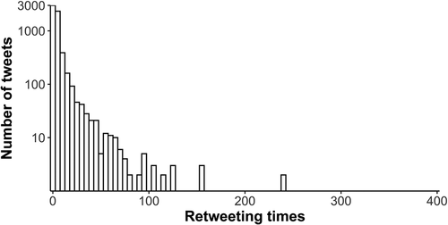
The number of original tweets with different retweet counts is shown in . In general, the number of tweets decreases as the retweet count increases. Among all 47,604 tweets, 25,432 are retweets, occupying 53.4% of the total tweets. A total of 10,443 (21.9% of the total 47,604 tweets) tweets do not have any retweets during our streamed period. Only 27 original tweets were retweeted over 100 times. Among the 37,161 tweets with at least one retweet, the number of tweets with over 10 retweets is 18,807 (50.6%), while the number of tweets with less than 10 retweets is 18,354 (49.4%). So, we used the threshold of 10 retweets to split the 37,161 tweets into the popular group (>10 retweets) and unpopular group (1–10 retweets). The popular group originates from the 509 original tweets while the unpopular group originates from 8,891 original tweets. In addition, 684 retweets cannot find their origins within the streamed period and were excluded.
Figure 2. Frequencies of original tweets with different numbers of retweets (log scale in y-axis).
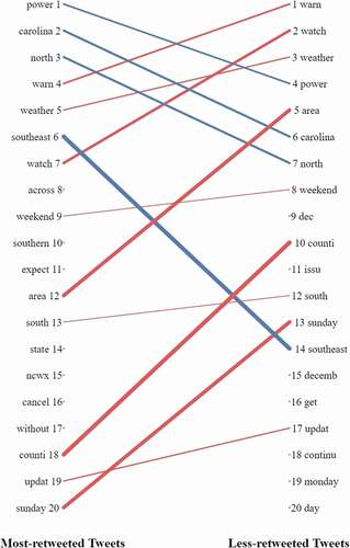
The top 20 most frequent words in the popular group (retweet count more than 10) and the unpopular group (retweet count between 1 and 10) were compared (). Both groups share some common frequent words. Many of the words are related to the storm impacts (‘power’, ‘warn’, ‘watch’), time (e.g. ‘sunday, ‘december’) and location (e.g. ‘southeast’), indicating that the public are interested in situational information of the storm. The differences between the two rankings imply latent topics that make tweets more popular (i.e. having more retweets). For instance, ‘power’ is the most frequent words in the popular tweet group, as well as words indicating locational information, such as ‘carolina’ and ‘north’. Additionally, words about adverse impacts such as ‘power’ and ‘cancel’ are ranked high in popular group.
Figure 3. The top 20 most frequent words in the popular group (left) and the unpopular group (right). The same words in the two groups are linked by lines. The line width indicates the ranking difference in the two groups, and the line colours indicate the increase and decrease in the ranking positions in the two groups.
4.2 Topics in Popular Retweets
To further uncover the latent topics of the popular tweets, the study used LDA models with different topic numbers in the Python package Gensim. The coherence score reaches the peak (0.5713) when tweets are classified in 6 topics (). The topic classification results are listed ().
Figure 4. LDA model training result: the upper limit of topics was set to 10 to ensure the result to be interpretable; 509 unique popular original tweets were processed in these models.
Next, topics in the same theme were further combined. Referring to the tweet classification in (Lachlan et al. Citation2016), topics containing common principal components (highlighted in bold and underscore) in were combined into 4 major topics in . The common principal components in Topic 1 are related to impacts on work, such as ‘work’ and ‘register’, thus we categorized Topic 1 as ‘Impact on work’. Topic 2 has principal components related to forecasts and was labelled as ‘Forecasts’. Topic 3, 4, and 5 all contain principal components related to the impacts on life’. For example, Topic 3 and 4 focus on general impacts related to power outage and flight cancel, and Topic 5 focuses on specific household impacts, such as fireplace and stove. Thus Topic 3, 4, and 5 were combined into a general topic labelledas ‘Impact on life’. Topic 6, which has ‘photo’ and ‘picture’ as its principal components, was categorized as ‘Pictures and Photos’.
Table 2. Summarized topics of tweets (after geocoding and screening)
4.3 Directions of retweets
After the geocoding and screening process, 5,834 retweets (31% of all popular retweets) have valid county-level locations within the CONUS. The count of retweets is shown in by their origins and destinations. The majority (52.9%) of retweets are spread from outside to outside (Out-Out), indicating widespread interests on this storm. The second major diffusion direction is from inside to inside (In-In), indication locally circulated information. The information diffused from inside to outside (In-Out) and from outside to inside (Out-In) are in relatively lower numbers.
Table 3. The number of retweets by diffusion direction
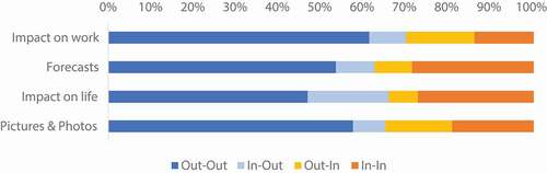
The ratios of retweets in the four different topics are demonstrated (). The lower ratios of tweets received in the affected areas would indicate higher attention paid by people outside of the affected areas, which potentially imply more extensive diffusion of these topic categories. Tweets in the topic ‘Impact on work’ have the lowest ratio of reception in the impact areas. In contrast, tweets about ‘Forecasts’ have a higher ratio of retweets in the affected areas, meaning that these types of tweets draw more local attention than outside.
Figure 5. The ratio of retweets by diffusion direction in affected areas.
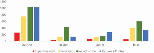
The counts of retweets by each diffusion direction and topic are shown (). Among the four diffusion directions, Out-Out tweets has the highest volume, followed by In-In tweets, and In-Out tweets, while Out-in tweets occupy the smallest number. Tweets in topic ‘Pictures and Photos’ occupy large quantities in the Out-Out and Out-In direction, indicating photos and pictures generated by outside users are widely dispersed to all places. Tweets in ‘Impact on life’ are also widely retweeted in three directions except the Out-In direction, representing the strong statewide interests and concerns on the life impacted by the storm. It also indicates that a majority of tweets in ‘Impact on life’ are posted by local users.
Figure 6. Number of tweets by each topic and diffusion direction.
4.4 Standard Deviational Ellipse
Standard deviational ellipse (SDE), which is also known as directional distribution, is a centrographic method to measure geographic concentration. In this study, SDE was applied to analyse spatial distribution patterns of the retweets in the four topics. The spatial extent of the diffusion in each topic is indicated by the size of the SDE. The shape (major and minor axis) and orientation of the SDE show the spatial directional distribution of the retweet topic. The centroid of an SDE indicates the centre of the distribution.
As shown in and , tweets on different topics have different sizes of SDEs. ‘Pictures and Photos’ tweets have the largest SDEs in size, followed by the ‘Impact on life’ tweets, which indicate relatively larger diffusion extents of these topics. ‘Forecasts’ and ‘Impact on work’ tweets have the smallest diffusion extents (i.e. smallest SDE), which implies the attention to this topic is spatially concentrated around the centroid. Due to the local concentration of the impact (on both work and life) and forecast tweets, the centres of their SDEs are the easternmost. On the contrary, ‘Pictures & Photos’ tweets have the westernmost centroid due to the extensive attention to this topic from the West Coast.
Figure 7. Standard Deviational Ellipses of retweets in the Contiguous United States (CONUS).
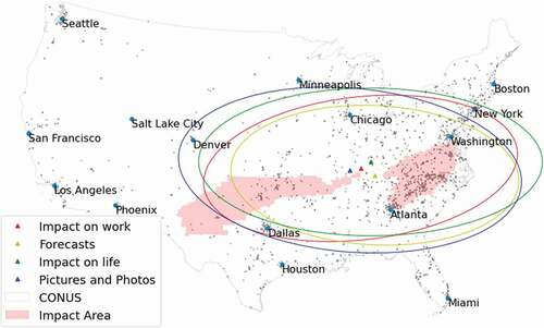
Table 4. Parameters of SDE
4.5 Diffusion Distance Assessment
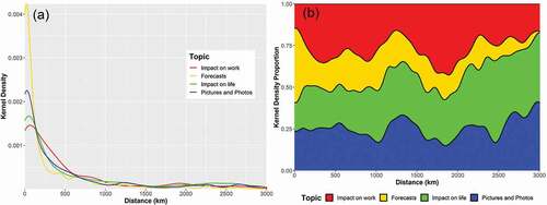
Diffusion distances were calculated between locations of original tweets and their retweets. The distances indicate the diffusion ability of the topics. The density plot () shows that a large number of retweets are concentrated within a short distance (~250 km) from the original tweets, and the number declines as the distance increases. Such a distance decay pattern reflects that the retweets are generally concentrated around the original tweets. In other words, people tend to pay attention to information originated in nearby places. Among four topics, the density of ‘Forecasts’ tweets has the sharpest decline from the original tweet (at 0 km diffusion distance), while retweets in other topics have a slower decline. ‘Forecasts’ tweets dominate within a short distance and quickly decline when the distance increases (). The ‘Impact on life’ and ‘Pictures and Photos’ tweets start to gain popularity as the distance increases. These different diffusion patterns imply that tweet contents (topics) are a potential factor contributing to the information diffusion over the geographic space.
Figure 8. Kernel density (a) and kernel density proportion (b) of retweets in varying distance (km) from the original tweets in four topics.
4.6 Spatial Distribution of Sentiments
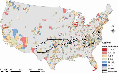
To further understand public perception on the hazard, average sentiment scores were calculated in counties to show the spatial distribution of public perception to the storm. A total of 5,834 retweets with a location below county-level were processed within 799 counties in the CONUS and the result is demonstrated (). Counties tend to have positive sentiments within the impact areas (−0.003 ± 0.196) compared with the non-impact areas (−0.038 ± 0.203). Only few counties within the impact areas have a low average sentiment score (red colour), while a large number of counties with low sentiment are outside of the impact area. This pattern may indicate that people outside the impact areas were more concerned about the storm than people from the inside.
Figure 9. Average sentiment score of retweets by each county.
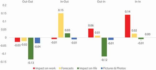
To precisely examine the public perception from both the impact and non-impact areas, average sentiment scores in the four topics and four diffusion directions were calculated by EquationEquation 2Eq 2
Eq 2 (). In the Out-Out retweets, the average sentiment scores in all the four topics are low (negative), with the ‘Impact on life’ topic being the lowest. The ‘Forecasts’ tweets in the In-Out direction have the highest sentiment score among all categories. Surprisingly, the ‘Impact on work’ retweets have a high (positive) sentiment score in the In-In and Out-In diffusion directions, implying people in the impact areas are more optimistic to this issue than those from outside. ‘Pictures and Photos’ tweets have a negative sentiment in all diffusion directions except the In-In direction with a small positive value. In general, retweets spread to the non-impact areas (In-Out and Out-Out) have lower sentiments than those in the impact areas (In-In and Out-In). This finding reveals that people outside the affected area may be more concerned about the storm than people in the affected area.
Figure 10. Average sentiment in each topic by diffusion direction using Equation 2.
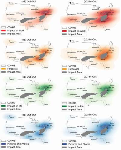
4.7 Kernel Density Maps of Retweets in the Non-affected Areas
Based on the fact that retweets from the non-impact areas are different from impact areas, kernel density maps in were applied to show hotspots of retweets in the non-affected areas in both Out-Out and In-Out directions. The density maps highlight places where people pay attention to a disaster that did not affect their areas. These maps also reflect public interest in different topics of tweets and latent connections between places. Hotspots of retweets are generally clustered in populated areas, such as Washington D.C. and New York City in the East Coast and Los Angeles and Seattle in the West Coast (). High density of ‘Forecasts’ and ‘Pictures and Photos’ retweets can also be found in Atlanta and Dallas, two large metropolitans near the impact areas.
Figure 11. Kernel density map of retweets in non-affected areas relating to (a) ‘Impact on work’; (b) ‘Forecasts’; (c) ‘Impact on life’; (d) ‘Pictures and Photos’.
5. Discussion
This study utilized retweets to analyse spatial pattern of information diffusion in a winter storm. The findings derived in this study can be used to improve information broadcasting and communication in disaster preparation, mitigation, and emergency response. First, the spatial pattern of information flows through retweets varies among different topics. People in the impact areas like to retweet the topics of ‘Forecasts’ and ‘Impact on life’ posted by local users (i.e. the In-In direction). People outside of the impact areas tend to pay attention to ‘Impact on life’ and ‘Pictures & Photos’ generated by users outside of the impact areas. In all the four topics, the number of retweets in the In-Out direction is similar to the opposite direction (Out-In), but the dominant topic in each direction is different, indicating local interests in the outside pictures and photos and statewide interests in the impact on local users’ life.
Second, retweets in different topics have different spatial concentration and diffusion distance. The declining density of retweets in increasing diffusion distance (discussed Section 4.5) implies that people tend to pay attention to and communicate information generated in their proximity. However, the pattern of distance decay varies among different topics. Retweets in the ‘Forecasts’ topic have a relatively shorter diffusion distance. In contrast, retweets about ‘Pictures and Photos’ and ‘Impact on life’ can spread further to distant places. This finding informs that tweets with pictures can better catch attention from people who were not directly affected by the hazards.
Third, retweets in non-affected areas have lower (negative) sentiment scores compared with the affected areas. For example, the sentiment score of retweets on ‘Impact on work’ and ‘Forecasts’ is negative in the Out-Out direction but is positive in the In-In direction. Possibly due to the lack of first-hand information about the storm, people outside the impact areas may negatively perceive the storm impacts and spread tweets that express worrisome and pessimistic sentiment. In contrast, people in the impact areas have a better understanding of the situation and are less worried about the impacts. This finding informs that updated and transparent information can potentially mitigate panics and pessimistic emotion caused by hazardous events.
Last but not least, as shown in the kernel density maps, large cities, where population and news media are concentrated, play an important role in disseminating the hazard-related tweets. The hotspot of retweets in large cities is possibly due to the high population density and the concentration of media industry (e.g. ABC News, Fox News) that have been actively reporting the storm event in their Twitter accounts. The high density of ‘Forecast’ and ‘Pictures and Photos’ retweets in Atlanta is possibly due to proximity of this city to the impact areas so that people pay more attention to the storm. The high density near Dallas (Texas) in (Figure 11b1 & d1) may be formed similarly. People in this area have been paying close attention to the potential storm by retweeting the storm-related tweets.
Despite the interesting results, the following improvements should be considered in future studies. In addition to tweet contents (topics), the underlying social networks can also affect the diffusion pattern of the retweets. Retweets can spread in a long distance due to strong connectivity between users. Using Twitter streaming API to construct user networks through the following relation can help resolve this issue. Besides, the registered locations in user profile, which are used to geolocate tweets and retweets, have uncertainty in their accuracy. The estimates of diffusion distance can be skewed if the user location is different from the tweet location. Future analysis should include an improved screening method to select tweets with reliable locations. Additionally, the biased user demographics (Jiang, Li, and Ye Citation2019; Sloan et al. Citation2013) and geographic disparities of social media access (Zou et al. Citation2019), such as limited access to the elderly, the poverty, and the minority, may lead to environmental injustice issues when using social media as a disaster management tool (Lai Citation2019; Spagnoletti, Resca, and Sæbø Citation2015). The spatial patterns of information diffusion in this analysis are related to geographical disparities of hazard risk communication and social media use in a natural hazard. In future works, more in-depth analyses should be conducted to understand such disparities and effective measures should be developed to communicate hazard information in underrepresented communities on social media.
6. Conclusion
This study utilized NLP techniques and spatial analyses to explore the information diffusion patterns in Twitter during a winter storm. The analysis explored the prevailing topics in Twitter and how tweets in these topics are spread over the geographic space through retweets. The analyses projected the information diffusion in the cyberworld into the geographic space, which increased our understanding about how hazard-related information spread geographically through social networks in Twitter. The spatial extents, directions, concentration and sentiment of retweets in four major topics were analysed and discussed. A distance decay pattern of retweet density was observed in all the four topics with varying decay rates. The findings confirm the distance decay of spatial interaction, which is a fundamental geographical theory, are also valid for information diffusion in the cyberworld. In other words, the distance decay pattern implies that people more likely to respond to information generated from nearby locations than distant locations. Overall, this study tested a suite of analytical methods to study geographic phenomena on social media. The application in the winter storm provides actionable information for developing communication strategies to disseminate hazard-related information.
Acknowledgements
I would like to thank all reviewers for their constructive and detailed comments, which helped improve the quality of this work. The author is responsible for any errors that may remain. The data and scripts that used in this study are available upon request.
Disclosure statement
No potential conflict of interest was reported by the author(s).
Data availability statement
The dataset used in this study is available in the following DOI: 10.5281/zenodo.3573973
Additional information
Funding
References
- Aletras, N., and M. Stevenson (2013). Evaluating Topic Coherence Using Distributional Semantics. Proceedings of the 10th International Conference on Computational Semantics (IWCS 2013)–Long Papers, Potsdam, Germany, 13–22.
- Alexander, D. E. 2014. “Social Media in Disaster Risk Reduction and Crisis Management.” Science and Engineering Ethics 20 (3): 717–733. doi:https://doi.org/10.1007/s11948-013-9502-z.
- Blei, D. M., A. Y. Ng, and M. I. Jordan. 2003. “Latent Dirichlet Allocation.” Journal of Machine Learning Research 3 (Jan): 993–1022.
- Caragea, Cornelia, Anna Cinzia Squicciarini, Sam Stehle, Kishore Neppalli, and Andrea H. Tapia. “Mapping moods: Geo-mapped sentiment analysis during hurricane sandy.„ In ISCRAM. 2014
- Dufty, N. 2012. “Using Social Media to Build Community Disaster Resilience.” Australian Journal of Emergency Management, The 27 (1): 40.
- Edwards, C., A. Edwards, P. R. Spence, and A. K. Shelton. 2014. “Is that a Bot Running the Social Media Feed? Testing the Differences in Perceptions of Communication Quality for a Human Agent and a Bot Agent on Twitter.” Computers in Human Behavior 33: 372–376. doi:https://doi.org/10.1016/j.chb.2013.08.013.
- Fish, C., K. P. Goldsberry, and S. Battersby. 2011. “Change Blindness in Animated Choropleth Maps: An Empirical Study.” Cartography and Geographic Information Science 38 (4): 350–362. doi:https://doi.org/10.1559/15230406384350.
- Goodchild, M. F. 2007a. “Citizens as Sensors: The World of Volunteered Geography.” GeoJournal 69 (4): 211–221. doi:https://doi.org/10.1007/s10708-007-9111-y.
- Goodchild, M. F. 2007b. “Citizens as Voluntary Sensors: Spatial Data Infrastructure in the World of Web 2.0.” International Journal of Spatial Data Infrastructures Research 2 (2): 24–32.
- Google, Inc., 2020. Google Geocoding API. Google Dev. Retrieved 23 June 2019, from https://developers.google.com/maps/documentation/geocoding/start
- Honnibal, M., and I. Montani. 2017. “Spacy 2: Natural Language Understanding with Bloom Embeddings, Convolutional Neural Networks and Incremental Parsing.” To Appear 7: 1.
- Houston, J. B., J. Hawthorne, M. F. Perreault, E. H. Park, M. G. Hode, M. R. Halliwell, S. E. T. McGowen, et al. 2015. “Social Media and Disasters: A Functional Framework for Social Media Use in Disaster Planning, Response, and Research.” Disasters 39 (1): 1–22. doi:https://doi.org/10.1111/disa.12092.
- Huang, Q., and D. W. S. Wong. 2016. “Activity Patterns, Socioeconomic Status and Urban Spatial Structure: What Can Social Media Data Tell Us?” International Journal of Geographical Information Science 30 (9): 1873–1898. doi:https://doi.org/10.1080/13658816.2016.1145225.
- Imran, M., C. Castillo, F. Diaz, and S. Vieweg. 2015. “Processing Social Media Messages in Mass Emergency: A Survey.” ACM Computing Surveys 47 (4): 1–67. 67: : 38. . doi:https://doi.org/10.1145/2771588
- Isaak, N., and L. Michael. 2016. “Tackling the Winograd Schema Challenge through Machine Logical Inferences.” STAIRS 284: 75–86.
- Jiang, Y., Z. Li, and S. L. Cutter. 2019. “Social Network, Activity Space, Sentiment, and Evacuation: What Can Social Media Tell Us?” Annals of the American Association of Geographers: 1–16. doi:https://doi.org/10.1080/24694452.2019.1592660.
- Jiang, Y., Z. Li, and X. Ye. 2019. “Understanding Demographic and Socioeconomic Biases of Geotagged Twitter Users at the County Level.” Cartography and Geographic Information Science 46 (3): 228–242. doi:https://doi.org/10.1080/15230406.2018.1434834.
- Kent, J. D., and H. T. Capello. 2013. “Spatial Patterns and Demographic Indicators of Effective Social Media Content during theHorsethief Canyon Fire of 2012.” Cartography and Geographic Information Science 40 (2): 78–89. doi:https://doi.org/10.1080/15230406.2013.776727.
- Kim, J., and M. Hastak. 2018. “Social Network Analysis: Characteristics of Online Social Networks after a Disaster.” International Journal of Information Management 38 (1): 86–96. doi:https://doi.org/10.1016/j.ijinfomgt.2017.08.003.
- Kim, Y.-C., and J. Kang. 2010. “Communication, Neighbourhood Belonging and Household Hurricane Preparedness.” Disasters 34 (2): 470–488. doi:https://doi.org/10.1111/j.1467-7717.2009.01138.x.
- Kireyev, K., L. Palen, and K. Anderson. 2009. “Applications of Topics Models to Analysis of Disaster-related Twitter Data.” In NIPS Workshop on Applications for Topic Models: Text and Beyond, 1. Canada: Whistler.
- Lachlan, K. A., P. R. Spence, X. Lin, K. Najarian, and M. Del Greco. 2016. “Social Media and Crisis Management: CERC, Search Strategies, and Twitter Content.” Computers in Human Behavior 54: 647–652. doi:https://doi.org/10.1016/j.chb.2015.05.027.
- Lai, C. 2019. “The Influence of Extramural Access to Mainstream Culture Social Media on Ethnic Minority Students’ Motivation for Language Learning.” British Journal of Educational Technology 50 (4): 1929–1941. doi:https://doi.org/10.1111/bjet.12693.
- Li, Z., C. Wang, C. T. Emrich, and D. Guo. 2018. “A Novel Approach to Leveraging Social Media for Rapid Flood Mapping: A Case Study of the 2015 South Carolina Floods.” Cartography and Geographic Information Science 45 (2): 97–110. doi:https://doi.org/10.1080/15230406.2016.1271356.
- Lowe, T., K. Brown, S. Dessai, M. de França Doria, K. Haynes, and K. Vincent. 2006. “Does Tomorrow Ever Come? Disaster Narrative and Public Perceptions of Climate Change.” Public Understanding of Science 15 (4): 435–457. doi:https://doi.org/10.1177/0963662506063796.
- Paramkusham, S. 2017. “NLTK: The Natural Language Toolkit.” Int. J. Technol. Res. Eng 5: 2845–2847.
- Řehůřek, R., and P. Sojka. 2011. “Gensim—Statistical Semantics in Python.” Retrieved from Genism. Org.
- Resch, B., F. Usländer, and C. Havas. 2018. “Combining Machine-learning Topic Models and Spatiotemporal Analysis of Social Media Data for Disaster Footprint and Damage Assessment.” Cartography and Geographic Information Science 45 (4): 362–376. doi:https://doi.org/10.1080/15230406.2017.1356242.
- Sloan, L., J. Morgan, W. Housley, M. Williams, A. Edwards, P. Burnap, and O. Rana. 2013. “Knowing the Tweeters: Deriving Sociologically Relevant Demographics from Twitter.” Sociological Research Online 18 (3): 74–84. doi:https://doi.org/10.5153/sro.3001.
- Spagnoletti, P., A. Resca, and Ø. Sæbø. 2015. “Design for Social Media Engagement: Insights from Elderly Care Assistance.” The Journal of Strategic Information Systems 24 (2): 128–145. doi:https://doi.org/10.1016/j.jsis.2015.04.002.
- Twitter Inc., 2019. Standard Stream Parameters. Retrieved 22 June 2019, from https://developer.twitter.com/en/docs/twitter-api/v1/tweets/filter-realtime/guides/basic-stream-parameters
- Västfjäll, Daniel, Ellen Peters, and Paul Slovic. 2008. “Affect, risk perception and future optimism after the tsunami disaster.„ Judgment and Decision making 3(1), 64–72
- Wahlberg, A. A. F., and L. Sjoberg. 2000. “Risk Perception and the Media.” Journal of Risk Research 3 (1): 31–50. doi:https://doi.org/10.1080/136698700376699.
- Zou, L., N. S. Lam, S. Shams, H. Cai, M. A. Meyer, S. Yang, K. Lee, S.-J. Park, and M. A. Reams. 2019. “Social and Geographical Disparities in Twitter Use during Hurricane Harvey.” International Journal of Digital Earth 12 (11): 1300–1318. doi:https://doi.org/10.1080/17538947.2018.1545878.
- Zou, L., N. S. N. Lam, H. Cai, and Y. Qiang. 2018. “Mining Twitter Data for Improved Understanding of Disaster Resilience.” Annals of the American Association of Geographers 108 (5): 1422–1441. doi:https://doi.org/10.1080/24694452.2017.1421897.