
It is said that one picture is worth a thousand words. For the analyst this might be reformulated as one diagram being worth a hundred numbers. The need to present complex quantitative information in a manner that is both accessible and efficient has led to the rise of “infographics,” “data visualization,” and “visual analytics.”
This column is prompted and informed by the just-published The Art of Statistics by David Spiegelhalter, Chair of the Winton Centre for Risk and Evidence Communication at the University of Cambridge (and a memorable past OR Society Blackett lecturer) and also by the historic works of “the world’s leading analyst of graphic information,” Edwin Tufte, The Visual Display of Quantitative Information and Visual Explanations.
In The Art of Statistics Spiegelhalter provides an expert, entertaining and largely non-technical guided tour of key statistical ideas and issues, illuminated throughout by real-world problems ranging from the commonplace, such as the benefit of taking a daily statin pill, to the more exotic, such as the probability that the skeleton found in a Leicester car park really was that of Richard III. A key message in Spiegelhalter’s book is that quantitative analysis is just one component of a problem-solving cycle which also includes understanding the problem and communicating conclusions.
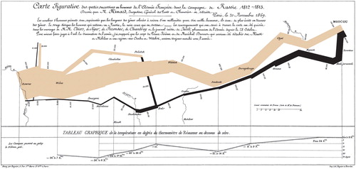
In keeping perhaps with the title of his book, I would like to focus here on the use of data-based diagrams and charts to impart understanding, suggest or test ideas, and inform decisions and actions. Such use is relatively modern, dating back to about 1750. An early example (included in Tufte’s first book) is the visually striking representation of quantitative information in the classic chart, , by the engineer Charles Joseph Minard, of Napoleon’s fateful campaign of 1812–13 in Russia. It vividly portrays the destruction of his army, dogged by disease during its advance and by a bitterly cold winter in its retreat, through mapping, across both space and time, the numbers of remaining soldiers as a shaded ribbon of continually shrinking width.
Figure 1 Minard’s chart of Napoleon’s Russian Campaign
Graphics for understanding probability and risk
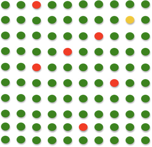
In an earlier column (“Wrong Numb3rs,” Impact Autumn 2015) I discussed (mis)perceptions about health risks. Many people are confused by traditional expressions of probability and by the difference between absolute and relative risk – including many clinicians, who consequently may advise patients incorrectly – but understand much better when probabilities and risks are expressed in simple visual formats. Spiegelhalter gives an example of this, in discussing the health risks of eating a bacon sandwich every day, with an estimated increase in lifetime risk of bowel cancer of 18% (the relative risk) compared to bacon sandwich non-eaters, who have a lifetime bowel cancer risk of 6% (the absolute risk). To illustrate this he uses a simple matrix or array diagram (redrawn here in a basic dot form; see ) – the absolute risk is shown by shading six out of a hundred dots and the increase of 18% in relative risk – unfortunately the way in which risk differences are often described in the media, perhaps because it sounds a lot more dramatic than the 1% increase in absolute risk to which it here equates (6% × 1.18 = 7%) – would then be shown by shading just one additional dot. And that is eating 50 g of bacon every single day of every year; maybe enjoying the odd bacon sandwich is a tolerable risk after all!
Figure 2 Probability dots
Graphics for suggesting and testing ideas
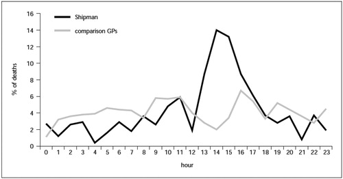
Several simple and revealing graphics, discussed in The Art of Statistics, that could have raised life-saving questions (but which, unfortunately, were constructed only after the events), concerned the infamous Dr Howard Shipman, who is thought to have murdered over 200 of his patients. One such chart (see , from the Department of Health’s clinical audit report by Professor Richard Baker) shows how the time of death of Shipman’s patients differed markedly from those of patients of other local family doctors. Overwhelmingly, his patients tended to die in the early afternoon. Spiegelhalter points out that the discrepancy does not require subtle analysis, indeed that it can be described as “inter-ocular,” “since it hits you between the eyes.”
Figure 3 Shipman: death in the afternoon. From Professor Richard Baker “Harold Shipman’s Clinical Practice, 1974–1998.” London: HMSO, 2001. Contains public sector information licensed under the open government licence v3.0
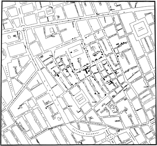
Another “inter-ocular” graphic can be found in one of Tufte’s historical – indeed historic – examples; the physician John Snow’s map () on which he plotted the distribution of cases of cholera in the London epidemic of 1854. This revealed a concentration of cases in households near to a particular water pump (in Broad Street) but, tellingly, a comparative lack of cases in a nearby workhouse and brewery, which had their own separate water supply, and a few isolated cases further afield, which investigation showed to have been of people out of the area who nevertheless obtained their water from Broad Street. This supported Snow’s theory that that cholera is transmitted not by air, as was commonly believed, but by contaminated water.
Figure 4 Snow’s London Cholera Map
Graphics for supporting decision making
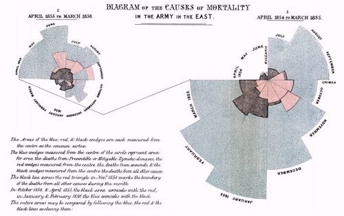
Although the most important outcome of Snow’s map concerned epidemiological thinking, it also had an immediate practical result (the famed removal of the handle of the Broad Street pump). So, did Florence Nightingale’s influential 1858 chart (, oddly not included by Tufte) of soldier mortality in field hospitals in the Crimean War. This indicates the number of deaths that occurred from preventable diseases (in, now faded, blue), those that were the results of wounds (in, now faded, red), and those due to other causes (in black). The graphic demonstrates that many more soldiers died from disease than from wounds, and also shows the decline in these preventable deaths that followed the introduction of Nightingale’s sanitary reforms in the field hospitals. Her chart and Snow’s map were not only clear descriptions, but also led to practical action – they were some of the first visual decision support tools.
Figure 5 Nightingale’s diagram of mortality in the Army in Crimea
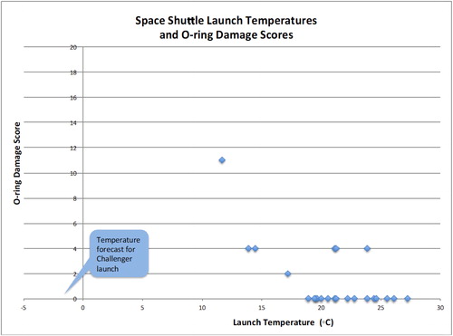
A disastrous decision that might well have been avoided by use of simple but revealing graphics was the go-ahead to launch the Challenger space shuttle on January 28th, 1986. Tufte describes how misleading selection and presentation to senior managers of data on booster rocket damage contributed to a decision to launch in freezing cold weather, with tragic results. The immediate cause of the disaster was found to be failure of O-ring seals in joints in the booster rocket casing. The rubber seals had lost resilience in the very low ambient temperature, with consequent catastrophic leakage of burning gases. The engineers, aware of this potential problem, had pointed out that no launch had ever been made below 53 °F and advised not launching at lower temperatures. Why had their advice not been followed?
The engineers were thinking analytically (and correctly), but they did not display their thinking in a sufficiently compelling way. In deliberating on whether or not to launch in such cold weather, historical data was presented on launches only where the most worrying damage to the rubber O-rings had occurred, for which there were just two cases – one was on the coldest day of a launch (53 °F) but the other was on a hot day (75 °F). With only two seemingly inconclusive cases to go on, the engineers were overruled.
What was missing was a presentation of data on seal damage and launch temperature, not only of the two launches that had shown the most worrying seal damage, but also of the other 22 launches, most of which had shown little or no damage to the booster rocket seals. Tufte remarks that omitting this latter data was “as if John Snow had ignored some areas with cholera and all the cholera free areas.” , recreated from data in Visual Explanations, shows that every launch below 65 °F showed some damage to the vital seals, compared to about 15% of those above that temperature. If such a chart had been shown to NASA, would they have risked launching the shuttle in such cold weather?
Figure 6 Space shuttle O-ring damage and launch temperature
What makes for a good graphic?
Tufte states “At their best, graphics are instruments for reasoning about quantitative information…. of all methods for analysing and communicating statistical information, well-designed data graphics are usually the simplest and at the same time the most powerful.” Which begs the question, what makes for a well-designed data graphic?
Spiegelhalter quotes from another expert in the field of data visualisation, Alberto Cairo (holder of the Chair in Visual Journalism at the School of Communication of the University of Miami and author of the acclaimed book, The Truthful Art: Data, Charts, and Maps for Communication). Cairo’s principles for a good data graphic are:
it contains reliable information
the design has been chosen so that relevant patterns become noticeable
it is presented in an attractive manner, but appearance should not get in the way of honesty, clarity and depth
when appropriate, it is organised in a way that enables some exploration
The last feature can be aided by interactive graphics. Obviously these cannot be shown in print, but the TED talks by the late, great, Hans Rosling provide some wonderful examples. If you have not seen one, do take a look (https://www.ted.com/talks/hans_rosling_shows_the_best_stats_you_ve_ever_seen), and you will be in for an inter-ocular analytical treat.
Additional information
Notes on contributors

Geoff Royston
Dr Geoff Royston is a former president of the OR Society and a former chair of the UK Government Operational Research Service. He was head of strategic analysis and operational research in the Department of Health for England, where for almost two decades he was the professional lead for a large group of health analysts.