
Abstract
This study introduces a synthesised framework for the analysis of data visualisations in the news. Through a close examination of seminal content analyses, their methodologies and findings, this article proposes a framework that consolidates dimensional components of data visualisations previously scattered across this body of research. To transition from incidental and essentialist examinations of visual data artefacts towards a systematic and theory-informed exploration, we consider the diagrammatic dimensions of data visualisations. The offered synthesized framework can serve as a starting point for both theory-infused descriptive purposes as well as more theory-guided explorations. The framework is put to the test by analysing 185 visualisations drawn from award-winning data stories. Findings generated through the application of the framework highlight the varied composition of components of data visualisations, though certain combinations of components are prevalent, leading to static categorical comparisons or interactive spatial localization. After all, data artefacts can be understood as problem-posing elements that are the outcome of diagrammatic thinking that journalists employ to communicate claims.
Introduction
As a distinct feature of data journalism, visualisations have been widely recognized as offering worthwhile material for content analyses in journalism research. Many of these endeavours contributed to rich descriptions of the appearance of data-driven articles: the visualisation types these include (or not), interactive features, or the provenance of underlying data and data repositories of providers as sources. As important as these efforts are to further our understanding of data journalism products and what they look like, counting units and classifying data journalism appeared to hypostatize data artefacts as editorial techniques rather than diagrammatic elements. Within this study, it is our objective to describe in detail multiple content analyses, which we examined regarding their methodologies and findings. We then discuss their value and compare the different approaches taken to analyse data visualisations. Finally, we arrive at a synthesized framework that is the outcome of all these steps.
To do so, we inspect the methodological frameworks of previous content analyses that untangled and pinpointed the components of data visualisations. We argue that the components of visualisations, which comprise visualisation types, their interactivity, data sources and intended purpose can inherently affect the diagrammatic dimensions of the visualisations. With this study, we set out to capture these dimensional components of data visualisations that are yet separated and scattered across this body of research.
Various qualitative studies focussing on journalists’ professional routines of data-driven newswork (e.g. Parasie and Dagiral Citation2013; Parasie Citation2015; Coddington Citation2015; Borges-Rey Citation2016; Citation2017), took into account the role of data and visualisation in data-driven newswork and akin quantitative computational approaches. These studies commonly stress the twofold dimensions of data by considering it “to be a material artefact that functions as either an evidential input for stories or as data-driven output”, oftentimes in the form of interactive visualisations (Borges-Rey Citation2017, p. 8; also see Coddington Citation2019). On the one hand, journalists use data to test hypotheses or to rather freely explore the datasets to refine their argumentation and to arrive at legitimated knowledge claims (Parasie Citation2015). Due to data journalism’s focus on visual storytelling, through which journalists bolster transparency and interactivity (Usher Citation2016; Coddington Citation2019), data artefacts are visualised and thereby not only used to inform journalists’ claims but also to communicate them. Borges-Rey (Citation2017) emphasizes the dual function of data “as transactional objects that either informed their stories as evidentiary material or powered datafied outputs” (p. 15). Therewith, this strand of research prominently positions data visualisation both as a central pillar of data journalism epistemology as well as communicative device. The latter indicates a move away from considering visualisations as an aesthetic display of data but as a diagrammatic actualization of problem-posing (McCosker and Wilken Citation2014). Beneath the top layer, data visualisations include several components, such as specific data sources or interactive elements, that should be taken into account in order to arrive at a holistic understanding of these visualisations and to fully understand their diagrammatic construction.
To follow up on that, we argue that on top of analysing and counting the superficial aesthetic characteristics of data visualisations, we must pay attention to visualisations’ underlying components that are assembled by journalists resulting in a data visualisation. This diagrammatic construction of data artefacts incorporates several components and thereby analytical dimensions that have been examined through various content analyses of data visualisations, though remained scattered across these studies.
It is the objective of this article to bring together analytical dimensions of seminal content analyses of data visualisations in order to design a comprehensive framework for analysing the components of data visualisations in news. As mentioned above and described in more detail in the following sections, considering data visualisation as diagrammatic constructs that comprise several components, benefits from an analytical framework that reflects this conceptualization.
After a diagrammatic theorization of data visualisations and the synthesis of a dimensional framework for analysis, we put this framework to the test by applying it on a corpus of 185 visualisations in 78 award-winning data journalism projects, spanning the years between 2013 and 2017. This is by no means a comprehensive sample with the intention to depict all of data journalism and its visual artefacts. Rather, this sample consists of ideal-typical units of analyses and therefore allows us to test whether the analytical framework covers the essential components of data visualisations in journalism. At the same time, this framework is offered for discussion and further modification and adjustment to redeem shortcomings and oversights, in a joint effort towards a standardized exploration of data visualisations in the news.
Literature Analysis: Data Artefacts in the News
Since the proliferation of data journalism as a practice in newsrooms, using data visualisation to communicate the final story has been regarded, by many, as an integral part of data journalism projects. This is evident by the projects nominated for the annual Data Journalism Awards between 2013 and 2016, where 99% of 225 analysed nominated cases involved visual elements (Loosen, Reimer, and De Silva-Schmidt Citation2020Footnote1). This is reflected by a plethora of studies on data journalism articles that examined - amongst other aspects - visualisation in data stories.
Broadly speaking, the study of data visualisation in the context of data journalism can be categorized twofold: studies on visualisations of distinguished and award-winning projects; and studies on visualisations predominantly found in everyday data stories. Naturally, varying data-driven practices of journalists, who produce their stories in different cultural and local contexts for specific audiences (Witschge Citation2008), materialize through diverse data journalism artefacts.
Parasie and Dagiral (Citation2013) determined that only 10% of the database stories published by the Chicago Tribune between 2002 and 2009 (N = 69) did not feature charts, tables, or maps. Tandoc and Oh (Citation2017) found that tables, photographs, and static infographics were the most used visualisations on The Guardian’s Data Blog (N = 260). Similarly, Knight (Citation2015) concluded that infographics as well as static maps, graphs and charts were widely employed types of visualisations in the UK national daily and Sunday newspapers studies. With respect to the specific types of data visualisation used, Stalph (Citation2018) found that mostly bar and line charts, being oft-used chart types in articles published by Zeit Online, Spiegel Online, The Guardian, and Neue Zürcher Zeitung, offer little interactivity (N = 244). Loosen, Reimer, and De Silva-Schmidt (Citation2020) analysed 225 stories nominated for the DJA between 2013 and 2016. They found that the most frequently used types of visualisations were images and simple static charts, followed by maps. In their analysis of data stories published by the websites of five major print publications and a French-language public radio and television broadcaster from Quebec (N = 178), Tabary, Provost, and Trottier (Citation2016) differentiated between infographics, graphics, and maps. They found that maps were the most frequent visualisation whereas graphics and infographics were often mixed with other forms of visualisation.
Like visualisations, underlying data sources have been examined through a number of studies. In the UK mainstream news media (N = 106), institutional sources, particularly government agencies, are the most used data sources; press releases by research institutes are often referred to in stories on social issues and health (Knight Citation2015). Parasie and Dagiral (Citation2013) found that data-driven stories in the printed edition of the Chicago Tribune (N = 69) rely in 61% of all cases on data published by public officials. These datasets are used as provided through governmental releases without in-house reporters curating databases. Parasie and Dagiral (Citation2013, p. 13) ascertain “the dependence on government agendas”. In a similar vein, Tabary, Provost, and Trottier (Citation2016, p. 75) propose a high “dependency on pre-processed public data'' of data journalism projects from Quebec (N = 178): Merely two percent are original data whereas almost half of all data-sets are institutional and 16% are a mix of institutional and other data sources. Another study on Canadian data stories (N = 26) shows that more than half of the sampled visualisations are based on public records (Young, Hermida, and Fulda Citation2017). Tandoc and Oh (Citation2017, p. 1004–1005) analysed stories published via the Guardian’s Datablog (N = 260) and found that almost a third rely on governmental sources. Also, stories submitted to the DJA between 2013 and 2015 (N = 225) use data provided by official institutions in more than two thirds of these cases. These cases do, however, distinguish themselves as 20% rely on data that had been collected by news organizations themselves (Loosen, Reimer, and De Silva-Schmidt Citation2020).
Interactivity is another oft-explored attribute of data visualisations. Studying stories awarded by the DJA (N = 44) 2013 and 2016, Ojo and Heravi (Citation2018) found out that 59% of the winning projects had elements of interactivity. They found that maps offer more interactive elements than other visualisation types such as bar charts. While various studies take into account the interactivity of data visualisations, the approaches to measuring interactivity differ across the board, negating comparable and standardized findings: for instance, Knight (Citation2015) distinguishes between dynamic and static maps, therewith conflating two levels of analysis, i.e. visualisation type and interactivity. Similarly, Loosen, Reimer, and De Silva-Schmidt (Citation2020), differentiate between visualisation types such as ‘simple static charts’, ‘combined static charts’, or ‘maps’ while additionally categorising interactive functions such as zooming or filtering on separate level of measurement.
Across these studies, diverging methods come to the fore. Although most authors seek to measure the same aspects of data visualisations, such as visualisation types, data sources, or interactivity, they generate incomparable findings due to the application of incompatible measurements. On top of that, the highly customized composition of these variables and measurement complicates replication and consolidation of future findings.
Diagrammatic Components of Data Visualisations
While these content analyses explored various aspects of data visualisations through different instruments, they seem disconnected to the actual journalistic procedure of visualising data. In that regard, data visualisations are the outcome of an intricate and deliberate process of journalists’ newswork (see Weber, Engebretsen and Wilken Citation2018). It is thus appropriate to develop an instrument that mirrors the methodical construction of data visualisations by considering the intricate components that data journalists consciously assemble. To do so, we argue that it is helpful to acknowledge data visualisation as storytelling devices that integrate diagrammatic potentials of certain components.
Kirk (Citation2016) defines data visualisations as “the representation and presentation of data to facilitate understanding” (p. 52). He considers understanding as procedural and comprising thought-processes of perceiving, interpreting, and comprehending. Therewith, he acts on the assumption of an active and participant reader that can deduce information from a visualised data artefact. Thereby, visualisations are to be understood as elements of a journalistic article that communicate claims and mediate journalistic values such as trustworthiness and accessibility (Kirk Citation2016, 52) through their sociomateriality and diagrammatic characteristics. From the perspective of diagrammatic reasoning, visualisations “serve thought and communication in numerous ways” (Bechtel Citation2013, 20). Bechtel (Citation2013) argues that “people design and use diagrams to spatialize thought and make it public … to communicate ideas to others” (p. 20). Against this backdrop, we understand data visualisations as an assemblage of various components appearing as visual representations of data that serve as a rhetoric tool to communicate journalistic claims.
This signals a departure from essentialist descriptions of data visualisations away from metaphoric as well as purely aesthetic points of entry. In a similar vein, McCosker and Wilken (Citation2014) examine the “problematic celebration of beauty in data visualisation” (p. 156) as a result of sensualized and aestheticised considerations that overlook diagrammatic complexities. Therefore, McCosker and Wilken (Citation2014) postulate turning to diagrammatic reasoning or diagrammatic thinking. The authors refer to Deleuze and Guattari's realist conception of a diagram as the “actualization of the virtual” (De Landa Citation2000, 40) that underlies the genesis of a meshwork of diverse, hetero- or homogeneous components and elements. Actualising this virtual diagrammatic process is diagrammatic thinking. Diagrammatic thinking should not be understood as problem-solving but as “problem-posing, that is, framing the right problems rather than solving them” (De Landa Citation2000, 40–41) by constraining and limiting the multiplicity and unlimited combinations of elements. This is in line with storytelling conventions as their “function is less to increase or decrease the truth value of the messages they convey than to shape and narrow the range of what kinds of truths can be told” (Schudson Citation1982, 98–99). Accordingly, McCosker and Wilken (Citation2014) conclude that “the visualisation, the figure, does not stand as the final stage in a process of problem-solving, but should be better understood as the actualisation of new ways of problem-posing” (McCosker and Wilken Citation2014, 163). It is at this point, where audiences are being confronted with a problem repacked in the shape of a visualisation, which are offered for discussion.
Projecting this onto journalism, Bounegru et al. (Citation2017) stipulate that visualisations have the “potential to possess narrativity” (p. 701). Clearly, visualisations that appear throughout data-driven articles are not merely the outward-facing result of an investigation in the sense of a storytelling device, but also a procedural tool within the process of journalistic investigation to identify trends or patterns (Borges-Rey Citation2017; Splendore Citation2016) as well as a tool to communicate these to readers. By externalising their internal investigation and data processing tasks, which are often done with the help of data visualisations, journalists reveal the intricate steps of their newswork by offering data visualisations to their readers – in that sense, journalists externalize diagrammatic problem-posing.
This falls in line with Coddington’s (Citation2019) motifs of data journalism that include transparency through (interactive) data visualisation: Visualisations “aid transparency and allow audiences to act as coproducers of the truth claims of the journalistic artifact” (Coddington Citation2019, 230–231). Consequently, the diagrammatic problem-posing through and with visualisations permeates journalistic investigation, data analysis, presentation, and storytelling as well as news consumption. Similarly, data sources, usually given under the visualisation or as a footnote or referred to in the text, adds the actualization of the diagrammatic process of problem-posing. The provenance of the data source itself generates meaning and can elevate a visualisation validity. This has been widely discussed in the context of (data) journalism epistemology (Ettema and Glasser Citation1985; Carlson Citation2017; Ekström and Westlund Citation2019). The use of “pre-processed public data” (Tabary, Provost, and Trottier Citation2016, 75) certainly affects journalists’ selection of such data as well as a potential consecutive public discourse around the issue at hand (Witschge Citation2008).
By acknowledging the data visualisation as both a storytelling device and a communicative tool of diagrammatic thinking and problem posing, we can identify several components of visualisations, which data journalists enrol in these processes. These components that make a difference in the construction and composition of data visualisations are detailed in the following section. The components include visualisations types, interactivity, data sources, data access, and purpose.
Methodological Synthesis
As described above, previous endeavours often conflated several levels of categorical measurements and refrained from interpreting their findings aside from comparing them to those of other studies (see Stalph Citation2018). This exposes a lack of theorization of data artefacts and therewith impedes theory-driven interpretation and the integration of generated results in the consolidated body of research on data journalism.
The framework proposed in this article, is to be considered as a first attempt to standardize the methodological design for analysing data artefacts in journalism, unifying previously disconnected endeavours and offering an outline for future content analysis. Core to this framework are the dimensional components of data visualisations in the news, which are the outcome of our synthesis of previous content analyses and expand on these studies’ frameworks to take into account diagrammatic functions of data visualisations. Thereby, we understand data visualisations as the sum of their parts, to which we refer to as components.
What all these previous analyses have in common - and it is at this point where the present study seeks to move beyond these endeavours - is an essentialist foundation that inevitably leads to reductionist classifications and limited interpretations aside from purely descriptive accounts. These examinations of data artefacts set out to measure and count physical attributes, such as visualisation types, interactive features and underlying technologies, or source attributions. For instance, Stalph (Citation2018) classifies data journalism by distinguishing daily data stories from singular prime examples by measuring formal characteristics; Ojo and Heravi (Citation2018) differentiate story types and technologies and deduce a data story typology; similarly, Loosen, Reimer, and De Silva-Schmidt (Citation2020) take into account data set types, sources, visualisations, and interactive features. These descriptive and essentialist analyses, being time-consuming and complex, bring to the fore foundational findings that are necessary for subsequent research: “in a moment of rapid change and complexity, it makes sense that our first move should be to get the lay of the land. Detailed description should come first, before explanation or critique” (Benson Citation2017, p. 29). We understand that these studies are instrumental for journalism studies to untangle and pinpoint the components of data visualisations that inherently affect the diagrammatic dimensions of the visualisations. With this study, we set out to bring together these dimensional components of data visualisations that are yet separated scattered across this body of research. These dimensional components are visualisation types, their interactivity, data sources comprising data providers and methods of access, and intended purpose. We will detail these components as we operationalize them in the following section. We understand these components as diagrammatic, as they each serve the purpose of problem-posing, transcending or rather composing aesthetic or metaphoric potentials of visualisations. Through this theorization, we offer components that are not arbitrary categories for analysing data visualisations, but essential components of visualisations, which journalists deliberately assemble.
The proposed framework merges previously stratified approaches to the analysis of data artefacts, to offer a synthesized framework that builds on previous content analyses. After describing the (a) formation of the framework, we (b) put it to the test by analysing a batch of data visualisations and their inherent components, and, eventually, showcase how findings generated through the application of the framework can bolster (c) interpretations of these findings that tie into current discussions around data and visualisations in the news.
A Framework for Analysing Data Visualisation in the News
To provide an analysis framework that ensures generalisability, comparability, and replicability, we present the development and design of our instrument in detail. We thereby contribute towards a standardized and scalable, thus widely applicable framework that could help to generate novel contributions to the field in the future.
Analyses of data visualisations often start with coding a selected corpus of data visualisations. These codes should be devised based on a well-designed framework, which should “consult both scholarly literature and applied research and use theory as a guide” (Neuendorf Citation2017, p. 96). This results in a systematic framework with predefined rules and scripts, documented in a coding protocol that we have made available to all coders. This analysis framework is composed of two foundational parts:
A theorization of data visualisations in the news.
A methodological framework for coding.
Analytical Framework for Data Visualisation in the News
To ensure the consistency and validity of the analysis, variables, measurements, and coding rules must be defined and imposed through an a priori design. It is therefore necessary to identify and operationalize variables that incorporate theory-infused and empirical underpinnings of the object of analysis.
The analytical framework we propose is based on ontological assumptions that determine the various components of data visualisations. These ontological assumptions – and therefore the components of data visualisations – stem from the previous close reading of content analyses and theorisations of data visualisations in the news, as laid out in the previous chapters. The framework comprises components that were repeatedly focussed on in preceding explorations of data visualisations. depicts an overview of the components of data visualisations in the analytical framework, as well as their operationalized variables.
Figure 1. Components of the Data Visualization Analytical Framework.
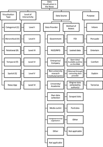
The analytical framework thus comprises five components: visualisation type, level of interactivity, data provider, method of access (to data), and purpose. These components are then operationalized into measurable variables, which are the results of a synthesis of previously applied and proven variables, as detailed in .
Table 1. Operationalization of components of data visualizations.
We consider these variables as essential variables of visualisations. By no means do we propose this as a finite framework but rather as a work in progress modular framework that could either inform a holistic framework, picked apart for more focussed explorations of certain aspects or expanded by adding or adapting the classification units.
Data Visualisation Type
Given its comprehensiveness and accessibility, when developing variables for analysing data visualisation types, we employed Kirk’s (Citation2016) CHRTS classification and the visualisation types associated to each category. Each family surmises an array of different chart types that are grouped according to their primary purpose. For instance, bar charts, pictograms or histograms are classified as ‘categorical’, pie charts or stacked charts as ‘hierarchical’, scatter plots or chord diagrams as ‘relational’, line or area charts as ‘temporal’, and choropleth or dot maps as ‘spatial’. presents the CHRTS families and their description, followed by , which presents the visualisation types associated with each of these categories. These visualisation types should technically sit under their associated category in , but given the space limitations, we have only included them in .
Table 2. CHRTS Families and Functions.
Table 3. CHRTS Families and Visualization Types (α = 0.92).
To facilitate effective coding, we add three additional codes to Kirk’s. These are ‘Mixed types’, ‘Apps’, ‘None’. If a visualisation appears as the combination of different types (e.g. map with embedded bar charts), the coders are recommended to code as ‘mixed type’. We define ‘Apps’ as customized visualisations that are built around the user input, the visual interaction with the website; the visualisation is assembled based on the specific interactions of each user. These are graphics where the data visualisations are not generated before the user engagement/interaction. We consider ‘newsgames’ as a type of app. However, depending on the focus of the research, newsgames may be added as a new type.
For details on each of these visualisation types we refer the reader to the 2016 edition of Kirk’s data visualisation handbook.
Interactivity
To analyse the interactivity levels of each visualisation, we looked to Schulmeister’s (Citation2003) taxonomy of multimedia component interactivity, which has previously been applied by Stalph (Citation2018), while also consulting the methodology sections of previous content analyses of data-driven stories. The interactivity scale classifies didactic components such as “images, diagrams, animations sequences … or tables, formulas, JavaApplets, and Flash programs” (Schulmeister Citation2003, p. 64) in multimedia learning systems or learning websites. This corresponds with our conceptualization of data visualisations as epistemic elements that support and mediate journalistic knowledge claims and that readers can derive knowledge from. Schulmeister (Citation2003) proposes six levels of interactivity (see ). At the first level, elements do not have any interactive features. At the second level objects can again merely be viewed but multiple predefined variations are available. Level III interactivity allows user manipulation via scaling or rotation, as in choosing different perspectives, or navigating within a visual. At the fourth level, visualisations are not predefined but generated through user input. At the fifth level, users build the visual with the help of a comprehensive toolset. Level VI adds computerized or algorithmic feedback to the previous levels and automatically adds meaningful layers.
Table 4. Interactivity Levels (α = 0.90).
Data Source: Data Provider
As one of the two primary elements associated with ‘data source’, data provider determines the type of unit that produced or provided the data. These are listed in . Oftentimes, sources are indicated within the visualisation panel, somewhere near the graphic. If not, we recommend that the coders should check the text and see if it is stated where the data is sourced from.
Table 5. Data Providers as Data Sources (α = 0.82).
Data Source: Data Access
As the second primary element associated with ‘data source’, data access captures the way/mode that data was obtained. These are defined in .
Table 6. Data Access (α = 0.74).
Purpose
Purpose indicated the primary purpose or intent of the story as communicated. This element is borrowed from Slaney (Citation2012) and has previously been applied by Ojo and Heravi (Citation2018). The purpose could be one (or more of) of the six types of inform, explain, persuade, comfort, terrorize, and entertain.
Methodological Framework for Coding
Data collection and analysis procedure comprises the following recommended steps:
Corpus selection: Compilation of a list of data visualisations to be analysed.
Coders to be trained and given an instructions guideline and the codebook.
A data collection form to be shared with coders. This could be paper based form, or an online form.
Coding.
Merging and cleaning of the final data set.
Analysis.
To ensure intercoder reliability, we recommend double coding by forming teams of coders, where each team is assigned the same set of stories. Each coder will carry out an individual assessment, where they examine the set of stories assigned to them individually. In a second step, coders meet to discuss the differences within the group, and during a deliberation process they decide on the most appropriate codes to be recorded. We further recommend that data collection forms should accommodate stories with more than one data visualisation.
When the coding is completed, the researchers need to check for consistency and quality of collected data, resolve any remaining issues, and proceed to statistical analysis.
The Application of the Analytical Framework
In this section we apply the proposed framework to analyse a corpus of award-winning data visualisations between 2013 and 2017. The Global Editors Network (GEN) was a cross-platform community for editors and media innovators, which recognized outstanding practice in data journalism from 2012 to 2019. Given the international nature of this annual award and the high number of cases submitted to them each year, this is considered to be an ideal repository to investigate good practice in relation to data journalism globally. Award-winning cases appear to be particularly valuable as they mirror what industry peers consider worthwhile (Küng Citation2004) and indicative of “possible criteria of quality” (Gladney, Shapiro, and Castaldo Citation2007, 58) of data journalism practice.
Data Collection and Coding of GEN Corpus
By analysing a sample of award-winning data stories, we aim at demonstrating the practicality of the proposed framework. As we designed the proposed analytical framework with the ideal-typical data journalism story in mind, we hope to offer a framework that recognizes and accommodates the core characteristics of data journalism stories that are archetypical for the field. Following the steps in the proposed framework, our data collection comprised the following steps:
Compilation of an indexed list of all award-winning data stories.
Coders were trained and given an instructions guideline and a codebook.
Assigned samples to coders; first individual coding via a pen-and-paper form; intercoder reliability test via Krippendorff’s α of 30 items with a bootstrap of 10,000 (indicated above the respective table); final double coding via an online form.
Merging and cleaning of final data set.
We employed double coding by forming teams of two coders. At the end of this phase, each pair agreed on a final set of codings for each story they evaluated and entered the final codes in a Google Form questionnaire. The authors of this article acted as arbiters who went over all codings and finalized the data set.
For this study, the sample is defined as award-winning data-driven stories made accessible via the DJA website between 2013 and 2017.
The units of data collection in each single data story that was presented as a winning project by GEN. In 2013, seven stories were awarded; one of these stories was not available at the time of coding. In some years, more units were sampled as winners can also include portfolios of data journalists/teams that comprise several stories. The sample consists of 78 award-winning projects that include 206 visualisations overall. For further analysis, we discarded those visualisations we considered not suitable for this kind of quantitative analysis - these were mostly highly customized interactives as part of news apps - that would be in need of a more open qualitative treatment, reducing the total number of examined visualisations to 185. Furthermore, we established a cut-off at a maximum of ten visualisations per story in our data entry forms. One news-app featured twelve interactives that were regarded for the overall count of visualisations but not considered as units of analysis (see ). Visualisations are the units of analyses, layering interactivity and data sources.
Table 7. GEN Sample.
We assume that this sample will allow us to gain comprehensive insights into the structure and systematic of award winning data-driven stories, illustrating characteristics of prime examples of data visualisations. By doing so, we (1) put our analysis framework to action, and (2) present findings comparable to other studies on best-case data stories as well as findings that contrast studies on daily and quick turnaround data pieces.
Findings
Data Visualisations
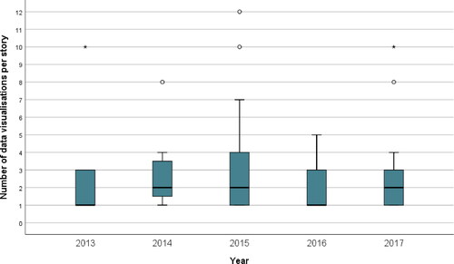
The analysis of award-winning data visualisations show that data visualisations play an important role in data journalism stories. Just over half of all stories in our dataset had two or more visualisations, while 80% had up to three visualisations, and another 20% more than three visualisations. One story had 12 visualisations (see ). None of the stories had no visual element, as we previously cleaned our sample by cutting articles with no visualisation available; we assume, however, that those graphics were mostly not being displayed since they were not available any more years after their publication date.
Figure 2. Boxplot of Distribution of Visualizations grouped per Year.
Note. * Extreme; ○ Outlier; ┬ Maximum; ┴ Minimum; □ Interquartile range; ▬ Median.
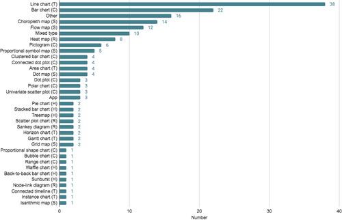
Of all 185 visualisations, including apps, mixed chart types, and charts that would not fit any category, 156 could be classified according to Kirk’s (Citation2016) CHRTS family (). Line charts appeared as the most commonly used visualisation type accounting for 20.5% of the sample, followed by bar charts (11.9%), choropleth maps (7.6%) and flow maps (6.5%). In order to add a functional layer to a mere descriptive layer of visualisation types, Kirk (Citation2016) considers some visualisation types particularly useful for exploratory data analysis and also evaluates which types offer best usability through interactive features. The oft-used bar chart and choropleth maps, for instance, serve well the former function of exploratory analysis to assess and rank values of measurements. Overall, temporal (changes and developments over a time axis), categorical (comparisons and distributions) and spatial (mapping patterns) are the most used chart families. The findings coincide with McGhee (Citation2012), who considers showing “how values have changed over time” (p. 193) the “most common use of data visualisation” (p. 193). Weber (Citation2020) argues that a temporal dimension can turn “charts into narratives” (p. 305) by combining “temporal data (when) with numerical data (how many)” (p. 305). Through temporality, charts would not merely state facts but narrate how a certain measurement changed over time, thereby telling a story. If we consider the temporal dimension as transforming a visual fact into a narrative, the majority of our analysed data visualisation appears to be employed as a narrative device.
Figure 3. Visualization Types.
Interactivity
Overall, 38.4% of data visualisations in our corpus are static (n = 71) and almost two thirds (n = 114) featured interactive functions to varying degrees. As interactivity levels differ across visualisation types, we looked at them per CHRTS family, to offer more stratified though still somewhat generalizable findings. To this end, we applied the Kruskal-Wallis test in order to compare groups containing independent scores (Field Citation2018, 306). The test showed that the mean ranks of the groups differed, the spatial family having the highest and the hierarchical family having the lowest rank, so we can determine that all groups had a different central tendency. The asymptotic significance (p = .039) of the test was below .05, indicating that there are significant differences between the CHRTS families regarding their interactivity levels. Still, pairwise comparisons of these families did not show significant differences. Notwithstanding, we understand that categorical, hierarchical, relational, temporal and spatial chart types do show varying levels of interactivity, particularly hierarchical-spatial and categorical-spatial. Dismissing the hierarchical family due to it being rarely coded, it becomes clear that the categorical family is predominantly represented by bar charts. This shows that mostly static bar charts with very little interactive features are still some of the most employed visualisation types ().
Figure 4. Ratio and Counts of Interactivity per CHRTS family.
Note. The numbers in the bars are the total counts per interactivity level. The colorization of the bars represents the counts per interactivity level of each group as the percentage for the ratio of ‘highly interactive’ to ‘interactive’ to ‘not interactive’ per group (ratio: interactivity level/group).
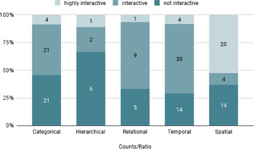
Overall, it appears that the interactivity levels of temporal, spatial, and relational chart types are similar and respectively more interactive than hierarchical and categorical chart types. As it turns out, interactivity levels V and VI according to Schulmeister’s (Citation2003) taxonomy are only coded for ∼10% of all cases. After recoding and simplifying the taxonomy to accommodate the fact that at the first level charts are not interactive at all, at the second level feature some light interactive elements, and – this step leads to some abstraction and information loss – merged levels III, IV, V, and VI under the label ‘highly interactive’. Only one article contained a visualisation that was coded as level VI on the interactivity scale: A colour-coded algorithmic exploration of rhymes and rhythms of the hip-hop musical Hamilton that allows users to input own data that is then analysed based on the provided algorithm. After this re-coding we repeated the Kruskal-Wallis test, and it shows a significant difference of interactivity levels between categorical and spatial chart types (p = .037). After all, this result is quite obvious though it affirms that some chart types are used along their established and inherent interactive functionalities.
After the recoding of the interactivity scale, roughly one quarter of all visualisations are highly interactive (n = 42) while 38.4% are static (n = 71), and 38.9% feature some interactive functions such as the option to choose from predefined data sets via filtering or displaying overlays and annotations.
Via (highly) interactive visualisations, journalists yield some of their “narrative control” (Segel and Heer Citation2010, 9) by letting “the user find their own insights” (Kirk Citation2016, 79). By allowing readers to explore data artefacts such as interactive maps, scatter plots or timelines, journalists empower readers as “co-producers of the truth claims of the journalistic artifact” (Coddington Citation2019, 230–231). Interactive visualisations in particular appear to play an important role in the participatory generation of knowledge.
Data Sources and Access
It is common practice that data visualisations are based on an underlying dataset that was drawn from a data source. In fact, if there is no data, there is no data visualisation. Most visualisation tools and apps regard this by offering options to state the source within the frame of the visualisation. Therefore, we could analyse what kind of data sources had been used for each of the visualisations (N = 185) in our sample.
The overall distribution of sources does not deviate much from previous findings on data sources (). Governmental sources still represent the largest part of data sources (51,9%) bearing interesting implications for the state of data journalism. Certainly, governmental bodies offer comprehensive amounts of data that are easily accessible through open data repositories or annual iterant reports. Data sources coded as ‘Other’ (11.4%) or ‘mixed’ (5,4%) need to be examined more closely. Such sources often include data that is increasingly untraceable due to sophisticated ways of processing. For instance, FiveThirtyEight 2016 primary forecasts draws on polling data from several institutions that is processed through original forecasting models, ultimately outputting novel calculations. In another case, Rutas Del Conflicto, on conflicts in Columbia, journalists gathered and merged data from various sources, compiling a new dataset including qualitative descriptions of every incident.
Figure 5. Data Sources.
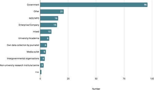
Furthermore, the data shows that merely 3.2% (n = 6) of all data was collected by journalists or data teams themselves (). This implies two things: Collecting data is time consuming, therefore journalists might opt-out of doing so and rather look to data that is readily available. The predominance of governmental data certainly supports this hypothesis. There are no significant changes regarding originally data over time, so our limited sample contrasts Lowrey and Hou’s (Citation2021) assertion of a decline in governmental data and rise of self-collected data.
Figure 6. Data Access.
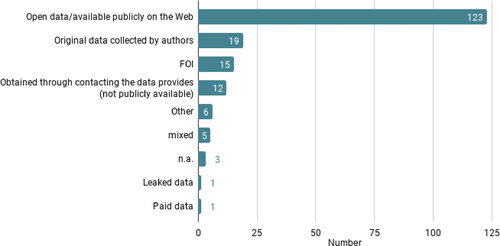
Another implication could be that journalists are rarely trained in social science methodology. While data journalism still traces back to Meyer’s (Citation1973) Precision Journalism in the tradition of a socio-scientific journalism, Heravi (Citation2018a; see also Heravi Citation2018b; Heravi and Lorenz Citation2021) found that only half of her study’s respondents (n = 183) had little to no formal training in analysis, statistics, coding or data science. It is fair to assume that a lack of educational background in social sciences further adds to the scarce appearance of original data collections by the journalists. These findings concur with how data was accessed: The majority of the used data was either open access or made publicly available by data providers (66.5%). Only in fifteen cases, journalists stated that the data was acquired via freedom of information requests. This supports the hypothesis that data journalists tend to use work with data that is readily available and that most data visualisations are built on “datasets pre-processed by public institutions” (Tabary, Provost, and Trottier Citation2016, p. 81).
The surplus of governmental sources further puts forward a previously oft-observed but inadequately portrayed aspect of data journalism epistemology: By acknowledging that data visualisations can “carry certain epistemological assumptions” (Westlund and Lewis Citation2017, 272), it appears that these assumptions are most of the time derived from data collections by governmental officials. Looking back to Ettema and Glasser (Citation1985) this would mean that data-driven stories based on such data sources stand in diametrical opposition to investigative stories as these data stories do not rely on original data but instead prominently exhibit “bureaucratically credible sources” (p. 190). The knowledge claims of these data stories “need not, then, be justified by the daily reporter because they are pre-justified” (Ettema and Glasser Citation1985, 190). This illustrates the data teams’ struggle over epistemic authority as they capitalize on pre-legitimised data.
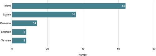
Purpose
The coding of the purpose of the data stories was done by comparing judgement calls of the coders. The purpose could most of the time be abstracted from the stories’ headlines and the descriptions of visualisations ().
For instance, a story titled “How Scalia Became The Most Influential Conservative Jurist Since The New Deal” (FiveThirtyEight, February 14, 2016) features temporal line charts and dot plots to explain how the Supreme Court official became a central figurehead of the U.S. legal system. A database that allows user input was set up by ProPublica (September 12, 2015) so that college students could query how much U.S. schools their students financially. These examples stand representative for the wide range of data-driven pieces as to their purpose. This goes to show that the intent of the authoring journalists translates into a wide range of stories, also regarding the visual representation and preparation of data. Interpreting these results most clearly shows the limitations of a quantitative approach, as the purpose is inherently connected to the narrative of visualisations. A follow-up qualitative approach that considers visualisation rhetoric techniques as suggested by Hullman and Diakopoulos (Citation2011) will certainly yield worthwhile findings.
Figure 7. Purpose of Data Stories.
Discussion and Conclusion
The findings show that journalists compose data visualisations in various ways, although certain combinations of the visualisations’ elements come to the fore: As pointed out in other studies, maps offer the most interactive features to enhance their spatial discoverability. Temporal visualisations such as line charts offer more basic interactive features – mostly through annotations and scrolling – due to their one-dimensional depiction of time. Similarly, categorical bar charts rely on annotations or sorting and filtering options, constrained by journalists’ pre-defined selections of underlying data. Eventually, the interactivity of visualisation types tie into discussions on journalists’ diagrammatic reasoning and their efforts to retain “narrative control” (Segel and Heer Citation2010, p. 9). Some research has tapped into this issue: Appelgren (Citation2018) examined the prescribed intentionality of diagrams and she found paternalistic tendencies within data visualisations that guide readers through a narrative but mask this through an illusion of interactivity. In a similar vein, Usher (Citation2020) theorizes how journalists produce maps to offer spatial information in order to mitigate a lack of first-hand and on-site information in a struggle over “epistemic authority over places” (p. 257). These studies emphasize the need for a more nuanced examination of visualisation types and their interactivity. We hope that this proposed framework can add quantitative data to these discussions.
At the same time, data sources and how journalists access them, have a twofold effect on data visualisations: On the one hand, the availability of data is conditional for data journalism. With the abundance of publicly available open data, journalists appear to keep on relying on data offered this way, as has been shown in this and previous analyses. The overreliance on data predominantly provided by governmental sources, however, might impart hegemonial readings of socioeconomic measures and limits journalists in their selection of diverse sources. While this issue has been discussed in the broader context of journalism (Fishman Citation1980; Ettema and Glasser Citation1985; Reich Citation2011), is rarely brought up in discussions on data-driven news work.
Another topic relevant to this research is long-term preservation of dynamically created data visualisation in journalism (Heravi et al. Citation2021; Broussard and Boss Citation2018; Broussard Citation2015). We believe that the analytical framework proposed in this article could provide valuable suggestions for codifying and identification of significant properties for data visualisations in the news, as discussed by Heravi et al. (Citation2021).
On the other hand, future research would do well to explore subsequent discourses among recipients, with consideration for surrounding cultural or political contexts, as proposed by Witschge (Citation2008). This would add another dimension to the exploration of (official) sources and how readers receive them, since “news journalism is definitely not a homogeneous discourse” (Ekström and Westlund Citation2019, 8).
It would also be interesting to take a closer look at how the data journalists actualize, translate, and parse data into categories that are subsequently visualised. This notion was brought forward by Lowrey and Hou (Citation2021) who discussed the abstract constructs and metrics in data journalism. The underlying question is: How much thought do journalists put in the construction and composition of the elements of data visualisations.
This study is in so far limited in its scope as it only touches on visual artefacts of data-driven news production and does not take into account cultural contexts of the production or readers’ perceptions of visualisations. It would be a worthwhile endeavour to examine the contexts of different cultural settings as proposed by Witschge (Citation2008). Following up with qualitative or quantitative perception studies can certainly offer additional insights. Hullman and Diakopoulos (Citation2011), for instance, offer a conceptual framework for a comprehensive exploration of the narrative dimension of visualisations.
Still, we hope that the proposed theorization and analytical framework serve as a systematic template for future analyses of data visualisation in the news. We hope to contribute to a deeper understanding of the diagrammatic implications of data visualisations and their components such as data sources and how journalists access them, visualisation types, their primary diagrammatic functions and interactive potentials, as well as the editorial purpose of data visualisations in journalism.
Disclosure Statement
No potential conflict of interest was reported by the author(s).
Notes
1 Loosen et al.’s study was first published in 2017 and is one of the early influences in this body of literature.
References
- Appelgren, E. 2018. “An Illusion of Interactivity. The Paternalistic Side of Data Journalism.” Journalism Practice 12 (3): 308–325.
- Bechtel, W. 2013. “Diagrammatic Cognition: Discovery and Design.” Proceedings of the Annual Meeting of the Cognitive Science Society 35 (35): 20–21. https://escholarship.org/uc/item/4jh7k5w1.
- Benson, R. 2017. “From Heterogeneity to Differentiation: Searching for a Good Explanation in a New Descriptivist Era.” In Remaking the News: Essay on the Future of Journalism Scholarship, edited by P. J. Boczkowski, & C. W. Anderson, 27–45. Cambridge, MA: The MIT Press.
- Borges-Rey, E. 2016. “Unravelling Data Journalism: A Study of Data Journalism Practice in British Newsrooms.” Journalism Practice 10 (7): 833–843.
- Borges-Rey, E. 2017. “Towards an Epistemology of Data Journalism in the Devolved Nations of the United Kingdom: Changes and Continuities in Materiality, Performativity and Reflexivity.” Journalism 21 (7): 915–932. https://doi.org/10.1177/1464884917693864.
- Bounegru, L., T. Venturini, J. Gray, and M. Jacomy. 2017. “Narrating Networks.” Digital Journalism 5 (6): 699–730.
- Broussard, M. 2015. “Preserving News Apps Present Huge Challenges.” Newspaper Research Journal 36 (3): 299–313.
- Broussard, M., and K. Boss. 2018. “Saving Data Journalism.” Digital Journalism 6 (9): 1206–1221.
- Carlson, M. 2017. Journalistic Authority: Legitimating News in the Digital Era. New York, NY: Columbia University Press.
- Coddington, M. 2015. “Clarifying Journalism’s Quantitative Turn: A Typology for Evaluating Data Journalism, Computational Journalism, and Computer-Assisted Reporting.” Digital Journalism 3 (3): 331–348.
- Coddington, M. 2019. “Defining and Mapping Data Journalism and Computational Journalism: A Review of Typologies and Themes.” In The Routledge Handbook of Developments in Digital Journalism Studies, edited by S. A. Eldridge II., and B. Franklin, 225–236. Abingdon: Routledge.
- De Landa, M. 2000. “Deleuze, Diagrams, and the Genesis of Form.” Amerikastudien/American Studies 45 (1): 33–41.
- Ekström, M., and O. Westlund. 2019. “The Dislocation of News Journalism: A Conceptual Framework for the Study of Epistemologies of Digital Journalism.” Media and Communication 7 (1): 259–270.
- Ettema, J. S., and T. L. Glasser. 1985. “On the Epistemology of Investigative Journalism.” Communication 8: 183–206.
- Field, A. 2018. Discovering Statistics Using IBM SPSS Statistics. 5th ed. London: Sage.
- Fishman, M. 1980. Manufacturing the News. Austin, TX: University of Texas Press.
- Gladney, G. A., I. Shapiro, and J. Castaldo. 2007. “Online Editors Rate Web News Quality Criteria.” Newspaper Research Journal 28 (1): 55–69.
- Heravi, B. R. 2018a. “3Ws of Data Journalism Education.” Journalism Practice 13 (3): 349–366.
- Heravi, B. R. 2018b. “Data Journalism in 2017: A Summary of Results from the Global Data Journalism Survey.” In Transforming Digital Worlds, iConference 2018: Lecture Notes in Computer Science, edited by G. Chowdhury, J. McLeod, V. Gillet, and P. Willett, Vol. 10766, 107–113. Cham: Springer. https://doi.org/10.1007/978-3-319-78105-1_13
- Heravi, B. R., K. Cassidy, E. Davis, and N. Harrower. 2021. “Preserving Data Journalism: A Systematic Literature Review.” Journalism Practice. doi:10.1080/17512786.2021.1903972.
- Heravi, B. R., and M. Lorenz. 2021. “Data Journalism Practices Globally.” Journal. Media. 2020 1 (1): 26–40.
- Hullman, J., and N. Diakopoulos. 2011. “Visualisation Rhetoric: Framing Effects in Narrative Visualisation.” IEEE Transactions on Visualisation and Computer Graphics 17 (12): 2231–2240.
- Kirk, A. 2016. Data Visualisation: A Handbook for Data Driven Design. London: Sage.
- Knight, M. 2015. “Data Journalism in the UK: A Preliminary Analysis of Form and Content.” Journal of Media Practice 16 (1): 55–72.
- Küng, L. 2004. “What Makes Media Firms Tick? Exploring the Hidden Drivers of Firm Performance.” In Strategic Responses to Media Market Changes, edited by R. G. Picard, 65–82. Jönköping: Jönköping International Business School.
- Loosen, W., J. Reimer, and F. De Silva-Schmidt. 2020. “Data-Driven Reporting: An on-Going (r)Evolution? An Analysis of Projects Nominated for the Data Journalism Awards 2013–2016.” Journalism 21 (9): 1246–1263. https://doi.org/10.1177/2F1464884917735691.
- Lowrey, W., and J. Hou. 2021. “All Forest, No Trees? Data Journalism and The Construction of Abstract Categories.” Journalism 22 (1): 35–51.
- McCosker, A., and R. Wilken. 2014. “Rethinking ‘Big Data’ as Visual Knowledge: The Sublime and the Diagrammatic in Data Visualisation.” Visual Studies 29 (2): 155–164.
- McGhee, G. 2012. “Using Visualisations to Tell Stories.” In Data Journalism Handbook: How Journalists Can Use Data to Improve the News, edited by J. Gray, L. Chambers, and L. Bounegru, 191–201. Sebastopol, CA: O’Reilly.
- Meyer, P. 1973. Precision Journalism: A Reporter’s Introduction to Social Science Methods. Bloomington and London: Indiana University Press.
- Neuendorf, K. A. 2017. The Content Analysis Guidebook. 2nd ed. Thousand Oaks, CA: Sage.
- Ojo, A., and B. R. Heravi. 2018. “Patterns in Award Winning Data Storytelling.” Digital Journalism 6 (6): 693–718.
- Parasie, S. 2015. “Data-Driven Revelation? Epistemological Tensions in Investigative Journalism in the Age of ‘Big Data.” Digital Journalism 3 (3): 364–380.
- Parasie, S., and E. Dagiral. 2013. “Data-Driven Journalism and the Public Good: ''Computer-Assisted-Reporters'' and ''Programmer-Journalists'' in Chicago.” New Media & Society 15 (6): 1–19.
- Reich, Z. 2011. “Different Practices, Similar Logic.” The International Journal of Press/Politics 17 (1): 76–99.
- Schudson, M. 1982. “The Politics of Narrative Form: The Emergence of News Conventions in Print and Television.” Daedalus 111 (4): 97–112.
- Schulmeister, R. 2003. “Taxonomy of Multimedia Component Interactivity. A Contribution to the Current Metadata Debate.” SComS: New Media in Education 3 (1): 61–80.
- Segel, E., and J. Heer. 2010. “Narrative Visualisation: Telling Stories with Data.” IEEE Transactions on Visualisation and Computer Graphics 16 (6): 1139–1148.
- Slaney, M. 2012. “Tell Me a Story.” IEEE Computer 19 (1): 4–6.
- Splendore, S. 2016. “Quantitatively Oriented Forms of Journalism and Their Epistemology.” Sociology Compass 10 (5): 343–352.
- Stalph, F. 2018. “Classifying Data Journalism.” Journalism Practice 12 (10): 1332–1350.
- Tabary, C., A. Provost, and A. Trottier. 2016. “Data Journalism’s Actors, Practices and Skills: A Case Study from Quebec.” Journalism 17 (1): 66–84.
- Tandoc, E., and S. Oh. 2017. “Small Departures, Big Continuities? Norms, Values, and Routines in the Guardian’s Big Data Journalism.” Journalism Studies 18 (8): 997–1015.
- Usher, N. 2016. Interactive Journalism: Hackers, Data, and Code. Urbana, IL: University of Illinois Press.
- Usher, N. 2020. “News Cartography and Epistemic Authority in the Era of Big Data: Journalists as Map-Makers, Map-Users, and Map-Subjects.” New Media & Society 22 (2): 247–263. https://doi.org/10.1177/2F1461444819856909.
- Weber, W. 2020. “Exploring Narrativity in Data Visualisation in Journalism.” In Data Visualisation in Society, edited by M. Engebretsen and H. Kennedy, 295–312. Amsterdam: Amsterdam University Press.
- Weber, W., M. Engebretsen, and H. Kennedy. 2018. “Data Stories. Rethinking Journalistic Storytelling in the Context of Data Journalism.” Studies in Communication Sciences 18 (1): 191–206.
- Westlund, O., and S. C. Lewis. 2017. “Four Conceptual Lenses for Journalism Amidst Big Data: Towards an Emphasis on Epistemological Challenges.” In News, Numbers and Public Opinion in a Data-Driven World, edited by A. Nguyen, 260–276. New York, NY: Bloomsbury.
- Witschge, T. 2008. “Examining Online Public Discourse in Context.” Javnost-The Public 15 (2): 75–92.
- Young, M. L., A. Hermida, and J. Fulda. 2017. “What Makes for Great Data Journalism? A Content Analysis of Data Journalism Awards Finalists 2012–2015.” Journalism Practice 12 (1): 115–135.