
 ?Mathematical formulae have been encoded as MathML and are displayed in this HTML version using MathJax in order to improve their display. Uncheck the box to turn MathJax off. This feature requires Javascript. Click on a formula to zoom.
ABSTRACT
The substantial increase in economic inequality in favor of the upper income group in the United States and many other developed and developing nations during the past 30 years has become a major concern in public policy. Modifications of the standard measures of inequality, the Lorenz curve and Gini index, are proposed that better reflect the decline in the share of income received by the poor and middle portions of the income distribution relative to the upper end. A second pair of curves based on the fractions of either the middle or lower portion of the income curve that has the same share as the top u% and the areas between them and the line of equality are introduced. The proposed curves and related measures indicate that a noticeably greater change in the U.S. income distribution occurred during the 1967–2013 time period than are observed in the Lorenz curve and Gini index. The maximum difference between the proposed curves for the income and wealth data in the United Kingdom's 2010–2012 survey are greater than that of the Lorenz curve.
1. Introduction
The increase in income inequality in the U.S. (Jenkins and Van Kerm Citation2006), U.K. (Jenkins Citation2015), and many other nations (Milanovic Citation2012) over several decades, without an accompanying increase in the income of the typical household is a serious public policy issue. The latest survey of consumer finances in the United States (Bricker et al. Citation2014) reported a substantial decline in the average real income of families at the low end of the income distribution between 2010 and 2013, continuing the decline that occurred between 2007 and 2010. In addition to issues of fairness, increased inequality negatively affects economic growth. Cingano (Citation2014) estimated that rising inequality during 1985–2005 reduced the growth rate of many countries by 5%–10% during the subsequent years and that a decline in the share of income going to the lower middle class has the biggest effect on economic growth. Dabla-Norris et al. (Citation2015) described studies by the International Monetary Fund showing that both increased inequality and an increase in the share of income received by the upper end of the distribution decrease the growth of a nation's GDP, while an increase in the share of income received by the bottom 20% appears to increase GDP growth. These results indicate that policies focusing on the poor and middle class both mitigate inequality and increase economic output of a country. This article proposes measures of inequality that give greater emphasis to the relative status of the lower and middle classes, which should aid in evaluating the effect of programs and policies designed to reduce inequality and stimulate economic growth.
Most research on economic inequality has been based on the commonly used measures based on the Lorenz curve L(p), defined in Section 2, such as the Gini index (Atkinson Citation1983; Cowell Citation2011, Fellman Citation2012). These measures do not fully reflect the shift in favor of the upper income groups because their denominator depends on the mean income, which increases when most of the income growth accrues to households already having high incomes. Gastwirth (Citation2014) modified the Gini index by replacing the mean by the median in its denominator and showed that the modified index grew at twice the rate of the Gini index in the U.S. and about one and a half times the Gini index in Sweden over the last 40 years. Thus, there is a need for modifications of the usual measures of inequality to give greater weight to the shares of income received by the lower and middle parts of the distribution. The measures proposed here are designed to emphasize the shares of the lower or middle income groups relative to the share of income received by the upper end. They are related to the classic Bonferroni curve and the recent Zenga (Citation2007) curve and index reviewed by Arcagni and Porro (Citation2014), Greselin, Pasquazzi, and Zitikis (Citation2013), Greselin (Citation2014), and Arnold (Citation2015a) and the family of measures based on functions of the Lorenz curve (Sordo, Navarro, and Sarabia Citation2014).
Unlike the Zenga curve, which is based on the difference between the average incomes of the lowest 100p% of the population and the highest 100(1−p)% or the Bonferroni curve (Georgi and Crescenzi Citation2001), the ratio of the average income of the lowest 100p% to the average income, the proposed curves and measures compare the ratio of the income of either the lowest or middle pth fraction of the income distribution to that of the upper pth fraction. The area between the corresponding line of equality and these curves can be regarded as a summary measure and a weighting function (Mehran Citation1976) giving greater emphasis to the gap between the richest and poorest or middle incomes can be incorporated. Another measure related to the Lorenz curve is appropriate for studying the question: Given the fraction of income, 1-L(1-q), received by the upper qth fraction of households, what are the corresponding fractions of households, starting from either the smallest or the middle income recipient needed in order for them to receive the same total income as the top 100q%? The proposed curves and related measures are defined in Section 2 and illustrated on the Pareto-family of distributions in Section 3. The changes in the U.S. income distribution that have occurred from 1967–2013 are explored in Section 4. It will be seen that the proposed measures of inequality, especially those focusing on changes in the middle portion of the income distribution, increased more rapidly during this time frame than the commonly used Gini index. For example, in 1967, the middle 19.8% of the distribution received the same share (17.2%) of income as the top 5% but in 2013 the share of income received by the top 5% increased to 22.2% and one needs the middle 30.6% of the distribution to have the same income. Similarly, in 1967 the lowest 43.3% of the distribution received the same share as the top 5% but in 2013, the lowest 55.5% of households are needed in order for their total income to equal that of the top 5%. Thus, in 2013, households in the top 5% of income recipients received more income than the lower half and almost as much as the middle one-third of the distribution. The additional insights provided by the new measures are illustrated by comparing the distributions of income and wealth in the UK in 2010–2012 in Section 5. In particular, the top 5% of wealth holders have the same share of the nation's wealth as the middle 50% or lowest 74%. With regard to income in the UK, the top 5% have the same share as the middle 28.6% and lowest 50%. Although these two percentages reflect a substantial degree of inequality in the income distribution of the U.K., they are lower than the corresponding ones in the U.S.
2. The Measures
The ratio of the Lorenz curve at p to its value at 1−p measures the fraction of income that the lowest 100p% of the population have relative to the upper 100p%. It is defined mathematically (Gastwirth Citation1971) by where F denotes the c.d.f. and µ the mean of the underlying income distribution. Formally, the curve J(p) is defined as
(1)
(1)
For each p, J(p) is the ratio of the total income of the poorest pth fraction of the population to the total income of the highest pth fraction; which implies that as p increases, J(p) increases as its numerator will increase, while its denominator will decrease. The reciprocal of J(p) when p = 0.10 has been used by the OECD (Cingano Citation2014); however, the entire curve is more informative.
When every unit receives the same income, J(p) = 1 and given that, the area (AJ), between J(p) and 1 can be regarded as a measure of inequality, similar to the Gini and Zenga indices. Due to the considerable variation in skill, training, endowments, and effort between individuals, one does not expect J(p) to equal 1. However, changes over time in the curve and consequently the area (AJ), reflect the parts of the income distribution where the change was greatest. In particular, when changes in the income distribution favour the upper end, the curve, J(p) moves further away from 1 and the area AJ will increase.
The relative status of the middle class is reflected by the Jm(p), the ratio of the total income received by the middle pth fraction of the distribution to that of the upper pth fraction. Formally,
(2)
(2)
It is clear from their definitions that Jm(p) ⩾ J(p) for all p. Again the area (AJm) between 1 and Jm can be regarded as a summary measure of inequality. Note that when p = 1/3, 0.5+p/2 = 1−p; so for values of p > 1/3, some incomes are included in both the numerator and denominator of Equation (Equation2(2)
(2) ). Therefore, economists and policy makers might give greater emphasis to the region where p is less than one-third.
Following Mehran (Citation1976), one can introduce weighted versions of both curves J and Jm by multiplying them by a weight function, which integrates to 1. For example, the family of functions wγ(p) = (1+γ)(1−p)γ places increasingly more weight on low values of p as γ increases from zero. Thus, the weighted average of J(p) with respect to w0.5(p) = 1.5 or w1(p) = 2(1−p), place greater weight on the ratio of the incomes of the top 100p% relative to the poorest 100p%. This is reasonable as the inequality literature focuses on the share of income received by the upper 10%, 5%, or 1% of the population relative to the poorest. Similarly, the weighted average of Jm(p), with respect to w0.5(p) or w1(p), places greater weight on the ratio of the income received by the top 100p% to that of the middle 100p%. Thus, a wide variety of inequality measures, analogous to the S and E extended Gini indices of inequality (Greselin, Puri, and Zitikis Citation2009; Yitzhaki and Schectman Citation2013) can be based on the curves J and Jm and the wγ(p) family of weighting functions.
Because the same proportion of the population is considered in both the numerator and denominator of J(p) and Jm(p), the measures can also be interpreted as the ratio of the average income received by the poorest 100p% or middle 100p% of the population to the average income of the upper 100p%. These interpretations are analogous to those Greselin (Citation2014) gives of the Zenga curve, which is the ratio of the difference between the average of the upper 100(1−p)% recipients and the average of the lowest 100p%, to the average of the upper group; however, measures relative to the middle portion of the income distribution, such as those based on Jm(p) have not received much attention. Recently, the role of the median has been emphasized by Aaberge and Atkinson (Citation2013) who stressed the importance of considering transfers from the upper to lower half of the income distribution and by Gastwirth (Citation2014), showing that replacing the mean by the median in the denominator of Gini index better detects shifts in the income distribution favoring the upper end.
An alternative way of measuring how much more income the upper 100q% receive relative to low or middle income group is to determine what fraction p*(m*) of the lowest or middle groups is needed in order that their share of the total income equals 1−L(1−q), the share of the top 100q%. For the low income group, p*, is determined from L(p*) = 1−L(1−q), or
(3)
(3)
Similarly, the value of m* for which the middle 100m* percent have the same share of income as the top 100q% is determined from
(4)
(4)
One can consider the corresponding curves p*(q) and m*(q) as their steepness reflects a greater concentration of income at the upper end compared to the lower or middle groups. This steepness is also reflected in the area between p*(q) or m*(q) and the line of equality, S(q) = q.
3. The Values of the New Measures for the Pareto Family of Distributions
The upper tail of the income distribution is often approximated by a Pareto distribution, F(x) and then the corresponding Lorenz curve, L(p) given by (Arnold Citation2015b):
(5)
(5)
Consequently, J(p) and Jm(p) are given by
(6)
(6) and
(7)
(7)
The values of J(p) and Jm(p) for several values of p are given in for values of α ranging from 2.50 down to 1.25, whose distributions have Gini indices ranging from 0.25 to 0.667, a range that contains the Gini coefficients of the income distribution in all countries in the OECD data base (OECD Citation2016). Notice that as the parameter α decreases, the ratio of the share of income received by the middle 100pth percent to the share of the upper 100pth percent declines. In particular, when alpha = 2.0, the share of total income received by the middle one (ten) percent as a fraction of the income going to the upper one (ten) percent is 0.071 (0.224); however, when α = 1.5, the corresponding fraction declines to 0.0246 (0.114).
Table 1. The values of J(p) and Jm(p) for several values of p when incomes follow a Pareto distribution.
Table 2. The areas AJ and AJm between the line of equality and the J(p) and Jm(p) curves for the Pareto family of distributions.
Graphs of J(p) and Jm(p) for several values of alpha(1.5,1.75, 2.0 and 2.5) are given in . As alpha decreases, both curves move further away from the line of equality (y = 1). The area between the line of equality (y = 1) and J or Jm may be regarded as a summary statistic, analogous to the interpretation of the Gini index as twice the area between the line of equality S(p) = p and the Lorenz curve. reportsthe areas AJ and AJm between the line y = 1 and the curves J and Jm for the same set of Pareto distributions considered in . The areas AJ and AJm appear to be correlated with the Gini index and with each other. Since the Lorenz curves for the Pareto distribution are Lorenz ordered, that is, if α1 < α2, L1(p) < L2(p), the relationship between AJ and the Gini index follow from more general considerations (see the Appendix).
Figure 1. J curves for Pareto distributions with α = 2.5, 2.0, 1.75, and 1.5.
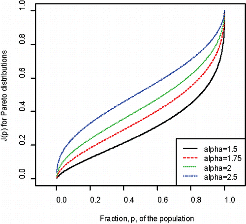
Figure 2. The Jm curves for Pareto distributions with α = 2.5, 2.0, 1.75, and 1.50.
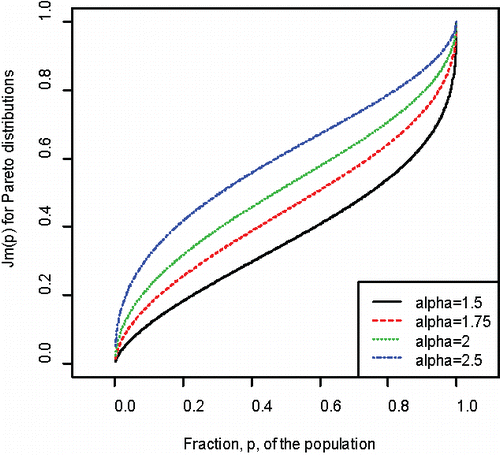
Even though the Jm curve compares the share of income received by the upper 100p% to the middle 100p% of the distribution rather than the lowest 100p%, for each value of alpha, the differences between AJ and AJm for the Pareto distributions considered in are not large. To assess the potential impact of giving greater weight to the gap between the richest and either the poorest or the middle of the distribution the weighted areas of (1−J) and (1−Jm) with respect to the weight function 2(1−p) can be calculated. The formulas for these weighted averages are:
(8)
(8) where J(p) is given in Equation Equation(6)
(6)
(6) and Jm(p) is given by Equation Equation(7)
(7)
(7) .
For the two Pareto distributions with α = 2.0 and 1.5, these weighted areas are 0.6805 (0.8122) for (1−J) and 0.6080 (0.7459) for (1−Jm). As expected, they exceed the values 0.5708 (0.7092) and 0.4875 (0.6436) of the un-weighted areas.
The share of income received by the top 100q%, denoted by TS(q), of the population is q(1−1/α) and using the relationship L(p*) = q(1−1/α),
(9)
(9) where τ = 1− (1/α). Similarly, for any value of q, m* is the value of m, satisfying:
(10)
(10)
Recalling that τ = 1−1/α and the Lorenz curve for a Pareto-α given in Equation Equation(5)(5)
(5) , the value of m = m*(q) satisfying Equation Equation(10)
(10)
(10) becomes
(11)
(11)
For any pair of values of α and q, the solution m*(q) of (Equation11(11)
(11) ) is obtained numerically using the Newton-Raphson method.
The results in conform to the expected pattern of a lower degree of inequality corresponding to a higher value of the parameter α. Since the Gini index in many nations is in the range 0.333 to 0.500, the substantially larger proportion of lower or middle income recipients needed in order for their share of income to equal that of the top 1 or 5%, denoted by TS(0.01) and TS(0.05), when the corresponding values of α decline from 2.0 to 1.5 is noteworthy. In particular, notice that that when the Pareto parameter alpha decreases from 1.75 to 1.5, corresponding to an increase in the Gini index from 0.40 to 0.50, the proportion, m*, of the middle class needed to have the same income as the top 1% (5%) increases from 21.7% (42.3%) to 39.5% (63.6%).
Table 3. The share, TS(q) of income held by the upper 100q% and proportions p* and m* of the lower or middle income group having the same share, TS(q) of the total income.
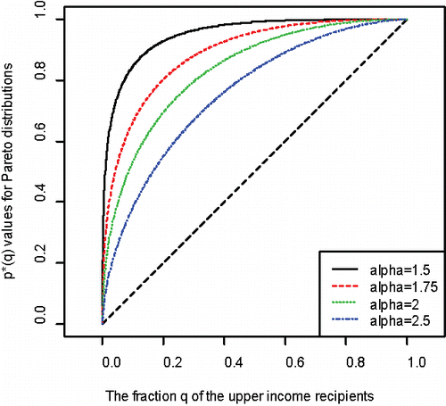
The p*-curves in show that as α decreases the fraction (p*) of the lower income recipients needed to have the same share as the top 100q% of the distribution increases markedly. This is also reflected by the increase in the area (A) between the 45-degree line, S(q) = q, and the curves for the different Pareto distributions. The most unequal distribution would have all the income going to one household, so the p* curve would equal to 1 for all values of u. Hence, the ratio of the area A to that of the triangle formed by (0, 0), (0, 1), and (1, 1) or 2A can be considered an analogue of the Gini index. When α = 1.5, 1.75, 2.0, 2.5, the values of 2A, which will be noted by AGP, are 0.8998, 0.7751, 0.6666, and 0.5111, respectively.
Figure 3. The proportion p* of income recipients, cumulated from the poorest, having the same share of income as the top 100q% assuming income followed a Pareto distribution with α = 1.5, 1.75, 2.0, or 2.5.
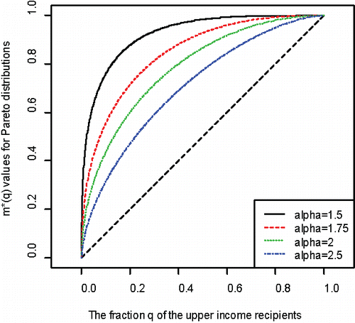
gives the corresponding m* curves for the fraction m*(q) of the middle portion of the income distribution having the same share of income as the top 100q%. Although for each underlying Pareto distribution, m*(q) is less than p*(q), the curves are similar. When α = 1.5, 1.75, 2.0 and 2.5, twice the area between m*(q) and the equality line S(q) = q, denoted by AGM, equals 0.8482, 0.6915, 0.5707, and 0.4146, respectively.
Figure 4. The proportion m* of income recipients cumulated in a symmetric interval about the median having the same share of income as the top 100q% assuming income follows a Pareto distribution with α = 1.5, 1.75, 2.0, or 2.5.
4. Analysis of U.S. Income Data for 1967 and 2013
The proposed curves and measures will be used to analyze and compare the distribution of household incomes in the U.S. for 1967 and 2013. Because the data are reported in grouped form (DeNavas-Walt and Proctor Citation2014), the Lorenz curves were obtained using the method given in Lyon, Cheung, and Gastwirth (Citation2016). The estimates of the Gini index derived from the interpolated Lorenz curve were very close to the Gini indices reported by the Census Bureau with an average absolute error of 0.001 for the entire 1967–2013 period. The Lorenz curves for 1967 (dashed line) and 2013 (solid line) are given in . The curve for 2013 lies entirely below the one for 1967 indicating they are Lorenz ordered (Arnold Citation2015a; Kamke and Radermacher Citation2015; Wilfing Citation1996). This is consistent with the increase in the Gini index from 0.397 in 1963 to 0.476 in 2013.
Figure 5. The Lorenz curves for the U.S. household income data in 1967 and 2013.
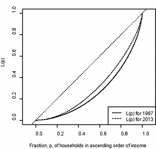
The J and Jm curvesfor both years are given in . presents the p* and m* curves. From them, one can see that the downward shift in the Jm curves exceeded that of both the J and Lorenz curves. This is reflected in the differences in the areas (0.055 and 0.0904) of inequality between the J and Jm curves and the line of equality. In 1967 those areas were 0.6581 and 0.4317 and in 2013 they increased to 0.7126 and 0.5221, respectively. The differences between the Jm curves for the 1967 and 2013 income data and the related areas of inequality are larger than the differences in the corresponding J curves highlighting the greater relative decline of the middle of the distribution during the period.
Figure 6. The J and Jm curves for the U.S. income distribution in 1967 and 2013.
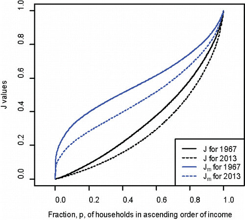
Figure 7. The p* and m* curves for the U.S. income distribution for 1967 and 2013.
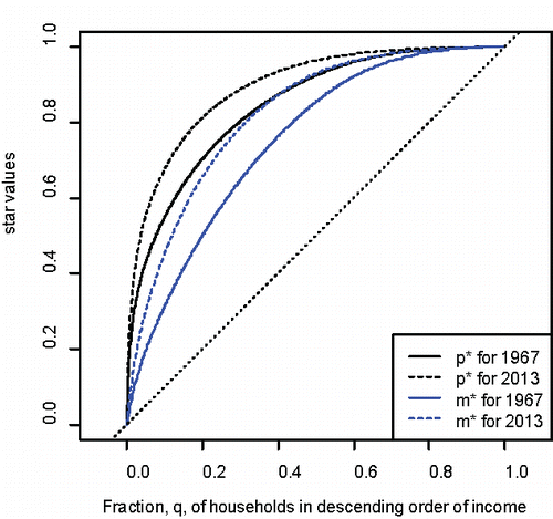
The additional insight obtained from considering the proportions p*(q) and m*(q) of the lowest or middle portions, respectively of the income distribution that receive the same share, TS(q), of income as the top 100q% is illustrated by the results in . In 1967, the top 5% received 17.2% of the total income, TS(0.05), as much as the lower 43.4%, p*(0.05) or middle 19.8%, (m*0.05). In 2013, the share of the total income, TS (0.05), of the top 5% rose to 22.2%; the same share as the lowest 55.5%, p*(0.05) or middle 30.6%, m*(0.05). Notice that the relative increase (30.6/19.8 = 1.55) in the proportion of the middle part of the income distribution required to receive the same share of income as the top 5% is greater than the relative increase (1.28) in the proportion of income recipients, starting from the poorest and the relative increase (1.20) in the Gini index from 1976 to 2013. A similar phenomenon occurs if one examines the shares of the top 10 or 20% in .
Table 4. The share of income held by the upper 100q% and proportion of the lower or middle income group having the same total income in 1967 and 2013.
Examining the p* and m* curves in shows that those for 2013 are above their counterparts for 1967 for all q in (0, 1). They also increase faster for small values of q, reflecting the change in the income distribution in favor of the upper income group. The analogs of the Gini index, twice the area between the curves and the equality line S(q) = q, also reflect the increase in inequality. The AGP for p* increased from 0.6868 to 0.7878 during the period, while the AGM for m* increased from 0.4994 to 0.6427. During this time period both increases, 0.101 and 0.1433, in these area-based measures calculated from the p* and m* curves exceed the corresponding increase, 0.079, in the Gini index. The noticeably greater change in the value of AGM, calculated from the m* curves, indicates that the middle portion of the income distribution lost a proportionately greater share of income to those at the upper end than the poor did during the last 45 years. This conclusion is consistent with the noticeable increase in the middle portion of the income distribution needed in order that they receive the same share as the top 5% in and the similar changes in the Jm curves for the two years noted previously.
Table 5. The share of income and wealth held by the upper 100q% and proportion of the lower or middle income group having the same total income or wealth in the 2010–2012 survey in the UK.
5. Inequality of the Distribution of Wealth and Income in the United Kingdom
The importance of considering the inequality in the distributions of both wealth and the income is emphasized by Stiglitz, Sen, and Fitoussi (Citation2009). While some research has indicated that health inequalities are related to income inequality (Dorling Citation2015; Pickett and Wilkinson Citation2015), the negative relationship between wealth inequality and inequalities in health with respect to life expectancy and infant mortality appears to be stronger (Nowatzki Citation2012). In this section we use the proposed curves and measures to re-examine the 2010–2012 data on inequality in income and wealth in the United Kingdom. The reported (Office of National Statistics Citation2014) values of the Gini indices of inequality are 0.43 for income and 0.61 for wealth. The median household income was 32,100 GB, while the median household wealth was 218,400 GB.
The Lorenz, J (Jm) and p* (m*) curves for the 2010–2012 data are given in , respectively. The values of AJ from the J curve for the income and wealth data in are 0.6750 and 0.8005, respectively. The corresponding values of AJm are 0.5001 and 0.6253. The increases of the values of the Gini index (0.13), AJ(0.125), and AJm(0.125) for the wealth data over their values on the income data are very close, indicating that the areas between the corresponding curves in are almost equal. The maximum differences between the J and Jm curves for income and wealth in , however, are larger than the corresponding difference in the Lorenz curve (see ).
Figure 8. The Lorenz curves for the UK income and wealth distributions in 2010–2012.
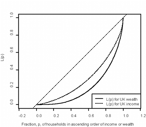
Figure 9. J and Jm curves for the UK income and wealth distributions in 2010–2012.
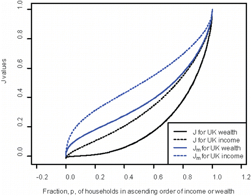
Figure 10. The p* and m* curves for the UK income and wealth distributions in 2010–2012.
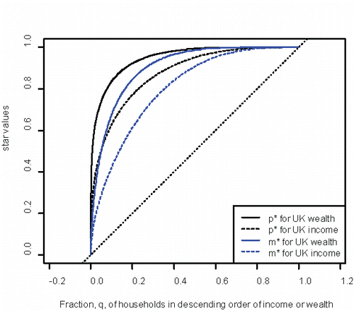
The shares (TS) of the top 5%, 10%, and 20% of the income and wealth distributions are given in along with the corresponding fractions, p* and m*, of the lower and middle parts of the income distribution that receive the same share of income as the top. As expected, the inequality in the distribution of wealth is substantially greater than that of income. For example, both the top 5% of UK households and middle 50% possess about 30% of the wealth. In contrast, the top 5% and middle 28.6% received 21.5% of the income reported in the survey. Thus, the proportion of the middle class needed to have the same amount of wealth as the top 5% is 1.75 times the corresponding proportion of the middle class needed to have the same total income as the top 5% of income recipients. The areas AGP and AGM, which are twice the areas between the p* and m* curves and the line of equality, S(q) = q in are 0.7564 and 0.6070, respectively. The values of AGP and AGM obtained from the corresponding wealth curves in are 0.8991 and 0.8081, clearly larger than their values on the UK income data. Notice that the relative increases of three area based measures: the Gini index derived from the Lorenz curve, AGP derived from the p* curve and AGM, obtained from the m* curve, which equal 1.415, 1.189, and, 1.33, respectively, are less than the ratio 1.75 of the value of m*(0.05) from the wealth distribution to its value on the income distribution (see ). This is a consequence of the fact that the area based measures must lie between 0 and 1.0. Thus, these summary measures may not fully reflect the full degree of inequality between two distributions, especially when both are rather unequal to begin with; policy makers and economists should use them in conjunction with the curves, when examining income and wealth data. Notice that the p* curve for the wealth distribution (see ) is quite steep, reflecting that it takes more than 60% of the population, accumulated from the poorest, to possess the same amount of wealth as the top few percent. While the m* curve (see ) for wealth is not as steep as the corresponding p* curve, it also clearly indicates that the wealth of the top five percent equals that of the middle half of all households. Indeed, the m* curve for wealth is almost as steep as the p* curve for income for small values of q and is higher than the p* curve income values of q greater than 0.10 (see ).
Although the concepts of income and the survey methodology differ somewhat in the two nations, it is interesting to note that the share (21.5%) of income going to the top 5% in the UK in 2010–2012 is nearly equal to the 22.2% share in the U.S. reported in 2013. However, the shares of income received by the top 10 and especially the top 20% in the UK (see ) are less than the corresponding shares reported in for the 2013 U.S. income distribution. The proportions of the “lower” and “middle” income recipients that have the same total income as the upper 5%, 10%, or 20% in the UK in are less than the corresponding values in for the US, which supports the conclusion that the income distribution in the US is more unequal than that of the UK.
6. Summary and Discussion
The decreasing share of income received by the “middle class” has become a major concern in economics (Levy Citation1988; Pressman Citation2007; Foster and Wolfson Citation2010) and public policy (Brandolini Citation2010). Indeed, how to define the “middle class” has been a topic of interest surveyed by Atkinson and Brandolini (Citation2013). The curves and measures proposed here avoid the need to select a fixed percentage, e.g., the middle half or 60%, of the distribution. The first pair of curves J and Jm (see ) compares the share of income received by the lowest or middle 100p% of the distribution to the share of income received by the top 100p%. The areas between these curves and the line of equality (y = 1) may be regarded as summary measures similar in spirit to the Gini or Zenga indices. When comparing two distributions, examination of the entire Lorenz and the proposed curves enables one to see where the largest difference between them occurs. The decline in the share of income received by households in the middle of the income distribution relative to the upper end that occurred in United States during the 1967–2013 time period is shown more clearly by comparing the Jm curves (see ) and related areas than is seen from the Lorenz curves in and Gini indices. This is due, in part, to the fact that the mean of the distribution, which is in the denominator of both the Lorenz curve and Gini index, no longer has a role in J or Jm. Gastwirth (Citation2014) noted that a shift in income in favor of the top increases the mean and therefore used the median in place of the mean in a Gini type index. In the United States, this modified index of inequality grew at about twice the rate as the Gini index during the time period considered here. The rate of growth of the median-based Gini index in Great Britain from 1967–2012 was one and a half times that of the usual Gini index.
A second pair of curves p* and m* (see ) are based on the fraction of lower or middle income recipients needed in order for them to receive the same share of total income as the top 100q%. The difference between those graphs for 1967 and 2013 and the corresponding increases in the related area based measures (0.101 in AGP and 0.143 in AGM) of inequality also indicate that a larger increase in income inequality in the US occurred between 1967 and 2013 than the change (0.078) in the Gini index or difference between the Lorenz curves in . Both the p* and m* curves moved further from the line of equality during the time frame reflecting the substantial increase in the share of total income going to the upper end the distribution during the 1967–2013 period. The differences between the m*curves and the related AGM measure of inequality for the U.S. household income data in 1967 and 2013 are greater than those between the p* curves and the AGP measure, demonstrating the greater decline in the economic status of the middle class.
The J and p* curves place greater emphasis on the relative status of the poor and lower income recipients, while the Jm and m* curves give greater weight to the status of the middle class. The decline in the economic well-being of both groups in the U.S. over the last 40 years has become a serious concern to policy makers. Because J(p) and Jm(p) are ratios of the average income of the top 100p% to the average of the lowest 100p% or middle 100p%, respectively, they are readily understood. Similarly, the p* and m* curves and their values for the top 100q% in are easy to interpret and provide a clearer picture of the degree to which the lower and middle income groups have lost ground to the upper end of the income distribution than the Lorenz curves.
In both examples, the differences between the proposed curves were clearer than the change in the two Lorenz curves. Thus, one may not need to incorporate a weighting function in the spirit of Mehran (Citation1976) to place greater emphasis on changes in a particular portion of the income distribution. As illustrated in the discussion of the J and Jm curves for the Pareto distribution in Section 3, one can incorporate a weighting function to give more focus to changes at the lower or middle parts of the distribution. The mathematical form of one family of weights, which can readily be incorporated to calculate a weighted area, is suggested. The choice of weighting function, however, should be based on economic and policy considerations, for example, maximizing an appropriate utility or social welfare function rather than computational ones.
USPP_1213148_Supplemental_File.zip
Download Zip (25.2 KB)Acknowledgments
It is a pleasure to thank Chris Skinner and the Department of Statistics of the London School of Economics (LSE) for providing me with space and more importantly, an intellectually stimulating environment during my stay. My discussions with Quiwei Yao and Stephen Jenkins of LSE and Wendy Lou of the University of Toronto were very insightful. I am grateful for the most helpful and thorough computer assistance Li Cheung and Jie Cong provided. The author thanks the two reviewers, the Associate Editor, and Editor for many valuable suggestions that improved the article.
Supplementary Materials
The relationship between the J(p) and p*(q) curves and Lorenz ordering.
References
- Aaberge, R., and Atkinson, A. B. (2013), “The Median as a Watershed,” Discussion Paper No. 749 Statistics Norway, Oslo.
- Arcagni, A., and Porro, F. (2014), “The Graphical Representation of Inequality,” Revista Colombiana de Estadística, 37, 419–437.
- Arnold, B. C. (2015a), “On Zenga and Bonferroni Curves,” Metron, 73(1), 25–30.
- ——— (2015b), Pareto Distributions (2nd ed.). London: Chapman Hall.
- Atkinson, A. B. (1983), The Economics of Inequality. (2nd ed.). Oxford: Clarendon Press.
- Atkinson, A. B., and Brandolini, A. (2013), “On the Identification of the Middle Class,” in Income Inequality, eds. J. C. Gornick and M. Jäntti, Palo Alto, CA: Stanford University Press, pp. 77–100.
- Brandolini, A. (2010), “Political Economy and the Mechanics of Politics,” Politics and Society, 38, 212–226.
- Cingano, F. (2014), “Trends in Income Inequality and its Impact on Economic Growth”, OECD Social. Employment and Migration Working Papers, No. 163, OECD. http://dx.doi.org/10.1787/5jxrjncwxv6j-en
- Cowell, F. (2011), Measuring Inequality (3rd ed.), Oxford: Oxford University Press.
- Dabla-Norris, E., Kochhar, K., Suphaphiphat, N., Ricka, F., and Tsounta, E. (2015), “Causes and Consequences of Income Inequality: A Global Perspective,” International Monetary Fund Staff Discussion Note.
- DeNavas-Walt, C. and Proctor, B.D. (2014), “Income and Poverty in the United States:2013,” CPS Report 249 U.S. Bureau of the Census.
- Dorling, D. (2015), “The Mother of Underlying Causes—Economic Ranking and Health Inequality,” Social Science & Medicine, 128, 327–330.
- Bricker, J., Dettling, L.J., Henriques, A., Hsu, H.W., Moore, K.B., Sabelhaus, J., Thompson, J. and Windle. R.A. (2014). “Changes in U.S. Family Finances from 2010 to 2013: Evidence from the Survey of Consumer Finances,” Federal Reserve Bulletin, 100, 1–40.
- Fellman, J. (2012), “Estimation of Gini coefficients Using Lorenz Curves,” Journal of Statistical and Econometric Methods, 1, 31–38.
- Foster, J.E. and Wolfson, M.C. (2010), “Polarization and the Decline of the Middle Class: Canada and the U.S.,” Journal of Economic Inequality, 8, 247–243.
- Gastwirth, J. L. (1971), “A General Definition of the Lorenz Curve,” Econometrica, 39, 1037–1039.
- ——— (2014), “Median-Based Measures of Inequality: Reassessing the Increase in Income Inequality in the U.S. and Sweden”, Statistical Journal of the IAOS, 30, 311–320.
- Georgi, G. M., and Crescenzi, M. (2001), “A Look at the Bonferroni Inequality Index in a Reliability Framework”, Statistica, LXL(4), 571–583.
- Greselin, F. (2014), “More Equal and Poorer, or Richer but More Unequal?” Economic Quality Control, 29, 99–117.
- Greselin, F., Puri, M. L., and Zitikis, R. (2009), “L-functions, Process and Statistics in Measuring Economic Inequality and Actuarial Risks,” Statistics and Its Interface, 2, 227–246.
- Greselin, F., Pasquazzi, L., and Zitikis, R. (2013), “Contrasting the Gini and Zenga Indices of Economic Inequality,” Journal of Applied Statistics, 40, 282–297.
- Jenkins, S. P. (2015), “The Income Distribution in the UK: A Picture of Advantage and Disadvantage,” in Social Advantage and Disadvantage, eds. H. Dean and L. Platt, Oxford: Oxford University Press, pp. 135–160.
- Jenkins, S. P., and Van Kerm, P. (2006), “Trends in Income Inequality, Pro-Poor Income Growth, and Income Mobility,” Oxford Economic Papers, 58, 531–548.
- Kamke, T., and Radermacher, J. P. (2015), Income Modeling and Balancing: A Rigorous Treatment of Distribution Patterns, Berlin: Springer.
- Levy, F. (1988), Dollars and Dreams: The Changing American Income Distribution, New York: Norton.
- Lyon, M., Cheung, L., and Gastwirth, J. L. (2016), “The Advantages of Using Group Means in Estimating the Lorenz Curve and Gini Index from Grouped Data,” The American Statistician, 70, 25–32.
- Mehran, F. (1976), “Linear Measures of Income Inequality,” Econometrica, 44, 805–809.
- Milanovic, B. (2012), “Global Inequality Recalculated and Updated: The Effect of New PPP Estimates on Global Inequality and 2005 Estimates,” Journal of Economic Inequality, 10, 1–18.
- Nowatzki, N. R. (2012), “Wealth Inequality and Health: A Political Economy Perspective,” International Journal of Health Services, 42, 403–424.
- OECD (2016) “Income Distribution Database (IDD): Gini, Poverty, Income, Methods and Concepts.” Available at http://www.oecd.org/social/income-distribution-database.htm
- Office of National Statistics (2014), Wealth and Income, 2010–1012
- Pickett, K. E., and Wilkinson, R. G. (2015), “Income Inequality and Health: A Causal Review,” Social Science & Medicine, 128, 316–326.
- Pressman, S. (2007), “The Decline of the Middle Class: An International Perspective,” Journal of Economic Issues, 41, 181–200.
- Sordo, M. A., Navarro, J., and Sarabia, J. M. (2014), “Distorted Lorenz Curves: Models and Comparisons,” Social Choice and Welfare, 42, 761–780.
- Stiglitz, J. E., Sen, A., and Fitoussi, J.-P. (2009), Report by the Commission on Economic Performance and Social Progress.
- Wilfing, B. (1996), “A Sufficient Condition for Lorenz Ordering,” Sankyha: The Indian Journal of Statistics, Series B, 58, 62–69.
- Yitzhaki, S., and Schectman, E. (2013), A Primer on Gini Methodology, New York: Springer.
- Zenga, M. (2007), “Inequality Curve and Inequality Index Based on the Ratios Between Lower and Upper Arithmetic Means,” Statistica & Applicazioni, 5, 3–27.